
Search results for "Resolved" in Home Design Ideas
 Custom Design & Construction
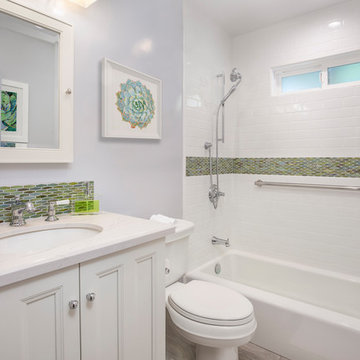
This design / build project in Redondo Beach, CA. focused on a family’s hall bathroom. There were multiple reasons that the homeowners decided to start this project but the issue that was most pressing was water damage from the shower. The homeowners knew it needed to be addressed ASAP. As long as a remodel was going to be completed they felt that it was time to address the layout as well. It was not efficient in its original state. Since bathrooms work so hard it was important that the remodel resolve this issue as well. The homeowners were also interested in new finishes.
Desiring something more light and fresh with a coastal feel we began reimagining the layout. The before and after pictures explain it best but basically the new shower was placed against the wall where there previously was a toilet and window. The location and size of the window was changed as well. The shower is now a three wall alcove with grab bars to allow the homeowners to age in place. The white subway tile is accented by a mosaic tile in the homeowners’ favorite coastal shades. The light and beachy feel is reinforced with the grey ceramic tile floor. The vanity is a furniture-style with details like decorative feet. The space is tied together with a backsplash that matches the border in the shower.
 TKS Design Group
Download our free ebook, Creating the Ideal Kitchen. DOWNLOAD NOW
A tired primary bathroom, with varying ceiling heights and a beige-on-beige color scheme, was screaming for love. Squaring the room and adding natural materials erased the memory of the lack luster space and converted it to a bright and welcoming spa oasis. The home was a new build in 2005 and it looked like all the builder’s material choices remained. The client was clear on their design direction but were challenged by the differing ceiling heights and were looking to hire a design-build firm that could resolve that issue.
This local Glen Ellyn couple found us on Instagram (@kitchenstudioge, follow us ?). They loved our designs and felt like we fit their style. They requested a full primary bath renovation to include a large shower, soaking tub, double vanity with storage options, and heated floors. The wife also really wanted a separate make-up vanity. The biggest challenge presented to us was to architecturally marry the various ceiling heights and deliver a streamlined design.
The existing layout worked well for the couple, so we kept everything in place, except we enlarged the shower and replaced the built-in tub with a lovely free-standing model. We also added a sitting make-up vanity. We were able to eliminate the awkward ceiling lines by extending all the walls to the highest level. Then, to accommodate the sprinklers and HVAC, lowered the ceiling height over the entrance and shower area which then opens to the 2-story vanity and tub area. Very dramatic!
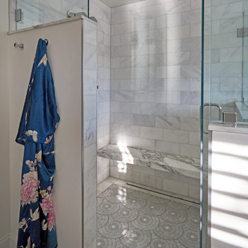
This high-end home deserved high-end fixtures. The homeowners also quickly realized they loved the look of natural marble and wanted to use as much of it as possible in their new bath. They chose a marble slab from the stone yard for the countertops and back splash, and we found complimentary marble tile for the shower. The homeowners also liked the idea of mixing metals in their new posh bathroom and loved the look of black, gold, and chrome.
Although our clients were very clear on their style, they were having a difficult time pulling it all together and envisioning the final product. As interior designers it is our job to translate and elevate our clients’ ideas into a deliverable design. We presented the homeowners with mood boards and 3D renderings of our modern, clean, white marble design. Since the color scheme was relatively neutral, at the homeowner’s request, we decided to add of interest with the patterns and shapes in the room.
We were first inspired by the shower floor tile with its circular/linear motif. We designed the cabinetry, floor and wall tiles, mirrors, cabinet pulls, and wainscoting to have a square or rectangular shape, and then to create interest we added perfectly placed circles to contrast with the rectangular shapes. The globe shaped chandelier against the square wall trim is a delightful yet subtle juxtaposition.
The clients were overjoyed with our interpretation of their vision and impressed with the level of detail we brought to the project. It’s one thing to know how you want a space to look, but it takes a special set of skills to create the design and see it thorough to implementation. Could hiring The Kitchen Studio be the first step to making your home dreams come to life?
 Mottram Architecture
Timber frame homes offer unique challenges during a remodel. What often makes them beautiful and attractive to most homeowners, also makes them challenging for space requirements.
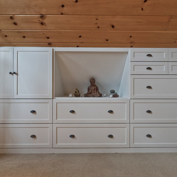
Context: The lovely couple that owned this home were struggling with some interesting floor plan challenges that just didn't work for their family. The loved the beautiful timbers and woodwork of their home, but the dramatically sloping ceilings on the second floor, particularly in the bathroom, just didn't work for this 1 1/2 bath home. Needing to use the skylight to approach the toilet was a less then ideal scenario. Although the bathroom footprint was more then adequate, the sloped ceiling only made half of the space useable. Check out the Before/After post on our blog to see the photos of the house pre-renovation. As much as they loved all the wood features in their home, another challenge they had was light. The wood ceiling made everything inside the house darker, even with a fantastic array of south facing windows, there were spaces in the home that felt dark and small. When they contacted us they wanted to know how could they make their brighter and more inviting, were there solutions to the 2nd floor sloped ceiling issues, and if they were going to do all of this work, how could they make their home more comfortable and efficient. A nagging water leak in the upstairs bathroom spurred them into action and here is how we solved their dilemma.
Conclusion: First, we added a little dormer to the rear of the house so we could get full headroom in nearly all of the upstairs bathroom! Then we decided to extend that dormer one more timber bay over to create a walk in closet with natural light and plenty of space. Since we were contemplating energy efficiency, we resolved a nagging issue that is present in a lot of timber frame construction, air tightness. Commonly found in timber frame construction, fiberglass insulation is installed in the rafter bays and board ceilings are installed over top. Unfortunately, board ceilings are anything but air tight, and fiberglass insulation needs to be in an airtight cavity for maximum effectiveness. So we were able to solve two issues at the same time for this homeowner. We removed the board ceiling and fiberglass insulation, we dense packed the rafter bays with cellulose insulation, and installed sheetrock in place of the boards. The boards were salvaged for re-use by the homeowner, and the space and light quality was dramatically improved. Some may think that losing the board ceiling took something away from the space, but what you'll see in the pictures is that it highly accentuates the heavy timbers and really makes them stand out in a beautiful way. Now with this added airtightness, better insulation, and brighter space, the homeowner hardly runs their wood stove, and it's so quiet in the space, an added bonus from changing the insulation. It became necessary to also add a sheetrock ceiling to the living room to hide the plumbing from the new bathroom layout above. Changing this ceiling gave the homeowner some real quality lighting that was lacking in the living room before. The brighter ceiling and new lighting layout completely transforms the living room into a space you want to hang out, even though the layout didn't change at all. When the homeowner saw the finished spaces she said "I can't believe this is my house, I want to live in this house"
Energy Efficiency: I touched a little on the efficiency above, but like all projects done with Mottram Architecture, we always want to leave you with a little extra. Timber frame construction with board ceilings and fiberglass insulation are notoriously leaky! If you want to know what we think about fiberglass insulation, check our our blog post on Why Fiberglass Insulation Sucks. By installing cellulose insulation and covering it with sheetrock we were able to greatly reduce the heat flowing out of this home. It not only improves cashflow it improves the comfort level in the space. Who wants to sit in their living room and feel a draft? Let us remind you, we are not saying cellulose insulation is an air barrier, we use the sheetrock to help with that, but it does significantly reduce the air flow over fiberglass insulation. And when we reduce the airflow, we reduce the heat flow. And when we reduce the heat flow, we reduce the need to re-heat that drafty air from outside. When it comes to energy efficiency the first and best place to start is air infiltration. We greatly reduced the air infiltration with the new insulation, but we also added a hat and warm boots. What I mean by that is, we improved the insulation in the roof, and we installed insulation in the basement. Maybe it's a silly analogy, but when you think about keeping warm, we always start with the hat and boots! With sustainability in mind, the next project will be to add a deck to the front of this house with rain catchment barrels from the metal roof. They are planning to plant a garden in the spring and the rain catchment system will help to irrigate the new garden.
Builder: East Shore Builders
Photographer: Michael Eric Berube
Find the right local pro for your project
 Star Furniture
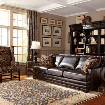
Bernhardt Fudge 100% top grain semi aniline leather sofa has generous down blend seating, large track style arms and nail head trim. 2 down blend accent pillows.
 Footprint Architects Ltd
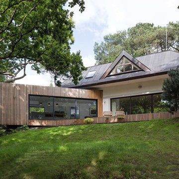
The key design driver for the project was to create a simple but contemporary extension that responded to the existing dramatic topography in the property’s rear garden. The concept was to provide a single elegant form, cantilevering out into the tree canopies and over the landscape. Conceived as a house within the tree canopies the extension is clad in sweet chestnut which enhances the relationship to the surrounding mature trees. Large sliding glass panels link the inside spaces to its unique environment. Internally the design successfully resolves the Client’s brief to provide an open plan and fluid layout, that subtly defines distinct living and dining areas. The scheme was completed in April 2016

 Castle Building & Remodeling
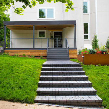
This modern home, near Cedar Lake, built in 1900, was originally a corner store. A massive conversion transformed the home into a spacious, multi-level residence in the 1990’s.
However, the home’s lot was unusually steep and overgrown with vegetation. In addition, there were concerns about soil erosion and water intrusion to the house. The homeowners wanted to resolve these issues and create a much more useable outdoor area for family and pets.
Castle, in conjunction with Field Outdoor Spaces, designed and built a large deck area in the back yard of the home, which includes a detached screen porch and a bar & grill area under a cedar pergola.
The previous, small deck was demolished and the sliding door replaced with a window. A new glass sliding door was inserted along a perpendicular wall to connect the home’s interior kitchen to the backyard oasis.
The screen house doors are made from six custom screen panels, attached to a top mount, soft-close track. Inside the screen porch, a patio heater allows the family to enjoy this space much of the year.
Concrete was the material chosen for the outdoor countertops, to ensure it lasts several years in Minnesota’s always-changing climate.
Trex decking was used throughout, along with red cedar porch, pergola and privacy lattice detailing.
The front entry of the home was also updated to include a large, open porch with access to the newly landscaped yard. Cable railings from Loftus Iron add to the contemporary style of the home, including a gate feature at the top of the front steps to contain the family pets when they’re let out into the yard.
Tour this project in person, September 28 – 29, during the 2019 Castle Home Tour!
 Footprint Architects Ltd
The key design driver for the project was to create a simple but contemporary extension that responded to the existing dramatic topography in the property’s rear garden. The concept was to provide a single elegant form, cantilevering out into the tree canopies and over the landscape. Conceived as a house within the tree canopies the extension is clad in sweet chestnut which enhances the relationship to the surrounding mature trees. Large sliding glass panels link the inside spaces to its unique environment. Internally the design successfully resolves the Client’s brief to provide an open plan and fluid layout, that subtly defines distinct living and dining areas. The scheme was completed in April 2016
 Bridgewater
The new owners were looking forward to living in their new home with an open floor plan, tall vaulted ceilings, and great views. It featured a large Great Room with two big French Doors separating the Dining Room from the Master Bedroom.
But after only a few months they identified a major design flaw: Each of the French Doors had ten glass windows with two large windows above each door. (Check out our before and after designs, traffic flow diagrams and photos of this project.) Glass windows and doors allowed sound and light from guests or the TV in the great room to easily sneak into the bedroom. With unique work and sleep schedules (he’s a pilot, she’s a registered nurse) this design wasn’t working.
Then there was a traffic flow design flaw: The Master Bedroom had a second entrance from a hallway. To get into the bedroom from the hallway you needed to walk down another claustrophobic hallway.
To get from the Master Bedroom to the Master Bath begin at the most remote corner of the bedroom and down a hallway between two closets. Once inside the bath, a huge triangular Jacuzzi dominating the space.
So, from a privacy and traffic flow perspective, this home had some major design issues.
When Craig Weber first met with the owners, he listened to their ideas and concerns. The owners trusted Craig to come up with the most efficient and most effective solution to this design dilemma. He offered a solution that resolved the bed-bath traffic flow problem, offered some bedroom room privacy, and updated the bath.
First, the two French Doors and windows were removed. A new wall was built with sound-absorbing materials, making the Great Room and Dining Room more comfortable spaces for entertaining while creating the bedroom privacy the owners craved.
Solving the Bedroom/Bath traffic flow problem began with removing the two existing closets. The bath door was relocated next to the hall entrance, and then a new walk-in closet was added adjacent to the hallway entrance. The solution offered easy access to and from the bath, closet and hallway without a hint of claustrophobia.
The Master Bath underwent a major transformation designed for convenience and comfort – especially during long, cold Minnesota winters.
Most everything from the former bath was torn out, beginning with the giant Jacuzzi.
A new bathtub that is wider and deeper than the standard size was installed with brushed Nickel fixtures. It’s the perfect place to relax with a glass of wine and candles.
Warm floors are a Minnesota “must have.” The bath’s new ceramic floor features in-floor electric heat. Getting in and out of the tub is easy and comfortable.
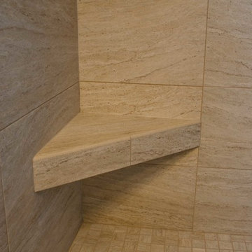
The new walk-in shower again features in-floor heating and a place to sit. The most interesting feature of this shower may the custom ceramic tile installed with unique patterns.
A new vanity Cambria Bradshaw countertops features two under-hung ceramic sinks with matching brushed Nickel fixtures.
Tall ceilings and three glass windows near the ceiling flood the room with natural light. A new energy-efficient window frames an ornamental stained glass window created by the owner’s father – a great personal touch.
A quiet place to sleep. A private dining room for entertaining. A Master Bath to die for. And easy traffic flow. The owners couldn’t have been more delighted with the outcome. And Lilly, their cat, loves it too.
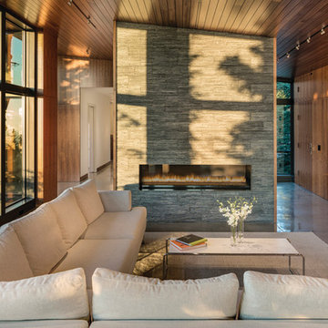
Mid-sized trendy open concept concrete floor living room photo in Other with brown walls, a ribbon fireplace and a stone fireplace
 TREX COMPANY INC
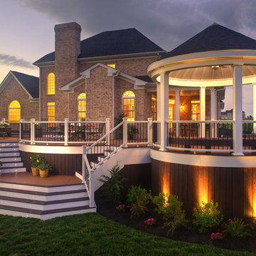
Deck featuring Trex Transcend in Tree House and Vintage Lantern with Transcend railing in Classic White and Trex Outdoor Lighting. See more at http://www.trex.com
 Castle Building & Remodeling
This modern home, near Cedar Lake, built in 1900, was originally a corner store. A massive conversion transformed the home into a spacious, multi-level residence in the 1990’s.
However, the home’s lot was unusually steep and overgrown with vegetation. In addition, there were concerns about soil erosion and water intrusion to the house. The homeowners wanted to resolve these issues and create a much more useable outdoor area for family and pets.
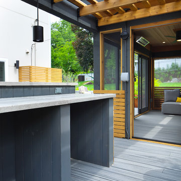
Castle, in conjunction with Field Outdoor Spaces, designed and built a large deck area in the back yard of the home, which includes a detached screen porch and a bar & grill area under a cedar pergola.
The previous, small deck was demolished and the sliding door replaced with a window. A new glass sliding door was inserted along a perpendicular wall to connect the home’s interior kitchen to the backyard oasis.
The screen house doors are made from six custom screen panels, attached to a top mount, soft-close track. Inside the screen porch, a patio heater allows the family to enjoy this space much of the year.
Concrete was the material chosen for the outdoor countertops, to ensure it lasts several years in Minnesota’s always-changing climate.
Trex decking was used throughout, along with red cedar porch, pergola and privacy lattice detailing.
The front entry of the home was also updated to include a large, open porch with access to the newly landscaped yard. Cable railings from Loftus Iron add to the contemporary style of the home, including a gate feature at the top of the front steps to contain the family pets when they’re let out into the yard.
Tour this project in person, September 28 – 29, during the 2019 Castle Home Tour!
 Taylor Knights
Peter Clarke
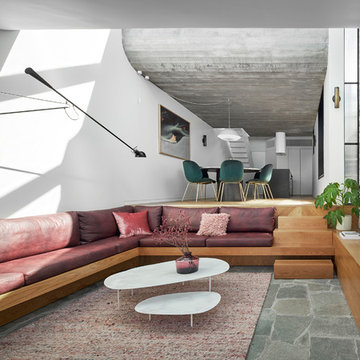
Living room - mid-sized contemporary open concept limestone floor and gray floor living room idea in Melbourne with white walls, no fireplace and no tv
Living room - mid-sized contemporary open concept limestone floor and gray floor living room idea in Melbourne with white walls, no fireplace and no tv
 Shea Homes - Arizona
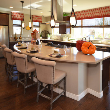
Huge trendy l-shaped dark wood floor open concept kitchen photo in Phoenix with an undermount sink, raised-panel cabinets, dark wood cabinets, quartz countertops, mosaic tile backsplash, stainless steel appliances and an island
 Renovisions
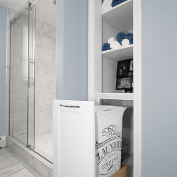
This master bath ‘Renovision’ came with three main requests from the homeowner: more storage, a larger shower and a luxurious look that feels like being at an upscale hotel. The Renovisions team accomplished these wishes and exceeded the clients expectations.
Request number 1: more storage. The existing closet was reconfigured to accommodate better storage for towels and bath supplies making it both functional and attractive. The custom built pull-out hamper was perfect. The long vanity and center tower offers much more cabinet space and drawer storage compared to what they had, especially with the increased vanity height.
Request number 2: A larger shower. Working within the existing footprint we were able to build a shower that is nearly a foot deeper as space was available. Creating a large rectangular cubby provides plenty of space for shampoos and soaps. The frameless sliding glass shower enclosure keeps the space open and airy while allowing the beautiful Carrera-look porcelain wall tiles to be the focus of this master bath.
Request number 3: a luxurious look. Turning their once boring, builder grade bathroom into an upscale hotel-like space was challenging, however, not a problem for the Renovisions team and their creative ways of resolving design snags along the way. Re-locating the doorway to the bathroom was one way to create a more spacious flow in and out of the space. Having the right design to start was half the battle – installing the beautiful products right the first time to ensure a proper fit and finish worthy of the upscale feel is the other half. The delicate tile detail in the shower cubby is the ‘jewelry’ in the room – the soft curves of this 2-tone wave design tile adds a dramatic feel and enlightened mood this client loves.
Overall, the homeowner was happy with every solution-based approach to all requests – their once dated builders bath is now bright, open and airy with a soft grey wall color adding to the soothing feel of this master bath.
 Ryan Associates Landscape Architecture & Planning
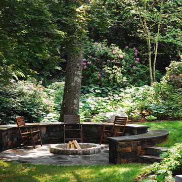
A walled firepit set in the landscape provides a place for family and friends to gather.
The challenge of this site was to design functional living spaces while resolving a series of problems. Two entry courts offer suitable welcomes to the home: a formal granite court that is approached from above as one descends down a once blind driveway, and a more utilitarian play court off the garage. The rear yard, once disconnected from the house, is terraced and suitable for entertaining. A granite stair descends from the terrace to a new expanded lower lawn. A custom fire pit sits off the upper terrace and provides a more intimate gathering space.
 Exclusive Home Interiors
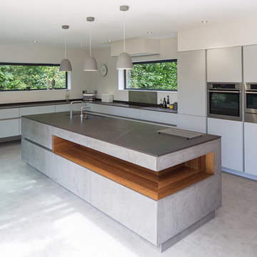
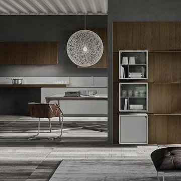
Functional and design kitchens
With 3.1, copatlife continues its march into the creation of definite relations between function and form, derived from a culture of industrial design.
It uses elements and materials able to create an idea of kitchen space suited for its lifestyle, where design and technology give to the project security and contemporary solutions.
copatlife designs solutions and forms in order to help to live this space as unique and special.
A continuous research to find formal and aesthetic solutions capable of resolving and characterizing.
Contents and forms to interpret at best the multiple needs of our daily lives.
 TKS Design Group
Download our free ebook, Creating the Ideal Kitchen. DOWNLOAD NOW
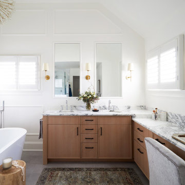
A tired primary bathroom, with varying ceiling heights and a beige-on-beige color scheme, was screaming for love. Squaring the room and adding natural materials erased the memory of the lack luster space and converted it to a bright and welcoming spa oasis. The home was a new build in 2005 and it looked like all the builder’s material choices remained. The client was clear on their design direction but were challenged by the differing ceiling heights and were looking to hire a design-build firm that could resolve that issue.
This local Glen Ellyn couple found us on Instagram (@kitchenstudioge, follow us ?). They loved our designs and felt like we fit their style. They requested a full primary bath renovation to include a large shower, soaking tub, double vanity with storage options, and heated floors. The wife also really wanted a separate make-up vanity. The biggest challenge presented to us was to architecturally marry the various ceiling heights and deliver a streamlined design.
The existing layout worked well for the couple, so we kept everything in place, except we enlarged the shower and replaced the built-in tub with a lovely free-standing model. We also added a sitting make-up vanity. We were able to eliminate the awkward ceiling lines by extending all the walls to the highest level. Then, to accommodate the sprinklers and HVAC, lowered the ceiling height over the entrance and shower area which then opens to the 2-story vanity and tub area. Very dramatic!
This high-end home deserved high-end fixtures. The homeowners also quickly realized they loved the look of natural marble and wanted to use as much of it as possible in their new bath. They chose a marble slab from the stone yard for the countertops and back splash, and we found complimentary marble tile for the shower. The homeowners also liked the idea of mixing metals in their new posh bathroom and loved the look of black, gold, and chrome.
Although our clients were very clear on their style, they were having a difficult time pulling it all together and envisioning the final product. As interior designers it is our job to translate and elevate our clients’ ideas into a deliverable design. We presented the homeowners with mood boards and 3D renderings of our modern, clean, white marble design. Since the color scheme was relatively neutral, at the homeowner’s request, we decided to add of interest with the patterns and shapes in the room.
We were first inspired by the shower floor tile with its circular/linear motif. We designed the cabinetry, floor and wall tiles, mirrors, cabinet pulls, and wainscoting to have a square or rectangular shape, and then to create interest we added perfectly placed circles to contrast with the rectangular shapes. The globe shaped chandelier against the square wall trim is a delightful yet subtle juxtaposition.
The clients were overjoyed with our interpretation of their vision and impressed with the level of detail we brought to the project. It’s one thing to know how you want a space to look, but it takes a special set of skills to create the design and see it thorough to implementation. Could hiring The Kitchen Studio be the first step to making your home dreams come to life?
 Saikley Architects
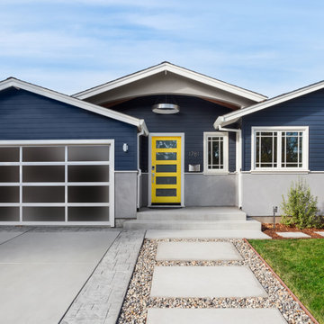
Our busy Silicon Valley clients asked us to convert their tight-quartered 1960’s ranch house to a gracious family home that would meet their long term needs. Ease of living was paramount, both in functionality and in ordered design.
The project was completed on a moderate budget. While retaining most of the structure of the existing house to avoid costly structural changes, we opened walls to improve the sight lines and flow of the house and bring in more light. We made small additions at the front and back bedrooms to gain space for the family and relatives. An existing underused patio area was improved with a simple outdoor kitchen and overhang to extend the living space to the outside. Costs were kept down with choices of modest materials.
Everything was made to be functional. Ample storage has been built into the right places. The details of the kitchen were carefully worked out to accommodate all the wishes of the various cooks in the family. The house is set up to be easy to keep clean. Acoustic walls separate living from bedroom spaces so adults can enjoy time together while children sleep. The outdoor kitchen has easy access to the indoor kitchen and the garage, and its setup promotes socializing while cooking outdoors.
A large part of the narrow back yard was previously unusable space due to a steep slope up to a neighbor’s higher fence. With a new retaining wall and some re-grading we took back more of the yard for the patio and play space on a new lawn.
The remodeled house is a mix of contemporary and traditional elements. Cool colors have a calming effect. Traditional items such as prairie style windows, trellis, mosaic tiles, and Shaker style cabinets, break down the scale in an otherwise streamlined, contemporary design. A new gabled roof with a broad arch at the front of the house marks the entry and resolves a challenging form where the central entry is set back from walls on both sides.
Photography: Kurt Manley
https://saikleyarchitects.com/portfolio/modern-ranch/
 Footprint Architects Ltd
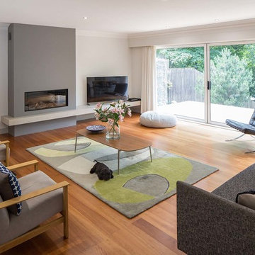
The key design driver for the project was to create a simple but contemporary extension that responded to the existing dramatic topography in the property’s rear garden. The concept was to provide a single elegant form, cantilevering out into the tree canopies and over the landscape. Conceived as a house within the tree canopies the extension is clad in sweet chestnut which enhances the relationship to the surrounding mature trees. Large sliding glass panels link the inside spaces to its unique environment. Internally the design successfully resolves the Client’s brief to provide an open plan and fluid layout, that subtly defines distinct living and dining areas. The scheme was completed in April 2016
20