
Search results for "Respected" in Home Design Ideas

 Colorado Custom Floors
Reclaimed Hardwood Floor
Small mountain style enclosed dark wood floor living room photo in Denver
Small mountain style enclosed dark wood floor living room photo in Denver

 O'Guin Decorative Finishes
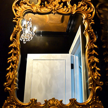
Venetian Plaster Niche with Gold Wax by O'Guin Decorative FInishes.
- Photographer: Lori Hamilton
Tuscan study room photo in Miami
Tuscan study room photo in Miami


Find the right local pro for your project


 LIFESTYLE DESIGN
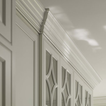
This updated master suite is a blend of European Antiques and transitional furnishings. Designed for relaxation and repose with a gentle color palette and detailed patterns.
 Living Gardens Landscape Design
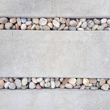
Contemporary backyard. White stucco wall retains slope. Ceramic tile flows from inside out. Concrete steppers and mexican beach pebbles keep it clean and contemporary. Benches to be installed at the firepit and dining area. More photos to come as plants grow in and furniture arrives.

 Paul Lopa Designs
See what our client say about Paul Lopa Designs:
We hired Paul Lopa to remodel our master bathroom. During the project, we increased the work to include upgrading all moldings and replaced all interior doors including our front door. We are very pleased with his work. There were no hidden costs, he followed through on every last detail and did so in a timely manner.
He guided us toward materials that were of a higher quality to prevent problems down the road. His team was respectful of our home and did their best to protect our belongings from the renovation destruction. We will definitely hire Paul Lopa again for future renovations.
Haw, Ron

 VIP Saloti
We are so proud to introduce our first Boston residential project for our very first Bostonian Client, Steven C., and his incredible team! #championshipteam We were part of a superb team that transformed a “barn” into a spectacular modern day villa in Jamaica Plain, MA. Credits are posted below to their respective accounts.
(The before pic of the space is last!)
-
There’s so much more to come, we are so excited to have worked with such wonderful people and professionals that inspire what’s possible through the art of design when passion is at the forefront!
-
If you’d like to see what opportunities can exist with your renovation projects please reach out to any of us and we’d happily consult with you to produce a detailed and realistic project rendering for you to envision your completed project!
-
Credits:
The Builder: @finalpickcontracting
The Designer: @debellis_designs
Furnished by @vipsaloti
 Paul Lopa Designs
See what our client say about Paul Lopa Designs:
We hired Paul Lopa to remodel our master bathroom. During the project, we increased the work to include upgrading all moldings and replaced all interior doors including our front door. We are very pleased with his work. There were no hidden costs, he followed through on every last detail and did so in a timely manner.
He guided us toward materials that were of a higher quality to prevent problems down the road. His team was respectful of our home and did their best to protect our belongings from the renovation destruction. We will definitely hire Paul Lopa again for future renovations.
Haw, Ron
 Flavin Architects
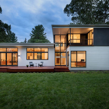
Our clients wanted to replace an existing suburban home with a modern house at the same Lexington address where they had lived for years. The structure the clients envisioned would complement their lives and integrate the interior of the home with the natural environment of their generous property. The sleek, angular home is still a respectful neighbor, especially in the evening, when warm light emanates from the expansive transparencies used to open the house to its surroundings. The home re-envisions the suburban neighborhood in which it stands, balancing relationship to the neighborhood with an updated aesthetic.
The floor plan is arranged in a “T” shape which includes a two-story wing consisting of individual studies and bedrooms and a single-story common area. The two-story section is arranged with great fluidity between interior and exterior spaces and features generous exterior balconies. A staircase beautifully encased in glass stands as the linchpin between the two areas. The spacious, single-story common area extends from the stairwell and includes a living room and kitchen. A recessed wooden ceiling defines the living room area within the open plan space.
Separating common from private spaces has served our clients well. As luck would have it, construction on the house was just finishing up as we entered the Covid lockdown of 2020. Since the studies in the two-story wing were physically and acoustically separate, zoom calls for work could carry on uninterrupted while life happened in the kitchen and living room spaces. The expansive panes of glass, outdoor balconies, and a broad deck along the living room provided our clients with a structured sense of continuity in their lives without compromising their commitment to aesthetically smart and beautiful design.

 TVL Creative Ltd.
This TVL project focused primarily on a gut of this home's only bathroom and included a facelift in the kitchen as well. This lovely Denver home features a very tiny bathroom with mostly original features. Our client requested a makeover to the bathroom that would improve function & health as well as push the bright white minimalism she loves so much throughout her home. Respecting both budget and timeline, we worked to create a highly functional space with nods toward European bathroom design. We increased space between the toilet and vanity while also increasing storage by integrating a vanity with drawers rather than a pedestal sink. We utilized high gloss white tile on the floors to help expand light and replaced all major plumbing fixtures for a fresh look. The bathroom now features a much deeper alcove tub, elongated white subway tiles on the walls, shiny chrome faucet fixtures, and a new vanity light. In the kitchen, new white shaker cabinets were installed and paired with a simple white subway tile backsplash. White quartz countertops and new hardwood floors were also added. We love the clean, bright, simple nature of every space in this house and are so happy our wonderful client can enjoy these for years to come!

 CLASS DESIGN HOME
Reference: 1012403
Top collection standing robe hook. Very decorative. Also can use as coat or hat hook.
Made of brass and polished 24K gold plated.
Designed and manufactured in Spain.

 The Brooklyn Studio
This residence was a complete gut renovation of a 4-story row house in Park Slope, and included a new rear extension and penthouse addition. The owners wished to create a warm, family home using a modern language that would act as a clean canvas to feature rich textiles and items from their world travels. As with most Brooklyn row houses, the existing house suffered from a lack of natural light and connection to exterior spaces, an issue that Principal Brendan Coburn is acutely aware of from his experience re-imagining historic structures in the New York area. The resulting architecture is designed around moments featuring natural light and views to the exterior, of both the private garden and the sky, throughout the house, and a stripped-down language of detailing and finishes allows for the concept of the modern-natural to shine.
Upon entering the home, the kitchen and dining space draw you in with views beyond through the large glazed opening at the rear of the house. An extension was built to allow for a large sunken living room that provides a family gathering space connected to the kitchen and dining room, but remains distinctly separate, with a strong visual connection to the rear garden. The open sculptural stair tower was designed to function like that of a traditional row house stair, but with a smaller footprint. By extending it up past the original roof level into the new penthouse, the stair becomes an atmospheric shaft for the spaces surrounding the core. All types of weather – sunshine, rain, lightning, can be sensed throughout the home through this unifying vertical environment. The stair space also strives to foster family communication, making open living spaces visible between floors. At the upper-most level, a free-form bench sits suspended over the stair, just by the new roof deck, which provides at-ease entertaining. Oak was used throughout the home as a unifying material element. As one travels upwards within the house, the oak finishes are bleached to further degrees as a nod to how light enters the home.
The owners worked with CWB to add their own personality to the project. The meter of a white oak and blackened steel stair screen was designed by the family to read “I love you” in Morse Code, and tile was selected throughout to reference places that hold special significance to the family. To support the owners’ comfort, the architectural design engages passive house technologies to reduce energy use, while increasing air quality within the home – a strategy which aims to respect the environment while providing a refuge from the harsh elements of urban living.
This project was published by Wendy Goodman as her Space of the Week, part of New York Magazine’s Design Hunting on The Cut.
Photography by Kevin Kunstadt

 Jon Allen Fine Metal Art
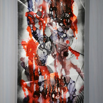
Premonition by Jon Allen - JAC 195
The Jon Allen Collection is an exclusive, hand-selected group of my most personal work to date. Each piece is hand-painted on aluminum. My art itself and my chosen medium, aluminum, are blissfully married. You may not think of the word organic when you hear the word metal, but this is some of my most organic art and that’s simply because metal allows my work to achieve true sentience. Aluminum’s naturally reflective nature enables each color, shape, and stroke to reach its full potential. A new aspect of the painting will reveal itself to you as it basks in the light that surrounds, evades, or envelops it in that moment. When you see the piece from different angles, you will appreciate how vibrant, dynamic, and environmentally influenced these pieces are. What you may see and feel by morning is not what you’ll see or feel by dusk and in many ways, and as such I feel these pieces capture the ever-ebbing and complex nature of human emotion and perception.
Some of these pieces are truly abstract while others are modern takes on traditional landscapes, marine life, and portraits. I hope you enjoy them a fraction of how much I enjoyed creating them. If you have any questions, please don’t hesitate to reach out.
Number of Pieces: 1
Dimensions: 48" x 24" x 2" off the wall
Care & Cleaning: Clean with a soft cloth and plain soap & water
Other Features: Hardware is pre-installed for simple hanging and art will “float” 2” off the wall

 Klopf Architecture
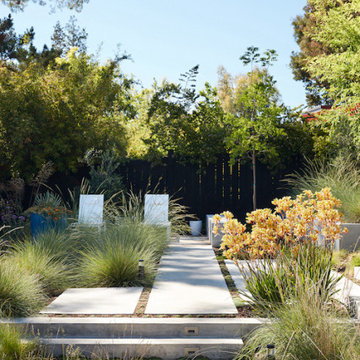
The Roger Lee designed house from 1962 was purchased by the current homeowners in almost original condition, as the previous owners elected to defer most maintenance projects over the years. The clients were able to see beyond the dated materials and finishes, single-paned glass and uninsulated walls and they approached Klopf Architecture to help them expand and update the entire home, one the family could settle into and enjoy for years to come. It was important that the new designs were aligned with Lee's original intent not only because of the client's appreciation for mid-century modern architecture, but also because the house was deemed historical. The Stanford Real Estate Office requires a stringent design review which safeguards the integrity of the community, which Klopf Architecture was happy to oblige going into their updated designs.
As with many original mid-century modern homes, the house was scaled to the 1960s lifestyle where rooms were smaller and openings to views were limited and tightly framed. The original conditions defined the direction the family of four would take in updating the house and making it comfortable for their modern lifestyle. Klopf designed a full gut remodel and major addition to bring the house into the 21st century and provide the living area needed for the client's family. The newly expanded house added just about 1,100 sf to create an airy, comfortable and family friendly house, taking full advantage of the beautiful southwestern views that extend out to the hills beyond. The enclosed garage created an additional 240 sf of covered space for long-term storage.
A cracked swimming pool created an eyesore taking up a majority of the backyard landscape, so it was one of the first elements to go during the transformation. Working with Outer Space Landscape Architects, the family asked for a mix of relaxing outdoor patio spaces that eventually blend into the native landscaping, extending their views outward toward the natural greenery of the trees beyond their property. Filling in the old pool was a smart way to expand the living spaces outward. The orientation of the house was designed to enjoy the views, but the original architecture provided the first homeowners with mere glimpses of the landscape outside.
Klopf was able to broaden those views, continuing and extending on the original architecture to take full advantage of the unobstructed natural views across the rear facade of the house. Small horizontal openings in the primary bedroom and office were replaced with much taller windows that now follow the angled roof line upward, extending across almost all of the facade. We worked with Western Windows, whose designs included an oblique-shaped, operable casement that allowed our design to rise with the slope. A new corner office added to the primary suite, offers a bright and functional work-from-home solution that looks out at the distant views and added natural light from the expanded window configuration that now wraps around the corner.
The existing lower level was designed by Lee as a utilitarian space, serving as a wet pool room with a drain in the center of the floor, bathroom, laundry and storage areas. Without the need for a pool room, Klopf was able to convert the area into a much more comfortable and functional living space with a new family room and guest suite. The new spaces enjoy easy access to a new outdoor patio through floor to ceiling, full-width glass sliders.
Continuing along the rear facade, a previously exposed deck extending from the living room and hallway provided access to the backyard through a single set of stairs leading toward the side of the house which made sense when the pool was in place. The new deck was re-envisioned as an extension of the main living room and now serves as a second outdoor living room. A new slatted pergola above provides the homeowners welcome relief from the hot afternoon sun. A second set of stairs now creates a better connection to the redesigned lower level. Klopf was able to reconfigure the spaces, extending the living room outward toward the views, where the family now claims it as the heart of the home, spending a large majority of their time outdoors.
Back inside, the original wood-burning Malm fireplace was beautifully restored and a gas burner installed to comply with California's strict air standards. It now rests in front of a wall of Heath accent tiles where a dated red brick wall used to stand. A new taller window brings more light and views into the refreshed interior living room. The original glass doors opposite the fireplace were replaced by larger sliders that when fully opened, create a seamless transition to the new outdoor living area so the two spaces feel like one connected space. The original utilitarian kitchen was needlessly tucked into the far back corner and closed-off, out of sight from the living room, so the clients asked Klopf to open it up and expand the kitchen forward so it felt more connected. Today the much larger kitchen is connected to the living area where a short wall with a cutout offers a visual glimpse into the kitchen and a handy pass-through counter for serving guests. A new breakfast nook was also added to create another spot where the family can gather for casual meals. Just outside, a new built-in outdoor grill and prep area extends the kitchen outside and connects to a new outdoor dining spot nestled amongst the trees, taking advantage of the views out back.
Klopf was able to expand the other two bedrooms, add a new laundry room and half-bath and convert the carport to an enclosed garage to add more storage areas which was lost when the pool house was converted to the family and guest room.
To maintain a historical connection to the original designs, the exterior siding was repeated on all exterior walls, a full-height stained glass window at the front entryway restored, and an interior slatted screen element repeated outside at the exterior entry courtyard and over the new outdoor living room to create a shade trellis. The new house stands proudly and shines against it's new landscaping features, while respecting and expanding on the original intent of Roger Lee's designs epitomizing the comforts of indoor-outdoor living in Northern California.
Completion year: 2020
Klopf Architecture project team: John Klopf, Klara Kevane, Noel Andrade
Contractor: ORB Construction, Brendan O'Reilly
Structural engineer: Sezen and Moon
Landscape architect: Outer space
Furnishings and decoration: Urbanism Designs
Photographer: Mariko Reed

 Artistic Impressions
Family room - small traditional enclosed ceramic tile family room idea with beige walls, no fireplace and no tv
Family room - small traditional enclosed ceramic tile family room idea with beige walls, no fireplace and no tv
 Paul Lopa Designs
See what our client say about Paul Lopa Designs:
We hired Paul Lopa to remodel our master bathroom. During the project, we increased the work to include upgrading all moldings and replaced all interior doors including our front door. We are very pleased with his work. There were no hidden costs, he followed through on every last detail and did so in a timely manner.
He guided us toward materials that were of a higher quality to prevent problems down the road. His team was respectful of our home and did their best to protect our belongings from the renovation destruction. We will definitely hire Paul Lopa again for future renovations.
Haw, Ron
 Jeffery Poss Architect, PLLC
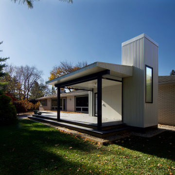
An academic couple, a renown materials scientist and a respected artist, wanted an outdoor space for entertainment and contemplation in their elegantly designed garden. We determined during the initial meeting that the design goal was “…to give them a reason to use the garden.” After several iterations, we developed the new space as an extension of the existing deck, creating a framed, optimal view of the garden and landscape that was previously de-emphasized. The pavilion can serve both as a stand-alone insect-protected space for a small group, or a covered deck expansion for larger gatherings.
The repetition of patterns is a theme throughout the space. The corrugated white metal exterior is conceived as a textural complement to the pale horizontal face brick of the adjacent ranch house. The decking planks become the floor of the pavilion. Wall and ceiling panels align with lights and fixtures. Temporal patterns result from rainwater channelled across the correlated roof surface, as well as scalloped shadows cast onto the deck and wall surfaces. The “light chimney” to the North reflects the house fireplace chimney to the South, and draws south light into the pavilion serving area. All of the pavilion's openings are carefully arranged to frame the existing plant compositions.
Since completion, the clients have entertained extensively in the pavilion. It has also become a favorite place for morning coffee, writing, and contemplation, thus fulfilling the initial goal of the project.
236