
Search results for "Responding" in Home Design Ideas
 b9 architects
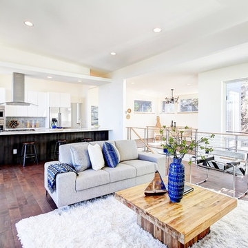
The Commodore Way residence in Seattle, WA overlooks Salmon Bay just west of the Hiram M. Chittenden Locks. It is a modern three-story home built on a large 8,000 square-foot sloping vacant lot. The four-bedroom, three and a half bath, 4,000 square-foot home, including basement and attached garage, responds to the topography and orientation of its property.
Inspired by the amazing view of Salmon Bay and the Olympic Mountains beyond, the primary living spaces are located on the top level taking full advantage of the view. Deck projections extend the indoor living experience to the view to the north. A sloped shed roof over half of the structure opens up to that view as well. The other portion of the roof allows for a generous roof deck extending the exterior space of the home and its fantastic view. The basement is flexible allowing for a variety of uses: playroom, den, art studio or mother in law dwelling.
 Maple Crest Construction LLC
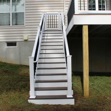
Screen Porch in Avondale PA
New deck/screenporch recently completed. Fiberon Sanctuary Expresso deck boards
Open Gable style w/ PVC white trim
Screeneaze screening
Superior 1000 series white vinyl railings with York balusters
Recessed lights and fan
Client's comments:
Daniel and his team at Maple Crest Construction were absolutely wonderful to work with on our enclosed patio project. He was very professional from start to finish, responded quickly to all of our questions, and always kept us up to date on the time frame. We couldn't have asked for a better builder. We look forward to enjoying it for many years to come! He really understood our vision for our perfect deck and explained our options to make that vision a reality. We are very happy with the result, and everyone is telling us how amazing our new deck is. Thank you, Daniel!

 Dynia Architects
This residence sits atop a precipice with views to the metropolitan Denver valley to the east and the iconic Flatiron peaks to the west. The two sides of this linear scheme respond independently to the site conditions. The east has a high band of glass for morning light infiltration, with a thick zone of storage below. Dividing the storage areas, a rhythm of intermittent windows provide views to the entry court and distant city. On the opposite side, full height sliding glass panels extend the length of the house embracing the best views. After entering through the solid east wall, the amazing mountain peaks are revealed.
For this residence, simplicity and restraint are the innovation. Materials are limited to wood structure and ceilings, concrete floors, and oxidized steel cladding. The roof extension provides sun shading for the west facing glass and shelter for the end terrace. The house’s modest form and palate of materials place it unpretentiously within its surroundings, allowing the natural environment to carry the day.
A.I.A. Wyoming Chapter Design Award of Merit 2011
Project Year: 2009
Find the right local pro for your project
 Lindy Design Build
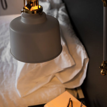
The primary bedroom didn’t go untouched. We anchored the space with Benjamin Moore Dragon’s Breath on the accent wall—a moody, rich tone that adds instant depth. It sets a stunning backdrop for the Rejuvenation Imbrie Articulating Sconces, which bring a classic brass-and-enamel moment into the mix. Paired with Buster + Punch dimmer switches, the lighting now responds intuitively to any mood, from soft nighttime reading to bright morning motivation.
Grounding the room is Dreamweaver’s Finishing Touch carpet in Shortbread, a soft, neutral foundation that keeps the room feeling cozy and connected to the palette of the bath.
 Pacific Home Source LLC
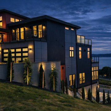
Modern Pacific Northwest residence designed for a steep hillside property with elevated water and territorial views. The project required careful integration of engineered foundation systems, retaining walls, and multi-level living spaces to maximize the challenging site conditions while preserving functional outdoor areas and view corridors.
The exterior combines contemporary architectural forms, expansive glazing, and warm evening lighting to create a dramatic modern presence that responds directly to the terrain, orientation, and surrounding Pacific Northwest landscape.
 Lindy Design Build
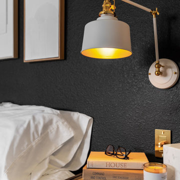
The primary bedroom didn’t go untouched. We anchored the space with Benjamin Moore Dragon’s Breath on the accent wall—a moody, rich tone that adds instant depth. It sets a stunning backdrop for the Rejuvenation Imbrie Articulating Sconces, which bring a classic brass-and-enamel moment into the mix. Paired with Buster + Punch dimmer switches, the lighting now responds intuitively to any mood, from soft nighttime reading to bright morning motivation.
Grounding the room is Dreamweaver’s Finishing Touch carpet in Shortbread, a soft, neutral foundation that keeps the room feeling cozy and connected to the palette of the bath.

 Reico Kitchen & Bath
Designed by Lauren Hunt of Reico Kitchen & Bath in Charlotte, NC this transitional style white and grey kitchen design features Green Forest Cabinetry in the Sierra door style in 2 finishes. The perimeter kitchen cabinets features a White finish and the kitchen island cabinets feature a Summit Grey finish. Kitchen countertops are marble in the color Fantasy Brown. Kitchen appliances are KitchenAid and Whirlpool. Kitchen tile backsplash is Soho Studio Alchimia White 3' x 12". For the customer, "working with Lauren and everyone involved was a pleasure. She was always quick to respond and address any issue I had. It was a relief turning the project over with complete faith in her." Photos courtesy of Six Cents Media LLC.
 Lindy Design Build
The primary bedroom didn’t go untouched. We anchored the space with Benjamin Moore Dragon’s Breath on the accent wall—a moody, rich tone that adds instant depth. It sets a stunning backdrop for the Rejuvenation Imbrie Articulating Sconces, which bring a classic brass-and-enamel moment into the mix. Paired with Buster + Punch dimmer switches, the lighting now responds intuitively to any mood, from soft nighttime reading to bright morning motivation.
Grounding the room is Dreamweaver’s Finishing Touch carpet in Shortbread, a soft, neutral foundation that keeps the room feeling cozy and connected to the palette of the bath.

 San Luis Kitchen Co.
The owners of a charming home in the hills west of Paso Robles recently decided to remodel their not-so-charming kitchen. Referred to San Luis Kitchen by several of their friends, the homeowners visited our showroom and soon decided we were the best people to design a kitchen fitting the style of their home. We were delighted to get to work on the project right away.
When we arrived at the house, we found a small, cramped and out-dated kitchen. The ceiling was low, the cabinets old fashioned and painted a stark dead white, and the best view in the house was neglected in a seldom-used breakfast nook (sequestered behind the kitchen peninsula). This kitchen was also handicapped by white tile counters with dark grout, odd-sized and cluttered cabinets, and small ‘desk’ tacked on to the side of the oven cabinet. Due to a marked lack of counter space & inadequate storage the homeowner had resorted to keeping her small appliances on a little cart parked in the corner and the garbage was just sitting by the wall in full view of everything! On the plus side, the kitchen opened into a nice dining room and had beautiful saltillo tile floors.
Mrs. Homeowner loves to entertain and often hosts dinner parties for her friends. She enjoys visiting with her guests in the kitchen while putting the finishing touches on the evening’s meal. Sadly, her small kitchen really limited her interactions with her guests – she often felt left out of the mix at her own parties! This savvy homeowner dreamed big – a new kitchen that would accommodate multiple workstations, have space for guests to gather but not be in the way, and maybe a prettier transition from the kitchen to the dining (wine service area or hutch?) – while managing the remodel budget by reusing some of her major appliances and keeping (patching as needed) her existing floors.
Responding to the homeowner’s stated wish list and the opportunities presented by the home's setting and existing architecture, the designers at San Luis Kitchen decided to expand the kitchen into the breakfast nook. This change allowed the work area to be reoriented to take advantage of the great view – we replaced the existing window and added another while moving the door to gain space. A second sink and set of refrigerator drawers (housing fresh fruits & veggies) were included for the convenience of this mainly vegetarian cook – her prep station. The clean-up area now boasts a farmhouse style single bowl sink – adding to the ‘cottage’ charm. We located a new gas cook-top between the two workstations for easy access from each. Also tucked in here is a pullout trash/recycle cabinet for convenience and additional drawers for storage.
Running parallel to the work counter we added a long butcher-block island with easy-to-access open shelves for the avid cook and seating for friendly guests placed just right to take in the view. A counter-top garage is used to hide excess small appliances. Glass door cabinets and open shelves are now available to display the owners beautiful dishware. The microwave was placed inconspicuously on the end of the island facing the refrigerator – easy access for guests (and extraneous family members) to help themselves to drinks and snacks while staying out of the cook’s way.
We also moved the pantry storage away from the dining room (putting it on the far wall and closer to the work triangle) and added a furniture-like hutch in its place allowing the more formal dining area to flow seamlessly into the up-beat work area of the kitchen. This space is now also home (opposite wall) to an under counter wine refrigerator, a liquor cabinet and pretty glass door wall cabinet for stemware storage – meeting Mr. Homeowner’s desire for a bar service area.
And then the aesthetic: an old-world style country cottage theme. The homeowners wanted the kitchen to have a warm feel while still loving the look of white cabinetry. San Luis Kitchen melded country-casual knotty pine base cabinets with vintage hand-brushed creamy white wall cabinets to create the desired cottage look. We also added bead board and mullioned glass doors for charm, used an inset doorstyle on the cabinets for authenticity, and mixed stone and wood counters to create an eclectic nuance in the space. All in all, the happy homeowners now boast a charming county cottage kitchen with plenty of space for entertaining their guests while creating gourmet meals to feed them.
Credits:
Custom cabinetry by Wood-Mode Fine Custom Cabinetry
Contracting by Michael Pezzato of Lost Coast Construction
Stone counters by Pyramid M.T.M.


 Century Stair Company
This staircase makes a bold design statement through restraint and precision. Thick squared-off white oak treads appear to float between dramatic, black-painted stringers, while horizontal 1/2" round bars create an open, minimal balustrade. The uniform open risers allow natural light to cascade down to the basement level, transforming the stairwell into a light-transmitting vertical shaft.
The design thoughtfully responds to the surrounding spaces, connecting levels without interrupting sightlines or blocking light flow. The result is a staircase that feels almost sculptural in its simplicity, proving that sometimes less truly is more.
1976-2026 © Century Stair Company
 Reico Kitchen & Bath
Designed by Lauren Hunt of Reico Kitchen & Bath in Charlotte, NC this transitional style white and grey kitchen design features Green Forest Cabinetry in the Sierra door style in 2 finishes. The perimeter kitchen cabinets features a White finish and the kitchen island cabinets feature a Summit Grey finish. Kitchen countertops are marble in the color Fantasy Brown. Kitchen appliances are KitchenAid and Whirlpool. Kitchen tile backsplash is Soho Studio Alchimia White 3' x 12". For the customer, "working with Lauren and everyone involved was a pleasure. She was always quick to respond and address any issue I had. It was a relief turning the project over with complete faith in her." Photos courtesy of Six Cents Media LLC.

 Southern Porch Development
Example of a transitional alcove shower design in Houston with an undermount sink and shaker cabinets
 Reico Kitchen & Bath
Designed by Lauren Hunt of Reico Kitchen & Bath in Charlotte, NC this transitional style white and grey kitchen design features Green Forest Cabinetry in the Sierra door style in 2 finishes. The perimeter kitchen cabinets features a White finish and the kitchen island cabinets feature a Summit Grey finish. Kitchen countertops are marble in the color Fantasy Brown. Kitchen appliances are KitchenAid and Whirlpool. Kitchen tile backsplash is Soho Studio Alchimia White 3' x 12". For the customer, "working with Lauren and everyone involved was a pleasure. She was always quick to respond and address any issue I had. It was a relief turning the project over with complete faith in her." Photos courtesy of Six Cents Media LLC.

 Larisa McShane & Associates
Watch our project videos with before and after pictures: http://www.larisamcshane.com/projects/
An outdated master bathroom was transformed into a visually interesting, revitalizing master spa with a large steam shower and an infrared sauna in a spacious room with natural light.
According to a unique style survey, which is a cornerstone in our design process, the client responded to striking primary colors. Creating a design concept from this idea, we used bold 4'x4' flower tiles, which visually connect the floor and wall of the bathroom and accented the vanity and shower walls with red mosaic tile.
Our team also designed exotic solid sapelle wood doors, installed a glass towel warmer, a massaging thermostatic shower system, a steam unit, an in-wall tank water-saving toilet, and radiant floors.
 Dynia Architects
This residence sits atop a precipice with views to the metropolitan Denver valley to the east and the iconic Flatiron peaks to the west. The two sides of this linear scheme respond independently to the site conditions. The east has a high band of glass for morning light infiltration, with a thick zone of storage below. Dividing the storage areas, a rhythm of intermittent windows provide views to the entry court and distant city. On the opposite side, full height sliding glass panels extend the length of the house embracing the best views. After entering through the solid east wall, the amazing mountain peaks are revealed.
For this residence, simplicity and restraint are the innovation. Materials are limited to wood structure and ceilings, concrete floors, and oxidized steel cladding. The roof extension provides sun shading for the west facing glass and shelter for the end terrace. The house’s modest form and palate of materials place it unpretentiously within its surroundings, allowing the natural environment to carry the day.
A.I.A. Wyoming Chapter Design Award of Merit 2011
Project Year: 2009
 AV Architects + Builders
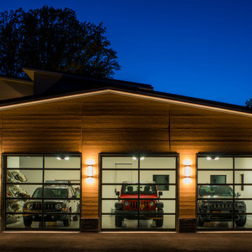
The Architect House is located on a breathtaking five-acre property in Great Falls, VA. This modern home was designed to shape itself into the site and landscape. By doing so each indoor space individually responds to the corresponding outdoor space. The entire house is then able to knit itself together with spaces that freely flow together from inside and out.
The orientation of the house allows sunlight to tell the time of the day while you are inside. Upon entering you see straight through a central atrium and into the landscape beyond. Natural light and views of nature are captured from every angle inside the home.
The modern exterior design of the house utilizes a linear brick at the base of the house that anchors it to the land. Gray and cedar colored modern architectural panel siding alternate patterns on all facades of the house, accentuating the different volumes. These volumes are then capped off by low sloping metal panel roofs. Exposed steel beans and columns are utilized to create long spans of covered outdoor spaces that then easily recede into the backdrop of the landscape.
The design of this modern home is in harmony with the site and landscape creating a warm welcoming feeling and one that conveys that the house belongs there.


 Century Stair Company
This staircase makes a bold design statement through restraint and precision. Thick squared-off white oak treads appear to float between dramatic, black-painted stringers, while horizontal 1/2" round bars create an open, minimal balustrade. The uniform open risers allow natural light to cascade down to the basement level, transforming the stairwell into a light-transmitting vertical shaft.
The design thoughtfully responds to the surrounding spaces, connecting levels without interrupting sightlines or blocking light flow. The result is a staircase that feels almost sculptural in its simplicity, proving that sometimes less truly is more.
1976-2026 © Century Stair Company

 Advance Design Studio, Ltd.
After six years of living in their Huntley IL home, Chris and Meghan were tired of their dark, dingy, outdated kitchen and it was finally time for a long-anticipated change. “The kitchen is the place where we live, it’s where we do everything,” Meghan said. “It was important that it be a space where we wanted to be.” Meghan loves cooking and enjoys including their girls in healthy meal prepping, this led them to want a brighter, more enjoyable kitchen with increased functionality and improved storage.
For Chris especially, the laundry room was an entirely dysfunctional eyesore. “We had a washer and a dryer, but it was all kind-of cobbled together!” Chris said. “There were always laundry piles everywhere, we weren’t really sure what we wanted to do in there, but it was time for us to make a change.” The mess of the space was stressful every time they walked in the door from the garage each day. Kids’ backpacks and shoes piled up haphazardly in the makeshift boot-bench closet left the family feeling disorganized and stressed. They needed space for folding clothes and locker cubbies to help keep the family organized.
Having known Christine and Todd in the Huntley community for years, Chris and Meghan were familiar with their work. “We already trusted them personally and having seen their projects for years we knew they did top notch work. After we reviewed the initial round of designs, we knew that hiring them was definitely the right choice,” Meghan and Chris said. Although Chris had done a lot of work in their home himself, the kitchen and laundry room renovation was such a large undertaking that he didn’t want to steal time away from his family to spend what would surely be many long weekends doing the job himself. “That would not have been a wise choice for us,” Chris laughed.
“Our designer, Michelle was very, very, easy to work with; anything we wanted to see or weren’t sure about, she went above and beyond to make this easy for us. She was easy to get hold of and always quick to respond,” the couple said. Michelle pulled ideas that mirrored the couple’s taste and style and was adept at directing the couple to limited choices that didn’t overwhelm them and kept the process moving. “I have a hard time making decisions. Michelle made the decision-making process so easy. I loved how she listened to what I liked and then presented three great options for me to choose from,” Meghan said.
The main objectives for the kitchen were better storage solutions, they wanted the space to reflect their lifestyle and taste, and they wanted it to last for years with low maintenance. One of the first steps in creating a more functional kitchen was relocating the refrigerator, creating an improved workflow for the busy family.
“We didn’t know that we could even move the refrigerator to a new location where it is now, that was something that we never would have thought of,” Chris said. “The new refrigerator location makes the kitchen feel so much bigger. We didn’t add any space, but our whole kitchen with the new design just seems like it’s so much larger than before!” Meghan said.
The perimeter mist colored cabinets helped warm and brighten the entire room, while the graphite colored cabinets on the island added contrast. Using this fresh, clean color palette satisfied the couple’s desire for a bright space that was the exact opposite of what they had before. Organization accessories were also added to the cabinets such as a spice drawer tray and roll outs to create hidden convenience.
“I absolutely love the hidden spices – it makes cooking so much more enjoyable!” Chris said. “And all the pull outs, and the double trash bin, who would think you could get so excited about organization!” the couple said in unison.
One thing they hated in their original kitchen was how dark the space felt. Added lighting on the ceiling with the new light fixtures combined with the lighter cabinetry colors throughout solved this problem. “Our new kitchen has this warm, almost cozy feeling that our old kitchen never had, it’s just a space that I love spending my time in now,” Meghan said. The light airy feeling was accentuated with the use of floating white shelves on either side of the decorative range hood. “We have so much cabinetry space, the new design is amazing we actually have more storage space than we will ever need,” Meghan said.
The island was extended to create more work surface and added space for stool seating. “The new island changes how we live. Now the kids can be in the kitchen with us, doing homework, eating breakfast, and the three of us have special dinners there when Chris is working late,” Meghan said.
The Carrara Marmi Quartz countertops were chosen because they are, not only beautiful, but are made from hard-working material that doesn’t require maintenance. The white subway tile backsplash that wraps to the ceiling behind the focal point cooktop range/hood compliments the crisp white countertops perfectly, while brushed brass hardware and light fixtures keep the design fresh and new.
The couple had a few fears at the beginning of the project, as most homeowners do. Their biggest fear was being out of their kitchen and laundry room for an extended time. The crew made it very easy for the family to work in a limited space keeping the washer and dryer hooked up the majority of the time, and also getting appliances working with minimal downtime.
“They above and beyond accommodated us to get us through the process,” Meghan said. “They did a great job making sure we were as comfortable as possible throughout the process,” Chris added.
“Our project manager DJ did a great job. He was very good at updating us on schedule changes, getting guys in as quickly as possible. Everyone that stepped in the house was nice and did great work,” said Chris. They thought Advance’s carpenter was phenomenal and were impressed when he took a conceptual idea from a photograph and worked with designer Michelle to create a one of a kind range/hood that has become the topic of conversation with friends and family who visit the new kitchen. “He was in our house literally every day for several weeks. He was easy to work with and good at what he did,” Meghan and Chris said.
The focal point of the kitchen; a hand-crafted, custom-built ventilation hood was clad with handpicked reclaimed barnwood. Advance Design’s carpenter built the framework and the cladding to create a one-of-a-kind design element that the couple loves.
“I think it was especially fun for him to create something unique from scratch, showcasing his talent in this area,” Meghan said. “I love that my kitchen is not like everyone else’s. I got to pick out the wood on my hood and watch it being built and was able to choose what pieces of wood went where on it. It’s totally unique.”
Red Oak flooring was toothed-in throughout the kitchen and the rest of the first floor anywhere changes were made. Then the whole floor was refinished to tone down the orange undertones in the existing floor stain, ultimately changing the color complexion of the entire first floor. The result is a completely new feeling to the entire home.
Renovating the laundry room was extremely important to Meghan and Chris, but they had trouble visualizing what the possibilities were for the seemingly small space. Michelle produced beautiful 3D illustrations that helped them envision the space in a whole new way.
“I must have told Michelle 100 times that I am a visual person, seeing the designs in 3D made it so easy to make decisions and see what we could really do with our space,” Meghan said.
A dividing wall and doorway were removed between the existing laundry room and hallway formerly containing a coat closet, providing space to design specialized graphite colored cabinetry matching the kitchen island to house custom storage cubbies for each family member. Adding the tall utility cabinetry in the new laundry area helped solve the storage issue, tucking away cleaning supplies, household items, and even the cat got its own cubby.
“I love how everything is now hidden in its own space. I can’t tell you how much I hated coming home and seeing everything sitting around on counters,” Chris said.
Electrical outlets were planned for the inside of utility cabinets, so devices could charge in hidden locations. Stacking the washer and dryer allowed for wider countertop space to provide a folding area and a special space for clothes to hang. “The way I do laundry has been completely transformed! I can actually fold clothes and hang them now right out of the washer and dryer,” Meghan said.
“The end result in the kitchen and the laundry/mud room was an updated light and bright space, with a smarter work flow that better meets the needs of this family,” Michelle said.
“I would totally recommend Advance Design,” Meghan said. “Sometimes I sit and just look at my kitchen and laundry room and think ‘Wow, I can’t believe I get to live here!’ It’s an understatement to say we love our new space.”
49