
Search results for "Restricted" in Home Design Ideas
 Wooldridge Interiors
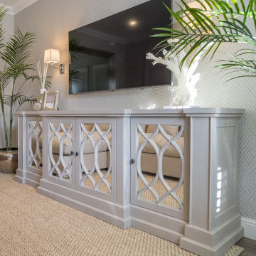
Earlier this year we completed a kitchen, lounge and bedroom refurbishment on behalf of our lovely client, and felt honoured to be called back to also refurbish their dining room into a cosy snug area recently.
When designing the space, we wanted to repeat similar materials, colours and themes that were in the other refurbished areas so that our client's property had flow and harmony.
We replaced the flooring throughout the house and incorporated a gorgeous sisal rug made from the same material as the main lounge and had the space painted in the same colour as the hallway and had a feature wall installed to provide tantalising texture.
Before doing this, we had the side window safely boarded up so that wall lights could be installed and so that the room regained it's symmetry.
Previously, the window provided only a restricted amount of day light due to the neighbouring property obstructing light, and hence, was redundant of it's primary function.
We decided to install wall lights each side of the television to provide additional lighting that did not obstruct the view of the TV.
Overall, the space was transformed into an indulgent yet gloriously cosy room, perfect for snuggling up, watching a film and welcoming those winter nights in.
 Sovereign
THE SHADOW HOUSE IS A PRODUCT OF THE CONTEXT IT SITS WITHIN, YET IT SUBVERTS IT AT THE SAME TIME. IT’S IMPOSSIBLE TO IGNORE IT UP CLOSE, YET FROM AFAR IT DISAPPEARS INTO THE ETHER. A TINY LOT, A LARGE PROGRAM, RESTRICTIVE ZONING REGULATIONS AND AN INVOLVED NEIGHBORHOOD INTEREST GROUP WERE THE CONSTANT AND UNRELENTING PRESSURES THAT CREATED THIS HOUSE — AND THE RESULT IS BETTER OFF FOR IT.
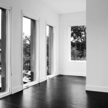
THE SCALLOPED SHINGLES ARE A COMMON ELEMENT ACROSS THE NEIGHBORHOOD, BUT ARE OFTEN RESERVED FOR DETAIL AREAS UNDER EAVES, AS THE MATERIAL WAS VERY EXPENSIVE ONE HUNDRED YEARS AGO. WE TOOK THAT HIGHLY-SPECIALIZED, VERY EXCLUSIVE MATERIAL AND APPLIED IT AS A BROAD, MASS-PRODUCED TEXTURE ACROSS THE ENTIRE RESIDENCE — TAKING SOMETHING FROM HIGHLIGHT TO BACKGROUND TEXTURE. THE SILHOUETTE DIRECTLY ECHOES THE ITALIANATE HOMES IN THE LARGER NEIGHBORHOOD — BUT WE STRIPPED THE TYPICAL ORNATE, DECORATED FAÇADE BACK TO UTTER MINIMALISM. WE ENLARGED THE TYPICAL WINDOW SIZE TO EXAGGERATE THE RIGID SYMMETRY OF THE STYLE, AND BROUGHT THEM TO THE FLOOR AND THE CEILING TO PROVIDE AS MUCH LIGHT AS POSSIBLE — AND THEN RECESSED THEM DEEP INTO THE FAÇADE TO MIMIC THE HEAVY BRICK AND STONE LINTELS OF THE PAST.
THE HOUSE IS BLACK — THE ONLY COLOR IT COULD BE. IF WE’D PAINTED IT UP LIKE ITS VICTORIAN SISTERS, IT WOULD’VE COMPETED FOR ATTENTION. BLACK CAUSES THE HOUSE TO SIMULTANEOUSLY DISAPPEAR AND STAND OUT — IT IS IMPOSSIBLE TO IGNORE WHILE YOU’RE WALKING PAST, BUT A FEW BLOCKS AWAY IT BECOMES IMPOSSIBLE TO DISCERN AGAINST THE BACKGROUND.
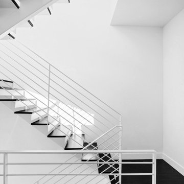
TWO BEDROOMS WITH EN-SUITE BATHS, FLOOR-TO-CEILING WINDOWS, AN AIRY AND OPEN STAIRCASE AND A MASSIVE GLASS ROOF DOOR MAKE THE SHADOW HOUSE IMPOSSIBLY LIGHT AND OPEN — YET IT’S ONLY 1,400 SQUARE FEET ON A 30’ X 50’ LOT.

 Bilotta Kitchen & Home
This kitchen, designed by David Arnoff, features Bilotta Collection cabinetry in a classic Frosty White paint on the perimeter and Rift Cut White Oak with a “Driftwood” stain for the island. The kitchen prior to renovation had a small island and a peninsula that blocked the flow into the other rooms. It also had a massive wood hood that flanked both sides of the range all the way down to the countertop which was very cumbersome and restrictive. The client wanted to reuse their appliances which were fairly new. So the cabinetry had to be designed around those models but laid out with a much more functional flow. David chose to eliminate the existing peninsula to allow access to the sun room and living area. He opted instead for a larger island to give back the space lost by removing the peninsula. This gave the same amount of cabinet and counter space and was far more functional and easier to move around. Since the one wall of cabinets (where the main sink is) had no wall cabinets, David designed the opposite wall with double stacked cabinets for additional storage – with glass fronts for aesthetics. They also raised the custom hood, by Amore, allowing for more countertop space around the range. The countertops are polished quartz, Aurea Stone by Eastern Stone. The Backsplash is a basket weave marble from Greenwich Tile Marble. Sink and faucets by Kohler. Appliances are a mix of Subzero and Wolf.
Designer: David Arnoff
Photo Credit: Peter Krupenye
Find the right local pro for your project

 Axis Mundi Design
Good design must reflect the personality of the client. So when siblings purchased studios in Downtown by Philippe Starck, one of the first buildings to herald the revitalization of Manhattan’s Financial District, the aim was to create environments that were truly bespoke. The brother’s tastes jibed synchronously with the insouciant idea of France’s most popular prankster converting a building that once housed the buttoned-up offices of JP Morgan Chase. His collection of Takashi Murakami works, the gallery-like centerpiece of the main area, announces his boldness and flair up front, as do furnishings by Droog, Moooi and, of course Starck, as well as hide rugs and upholstery, and a predominantly red palette. His sister was after something soothing and discreet. So Axis Mundi responded with a neutrals and used glass to carve out a bedroom surrounded by drapes that transform it into a golden cocoon. Hide (albeit less flamboyantly applied) evokes a familial commonality, and built-in furniture and cabinetry optimize space restrictions inherent in studio apartments.
Design Team: John Beckmann, with Richard Rosenbloom
Photography: Mikiko Kikuyama
© Axis Mundi Design LLC

 Shuler Architecture
Completed in 2011 this 4 BR, 3 1/2 bath custom home is situated on a very tight urban infill lot in Northern, Virginia. Our clients were relocating to the D.C. area from New England and wanted to retain some of the New England vernacular they were familiar with in their new home. Due to heavy zoning restrictions, stylistic CCR's and a large program of almost 7000 sf, our design response is a modern take on a traditional hipped 4-square.
We intentionally kept the skin and form of the building simple in order to contain cost and allow for a higher level of interior finish. The main level employs our favorite Great Room scheme that merges cooking, eating and entertaining into one seamless space that flows onto an expansive deck overlooking the rear yard. The entry elevation welcomes guests with a traditional front porch and stone path that passes by a small rain garden. The basement accommodates a guest room, media room, exercise area, and full shop while the upper level orients 2 kid's bedrooms, a Jack-n-Jill bath and the master suite toward a territorial view of the rear yard. All of this program is housed beneath a hipped roof that minimizes the scale of the house while presenting a thoughtful appearance toward the street and neighbors.
 Shuler Architecture
Completed in 2011 this 4 BR, 3 1/2 bath custom home is situated on a very tight urban infill lot in Northern, Virginia. Our clients were relocating to the D.C. area from New England and wanted to retain some of the New England vernacular they were familiar with in their new home. Due to heavy zoning restrictions, stylistic CCR's and a large program of almost 7000 sf, our design response is a modern take on a traditional hipped 4-square.
We intentionally kept the skin and form of the building simple in order to contain cost and allow for a higher level of interior finish. The main level employs our favorite Great Room scheme that merges cooking, eating and entertaining into one seamless space that flows onto an expansive deck overlooking the rear yard. The entry elevation welcomes guests with a traditional front porch and stone path that passes by a small rain garden. The basement accommodates a guest room, media room, exercise area, and full shop while the upper level orients 2 kid's bedrooms, a Jack-n-Jill bath and the master suite toward a territorial view of the rear yard. All of this program is housed beneath a hipped roof that minimizes the scale of the house while presenting a thoughtful appearance toward the street and neighbors.
 Axis Mundi Design
Good design must reflect the personality of the client. So when siblings purchased studios in Downtown by Philippe Starck, one of the first buildings to herald the revitalization of Manhattan’s Financial District, the aim was to create environments that were truly bespoke. The brother’s tastes jibed synchronously with the insouciant idea of France’s most popular prankster converting a building that once housed the buttoned-up offices of JP Morgan Chase. His collection of Takashi Murakami works, the gallery-like centerpiece of the main area, announces his boldness and flair up front, as do furnishings by Droog, Moooi and, of course Starck, as well as hide rugs and upholstery, and a predominantly red palette. His sister was after something soothing and discreet. So Axis Mundi responded with a neutrals and used glass to carve out a bedroom surrounded by drapes that transform it into a golden cocoon. Hide (albeit less flamboyantly applied) evokes a familial commonality, and built-in furniture and cabinetry optimize space restrictions inherent in studio apartments.
Design Team: John Beckmann, with Richard Rosenbloom
Photography: Mikiko Kikuyama
© Axis Mundi Design LLC
 7 Day Kitchens
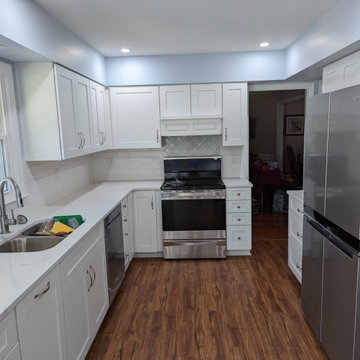
This charming south Charlotte home was in need of a little TLC. The original builder-grade cabinets and countertops were outdated and ready for a change to more modern materials.
The kitchen had a classic U-shaped layout that didn’t fit well with the space. The peninsula obstructed the work area and really restricted the movement around the kitchen. The work triangle was just right, but the honey toned wood cabinets and laminate countertops were definitely past their prime. So, we made some simple effective updates.
The biggest change was getting rid of the peninsula totally and adding a brand new spacious built-in buffet area. This gave her so much more storage space, and the roll-out trays made everyday items easily accessible. We added a built-in trash can pullout so she could hide her trash can. We also made the cabinets a little taller, going from 30 inches to 36 inches for even more storage space. The added benefit of taller cabinets gave the kitchen a fresh and modern look.
We also gave the laundry room a makeover and made it more functional with new cabinets over the washer and dryer for even more storage. We also replaced the flooring on the first floor with durable LVP flooring elevating the overall look and feel of the home. The whole project was completed in just 7 days, from start to finish.
 Swatch Design Group
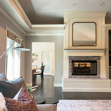
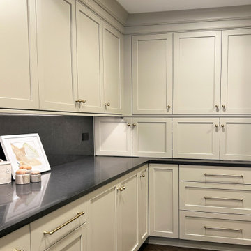
This comprehensive main floor remodel transformed a dated early-2000s home into a warm, distinctive space tailored for modern family life and effortless entertaining. Located in Northwest Indiana, the home’s renovation included the kitchen, living room, dining-to-sitting room conversion, office, mudroom, and laundry—each space reimagined with layered detail and a cohesive design language.
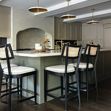
The project’s primary goal was to move away from builder-grade finishes and create a home full of character and comfort. In the kitchen, we reworked the layout to improve flow—removing a restrictive peninsula, extending the island for added seating, and designing a custom hood and cabinetry plan that worked around existing structural beams. A warmer palette of earth tones and neutrals reflected the clients’ personal style, while upgraded lighting, a statement range, and a larger pantry elevated functionality.
A double-sided fireplace connecting the kitchen and living room was redesigned to feel more intentional, with cohesive materials used on both faces. In the living area, a previously underwhelming wet bar became a standout moment with deep green cabinetry, a wine fridge, and built-in storage—adding both function and sophistication.
Throughout the project, structural limitations and narrow footprints presented design challenges that were met with custom solutions—from a uniquely shaped island to intentional lighting plans that worked around ceiling beams. The final result is a highly personal, connected series of spaces that support both everyday routines and meaningful moments of gathering—infused with warmth, purpose, and a relaxed sense of luxury.
 Swatch Design Group
This comprehensive main floor remodel transformed a dated early-2000s home into a warm, distinctive space tailored for modern family life and effortless entertaining. Located in Northwest Indiana, the home’s renovation included the kitchen, living room, dining-to-sitting room conversion, office, mudroom, and laundry—each space reimagined with layered detail and a cohesive design language.
The project’s primary goal was to move away from builder-grade finishes and create a home full of character and comfort. In the kitchen, we reworked the layout to improve flow—removing a restrictive peninsula, extending the island for added seating, and designing a custom hood and cabinetry plan that worked around existing structural beams. A warmer palette of earth tones and neutrals reflected the clients’ personal style, while upgraded lighting, a statement range, and a larger pantry elevated functionality.
A double-sided fireplace connecting the kitchen and living room was redesigned to feel more intentional, with cohesive materials used on both faces. In the living area, a previously underwhelming wet bar became a standout moment with deep green cabinetry, a wine fridge, and built-in storage—adding both function and sophistication.
Throughout the project, structural limitations and narrow footprints presented design challenges that were met with custom solutions—from a uniquely shaped island to intentional lighting plans that worked around ceiling beams. The final result is a highly personal, connected series of spaces that support both everyday routines and meaningful moments of gathering—infused with warmth, purpose, and a relaxed sense of luxury.
 Sovereign
THE SHADOW HOUSE IS A PRODUCT OF THE CONTEXT IT SITS WITHIN, YET IT SUBVERTS IT AT THE SAME TIME. IT’S IMPOSSIBLE TO IGNORE IT UP CLOSE, YET FROM AFAR IT DISAPPEARS INTO THE ETHER. A TINY LOT, A LARGE PROGRAM, RESTRICTIVE ZONING REGULATIONS AND AN INVOLVED NEIGHBORHOOD INTEREST GROUP WERE THE CONSTANT AND UNRELENTING PRESSURES THAT CREATED THIS HOUSE — AND THE RESULT IS BETTER OFF FOR IT.
THE SCALLOPED SHINGLES ARE A COMMON ELEMENT ACROSS THE NEIGHBORHOOD, BUT ARE OFTEN RESERVED FOR DETAIL AREAS UNDER EAVES, AS THE MATERIAL WAS VERY EXPENSIVE ONE HUNDRED YEARS AGO. WE TOOK THAT HIGHLY-SPECIALIZED, VERY EXCLUSIVE MATERIAL AND APPLIED IT AS A BROAD, MASS-PRODUCED TEXTURE ACROSS THE ENTIRE RESIDENCE — TAKING SOMETHING FROM HIGHLIGHT TO BACKGROUND TEXTURE. THE SILHOUETTE DIRECTLY ECHOES THE ITALIANATE HOMES IN THE LARGER NEIGHBORHOOD — BUT WE STRIPPED THE TYPICAL ORNATE, DECORATED FAÇADE BACK TO UTTER MINIMALISM. WE ENLARGED THE TYPICAL WINDOW SIZE TO EXAGGERATE THE RIGID SYMMETRY OF THE STYLE, AND BROUGHT THEM TO THE FLOOR AND THE CEILING TO PROVIDE AS MUCH LIGHT AS POSSIBLE — AND THEN RECESSED THEM DEEP INTO THE FAÇADE TO MIMIC THE HEAVY BRICK AND STONE LINTELS OF THE PAST.
THE HOUSE IS BLACK — THE ONLY COLOR IT COULD BE. IF WE’D PAINTED IT UP LIKE ITS VICTORIAN SISTERS, IT WOULD’VE COMPETED FOR ATTENTION. BLACK CAUSES THE HOUSE TO SIMULTANEOUSLY DISAPPEAR AND STAND OUT — IT IS IMPOSSIBLE TO IGNORE WHILE YOU’RE WALKING PAST, BUT A FEW BLOCKS AWAY IT BECOMES IMPOSSIBLE TO DISCERN AGAINST THE BACKGROUND.
TWO BEDROOMS WITH EN-SUITE BATHS, FLOOR-TO-CEILING WINDOWS, AN AIRY AND OPEN STAIRCASE AND A MASSIVE GLASS ROOF DOOR MAKE THE SHADOW HOUSE IMPOSSIBLY LIGHT AND OPEN — YET IT’S ONLY 1,400 SQUARE FEET ON A 30’ X 50’ LOT.
 Swatch Design Group
This comprehensive main floor remodel transformed a dated early-2000s home into a warm, distinctive space tailored for modern family life and effortless entertaining. Located in Northwest Indiana, the home’s renovation included the kitchen, living room, dining-to-sitting room conversion, office, mudroom, and laundry—each space reimagined with layered detail and a cohesive design language.
The project’s primary goal was to move away from builder-grade finishes and create a home full of character and comfort. In the kitchen, we reworked the layout to improve flow—removing a restrictive peninsula, extending the island for added seating, and designing a custom hood and cabinetry plan that worked around existing structural beams. A warmer palette of earth tones and neutrals reflected the clients’ personal style, while upgraded lighting, a statement range, and a larger pantry elevated functionality.
A double-sided fireplace connecting the kitchen and living room was redesigned to feel more intentional, with cohesive materials used on both faces. In the living area, a previously underwhelming wet bar became a standout moment with deep green cabinetry, a wine fridge, and built-in storage—adding both function and sophistication.
Throughout the project, structural limitations and narrow footprints presented design challenges that were met with custom solutions—from a uniquely shaped island to intentional lighting plans that worked around ceiling beams. The final result is a highly personal, connected series of spaces that support both everyday routines and meaningful moments of gathering—infused with warmth, purpose, and a relaxed sense of luxury.
 Sovereign
THE SHADOW HOUSE IS A PRODUCT OF THE CONTEXT IT SITS WITHIN, YET IT SUBVERTS IT AT THE SAME TIME. IT’S IMPOSSIBLE TO IGNORE IT UP CLOSE, YET FROM AFAR IT DISAPPEARS INTO THE ETHER. A TINY LOT, A LARGE PROGRAM, RESTRICTIVE ZONING REGULATIONS AND AN INVOLVED NEIGHBORHOOD INTEREST GROUP WERE THE CONSTANT AND UNRELENTING PRESSURES THAT CREATED THIS HOUSE — AND THE RESULT IS BETTER OFF FOR IT.
THE SCALLOPED SHINGLES ARE A COMMON ELEMENT ACROSS THE NEIGHBORHOOD, BUT ARE OFTEN RESERVED FOR DETAIL AREAS UNDER EAVES, AS THE MATERIAL WAS VERY EXPENSIVE ONE HUNDRED YEARS AGO. WE TOOK THAT HIGHLY-SPECIALIZED, VERY EXCLUSIVE MATERIAL AND APPLIED IT AS A BROAD, MASS-PRODUCED TEXTURE ACROSS THE ENTIRE RESIDENCE — TAKING SOMETHING FROM HIGHLIGHT TO BACKGROUND TEXTURE. THE SILHOUETTE DIRECTLY ECHOES THE ITALIANATE HOMES IN THE LARGER NEIGHBORHOOD — BUT WE STRIPPED THE TYPICAL ORNATE, DECORATED FAÇADE BACK TO UTTER MINIMALISM. WE ENLARGED THE TYPICAL WINDOW SIZE TO EXAGGERATE THE RIGID SYMMETRY OF THE STYLE, AND BROUGHT THEM TO THE FLOOR AND THE CEILING TO PROVIDE AS MUCH LIGHT AS POSSIBLE — AND THEN RECESSED THEM DEEP INTO THE FAÇADE TO MIMIC THE HEAVY BRICK AND STONE LINTELS OF THE PAST.
THE HOUSE IS BLACK — THE ONLY COLOR IT COULD BE. IF WE’D PAINTED IT UP LIKE ITS VICTORIAN SISTERS, IT WOULD’VE COMPETED FOR ATTENTION. BLACK CAUSES THE HOUSE TO SIMULTANEOUSLY DISAPPEAR AND STAND OUT — IT IS IMPOSSIBLE TO IGNORE WHILE YOU’RE WALKING PAST, BUT A FEW BLOCKS AWAY IT BECOMES IMPOSSIBLE TO DISCERN AGAINST THE BACKGROUND.
TWO BEDROOMS WITH EN-SUITE BATHS, FLOOR-TO-CEILING WINDOWS, AN AIRY AND OPEN STAIRCASE AND A MASSIVE GLASS ROOF DOOR MAKE THE SHADOW HOUSE IMPOSSIBLY LIGHT AND OPEN — YET IT’S ONLY 1,400 SQUARE FEET ON A 30’ X 50’ LOT.

 Moderne Builders
Gorgeous master bath with dramatic retro "wave" tile. Peak Photography
Example of a 1950s bathroom design in Los Angeles
Example of a 1950s bathroom design in Los Angeles
 Wooldridge Interiors
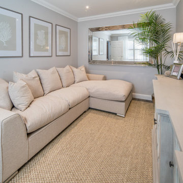
Earlier this year we completed a kitchen, lounge and bedroom refurbishment on behalf of our lovely client, and felt honoured to be called back to also refurbish their dining room into a cosy snug area recently.
When designing the space, we wanted to repeat similar materials, colours and themes that were in the other refurbished areas so that our client's property had flow and harmony.
We replaced the flooring throughout the house and incorporated a gorgeous sisal rug made from the same material as the main lounge and had the space painted in the same colour as the hallway and had a feature wall installed to provide tantalising texture.
Before doing this, we had the side window safely boarded up so that wall lights could be installed and so that the room regained it's symmetry.
Previously, the window provided only a restricted amount of day light due to the neighbouring property obstructing light, and hence, was redundant of it's primary function.
We decided to install wall lights each side of the television to provide additional lighting that did not obstruct the view of the TV.
Overall, the space was transformed into an indulgent yet gloriously cosy room, perfect for snuggling up, watching a film and welcoming those winter nights in.

 Mission Kitchen & Bath
One single selection of a design can lead you to create the entire picture. This is precisely how Mission Kitchen and Bath designed this stunning bathroom. They started with one component and then used it to select the other components, including a beautiful mix of metals.
Many people are resistant to combine different metal finishes in the same space, believing that everything should be perfectly matched. However, mixing metals, even in a small space like a bathroom, is a great way to add dimension. The contrast of the different metals creates layers and depth.
There are a variety of ways you can mix metals to look great. You can mix matte and polished elements in similar hues, such as nickel and chrome. Or, mix light and dark metals, such as nickel and bronze. You should restrict the number of metals you incorporate into your design to no more than four for the best results. Also keep in mind that if you have exposed hinges on your cabinetry, the cabinet and drawer pulls should be done in the same metal.
In this bathroom design, the designers at Mission Kitchen and Bath started by selecting a striking granite countertop that featured a blend of white, bronze, silver, and black elements. Next, they found a glass tile that complimented those same elements. From there they continued to incorporate other components in a variety of finishes, including chrome fixtures, antique bronze light fixtures, and burnished hardware. The pendant lights featured bubbled glass that created a warm metallic glow.
In addition to the carefully selected mix of metals, components were selected that all used clean lines, including the cabinet doors, pendants, tile, and hardware. The end result is a gorgeous bathroom that is warm and inviting.
 Swatch Design Group
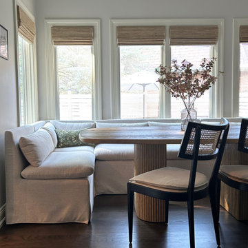
This comprehensive main floor remodel transformed a dated early-2000s home into a warm, distinctive space tailored for modern family life and effortless entertaining. Located in Northwest Indiana, the home’s renovation included the kitchen, living room, dining-to-sitting room conversion, office, mudroom, and laundry—each space reimagined with layered detail and a cohesive design language.
The project’s primary goal was to move away from builder-grade finishes and create a home full of character and comfort. In the kitchen, we reworked the layout to improve flow—removing a restrictive peninsula, extending the island for added seating, and designing a custom hood and cabinetry plan that worked around existing structural beams. A warmer palette of earth tones and neutrals reflected the clients’ personal style, while upgraded lighting, a statement range, and a larger pantry elevated functionality.
A double-sided fireplace connecting the kitchen and living room was redesigned to feel more intentional, with cohesive materials used on both faces. In the living area, a previously underwhelming wet bar became a standout moment with deep green cabinetry, a wine fridge, and built-in storage—adding both function and sophistication.
Throughout the project, structural limitations and narrow footprints presented design challenges that were met with custom solutions—from a uniquely shaped island to intentional lighting plans that worked around ceiling beams. The final result is a highly personal, connected series of spaces that support both everyday routines and meaningful moments of gathering—infused with warmth, purpose, and a relaxed sense of luxury.
 Swatch Design Group
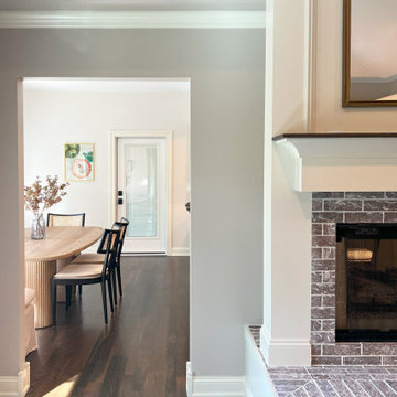
This comprehensive main floor remodel transformed a dated early-2000s home into a warm, distinctive space tailored for modern family life and effortless entertaining. Located in Northwest Indiana, the home’s renovation included the kitchen, living room, dining-to-sitting room conversion, office, mudroom, and laundry—each space reimagined with layered detail and a cohesive design language.
The project’s primary goal was to move away from builder-grade finishes and create a home full of character and comfort. In the kitchen, we reworked the layout to improve flow—removing a restrictive peninsula, extending the island for added seating, and designing a custom hood and cabinetry plan that worked around existing structural beams. A warmer palette of earth tones and neutrals reflected the clients’ personal style, while upgraded lighting, a statement range, and a larger pantry elevated functionality.
A double-sided fireplace connecting the kitchen and living room was redesigned to feel more intentional, with cohesive materials used on both faces. In the living area, a previously underwhelming wet bar became a standout moment with deep green cabinetry, a wine fridge, and built-in storage—adding both function and sophistication.
Throughout the project, structural limitations and narrow footprints presented design challenges that were met with custom solutions—from a uniquely shaped island to intentional lighting plans that worked around ceiling beams. The final result is a highly personal, connected series of spaces that support both everyday routines and meaningful moments of gathering—infused with warmth, purpose, and a relaxed sense of luxury.
 Swatch Design Group
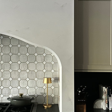
This comprehensive main floor remodel transformed a dated early-2000s home into a warm, distinctive space tailored for modern family life and effortless entertaining. Located in Northwest Indiana, the home’s renovation included the kitchen, living room, dining-to-sitting room conversion, office, mudroom, and laundry—each space reimagined with layered detail and a cohesive design language.
The project’s primary goal was to move away from builder-grade finishes and create a home full of character and comfort. In the kitchen, we reworked the layout to improve flow—removing a restrictive peninsula, extending the island for added seating, and designing a custom hood and cabinetry plan that worked around existing structural beams. A warmer palette of earth tones and neutrals reflected the clients’ personal style, while upgraded lighting, a statement range, and a larger pantry elevated functionality.
A double-sided fireplace connecting the kitchen and living room was redesigned to feel more intentional, with cohesive materials used on both faces. In the living area, a previously underwhelming wet bar became a standout moment with deep green cabinetry, a wine fridge, and built-in storage—adding both function and sophistication.
Throughout the project, structural limitations and narrow footprints presented design challenges that were met with custom solutions—from a uniquely shaped island to intentional lighting plans that worked around ceiling beams. The final result is a highly personal, connected series of spaces that support both everyday routines and meaningful moments of gathering—infused with warmth, purpose, and a relaxed sense of luxury.
 Swatch Design Group
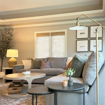
This comprehensive main floor remodel transformed a dated early-2000s home into a warm, distinctive space tailored for modern family life and effortless entertaining. Located in Northwest Indiana, the home’s renovation included the kitchen, living room, dining-to-sitting room conversion, office, mudroom, and laundry—each space reimagined with layered detail and a cohesive design language.
The project’s primary goal was to move away from builder-grade finishes and create a home full of character and comfort. In the kitchen, we reworked the layout to improve flow—removing a restrictive peninsula, extending the island for added seating, and designing a custom hood and cabinetry plan that worked around existing structural beams. A warmer palette of earth tones and neutrals reflected the clients’ personal style, while upgraded lighting, a statement range, and a larger pantry elevated functionality.
A double-sided fireplace connecting the kitchen and living room was redesigned to feel more intentional, with cohesive materials used on both faces. In the living area, a previously underwhelming wet bar became a standout moment with deep green cabinetry, a wine fridge, and built-in storage—adding both function and sophistication.
Throughout the project, structural limitations and narrow footprints presented design challenges that were met with custom solutions—from a uniquely shaped island to intentional lighting plans that worked around ceiling beams. The final result is a highly personal, connected series of spaces that support both everyday routines and meaningful moments of gathering—infused with warmth, purpose, and a relaxed sense of luxury.
120