
Search results for "Restricted" in Home Design Ideas

 Texas-Landman
This gorgeous Mediterranean/Tuscan style home is perched on a hillside overlooking thousands of acres of Texas Hill Country. Everything about the home captures your interest and draws you in. The home was built with every room taking advantage of the incredible views. As you enter, the handmade brick ceiling entices you into the magnificent great room. Your eyes continue through the great room and are drawn to the huge picture window that looks out forever.
The great room has a see through fireplace to the master bedroom, Saltillo tile floors, and a full bar with wine frig and icemaker.
To the right of the foyer is a study with wooden floors, a half bath and also includes a nice size closet.
To the left of the foyer is an open dining room with a cathedral ceiling and windows at the top allowing ample light to flow in. The dining room has wooden floors with a built-in buffet.
The master bedroom has plush carpet, French doors that open out onto the veranda, fireplace, his/hers closets with built ins and a huge master bath complete with laundry room.
The master bath has his/hers sinks with generous counter space, Jacuzzi tub and a walk- through shower with double heads.
The enormous kitchen is open to the den area and also has incredible views. A large granite island houses the sink and leaves more than enough room for friends to visit while your chef is preparing the meal. Stainless steel double ovens, five burner gas stove, terracotta tile countertops with backsplash, and thermador frig and freezer. The den has a native stone fireplace and a large wall of built-ins for your T.V. and plenty of books and other décor. Saltillo tile floors cover the kitchen and den area.
Next to the kitchen is a custom butler’s pantry with wood floors, terracotta tile counters, copper sink, a compact dishwasher plus a cutout into the wet bar area for ease of service.
Two additional bedrooms with private baths are in the main home, with a separate 900 SF guest quarters that has a nice size living area, kitchenette, two bedrooms and a full bath.
This incredible 4574+-SF estate is in a gated subdivision just minutes out of Kerrville and a stone’s throw from the eclectic Camp Verde General Store and Post Office. The home was custom built in 2004 with such attention to detail that it will stand the test of time and changing décor. The home sits on 30 acres in an area that is all wildlife exempt with superb restrictions to protect the homeowner’s investment.
 Swatch Design Group
This comprehensive main floor remodel transformed a dated early-2000s home into a warm, distinctive space tailored for modern family life and effortless entertaining. Located in Northwest Indiana, the home’s renovation included the kitchen, living room, dining-to-sitting room conversion, office, mudroom, and laundry—each space reimagined with layered detail and a cohesive design language.
The project’s primary goal was to move away from builder-grade finishes and create a home full of character and comfort. In the kitchen, we reworked the layout to improve flow—removing a restrictive peninsula, extending the island for added seating, and designing a custom hood and cabinetry plan that worked around existing structural beams. A warmer palette of earth tones and neutrals reflected the clients’ personal style, while upgraded lighting, a statement range, and a larger pantry elevated functionality.
A double-sided fireplace connecting the kitchen and living room was redesigned to feel more intentional, with cohesive materials used on both faces. In the living area, a previously underwhelming wet bar became a standout moment with deep green cabinetry, a wine fridge, and built-in storage—adding both function and sophistication.
Throughout the project, structural limitations and narrow footprints presented design challenges that were met with custom solutions—from a uniquely shaped island to intentional lighting plans that worked around ceiling beams. The final result is a highly personal, connected series of spaces that support both everyday routines and meaningful moments of gathering—infused with warmth, purpose, and a relaxed sense of luxury.

 Bilotta Kitchen & Home
This kitchen, designed by David Arnoff, features Bilotta Collection cabinetry in a classic Frosty White paint on the perimeter and Rift Cut White Oak with a “Driftwood” stain for the island. The kitchen prior to renovation had a small island and a peninsula that blocked the flow into the other rooms. It also had a massive wood hood that flanked both sides of the range all the way down to the countertop which was very cumbersome and restrictive. The client wanted to reuse their appliances which were fairly new. So the cabinetry had to be designed around those models but laid out with a much more functional flow. David chose to eliminate the existing peninsula to allow access to the sun room and living area. He opted instead for a larger island to give back the space lost by removing the peninsula. This gave the same amount of cabinet and counter space and was far more functional and easier to move around. Since the one wall of cabinets (where the main sink is) had no wall cabinets, David designed the opposite wall with double stacked cabinets for additional storage – with glass fronts for aesthetics. They also raised the custom hood, by Amore, allowing for more countertop space around the range. The countertops are polished quartz, Aurea Stone by Eastern Stone. The Backsplash is a basket weave marble from Greenwich Tile Marble. Sink and faucets by Kohler. Appliances are a mix of Subzero and Wolf.
Designer: David Arnoff
Photo Credit: Peter Krupenye
Find the right local pro for your project
 Wooldridge Interiors
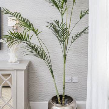
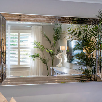
Earlier this year we completed a kitchen, lounge and bedroom refurbishment on behalf of our lovely client, and felt honoured to be called back to also refurbish their dining room into a cosy snug area recently.
When designing the space, we wanted to repeat similar materials, colours and themes that were in the other refurbished areas so that our client's property had flow and harmony.
We replaced the flooring throughout the house and incorporated a gorgeous sisal rug made from the same material as the main lounge and had the space painted in the same colour as the hallway and had a feature wall installed to provide tantalising texture.
Before doing this, we had the side window safely boarded up so that wall lights could be installed and so that the room regained it's symmetry.
Previously, the window provided only a restricted amount of day light due to the neighbouring property obstructing light, and hence, was redundant of it's primary function.
We decided to install wall lights each side of the television to provide additional lighting that did not obstruct the view of the TV.
Overall, the space was transformed into an indulgent yet gloriously cosy room, perfect for snuggling up, watching a film and welcoming those winter nights in.
 Wooldridge Interiors
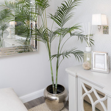
Earlier this year we completed a kitchen, lounge and bedroom refurbishment on behalf of our lovely client, and felt honoured to be called back to also refurbish their dining room into a cosy snug area recently.
When designing the space, we wanted to repeat similar materials, colours and themes that were in the other refurbished areas so that our client's property had flow and harmony.
We replaced the flooring throughout the house and incorporated a gorgeous sisal rug made from the same material as the main lounge and had the space painted in the same colour as the hallway and had a feature wall installed to provide tantalising texture.
Before doing this, we had the side window safely boarded up so that wall lights could be installed and so that the room regained it's symmetry.
Previously, the window provided only a restricted amount of day light due to the neighbouring property obstructing light, and hence, was redundant of it's primary function.
We decided to install wall lights each side of the television to provide additional lighting that did not obstruct the view of the TV.
Overall, the space was transformed into an indulgent yet gloriously cosy room, perfect for snuggling up, watching a film and welcoming those winter nights in.
 Bilotta Kitchen & Home
This kitchen, designed by David Arnoff, features Bilotta Collection cabinetry in a classic Frosty White paint on the perimeter and Rift Cut White Oak with a “Driftwood” stain for the island. The kitchen prior to renovation had a small island and a peninsula that blocked the flow into the other rooms. It also had a massive wood hood that flanked both sides of the range all the way down to the countertop which was very cumbersome and restrictive. The client wanted to reuse their appliances which were fairly new. So the cabinetry had to be designed around those models but laid out with a much more functional flow. David chose to eliminate the existing peninsula to allow access to the sun room and living area. He opted instead for a larger island to give back the space lost by removing the peninsula. This gave the same amount of cabinet and counter space and was far more functional and easier to move around. Since the one wall of cabinets (where the main sink is) had no wall cabinets, David designed the opposite wall with double stacked cabinets for additional storage – with glass fronts for aesthetics. They also raised the custom hood, by Amore, allowing for more countertop space around the range. The countertops are polished quartz, Aurea Stone by Eastern Stone. The Backsplash is a basket weave marble from Greenwich Tile Marble. Sink and faucets by Kohler. Appliances are a mix of Subzero and Wolf.
Designer: David Arnoff
Photo Credit: Peter Krupenye
 Wooldridge Interiors
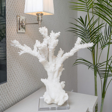
Earlier this year we completed a kitchen, lounge and bedroom refurbishment on behalf of our lovely client, and felt honoured to be called back to also refurbish their dining room into a cosy snug area recently.
When designing the space, we wanted to repeat similar materials, colours and themes that were in the other refurbished areas so that our client's property had flow and harmony.
We replaced the flooring throughout the house and incorporated a gorgeous sisal rug made from the same material as the main lounge and had the space painted in the same colour as the hallway and had a feature wall installed to provide tantalising texture.
Before doing this, we had the side window safely boarded up so that wall lights could be installed and so that the room regained it's symmetry.
Previously, the window provided only a restricted amount of day light due to the neighbouring property obstructing light, and hence, was redundant of it's primary function.
We decided to install wall lights each side of the television to provide additional lighting that did not obstruct the view of the TV.
Overall, the space was transformed into an indulgent yet gloriously cosy room, perfect for snuggling up, watching a film and welcoming those winter nights in.
 Andover Landscape Design & Construction
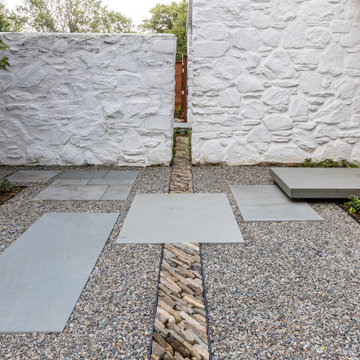
Modernist architect Marcel Breuer is known for his innovative Wassily chair, a pared back seat made up of tubular steel frame and strips of canvas. Even if that’s your only point of reference, you’ll see plenty of overlap in this Andover residence he designed. It is highly functional, with clean lines and plenty of open space. We had the honor to design an updated landscape to complement this home designed by Marcel Breuer, right here in Andover. As the landscape was originally designed by renowned landscape architect, Dan Kiley, we wanted to maintain his original design intent while also updating its functionality to suit the homeowner's needs. Ultimately, it was important to respect the architectural design intent of the property while creating a safe and inviting entry.
The simplicity of the design was created with a restricted palette that compliments the materials and color tones of the house. Orthogonal lines pull from the architecture out into the landscape, unifying the two. A metal runnel with stacked stone visually connects the front entry to the primary bedroom garden, while further highlighting a unique feature in Breuer’s architecture.
Moving to a space formed for privacy and respite, the zen garden off the primary bedroom offers an outdoor shower, water feature, and minimalistic planting. Arranged boulders, undulating moss plant beds, bluestone and gravel are mediums in which we used to paint a calming atmosphere extending from this unique home. To highlight the tranquil nature of the site, a boulder was hand carved to create a recirculating water feature that can be enjoyed from both the garden and primary bedroom. A wall of glass separates the bedroom from the spa-like garden, blurring the lines of architecture and landscape.

 Axis Mundi Design
Good design must reflect the personality of the client. So when siblings purchased studios in Downtown by Philippe Starck, one of the first buildings to herald the revitalization of Manhattan’s Financial District, the aim was to create environments that were truly bespoke. The brother’s tastes jibed synchronously with the insouciant idea of France’s most popular prankster converting a building that once housed the buttoned-up offices of JP Morgan Chase. His collection of Takashi Murakami works, the gallery-like centerpiece of the main area, announces his boldness and flair up front, as do furnishings by Droog, Moooi and, of course Starck, as well as hide rugs and upholstery, and a predominantly red palette. His sister was after something soothing and discreet. So Axis Mundi responded with a neutrals and used glass to carve out a bedroom surrounded by drapes that transform it into a golden cocoon. Hide (albeit less flamboyantly applied) evokes a familial commonality, and built-in furniture and cabinetry optimize space restrictions inherent in studio apartments.
Design Team: John Beckmann, with Richard Rosenbloom
Photography: Mikiko Kikuyama
© Axis Mundi Design LLC
 Andover Landscape Design & Construction
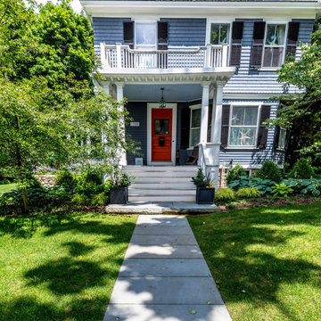
Situated mid-way between the historic Philips Academy campus and the bustling downtown area, this property came to life with a design that’s both functional and beautiful. When we initially sat down with the homeowners to discuss their lifestyle, they had just gotten a very exuberant puppy that needed a place to run and play. A traditional fence would isolate the yard and really restrict it’s flow, so we created a ‘puppy lawn’ surrounded by a stainless steel cable system that allows for a safe-dog environment while simultaneously keeping the sight lines open to the remainder of the property.
A circular fieldstone fire pit with a hand-tooled, two-piece cap sits perfectly within the bluestone patio. Located adjacent to the screened porch in the most private part of the yard, the location is optimal for this ultimate four-season retreat.
“The attention to detail is so critical to our builds. I constantly obsess over the ultimate ‘look’ as well as the fit and finish, as I believe it’s these details that the homeowners deserve. The bluestone cap on this fire pit was spec’d as two pieces to keep the joints minimal and clean. The exterior edge was rock-faced on-site by our masons and a stainless-steel ring in the center will protect the masonry from the heat of the flames. Careful stone selection as well as furniture choices create a composition that’s so very pleasing to the eye.” Russell
Throughout the remainder of the property, matching fieldstone walls help with the slight grade change and is complemented by a variety of flowering perennials designed to have a succession of blooms, all within a cool color tone.
Sit around the fire pit with a glass of wine on a crisp fall night and enjoy this perfect retreat within the energy of the downtown area; the dog is sure to join you.

 Metke Remodeling & Luxury Homes
A traditional 1926 cottage was transformed into a stunning, contemporary home. The focal point from both inside and out is a 3-story floating wood and stainless staircase, showcased by oversized windows and dramatic lighting. Walnut cabinetry with a distinct stain and natural slab surfaces offset the metals used throughout – Including at the interior and exterior of the fireplace. Reclaimed wood floors pay homage to the industrial area the home is situated in.
In designing this home restrictions set forth by the building department were key. For instance, in order for the project to be considered a remodel the existing 8’ tall perimeter walls had to remain in place. The homeowners desperately wanted 9’ tall ceilings, so with crafty engineering and framing we were able to embellish the existing wall framing to achieve the added height.
Clearstory windows allow much needed light into the spaces and creates the illusion of spaciousness, while maintaining wall areas for key furnishings and artwork. Every inch of space maximizes storage throughout the 2,600 square foot home.
A cabinet for shoe storage immediately inside the front door also serves as a key component at the staircase and provides a platform to highlight sculptural artwork. Unique products and details, such as a metal link shower curtain and custom built-in guest beds with strategically placed outlets and horizontal surfaces to allow for electronics to be close at hand, elevate this home to the next level.
 Axis Mundi Design
Good design must reflect the personality of the client. So when siblings purchased studios in Downtown by Philippe Starck, one of the first buildings to herald the revitalization of Manhattan’s Financial District, the aim was to create environments that were truly bespoke. The brother’s tastes jibed synchronously with the insouciant idea of France’s most popular prankster converting a building that once housed the buttoned-up offices of JP Morgan Chase. His collection of Takashi Murakami works, the gallery-like centerpiece of the main area, announces his boldness and flair up front, as do furnishings by Droog, Moooi and, of course Starck, as well as hide rugs and upholstery, and a predominantly red palette. His sister was after something soothing and discreet. So Axis Mundi responded with a neutrals and used glass to carve out a bedroom surrounded by drapes that transform it into a golden cocoon. Hide (albeit less flamboyantly applied) evokes a familial commonality, and built-in furniture and cabinetry optimize space restrictions inherent in studio apartments.
Design Team: John Beckmann, with Richard Rosenbloom
Photography: Mikiko Kikuyama
© Axis Mundi Design LLC

 Shuler Architecture
Completed in 2011 this 4 BR, 3 1/2 bath custom home is situated on a very tight urban infill lot in Northern, Virginia. Our clients were relocating to the D.C. area from New England and wanted to retain some of the New England vernacular they were familiar with in their new home. Due to heavy zoning restrictions, stylistic CCR's and a large program of almost 7000 sf, our design response is a modern take on a traditional hipped 4-square.
We intentionally kept the skin and form of the building simple in order to contain cost and allow for a higher level of interior finish. The main level employs our favorite Great Room scheme that merges cooking, eating and entertaining into one seamless space that flows onto an expansive deck overlooking the rear yard. The entry elevation welcomes guests with a traditional front porch and stone path that passes by a small rain garden. The basement accommodates a guest room, media room, exercise area, and full shop while the upper level orients 2 kid's bedrooms, a Jack-n-Jill bath and the master suite toward a territorial view of the rear yard. All of this program is housed beneath a hipped roof that minimizes the scale of the house while presenting a thoughtful appearance toward the street and neighbors.
 Wooldridge Interiors
Earlier this year we completed a kitchen, lounge and bedroom refurbishment on behalf of our lovely client, and felt honoured to be called back to also refurbish their dining room into a cosy snug area recently.
When designing the space, we wanted to repeat similar materials, colours and themes that were in the other refurbished areas so that our client's property had flow and harmony.
We replaced the flooring throughout the house and incorporated a gorgeous sisal rug made from the same material as the main lounge and had the space painted in the same colour as the hallway and had a feature wall installed to provide tantalising texture.
Before doing this, we had the side window safely boarded up so that wall lights could be installed and so that the room regained it's symmetry.
Previously, the window provided only a restricted amount of day light due to the neighbouring property obstructing light, and hence, was redundant of it's primary function.
We decided to install wall lights each side of the television to provide additional lighting that did not obstruct the view of the TV.
Overall, the space was transformed into an indulgent yet gloriously cosy room, perfect for snuggling up, watching a film and welcoming those winter nights in.


 Axis Mundi Design
Good design must reflect the personality of the client. So when siblings purchased studios in Downtown by Philippe Starck, one of the first buildings to herald the revitalization of Manhattan’s Financial District, the aim was to create environments that were truly bespoke. The brother’s tastes jibed synchronously with the insouciant idea of France’s most popular prankster converting a building that once housed the buttoned-up offices of JP Morgan Chase. His collection of Takashi Murakami works, the gallery-like centerpiece of the main area, announces his boldness and flair up front, as do furnishings by Droog, Moooi and, of course Starck, as well as hide rugs and upholstery, and a predominantly red palette. His sister was after something soothing and discreet. So Axis Mundi responded with a neutrals and used glass to carve out a bedroom surrounded by drapes that transform it into a golden cocoon. Hide (albeit less flamboyantly applied) evokes a familial commonality, and built-in furniture and cabinetry optimize space restrictions inherent in studio apartments.
Design Team: John Beckmann, with Richard Rosenbloom
Photography: Mikiko Kikuyama
© Axis Mundi Design LLC
 Wooldridge Interiors
Earlier this year we completed a kitchen, lounge and bedroom refurbishment on behalf of our lovely client, and felt honoured to be called back to also refurbish their dining room into a cosy snug area recently.
When designing the space, we wanted to repeat similar materials, colours and themes that were in the other refurbished areas so that our client's property had flow and harmony.
We replaced the flooring throughout the house and incorporated a gorgeous sisal rug made from the same material as the main lounge and had the space painted in the same colour as the hallway and had a feature wall installed to provide tantalising texture.
Before doing this, we had the side window safely boarded up so that wall lights could be installed and so that the room regained it's symmetry.
Previously, the window provided only a restricted amount of day light due to the neighbouring property obstructing light, and hence, was redundant of it's primary function.
We decided to install wall lights each side of the television to provide additional lighting that did not obstruct the view of the TV.
Overall, the space was transformed into an indulgent yet gloriously cosy room, perfect for snuggling up, watching a film and welcoming those winter nights in.

 ReSquare Architecture + Construction
Interior stair hall with upper skylight well bathes the home with natural light. Views and access to the grass roof expand the home's indoor/outdoor approach to the second story.
 Wooldridge Interiors
Earlier this year we completed a kitchen, lounge and bedroom refurbishment on behalf of our lovely client, and felt honoured to be called back to also refurbish their dining room into a cosy snug area recently.
When designing the space, we wanted to repeat similar materials, colours and themes that were in the other refurbished areas so that our client's property had flow and harmony.
We replaced the flooring throughout the house and incorporated a gorgeous sisal rug made from the same material as the main lounge and had the space painted in the same colour as the hallway and had a feature wall installed to provide tantalising texture.
Before doing this, we had the side window safely boarded up so that wall lights could be installed and so that the room regained it's symmetry.
Previously, the window provided only a restricted amount of day light due to the neighbouring property obstructing light, and hence, was redundant of it's primary function.
We decided to install wall lights each side of the television to provide additional lighting that did not obstruct the view of the TV.
Overall, the space was transformed into an indulgent yet gloriously cosy room, perfect for snuggling up, watching a film and welcoming those winter nights in.
 Bilotta Kitchen & Home
This kitchen, designed by David Arnoff, features Bilotta Collection cabinetry in a classic Frosty White paint on the perimeter and Rift Cut White Oak with a “Driftwood” stain for the island. The kitchen prior to renovation had a small island and a peninsula that blocked the flow into the other rooms. It also had a massive wood hood that flanked both sides of the range all the way down to the countertop which was very cumbersome and restrictive. The client wanted to reuse their appliances which were fairly new. So the cabinetry had to be designed around those models but laid out with a much more functional flow. David chose to eliminate the existing peninsula to allow access to the sun room and living area. He opted instead for a larger island to give back the space lost by removing the peninsula. This gave the same amount of cabinet and counter space and was far more functional and easier to move around. Since the one wall of cabinets (where the main sink is) had no wall cabinets, David designed the opposite wall with double stacked cabinets for additional storage – with glass fronts for aesthetics. They also raised the custom hood, by Amore, allowing for more countertop space around the range. The countertops are polished quartz, Aurea Stone by Eastern Stone. The Backsplash is a basket weave marble from Greenwich Tile Marble. Sink and faucets by Kohler. Appliances are a mix of Subzero and Wolf.
Designer: David Arnoff
Photo Credit: Peter Krupenye
119