
Search results for "Restricted" in Home Design Ideas
 Guenther Designs & Consulting LLC
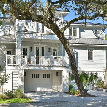
I was asked to design a new family home, for a lot that is third row back from the beach. As you can see the lot had numerous trees, all leaning in various directions, had to be accounted for. Besides the neighborhood restrictions the town, imposes even tighter guidelines on the mass and size of the building.
The collaberation with my client has ended up with thise lovely new home, just waiting for memories to be made.
Hee we can see the covered front porch with an open air second porch above. To help with the efficiency of the floor plan, due to site limitation, that fromt entry door is tucked around on the left side of the home.
We wanted a the home to have a "beachy" vibe to the architecture style. I incorporated a number of "low country architectural" design elements to provide the beach cottage feel. We used NuCedar shingle siding for ease of maintance and Hardie trim, for the some reason. The home owner choose a bronze standing seam metal roof to compliment the soft grey shingle color.
 Wooldridge Interiors
Earlier this year we completed a kitchen, lounge and bedroom refurbishment on behalf of our lovely client, and felt honoured to be called back to also refurbish their dining room into a cosy snug area recently.
When designing the space, we wanted to repeat similar materials, colours and themes that were in the other refurbished areas so that our client's property had flow and harmony.
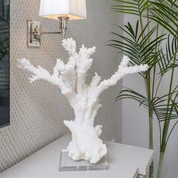
We replaced the flooring throughout the house and incorporated a gorgeous sisal rug made from the same material as the main lounge and had the space painted in the same colour as the hallway and had a feature wall installed to provide tantalising texture.
Before doing this, we had the side window safely boarded up so that wall lights could be installed and so that the room regained it's symmetry.
Previously, the window provided only a restricted amount of day light due to the neighbouring property obstructing light, and hence, was redundant of it's primary function.
We decided to install wall lights each side of the television to provide additional lighting that did not obstruct the view of the TV.
Overall, the space was transformed into an indulgent yet gloriously cosy room, perfect for snuggling up, watching a film and welcoming those winter nights in.
 Andover Landscape Design & Construction
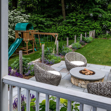
Situated mid-way between the historic Philips Academy campus and the bustling downtown area, this property came to life with a design that’s both functional and beautiful. When we initially sat down with the homeowners to discuss their lifestyle, they had just gotten a very exuberant puppy that needed a place to run and play. A traditional fence would isolate the yard and really restrict it’s flow, so we created a ‘puppy lawn’ surrounded by a stainless steel cable system that allows for a safe-dog environment while simultaneously keeping the sight lines open to the remainder of the property.
A circular fieldstone fire pit with a hand-tooled, two-piece cap sits perfectly within the bluestone patio. Located adjacent to the screened porch in the most private part of the yard, the location is optimal for this ultimate four-season retreat.
“The attention to detail is so critical to our builds. I constantly obsess over the ultimate ‘look’ as well as the fit and finish, as I believe it’s these details that the homeowners deserve. The bluestone cap on this fire pit was spec’d as two pieces to keep the joints minimal and clean. The exterior edge was rock-faced on-site by our masons and a stainless-steel ring in the center will protect the masonry from the heat of the flames. Careful stone selection as well as furniture choices create a composition that’s so very pleasing to the eye.” Russell
Throughout the remainder of the property, matching fieldstone walls help with the slight grade change and is complemented by a variety of flowering perennials designed to have a succession of blooms, all within a cool color tone.
Sit around the fire pit with a glass of wine on a crisp fall night and enjoy this perfect retreat within the energy of the downtown area; the dog is sure to join you.
Find the right local pro for your project

 Bilotta Kitchen & Home
This kitchen, designed by David Arnoff, features Bilotta Collection cabinetry in a classic Frosty White paint on the perimeter and Rift Cut White Oak with a “Driftwood” stain for the island. The kitchen prior to renovation had a small island and a peninsula that blocked the flow into the other rooms. It also had a massive wood hood that flanked both sides of the range all the way down to the countertop which was very cumbersome and restrictive. The client wanted to reuse their appliances which were fairly new. So the cabinetry had to be designed around those models but laid out with a much more functional flow. David chose to eliminate the existing peninsula to allow access to the sun room and living area. He opted instead for a larger island to give back the space lost by removing the peninsula. This gave the same amount of cabinet and counter space and was far more functional and easier to move around. Since the one wall of cabinets (where the main sink is) had no wall cabinets, David designed the opposite wall with double stacked cabinets for additional storage – with glass fronts for aesthetics. They also raised the custom hood, by Amore, allowing for more countertop space around the range. The countertops are polished quartz, Aurea Stone by Eastern Stone. The Backsplash is a basket weave marble from Greenwich Tile Marble. Sink and faucets by Kohler. Appliances are a mix of Subzero and Wolf.
Designer: David Arnoff
Photo Credit: Peter Krupenye

 Advance Design Studio, Ltd.
After living in this home for a decade, Crystal Lake residents Ken & Bonnie needed an update to their tired original kitchen to meet the needs of their busy family. Together with the expertise of designer Scott Christensen at Advance Design Studio they planned to completely reconfigure the entire space. They began by removing the restrictive peninsula and replaced it with a generous island designed to house an expansive farmhouse sink, convenient pull out trash receptacles, and a hidden dishwasher. Now there was ample room to add island seating to accommodate family gatherings, or for just “hanging out” with teenagers.
A dramatic new focal point was created with the design of an elegant range area featuring a beautiful custom wood mantle hood detailed with crushed glass handmade tile. Hidden storage houses every spice imaginable right at the cook’s fingertips. Double-stacked glass cabinetry emphasizes the impressive height of the room that was a wonderful architectural element that previously went unnoticed in the original kitchen.
The entire kitchen and breakfast nook was opened up to the 2 story family room by integrating enlarged arched openings. An outdated desk area was transformed into a beautiful breakfront bar with beverage refrigeration, glass display cabinets and plenty of new storage for entertainment pieces. An espresso nook was tucked neatly between tall cabinetry, and an old fashioned closet with shelves was converted into an efficient chef’s dream of organized custom pull out pantries.
“I am the leader of the Scott Christensen fan club,” says Bonnie. “With my busy family and a full time career, Scott made the process of designing this space so easy for me. He didn’t overwhelm me, but carefully determined what I liked and offered me two thoughtful solutions for just about everything - complete with his expert opinion that I really respected.”
Bright white Jay Rambo custom made maple cabinets are accented by Cambria quartz counter tops and simple subway tiles. Original hardwood floors were refinished and stained a darker shade, and stair risers and balusters were painted white to coordinate with the smart wainscot details throughout the first floor. The end effect is a cohesive first floor that flows together with grace and a level of elegance perfectly suitable for this stately Crystal Lake home.
Designer: Scott Christensen
Photographer: Joe Nowak

 Window Spaces
Roller Shades provide privacy and filter the bright sunlight and tie the colors of the room together!
Inspiration for a mid-sized contemporary formal and enclosed porcelain tile and beige floor living room remodel in San Diego with white walls and no tv
Inspiration for a mid-sized contemporary formal and enclosed porcelain tile and beige floor living room remodel in San Diego with white walls and no tv
 Bilotta Kitchen & Home
This kitchen, designed by David Arnoff, features Bilotta Collection cabinetry in a classic Frosty White paint on the perimeter and Rift Cut White Oak with a “Driftwood” stain for the island. The kitchen prior to renovation had a small island and a peninsula that blocked the flow into the other rooms. It also had a massive wood hood that flanked both sides of the range all the way down to the countertop which was very cumbersome and restrictive. The client wanted to reuse their appliances which were fairly new. So the cabinetry had to be designed around those models but laid out with a much more functional flow. David chose to eliminate the existing peninsula to allow access to the sun room and living area. He opted instead for a larger island to give back the space lost by removing the peninsula. This gave the same amount of cabinet and counter space and was far more functional and easier to move around. Since the one wall of cabinets (where the main sink is) had no wall cabinets, David designed the opposite wall with double stacked cabinets for additional storage – with glass fronts for aesthetics. They also raised the custom hood, by Amore, allowing for more countertop space around the range. The countertops are polished quartz, Aurea Stone by Eastern Stone. The Backsplash is a basket weave marble from Greenwich Tile Marble. Sink and faucets by Kohler. Appliances are a mix of Subzero and Wolf.
Designer: David Arnoff
Photo Credit: Peter Krupenye
 Bilotta Kitchen & Home
This kitchen, designed by David Arnoff, features Bilotta Collection cabinetry in a classic Frosty White paint on the perimeter and Rift Cut White Oak with a “Driftwood” stain for the island. The kitchen prior to renovation had a small island and a peninsula that blocked the flow into the other rooms. It also had a massive wood hood that flanked both sides of the range all the way down to the countertop which was very cumbersome and restrictive. The client wanted to reuse their appliances which were fairly new. So the cabinetry had to be designed around those models but laid out with a much more functional flow. David chose to eliminate the existing peninsula to allow access to the sun room and living area. He opted instead for a larger island to give back the space lost by removing the peninsula. This gave the same amount of cabinet and counter space and was far more functional and easier to move around. Since the one wall of cabinets (where the main sink is) had no wall cabinets, David designed the opposite wall with double stacked cabinets for additional storage – with glass fronts for aesthetics. They also raised the custom hood, by Amore, allowing for more countertop space around the range. The countertops are polished quartz, Aurea Stone by Eastern Stone. The Backsplash is a basket weave marble from Greenwich Tile Marble. Sink and faucets by Kohler. Appliances are a mix of Subzero and Wolf.
Designer: David Arnoff
Photo Credit: Peter Krupenye
 BMA Architects
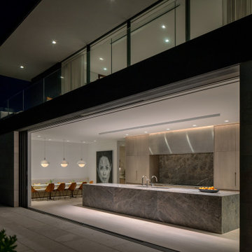
Though it’s located on 5.5 acres of pristine oceanfront in Southampton, this project came with inherent challenges. The clients had purchased the property with approvals in place, which locked in the size and location of the main house and accessory structure. The existing permits allowed for a 12,000 square foot traditional house with six bedrooms, yet the clients were looking to fit 11 bedrooms into the same footprint. Furthermore, the family regularly hosts large-scale gatherings and needed ample space for entertaining including a dining room that seats 50. The site boasts waterfront exposures on both the front and back sides of the property but shifting dunes had completely blocked the first-floor view toward the ocean.
In collaboration with a team of consultants, BMA determined that the tall dunes had grown unstable as ocean winds piled sand onto the site over decades. This created an opportunity to strategically re-sculpt the dunes for stability, with the added benefit of an improved view from the house. The view sequence was choreographed from the moment a visitor approaches the house, where a handful of stairs rise above the floodplain and lead to a dramatic courtyard. Moving toward the entry, views through the living area reveal the glimmering ocean beyond. Seen from the rear, the double-height living area anchors the volume, its minimalist grandeur framed in light limestone and crisp black wood. The design strategy ensures that water is visible from every major space in the house.
Despite the restrictive parameters that accompanied the project, gracious proportions and dramatic spaces transcend the initial limitations, giving the home a luxurious resort-like glamour. Interior spaces flow to the exterior, creating a house that engages with its site and celebrates the indoor-outdoor lifestyle for which the Hamptons are known.

 Axis Mundi Design
Good design must reflect the personality of the client. So when siblings purchased studios in Downtown by Philippe Starck, one of the first buildings to herald the revitalization of Manhattan’s Financial District, the aim was to create environments that were truly bespoke. The brother’s tastes jibed synchronously with the insouciant idea of France’s most popular prankster converting a building that once housed the buttoned-up offices of JP Morgan Chase. His collection of Takashi Murakami works, the gallery-like centerpiece of the main area, announces his boldness and flair up front, as do furnishings by Droog, Moooi and, of course Starck, as well as hide rugs and upholstery, and a predominantly red palette. His sister was after something soothing and discreet. So Axis Mundi responded with a neutrals and used glass to carve out a bedroom surrounded by drapes that transform it into a golden cocoon. Hide (albeit less flamboyantly applied) evokes a familial commonality, and built-in furniture and cabinetry optimize space restrictions inherent in studio apartments.
Design Team: John Beckmann, with Richard Rosenbloom
Photography: Mikiko Kikuyama
© Axis Mundi Design LLC
 Wooldridge Interiors
Earlier this year we completed a kitchen, lounge and bedroom refurbishment on behalf of our lovely client, and felt honoured to be called back to also refurbish their dining room into a cosy snug area recently.
When designing the space, we wanted to repeat similar materials, colours and themes that were in the other refurbished areas so that our client's property had flow and harmony.
We replaced the flooring throughout the house and incorporated a gorgeous sisal rug made from the same material as the main lounge and had the space painted in the same colour as the hallway and had a feature wall installed to provide tantalising texture.
Before doing this, we had the side window safely boarded up so that wall lights could be installed and so that the room regained it's symmetry.
Previously, the window provided only a restricted amount of day light due to the neighbouring property obstructing light, and hence, was redundant of it's primary function.
We decided to install wall lights each side of the television to provide additional lighting that did not obstruct the view of the TV.
Overall, the space was transformed into an indulgent yet gloriously cosy room, perfect for snuggling up, watching a film and welcoming those winter nights in.
 Andover Landscape Design & Construction
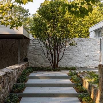
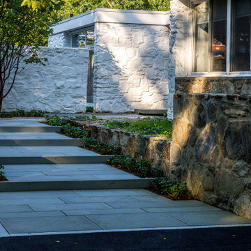
Modernist architect Marcel Breuer is known for his innovative Wassily chair, a pared back seat made up of tubular steel frame and strips of canvas. Even if that’s your only point of reference, you’ll see plenty of overlap in this Andover residence he designed. It is highly functional, with clean lines and plenty of open space. We had the honor to design an updated landscape to complement this home designed by Marcel Breuer, right here in Andover. As the landscape was originally designed by renowned landscape architect, Dan Kiley, we wanted to maintain his original design intent while also updating its functionality to suit the homeowner's needs. Ultimately, it was important to respect the architectural design intent of the property while creating a safe and inviting entry.
The simplicity of the design was created with a restricted palette that compliments the materials and color tones of the house. Orthogonal lines pull from the architecture out into the landscape, unifying the two. A metal runnel with stacked stone visually connects the front entry to the primary bedroom garden, while further highlighting a unique feature in Breuer’s architecture.
Moving to a space formed for privacy and respite, the zen garden off the primary bedroom offers an outdoor shower, water feature, and minimalistic planting. Arranged boulders, undulating moss plant beds, bluestone and gravel are mediums in which we used to paint a calming atmosphere extending from this unique home. To highlight the tranquil nature of the site, a boulder was hand carved to create a recirculating water feature that can be enjoyed from both the garden and primary bedroom. A wall of glass separates the bedroom from the spa-like garden, blurring the lines of architecture and landscape.
 Andover Landscape Design & Construction
Modernist architect Marcel Breuer is known for his innovative Wassily chair, a pared back seat made up of tubular steel frame and strips of canvas. Even if that’s your only point of reference, you’ll see plenty of overlap in this Andover residence he designed. It is highly functional, with clean lines and plenty of open space. We had the honor to design an updated landscape to complement this home designed by Marcel Breuer, right here in Andover. As the landscape was originally designed by renowned landscape architect, Dan Kiley, we wanted to maintain his original design intent while also updating its functionality to suit the homeowner's needs. Ultimately, it was important to respect the architectural design intent of the property while creating a safe and inviting entry.
The simplicity of the design was created with a restricted palette that compliments the materials and color tones of the house. Orthogonal lines pull from the architecture out into the landscape, unifying the two. A metal runnel with stacked stone visually connects the front entry to the primary bedroom garden, while further highlighting a unique feature in Breuer’s architecture.
Moving to a space formed for privacy and respite, the zen garden off the primary bedroom offers an outdoor shower, water feature, and minimalistic planting. Arranged boulders, undulating moss plant beds, bluestone and gravel are mediums in which we used to paint a calming atmosphere extending from this unique home. To highlight the tranquil nature of the site, a boulder was hand carved to create a recirculating water feature that can be enjoyed from both the garden and primary bedroom. A wall of glass separates the bedroom from the spa-like garden, blurring the lines of architecture and landscape.

 INSPERIORS, LLC
Complete Dry Bar Remodel Designed by Interior Designer Nathan J. Reynolds and Installed by Wescott Building & Remodeling, LLC. phone: (401) 234-6194 and (508) 837-3972 email: nathan@insperiors.com www.insperiors.com Photography Courtesy of © 2017 C. Shaw Photography.
 Swatch Design Group
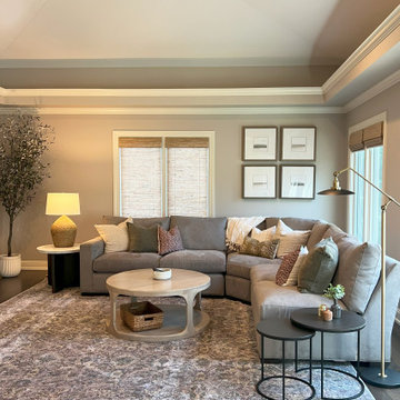
This comprehensive main floor remodel transformed a dated early-2000s home into a warm, distinctive space tailored for modern family life and effortless entertaining. Located in Northwest Indiana, the home’s renovation included the kitchen, living room, dining-to-sitting room conversion, office, mudroom, and laundry—each space reimagined with layered detail and a cohesive design language.
The project’s primary goal was to move away from builder-grade finishes and create a home full of character and comfort. In the kitchen, we reworked the layout to improve flow—removing a restrictive peninsula, extending the island for added seating, and designing a custom hood and cabinetry plan that worked around existing structural beams. A warmer palette of earth tones and neutrals reflected the clients’ personal style, while upgraded lighting, a statement range, and a larger pantry elevated functionality.
A double-sided fireplace connecting the kitchen and living room was redesigned to feel more intentional, with cohesive materials used on both faces. In the living area, a previously underwhelming wet bar became a standout moment with deep green cabinetry, a wine fridge, and built-in storage—adding both function and sophistication.
Throughout the project, structural limitations and narrow footprints presented design challenges that were met with custom solutions—from a uniquely shaped island to intentional lighting plans that worked around ceiling beams. The final result is a highly personal, connected series of spaces that support both everyday routines and meaningful moments of gathering—infused with warmth, purpose, and a relaxed sense of luxury.

 Metke Remodeling & Luxury Homes
A traditional 1926 cottage was transformed into a stunning, contemporary home. The focal point from both inside and out is a 3-story floating wood and stainless staircase, showcased by oversized windows and dramatic lighting. Walnut cabinetry with a distinct stain and natural slab surfaces offset the metals used throughout – Including at the interior and exterior of the fireplace. Reclaimed wood floors pay homage to the industrial area the home is situated in.
In designing this home restrictions set forth by the building department were key. For instance, in order for the project to be considered a remodel the existing 8’ tall perimeter walls had to remain in place. The homeowners desperately wanted 9’ tall ceilings, so with crafty engineering and framing we were able to embellish the existing wall framing to achieve the added height.
Clearstory windows allow much needed light into the spaces and creates the illusion of spaciousness, while maintaining wall areas for key furnishings and artwork. Every inch of space maximizes storage throughout the 2,600 square foot home.
A cabinet for shoe storage immediately inside the front door also serves as a key component at the staircase and provides a platform to highlight sculptural artwork. Unique products and details, such as a metal link shower curtain and custom built-in guest beds with strategically placed outlets and horizontal surfaces to allow for electronics to be close at hand, elevate this home to the next level.
 Plan Architecture
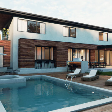
This 3,850-square-foot single-family home in New Jersey exemplifies modern design and architectural ingenuity. Built on a tight lot with stringent zoning regulations, the project posed unique challenges that were met with innovative solutions to deliver a truly remarkable residence tailored for modern home enthusiasts.
The home’s design embraces open spaces filled with natural light, creating a seamless integration between indoor and outdoor living. A thoughtful combination of materials—concrete, stucco, wood, and glass—come together to craft a sleek yet inviting aesthetic. Each material was carefully selected and positioned to enhance the overall structure and functionality of the house while contributing to its contemporary appeal.
One of the standout architectural features includes impressive cantilevers that not only enhance the home’s visual impact but also address complex structural challenges with sophistication. These bold design choices create a feeling of weightlessness and add to the dynamic character of the residence.
Despite the tight lot constraints, the layout maximizes every corner of the space without compromising comfort or style. A practical yet elegant floor plan ensures a sense of openness and fluidity throughout, providing ample areas for family living, entertaining, and relaxation.
This project demonstrates that thoughtful design and strategic engineering can overcome restrictive site limitations and zoning challenges to deliver a home that is both functional and stunningly modern. It is a testament to the possibilities of modern architecture and a celebration of creativity, engineering, and craftsmanship.
 Sovereign
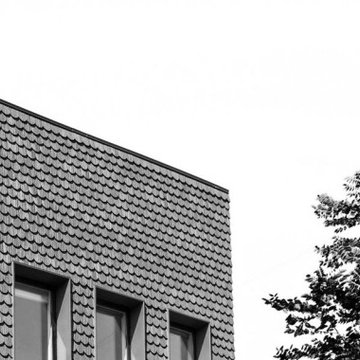
THE SHADOW HOUSE IS A PRODUCT OF THE CONTEXT IT SITS WITHIN, YET IT SUBVERTS IT AT THE SAME TIME. IT’S IMPOSSIBLE TO IGNORE IT UP CLOSE, YET FROM AFAR IT DISAPPEARS INTO THE ETHER. A TINY LOT, A LARGE PROGRAM, RESTRICTIVE ZONING REGULATIONS AND AN INVOLVED NEIGHBORHOOD INTEREST GROUP WERE THE CONSTANT AND UNRELENTING PRESSURES THAT CREATED THIS HOUSE — AND THE RESULT IS BETTER OFF FOR IT.
THE SCALLOPED SHINGLES ARE A COMMON ELEMENT ACROSS THE NEIGHBORHOOD, BUT ARE OFTEN RESERVED FOR DETAIL AREAS UNDER EAVES, AS THE MATERIAL WAS VERY EXPENSIVE ONE HUNDRED YEARS AGO. WE TOOK THAT HIGHLY-SPECIALIZED, VERY EXCLUSIVE MATERIAL AND APPLIED IT AS A BROAD, MASS-PRODUCED TEXTURE ACROSS THE ENTIRE RESIDENCE — TAKING SOMETHING FROM HIGHLIGHT TO BACKGROUND TEXTURE. THE SILHOUETTE DIRECTLY ECHOES THE ITALIANATE HOMES IN THE LARGER NEIGHBORHOOD — BUT WE STRIPPED THE TYPICAL ORNATE, DECORATED FAÇADE BACK TO UTTER MINIMALISM. WE ENLARGED THE TYPICAL WINDOW SIZE TO EXAGGERATE THE RIGID SYMMETRY OF THE STYLE, AND BROUGHT THEM TO THE FLOOR AND THE CEILING TO PROVIDE AS MUCH LIGHT AS POSSIBLE — AND THEN RECESSED THEM DEEP INTO THE FAÇADE TO MIMIC THE HEAVY BRICK AND STONE LINTELS OF THE PAST.
THE HOUSE IS BLACK — THE ONLY COLOR IT COULD BE. IF WE’D PAINTED IT UP LIKE ITS VICTORIAN SISTERS, IT WOULD’VE COMPETED FOR ATTENTION. BLACK CAUSES THE HOUSE TO SIMULTANEOUSLY DISAPPEAR AND STAND OUT — IT IS IMPOSSIBLE TO IGNORE WHILE YOU’RE WALKING PAST, BUT A FEW BLOCKS AWAY IT BECOMES IMPOSSIBLE TO DISCERN AGAINST THE BACKGROUND.
TWO BEDROOMS WITH EN-SUITE BATHS, FLOOR-TO-CEILING WINDOWS, AN AIRY AND OPEN STAIRCASE AND A MASSIVE GLASS ROOF DOOR MAKE THE SHADOW HOUSE IMPOSSIBLY LIGHT AND OPEN — YET IT’S ONLY 1,400 SQUARE FEET ON A 30’ X 50’ LOT.
 First Bay Architecture
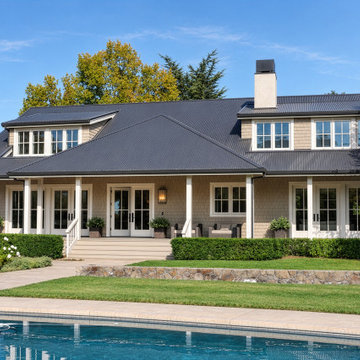
Located within walking distance of the charming town of St. Helena, this farmhouse was originally built in the 1990s with a promising concept: a traditional farmhouse with a wraparound porch, set within a community vineyard and framed by beautifully maintained gardens belonging to adjacent neighbors. Unfortunately, the execution fell short. The original layout featured a confusing and inefficient room arrangement that disrupted circulation and created awkward spatial relationships. Additionally, the scale of the windows and doors was disproportionately low, reducing interior daylight and severely limiting views to the surrounding vineyards and hillsides.
Our client approached us with a clear goal: to transform the home while staying within the existing building footprint, as zoning restrictions prohibited any expansion beyond it. Our solution was a complete interior reconfiguration. We redesigned every room to enhance flow and function, and replaced the original windows and doors with larger, better-proportioned openings to frame sweeping views of the garden and landscape beyond.
The new finishes were carefully selected for their elegance and harmony, creating a serene and balanced interior. To address the lack of natural light on the upper floor, we introduced several dormers. These not only brightened the interior but also helped visually lighten the massing of the original heavy roofline. The result is a peaceful, refined home that now lives up to its idyllic setting.
 First Bay Architecture
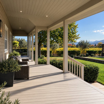
Located within walking distance of the charming town of St. Helena, this farmhouse was originally built in the 1990s with a promising concept: a traditional farmhouse with a wraparound porch, set within a community vineyard and framed by beautifully maintained gardens belonging to adjacent neighbors. Unfortunately, the execution fell short. The original layout featured a confusing and inefficient room arrangement that disrupted circulation and created awkward spatial relationships. Additionally, the scale of the windows and doors was disproportionately low, reducing interior daylight and severely limiting views to the surrounding vineyards and hillsides.
Our client approached us with a clear goal: to transform the home while staying within the existing building footprint, as zoning restrictions prohibited any expansion beyond it. Our solution was a complete interior reconfiguration. We redesigned every room to enhance flow and function, and replaced the original windows and doors with larger, better-proportioned openings to frame sweeping views of the garden and landscape beyond.
The new finishes were carefully selected for their elegance and harmony, creating a serene and balanced interior. To address the lack of natural light on the upper floor, we introduced several dormers. These not only brightened the interior but also helped visually lighten the massing of the original heavy roofline. The result is a peaceful, refined home that now lives up to its idyllic setting.
117