
Search results for "Resultant listing" in Home Design Ideas
 KCBR Design | Remodel
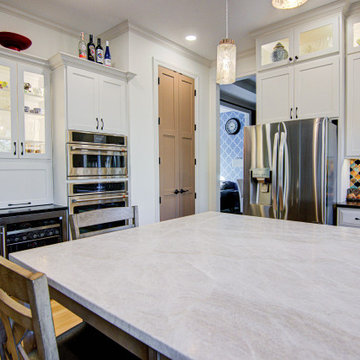
After previously remodeling all of this family’s upstairs bathrooms, we were honored to return and transform their kitchen. Their goal was clear: improve function, enhance flow, and create spaces that truly support how they live day to day.
We reworked the island to improve circulation and usability, added a dedicated pantry for better organization, and incorporated a custom drink station to make hosting easy. Smart storage solutions were thoughtfully integrated throughout the kitchen, including an appliance lift that keeps their KitchenAid mixer accessible but neatly tucked away when not in use.
Personal details bring even more character to the space, like a chalkboard wall inside the pantry for last minute grocery list additions. The result is an updated kitchen that balances beauty and practicality, giving this family a space that feels both intentional and inviting.
 Simplicity by Hayden Homes
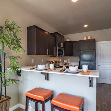
When this investor purchased the land that is now Turtle Creek, it was surrounded by multi-family house-like dwellings with great curb appeal. A large city park was adjacent as well. Simplicity was able to maximize the use of the land by building the single family dwellings in our signature “cottage community” style, creating a cozy space for renters that also made best use of the land available for the investor. The result was a 20-home subdivision with tiny homes ranging from 400-880sf that rented at 100% occupancy with a waiting list.
 Cusp Interiors
Already a beauty, this classic Edwardian had a few open opportunities for transformation when we came along. Our clients had a vision of what they wanted for their space and we were able to bring it all to life.
First up - transform the ignored Powder Bathroom into a showstopper. In collaboration with decorative artists, we created a dramatic and moody moment while incorporating the home's traditional elements and mixing in contemporary silhouettes.
Next on the list, we reimagined a sitting room off the heart of the home to a more functional, comfortable, and inviting space. The result was a handsome Den with custom built-in bookcases to showcase family photos and signature reading as well three times the seating capacity than before. Now our clients have a space comfortable enough to watch football and classy enough to host a whiskey tasting.
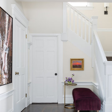
We rounded out this project with a bit of sprucing in the Foyer and Stairway. A favorite being the alluring bordeaux bench fitted just right to fit in a niche by the stairs. Perfect place to perch and admire our client's captivating art collection.
Find the right local pro for your project
 Drury Design
The Setup:
After purchasing this home, the homeowners faced a unique opportunity to reimagine their kitchen and nearby spaces. Water damage from a burst pipe had left much of the home’s interior in need of repair, and while the existing kitchen was functional and in relatively good shape, it didn’t align with the family’s vision for their new home. The layout included a peninsula that wasn’t ideal, and there were some druthers with the nearby pantry.
Since the space needed to be rebuilt anyway, the homeowners saw this as a chance to create a kitchen that was both highly functional for their four young children and timeless in its design. The project also included a refresh of the adjacent message center and dining room — spaces that play key roles in the family’s daily life. The goal was to create a cohesive flow between these areas, balancing modern functionality with the craftsman-inspired character of the rest of the home.
Design Objectives:
- Replace the outdated peninsula with a large island to maximize counter space and create new seating options.
- Open up the space visually by removing soffits and rethinking the cabinetry layout.
Incorporate concealed refrigeration and freezer units to provide significant storage for the family while maintaining a streamlined aesthetic.
- Integrate black cabinetry into the design without making the space feel harsh or heavy.
- Ensure the lighting plan balances functional task lighting with ambient accent lighting.
- Avoid visual clutter in the cabinetry design while still giving a nod to the craftsman aesthetic.
- Incorporate a slab backsplash as a key design feature.
Design Challenges:
- The outdated peninsula left dead space in the kitchen and lacked sufficient seating for the family.
- The cooktop wall was cramped, with small cabinets flanking the hood, limited storage, and soffits that made the space feel closed-in.
- The family needed significant refrigeration space (two refrigerators and a freezer) but wanted to avoid a cluttered look with visible stainless steel appliances.
- Adding black cabinetry risked making the space feel too dark or heavy.
- The original lighting plan was insufficient, particularly over the dining table where a decorative fixture proved too dim.
- The family wanted shaker-style drawer fronts to match the home’s arts-and-crafts design but worried that too much shaker cabinetry might look overly busy.
- Prioritizing a slab backsplash in the wish list priority planning.
The Renewed Space
Design Solutions:
- A functional island: The peninsula was replaced with a large island that provides continuous countertop space for prepping and serving. The island also features seating for four people, creating a central hub for informal meals and activities.
- Streamlined cooktop wall: The soffits were removed, and the upper cabinets on the cooktop wall were eliminated to create a more open, streamlined design. A custom oversized hood became the focal point of the wall, with the blower unit offset inside it to align with the cooktop while maintaining exterior visual symmetry.
- Concealed refrigeration: Two column refrigerators and one freezer were integrated into the cabinetry, concealing them behind wood paneling that blends seamlessly with the overall design.
- Warm black cabinetry: The black cabinetry was crafted from hickory with a visible grain, softening its appearance and adding warmth. The grain detail gives the cabinetry a rich, textured look that avoids feeling stark or overpowering.
- Additional lighting: In the dining area, recessed can lights were added during an additional installation phase to supplement the gorgeous decorative fixture’s dim output. The new lighting plan creates a layered effect, combining functional task lighting with softer ambient lighting.
- Simplified cabinetry details: Slab drawer fronts were used on the upper drawers, while five-piece shaker fronts (with slightly less prominent rail and stile pieces) were reserved for the middle and lower drawers. This approach simplified the overall look while maintaining the craftsman-inspired aesthetic.
- Slab backsplash priority: The slab backsplash was prioritized by making thoughtful adjustments elsewhere, like opting not to extend cabinetry to the ceiling, which also helped visually prioritize the gorgeous slab backsplash. This decision also enhanced the kitchen’s furniture-like feel, aligning with the home’s craftsman character.
- This kitchen perfectly balances practicality with timeless style. By addressing the family’s functional needs — ample seating, smart storage, and effective lighting — while incorporating thoughtful design elements like warm black cabinetry and a striking slab backsplash, Alicia created a space that works beautifully for a busy household. The result is a cohesive, inviting kitchen that honors the home’s craftsman roots and will serve the family well for years to come.
 Garden Artisans LLC
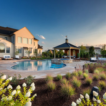
Our client's childhood memories of summer fun in her parents' pool and family time on Long Beach Island, NJ is what she wanted to recreate for her own children in the comfort of their backyard. The client's wish list included a pool that was versatile for all ages and activities. We teamed up with Liquidscapes to assist with the pool design process to ensure functionality and quality was achieved. The saltwater pool has a swim lane, sun-shelf, deck jets, built-in seating and a raised spa with an 8' spillway!
The pool deck is built with limestone, which remains cool in the hot sun. A custom pavilion cantilevers the deep end of the pool serving as a shady poolside lounge. The wavy garden beds were designed to complement the freeform shape of the pool. The landscape consists of multi-layered magnolias, ilex, and cryptomeria to ensure privacy year round. Fagus, lagerstroemia, and cotinus add in-season privacy, color, and contrast. The large garden beds are filled with lush hydrangeas, perennials, perennial grasses, and ferns.
During our presentation for the front of the property, which is the final phase of this project, our client said to us: "Over the years we have dealt with many design and build companies and we're very happy we finally found one that is a pleasure to work with and cares about delivering high quality results.”
 Nip Tuck Remodeling
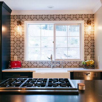
Our Issaquah client hired us because project management and budget were on the list of priorities along with a well thought out design. With opening the wall between the dining room and kitchen, we were able to give our client a better use of her space for entertaining with family and friends. The end result was a very happy client where her needs were met on design, budget and Nip Tucks management of the project.
 ALTER Design Studio
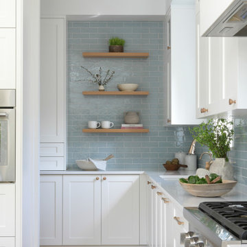
We met with our clients a few times over six months before we starting designing. They had an interesting existing layout and a very specific list of wants. We worked with their architect, re-working the home to achieve the open, light filled space they dreamed of. With roots in Australia, they wanted an elevated coastal vibe. We used muted blues, layered in texture and warm finishes - the results speak for themselves. Storage was a big challenge in the very small original kitchen. In addition to the large island and run of cabinets, we added a hidden pantry.


 Artistic Kitchens - Kristi Hodson
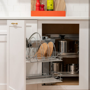
The original kitchen in this midcentury Ann Arbor home was only a fraction of the size it is today. We removed walls to open up the main floor and create a brighter, more connected space that fits the way this family lives. The existing hardwood floors were blended and refinished for a seamless transition between old and new, tying the whole space together. Storage and function were at the top of the list. We added dedicated spaces for spices, a mixer, corner pullouts, and small appliances to keep the counters clear and organized. Full-size column refrigerator and freezer units now provide plenty of food storage without sacrificing style. We also improved the light and flow of the space. A small window that faced a brick wall and a non-functioning door were both removed, replaced by a new sliding door that brings in natural light and connects the kitchen to the backyard. The new design combines navy and white cabinetry with brass and orange accents for a look that feels modern but still connected to the home’s midcentury roots. The result is a kitchen that works as beautifully as it looks, filled with smart storage and thoughtful details. Contractor: MAV Design + Build Stylist: Jill Fagan Interiors Photographer: Jacob Hawkins Photography
 Alloy Architecture & Construction
Originally built in 1859 by Justice William J. Robertson and listed on the National Register of Historic Places in 1999, this home has elements of both the Italianate and Gothic Revival styles which were taken into consideration during the design process.
The project consisted of three main components: a basement renovation, a new screened in porch and a new two car garage.
For the basement renovation we removed the original brick floor which was causing moisture issues and replaced them with an insulated, colored concrete slab. The end result: a previously unusable space was transformed into a family room with a complete guest suite and an exercise room.
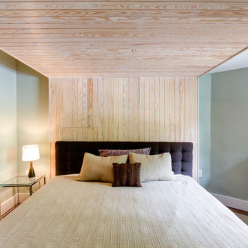
In the guest bedroom, low ceilings due to existing duct work were strategically wrapped with stained pine tongue and groove creating a cozy sleeping nook. In the bathroom, subway tiles and lightly stained wood are the background to a livelier tile accent in the shower and around the vanity.
The family room features floor to ceiling millwork piece that has several storage cubbies; some with doors to conceal and others open for display.
The screened porch is located at the back of the house overlooking a new stone patio at the lower level yard. The new porch takes cues from the existing sun room by matching materials, colors, and proportion. The new porch off the living room allows the clients to sit and relax while staying close to their children when inside or playing in the yard.
The garage was built using the same material palette and style of the house but set back so as to not to detract from the main house. With large sliding barn doors on the back, it opens up to a manicured lawn allowing the garage to double as a pavilion for outdoor entertaining and yard parties. Alloy worked with Water Street Studio, a local architectural landscaping firm, to create more inviting and usable spaces for the children and adults to enjoy.
Andrea Hubbel Photography
 JRP Design & Remodel
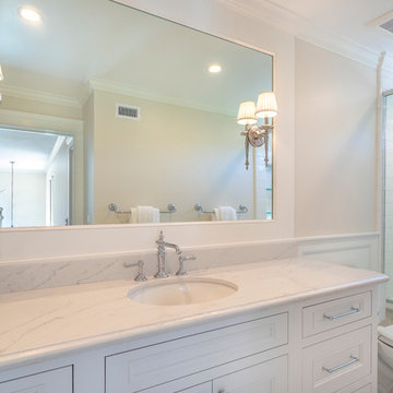
Our clients were living with outdated, dark bathrooms in their newly purchased Falling Star home. The dull palette of warm neutrals did not reflect the couple’s East Coast traditional style. They noticed several renovation projects by JRP in the neighborhood. The professionalism and the process impressed them. After receiving a Pardon Our Dust courtesy letter from JRP, the couple decided to call for a consultation. Their wish list was clear. They wanted the Falling Star design to be light, airy, and white. It had to reflect their East Coast roots. Working with the original footprint, JRP completely transformed the space, creating a tranquil primary suite rich with traditional detail. The result is an effusive celebration of classic style.
Now, the radiant rooms glow. To enlarge the primary closet, the JRP team removed a cluttered storage area. Inside, a separate dressing space is finished with upgraded storage and refined built-in cabinetry with recessed panels. Pops of glam such as Robert Abbey glass chandeliers and brilliant bits of chrome are moored by traditional elements like crown molding, porcelain tiles, and a quartz-clad drop-in soaking tub. Large windows in the primary bath and funnel skylights in the closet harness the natural light to stunning effect, sweeping the rooms with the cool feeling of fresh air. The “Sail Cloth” white paint adds soft depth to the uncomplicated elegance of both rooms.
PROJECT DETAILS:
• Style: Transitional
• Countertops: Vadara Quartz – Calacatta Dorado
• Cabinets: DeWils Recessed-panel, painted white
• Hardware/Plumbing Fixture Finish: Chrome
• Lighting Fixtures:
Master Closet: Skylight Sun Tunnel
Master Bath: Robert Abbey, Glass Chandelier
• Flooring:
Floor: Calacatta Dorado Porcelain Tiles w/Accent
• Tile/Backsplash: Shower Surround: Ceramic Blanc/Crackle
• Paint Colors:
Master Bath & Closet: Dunn Edwards Sail Cloth
Hall Bath: Benjamin Moore Ballet White
• Other Details: Drop-in soaking Tub
Photographer: J.R. Maddox
 Steven Flores
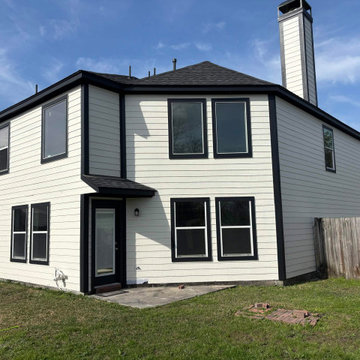
Full exterior repaint on a two-story Houston residential property. House was painted in a crisp white base coat with bold black trim, window frames, and fascia throughout. All surfaces were properly prepped and primed before application. Two finish coats applied for a clean, lasting result. This two-tone exterior transformation was completed as part of a pre-listing renovation for a Houston real estate investor.
 ALTER Design Studio
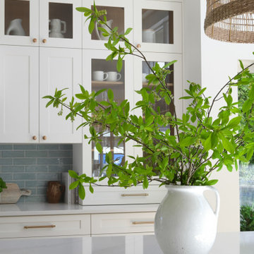
We met with our clients a few times over six months before we starting designing. They had an interesting existing layout and a very specific list of wants. We worked with their architect, re-working the home to achieve the open, light filled space they dreamed of. With roots in Australia, they wanted an elevated coastal vibe. We used muted blues, layered in texture and warm finishes - the results speak for themselves. Storage was a big challenge in the very small original kitchen. In addition to the large island and run of cabinets, we added a hidden pantry.
 TKS Design Group
Free ebook, Creating the Ideal Kitchen. DOWNLOAD NOW
Having a space for their teenage kids to hang out after school, study and interact with Mom & Dad was at the top of the list for this remodel. The 1928 home, sits in a lovely Glen Ellyn neighborhood, near downtown and near all the action of the local high school and lake. It’s was a great house with great bones but the kitchen was in need of some TLC. The remodel project had been a long time coming, and since both the homeowners work from home, they had been nervous about disrupting their bustling daily schedules to get the project in motion.
Once we had a plan in place, we dug in and got to work. The first step was to remove a non-load bearing wall between the kitchen and dining room. We then reworked the space a bit, eliminating a redundant passage way to the hall, and reworking a closet to allow for a large galley style kitchen and small bar area open to the dining room. The new kitchen has a small peninsula for the family to have casual meals and for the kids to hang out after school. A window was eliminated to give more space for cabinetry and storage, and another window was made larger to allow for a grander view into the backyard.
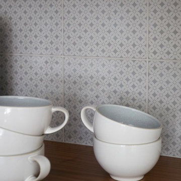
We decided upon a layered approach to this space to provide character appropriate to the older home. White painted cabinetry provides a backdrop for interesting touches such as gray herringbone tile, a reeded farmhouse sink and bronze hardware and lighting. The bar has its own unique look featuring gray cabinetry with a patterned cement tile backsplash and walnut top. A bar fridge, glass cabinets and baskets for tucking away homework give this little multi-functional area loads of character. A miniature mudroom area was also added to the dining room so that the new space can be kept neat and tidy.
The stylish result looks both appropriate to the 1928 home and provides loads of functionality for this active family that can now take advantage of every square inch their home.
Designed by: Susan Klimala, CKD, CBD
Photography by: Michael Alan Kaskel
For more information on kitchen and bath design ideas go to: www.kitchenstudio-ge.com
 Design Vision Studio
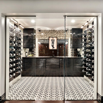
After successfully designing the main levels of their new home, our Canadian clients were ready to tackle the design and remodeling of their 1200sf basement. They wanted to utilize the lower level of their home for family gatherings and entertaining guests - yet have it cozy enough for just the two of them to watch a movie and enjoy a glass of wine. Working remotely, their wish-list was addressed by creating defined zones in the space to include: a wine cellar, wine lounge, game room, and media area. The design plan was created with a sexy Vegas nightclub vibe as inspiration and using a black and white color scheme. We carved out space for a new wine cellar in an adjacent ‘cold room’ and filled it with dramatic elements, making it the true showpiece of the room. Our makeover required mostly all new furnishings that could easily be rearranged, depending on the occasion. We added unique lighting, dimensional custom cabinetry, rugs and décor. Antique mirror was added in the wine cellar, above the pool table (where adding a light fixture was not possible) and also was used to cover the unsightly support posts. This feature alone elevates and brings harmony to the room to the point you can hardly believe you’re in a basement. The clients complete trust in our bold design decisions is what made this project a success. The results exceeded their expectations and this room is now their favorite place in the home.
 JRP Design & Remodel
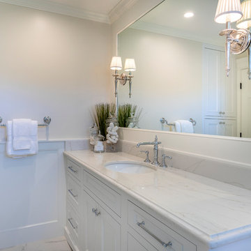
Our clients were living with outdated, dark bathrooms in their newly purchased Falling Star home. The dull palette of warm neutrals did not reflect the couple’s East Coast traditional style. They noticed several renovation projects by JRP in the neighborhood. The professionalism and the process impressed them. After receiving a Pardon Our Dust courtesy letter from JRP, the couple decided to call for a consultation. Their wish list was clear. They wanted the Falling Star design to be light, airy, and white. It had to reflect their East Coast roots. Working with the original footprint, JRP completely transformed the space, creating a tranquil primary suite rich with traditional detail. The result is an effusive celebration of classic style.
Now, the radiant rooms glow. To enlarge the primary closet, the JRP team removed a cluttered storage area. Inside, a separate dressing space is finished with upgraded storage and refined built-in cabinetry with recessed panels. Pops of glam such as Robert Abbey glass chandeliers and brilliant bits of chrome are moored by traditional elements like crown molding, porcelain tiles, and a quartz-clad drop-in soaking tub. Large windows in the primary bath and funnel skylights in the closet harness the natural light to stunning effect, sweeping the rooms with the cool feeling of fresh air. The “Sail Cloth” white paint adds soft depth to the uncomplicated elegance of both rooms.
PROJECT DETAILS:
• Style: Transitional
• Countertops: Vadara Quartz – Calacatta Dorado
• Cabinets: DeWils Recessed-panel, painted white
• Hardware/Plumbing Fixture Finish: Chrome
• Lighting Fixtures:
Master Closet: Skylight Sun Tunnel
Master Bath: Robert Abbey, Glass Chandelier
• Flooring:
Floor: Calacatta Dorado Porcelain Tiles w/Accent
• Tile/Backsplash: Shower Surround: Ceramic Blanc/Crackle
• Paint Colors:
Master Bath & Closet: Dunn Edwards Sail Cloth
Hall Bath: Benjamin Moore Ballet White
• Other Details: Drop-in soaking Tub
Photographer: J.R. Maddox
 ALTER Design Studio
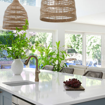
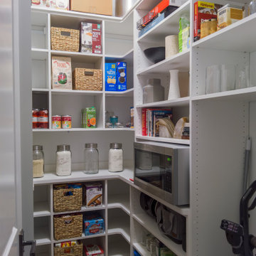
We met with our clients a few times over six months before we starting designing. They had an interesting existing layout and a very specific list of wants. We worked with their architect, re-working the home to achieve the open, light filled space they dreamed of. With roots in Australia, they wanted an elevated coastal vibe. We used muted blues, layered in texture and warm finishes - the results speak for themselves. Storage was a big challenge in the very small original kitchen. In addition to the large island and run of cabinets, we added a hidden pantry.
 Drury Design
The Setup:
After purchasing this home, the homeowners faced a unique opportunity to reimagine their kitchen and nearby spaces. Water damage from a burst pipe had left much of the home’s interior in need of repair, and while the existing kitchen was functional and in relatively good shape, it didn’t align with the family’s vision for their new home. The layout included a peninsula that wasn’t ideal, and there were some druthers with the nearby pantry.
Since the space needed to be rebuilt anyway, the homeowners saw this as a chance to create a kitchen that was both highly functional for their four young children and timeless in its design. The project also included a refresh of the adjacent message center and dining room — spaces that play key roles in the family’s daily life. The goal was to create a cohesive flow between these areas, balancing modern functionality with the craftsman-inspired character of the rest of the home.
Design Objectives:
- Replace the outdated peninsula with a large island to maximize counter space and create new seating options.
- Open up the space visually by removing soffits and rethinking the cabinetry layout.
Incorporate concealed refrigeration and freezer units to provide significant storage for the family while maintaining a streamlined aesthetic.
- Integrate black cabinetry into the design without making the space feel harsh or heavy.
- Ensure the lighting plan balances functional task lighting with ambient accent lighting.
- Avoid visual clutter in the cabinetry design while still giving a nod to the craftsman aesthetic.
- Incorporate a slab backsplash as a key design feature.
Design Challenges:
- The outdated peninsula left dead space in the kitchen and lacked sufficient seating for the family.
- The cooktop wall was cramped, with small cabinets flanking the hood, limited storage, and soffits that made the space feel closed-in.
- The family needed significant refrigeration space (two refrigerators and a freezer) but wanted to avoid a cluttered look with visible stainless steel appliances.
- Adding black cabinetry risked making the space feel too dark or heavy.
- The original lighting plan was insufficient, particularly over the dining table where a decorative fixture proved too dim.
- The family wanted shaker-style drawer fronts to match the home’s arts-and-crafts design but worried that too much shaker cabinetry might look overly busy.
- Prioritizing a slab backsplash in the wish list priority planning.
The Renewed Space
Design Solutions:
- A functional island: The peninsula was replaced with a large island that provides continuous countertop space for prepping and serving. The island also features seating for four people, creating a central hub for informal meals and activities.
- Streamlined cooktop wall: The soffits were removed, and the upper cabinets on the cooktop wall were eliminated to create a more open, streamlined design. A custom oversized hood became the focal point of the wall, with the blower unit offset inside it to align with the cooktop while maintaining exterior visual symmetry.
- Concealed refrigeration: Two column refrigerators and one freezer were integrated into the cabinetry, concealing them behind wood paneling that blends seamlessly with the overall design.
- Warm black cabinetry: The black cabinetry was crafted from hickory with a visible grain, softening its appearance and adding warmth. The grain detail gives the cabinetry a rich, textured look that avoids feeling stark or overpowering.
- Additional lighting: In the dining area, recessed can lights were added during an additional installation phase to supplement the gorgeous decorative fixture’s dim output. The new lighting plan creates a layered effect, combining functional task lighting with softer ambient lighting.
- Simplified cabinetry details: Slab drawer fronts were used on the upper drawers, while five-piece shaker fronts (with slightly less prominent rail and stile pieces) were reserved for the middle and lower drawers. This approach simplified the overall look while maintaining the craftsman-inspired aesthetic.
- Slab backsplash priority: The slab backsplash was prioritized by making thoughtful adjustments elsewhere, like opting not to extend cabinetry to the ceiling, which also helped visually prioritize the gorgeous slab backsplash. This decision also enhanced the kitchen’s furniture-like feel, aligning with the home’s craftsman character.
- This kitchen perfectly balances practicality with timeless style. By addressing the family’s functional needs — ample seating, smart storage, and effective lighting — while incorporating thoughtful design elements like warm black cabinetry and a striking slab backsplash, Alicia created a space that works beautifully for a busy household. The result is a cohesive, inviting kitchen that honors the home’s craftsman roots and will serve the family well for years to come.
 Byggmeister Inc
Photo by Mike Casey
Cramped, uncomfortable, and out of date: when the owners of this home approached us about renovating their kitchen and adjoining sunroom, these were high on their list of complaints.
OPENING UP THE KITCHEN
Our plan kept the kitchen in the same location but took down the walls between both the dining room and the sunroom to create an expansive multi-purpose space with spectacular views to conservation land along the back of the property. We removed the powder room and in its place created a window-lined hallway to the living room—opening up direct access between these two previously disconnected spaces. We then built a new half bath between these two rooms, with a door along the back hallway. The result is a more private powder room that is easier to access than before.
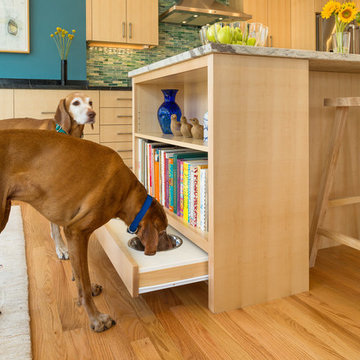
Significantly improved cabinetry provides ample storage for both human and canine needs. An island countertop is functional and pleasant, enabling the owners to prep for and clean up from dinner all while enjoying the view of the woods behind their house.
CREATING COMFORT
We also completely rebuilt the sunroom, thickening the framing to allow for extra insulation and raising the roof to accommodate a higher ceiling and tall windows that let in as much natural light as the skylights they replaced, but much less of the solar gain that had made the room so intolerable in the summer.
We improved visual connections between spaces and admitted more natural light by converting the framing of the main stairway from full to half walls. We also insulated the attic and replaced an aging, inefficient central air conditioning system with ductless minisplit heat pumps, which can also be used as supplemental heat.
All in all, this was our kind of project: we made the home more attractive, more comfortable, and more energy-efficient—all over the course of a single, well-integrated project.
 Artistic Kitchens - Kristi Hodson
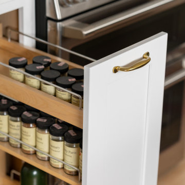
The original kitchen in this midcentury Ann Arbor home was only a fraction of the size it is today. We removed walls to open up the main floor and create a brighter, more connected space that fits the way this family lives. The existing hardwood floors were blended and refinished for a seamless transition between old and new, tying the whole space together. Storage and function were at the top of the list. We added dedicated spaces for spices, a mixer, corner pullouts, and small appliances to keep the counters clear and organized. Full-size column refrigerator and freezer units now provide plenty of food storage without sacrificing style. We also improved the light and flow of the space. A small window that faced a brick wall and a non-functioning door were both removed, replaced by a new sliding door that brings in natural light and connects the kitchen to the backyard. The new design combines navy and white cabinetry with brass and orange accents for a look that feels modern but still connected to the home’s midcentury roots. The result is a kitchen that works as beautifully as it looks, filled with smart storage and thoughtful details. Contractor: MAV Design + Build Stylist: Jill Fagan Interiors Photographer: Jacob Hawkins Photography
 Hawaii Life
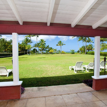
213 FEET OF PRIME BEACHFRONT PROPERTY ON HANALEI BAY.
*The Faye property at Hanalei was purchased by Hans Peter Faye in 1915. Faye was a prominent Kauai sugar plantation manager and a member of the elite society of the day. He and a few others were privileged with the opportunity to purchase prime Hanalei beachfront lots at auction. The intention was to build summer beach houses on the best section of the Bay.
*In 1915, H.P. Faye cleverly combined two of the original Hanalei Beach Lots, resulting in twice the land area and beach frontage of current comparables. Skillfully selected by Hans Peter Faye in 1915 at a time when Hanalei Bay was wide open. The location offers shelter, consistent offshore trade winds, sandbars, and amazing views. H.P. Faye had the vision and the finances to purchase not one but two lots in the best part of the Bay. The property has views both mauka and makai, and is perfect for swimming, parties and the beach lifestlye.
*Building on the property may be permitted for up to 9,000 sf, allowing for additional structures, pool, & larger buildings(compared to average 4,500 sf on other Hanalei beachfront lots).
*Today, almost all of the lots on Hanalei Bay have been subdivided and many of the original large estates are gone. Gone are the days of expansive,open spaces at Hanalei. The Faye property is one of a few parcels that retain the large, open feel and the ONLY ONE THAT IS AVAILABLE FOR SALE. Listed by Neal Norman, REALTOR (B) neal@hawaiilife.com - (808) 651-1777
50