
Search results for "Reworking" in Home Design Ideas
 USI Design & Remodeling
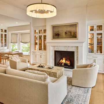
Remodel-Kitchen & Family Room: Quiet Luxury with a Natural Palette
This remodel reimagines the heart of the home by seamlessly integrating the kitchen and family room into a refined yet inviting open-concept space, grounded in a “quiet luxury” aesthetic and a natural palette.
Kitchen Transformation:
The kitchen layout is completely reworked for improved flow and functionality. Major appliances have been reassigned for efficiency:
• The refrigerator is built in and anchors the focal wall providing improved access to both prep and serving areas.
• The range has been centered on the back wall, framed by two- toned cabinetry and a low-profile custom hood accented with brass that blends seamlessly into the wall for an understated look.
• The dishwasher and sink have been relocated to the new central island, allowing for uninterrupted views across the room and better interaction with guests or family.
At the heart of the space is a large central island, topped with Taj Mahal quartzite in soft beige and taupe tones. The island serves as a multi-functional hub.
The cabinetry is custom-built in white oak, finished in a matte clear coat that highlights the wood’s natural grain. Hardware is kept minimal, in brushed brass for a touch of subdued elegance.
Natural Palette & Materials:
The entire space embraces a natural color scheme—warm whites, layered pastel beiges and natural wood tones—accented with natural stone. Leathered Taj Mahal backsplash with subtle texture adds quiet visual interest without overpowering the calm atmosphere.
Family Room Integration:
The kitchen flows effortlessly into the family room, unified by wide-plank oak flooring and soft lighting. A fluted marble-clad fireplace anchors the space, surrounded by, built-in shelving with the same oak finish inside as the kitchen cabinetry. Furnishings follow the same philosophy: clean lines, neutral fabrics, and a mix of soft textures. Think boucle armchairs, a deep linen sectional, and a reclaimed wood coffee table.
Lighting & Finishing Touches:
Soft, layered lighting—including recessed lights, sculptural clear pendant lights above the island, and concealed LED strips—enhances the serene mood.
 TVL Creative Ltd.
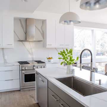
These wonderful clients returned to us for their newest home remodel adventure. Their newly purchased custom built 1970s modern ranch sits in one of the loveliest neighborhoods south of the city but the current conditions of the home were out-dated and not so lovely. Upon entering the front door through the court you were greeted abruptly by a very boring staircase and an excessive number of doors. Just to the left of the double door entry was a large slider and on your right once inside the home was a soldier line up of doors. This made for an uneasy and uninviting entry that guests would quickly forget and our clients would often avoid. We also had our hands full in the kitchen. The existing space included many elements that felt out of place in a modern ranch including a rustic mountain scene backsplash, cherry cabinets with raised panel and detailed profile, and an island so massive you couldn’t pass a drink across the stone. Our design sought to address the functional pain points of the home and transform the overall aesthetic into something that felt like home for our clients.
For the entry, we re-worked the front door configuration by switching from the double door to a large single door with side lights. The sliding door next to the main entry door was replaced with a large window to eliminate entry door confusion. In our re-work of the entry staircase, guesta are now greeted into the foyer which features the Coral Pendant by David Trubridge. Guests are drawn into the home by stunning views of the front range via the large floor-to-ceiling glass wall in the living room. To the left, the staircases leading down to the basement and up to the master bedroom received a massive aesthetic upgrade. The rebuilt 2nd-floor staircase has a center spine with wood rise and run appearing to float upwards towards the master suite. A slatted wall of wood separates the two staircases which brings more light into the basement stairwell. Black metal railings add a stunning contrast to the light wood.
Other fabulous upgrades to this home included new wide plank flooring throughout the home, which offers both modernity and warmth. The once too-large kitchen island was downsized to create a functional focal point that is still accessible and intimate. The old dark and heavy kitchen cabinetry was replaced with sleek white cabinets, brightening up the space and elevating the aesthetic of the entire room. The kitchen countertops are marble look quartz with dramatic veining that offers an artistic feature behind the range and across all horizontal surfaces in the kitchen. As a final touch, cascading island pendants were installed which emphasize the gorgeous ceiling vault and provide warm feature lighting over the central point of the kitchen.
This transformation reintroduces light and simplicity to this gorgeous home, and we are so happy that our clients can reap the benefits of this elegant and functional design for years to come.

Find the right local pro for your project

 Ania Omski-Talwar Interior Design
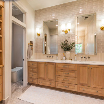
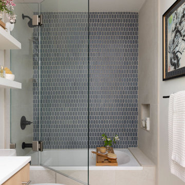
Once part of a Jack-and-Jill layout, this guest bath was thoughtfully reworked into a calm, spa-like escape. Smart space planning makes the most of its petite footprint, creating a room that feels both serene and highly functional. As the home’s only bath with a tub, it offers everyday comfort for the homeowners and a quiet luxury for guests—while quietly boosting resale value.
 JRP Design & Remodel
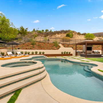
Our client came to us with a desire to take an overgrown, neglected space and transform it into a clean contemporary backyard for the family to enjoy. Having had less than stellar experiences with other contractors, they wanted to find a trustworthy company; One that would complement their style and provide excellent communication. They saw a JRP banner at their son's baseball game at Westlake High School and decided to call. After meeting with the team, they knew JRP was the firm they needed to give their backyard a complete overhaul.
With a focus on sleek, clean lines, this contemporary backyard is captivating. The outdoor family room is a perfect blend of beauty, form, and function. JRP reworked the courtyard and dining area to create a space for the family to enjoy together. An outdoor pergola houses a media center and lounge. Restoration Hardware low profile furniture provides comfortable seating while maintaining a polished look. The adjacent barbecue is perfect for crafting up family dinners to enjoy amidst a Southern California sunset.
Before renovating, the landscaping was an unkempt mess that felt overwhelming. Synthetic grass and concrete decking was installed to give the backyard a fresh feel while offering easy maintenance. Gorgeous hardscaping takes the outdoor area to a whole new level. The resurfaced free-form pool joins to a lounge area that's perfect for soaking up the sun while watching the kids swim. Hedges and outdoor shrubs now maintain a clean, uniformed look.
A tucked-away area taken over by plants provided an opportunity to create an intimate outdoor dining space. JRP added wooden containers to accommodate touches of greenery that weren't overwhelming. Bold patterned statement flooring contrasts beautifully against a neutral palette. Additionally, our team incorporated a fireplace for a feel of coziness.
Once an overlooked space, the clients and their children are now eager to spend time outdoors together. This clean contemporary backyard renovation transformed what the client called "an overgrown jungle" into a space that allows for functional outdoor living and serene luxury.
Photographer: Andrew - OpenHouse VC
 TKS Design Group
Free ebook, Creating the Ideal Kitchen. DOWNLOAD NOW
Having a space for their teenage kids to hang out after school, study and interact with Mom & Dad was at the top of the list for this remodel. The 1928 home, sits in a lovely Glen Ellyn neighborhood, near downtown and near all the action of the local high school and lake. It’s was a great house with great bones but the kitchen was in need of some TLC. The remodel project had been a long time coming, and since both the homeowners work from home, they had been nervous about disrupting their bustling daily schedules to get the project in motion.
Once we had a plan in place, we dug in and got to work. The first step was to remove a non-load bearing wall between the kitchen and dining room. We then reworked the space a bit, eliminating a redundant passage way to the hall, and reworking a closet to allow for a large galley style kitchen and small bar area open to the dining room. The new kitchen has a small peninsula for the family to have casual meals and for the kids to hang out after school. A window was eliminated to give more space for cabinetry and storage, and another window was made larger to allow for a grander view into the backyard.
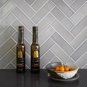
We decided upon a layered approach to this space to provide character appropriate to the older home. White painted cabinetry provides a backdrop for interesting touches such as gray herringbone tile, a reeded farmhouse sink and bronze hardware and lighting. The bar has its own unique look featuring gray cabinetry with a patterned cement tile backsplash and walnut top. A bar fridge, glass cabinets and baskets for tucking away homework give this little multi-functional area loads of character. A miniature mudroom area was also added to the dining room so that the new space can be kept neat and tidy.
The stylish result looks both appropriate to the 1928 home and provides loads of functionality for this active family that can now take advantage of every square inch their home.
Designed by: Susan Klimala, CKD, CBD
Photography by: Michael Alan Kaskel
For more information on kitchen and bath design ideas go to: www.kitchenstudio-ge.com
 John Lum Architecture, Inc. AIA
Architecture: John Lum Architecture
Interior Design: NicoleHollis
Contractor: Jetton Construction
Landscape: Arterra Landscape Architects
Photography: Douglas Friedman
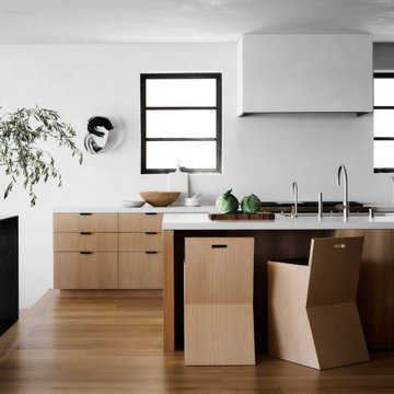
We reworked a spec-level Mediterranean into a design that quietly fits its spectacular bay-side setting. Referencing Sausalito’s fishing village roots, the stucco and styrofoam detailing were replaced with environmentally-conscious materials designed to weather, utilizing a palette of Kebony, cement plaster, and copper standing seam roof.
 TKS Design Group
Free ebook, Creating the Ideal Kitchen. DOWNLOAD NOW
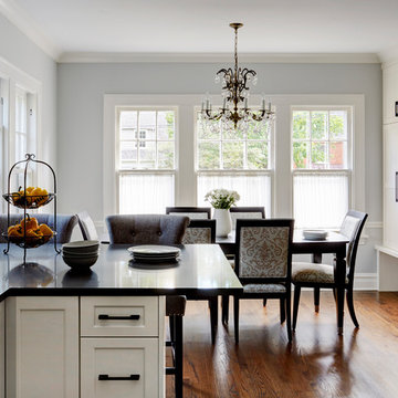
Having a space for their teenage kids to hang out after school, study and interact with Mom & Dad was at the top of the list for this remodel. The 1928 home, sits in a lovely Glen Ellyn neighborhood, near downtown and near all the action of the local high school and lake. It’s was a great house with great bones but the kitchen was in need of some TLC. The remodel project had been a long time coming, and since both the homeowners work from home, they had been nervous about disrupting their bustling daily schedules to get the project in motion.
Once we had a plan in place, we dug in and got to work. The first step was to remove a non-load bearing wall between the kitchen and dining room. We then reworked the space a bit, eliminating a redundant passage way to the hall, and reworking a closet to allow for a large galley style kitchen and small bar area open to the dining room. The new kitchen has a small peninsula for the family to have casual meals and for the kids to hang out after school. A window was eliminated to give more space for cabinetry and storage, and another window was made larger to allow for a grander view into the backyard.
We decided upon a layered approach to this space to provide character appropriate to the older home. White painted cabinetry provides a backdrop for interesting touches such as gray herringbone tile, a reeded farmhouse sink and bronze hardware and lighting. The bar has its own unique look featuring gray cabinetry with a patterned cement tile backsplash and walnut top. A bar fridge, glass cabinets and baskets for tucking away homework give this little multi-functional area loads of character. A miniature mudroom area was also added to the dining room so that the new space can be kept neat and tidy.
The stylish result looks both appropriate to the 1928 home and provides loads of functionality for this active family that can now take advantage of every square inch their home.
Designed by: Susan Klimala, CKD, CBD
Photography by: Michael Alan Kaskel
For more information on kitchen and bath design ideas go to: www.kitchenstudio-ge.com
 TKS Design Group
Free ebook, Creating the Ideal Kitchen. DOWNLOAD NOW
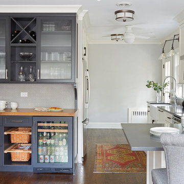
Having a space for their teenage kids to hang out after school, study and interact with Mom & Dad was at the top of the list for this remodel. The 1928 home, sits in a lovely Glen Ellyn neighborhood, near downtown and near all the action of the local high school and lake. It’s was a great house with great bones but the kitchen was in need of some TLC. The remodel project had been a long time coming, and since both the homeowners work from home, they had been nervous about disrupting their bustling daily schedules to get the project in motion.
Once we had a plan in place, we dug in and got to work. The first step was to remove a non-load bearing wall between the kitchen and dining room. We then reworked the space a bit, eliminating a redundant passage way to the hall, and reworking a closet to allow for a large galley style kitchen and small bar area open to the dining room. The new kitchen has a small peninsula for the family to have casual meals and for the kids to hang out after school. A window was eliminated to give more space for cabinetry and storage, and another window was made larger to allow for a grander view into the backyard.
We decided upon a layered approach to this space to provide character appropriate to the older home. White painted cabinetry provides a backdrop for interesting touches such as gray herringbone tile, a reeded farmhouse sink and bronze hardware and lighting. The bar has its own unique look featuring gray cabinetry with a patterned cement tile backsplash and walnut top. A bar fridge, glass cabinets and baskets for tucking away homework give this little multi-functional area loads of character. A miniature mudroom area was also added to the dining room so that the new space can be kept neat and tidy.
The stylish result looks both appropriate to the 1928 home and provides loads of functionality for this active family that can now take advantage of every square inch their home.
Designed by: Susan Klimala, CKD, CBD
Photography by: Michael Alan Kaskel
For more information on kitchen and bath design ideas go to: www.kitchenstudio-ge.com
 Y Rosemary Fivian Architect Inc
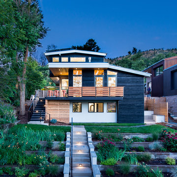
This project is a total rework and update of an existing outdated home with a total rework of the floor plan, an addition of a master suite, and an ADU (attached dwelling unit) with a separate entry added to the walk out basement.
Daniel O'Connor Photography
 TVL Creative Ltd.
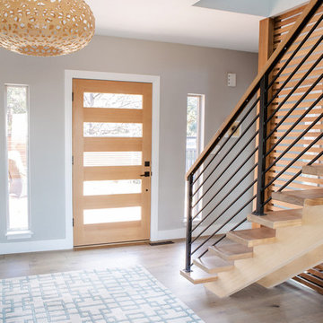
These wonderful clients returned to us for their newest home remodel adventure. Their newly purchased custom built 1970s modern ranch sits in one of the loveliest neighborhoods south of the city but the current conditions of the home were out-dated and not so lovely. Upon entering the front door through the court you were greeted abruptly by a very boring staircase and an excessive number of doors. Just to the left of the double door entry was a large slider and on your right once inside the home was a soldier line up of doors. This made for an uneasy and uninviting entry that guests would quickly forget and our clients would often avoid. We also had our hands full in the kitchen. The existing space included many elements that felt out of place in a modern ranch including a rustic mountain scene backsplash, cherry cabinets with raised panel and detailed profile, and an island so massive you couldn’t pass a drink across the stone. Our design sought to address the functional pain points of the home and transform the overall aesthetic into something that felt like home for our clients.
For the entry, we re-worked the front door configuration by switching from the double door to a large single door with side lights. The sliding door next to the main entry door was replaced with a large window to eliminate entry door confusion. In our re-work of the entry staircase, guesta are now greeted into the foyer which features the Coral Pendant by David Trubridge. Guests are drawn into the home by stunning views of the front range via the large floor-to-ceiling glass wall in the living room. To the left, the staircases leading down to the basement and up to the master bedroom received a massive aesthetic upgrade. The rebuilt 2nd-floor staircase has a center spine with wood rise and run appearing to float upwards towards the master suite. A slatted wall of wood separates the two staircases which brings more light into the basement stairwell. Black metal railings add a stunning contrast to the light wood.
Other fabulous upgrades to this home included new wide plank flooring throughout the home, which offers both modernity and warmth. The once too-large kitchen island was downsized to create a functional focal point that is still accessible and intimate. The old dark and heavy kitchen cabinetry was replaced with sleek white cabinets, brightening up the space and elevating the aesthetic of the entire room. The kitchen countertops are marble look quartz with dramatic veining that offers an artistic feature behind the range and across all horizontal surfaces in the kitchen. As a final touch, cascading island pendants were installed which emphasize the gorgeous ceiling vault and provide warm feature lighting over the central point of the kitchen.
This transformation reintroduces light and simplicity to this gorgeous home, and we are so happy that our clients can reap the benefits of this elegant and functional design for years to come.
 design styles architecture
The interior of this single family residential home was in need of a remodel. The space was enhanced aesthetically, re-worked for better functionality, and opened up for more natural light and space. The Key areas of focus were the kitchen, master bathroom, and master walk in closet. These areas were most changed architecturally. The spaces we reconfigured to make them more user friendly, adding storage and better foot traffic paths. A wall was removed that divided the kitchen and the living space providing better lighting and an open concept peninsula. The kitchen layout was also re-worked moving the refrigerator, stove, and sink to provide a better configuration for cooking and entertaining. The rest of the home was remodeled to coordinate with the finishes and selections of the master bath and kitchen.
 Simply Home Decorating
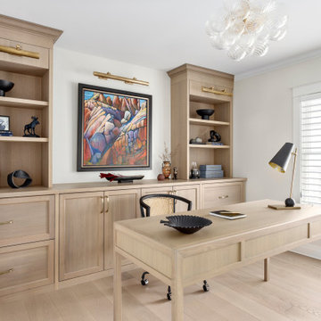
When our clients approached us to renovate their 1950s Newfoundland home, their goal was to modernize while reflecting both their West Coast roots and current East Coast lifestyle. What began as a simple ensuite repair expanded into a full home transformation, completed in two thoughtfully phased renovations. Drawing from our cross-coastal experience—and a personal connection to the home’s past—we blended classic East Coast charm with West Coast simplicity. From reworking the layout and finishes to integrating their art collection and layering in warm, tactile materials, every detail was designed to feel cohesive, inviting, and deeply personal.
 Payte Miller Interiors
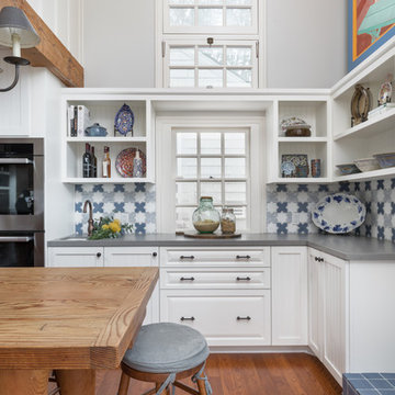
We completely reworked the pantry to include more storage (see Before pictures).
Inspiration for a mid-sized coastal l-shaped medium tone wood floor kitchen remodel in San Diego with a single-bowl sink, white cabinets, quartz countertops, multicolored backsplash, terra-cotta backsplash, stainless steel appliances, gray countertops and an island
Inspiration for a mid-sized coastal l-shaped medium tone wood floor kitchen remodel in San Diego with a single-bowl sink, white cabinets, quartz countertops, multicolored backsplash, terra-cotta backsplash, stainless steel appliances, gray countertops and an island
 Shea Construction And Design
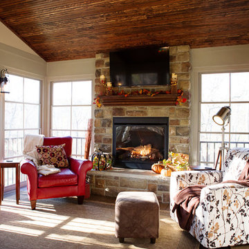
Mid-sized trendy medium tone wood floor and brown floor sunroom photo in St Louis with a standard fireplace, a stone fireplace and a standard ceiling
 Nicole Arnold Interiors
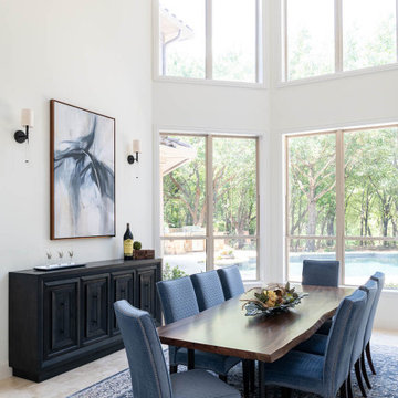
Purchased as a fixer-upper, this 1998 home underwent significant aesthetic updates to modernize its amazing bones. The interior had to live up to the coveted 1/2 acre wooded lot that sprawls with landscaping and amenities. In addition to the typical paint, tile, and lighting updates, the kitchen was completely reworked to lighten and brighten an otherwise dark room. The staircase was reinvented to boast an iron railing and updated designer carpeting. Traditionally planned rooms were reimagined to suit the needs of the family, i.e. the dining room is actually located in the intended living room space and the piano room Is in the intended dining room area. The live edge table is the couple’s main brag as they entertain and feature their vast wine collection while admiring the beautiful outdoors. Now, each room feels like “home” to this family.
 TKS Design Group
Download our free ebook, Creating the Ideal Kitchen. DOWNLOAD NOW
The homeowners built their traditional Colonial style home 17 years’ ago. It was in great shape but needed some updating. Over the years, their taste had drifted into a more contemporary realm, and they wanted our help to bridge the gap between traditional and modern.
We decided the layout of the kitchen worked well in the space and the cabinets were in good shape, so we opted to do a refresh with the kitchen. The original kitchen had blond maple cabinets and granite countertops. This was also a great opportunity to make some updates to the functionality that they were hoping to accomplish.
After re-finishing all the first floor wood floors with a gray stain, which helped to remove some of the red tones from the red oak, we painted the cabinetry Benjamin Moore “Repose Gray” a very soft light gray. The new countertops are hardworking quartz, and the waterfall countertop to the left of the sink gives a bit of the contemporary flavor.
We reworked the refrigerator wall to create more pantry storage and eliminated the double oven in favor of a single oven and a steam oven. The existing cooktop was replaced with a new range paired with a Venetian plaster hood above. The glossy finish from the hood is echoed in the pendant lights. A touch of gold in the lighting and hardware adds some contrast to the gray and white. A theme we repeated down to the smallest detail illustrated by the Jason Wu faucet by Brizo with its similar touches of white and gold (the arrival of which we eagerly awaited for months due to ripples in the supply chain – but worth it!).
The original breakfast room was pleasant enough with its windows looking into the backyard. Now with its colorful window treatments, new blue chairs and sculptural light fixture, this space flows seamlessly into the kitchen and gives more of a punch to the space.
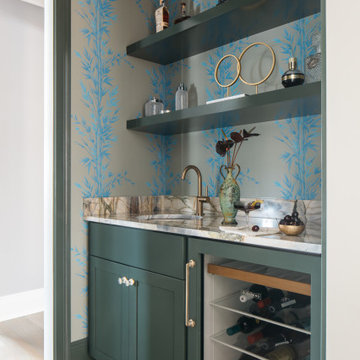
The original butler’s pantry was functional but was also starting to show its age. The new space was inspired by a wallpaper selection that our client had set aside as a possibility for a future project. It worked perfectly with our pallet and gave a fun eclectic vibe to this functional space. We eliminated some upper cabinets in favor of open shelving and painted the cabinetry in a high gloss finish, added a beautiful quartzite countertop and some statement lighting. The new room is anything but cookie cutter.
Next the mudroom. You can see a peek of the mudroom across the way from the butler’s pantry which got a facelift with new paint, tile floor, lighting and hardware. Simple updates but a dramatic change! The first floor powder room got the glam treatment with its own update of wainscoting, wallpaper, console sink, fixtures and artwork. A great little introduction to what’s to come in the rest of the home.
The whole first floor now flows together in a cohesive pallet of green and blue, reflects the homeowner’s desire for a more modern aesthetic, and feels like a thoughtful and intentional evolution. Our clients were wonderful to work with! Their style meshed perfectly with our brand aesthetic which created the opportunity for wonderful things to happen. We know they will enjoy their remodel for many years to come!
Photography by Margaret Rajic Photography
 Simply Home Decorating
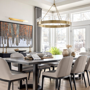
When our clients approached us to renovate their 1950s Newfoundland home, their goal was to modernize while reflecting both their West Coast roots and current East Coast lifestyle. What began as a simple ensuite repair expanded into a full home transformation, completed in two thoughtfully phased renovations. Drawing from our cross-coastal experience—and a personal connection to the home’s past—we blended classic East Coast charm with West Coast simplicity. From reworking the layout and finishes to integrating their art collection and layering in warm, tactile materials, every detail was designed to feel cohesive, inviting, and deeply personal.
 TVL Creative Ltd.
These wonderful clients returned to us for their newest home remodel adventure. Their newly purchased custom built 1970s modern ranch sits in one of the loveliest neighborhoods south of the city but the current conditions of the home were out-dated and not so lovely. Upon entering the front door through the court you were greeted abruptly by a very boring staircase and an excessive number of doors. Just to the left of the double door entry was a large slider and on your right once inside the home was a soldier line up of doors. This made for an uneasy and uninviting entry that guests would quickly forget and our clients would often avoid. We also had our hands full in the kitchen. The existing space included many elements that felt out of place in a modern ranch including a rustic mountain scene backsplash, cherry cabinets with raised panel and detailed profile, and an island so massive you couldn’t pass a drink across the stone. Our design sought to address the functional pain points of the home and transform the overall aesthetic into something that felt like home for our clients.
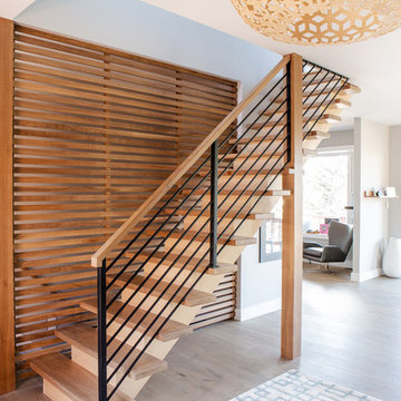
For the entry, we re-worked the front door configuration by switching from the double door to a large single door with side lights. The sliding door next to the main entry door was replaced with a large window to eliminate entry door confusion. In our re-work of the entry staircase, guesta are now greeted into the foyer which features the Coral Pendant by David Trubridge. Guests are drawn into the home by stunning views of the front range via the large floor-to-ceiling glass wall in the living room. To the left, the staircases leading down to the basement and up to the master bedroom received a massive aesthetic upgrade. The rebuilt 2nd-floor staircase has a center spine with wood rise and run appearing to float upwards towards the master suite. A slatted wall of wood separates the two staircases which brings more light into the basement stairwell. Black metal railings add a stunning contrast to the light wood.
Other fabulous upgrades to this home included new wide plank flooring throughout the home, which offers both modernity and warmth. The once too-large kitchen island was downsized to create a functional focal point that is still accessible and intimate. The old dark and heavy kitchen cabinetry was replaced with sleek white cabinets, brightening up the space and elevating the aesthetic of the entire room. The kitchen countertops are marble look quartz with dramatic veining that offers an artistic feature behind the range and across all horizontal surfaces in the kitchen. As a final touch, cascading island pendants were installed which emphasize the gorgeous ceiling vault and provide warm feature lighting over the central point of the kitchen.
This transformation reintroduces light and simplicity to this gorgeous home, and we are so happy that our clients can reap the benefits of this elegant and functional design for years to come.
35