
Search results for "Rich quick" in Home Design Ideas
 The Home Improvements Group, Inc.
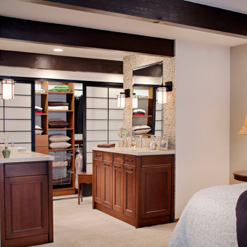
THIS MASTER SUITE IS IN A MID-CENTURY MODERN HOME IN NORTHERN CALIFORNIA. THE OPEN PLACEMENT OF THE VANITIES SHOWS OFF THE SHOJI SCREEN CLOSET DOORS (MADE WITH A SYNTHETIC RICE PAPER SCREEN TO PROTECT AGAINST DAMAGE FROM SHOWER MOISTURE) BUT STILL ENABLES PRIVACY SINCE THE SHOWER IS BEHIND ONE VANITY AND THE TOILET AREA IS TUCKED BEHIND THE OTHER.
DESIGNED AND BUILT BY THE HOME IMPROVEMENTS GROUP, WOODLAND, CA
PHOTOS BY CHIPPER HATTER PHOTOGRAPHY


 Bliss Garden Design, LLC
Bliss Garden Design
This is an example of a contemporary landscaping in Seattle.
This is an example of a contemporary landscaping in Seattle.
Find the right local pro for your project

 Noz Design
Colin Price Photography
Trendy master light wood floor bedroom photo in San Francisco with blue walls
Trendy master light wood floor bedroom photo in San Francisco with blue walls
 Steve Masley Consulting and Design
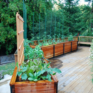
The garden 3 weeks after planting, on a foggy day.
Photo by Steve Masley
Inspiration for a timeless deck container garden remodel in San Francisco
Inspiration for a timeless deck container garden remodel in San Francisco
 reStyled by Valerie
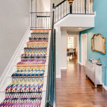
Light gray walls with a slate blue accent wall is punched up with this colorful patterned stair runner. Photo by Cinematic Homes
Example of a mid-sized transitional painted l-shaped staircase design in Columbus with painted risers
Example of a mid-sized transitional painted l-shaped staircase design in Columbus with painted risers
 FineLine Kitchens, Inc.
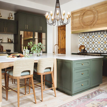
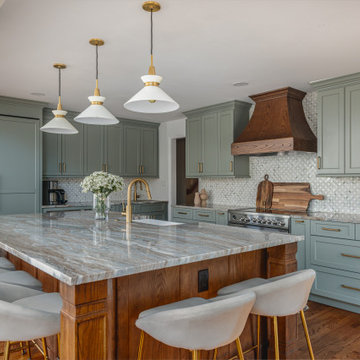
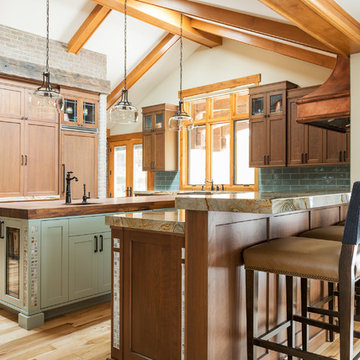
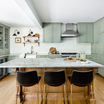
Hi everyone, I'm Sarah and Ogun we are here with fine line kitchens. So we are a couple working together. I do the interior design and remodeling of the space material selection meeting with the clients. And I handled operations outside, you know meaning all the construction work that is taking place the inside. The houses that we work in. I handle all the aspects of the construction, so today's project is very special. We're in Vienna and the client had a very big family. It's a family of seven that lives here. So we had a few aspects that we needed to keep in mind while designing this one. Having everybody be able to sit on the island. So we wanted plenty of seating all the way around. We didn't want anybody standing or anything like that. So what we did is we maximize the space. The center island is the biggest part of the kitchen. We use a natural stone to kind of give it a beautiful texture versus quartz. It's kind of standard white or kind of fabricated, so I wanted something very natural. We did this because I took my inspiration from the outside, so the inspiration if you look at the view right in front of me is there are so many greens there's a lot of brass accents and I wanted to bring this. Into this kitchen while designing it for my clients. She is very warm very. She wanted a very homey, comfy kind of look for the kitchen. So that's what we did today. As you can see, the cabinets are sage green, very light, so I still think it's a neutral, but it's a lighter color that again brings the outside in and we combine that with the oak right behind me so it's a slightly warm oak. It's not very dark. It's not very light. It's a medium brown and the same color went on the island. To kind of tie these two in and the backsplash, my favorite part is where you can see a little bit of design. It is, in my opinion still classic, but includes a pattern so the outside part is as we said in the beginning, is handled by my husband. I'd like him to speak a little bit about that. Thanks, Sarah, I want to talk to you guys a little bit about the construction part of this project. Originally this kitchen was located mostly in this area. They had their stove there sing. It was more of a peninsula layout in Sarah's and the customer vision they wanted. They wanted to get rid of the peninsula and they want to be able to have a huge island that can at least sit seven people because they're familiar with seven. So we wanted to make sure that we can achieve this design and bring it to life so that they can be happy with this layout. Some of the challenges we had, the house, the home being, you know, old home. There were a lot of you know the older electrical and plumbing that had to be replaced. We had to relocate the stove from here to this area. Over here we had put a nice foot fan that we had to relocate all the ductwork and the plumbing. Was being on the peninsula area. We had to relocate it to the center islands. So we achieved all this and kind of like bring it to bring in this kitchen up to date it looks beautiful. That's true, so yes, the old layout did not function for my clients because everything was kind of gathered on one side of the kitchen. So there was like a peninsula right there. So the end of this island kind of continued straight. And that was just the L shape. Kind of where everything was and there used to be another big table here, so they were using only kind of half of the space. So like I said at the beginning, our vision was to kind of feed everybody at the island, create some symmetry. 'cause I love that. So as you can see behind me, this is kind of the focal point symmetrical. Everything is kind of even we wanted to also panel the fridge here so it mimics the pantry and another size. So when you're looking at it, it is bringing again that symmetry back again. I hope you enjoyed this kitchen and this video and I'll see you soon. So how do you think this project turned out? It's nice. I like the color. I think it turned out nice. It's kind of like a little bit different color than what we always do. So I realize. Are you giving me a little bit of credit here that I did something different? Are you proud? I'm so proud of you. Other than that I like it. That they have kind of like a two sink. So if this was our kitchen, if we ever like you can have your own. I can have mine if we ever get into a fight then this can be like my own kitchen. Why are we gonna bring in a fight right now? So I'm cooking anyway. You're grilling most of the time, So what are you even talking about? My kitchen? That's my kitchen. You can just take the small sink. That's fine. It's always good to have your own space right there, so anyways. Thank you guys for watching. We hope to see you soon and if you have any questions please click the link below. It'll lead you to our website, house, YouTube and all of the social media is so nice to have you guys. We'll see you soon. Thanks bye bye-bye.
Sponsored
Columbus, OH

Wannemacher Interiors
Customized Award-Winning Interior Design Solutions in Franklin Cnty OH
 The Artisan Shop, Inc.
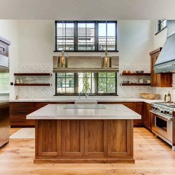
Clear Select Walnut - Artisan Inset Frame -
Custom Stain -
Shaker style -
Spice roll out -
Floating shelves -
Knife block roll out
Inspiration for a timeless u-shaped medium tone wood floor and brown floor kitchen remodel in Denver with a farmhouse sink, shaker cabinets, medium tone wood cabinets, stainless steel appliances and an island
Inspiration for a timeless u-shaped medium tone wood floor and brown floor kitchen remodel in Denver with a farmhouse sink, shaker cabinets, medium tone wood cabinets, stainless steel appliances and an island
 Echelon Builders, Inc.
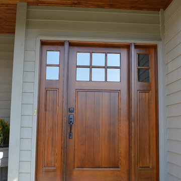
This beautiful Douglas Fir front entry door with side lights has a raised panel of tongue and groove and a rich custom stain that highlights the depth in the wood grain. The ceiling was covered with a cedar tongue and groove finished in the same custom stain.

 Michael Banys Artwork
Gray Birch at Chicago Botanic Garden.
Design ideas for a landscaping in San Francisco.
Design ideas for a landscaping in San Francisco.


Blanket Flower / Gaillardia aristata
Photo: Matt Lavin, licensed under Creative Commons Attribution-ShareAlike 2.0 Generic
This is an example of a landscaping in Other.
This is an example of a landscaping in Other.
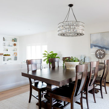
 Lindsey Brooke Design
Light and Bright with rich color and textures.
Photo by Amy Bartlam
Great room - coastal medium tone wood floor and beige floor great room idea in Orange County with white walls and a standard fireplace
Great room - coastal medium tone wood floor and beige floor great room idea in Orange County with white walls and a standard fireplace
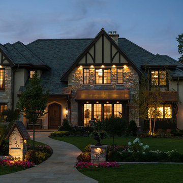
 Erotas Custom Building
Spacecrafing
Traditional beige two-story mixed siding house exterior idea in Minneapolis with a hip roof and a shingle roof
Traditional beige two-story mixed siding house exterior idea in Minneapolis with a hip roof and a shingle roof
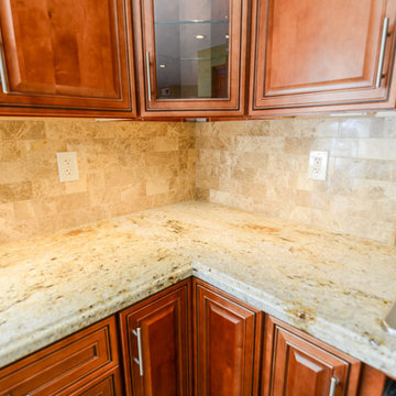
 TaylorPro Design and Remodeling, Inc.
"TaylorPro remodeled our kitchen, replacing cabinets, countertops and appliances. Keeping with the same footprint of our original kitchen and keeping our original travertine floors, Kerry Taylor helped us select a palette of rich, natural colors and materials--mocha-maple glazed cabinets, handsome granite and polished travertine backsplash tiles--to create a warm and beautiful new kitchen. He offered excellent design suggestions for placements of cabinetry and appliances. He recommended and implemented window trim enhancements as well as paint color and lighting design that brought the kitchen and attached family room together with a modern and very warm look. He created a rich, textured backsplash behind the stovetop that enhances the modern stainless steel vent hood. We couldn't be more pleased with the character and design of the kitchen and family room suite.
To begin with, Kerry gave us a detailed estimate covering the likely costs of labor, cabinetry, granite, tile backsplash, construction materials and appliances. His estimate for labor, granite and tile turned out to be ""spot-on"" accurate. Much to our surprise, for example, the granite slabs we selected from Daltile turned out to be exactly the price Kerry had estimated when evaluating the level of materials we would likely install in our kitchen. Kerry kept to his original labor costs, to the penny. Each week, he provided us with an invoice that showed, in percentages, exactly how much labor had been performed that week and how much remained to be done in future weeks. The amounts he charged each week for his labor were exact percentages of the amount of labor his crew had performed to that point. Though these invoices invited us to do a little math to confirm the accuracy of these percentages, Kerry's figures were consistently accurate.
The only categories in which Kerry's original estimate did not conform to the actual costs were in the areas of supplies from Home Depot (needed for the remodeling) and supplies from paint and hardware stores (needed for painting). These materials ended up costing somewhat more that Kerry had estimated. However, Kerry did provide us with receipts for all of these supplies.
Kerry's cabinet man, Jerry, made a very workable design using pre-fabricated cabinets; he then customized the sizes of at least half of these cabinets to conform to the requirements of the center island, cooktop and pantry spaces. We are very happy with the quality of the cabinets. We found the installation expertise of Jerry's installer, Gil, to be top-rate. His installation achieved a custom look and all the cupboards and drawers worked flawlessly.
Kerry's crew, Jake, Randall and Kevin, were great guys to have on site. They respected our property (and our dog) and possessed both skill and integrity. They arrived daily at the time they specified and worked tirelessly to achieve what they set out to do. We couldn't have been happier with their work. Kerry was on site frequently to supervise and coordinate their work and the work of subcontractors.
The project went quickly and efficiently, and the final result was outstanding. We recommend TaylorPro very highly."
~ Judy & Ron C, Clients
Photo By: Kerry W. Taylor

 Décor Aid
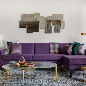
To create a soothing oasis for our busy bicoastal client, like we did for her Bay Area residence, we took cues from her petite NYC apartment’s architectural features and floor to ceiling windows as a foundational starting point for a luxurious interior design upgrade boasting brilliant décor and personality.
And to make the space have a similar feel to her San Francisco home, Décor Aid’s interior designer Victoria C. set about to create the same sense of comfort and consistency that we did for her first project with us.
Centered around her modern art collection, our client wanted a modern, fun, comfortable, and casual interior design upgrade for her apartment that boasted a light and airy feel along with a pulled-together sense of everyday urban glamor.
From room to room, Victoria’s main objective was to create a quick budget-friendly turnaround with furnishings that were neither too precious or required custom construction – everything needed to be ready on the go as you can imagine for a client with such a heavy, frequent commute.
For the living room, a transitional sectional in a rich purple hue was brought in for an easy sense of relaxed drama, was finished with pillows in complimentary jewel tones, and punctuated with a graphic cubist wall hanging featuring tonal shades of matte and muted gold.
In order to break away from the rooms angular lined furnishings, a rounded glass-topped coffee table was sourced to also make the living room appear larger than it is. And a white sculptural Eames chaise was introduced as a conversation starter and juxtaposition to the indulgent color scheme of the other furnishings.
For the den, Victoria placed a playful boldly hued collaged wall hanging above a somewhat traditional gray couch to emphasize a non-fussy approach to the room’s décor. While a modern rustic shelving unit was introduced to do triple duty as an entertainment center, a mini-library, and a spot to highlight decorative objects and collectibles.
 Steven Allen Designs, LLC
Photos By Simple Photography
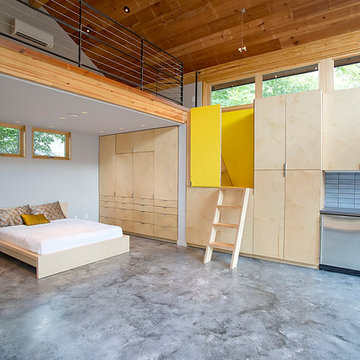
Custom Russian Birch Cabinets, Exposed & Sealed Rich Portland Concrete Flooring by Dungan Miller Design, Farrow & Ball Paint, Marvin Windows and Doors, LED Lighting & Reclaimed Historic Houston's Salvage Warehouse Shiplap Ceiling
 Castle Kitchens and Interiors
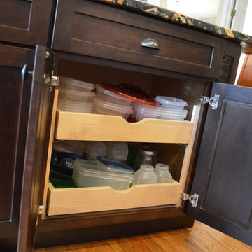
Kitchen design and photography by Jennifer Hayes of Castle Kitchens and Interiors
Arts and crafts u-shaped eat-in kitchen photo in Denver with recessed-panel cabinets, granite countertops, multicolored backsplash, stainless steel appliances, dark wood cabinets and an island
Arts and crafts u-shaped eat-in kitchen photo in Denver with recessed-panel cabinets, granite countertops, multicolored backsplash, stainless steel appliances, dark wood cabinets and an island

5