
Search results for "Scaled down options" in Home Design Ideas
 Axis Mundi
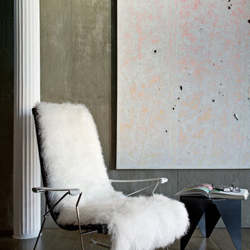
This NoHo apartment, in a landmarked circa 1870 building designed by Stephen Decatur Hatch and converted to lofts in 1987, had been interestingly renovated by a rock musician before being purchased by a young hedge fund manager and his gallery director girlfriend. Naturally, the couple brought to the project their collection of painting, photography and sculpture, mostly by young emerging artists. Axis Mundi accommodated these pieces within a neutral palette accented with occasional flashes of bright color that referenced the various artworks. Major furniture pieces – a sectional in the library, a 12-foot-long dining table–along with a rich blend of textures such as leather, linen, fur and warm woods, helped bring the sprawling dimensions of the loft down to human scale.
Photography: Mark Roskams
 Dale Tu Photography
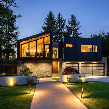
The home is split into two upper volumes suspended over a stone base, breaking down the mass and bulk of the building, to respect the scale of the neighborhood. The stone visually anchors the project to the ground, while the metal cladding provides a durable and low-maintenance material while maintaining a contemporary look. Stained cedar clads the inside of the volume, providing warmth and richness to the material palette, and creates a welcoming lantern-like effect at the entry during the evenings.
 Susan Yeley Homes
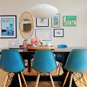
Our poster project for The Three P's, this small midcentury home south of campus has great bones but lacked vibrancy - a je ne sais quoi that the clients were searching to savoir once and for all. SYI worked with them to nail down a design direction and furniture plan, and they decided to invest in the big-impact items first: built-ins and lighting and a fresh paint job that included a beautiful deep blue-green line around the windows. The vintage rug was an Etsy score at an awesome price, but only after the client spent months scouring options and sources online that matched the vision and dimensions of the plan. A good year later, the West Elm sofa went on sale, so the client took advantage; some time after that, they painted the kitchen, created the drop zone / bench area, and rounded out the room with occasional tables and accessories. Their lesson: in patience, and details, there is beauty.
Photography by Gina Rogers Photography
Find the right local pro for your project
 Interior Analysis by Allan Skriloff
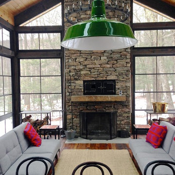
Post and beam addition. Windows are a plastic material and they slide up or down allowing the room to become a full screened in porch. Sofas convert to beds for summer sleeping,The dining table is metal with a Zinc top. Simple industrial chandelier over table
 Jameson Design Group
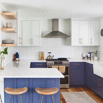
By moving the exterior wall to the patio out two feet, we were able to create an open kitchen/dining/living space in perfect proportion for this mid-century style home. This extra space allowed us to transform the existing galley kitchen into a U-shape with a peninsula bar. The blue base cabinets pack a punch of color, while the white uppers and backsplash create a light and airy space that looks bigger than the actual square footage.
 DesignARC
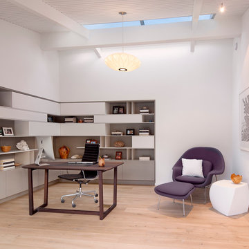
Inspired by DesignARC's Greenworth House, the owners of this 1960's single-story ranch house desired a fresh take on their out-dated, well-worn Montecito residence. Hailing from Toronto Canada, the couple is at ease in urban, loft-like spaces and looked to create a pared-down dwelling that could become their home.
Photo Credit: Jim Bartsch Photography
 Cantoni Atlanta
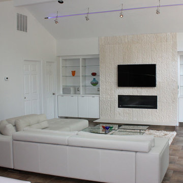
One can say that the redesign job on this Atlanta-area home was just what the doctor ordered, since physician Jim Linnane chose Cantoni designer Kohl Sudnikovich to help him re-imagine his 50s ranch-style residence.
Online browsing, and a fondness for modern design, led the medical professional into our Georgia store/" title="Cantoni Modern Furniture Stores" class="crosslinking">showroom after purchasing the 50s-built home in early 2011. Since then, walls were torn down, the kitchen got a facelift, a lone loft morphed in to a music room, and the fireplace got haute while the pool became cool.
As always, step one of the design process began with Kohl visiting the home to measure and scale-out floor plans. Next, ideas were tossed around and the client fell in love with the Mondrian sectional, in red. “Jim’s selection set the color scheme for the home’s living areas,” explains Kohl, “and he loves the punchy accents we added with art, both inside and out.”
“Kohl worked closely with me, from start to finish, and guided me through the entire process,” explains Jim. “He helped me find a great contractor, and I’m particularly fond of the plan he conceived to replace the dated fireplace with a more contemporary linear gas box set in striated limestone.”
Adds Kohl, “I love how we opened the loft and staircase walls by replacing them with metal and cable railings, and how we created a sitting area (in what was the dining room) to open to the living room we enhanced with mirrors.”
A creative fix, like re-facing the cabinets, drawers and door panels in the kitchen, illustrates how something simple (and not too pricey) can make a big impact.
The project, on a whole, is also a good example of how our full-service design studio and talented staff can help re-imagine and optimize your living space while working within your budget.
“Meeting and working with Kohl was such a great experience,” says Jim, in closing. “He is so talented. He came up with great design ideas to completely change the look of my home’s interior, and I think the results are amazing.” Guess what, Jim? We think the results of your collaboration with Kohl are pretty amazing, too.

Sponsored
Westerville, OH

Custom Home Works
Franklin County's Award-Winning Design, Build and Remodeling Expert
 Lewis & Associates Designs, llc
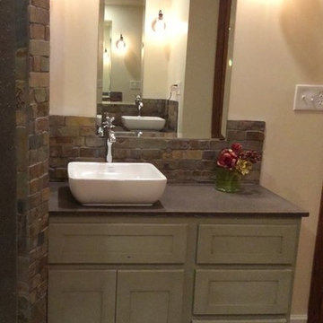
Sometimes the true inspiration for a space come from who the client's really are at heart. The owners of this center-hall colonial just didn't seem to match their house. Oh sure the space was cut up and horrendously decorated, but the true inspiration was the client's love for the horse world and their down-to-earth lifestyle.
Immediately, I blew out the walls of a space that was segregated into three little rooms; a dressing room, a vanity/tub room, and a shower/commode room. Using the supply and waste lines locations of the tub I was able to build them a custom shower area that better fit their lifestyle. Jumping on the old shower supply and waste lines, I was able to add a second vanity to this master suite.
The real magic came from the use of materials. I didn't want this to come off a "gitchy", over-the-top horse and barn motif but a space that spoke of an earthy naturalness. I chose materials that had a irregular, organic feel and juxtaposed them against a containing grid and strong vertical lines. The palette is intentionally simple so as not to overwhelm the strong saturation of the natural materials. The simplicity of line and the scale of the shapes are all designed to compliment the pungent earthiness of the well-chosen materials.
Now they have a room that "feels" like them, but allows them to interpret that as they enjoy the room for years to come!
 May Construction, Inc.
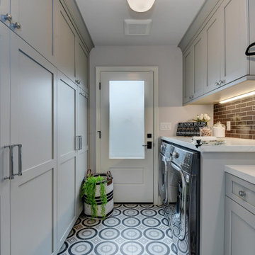
Down the hall, storage was key in designing this lively laundry room. Custom wall cabinets, shelves, and quartz countertop were great storage options that allowed plentiful organization when folding, placing, or storing laundry. Fun, cheerful, patterned floor tile and full wall glass backsplash make a statement all on its own and makes washing not such a bore. .
Budget analysis and project development by: May Construction
 CKS Residential
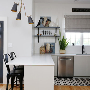
Inspiration for a scandinavian eat-in kitchen remodel in Raleigh with an undermount sink, white backsplash, stainless steel appliances and a peninsula
 Hard Topix LLC
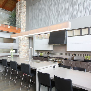
Custom Concrete Countertops are featured on this Kitchen Island and fireplace surround. The upper island piece was 14' long and was made in 1 piece without a seam. Both the fireplace surround and island feature drop down waterfall legs. www.hardtopix.com
 Mercury Mosaics and Tile
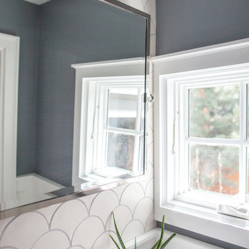
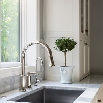
Moroccan Fish Scales in all white were the perfect choice to brighten and liven this small partial bath! Using a unique tile shape while keeping a monochromatic white theme is a great way to add pizazz to a bathroom that you and all your guests will love.
Large Moroccan Fish Scales – 301 Marshmallow
 Liz Schupanitz Designs
A PLACE TO GATHER
Location: Eagan, MN, USA
This family of five wanted an inviting space to gather with family and friends. Mom, the primary cook, wanted a large island with more organized storage – everything in its place – and a crisp white kitchen with the character of an older home.
Challenges:
Design an island that could accommodate this family of five for casual weeknight dinners.
Create more usable storage within the existing kitchen footprint.
Design a better transition between the upper cabinets on the 8-foot sink wall and the adjoining 9-foot cooktop wall.
Make room for more counter space around the cooktop. It was poorly lit, cluttered with small appliances and confined by the tall oven cabinet.
Solutions:
A large island, that seats 5 comfortably, replaced the small island and kitchen table. This allowed for more storage including cookbook shelves, a heavy-duty roll out shelf for the mixer, a 2-bin recycling center and a bread drawer.
Tall pantries with decorative grilles were placed between the kitchen and family room. These created ample storage and helped define each room, making each one feel larger, yet more intimate.
A space intentionally separates the upper cabinets on the sink wall from those on the cooktop wall. This created symmetry on the sink wall and made room for an appliance garage, which keeps the countertops uncluttered.
Moving the double ovens to the former pantry location made way for more usable counter space around the cooktop and a dramatic focal point with the hood, cabinets and marble backsplash.
Special Features:
Custom designed corbels and island legs lend character.
Gilt open lanterns, antiqued nickel grilles on the pantries, and the soft linen shade at the kitchen sink add personality and charm.
The unique bronze hardware with a living finish creates the patina of an older home.
A walnut island countertop adds the warmth and feel of a kitchen table.
This homeowner truly understood the idea of living with the patina of marble. Her grandmother’s marble-topped antique table inspired the Carrara countertops.
The result is a highly organized kitchen with a light, open feel that invites you to stay a while.
Liz Schupanitz Designs
Photographed by: Andrea Rugg


 Benson Homes LLC
Many families ponder the idea of adding extra living space for a few years before they are actually ready to remodel. Then, all-of-the sudden, something will happen that makes them realize that they can’t wait any longer. In the case of this remodeling story, it was the snowstorm of 2016 that spurred the homeowners into action. As the family was stuck in the house with nowhere to go, they longed for more space. The parents longed for a getaway spot for themselves that could also double as a hangout area for the kids and their friends. As they considered their options, there was one clear choice…to renovate the detached garage.
The detached garage previously functioned as a workshop and storage room and offered plenty of square footage to create a family room, kitchenette, and full bath. It’s location right beside the outdoor kitchen made it an ideal spot for entertaining and provided an easily accessible bathroom during the summertime. Even the canine family members get to enjoy it as they have their own personal entrance, through a bathroom doggie door.
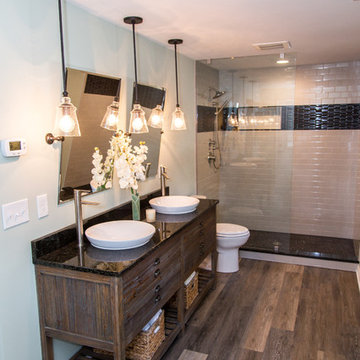
Our design team listened carefully to our client’s wishes to create a space that had a modern rustic feel and found selections that fit their aesthetic perfectly. To set the tone, Blackstone Oak luxury vinyl plank flooring was installed throughout. The kitchenette area features Maple Shaker style cabinets in a pecan shell stain, Uba Tuba granite countertops, and an eye-catching amber glass and antique bronze pulley sconce. Rather than use just an ordinary door for the bathroom entry, a gorgeous Knotty Alder barn door creates a stunning focal point of the room.
The fantastic selections continue in the full bath. A reclaimed wood double vanity with a gray washed pine finish anchors the room. White, semi-recessed sinks with chrome faucets add some contemporary accents, while the glass and oil-rubbed bronze mini pendant lights are a balance between both rustic and modern. The design called for taking the shower tile to the ceiling and it really paid off. A sliced pebble tile floor in the shower is curbed with Uba Tuba granite, creating a clean line and another accent detail.
The new multi-functional space looks like a natural extension of their home, with its matching exterior lights, new windows, doors, and sliders. And with winter approaching and snow on the way, this family is ready to hunker down and ride out the storm in comfort and warmth. When summer arrives, they have a designated bathroom for outdoor entertaining and a wonderful area for guests to hang out.
It was a pleasure to create this beautiful remodel for our clients and we hope that they continue to enjoy it for many years to come.
 Fredman Design Group
Designers gave the house a wood-and-steel façade that blends traditional and industrial elements.Photography by Eric Hausman
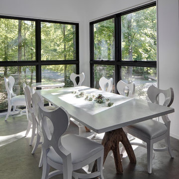
Designers gave the house a wood-and-steel façade that blends traditional and industrial elements. This home’s noteworthy steel shipping container construction material, offers a streamlined aesthetic and industrial vibe, with sustainable attributes and strength. Recycled shipping containers are fireproof, impervious to water and stronger than traditional building materials. Inside, muscular concrete walls, burnished cedar beams and custom oak cabinetry give the living spaces definition, decorative might, and storage and seating options.
For more than 40 years, Fredman Design Group has been in the business of Interior Design. Throughout the years, we’ve built long-lasting relationships with our clients through our client-centric approach. When creating designs, our decisions depend on the personality of our clients—their dreams and their aspirations. We manifest their lifestyle by incorporating elements of design with those of our clients to create a unique environment, down to the details of the upholstery and accessories. We love it when a home feels finished and lived in, with various layers and textures.
While each of our clients and their stories has varied over the years, they’ve come to trust us with their projects—whether it’s a single room to the larger complete renovation, addition, or new construction.
They value the collaborative team that is behind each project, embracing the diversity that each designer is able to bring to their project through their love of art, travel, fashion, nature, history, architecture or film—ultimately falling in love with the nurturing environments we create for them.
We are grateful for the opportunity to tell each of clients’ stories through design. What story can we help you tell?
Call us today to schedule your complimentary consultation - 312-587-9184
 Aspen Kitchens Inc.
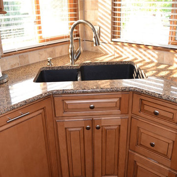
Inspiration for a mid-sized timeless l-shaped medium tone wood floor eat-in kitchen remodel in Denver with an undermount sink, raised-panel cabinets, medium tone wood cabinets, quartz countertops, beige backsplash, stone tile backsplash, paneled appliances and no island
 Susan Yeley Homes
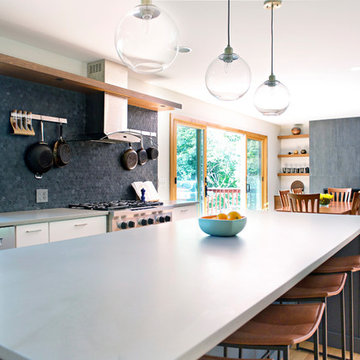
Two years before this photo shoot, a Bloomington couple came to SYI wondering whether to renovate their dated bi-level or upgrade to a new house entirely: the classic love-it-or-list-it dilemma. The whole house needed to be touched, really: bathrooms and kitchen, lighting and flooring and paint everywhere, not to mention new furniture to fill in and improve the living spaces. We spent a year with this family, considering options that were less transformative but allowed for the whole house to be upgraded, as well as options that dramatically changed the main living space but meant the rest of the house would have to wait. Meanwhile, they kept an eye out for better digs in town: a house at their price point, that met their family's needs and matched their aesthetic without major construction.
After a year of hunting, hemming and hawing: they pulled the trigger. Give us the whole enchilada in the kitchen and main living space, they said. There's no other house for us. The bathrooms and basement can wait. Make this space, where we spend all our time, a place we love to be.
Walls and ceilings came down; clerestory windows went in. A stunning 4-panel sliding door-cum-window wall replaced two separate doors in two separate rooms, and the sun streaming in now gives this house in Indiana a California-like access to the outdoors. The central custom screen does triple duty: displaying the client's objets d'art, hiding an HVAC chase, and holding up the ceiling. The gas fireplace is completely new, with custom shelving on either side. Of course, in 2017, the kitchen anchors everything. Family Central, it features custom cabinetry, honed quartz, a new window wall, and a huge island. Materials are earthy and natural, lending a warm modern effect to the space. The medium stain of the wood and overall horizontality of the design are a nod to the home's era (1967), while white cabinetry and charcoal tile provide a neutral but crisp backdrop for the family's stunning and colorful art collection.
The result: an ordinary bi-level is now an extraordinary home, unlike any other in Bloomington.
Contractor: Rusty Peterson Construction
Cabinetry: Tim Graber Furniture
Photography: Gina Rogers

Sponsored
Columbus, OH

Hope Restoration & General Contracting
Columbus Design-Build, Kitchen & Bath Remodeling, Historic Renovations
 Alair Homes Plano
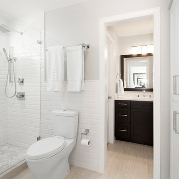
We loved updating this 1977 house giving our clients a more transitional kitchen, living room and powder bath. Our clients are very busy and didn’t want too many options. Our designers narrowed down their selections and gave them just enough options to choose from without being overwhelming.
In the kitchen, we replaced the cabinetry without changing the locations of the walls, doors openings or windows. All finished were replaced with beautiful cabinets, counter tops, sink, back splash and faucet hardware.
In the Master bathroom, we added all new finishes. There are two closets in the bathroom that did not change but everything else did. We.added pocket doors to the bedroom, where there were no doors before. Our clients wanted taller 36” height cabinets and a seated makeup vanity, so we were able to accommodate those requests without any problems. We added new lighting, mirrors, counter top and all new plumbing fixtures in addition to removing the soffits over the vanities and the shower, really opening up the space and giving it a new modern look. They had also been living with the cold and hot water reversed in the shower, so we also fixed that for them!
In their den, they wanted to update the dark paneling, remove the large stone from the curved fireplace wall and they wanted a new mantel. We flattened the wall, added a TV niche above fireplace and moved the cable connections, so they have exactly what they wanted. We left the wood paneling on the walls but painted them a light color to brighten up the room.
There was a small wet bar between the den and their family room. They liked the bar area but didn’t feel that they needed the sink, so we removed and capped the water lines and gave the bar an updated look by adding new counter tops and shelving. They had some previous water damage to their floors, so the wood flooring was replaced throughout the den and all connecting areas, making the transition from one room to the other completely seamless. In the end, the clients love their new space and are able to really enjoy their updated home and now plan stay there for a little longer!
Design/Remodel by Hatfield Builders & Remodelers | Photography by Versatile Imaging
Less
 Alair Homes Plano
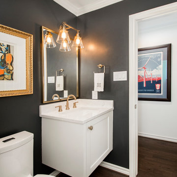
We loved updating this 1977 house giving our clients a more transitional kitchen, living room and powder bath. Our clients are very busy and didn’t want too many options. Our designers narrowed down their selections and gave them just enough options to choose from without being overwhelming.
In the kitchen, we replaced the cabinetry without changing the locations of the walls, doors openings or windows. All finished were replaced with beautiful cabinets, counter tops, sink, back splash and faucet hardware.
In the Master bathroom, we added all new finishes. There are two closets in the bathroom that did not change but everything else did. We.added pocket doors to the bedroom, where there were no doors before. Our clients wanted taller 36” height cabinets and a seated makeup vanity, so we were able to accommodate those requests without any problems. We added new lighting, mirrors, counter top and all new plumbing fixtures in addition to removing the soffits over the vanities and the shower, really opening up the space and giving it a new modern look. They had also been living with the cold and hot water reversed in the shower, so we also fixed that for them!
In their den, they wanted to update the dark paneling, remove the large stone from the curved fireplace wall and they wanted a new mantel. We flattened the wall, added a TV niche above fireplace and moved the cable connections, so they have exactly what they wanted. We left the wood paneling on the walls but painted them a light color to brighten up the room.
There was a small wet bar between the den and their family room. They liked the bar area but didn’t feel that they needed the sink, so we removed and capped the water lines and gave the bar an updated look by adding new counter tops and shelving. They had some previous water damage to their floors, so the wood flooring was replaced throughout the den and all connecting areas, making the transition from one room to the other completely seamless. In the end, the clients love their new space and are able to really enjoy their updated home and now plan stay there for a little longer!
Design/Remodel by Hatfield Builders & Remodelers | Photography by Versatile Imaging
Less
 Rylex Custom Cabinetry and Closets
Kara Lashuay
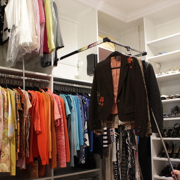
Walk-in closet - mid-sized contemporary women's walk-in closet idea in New York with flat-panel cabinets and white cabinets
Walk-in closet - mid-sized contemporary women's walk-in closet idea in New York with flat-panel cabinets and white cabinets
87