
Search results for "School going children" in Home Design Ideas
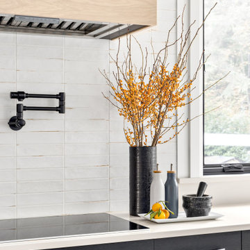
 Simply Home Decorating
This beautiful North Vancouver home belongs to a nature-loving and health-conscious couple, Emma and Vince (names changed), their two young children, and their dog, Jasper. When they contacted us about renovating and furnishing their kitchen and family room, we walked in and saw a world of potential waiting to be uncovered.
Before: Larkhall Crescent Home:
Like many original North Vancouver homes, the interior was definitely dated. We encountered late ‘80s finishes in powder pink and teal green, old carpet, and a kitchen that wasn’t maximized to suit this family’s modern-day lifestyle. However, the size of the rooms offered us a ton of space with which to get creative.
Knowing our clients’ love of cooking, need for work spaces (Emma and Vince both work remotely), and growing family, we developed a design concept that would increase usable space, optimize storage, and create intimacy in this large area. As for the style, we were inspired by their European roots, inventing a new and modern take on “Belgian Farmhouse” style. Now, the home is truly one-of-a-kind.
After: Warm & Cozy Family Room:
Fresh, bright, and comfortable, this living area has been transformed! We started with the fireplace as a focal point, selecting aged brick tiles for added texture and a crisp wood mantle. The taupe-coloured sectional infuses the room with visual warmth and serves the added purpose of separating the family room from the kitchen.
Emma and Vince were also keen on using non-toxic materials in their home, and we were happy to oblige. To meet their needs, we sourced natural wood elements and sought out Canadian-made products - that adhere to high health standards - whenever possible.
Look closer at the elements of this space, and you will find this stunning, honeycomb-patterned rug in earthy gold, beige, and charcoal tones. It’s plush to the touch and full of visual texture that brings this room’s colour palette together. We sourced these two-tone chairs with caning, petrified wood side table, black sconces, and botanical prints in greyscale from local artist, Heather Johnston.
We topped off the space with this dark wood and rattan console that offers storage facing the kitchen and presents an opportunity to display cherished items. The result is a cozy lounging space brimming with comfort and functionality. It’s perfect for enjoying quality family time, or Emma can simply slide the coffee table away to make room for her morning yoga practice.
Now, let’s turn around and give some attention to the kitchen. Do you remember what the original kitchen looked like? If not, scroll back up, because the transformation is shocking…
Moody & Welcoming Kitchen for Healthy Living:
This kitchen looks very different from how it started, right? Though we didn’t touch any walls, the kitchen has almost doubled in usable space! We created a long, extended island with storage, an outlet for small appliances, and seating for comfortable prep, after-school snacking, or mingling among friends.
On the other side of the island, the family has even more storage and an integrated dishwasher within easy reach of the sink, perfect for quick clean-up. From this angle, you can also see the expansive custom Shaker cabinetry in white and the integrated double ovens. These facilitate their cooking experience and gave us the opportunity to add an additional surprise…
A coffee garage station and more hidden storage! Keeping these items located along the perimeter allows them to be accessed by the family or their guests without someone getting under the cook’s feet. These are the little details that make everyday life easier and more enjoyable.
Moving deeper into the kitchen, the seamless induction cooktop topped with a freestanding concealed hood fan commands attention in a soft yet prominent way. The natural wood accent mirrors the fireplace mantle, and the choice of off-black wood-grain cabinets not only continues our black-and-white colour palette but adds a sense of depth and contrast. The corner sink is located to the right and perfectly positioned with a view of their thriving backyard.
To invite more of this family’s character into the space, we mixed metals for interest — matte black, dark pewter, and warm brass — and created open shelves in white oak for their plants and decor. You can also glimpse the tumbled edge of the backsplash tile, which echoes the rustic brick of the fireplace. It adds that farmhouse charm while still feeling timeless and sophisticated.
Last but not least, we designed this dining banquette in the bay window (with integrated bench storage, of course), where the family can share a meal together, the kids can do homework, or Emma and Vince can work and enjoy a change of scenery from their offices. Like the other spaces in the home, it was designed to be beautiful, multi-functional, and long-lasting.
Praise from Our Clients:
It is clear that we love this home, but what did our clients have to say?
“Lori is a visionary and masters execution to the finest detail all at the same time. When she first met us to know more about who we are and how we live, she could right away envision how we could use the space in our kitchen and living room…The results exceeded our expectations.
Lori and her team were also a delight to work with — coordination with all the trades, fast problem-solving, regular updates, professional and friendly attitude of her entire team — made it the dream team. Thank you SHD for making our space so beautiful!”
In turn, we are so grateful for this family’s trust, their open communication, and for being wonderful people with whom to work. (So, thank you!)

 Hearthstone Inc
Richard Herman is in the hospitality business and owns several upscale hotels in Florida and in other states as well as cattle ranches in both Florida and Missouri. Their farm in Ocala is by farm their most unique. The property serves as a 4-H demonstration project for the purpose of children’s education. They have been working with the Academy Prep of St. Pete which is dedicated to inner-city youths that are selected on the basis of need and achievement. Wife Diane spends her time on the farm raising Gypsy Vanners, a diminutive draft horse named after the job they did in Eastern Europe, pulling the wagons (vans) for gypsies that wandered across the continent. On the Ocala farm, there are several mules with a unique profession.
Richard had visited the Hearthstone display at a Log & Timber Home Shows at the Orlando Convention Center many years ago. He was impressed that Hearthstone had stayed in touch with him over the years by mailings, invitations to shows, and periodic phone calls. When the time came to start serious consideration of the design of barn, Hearthstone responded promptly and professionally to Richard and Diane’s requests for information and a review of their ideas for their barn, which would serve as the centerpiece for their new farm.
They wanted a multipurpose facility that could accommodate an educational environment and a large hall suitable for the fundraising events for his charities. Richard wanted a barn that reflected the look and feel of barns built at the dawn of the 20th century. Besides the rustic chicken houses and vegetable gardens, they have completely renovated a 1020’s era farmhouse to be as historically correct as possible and serves as the entry to the farm.
“They very careful to feel us out, get comfortable with our capabilities, and be convinced that we could perform as promised,” said Project Manager John Ricketson of Hearthstone.
Design Process
There were some initial drawings that gave us a start on the basic shape and size of the barn. From there, it was a process of narrowing down the uses of each area and the spans that could be achieved. The barn was going to have the traditional “board & batten” exterior siding and a metal roof. There is a cantilevered ‘hay hood” on the north gable end above the large sliding barn doors that open into the foyer and horse stalls. The wings house a combination of areas, beginning with the large restrooms to accommodate crowds for events. Other parts of the wings have garage areas for the farm vehicles, feed room, tack room, wash rack, storage, offices, and smaller restrooms.
Keeping with the look and feel of the turn of the century, Hearthstone developed a process for giving the timbers a surface texture that mimicked the circular cuts of timbers that had just come out of an old sawmill. This was easier said than done. Randy Giles guided his millwright (Wolfgang) in designing a machine that would do this effectively.
The barn was delivered in October of 2014 and was erected over the course of two weeks, thanks to a hardworking crew (Eric Foster) and near-perfect weather. After the Hearthstone crew completed the erection and roof dry-in, it was time for the local carpenters to step up and install some light conventional framing on the gable ends before applying the roof fascia and exterior board & batten siding. Next came the big sliding barn doors, plumbing, electrical, heating, and cooling. Large rustic fixtures were hung from the great hall roof timbers.
Exterior
The board & batten siding was cypress and allowed to turn color naturally as rain hit it and the sun started working on it with UV rays. This method causes a much grayer look closer to the ground and less so where the roof overhang provides protection. The North end has some large limestone boulders and planters arranged around the pad with tall pampas grass. The planters provide casual seating before events and during outside receptions. The entire area was sodded with lush St. Augustine grass and split rail fences were added to enclose the barn area. The corrugated metal roof was a special order material that immediately rusted after being exposed to moisture. The layer of rust protects the metal from the elements.
Interior
The board & batten theme was carried throughout most of the interior with the timbers left natural to show off the circular saw texture. All of the tongue & groove decking was shipped in advance to allow the local painter to pre-stain it with a dark brown transparent stain that is a beautiful background to the light color Eastern White Pine timbers.
“Everything was unique in this project” said Project Manager John Ricketson. “The setting on a small demonstration farm close to Ocala, the multipurpose design, the circular saw texture on the timbers.”
The Hermans are very proud of their farm’s outcome. Richard sent a note to Randy Giles, owner of Hearthstone: “The Barn is fantastic, not a single problem, period. Next month, we have Jo Dee Messina coming in to help with a fundraiser for a local center for abused kids. Folks love the farm, ...... but that barn gets all of the attention. I would encourage you to use me as a reference for your sales team, feel free to extend my cell phone to any prospective purchasers.”
 InnovationLand
We are so excited about this stylish Houston patio addition!
It's one of our most recent outdoor living space design projects - and one of our new favorites!
We particularly love the rustic corner fireplace, the beautiful, vaulted pine ceiling and the Restoration Hardware furniture and accessories.
"Even though this space has an outdoor kitchen - often the highlight of our projects - the focus here is beautiful, comfortable outdoor living," says Outdoor Homescapes of Houston owner Wayne Franks. "And I have to say, I think this is one of the most gorgeous spaces we've created for doing that - in style."
"This project was special from the start, as we were creating this space for a friend of Wayne’s who had been a long time mentor to his boys growing up," adds Lisha Maxey, owner of LGH Designs in Houston (she coordinated furniture and finishes for the project). "This client was the principal of their high school and knew all of them very well and Wayne, too. This made it very personal, indeed, and we wanted everything to be perfect!"
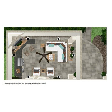
The 23- by 16-foot addition, located at the back of the house in Cypress, looks out onto a manmade lake in the homeowners' subdivision. The focal point? A 9-foot-8-inch-high-by-7-foot-wide corner fireplace in Earth Grey rustic ledgestone from Colorstone in Houston. The fireplace features a custom wooden mantel, stone bench seating and a 52-inch Sunbrite outdoor TV.
Another highlight is the flooring - silver travertine tile laid out in a Versailles pattern. "We chose silver travertine in a 'Tumbled' color palette with variations of cream and brown," says Lisha. "So we had those two colors, plus grey, to pull from."
The 7-foot-long, stucco outdoor kitchen island's countertops are also noteworthy - Absolute Black granite in a leathered finish offering a modern look and a dark grey hue that works perfectly with the color palette. The kitchen island also houses an RCS 30-inch grill and fridge.
The seating area includes a sectional couch, coffee table, two swivel chairs and two ottomans - all from Restoration Hardware.
"We used Restoration Hardware's Biscayne sectional, swivel chairs and ottomans in gray, with textured linen weave in Sand and cushions and peacock accent pillows in gray," says Lisha. The coffee table is made of solid teak with a concrete top - as is the matching side table.
"We added a console table, also in teak, behind the sofa. And for accents, we added three Amalfi lanterns from Restoration Hardware in weathered zinc."
A Sunbrella® Heathered area rug (in Gray) was added to anchor the space and visually tie it together.
"The space as a whole leans towards a transitional style, in that it has many traditional cozy comforts and colors, but the furniture gives it a more contemporary look," says Lisha. "The idea from the beginning was to marry these two styles, as our clients wanted a look that would not age and be in vogue for years to come."
On the exterior, you can see how we worked to make the addition blend with the existing home - matching the shingles and stucco and continuing the landscaping.
3D graphic renderings and a virtual video tour allowed the clients to know exactly what the space would look like beforehand.
"It takes a lot of the guesswork out of the process," says Outdoor Homescapes' graphic designer, Kristy Buell Franks. "Floor plans and elevation drawings are good for giving an idea of the overall scope of the project, but it's the 3D renderings that really show what the space is going to look like."
The 3D graphics and video tours also help immensely when choosing finishing materials and furniture, she says: "The clients' choices can be put into the design to allow the clients to see how the materials will work with the existing materials on the house and how the furniture will look in the space."
What do you like about this space? Post a comment and let us know!
URL
http://www.outdoorhomescapes.com
Find the right local pro for your project

 Envision Web
Stuart Wade, Envision Virtual Tours
The second-largest and most developed of Georgia's barrier islands, St. Simons is approximately twelve miles long and nearly three miles wide at its widest stretch (roughly the size of Manhattan Island in New York). The island is located in Glynn County on Georgia's coast and lies east of Brunswick (the seat of Glynn County), south of Little St. Simons Island and the Hampton River, and north of Jekyll Island. The resort community of Sea Island is separated from St. Simons on the east by the Black Banks River. Known for its oak tree canopies and historic landmarks, St. Simons is both a tourist destination and, according to the 2010 U.S. census, home to 12,743 residents.
Early History
The earliest
St. Simons Island Village
record of human habitation on the island dates to the Late Archaic Period, about 5,000 to 3,000 years ago. Remnants of shell rings left behind by Native Americans from this era survive on many of the barrier islands, including St. Simons. Centuries later, during the period known by historians as the chiefdom era, the Guale Indians established a chiefdom centered on St. Catherines Island and used St. Simons as their hunting and fishing grounds. By 1500 the Guale had established a permanent village of about 200 people on St. Simons, which they called Guadalquini.
Beginning in 1568, the Spanish attempted to create missions along the Georgia coast. Catholic missions were the primary means by which Georgia's indigenous Native American chiefdoms were assimilated into the Spanish colonial system along the northern frontier of greater Spanish Florida. In the 1600s St. Simons became home to two Spanish missions: San Buenaventura de Guadalquini, on the southern tip of the island, and Santo Domingo de Asao (or Asajo), on the northern tip. Located on the inland side of the island were the pagan refugee villages of San Simón, the island's namesake, and Ocotonico. In 1684 pirate raids left the missions and villages largely abandoned.
Colonial History
As
Fort Frederica
early as 1670, with Great Britain's establishment of the colony of Carolina and its expansion into Georgia territory, Spanish rule was threatened by the English. The Georgia coast was considered "debatable land" by England and Spain, even though Spain had fully retreated from St. Simons by 1702. Thirty-one years later General James Edward Oglethorpe founded the English settlement of Savannah. In 1736 he established Fort Frederica, named after the heir to the British throne, Frederick Louis, prince of Wales, on the west side of St. Simons Island to protect Savannah and the Carolinas from the Spanish threat.
Between 1736 and 1749 Fort Frederica was the hub of British military operations along the Georgia frontier. A town of the same name grew up around the fort and was of great importance to the new colony. By 1740 Frederica's population was 1,000. In 1736 the congregation of what would become Christ Church was organized within Fort Frederica as a mission of the Church of England. Charles Wesley led the first services. In 1742 Britain's decisive victory over Spain in the Battle of Bloody Marsh, during the War of Jenkins' Ear, ended the Spanish threat to the Georgia coast. When the British regimen disbanded in 1749, most of the townspeople relocated to the mainland. Fort Frederica went into decline and, except for a short time of prosperity during the 1760s and 1770s under the leadership of merchant James Spalding, never fully recovered. Today the historic citadel's tabby ruins are maintained by the National Park Service.
Plantation Era
By the start of the American Revolution (1775-83), Fort Frederica was obsolete, and St. Simons was left largely uninhabited as most of its residents joined the patriot army. Besides hosting a small Georgia naval victory on the Fort Frederica River, providing guns from its famous fort for use at Fort Morris in Sunbury, and serving as an arena for pillaging by privateers and British soldiers, the island played almost no role in the war.
Following the war, many of the townspeople, their businesses destroyed, turned to agriculture. The island was transformed into fourteen cotton plantations after acres of live oak trees were cleared for farm land and used for building American warships, including the famous USS Constitution, or "Old Ironsides." Although rice was the predominant crop along the neighboring Altamaha River, St. Simons was known for its production of long-staple cotton, which soon came to be known as Sea Island cotton.
Between
Ebos Landing
the 1780s and the outbreak of the Civil War (1861-65), St. Simons's plantation culture flourished. The saline atmosphere and the availability of cheap slave labor proved an ideal combination for the cultivation of Sea Island cotton. In 1803 a group of Ebo slaves who survived the Middle Passage and arrived on the west side of St. Simons staged a rebellion and drowned themselves. The sacred site is known today as Ebos Landing.
One of the largest owners of land and slaves on St. Simons was Pierce Butler, master of Hampton Point Plantation, located on the northern end of the island. By 1793 Butler owned more than 500 slaves, who cultivated 800 acres of cotton on St. Simons and 300 acres of rice on Butler's Island in the Altamaha River delta. Butler's grandson, Pierce Mease Butler, who at the age of sixteen inherited a share of his grandfather's estate in 1826, was responsible for the largest sale of human beings in the history of the United States: in 1859, to restore his squandered fortune, he sold 429 slaves in Savannah for more than $300,000. The British actress and writer Fanny Kemble, whose tumultuous marriage to Pierce ended in divorce in 1849, published an eyewitness account of the evils of slavery on St. Simons in her book Journal of a Residence on a Georgian Plantation in 1838-1839 (1863).
Another
Retreat Plantation
large owner of land and slaves on St. Simons was Major William Page, a friend and employee of Pierce Butler Sr. Before purchasing Retreat Plantation on the southwestern tip of the island in 1804, Page managed the Hampton plantation and Butler's Island. Upon Page's death in 1827, Thomas Butler King inherited the land together with his wife, Page's daughter, Anna Matilda Page King. King expanded his father-in-law's planting empire on St. Simons as well as on the mainland, and by 1835 Retreat Plantation alone was home to as many as 355 slaves.
The center of life during the island's plantation era was Christ Church, Frederica. Organized in 1807 by a group of island planters, the Episcopal church is the second oldest in the Diocese of Georgia. Embargoes imposed by the War of 1812 (1812-15) prevented the parishioners from building a church structure, so they worshiped in the home of John Beck, which stood on the site of Oglethorpe's only St. Simons residence, Orange Hall.
The first Christ Church building, finished on the present site in 1820, was ruined by occupying Union troops during the Civil War. In 1884 the Reverend Anson Dodge Jr. rebuilt the church as a memorial to his first wife, Ellen. The cruciform building with a trussed gothic roof and stained-glass windows remains active today as Christ Church.
Civil War and Beyond
The
St. Simons Island Lighthouse
outbreak of the Civil War in 1861 put a sudden end to St. Simons's lucrative plantation era. In January of that year, Confederate troops were stationed at the south end of the island to guard the entrance to Brunswick Harbor. Slaves from Retreat Plantation, owned by Thomas Butler King, built earthworks and batteries. Plantation residents were scattered—the men joined the Confederate army and their families moved to the mainland. Cannon fire was heard on the island in December 1861, and Confederate troops retreated in February 1862, after dynamiting the lighthouse to keep its beacon from aiding Union troops. Soon thereafter, Union troops occupied the island, which was used as a camp for freed slaves. By August 1862 more than 500 former slaves lived on St. Simons, including Susie King Taylor, who organized a school for freed slave children. But in November the ex-slaves were taken to Hilton Head, South Carolina, and Fernandina, Florida, leaving the island abandoned.
After the Civil War the island never returned to its status as an agricultural community. The plantations lay dormant because there were no slaves to work the fields. After Union general William T. Sherman's January 1865 Special Field Order No. 15 —a demand that former plantations be divided and distributed to former slaves—was overturned by U.S. president Andrew Johnson less than a year later, freedmen and women were forced to work as sharecroppers on the small farms that dotted the land previously occupied by the sprawling plantations.
By
St. Simons Lumber Mills
1870 real economic recovery began with the reestablishment of the timber industry. Norman Dodge and Titus G. Meigs of New York set up lumber mill operations at Gascoigne Bluff, formerly Hamilton Plantation. The lumber mills provided welcome employment for both blacks and whites and also provided mail and passenger boats to the mainland. Such water traffic, together with the construction of a new lighthouse in 1872, designed by architect Charles B. Cluskey, marked the beginning of St. Simons's tourism industry. The keeper of the lighthouse created a small amusement park, which drew many visitors, as did the seemingly miraculous light that traveled from the top of the lighthouse tower to the bottom. The island became a summer retreat for families from the mainland, particularly from Baxley, Brunswick, and Waycross.
The island's resort industry was thriving by the 1880s. Beachfront structures, such as a new pier and grand hotel, were built on the southeastern end of the island and could be accessed by ferry. Around this time wealthy northerners began vacationing on the island.
Twentieth Century
The
St. Simons Island Pier and Village
opening in 1924 of the Brunswick–St. Simons Highway, today known as the Torras Causeway, was a milestone in the development of resorts in the area. St. Simons's beaches were now easily accessible to locals and tourists alike. More than 5,000 automobiles took the short drive from Brunswick to St. Simons via the causeway on its opening day, paving the way for convenient residential and resort development.
In 1926 automotive pioneer Howard Coffin of Detroit, Michigan, bought large tracts of land on St. Simons, including the former Retreat Plantation, and constructed a golf course, yacht club, paved roads, and a residential subdivision. Although the causeway had brought large numbers of summer people to the island, St. Simons remained a small community with only a few hundred permanent residents until the 1940s.
The
St. Simons Island
outbreak of World War II (1941-45) brought more visitors and residents to St. Simons. Troops stationed at Jacksonville, Florida; Savannah; and nearby Camp Stewart took weekend vacations on the island, and a new naval air base and radar school became home to even more officers and soldiers. The increased wartime population brought the island its first public school. With a major shipyard for the production of Liberty ships in nearby Brunswick, the waters of St. Simons became active with German U-boats. In April 1942, just off the coast, the Texas Company oil tanker S. S. Oklahoma and the S. S. Esso Baton Rouge were torpedoed by the Germans, bringing the war very close to home for island residents.
Due in large part to the military's improvement of the island's infrastructure during the war, development on the island boomed in the 1950s and 1960s. More permanent homes and subdivisions were built, and the island was no longer just a summer resort but also a thriving community. In 1950 the Methodist conference and retreat center Epworth by the Sea opened on Gascoigne Bluff. In 1961 novelist Eugenia Price visited St. Simons and began work on her first works of fiction, known as the St. Simons Trilogy. Inspired by real events on the island, Price's trilogy renewed interest in the history of Georgia's coast, and the novelist herself relocated to the island in 1965 and lived there for thirty-one years. St. Simons is also home to contemporary Georgia writer Tina McElroy Ansa.
Since
Epworth by the Sea
1980 St. Simons's population has doubled. The island's continued status as a vacation destination and its ongoing development boom have put historic landmarks and natural areas at risk. While such landmarks as the Fort Frederica ruins and the Battle of Bloody Marsh site are preserved and maintained by the National Park Service, and while the historic lighthouse is maintained by the Coastal Georgia Historical Society, historic Ebos Landing has been taken over by a sewage treatment plant.
Several coastal organizations have formed in recent years to save natural areas on the island. The St. Simons Land Trust, for example, has received donations of large tracts of land and plans to protect property in the island's three traditional African American neighborhoods. Despite its rapid growth and development, St. Simons remains one of the most beautiful and important islands on the Georgia coast.
 United Signature
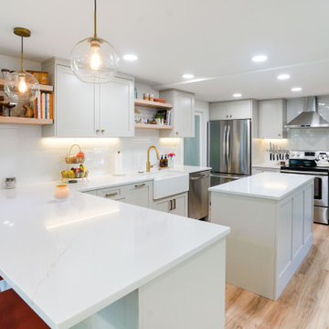
Full kitchen remodel opening to an open concept, contemporary style kitchen. Adding more lighting to lighten the room, relocated plumbing, focused on a more natural flow design, installed new flooring throughout, removed a brick chimney that separated the living room from the kitchen and patched up the roof. Lastly installed brand new drywall wall throughout.
 TKS Design Group
Free ebook, Creating the Ideal Kitchen. DOWNLOAD NOW
The Klimala’s and their three kids are no strangers to moving, this being their fifth house in the same town over the 20-year period they have lived there. “It must be the 7-year itch, because every seven years, we seem to find ourselves antsy for a new project or a new environment. I think part of it is being a designer, I see my own taste evolve and I want my environment to reflect that. Having easy access to wonderful tradesmen and a knowledge of the process makes it that much easier”.
This time, Klimala’s fell in love with a somewhat unlikely candidate. The 1950’s ranch turned cape cod was a bit of a mutt, but it’s location 5 minutes from their design studio and backing up to the high school where their kids can roll out of bed and walk to school, coupled with the charm of its location on a private road and lush landscaping made it an appealing choice for them.
“The bones of the house were really charming. It was typical 1,500 square foot ranch that at some point someone added a second floor to. Its sloped roofline and dormered bedrooms gave it some charm.” With the help of architect Maureen McHugh, Klimala’s gutted and reworked the layout to make the house work for them. An open concept kitchen and dining room allows for more frequent casual family dinners and dinner parties that linger. A dingy 3-season room off the back of the original house was insulated, given a vaulted ceiling with skylights and now opens up to the kitchen. This room now houses an 8’ raw edge white oak dining table and functions as an informal dining room. “One of the challenges with these mid-century homes is the 8’ ceilings. I had to have at least one room that had a higher ceiling so that’s how we did it” states Klimala.
The kitchen features a 10’ island which houses a 5’0” Galley Sink. The Galley features two faucets, and double tiered rail system to which accessories such as cutting boards and stainless steel bowls can be added for ease of cooking. Across from the large sink is an induction cooktop. “My two teen daughters and I enjoy cooking, and the Galley and induction cooktop make it so easy.” A wall of tall cabinets features a full size refrigerator, freezer, double oven and built in coffeemaker. The area on the opposite end of the kitchen features a pantry with mirrored glass doors and a beverage center below.
The rest of the first floor features an entry way, a living room with views to the front yard’s lush landscaping, a family room where the family hangs out to watch TV, a back entry from the garage with a laundry room and mudroom area, one of the home’s four bedrooms and a full bath. There is a double sided fireplace between the family room and living room. The home features pops of color from the living room’s peach grass cloth to purple painted wall in the family room. “I’m definitely a traditionalist at heart but because of the home’s Midcentury roots, I wanted to incorporate some of those elements into the furniture, lighting and accessories which also ended up being really fun. We are not formal people so I wanted a house that my kids would enjoy, have their friends over and feel comfortable.”
The second floor houses the master bedroom suite, two of the kids’ bedrooms and a back room nicknamed “the library” because it has turned into a quiet get away area where the girls can study or take a break from the rest of the family. The area was originally unfinished attic, and because the home was short on closet space, this Jack and Jill area off the girls’ bedrooms houses two large walk-in closets and a small sitting area with a makeup vanity. “The girls really wanted to keep the exposed brick of the fireplace that runs up the through the space, so that’s what we did, and I think they feel like they are in their own little loft space in the city when they are up there” says Klimala.
Designed by: Susan Klimala, CKD, CBD
Photography by: Carlos Vergara
For more information on kitchen and bath design ideas go to: www.kitchenstudio-ge.com

 ZeroEnergy Design
This LEED Platinum certified house reflects the homeowner's desire for an exceptionally healthy and comfortable living environment, within a traditional neighborhood.
INFILL SITE. The family, who moved from another area of Wellesley, sought out this property to be within walking distance of the high school and downtown area. An existing structure on the tight lot was removed to make way for the new home. 84% of the construction waste, from both the previous structure and the new home, was diverted from a landfill. ZED designed to preserve the existing mature trees on the perimeter of the property to minimize site impacts, and to maintain the character of the neighborhood as well as privacy on the site.
EXTERIOR EXPRESSION. The street facade of the home relates to the local New England vernacular. The rear uses contemporary language, a nod to the family’s Californian roots, to incorporate a roof deck, solar panels, outdoor living space, and the backyard swimming pool. ZED’s careful planning avoided to the need to face the garage doors towards the street, a common syndrome of a narrow lot.
THOUGHTFUL SPACE. Homes with dual entries can often result in duplicate and unused spaces. In this home, the everyday and formal entry areas are one and the same; the front and garage doors share the entry program of coat closets, mudroom storage with bench for removing your shoes, and a laundry room with generous closets for the children's sporting equipment. The entry area leads directly to the living space, encompassing the kitchen, dining and sitting area areas in an L-shaped open plan arrangement. The kitchen is placed at the south-west corner of the space to allow for a strong connection to the dining, sitting and outdoor living spaces. A fire pit on the deck satisfies the family’s desire for an open flame while a sealed gas fireplace is used indoors - ZED’s preference after omitting gas burning appliances completely from an airtight home. A small study, with a window seat, is conveniently located just off of the living space. A first floor guest bedroom includes an accessible bathroom for aging visitors and can be used as a master suite to accommodate aging in place.
HEALTHY LIVING. The client requested a home that was easy to clean and would provide a respite from seasonal allergies and common contaminants that are found in many indoor spaces. ZED selected easy to clean solid surface flooring throughout, provided ample space for cleaning supplies on each floor, and designed a mechanical system with ventilation that provides a constant supply of fresh outdoor air. ZED selected durable materials, finishes, cabinetry, and casework with low or no volatile organic compounds (VOCs) and no added urea formaldehyde.
YEAR-ROUND COMFORT. The home is super insulated and air-tight, paired with high performance triple-paned windows, to ensure it is draft-free throughout the winter (even when in front of the large windows and doors). ZED designed a right-sized heating and cooling system to pair with the thermally improved building enclosure to ensure year-round comfort. The glazing on the home maximizes passive solar gains, and facilitates cross ventilation and daylighting.
ENERGY EFFICIENT. As one of the most energy efficient houses built to date in Wellesley, the home highlights a practical solution for Massachusetts. First, the building enclosure reduces the largest energy requirement for typical houses (heating). Super-insulation, exceptional air sealing, a thermally broken wall assembly, triple pane windows, and passive solar gain combine for a sizable heating load reduction. Second, within the house only efficient systems consume energy. These include an air source heat pump for heating & cooling, a heat pump hot water heater, LED lighting, energy recovery ventilation, and high efficiency appliances. Lastly, photovoltaics provide renewable energy help offset energy consumption. The result is an 89% reduction in energy use compared to a similar brand new home built to code requirements.
RESILIENT. The home will fare well in extreme weather events. During a winter power outage, heat loss will be very slow due to the super-insulated and airtight envelope– taking multiple days to drop to 60 degrees even with no heat source. An engineered drainage system, paired with careful the detailing of the foundation, will help to keep the finished basement dry. A generator will provide full operation of the all-electric house during a power outage.
OVERALL. The home is a reflection of the family goals and an expression of their values, beautifully enabling health, comfort, safety, resilience, and utility, all while respecting the planet.
ZED - Architect & Mechanical Designer
Bevilacqua Builders Inc - Contractor
Creative Land & Water Engineering - Civil Engineering
Barbara Peterson Landscape - Landscape Design
Nest & Company - Interior Furnishings
Eric Roth Photography - Photography

 Advance Design Studio, Ltd.
Jackie and Sean loved the Algonquin neighborhood they lived in with the peaceful neighborhood and the close proximity to work and school. What they didn’t love was how outdated their home had become. With a cramped kitchen and an unused dining room, they decided a remodel was the perfect solution to their problem. They would be able to continue to live in the area they loved, while at the same time they could have the dream home they envisioned.
After a thorough search, Jackie came across Advance Design Studio. She was impressed by all of the positive reviews she saw on the internet and saw herself identifying with all of the project stories she saw on the website. Once they met with designer Scott Christensen and owner Todd Jurs, they knew Advance Design was the right company to make their dreams a reality.
The project consisted of four main areas: the kitchen/dining/powder room, the laundry room, the master bathroom, and the kid’s bathroom. They wanted to expand the kitchen into the seldom used dining room and add a large island for hosting parties and family gatherings. They also wanted new hardwood flooring throughout the first level. The laundry room needed to be more functional, and all three bathrooms were in dire need of updating.
The closed off kitchen was opened up to create a sweeping space between the new eating area and the much larger kitchen. A handsome dry bar complete with a beverage refrigerator and lighted glass door cabinetry makes an elegant transition across from a peninsula area filled with storage. An additional decorative cabinet lighting up elegant dishware through the mullioned glass sits directly across from the drybar.
An expansive island was critical to the kitchen plans. Jackie, Sean and Scott worked closely together to create just the right details for their design. They wanted the island to be functional in addition to being the centerpiece of the room. Added storage for the kid’s school supplies was hidden behind cabinet doors so the children could do their schoolwork right at the island, and a microwave drawer glides open with the touch of a finger hidden inconspicuously within the island space. The easy to care for Cambria Britannica Quartz island top with its sweeping grey and white marble look perched atop hand-carved Craftsman corbels was absolutely what they were hoping for, blending both beauty and function perfectly.
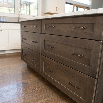
Adding a nice contrast to the brightness of the quartz and the white cabinetry, Kodiak - Leather granite countertops were used to balance the light and dark tones of the space. Dura Supreme Classic White painted cabinets grace the perimeter, while Maple Poppy Seed stained cabinets with a beautiful soft grey woodgrain were used in the beverage center and island. The two tones compliment the large space balancing it out nicely creating interest and elegance with the simple Craftsman style full overlay doors.
A deep warm Barnwood White Oak flooring was added throughout the lower level. The new floor brings additional contrast to the bright kitchen and provides unity with the now open floorplan as it rolls in to the foyer and family room. Final details like the show-stopping lunar like duo light fixtures complete the space and intermix expertly with crisscross details of the glass door mullions, the island bar seating and even accessories in the space.
The small cluttered laundry room needed more space and more storage. With a busy family it seemed to overflow daily and did not have anywhere to hide the families “in and out stuff.” Scott designed the new space with a stackable washer and dryer and much more efficiently organized cabinetry. Doing laundry is now (almost!) a pleasure and keeping everyone’s “stuff” hidden, but readily accessible is now a snap.
The master bath was not a place where the couple enjoyed spending time getting ready for their day. The tub almost never was used, so removing it made it possible to build an extra-large shower, replacing the small cramped cube of the previous shower they hated. Clean, horizontal lines softly draw your eye around the space with porcelain tile called Driftwood Sea spray. Full overlay cabinetry in a soft white vanity with double sinks makes getting ready for the day much more convenient for the busy couple.
Long floor planks made of porcelain tile mimic real hardwood floors in a soft grey to compliment the shower, but with the ease and care of a tile surface. Cambrian Black Granite counters with a matte finish and under mount porcelain sinks with handsome brushed chrome hardware complete the handsome space. A real bonus in any master bath; a custom built in storage nook was tucked in the corner of the space for linens and heavenly storage.
The kid’s bath was in sad shape because it was original to the house. To keep the budget in control, the tub which was in great condition was retained, but focus was on the new large brick style porcelain charcoal tile on the floor, crisp white new Craftsman style cabinetry with pretty furniture details on the corner base, a striking granite top with white under mount porcelain sinks and fresh hardware and faucets. Some beautiful soft grey wood mirrors to match mom and dads were custom sized and placed under new lighting, and 4 hooks were smartly arranged down the wall for kids’ towels.
This couple was determined not to move, and made their house their dream home. Not only does their home function greatly now, but Jackie says, “When the neighbors come to visit, they’re asking if they can “steal” the design”! The added functionality, elegance, and open floor plan were exactly what this family needed in order to stay.
Advance Design Studio, Joe Nowak

 Legendary Escapes Pools
This project began as a wilderness retreat for the homeowners at their rural estate. They already had a large outdoor area complete with a pond, and detached garage in the perfect location to tie into an outdoor entertaining area/kitchen for the swimming pool. The homeowners were hoping that the design team at Legendary Escapes could create something magical for their small grandchildren, and for the grownups to enjoy for summertime relaxation.
When the discussion turned to themes, the cartoon SpongeBob came up, and our team found a direction to go, either to the homeowners delight, possibly mixed with a bit of apprehension at the thought of a cartoony theme as a result. We promised subtle surprise and delight - and the homeowner decided to let the team go with their vision. The pool is a very abundant sized swimming pool, much larger than the average residential swimming pool. The sunledge was also made larger after the pool layout, providing even more space for chairs and play area for small children. One of the special surprises the owners didn't even know about until after they were in were the secret port holes that were re-seated with magnifying glass - and showcased miniature characters behind them, that when viewed through the glass looked giant in size.
The waterfall/slide combination also features a large grotto - themed and decorated with elements that remind visitors to the space of the lessons and themes of the cartoon. The castle is solid, carved concrete - mixed and sculpted on site and hand placed. As the waterfall began to take shape, the outside was created as a sand castle, providing the perfect whimsical backdrop for the slide, and accents including a pair of flipper outfitted legs of what we can only think is mermaid man.
One of the biggest surprises on this project came when Al found an old wooden boat at an auction, which he bought, took back to the job and cut it in half - creating the tail end of a boating incident, much like SpongeBob would have had when he missed the direction of the curve sign while out boating. (The joke in the show is that he can't ever get his drivers license because he doesn't know how to steer.) The other end of the boat became a vertical storage space for firewood or other pool side needs. The two parts of the boat became anchor pieces for what became the "wharf wall" which is the perfect area to lead people into the swimming pool retreat.
The pool has three different entertaining patio levels, including the lower wharf level, swim up bar and raised concrete counter at the deep end of the pool. The middle section of patio is perfect for relaxing and watching kids play in the pool with the deck jets and sun ledge, and the upper area is adjacent to the outdoor kitchen area, also designed and created out of concrete (carved timbers) as the cabinetry and under bar areas.
The pool was completed with ecoFinish on the sun ledge, interior of the spa, grotto and the slide. The main swimming area of the pool was vinyl liner, constructed in the special hybrid way of the team.
With the project complete, the homeowners and family thoroughly enjoyed their backyard retreat. Any hesitation at the initial theme ideas were fully appreciated as they developed along the way, with the final project a subtle blend of function and whimsy, meeting everything that they could have asked for in a backyard entertaining retreat. Their advice is to just trust Al and the team through the process, because the results will be more than you would ever hope for. If our team can help you create a backyard or custom retreat, which includes a pool and plenty of outdoor entertaining options to surprise and delight you and your family, please reach out to start your design discussions.
 Margali & Flynn Designs
Interior and Exterior Design Project
This was an exciting interior and exterior design project for This house was purchased directly from a builder by a vibrant career couple with active children and a love for spending time with their extended family and friends. While it was presented to us empty, we still had input on the flooring, lighting, cabinetry, moldings and wall colors. We decided to go with a transitional design style and bring in furnishings with an emphasis on being comfortable for their large family and frequent family gatherings.
With a love for family gatherings and entertainment of the immediate and extended family we knew from the start that our design had to be beautiful, very functional and durable. Having worked with the this couple’s parents and sister we knew the family, their style and preferences. We knew this multi generational family loved being and entertaining with each other and we knew from the start that our design had to be beautiful, very functional and durable.
Since the family room and living room are connected we designed a seamless flow between them and unique ways to share the some of the furnishings between them. We began with a large sectional with cozy seating in the family room. We brought in extra swivel chairs guests could turn to the living room to converse with guests or swivel family room to and see TV. We love ottomans for extra seating in living room to accommodate 8 and can be pulled into the family room for additional seating. The carpet was selected with family in mind to look beautiful, functional and easy to clean.
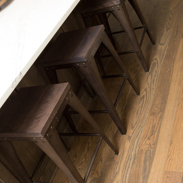
En route from the family room to the kitchen eating area we designed a fully accessorized bookcase that complimented perfectly the custom built “only by Margali and Flynn” built in desk with hid-a-way doors hide homework and and paperwork when needed. In the kitchen we created a family dining center on the large central island with lots of stools.
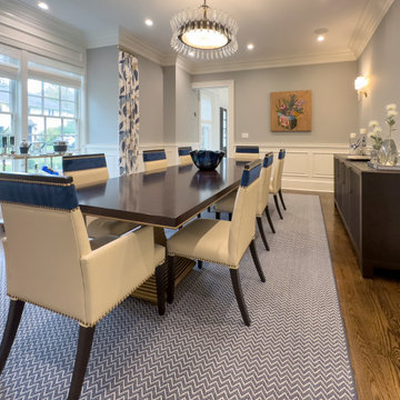
In the dining area we installed beautiful dining set with functional leather fabric. We used suede with nailheads, a herringbone wool carpet and transitional circular lighting to compliment the traditional colors of warm blues and neutrals … all working together to create a sophisticated and comfortable feel.
 Hearthstone Inc
Richard Herman is in the hospitality business and owns several upscale hotels in Florida and in other states as well as cattle ranches in both Florida and Missouri. Their farm in Ocala is by farm their most unique. The property serves as a 4-H demonstration project for the purpose of children’s education. They have been working with the Academy Prep of St. Pete which is dedicated to inner-city youths that are selected on the basis of need and achievement. Wife Diane spends her time on the farm raising Gypsy Vanners, a diminutive draft horse named after the job they did in Eastern Europe, pulling the wagons (vans) for gypsies that wandered across the continent. On the Ocala farm, there are several mules with a unique profession.
Richard had visited the Hearthstone display at a Log & Timber Home Shows at the Orlando Convention Center many years ago. He was impressed that Hearthstone had stayed in touch with him over the years by mailings, invitations to shows, and periodic phone calls. When the time came to start serious consideration of the design of barn, Hearthstone responded promptly and professionally to Richard and Diane’s requests for information and a review of their ideas for their barn, which would serve as the centerpiece for their new farm.
They wanted a multipurpose facility that could accommodate an educational environment and a large hall suitable for the fundraising events for his charities. Richard wanted a barn that reflected the look and feel of barns built at the dawn of the 20th century. Besides the rustic chicken houses and vegetable gardens, they have completely renovated a 1020’s era farmhouse to be as historically correct as possible and serves as the entry to the farm.
“They very careful to feel us out, get comfortable with our capabilities, and be convinced that we could perform as promised,” said Project Manager John Ricketson of Hearthstone.
Design Process
There were some initial drawings that gave us a start on the basic shape and size of the barn. From there, it was a process of narrowing down the uses of each area and the spans that could be achieved. The barn was going to have the traditional “board & batten” exterior siding and a metal roof. There is a cantilevered ‘hay hood” on the north gable end above the large sliding barn doors that open into the foyer and horse stalls. The wings house a combination of areas, beginning with the large restrooms to accommodate crowds for events. Other parts of the wings have garage areas for the farm vehicles, feed room, tack room, wash rack, storage, offices, and smaller restrooms.
Keeping with the look and feel of the turn of the century, Hearthstone developed a process for giving the timbers a surface texture that mimicked the circular cuts of timbers that had just come out of an old sawmill. This was easier said than done. Randy Giles guided his millwright (Wolfgang) in designing a machine that would do this effectively.
The barn was delivered in October of 2014 and was erected over the course of two weeks, thanks to a hardworking crew (Eric Foster) and near-perfect weather. After the Hearthstone crew completed the erection and roof dry-in, it was time for the local carpenters to step up and install some light conventional framing on the gable ends before applying the roof fascia and exterior board & batten siding. Next came the big sliding barn doors, plumbing, electrical, heating, and cooling. Large rustic fixtures were hung from the great hall roof timbers.
Exterior
The board & batten siding was cypress and allowed to turn color naturally as rain hit it and the sun started working on it with UV rays. This method causes a much grayer look closer to the ground and less so where the roof overhang provides protection. The North end has some large limestone boulders and planters arranged around the pad with tall pampas grass. The planters provide casual seating before events and during outside receptions. The entire area was sodded with lush St. Augustine grass and split rail fences were added to enclose the barn area. The corrugated metal roof was a special order material that immediately rusted after being exposed to moisture. The layer of rust protects the metal from the elements.
Interior
The board & batten theme was carried throughout most of the interior with the timbers left natural to show off the circular saw texture. All of the tongue & groove decking was shipped in advance to allow the local painter to pre-stain it with a dark brown transparent stain that is a beautiful background to the light color Eastern White Pine timbers.
“Everything was unique in this project” said Project Manager John Ricketson. “The setting on a small demonstration farm close to Ocala, the multipurpose design, the circular saw texture on the timbers.”
The Hermans are very proud of their farm’s outcome. Richard sent a note to Randy Giles, owner of Hearthstone: “The Barn is fantastic, not a single problem, period. Next month, we have Jo Dee Messina coming in to help with a fundraiser for a local center for abused kids. Folks love the farm, ...... but that barn gets all of the attention. I would encourage you to use me as a reference for your sales team, feel free to extend my cell phone to any prospective purchasers.”

 Cantoni Los Angeles
It’s warm in Southern California, and that’s exactly the feeling Andy and Liz sought to maintain inside their new Tuscan-style home as they embarked on a modern interior makeover. After all, the couple had two small children and a dog to consider. Empty and austere simply wasn’t a good fit for the young family whose interests include photography, art and lots of Lego’s.
Andy, an engineer, became intrigued with Cantoni after driving past the Irvine location on his daily commute. It wasn’t long before he and Liz decided to venture into the Los Angeles showroom, and that’s where they met Bernadette. By all accounts, the trio made for great collaboration, and the project that began in February 2012 is still a work in progress today.
“We were impressed by Bernadette,” says Andy. “We liked her and her work, and she won us over.”
The project began with pictures sent and an in-home walk-through where measurements were taken. The couple knew they wanted furnishings for the living, dining and family rooms, as well as the media room and a study. They were open to art and accent pieces, and hoped to incorporate natural elements into the mix. Bernadette set to work.
“It was fun touring our LA showroom and listening to Liz and Andy discuss their likes and dislikes. One thing was for sure,” she adds, “the Laguna Sectional was going in their theater room even if we needed to knock out a wall!”
UpstairsPhase I of the job is complete (as you can see from the stunning images), but instead of parting ways, Andy and Liz decided to have Bernadette help re-imagine the master bedroom and kitchen, next. The ongoing nature of this project illustrates a trend we see with most of our clients: we build trusted, long-term relationships. It’s not about the transaction, but about great design, the design process, and the ability of our talented staff to help clients create the lifestyles they want.
As always, there’s plenty to love about the products seen in our feature stories. To help you shop the look, we’re introducing a Featured Products page via a link to the images in each story. We’ve also redesigned our site to make sourcing and finding that just-right piece a breeze.
 Advance Design Studio, Ltd.
Jackie and Sean loved the Algonquin neighborhood they lived in with the peaceful neighborhood and the close proximity to work and school. What they didn’t love was how outdated their home had become. With a cramped kitchen and an unused dining room, they decided a remodel was the perfect solution to their problem. They would be able to continue to live in the area they loved, while at the same time they could have the dream home they envisioned.
After a thorough search, Jackie came across Advance Design Studio. She was impressed by all of the positive reviews she saw on the internet and saw herself identifying with all of the project stories she saw on the website. Once they met with designer Scott Christensen and owner Todd Jurs, they knew Advance Design was the right company to make their dreams a reality.
The project consisted of four main areas: the kitchen/dining/powder room, the laundry room, the master bathroom, and the kid’s bathroom. They wanted to expand the kitchen into the seldom used dining room and add a large island for hosting parties and family gatherings. They also wanted new hardwood flooring throughout the first level. The laundry room needed to be more functional, and all three bathrooms were in dire need of updating.
The closed off kitchen was opened up to create a sweeping space between the new eating area and the much larger kitchen. A handsome dry bar complete with a beverage refrigerator and lighted glass door cabinetry makes an elegant transition across from a peninsula area filled with storage. An additional decorative cabinet lighting up elegant dishware through the mullioned glass sits directly across from the drybar.
An expansive island was critical to the kitchen plans. Jackie, Sean and Scott worked closely together to create just the right details for their design. They wanted the island to be functional in addition to being the centerpiece of the room. Added storage for the kid’s school supplies was hidden behind cabinet doors so the children could do their schoolwork right at the island, and a microwave drawer glides open with the touch of a finger hidden inconspicuously within the island space. The easy to care for Cambria Britannica Quartz island top with its sweeping grey and white marble look perched atop hand-carved Craftsman corbels was absolutely what they were hoping for, blending both beauty and function perfectly.
Adding a nice contrast to the brightness of the quartz and the white cabinetry, Kodiak - Leather granite countertops were used to balance the light and dark tones of the space. Dura Supreme Classic White painted cabinets grace the perimeter, while Maple Poppy Seed stained cabinets with a beautiful soft grey woodgrain were used in the beverage center and island. The two tones compliment the large space balancing it out nicely creating interest and elegance with the simple Craftsman style full overlay doors.
A deep warm Barnwood White Oak flooring was added throughout the lower level. The new floor brings additional contrast to the bright kitchen and provides unity with the now open floorplan as it rolls in to the foyer and family room. Final details like the show-stopping lunar like duo light fixtures complete the space and intermix expertly with crisscross details of the glass door mullions, the island bar seating and even accessories in the space.
The small cluttered laundry room needed more space and more storage. With a busy family it seemed to overflow daily and did not have anywhere to hide the families “in and out stuff.” Scott designed the new space with a stackable washer and dryer and much more efficiently organized cabinetry. Doing laundry is now (almost!) a pleasure and keeping everyone’s “stuff” hidden, but readily accessible is now a snap.
The master bath was not a place where the couple enjoyed spending time getting ready for their day. The tub almost never was used, so removing it made it possible to build an extra-large shower, replacing the small cramped cube of the previous shower they hated. Clean, horizontal lines softly draw your eye around the space with porcelain tile called Driftwood Sea spray. Full overlay cabinetry in a soft white vanity with double sinks makes getting ready for the day much more convenient for the busy couple.
Long floor planks made of porcelain tile mimic real hardwood floors in a soft grey to compliment the shower, but with the ease and care of a tile surface. Cambrian Black Granite counters with a matte finish and under mount porcelain sinks with handsome brushed chrome hardware complete the handsome space. A real bonus in any master bath; a custom built in storage nook was tucked in the corner of the space for linens and heavenly storage.
The kid’s bath was in sad shape because it was original to the house. To keep the budget in control, the tub which was in great condition was retained, but focus was on the new large brick style porcelain charcoal tile on the floor, crisp white new Craftsman style cabinetry with pretty furniture details on the corner base, a striking granite top with white under mount porcelain sinks and fresh hardware and faucets. Some beautiful soft grey wood mirrors to match mom and dads were custom sized and placed under new lighting, and 4 hooks were smartly arranged down the wall for kids’ towels.
This couple was determined not to move, and made their house their dream home. Not only does their home function greatly now, but Jackie says, “When the neighbors come to visit, they’re asking if they can “steal” the design”! The added functionality, elegance, and open floor plan were exactly what this family needed in order to stay.
Advance Design Studio, Joe Nowak

 Cantoni Los Angeles
It’s warm in Southern California, and that’s exactly the feeling Andy and Liz sought to maintain inside their new Tuscan-style home as they embarked on a modern interior makeover. After all, the couple had two small children and a dog to consider. Empty and austere simply wasn’t a good fit for the young family whose interests include photography, art and lots of Lego’s.
Andy, an engineer, became intrigued with Cantoni after driving past the Irvine location on his daily commute. It wasn’t long before he and Liz decided to venture into the Los Angeles showroom, and that’s where they met Bernadette. By all accounts, the trio made for great collaboration, and the project that began in February 2012 is still a work in progress today.
“We were impressed by Bernadette,” says Andy. “We liked her and her work, and she won us over.”
The project began with pictures sent and an in-home walk-through where measurements were taken. The couple knew they wanted furnishings for the living, dining and family rooms, as well as the media room and a study. They were open to art and accent pieces, and hoped to incorporate natural elements into the mix. Bernadette set to work.
“It was fun touring our LA showroom and listening to Liz and Andy discuss their likes and dislikes. One thing was for sure,” she adds, “the Laguna Sectional was going in their theater room even if we needed to knock out a wall!”
UpstairsPhase I of the job is complete (as you can see from the stunning images), but instead of parting ways, Andy and Liz decided to have Bernadette help re-imagine the master bedroom and kitchen, next. The ongoing nature of this project illustrates a trend we see with most of our clients: we build trusted, long-term relationships. It’s not about the transaction, but about great design, the design process, and the ability of our talented staff to help clients create the lifestyles they want.
As always, there’s plenty to love about the products seen in our feature stories. To help you shop the look, we’re introducing a Featured Products page via a link to the images in each story. We’ve also redesigned our site to make sourcing and finding that just-right piece a breeze.

 Morris Black Designs
Kitchen for a bi-coastal family with sophisticated taste. Designer Suzanne Joseph of Morris Black Designs created drama with a full granite backsplash - from hood to range, floating shelves and horizontal stainless pulls.
#SuzanneForMorrisBlack #MorrisBlackDesigns
 Advance Design Studio, Ltd.
Jackie and Sean loved the Algonquin neighborhood they lived in with the peaceful neighborhood and the close proximity to work and school. What they didn’t love was how outdated their home had become. With a cramped kitchen and an unused dining room, they decided a remodel was the perfect solution to their problem. They would be able to continue to live in the area they loved, while at the same time they could have the dream home they envisioned.
After a thorough search, Jackie came across Advance Design Studio. She was impressed by all of the positive reviews she saw on the internet and saw herself identifying with all of the project stories she saw on the website. Once they met with designer Scott Christensen and owner Todd Jurs, they knew Advance Design was the right company to make their dreams a reality.
The project consisted of four main areas: the kitchen/dining/powder room, the laundry room, the master bathroom, and the kid’s bathroom. They wanted to expand the kitchen into the seldom used dining room and add a large island for hosting parties and family gatherings. They also wanted new hardwood flooring throughout the first level. The laundry room needed to be more functional, and all three bathrooms were in dire need of updating.
The closed off kitchen was opened up to create a sweeping space between the new eating area and the much larger kitchen. A handsome dry bar complete with a beverage refrigerator and lighted glass door cabinetry makes an elegant transition across from a peninsula area filled with storage. An additional decorative cabinet lighting up elegant dishware through the mullioned glass sits directly across from the drybar.
An expansive island was critical to the kitchen plans. Jackie, Sean and Scott worked closely together to create just the right details for their design. They wanted the island to be functional in addition to being the centerpiece of the room. Added storage for the kid’s school supplies was hidden behind cabinet doors so the children could do their schoolwork right at the island, and a microwave drawer glides open with the touch of a finger hidden inconspicuously within the island space. The easy to care for Cambria Britannica Quartz island top with its sweeping grey and white marble look perched atop hand-carved Craftsman corbels was absolutely what they were hoping for, blending both beauty and function perfectly.
Adding a nice contrast to the brightness of the quartz and the white cabinetry, Kodiak - Leather granite countertops were used to balance the light and dark tones of the space. Dura Supreme Classic White painted cabinets grace the perimeter, while Maple Poppy Seed stained cabinets with a beautiful soft grey woodgrain were used in the beverage center and island. The two tones compliment the large space balancing it out nicely creating interest and elegance with the simple Craftsman style full overlay doors.
A deep warm Barnwood White Oak flooring was added throughout the lower level. The new floor brings additional contrast to the bright kitchen and provides unity with the now open floorplan as it rolls in to the foyer and family room. Final details like the show-stopping lunar like duo light fixtures complete the space and intermix expertly with crisscross details of the glass door mullions, the island bar seating and even accessories in the space.
The small cluttered laundry room needed more space and more storage. With a busy family it seemed to overflow daily and did not have anywhere to hide the families “in and out stuff.” Scott designed the new space with a stackable washer and dryer and much more efficiently organized cabinetry. Doing laundry is now (almost!) a pleasure and keeping everyone’s “stuff” hidden, but readily accessible is now a snap.
The master bath was not a place where the couple enjoyed spending time getting ready for their day. The tub almost never was used, so removing it made it possible to build an extra-large shower, replacing the small cramped cube of the previous shower they hated. Clean, horizontal lines softly draw your eye around the space with porcelain tile called Driftwood Sea spray. Full overlay cabinetry in a soft white vanity with double sinks makes getting ready for the day much more convenient for the busy couple.
Long floor planks made of porcelain tile mimic real hardwood floors in a soft grey to compliment the shower, but with the ease and care of a tile surface. Cambrian Black Granite counters with a matte finish and under mount porcelain sinks with handsome brushed chrome hardware complete the handsome space. A real bonus in any master bath; a custom built in storage nook was tucked in the corner of the space for linens and heavenly storage.
The kid’s bath was in sad shape because it was original to the house. To keep the budget in control, the tub which was in great condition was retained, but focus was on the new large brick style porcelain charcoal tile on the floor, crisp white new Craftsman style cabinetry with pretty furniture details on the corner base, a striking granite top with white under mount porcelain sinks and fresh hardware and faucets. Some beautiful soft grey wood mirrors to match mom and dads were custom sized and placed under new lighting, and 4 hooks were smartly arranged down the wall for kids’ towels.
This couple was determined not to move, and made their house their dream home. Not only does their home function greatly now, but Jackie says, “When the neighbors come to visit, they’re asking if they can “steal” the design”! The added functionality, elegance, and open floor plan were exactly what this family needed in order to stay.
Advance Design Studio, Joe Nowak
 Legendary Escapes Pools
This project began as a wilderness retreat for the homeowners at their rural estate. They already had a large outdoor area complete with a pond, and detached garage in the perfect location to tie into an outdoor entertaining area/kitchen for the swimming pool. The homeowners were hoping that the design team at Legendary Escapes could create something magical for their small grandchildren, and for the grownups to enjoy for summertime relaxation.
When the discussion turned to themes, the cartoon SpongeBob came up, and our team found a direction to go, either to the homeowners delight, possibly mixed with a bit of apprehension at the thought of a cartoony theme as a result. We promised subtle surprise and delight - and the homeowner decided to let the team go with their vision. The pool is a very abundant sized swimming pool, much larger than the average residential swimming pool. The sunledge was also made larger after the pool layout, providing even more space for chairs and play area for small children. One of the special surprises the owners didn't even know about until after they were in were the secret port holes that were re-seated with magnifying glass - and showcased miniature characters behind them, that when viewed through the glass looked giant in size.
The waterfall/slide combination also features a large grotto - themed and decorated with elements that remind visitors to the space of the lessons and themes of the cartoon. The castle is solid, carved concrete - mixed and sculpted on site and hand placed. As the waterfall began to take shape, the outside was created as a sand castle, providing the perfect whimsical backdrop for the slide, and accents including a pair of flipper outfitted legs of what we can only think is mermaid man.
One of the biggest surprises on this project came when Al found an old wooden boat at an auction, which he bought, took back to the job and cut it in half - creating the tail end of a boating incident, much like SpongeBob would have had when he missed the direction of the curve sign while out boating. (The joke in the show is that he can't ever get his drivers license because he doesn't know how to steer.) The other end of the boat became a vertical storage space for firewood or other pool side needs. The two parts of the boat became anchor pieces for what became the "wharf wall" which is the perfect area to lead people into the swimming pool retreat.
The pool has three different entertaining patio levels, including the lower wharf level, swim up bar and raised concrete counter at the deep end of the pool. The middle section of patio is perfect for relaxing and watching kids play in the pool with the deck jets and sun ledge, and the upper area is adjacent to the outdoor kitchen area, also designed and created out of concrete (carved timbers) as the cabinetry and under bar areas.
The pool was completed with ecoFinish on the sun ledge, interior of the spa, grotto and the slide. The main swimming area of the pool was vinyl liner, constructed in the special hybrid way of the team.
With the project complete, the homeowners and family thoroughly enjoyed their backyard retreat. Any hesitation at the initial theme ideas were fully appreciated as they developed along the way, with the final project a subtle blend of function and whimsy, meeting everything that they could have asked for in a backyard entertaining retreat. Their advice is to just trust Al and the team through the process, because the results will be more than you would ever hope for. If our team can help you create a backyard or custom retreat, which includes a pool and plenty of outdoor entertaining options to surprise and delight you and your family, please reach out to start your design discussions.
Sponsored
Fredericksburg, OH

High Point Cabinets
Columbus' Experienced Custom Cabinet Builder | 4x Best of Houzz Winner
 Advance Design Studio, Ltd.
Jackie and Sean loved the Algonquin neighborhood they lived in with the peaceful neighborhood and the close proximity to work and school. What they didn’t love was how outdated their home had become. With a cramped kitchen and an unused dining room, they decided a remodel was the perfect solution to their problem. They would be able to continue to live in the area they loved, while at the same time they could have the dream home they envisioned.
After a thorough search, Jackie came across Advance Design Studio. She was impressed by all of the positive reviews she saw on the internet and saw herself identifying with all of the project stories she saw on the website. Once they met with designer Scott Christensen and owner Todd Jurs, they knew Advance Design was the right company to make their dreams a reality.
The project consisted of four main areas: the kitchen/dining/powder room, the laundry room, the master bathroom, and the kid’s bathroom. They wanted to expand the kitchen into the seldom used dining room and add a large island for hosting parties and family gatherings. They also wanted new hardwood flooring throughout the first level. The laundry room needed to be more functional, and all three bathrooms were in dire need of updating.
The closed off kitchen was opened up to create a sweeping space between the new eating area and the much larger kitchen. A handsome dry bar complete with a beverage refrigerator and lighted glass door cabinetry makes an elegant transition across from a peninsula area filled with storage. An additional decorative cabinet lighting up elegant dishware through the mullioned glass sits directly across from the drybar.
An expansive island was critical to the kitchen plans. Jackie, Sean and Scott worked closely together to create just the right details for their design. They wanted the island to be functional in addition to being the centerpiece of the room. Added storage for the kid’s school supplies was hidden behind cabinet doors so the children could do their schoolwork right at the island, and a microwave drawer glides open with the touch of a finger hidden inconspicuously within the island space. The easy to care for Cambria Britannica Quartz island top with its sweeping grey and white marble look perched atop hand-carved Craftsman corbels was absolutely what they were hoping for, blending both beauty and function perfectly.
Adding a nice contrast to the brightness of the quartz and the white cabinetry, Kodiak - Leather granite countertops were used to balance the light and dark tones of the space. Dura Supreme Classic White painted cabinets grace the perimeter, while Maple Poppy Seed stained cabinets with a beautiful soft grey woodgrain were used in the beverage center and island. The two tones compliment the large space balancing it out nicely creating interest and elegance with the simple Craftsman style full overlay doors.
A deep warm Barnwood White Oak flooring was added throughout the lower level. The new floor brings additional contrast to the bright kitchen and provides unity with the now open floorplan as it rolls in to the foyer and family room. Final details like the show-stopping lunar like duo light fixtures complete the space and intermix expertly with crisscross details of the glass door mullions, the island bar seating and even accessories in the space.
The small cluttered laundry room needed more space and more storage. With a busy family it seemed to overflow daily and did not have anywhere to hide the families “in and out stuff.” Scott designed the new space with a stackable washer and dryer and much more efficiently organized cabinetry. Doing laundry is now (almost!) a pleasure and keeping everyone’s “stuff” hidden, but readily accessible is now a snap.
The master bath was not a place where the couple enjoyed spending time getting ready for their day. The tub almost never was used, so removing it made it possible to build an extra-large shower, replacing the small cramped cube of the previous shower they hated. Clean, horizontal lines softly draw your eye around the space with porcelain tile called Driftwood Sea spray. Full overlay cabinetry in a soft white vanity with double sinks makes getting ready for the day much more convenient for the busy couple.
Long floor planks made of porcelain tile mimic real hardwood floors in a soft grey to compliment the shower, but with the ease and care of a tile surface. Cambrian Black Granite counters with a matte finish and under mount porcelain sinks with handsome brushed chrome hardware complete the handsome space. A real bonus in any master bath; a custom built in storage nook was tucked in the corner of the space for linens and heavenly storage.
The kid’s bath was in sad shape because it was original to the house. To keep the budget in control, the tub which was in great condition was retained, but focus was on the new large brick style porcelain charcoal tile on the floor, crisp white new Craftsman style cabinetry with pretty furniture details on the corner base, a striking granite top with white under mount porcelain sinks and fresh hardware and faucets. Some beautiful soft grey wood mirrors to match mom and dads were custom sized and placed under new lighting, and 4 hooks were smartly arranged down the wall for kids’ towels.
This couple was determined not to move, and made their house their dream home. Not only does their home function greatly now, but Jackie says, “When the neighbors come to visit, they’re asking if they can “steal” the design”! The added functionality, elegance, and open floor plan were exactly what this family needed in order to stay.
Advance Design Studio, Joe Nowak

 Save home
A clean, white, and fresh look never cease to accentuate your kitchen’s interior.
Whether you have a small kitchen or a large one, it is highly unlikely to make a wrong decision with the white color. A white kitchen is a timeless addition to your entire décor, which always radiates more light, a bright look, and an aesthetically soothing aura.
However, although the color white has the power to uplift the look of your kitchen, it is not enough to just paint the walls white. You need to strike a chord between various textures and colors along with kitchen elements, like shaker kitchen cabinets, countertop, etc.
In the following section, we have compiled a list of modern kitchen cabinets ideas. Read on see some of the best white kitchen cabinet styles for your kitchen.
Top 10 Modern White Kitchen Ideas
There’s no doubt in the fact that a white kitchen and RTA cabinets can form the perfect base for your kitchen’s interior. You can add some plants, a pinch of gold, and or a simple black countertop for a different yet appealing look. Below we have discussed some of these ideas. Read on:
1. Airy and Light
The simplest way to design your modern white kitchen is to use a white and timber combination. This can include white cabinets, timber doors, and white wall tiles. Or you can choose timber RTA cabinets paired with white tiles, flooring, and countertop.
2. Sophisticated
Another way is to sophisticatedly turn around your white choices. Here’s an example:
Use white cabinets, steel fittings, and accessories paired with textured white tiles and marble countertop. The flooring can also be white, similar to the countertop. This would give a nice, clean, and refreshing look to your modern white kitchen
.
3. Stone Look
The stone look is always best paired with white cabinets. So, if you utilize shaker kitchen cabinets, which are white, and pair it with everything white stone-like look, then your kitchen would look mesmerizing. This means using marble countertop, marble flooring, and stone-looking back tiles.
4. Monochrome
Black and white appeals to a lot of homeowners. It is the best combination that is unlikely to go wrong. In fact, it helps you move ahead of the ordinary kitchen interior.
You can set your monochrome modern white kitchen in two ways:
Firstly, you have white cabinets paired with black countertop and black fittings. Too much black would reduce lighting and make your kitchen look smaller. So, add white flooring and white back tiles.
Secondly, you can keep the lower RTA cabinets black, and rest everything white, such as textured back tiles, white knobs, etc. You can also pair it with timber upper cabinets.
5. Grey Shade
Similar to monochrome, grey is also amazing. It looks much more sophisticated than monochrome, but a little less bold. So, you can keep your modern white kitchen in these two shades. For example, grey cabinets and white countertop, tiles, and flooring. Here, glossy back tiles can accentuate the look.
6. Brass Touch
Brass touch can literally light up any dull space. If you just add a brass lamp to your living room or kitchen, it can drastically enhance the look. You can use brass in the form of brass windows and lamps. You can also add copper stools and upper cabinets for the same effect.
7. White Countertop
One thing that can make your modern white kitchen look extremely beautiful is the attention to detail. This includes adding a white countertop that really improves the look. A lot of people add a white countertop but making it complement your cabinets can improve the interior a lot.
For example, marble countertop, wooden flooring, white cabinets, and copper knobs.
8. Wood Shelves
The color of wood and timber automatically adds a sense of warmth to your kitchen. So, you can also use either upper or lower timber cabinets. If you are using timber or wood for the upper cabinet and RTA cabinets for the lower cabinets, then you can keep upper cabinets as open shelves. This can also be a bar wood shelf.
9. White Tiles
Basic, old-school white tiles are also great. Earlier, we had small white tiles that used to go with everything. These tiles still complement your kitchen. Use white RTA cabinets, black countertop, and white tiles for a perfect contrast.
10. Light and Bright
Another amazing way to install shaker kitchen cabinets in a modern white kitchen is to keep everything white but add colorful chairs to your dining table. This will add life to your kitchen.
Conclusion
If you are redesigning your kitchen or re-structuring it, modern white kitchen themes are the best option. Simply take inspiration from the above examples and choose a versatile approach for remodeling your kitchen. There’s no shortage of options that you can choose from, such as monochrome, black cabinets, etc. Just remember to check the kitchen size, your budget, and lighting in your kitchen to ensure that you are moving in the right direction.
Whether you have a small kitchen or a large one, it is highly unlikely to make a wrong decision with the white color. A white kitchen is a timeless addition to your entire décor, which always radiates more light, a bright look, and an aesthetically soothing aura.
However, although the color white has the power to uplift the look of your kitchen, it is not enough to just paint the walls white. You need to strike a chord between various textures and colors along with kitchen elements, like shaker kitchen cabinets, countertop, etc.
In the following section, we have compiled a list of modern kitchen cabinets ideas. Read on see some of the best white kitchen cabinet styles for your kitchen.
Top 10 Modern White Kitchen Ideas
There’s no doubt in the fact that a white kitchen and RTA cabinets can form the perfect base for your kitchen’s interior. You can add some plants, a pinch of gold, and or a simple black countertop for a different yet appealing look. Below we have discussed some of these ideas. Read on:
1. Airy and Light
The simplest way to design your modern white kitchen is to use a white and timber combination. This can include white cabinets, timber doors, and white wall tiles. Or you can choose timber RTA cabinets paired with white tiles, flooring, and countertop.
2. Sophisticated
Another way is to sophisticatedly turn around your white choices. Here’s an example:
Use white cabinets, steel fittings, and accessories paired with textured white tiles and marble countertop. The flooring can also be white, similar to the countertop. This would give a nice, clean, and refreshing look to your modern white kitchen
.
3. Stone Look
The stone look is always best paired with white cabinets. So, if you utilize shaker kitchen cabinets, which are white, and pair it with everything white stone-like look, then your kitchen would look mesmerizing. This means using marble countertop, marble flooring, and stone-looking back tiles.
4. Monochrome
Black and white appeals to a lot of homeowners. It is the best combination that is unlikely to go wrong. In fact, it helps you move ahead of the ordinary kitchen interior.
You can set your monochrome modern white kitchen in two ways:
Firstly, you have white cabinets paired with black countertop and black fittings. Too much black would reduce lighting and make your kitchen look smaller. So, add white flooring and white back tiles.
Secondly, you can keep the lower RTA cabinets black, and rest everything white, such as textured back tiles, white knobs, etc. You can also pair it with timber upper cabinets.
5. Grey Shade
Similar to monochrome, grey is also amazing. It looks much more sophisticated than monochrome, but a little less bold. So, you can keep your modern white kitchen in these two shades. For example, grey cabinets and white countertop, tiles, and flooring. Here, glossy back tiles can accentuate the look.
6. Brass Touch
Brass touch can literally light up any dull space. If you just add a brass lamp to your living room or kitchen, it can drastically enhance the look. You can use brass in the form of brass windows and lamps. You can also add copper stools and upper cabinets for the same effect.
7. White Countertop
One thing that can make your modern white kitchen look extremely beautiful is the attention to detail. This includes adding a white countertop that really improves the look. A lot of people add a white countertop but making it complement your cabinets can improve the interior a lot.
For example, marble countertop, wooden flooring, white cabinets, and copper knobs.
8. Wood Shelves
The color of wood and timber automatically adds a sense of warmth to your kitchen. So, you can also use either upper or lower timber cabinets. If you are using timber or wood for the upper cabinet and RTA cabinets for the lower cabinets, then you can keep upper cabinets as open shelves. This can also be a bar wood shelf.
9. White Tiles
Basic, old-school white tiles are also great. Earlier, we had small white tiles that used to go with everything. These tiles still complement your kitchen. Use white RTA cabinets, black countertop, and white tiles for a perfect contrast.
10. Light and Bright
Another amazing way to install shaker kitchen cabinets in a modern white kitchen is to keep everything white but add colorful chairs to your dining table. This will add life to your kitchen.
Conclusion
If you are redesigning your kitchen or re-structuring it, modern white kitchen themes are the best option. Simply take inspiration from the above examples and choose a versatile approach for remodeling your kitchen. There’s no shortage of options that you can choose from, such as monochrome, black cabinets, etc. Just remember to check the kitchen size, your budget, and lighting in your kitchen to ensure that you are moving in the right direction.

 Feinmann, Inc.
The re-designed floor plan provides a separate mudroom at the back entry. With tile floors and plenty of storage, this mudroom is highly functional for this multi-generational family.
171