
Search results for "Select 'adding'" in Home Design Ideas
 RAJ Kitchen and Bath, LLC
**Check out the video of this transformation on our website**
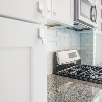
This small kitchen was way too small for this 2 bedrooms, 2 bathrooms apartment. Not only was it a very small kitchen, but the physical location of it made it very difficult to make it any bigger. There wasn't much that could have been done without incurring astronomical cost, which would get little or no return on the investment. The client wanted a kitchen that can be optimized in its current location to add a ton of value for resale.
This was difficult to do, because there was no moving of any mechanical around in the kitchen and even if we wanted to, the management of the building would not allow. For those of you who live in condos, co-ops or apartment building, you know how difficult it is to rework these foot prints. When we showed up, we saw the problems, but we also saw a huge opportunity where we can achieve those goals in the small space. This was accomplished by making some key changes and to incorporate some new things that was not possible when this kitchen was built years ago.
The crucial part of the design that would drive the entire new layout, was selecting the only appliance; that was the Refrigerator. Once we nailed down that refrigerator, we then proceeded to design the kitchen around it. We moved it to the other side of the wall where the sink was so that we can tap into the water line from the sink plumbing. It was crucial that it stays exactly 24" deep, not an inch more because we had to keep the entry as open as possible. Also, it was going to be directly in front of another big storage unit - The pantry. It is not ideal in most cases, but we needed the rest of the space to ramp up the design and open feel towards the side where all of the activities would take place, which happend to be the dining room and the view.
Once all that was figured out, we re-positioned the sink, dishwasher and the range and proceeded to wrap the cabinets around the columns to integrate them into the space. Thirty- six inches cabinets height was used so that they can be installed higher towards the ceiling height to give more room rather than the standard 18" required height between the counter tops. This was done to make the room feel a lot bigger than it really was. Not to mention, we also didn't want the faucet to be buried under the cabinets so that was also a necessary design detail for the space.
We then lowered both knee walls so that the counter top can sit on top of them, by removing that stop point that would have otherwise defined the kitchen area. This allowed us to pick up that extra footprint into the room for added prep space and enabled us to create the illusion of a kitchen that is looking longer than it really is. Every inch mattered when designing this kitchen and we made a conscious decision to use every one of that inch.
White cabinets were selected to do just what white cabinets are design to do; make a small or dark room appear bigger, brighter and more open. In this kitchen, this was amplified the more because of the kitchen location. It was perfect! We knew we did justice to the space because while we were there taking some photos, a few potential buyers walked in and went straight for the kitchen! They said its design just to fit the apartment.
Pantry roll out shelving, Double recycle bin, fancy handles, LED lighting, Quartz counter top, beautiful backslash tiles and grey linen floors finished off the kitchen which looked over a beautiful view of the George Washington Bridge from the top of this lovely 4th floor apartment.
Credit to Masterpiece Tile and Marble (Annmarie on the selection of Tiles and countertop and Val on the Construction to complete this project).
Davor Kokic Photography
 LEDVANS
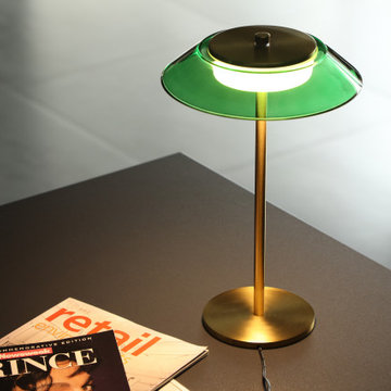
The banker's lamp is the highlight on the desktop, providing not only localized lighting but also adding decorative flair to the entire work area. When choosing a style, one can consider a simple and modern design to ensure it matches various decorative styles.
 French Creek Designs Kitchen & Bath Design Center
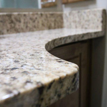
New Master Bath Remodel includes Ditra-Heat flooring for that extra warmth all year round. The door opening to the Master Bath was widened and a farm door added for easier access; aging in place. The ‘notch’ in the Master Countertop was added for ease of shower access. A hidden pull-out drawer was added in Master Bath for extra storage.
Large 12×24 Anthracite Black Porcelain Tile was used for the floor. Use of Stained Alder Knotty Cabinets with Giallo Ornamental Granite Countertops and offset with a White Undermount Sink.
French Creek Designs Kitchen & Bath Design Studio – where selections begin. Let us design and dream with you. Overwhelmed on where to start that Home Improvement, Kitchen or Bath Project? Let our Designers video conference or sit down with you, take the overwhelming out of the picture and assist in choosing your materials. Whether new construction, full remodel or just a partial remodel, we can help you to make it an enjoyable experience to design your dream space.
“Making Your Home Beautiful One Room at a Time with your local Kitchen & Bath Experts at French Creek Designs Center.”
#openforbusiness #casper #wyoming #casperbusiness #frenchcreekdesigns #shoplocal #casperwyoming #bathremodeling #bathdesigners #pebbles #niche #showersurround #showertiles #showerdrains #showerbench #cabinets #countertops #knobsandpulls #sinksandfaucets #flooring #tileandmosiacs #laundryremodel #homeimprovement
Find the right local pro for your project
 Koheid Design
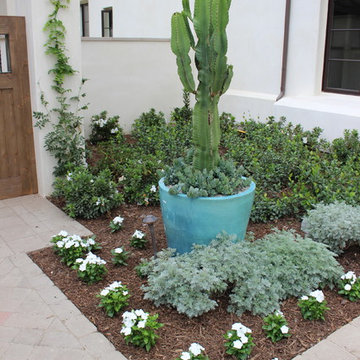
Photo of a mid-sized southwestern drought-tolerant and partial sun courtyard concrete paver garden path in Los Angeles.
 SKP Design
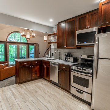
Located in a wooded setting which backs up to a golf course, The Woods is a vacation condo community in Canadian Lakes, Michigan. The owners asked us to create a comfortable modern design that would appeal to golfers and also families visiting relatives in the area. This complete renovation brought the design from 80's basic to rustic transitional. Colors and design elements echo the natural area surrounding the property.
SKP Design was involved in multiple aspects of this project. Our services included:
space planning for kitchen and both bathrooms
selecting finishes for walls, floors, trim, cabinets and countertops
reviewing construction details and electrical plans
specification of plumbing fixtures, appliances and accent lighting
furniture layout, specification and purchasing
fireplace design and stone selection
reviewing branding and signage ideas
In the great room, wrought iron accents are featured in a new staircase handrail system. Other metal accents are found in the new chandelier, barstools and the legs of the live edge coffee table. An open area under the staircase was enclosed with recessed shelving which gives a focal point to the dinette area. Recessed built-in cabinets near the fireplace store TV technology and accessories. The original tiled hearth was replaced by poured concrete with stone accents.
A queen sleeper sofa from Edgecomb provides additional sleeping. Fabrics and upholstery throughout the condo were selected for durability and cleanability.
Basic white laminate kitchen cabinets were replaced with beautiful dark stained wood. Floor tile is a wood-look porcelain from Daltile called Saddle Brook. Countertops in the kitchen and bathrooms are solid surface Corian Quartz (formerly called DuPont Zodiaq). Broadloom carpet is from Durkan. The first floor bedroom is Mona Vista pattern from Modesto Collection; all other carpet is Inviting Spaces pattern from Timeless Compositions. Walls are painted with Sherwin Williams 7647 Crushed Ice.
The main floor bedroom has a custom headboard mounted on a feature wall with plaid wallcovering. A freestanding vanity with undermount sink was added to the alcove area, creating space for a larger walk-in tiled shower with custom bench. On both levels, backlit mirrors highlight the sink areas. The upstairs bath has a blue tile feature wall and vessel sink.
A fiberglass bathtub surround was removed and replaced by a custom tiled shower. Vinyl wallcovering from D.L. Couch provides a focal point behind the king headboard in the loft bedroom. A twin sleeper chair adds an extra bed.
 Connecticut Roofcrafters Llc
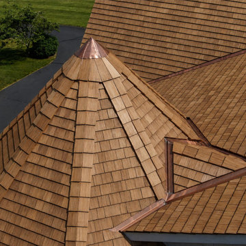
Flashing detail around this hexagonal turret and cricket roof; part of this intricate Western Red Cedar installation. CCA-treated tapersawn cedar from Waska Mills was selected for enhanced resistance to fungal growth—an important advantage in a shaded, moisture-prone environment near the brackish river. Beneath the cedar, Grace Select underlayment provides an added moisture barrier, topped with Cedar Breather matting to promote airflow and help the roof dry properly. Complex rooflines and transitions showcase the cedar’s natural character, while a Firestone .090 EPDM membrane provides durable protection across the expansive low-slope section, creating a carefully integrated hybrid roofing system.
 Sandra Hambley
Welcome to the beach house! We are pleased to share the photos from this OBX, NC beach house we decorated for one of our existing local clients. We were happy to travel to NC to assist in setting up their vacation home.
Setting the tone in the entryway we selected furnishings with a coastal vibe. This console is 80 inches in length and is accented with beachy accessories and artwork.
This home has a fantastic open concept living area that is perfect for large family gatherings. We furnished a dining space for ten, a family room with a large sectional that will provide seating for a crowd, and added game table with chairs for overflow.
The dining table offers seating for 10 and includes 6 chairs and a bench seat that will comfortably sit 4. We selected a striped area rug in vibrant shades of blues and greens to give the space a coastal vibe.
In the mudroom, shiplap walls, bench seating, cubbies and towel hooks are both pretty and hugely functional!
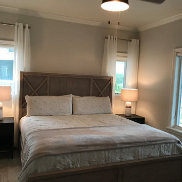
A restful sleep awaits in the primary bedroom of this OBX beach house! A king size bed made of sand-blasted solid Rustic Poplar with metal accents and coordinating bedside tables create a rustic-yet-modern vibe. A large-scale mirror features a dark bronze frame with antique mirror side panels and corners with copper cladding and nail head details. For texture and comfort, we selected an area rug crafted from hand tufted ivory wool and rescued denim. Sheer window treatments keep the room light and airy.
Need a sleeping space at your vacation home for the children? We created a bunk bed configuration that maximizes space and accommodates sleeping for eight at our client's OBX beach house. It's super functional and also fun!
Stairwells with soaring ceilings call for statement lighting! We are in love with this gorgeous chandelier we chose for our client's OBX beach house.

Sponsored
Columbus, OH

Hope Restoration & General Contracting
Columbus Design-Build, Kitchen & Bath Remodeling, Historic Renovations
 Rockledge Design + Architecture
To help make this family room in Wexford more functional and cohesive, we added new custom built-in storage around the brick fireplace. On the left side, an existing built-in was situated in between the fireplace and a small closet, which also contained a sink. We started by peeling away these elements to create a larger space.
Adding symmetry to the room, we designed new cabinetry which included a mix of hidden and open shelf storage. Behind full-height pocketing doors on the left, a new wet bar with a tiled backsplash and quartz countertop. On the right, another set of pocketing doors conceals three large drawers, plus overflow toy storage for the adjacent playroom. Immediately flanking the fireplace, bookshelves provide a space to display favorite items with even more storage beneath.
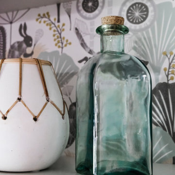
To balance the room’s rich wood tones and multi-tonal red brick, we helped the clients select a neutral color palette to make the space feel more relaxed. Complimentary colors and textures are added through the playful wallpaper lining the back of the shelves, and hexagon backsplash tile. A stylish new fireplace faceplate, gallery lighting, and cabinet hardware — each in a dark metal finish — help to tie everything together.
 RAJ Kitchen and Bath, LLC
**Check out the video of this transformation on our website**
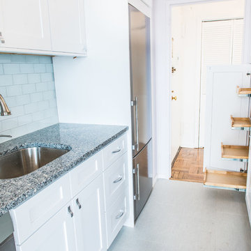
This small kitchen was way too small for this 2 bedrooms, 2 bathrooms apartment. Not only was it a very small kitchen, but the physical location of it made it very difficult to make it any bigger. There wasn't much that could have been done without incurring astronomical cost, which would get little or no return on the investment. The client wanted a kitchen that can be optimized in its current location to add a ton of value for resale.
This was difficult to do, because there was no moving of any mechanical around in the kitchen and even if we wanted to, the management of the building would not allow. For those of you who live in condos, co-ops or apartment building, you know how difficult it is to rework these foot prints. When we showed up, we saw the problems, but we also saw a huge opportunity where we can achieve those goals in the small space. This was accomplished by making some key changes and to incorporate some new things that was not possible when this kitchen was built years ago.
The crucial part of the design that would drive the entire new layout, was selecting the only appliance; that was the Refrigerator. Once we nailed down that refrigerator, we then proceeded to design the kitchen around it. We moved it to the other side of the wall where the sink was so that we can tap into the water line from the sink plumbing. It was crucial that it stays exactly 24" deep, not an inch more because we had to keep the entry as open as possible. Also, it was going to be directly in front of another big storage unit - The pantry. It is not ideal in most cases, but we needed the rest of the space to ramp up the design and open feel towards the side where all of the activities would take place, which happend to be the dining room and the view.
Once all that was figured out, we re-positioned the sink, dishwasher and the range and proceeded to wrap the cabinets around the columns to integrate them into the space. Thirty- six inches cabinets height was used so that they can be installed higher towards the ceiling height to give more room rather than the standard 18" required height between the counter tops. This was done to make the room feel a lot bigger than it really was. Not to mention, we also didn't want the faucet to be buried under the cabinets so that was also a necessary design detail for the space.
We then lowered both knee walls so that the counter top can sit on top of them, by removing that stop point that would have otherwise defined the kitchen area. This allowed us to pick up that extra footprint into the room for added prep space and enabled us to create the illusion of a kitchen that is looking longer than it really is. Every inch mattered when designing this kitchen and we made a conscious decision to use every one of that inch.
White cabinets were selected to do just what white cabinets are design to do; make a small or dark room appear bigger, brighter and more open. In this kitchen, this was amplified the more because of the kitchen location. It was perfect! We knew we did justice to the space because while we were there taking some photos, a few potential buyers walked in and went straight for the kitchen! They said its design just to fit the apartment.
Pantry roll out shelving, Double recycle bin, fancy handles, LED lighting, Quartz counter top, beautiful backslash tiles and grey linen floors finished off the kitchen which looked over a beautiful view of the George Washington Bridge from the top of this lovely 4th floor apartment.
Credit to Masterpiece Tile and Marble (Annmarie on the selection of Tiles and countertop and Val on the Construction to complete this project).
Davor Kokic Photography
 Robin's Nest Interiors
Updated Spec Home: The Bathrooms
The last stop on the main level of this Updated Spec Home are the Bathrooms. Every surface of the Guest Bath and Master Bath was touched- even some renovations in the Master bedroom. All I can say is thank goodness these two love wallpaper – we selected classic patterns for each bath that will stand the test of time!
Guest Bathroom
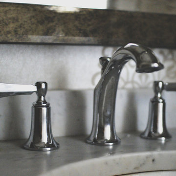
The Guest Bath also doubles as my mom’s bath. The footprint remained the same but we updated everything. A new vanity was chosen to give her that furniture look while still providing some storage – although there is a linen closet located just outside the bath. We topped it off with a beautiful mirror with great detail and an equally great light fixture. Also, we mixed the finishes in the bath between nickel and champagne, i.e., gold/silver mix. Mixing metals is perfectly acceptable and quite frankly way more interesting the everything matching. Updated Spec Home Bathrooms - Robin's Nest Interiors
Updated Spec Home Bathrooms - Robin's Nest Interiors
We found this amazing wallpaper with its subtle colors and pattern and selected a large square tile to coordinate for the floor. Yes, you can do a large tile in a small bath because it actually makes the space feel larger. For finishing touches, we had this gorgeous shower curtain made. Above the new toilet, we added interesting abstract artwork framed in a large mat so it would not clash with the wallpaper.
Master Bathroom
Originally, the Master Bath had a large garden tub as the focal point and a tiny stand up shower in the corner. We removed the garden tub, moved the shower to this area as the focal point and turned the tiny shower into a much needed linen closet. At this point, I know you are thinking, what about resale with no tub? There is a tub in the Guest Bath so the house will still be appealing to young families or bath lovers alike.
© 2016 RealTourCast | Tim Furlong Jr.
Tile selections came first – my sister fell in love with this gorgeous dark greige glass tile. We used it in the upper half of the shower while keeping the lower half light with this plank tile in a striated pattern. We carried the plank tile onto the floor for a seamless look.
Updated Spec Home Bathrooms - Robin's Nest Interiors
We replaced the two vanities with stock cabinetry that looks custom in a rich wood stain. Also, we found a gorgeous granite remnant for the countertop and finished off the vanity area with oversized mirrors, sleek lighting, and striking hardware.Updated Spec Home Bathrooms - Robin's Nest Interiors
The wallpaper is absolutely perfect for this space – it adds an interesting backdrop without overpowering the room. Her fantastic artwork was able to fit in the niche next to the new toilet. This is one gorgeous bath!
Updated Spec Home Bathrooms - Robin's Nest Interiors
Coming Soon
Spoiler Alert – my mom and sister have decided to update their Basement Family Room and add a small Powder Bath so look for Season 2 of the Updated Spec Home series!
See the rest of this house through these links! Foyer & Great Room, Kitchen & Breakfast Area, Bedrooms, Guest Bedroom.
 Charlie Allen Renovations, Inc.
Renovation is stressful. Wouldn’t it be nice to let someone else oversee product selections, manage day-to-day issues, and bring your project to a successful completion? The owners of a two-family in Arlington recently did just that, flying off to Florida just as we began renovating their first floor unit.
Of course, before they left we thoroughly discussed all aspects of the work order, which included renovating the kitchen and bathroom, painting the bedroom, and adding a laundry closet. We reviewed color and material selections, and set up a schedule for regular briefings.
A handful of issues did come up. But because we had planned ahead, we were able to resolve them with very little stress for our clients. For instance, the client had chosen a bright yellow paint color for the kitchen walls, but once the new cabinets, countertop, and flooring had been installed, it was clear that yellow would clash. We suggested a more complementary Benjamin Moore Lancaster Whitewash shade instead.
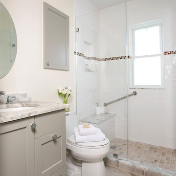
In the bathroom, the clients had selected a deep inset mirrored medicine cabinet. But when the wall behind the vanity was opened, it revealed a pipe running up the wall, too close for the inset model. In this small space, a bump-out medicine cabinet would be awkward, so instead we placed a mirror over the sink and two smaller inset cabinets on either side – a solution that pleased the homeowners, who now have his-and-hers storage spaces.
Finally, the homeowners had resigned themselves to the fact that the laundry closet would be too small for storing detergent and other needs. However once the units were in place, we realized that a small custom shelf could be built and had it installed to the delight of the homeowners.
Photo by Shelly Harrison
 French Creek Designs Kitchen & Bath Design Center
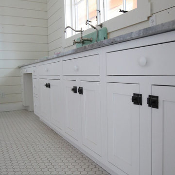
Laundry Room Cabinets bright white and beautiful. This large laundry room will be refreshing to walk into for years to come. With a large window adding additional bright light into the room. In addition, hexagon tile lines the floor adding dimension to the room. Perimeter is lined with white painted maple cabinets and Fantasy River marble countertops. A fun retro sink and hardware adds functionality to the laundry room. There is no lack of storage in this laundry room. Furthermore, lining the top of the washer and dryer with marble tops add additional workspace for folding and managing the loads of laundry. Which will be a great help on this busy ranch. White Painted Maple Cabinets and Marble Countertops complete in Client Project Laundry Room New Construction ~ Thank you for sharing! Client Remarks on the BBB “Wonderful company. Easy to work with and best prices in town.” Laundry rooms can feel dark and depressing. When designing your laundry can be just as important as your kitchen and bath. Creating productivity can begin with the overall design elements. Simply creating a space that is bright and refreshing can be the difference in enjoyment and dread. Not only for yourself but for your family. Engagement begins in a space that is fun and exciting to be in. Begin by choosing colors that brighten up the laundry. In addition, to choosing cabinetry that provides adequate storage can make working in your laundry fun and rewarding. Adding floating shelves to support those needed quick access items within reach. With many flooring options available from tile to luxury vinyl tile can create warmth through colors or wood looks. In addition, to brighten the space with bright whites and accents. Finally, purchasing electric floor warming for those bare feet can make your toes happy and content. Creating a workspace for your laundry room that is functional and beautiful can shift the mind into enjoying tasks rather than dreading them. Find your locally owned Home Improvement Store, let one of our designers assist in choosing materials and design your laundry room. Find French Creek Designs, on MeWe or Facebook, and follow us! In addition, read more about our process and read regular updates on client projects and updated materials selections and choices at FCD News a reliable source of information and current trends.
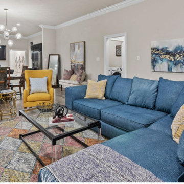
 Let's Decorate
The space was very neutral and we wanted to add some color and lots of seating for this Airb&b. We also added an office space. Decorating for an Airb&b is a little different that for a traditional space.


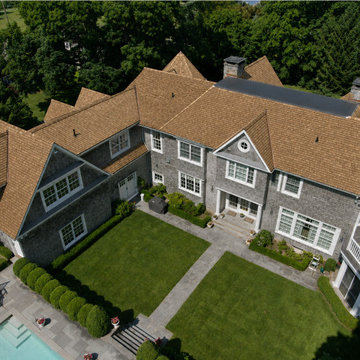 Connecticut Roofcrafters Llc
This intricate Western Red Cedar installation combines traditional craftsmanship with high-performance materials suited to its wooded Connecticut River setting. CCA-treated tapersawn cedar from Waska Mills was selected for enhanced resistance to fungal growth—an important advantage in a shaded, moisture-prone environment near the brackish river. Beneath the cedar, Grace Select underlayment provides an added moisture barrier, topped with Cedar Breather matting to promote airflow and help the roof dry properly. Complex rooflines and transitions showcase the cedar’s natural character, while a Firestone .090 EPDM membrane provides durable protection across the expansive low-slope section, creating a carefully integrated hybrid roofing system.
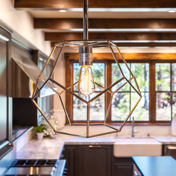
 Emily Roose Interiors
This kitchen was 20 years old with stained cabinets and felt dark and heavy. We painted all of the perimeter cabinets a beautiful blue grey and the island is a custom white with black glazing. For the countertops the perimeter is a grey and white quartzite and the island is a leathered black honed granite. The old sink was replaced with a Farmhouse styled white porcelain apron, a new faucet and added a hot/cold water dispenser. The old trash compactor was removed and replaced with a double trash pull-out drawer, a two drawer beverage fridge and ice maker were added as well. For the backspalsh we selected white marble tiles in a hexagon shape and added new geometric pendant lights over the peninsula. All the recessed can lights were updated to LED units for energy efficiency and to provide better lighting.
Photos by Patrick Sheehan of Sheehan Creative
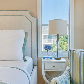
 SHELLEY RODNER DESIGN / DDI
DESIGN CHALLENGES ADDRESSED:
To anyone who may be reading this project overview, I do hope you'll have the opportunity to
have a look at the 'before' photo of this space. It's quite a transformation!
Our clients purchased their condo at the beach several years ago. As shown in the 'before' photo,
the owner's bedroom suite was a dark and dated space with unsightly paneled walls, heavy faux
ceiling beams and outdated furniture. Everything felt cramped and cluttered throughout the
condo, especially their primary bedroom . The client's vision for this space was for everything to
have an airy and relaxed spa like feel.
DESIGN SOLUTIONS PROVIDED:
The entire condo was taken down to the stud. The faux beams were edited out and the ceiling
raised. The heavy out-dated paneling was removed and replaced with fresh clean walls that were
painted in a calming creamy tone throughout the entire condo.
The awkwardly positioned windows were removed. New windows were then added with great
attention to placement. On the main wall, windows were spaced to allow a queen sized bed to
nest perfectly in between them. Richly textured honeycomb cellular shades were selected with a
black out liner to tame the direct sun throughout the day.
The homeowners have two dogs and a cat who love a visit to the beach as much as their
'humans'. All of our updated new furniture selections successfully addressed the client's quest
for a 'pet friendly' environment.
The existing dark and gloomy furniture was replaced with stylish updated pieces. Great thought
was given to the size, scale and textiles used in this space. A custom upholstered bed with great
architectural detailing was selected. It's richly textured easy-care fabric in a soft oatmeal tone
created the perfect touch.
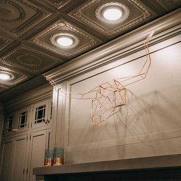
 Penny Black Interiors LLC.
This 1896 Italianate Victorian home in Portland Heights was all but derelict in 2017.
We partnered with Look Construction LLC. to save this iconic home that sits atop a steep embankment—a huge challenge for the necessary new foundation. The house was lifted and new foundation poured adding 4 feet and a whole new floor to boot.
It had been stripped of all its original interior character over the years, so the design replaced and added to what was there originally. We re-designed the home’s layout, reconfiguring the kitchen, moving the lower staircase, adding a staircase to the loft room and rebuilding the widows walk roof deck. All doorways were raised to 9 feet to add to the sense of space.
Finally, we splurged on a selection of incredible wallpapers to add drama and romance to this stunning show piece of a home.
The Penny Black House is featured in Gray Magazine #39, April 2018.


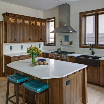
 Drury Design
The 100-year old home’s kitchen was old and just didn’t function well. A peninsula in the middle of the main part of the kitchen blocked the path from the back door. This forced the homeowners to mostly use an odd, U-shaped corner of the kitchen.
Design objectives:
-Add an island
-Wow-factor design
-Incorporate arts and crafts with a touch of Mid-century modern style
-Allow for a better work triangle when cooking
-Create a seamless path coming into the home from the backdoor
-Make all the countertops in the space 36” high (the old kitchen had different base cabinet heights)
Design challenges to be solved:
-Island design
-Where to place the sink and dishwasher
-The family’s main entrance into the home is a back door located within the kitchen space. Samantha needed to find a way to make an unobstructed path through the kitchen to the outside
-A large eating area connected to the kitchen felt slightly misplaced – Samantha wanted to bring the kitchen and materials more into this area
-The client does not like appliance garages/cabinets to the counter. The more countertop space, the better!
Design solutions:
-Adding the right island made all the difference! Now the family has a couple of seats within the kitchen space. -Multiple walkways facilitate traffic flow.
-Multiple pantry cabinets (both shallow and deep) are placed throughout the space. A couple of pantry cabinets were even added to the back door wall and wrap around into the breakfast nook to give the kitchen a feel of extending into the adjoining eating area.
-Upper wall cabinets with clear glass offer extra lighting and the opportunity for the client to display her beautiful vases and plates. They add and an airy feel to the space.
-The kitchen had two large existing windows that were ideal for a sink placement. The window closest to the back door made the most sense due to the fact that the other window was in the corner. Now that the sink had a place, we needed to worry about the dishwasher. Samantha didn’t want the dishwasher to be in the way of people coming in the back door – it’s now in the island right across from the sink.
-The homeowners love Motawi Tile. Some fantastic pieces are placed within the backsplash throughout the kitchen. -Larger tiles with borders make for nice accent pieces over the rangetop and by the bar/beverage area.
-The adjacent area for eating is a gorgeous nook with massive windows. We added a built-in furniture-style banquette with additional lower storage cabinets in the same finish. It’s a great way to connect and blend the two areas into what now feels like one big space!
 RAJ Kitchen and Bath, LLC
**Check out the video of this transformation on our website**
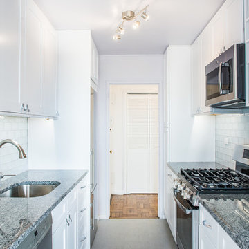
This small kitchen was way too small for this 2 bedrooms, 2 bathrooms apartment. Not only was it a very small kitchen, but the physical location of it made it very difficult to make it any bigger. There wasn't much that could have been done without incurring astronomical cost, which would get little or no return on the investment. The client wanted a kitchen that can be optimized in its current location to add a ton of value for resale.
This was difficult to do, because there was no moving of any mechanical around in the kitchen and even if we wanted to, the management of the building would not allow. For those of you who live in condos, co-ops or apartment building, you know how difficult it is to rework these foot prints. When we showed up, we saw the problems, but we also saw a huge opportunity where we can achieve those goals in the small space. This was accomplished by making some key changes and to incorporate some new things that was not possible when this kitchen was built years ago.
The crucial part of the design that would drive the entire new layout, was selecting the only appliance; that was the Refrigerator. Once we nailed down that refrigerator, we then proceeded to design the kitchen around it. We moved it to the other side of the wall where the sink was so that we can tap into the water line from the sink plumbing. It was crucial that it stays exactly 24" deep, not an inch more because we had to keep the entry as open as possible. Also, it was going to be directly in front of another big storage unit - The pantry. It is not ideal in most cases, but we needed the rest of the space to ramp up the design and open feel towards the side where all of the activities would take place, which happend to be the dining room and the view.
Once all that was figured out, we re-positioned the sink, dishwasher and the range and proceeded to wrap the cabinets around the columns to integrate them into the space. Thirty- six inches cabinets height was used so that they can be installed higher towards the ceiling height to give more room rather than the standard 18" required height between the counter tops. This was done to make the room feel a lot bigger than it really was. Not to mention, we also didn't want the faucet to be buried under the cabinets so that was also a necessary design detail for the space.
We then lowered both knee walls so that the counter top can sit on top of them, by removing that stop point that would have otherwise defined the kitchen area. This allowed us to pick up that extra footprint into the room for added prep space and enabled us to create the illusion of a kitchen that is looking longer than it really is. Every inch mattered when designing this kitchen and we made a conscious decision to use every one of that inch.
White cabinets were selected to do just what white cabinets are design to do; make a small or dark room appear bigger, brighter and more open. In this kitchen, this was amplified the more because of the kitchen location. It was perfect! We knew we did justice to the space because while we were there taking some photos, a few potential buyers walked in and went straight for the kitchen! They said its design just to fit the apartment.
Pantry roll out shelving, Double recycle bin, fancy handles, LED lighting, Quartz counter top, beautiful backslash tiles and grey linen floors finished off the kitchen which looked over a beautiful view of the George Washington Bridge from the top of this lovely 4th floor apartment.
Credit to Masterpiece Tile and Marble (Annmarie on the selection of Tiles and countertop and Val on the Construction to complete this project).
Davor Kokic Photography
 Rockledge Design + Architecture
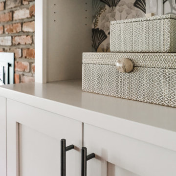
To help make this family room in Wexford more functional and cohesive, we added new custom built-in storage around the brick fireplace. On the left side, an existing built-in was situated in between the fireplace and a small closet, which also contained a sink. We started by peeling away these elements to create a larger space.
Adding symmetry to the room, we designed new cabinetry which included a mix of hidden and open shelf storage. Behind full-height pocketing doors on the left, a new wet bar with a tiled backsplash and quartz countertop. On the right, another set of pocketing doors conceals three large drawers, plus overflow toy storage for the adjacent playroom. Immediately flanking the fireplace, bookshelves provide a space to display favorite items with even more storage beneath.
To balance the room’s rich wood tones and multi-tonal red brick, we helped the clients select a neutral color palette to make the space feel more relaxed. Complimentary colors and textures are added through the playful wallpaper lining the back of the shelves, and hexagon backsplash tile. A stylish new fireplace faceplate, gallery lighting, and cabinet hardware — each in a dark metal finish — help to tie everything together.
107