
Search results for "Select 'adding'" in Home Design Ideas
 Marker Girl Home
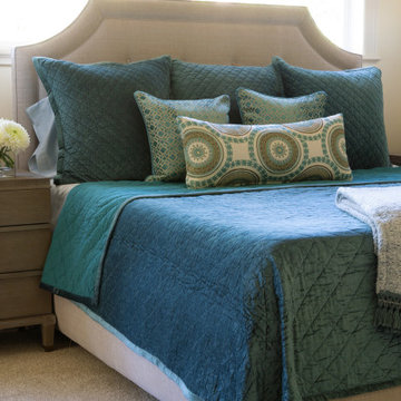
With this Master Bedroom, I added an upholstered bed with a straight clean line to compliment the window detail. The two nightstands that are added fit the very small space, the two tall slender lamps were added to give it height. A softly shaped cornice to cover the half windows along with remote controlled shades tucked underneath during the daytime. The bedding and fabric on the cornice were selected to match and to bring in more color. All of these details are opening this space up and not overcrowding it. Painted in Sherwin William 7623 Buff
 Bridges Const.
This project is a perfect example of how thoughtful design can completely transform the heart of a home.
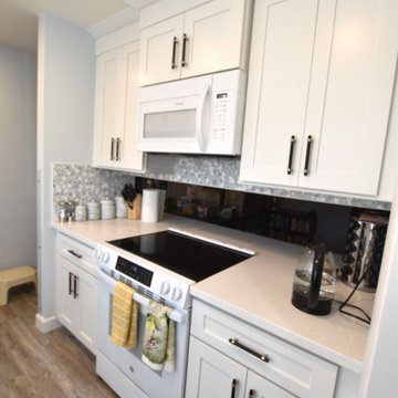
We started by lowering the raised peninsula bar, creating one continuous countertop that’s perfect for entertaining, meal prep, and everyday living. To brighten the space, we added recessed lighting, giving the kitchen a clean, modern feel.
The biggest transformation came with beautiful new white shaker-style cabinets by KCD, paired with sparkling white quartz countertops that bring elegance and durability to the space. To tie everything together, the homeowners selected a full-height Crystal Ocean mosaic tile backsplash, adding just the right amount of texture and shine.
But we didn’t stop with the kitchen!
✔️ Added a custom built-in linen cabinet in the hallway for extra storage.
✔️ Refreshed the laundry room with fresh paint and bypass pantry closet doors for a clean, updated look.
We’re proud to help homeowners create spaces that are not only beautiful but also more functional for everyday life.
 User
UserDesigned by Jennefier Martin of Closet Works
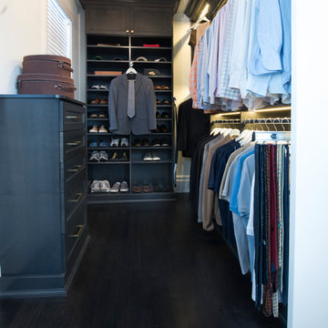
His side of the closet is quiet and refined. The use of stained wood in minimalistic shades of black and gray for the shelving, custom dressers, and hanging areas suited this dapper gentleman who definitely likes the finer things in life, but is very selective in his possessions.
Find the right local pro for your project
 Reyes Creative Concepts LLC.
Living Room:
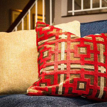
Our customer wanted to update the family room and the kitchen of this 1970's splanch. By painting the brick wall white and adding custom built-ins we brightened up the space. The decor reflects our client's love for color and a bit of asian style elements. We also made sure that the sitting was not only beautiful, but very comfortable and durable. The sofa and the accent chairs sit very comfortably and we used the performance fabrics to make sure they last through the years. We also wanted to highlight the art collection which the owner curated through the years.
Kithen:
We enlarged the kitchen by removing a partition wall that divided it from the dining room and relocated the entrance. Our goal was to create a warm and inviting kitchen, therefore we selected a mellow, neutral palette. The cabinets are soft Irish Cream as opposed to a bright white. The mosaic backsplash makes a statement, but remains subtle through its beige tones. We selected polished brass for the hardware, as well as brass and warm metals for the light fixtures which emit a warm and cozy glow.
For beauty and practicality, we used quartz for the working surface countertops and for the island we chose a sophisticated leather finish marble with strong movement and gold inflections. Because of our client’s love for Asian influences, we selected upholstery fabric with an image of a dragon, chrysanthemums to mimic Japanese textiles, and red accents scattered throughout.
Functionality, aesthetics, and expressing our clients vision was our main goal.
Photography: Jeanne Calarco, Context Media Development
 Sandra Hambley
Welcome to the beach house! We are pleased to share the photos from this OBX, NC beach house we decorated for one of our existing local clients. We were happy to travel to NC to assist in setting up their vacation home.
Setting the tone in the entryway we selected furnishings with a coastal vibe. This console is 80 inches in length and is accented with beachy accessories and artwork.
This home has a fantastic open concept living area that is perfect for large family gatherings. We furnished a dining space for ten, a family room with a large sectional that will provide seating for a crowd, and added game table with chairs for overflow.
The dining table offers seating for 10 and includes 6 chairs and a bench seat that will comfortably sit 4. We selected a striped area rug in vibrant shades of blues and greens to give the space a coastal vibe.
In the mudroom, shiplap walls, bench seating, cubbies and towel hooks are both pretty and hugely functional!
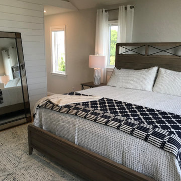
A restful sleep awaits in the primary bedroom of this OBX beach house! A king size bed made of sand-blasted solid Rustic Poplar with metal accents and coordinating bedside tables create a rustic-yet-modern vibe. A large-scale mirror features a dark bronze frame with antique mirror side panels and corners with copper cladding and nail head details. For texture and comfort, we selected an area rug crafted from hand tufted ivory wool and rescued denim. Sheer window treatments keep the room light and airy.
Need a sleeping space at your vacation home for the children? We created a bunk bed configuration that maximizes space and accommodates sleeping for eight at our client's OBX beach house. It's super functional and also fun!
Stairwells with soaring ceilings call for statement lighting! We are in love with this gorgeous chandelier we chose for our client's OBX beach house.
 Phoenix Home Remodeling
Eric and Jeni's master bathroom had always been functional, but it never quite lived up to the luxurious escape they desired. The cabinets were lackluster, offering basic storage, but they didn't contribute much to the room's aesthetics.
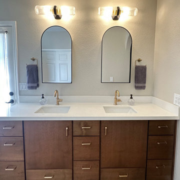
For cabinets, they selected Sollid Designer Series Cabinetry in Metro Cognac for both functionality and visual warmth. To top these cabinets, White Sand Quartz countertops were chosen, blending durability and elegance.
Delta Trinsic faucets in Champagne Bronze were selected to pair beautifully with two arched metal mirrors with contrasting black frames, adding refined modernity.
A Kohler sliding semi-frameless shower door with frosted glass and the Delta shower head in Champagne Bronze add the elegance desired by the homeowners.
Eric and Jeni made the great selections of Reside Beige tiles on the shower floor, and Terrazzo White tiles for the walls. An over-sized wall niche for the shower and a long bench with a quartz countertop seat were installed to complete the custom elegance of their new space.
 SKP Design
Located in a wooded setting which backs up to a golf course, The Woods is a vacation condo community in Canadian Lakes, Michigan. The owners asked us to create a comfortable modern design that would appeal to golfers and also families visiting relatives in the area. This complete renovation brought the design from 80's basic to rustic transitional. Colors and design elements echo the natural area surrounding the property.
SKP Design was involved in multiple aspects of this project. Our services included:
space planning for kitchen and both bathrooms
selecting finishes for walls, floors, trim, cabinets and countertops
reviewing construction details and electrical plans
specification of plumbing fixtures, appliances and accent lighting
furniture layout, specification and purchasing
fireplace design and stone selection
reviewing branding and signage ideas
In the great room, wrought iron accents are featured in a new staircase handrail system. Other metal accents are found in the new chandelier, barstools and the legs of the live edge coffee table. An open area under the staircase was enclosed with recessed shelving which gives a focal point to the dinette area. Recessed built-in cabinets near the fireplace store TV technology and accessories. The original tiled hearth was replaced by poured concrete with stone accents.
A queen sleeper sofa from Edgecomb provides additional sleeping. Fabrics and upholstery throughout the condo were selected for durability and cleanability.
Basic white laminate kitchen cabinets were replaced with beautiful dark stained wood. Floor tile is a wood-look porcelain from Daltile called Saddle Brook. Countertops in the kitchen and bathrooms are solid surface Corian Quartz (formerly called DuPont Zodiaq). Broadloom carpet is from Durkan. The first floor bedroom is Mona Vista pattern from Modesto Collection; all other carpet is Inviting Spaces pattern from Timeless Compositions. Walls are painted with Sherwin Williams 7647 Crushed Ice.
The main floor bedroom has a custom headboard mounted on a feature wall with plaid wallcovering. A freestanding vanity with undermount sink was added to the alcove area, creating space for a larger walk-in tiled shower with custom bench. On both levels, backlit mirrors highlight the sink areas. The upstairs bath has a blue tile feature wall and vessel sink.
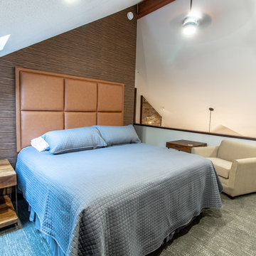
A fiberglass bathtub surround was removed and replaced by a custom tiled shower. Vinyl wallcovering from D.L. Couch provides a focal point behind the king headboard in the loft bedroom. A twin sleeper chair adds an extra bed.

Sponsored
Delaware, OH

Buckeye Basements, Inc.
Central Ohio's Basement Finishing ExpertsBest Of Houzz '13-'21
 Sandra Hambley
Welcome to the beach house! We are pleased to share the photos from this OBX, NC beach house we decorated for one of our existing local clients. We were happy to travel to NC to assist in setting up their vacation home.
Setting the tone in the entryway we selected furnishings with a coastal vibe. This console is 80 inches in length and is accented with beachy accessories and artwork.
This home has a fantastic open concept living area that is perfect for large family gatherings. We furnished a dining space for ten, a family room with a large sectional that will provide seating for a crowd, and added game table with chairs for overflow.
The dining table offers seating for 10 and includes 6 chairs and a bench seat that will comfortably sit 4. We selected a striped area rug in vibrant shades of blues and greens to give the space a coastal vibe.
In the mudroom, shiplap walls, bench seating, cubbies and towel hooks are both pretty and hugely functional!
A restful sleep awaits in the primary bedroom of this OBX beach house! A king size bed made of sand-blasted solid Rustic Poplar with metal accents and coordinating bedside tables create a rustic-yet-modern vibe. A large-scale mirror features a dark bronze frame with antique mirror side panels and corners with copper cladding and nail head details. For texture and comfort, we selected an area rug crafted from hand tufted ivory wool and rescued denim. Sheer window treatments keep the room light and airy.
Need a sleeping space at your vacation home for the children? We created a bunk bed configuration that maximizes space and accommodates sleeping for eight at our client's OBX beach house. It's super functional and also fun!
Stairwells with soaring ceilings call for statement lighting! We are in love with this gorgeous chandelier we chose for our client's OBX beach house.
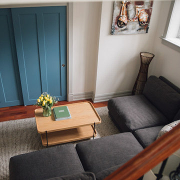
 Kaleidoscope Design Studio
Simple doesn’t have to be boring, especially when your backyard is a lush ravine. This was the name of the game when it came to this traditional cottage-style house, with a contemporary flare. Emphasizing the great bones of the house with a simple pallet and contrasting trim helps to accentuate the high ceilings and classic mouldings, While adding saturated colours, and bold graphic wall murals brings lots of character to the house. This growing family now has the perfectly layered home, with plenty of their personality shining through.
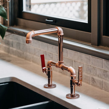
 Penny Black Interiors LLC.
This 1896 Italianate Victorian home in Portland Heights was all but derelict in 2017.
We partnered with Look Construction LLC. to save this iconic home that sits atop a steep embankment—a huge challenge for the necessary new foundation. The house was lifted and new foundation poured adding 4 feet and a whole new floor to boot.
It had been stripped of all its original interior character over the years, so the design replaced and added to what was there originally. We re-designed the home’s layout, reconfiguring the kitchen, moving the lower staircase, adding a staircase to the loft room and rebuilding the widows walk roof deck. All doorways were raised to 9 feet to add to the sense of space.
Finally, we splurged on a selection of incredible wallpapers to add drama and romance to this stunning show piece of a home.
The Penny Black House is featured in Gray Magazine #39, April 2018.
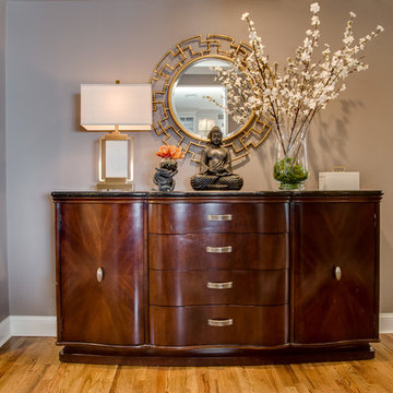 Reyes Creative Concepts LLC.
Living Room:
Our customer wanted to update the family room and the kitchen of this 1970's splanch. By painting the brick wall white and adding custom built-ins we brightened up the space. The decor reflects our client's love for color and a bit of asian style elements. We also made sure that the sitting was not only beautiful, but very comfortable and durable. The sofa and the accent chairs sit very comfortably and we used the performance fabrics to make sure they last through the years. We also wanted to highlight the art collection which the owner curated through the years.
Kithen:
We enlarged the kitchen by removing a partition wall that divided it from the dining room and relocated the entrance. Our goal was to create a warm and inviting kitchen, therefore we selected a mellow, neutral palette. The cabinets are soft Irish Cream as opposed to a bright white. The mosaic backsplash makes a statement, but remains subtle through its beige tones. We selected polished brass for the hardware, as well as brass and warm metals for the light fixtures which emit a warm and cozy glow.
For beauty and practicality, we used quartz for the working surface countertops and for the island we chose a sophisticated leather finish marble with strong movement and gold inflections. Because of our client’s love for Asian influences, we selected upholstery fabric with an image of a dragon, chrysanthemums to mimic Japanese textiles, and red accents scattered throughout.
Functionality, aesthetics, and expressing our clients vision was our main goal.
Photography: Jeanne Calarco, Context Media Development
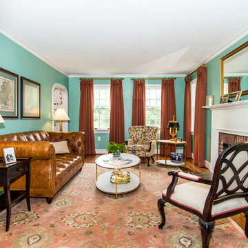 Sandra Hambley
A charming Airbnb, favorite restaurant, cozy coffee house, or a piece of artwork can all serve as design inspiration for your decor. How wonderful would it be to bring the colors, patterns, shapes, fabrics, or textures of those beloved places or things into your own home? That is exactly what Janet Aurora’s client was hoping to do. Her favorite restaurant, The Ivy Chelsea Garden, is located in London and features tufted leather sofas and benches, hues of salmon and sage, botanical patterns, and artwork surrounded by lush gardens and flowers. Take a look at how Janet used this point of inspiration in the client’s living room, dining room, entryway and study.
~ Dining Room ~
To accommodate space for a dining room table that would seat eight, we eliminated the existing fireplace. Janet custom designed a table with a beautiful wrought iron base and marble top, selected botanical prints for a gallery wall, and floral valances for the windows, all set against a fresh turquoise backdrop.
~ Living Room ~
Nods to The Ivy Chelsea Garden can be seen throughout the living room and entryway. A custom leather tufted sofa anchors the living room and compliments a beloved “Grandma’s chair” with crewel fabric, which was restored to its former beauty. Walls painted with Benjamin Moore’s Dreamcatcher 640 and dark salmon hued draperies create a color palette that is strikingly similar to the al fresco setting in London. In the entryway, floral patterned wallpaper introduces the garden fresh theme seen throughout the home.
~ The Study ~
Janet transformed an existing bedroom into a study by claiming the space from two reach-in closets to create custom built-ins with lighting. Many of the homeowner’s own furnishings were used in this room, but Janet added a much-needed reading chair in turquoise to bring a nice pop of color, window treatments, and an area rug to tie the space together. Benjamin Moore’s Deep Mauve was used on the walls and Ruby Dusk was added to the back of the cabinetry to add depth and interest. We also added French doors that lead out to a small balcony for a place to take a break or have lunch.
We love the way these spaces turned out and hope our clients will enjoy their spaces inspired by their favorite restaurant.
 Powell Construction
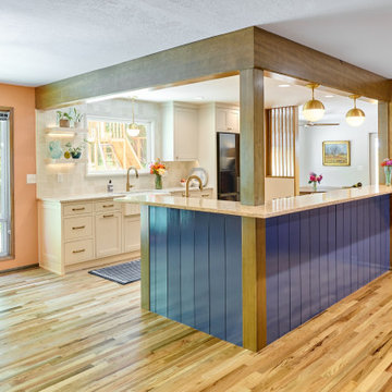
This 1960’s home underwent a striking transformation--remodeling the kitchen, hall bathroom and laundry room. These homeowners dreamed of an open floor plan that would unite the kitchen and adjacent living areas. To accomplish this, we removed an imposing chimney that separated the kitchen from the living room. Additionally, we eliminated a weight-bearing wall that was between the kitchen and dining room. What a change! The spaces that formerly felt dark and confined are now bright and connected, comfortably accommodating larger gatherings.
When considering the specifics of design, we wanted to stay true to the home’s mid-century roots, while updating it with today’s style elements. Embracing the mid-century aspects, we played off some of the existing features of the home by mirroring them in the spaces we redesigned. To introduce today’s style, we thoughtfully incorporated the finishes and touches that would aptly reflect that component. The resulting design is beautifully juxtaposed by the homeowners’ treasured antique furniture pieces.
In the kitchen, we enhanced the open and airy feel by choosing a light greige color for the inset cabinetry paired with a tonal light-colored, blue-veined quartz for the countertops. These tones are perfectly complemented by the gold finishes of the cabinet hardware, faucets, and mid-century modern pendants. To maximize the storage potential of this kitchen, we customized the cabinetry with a convenient utensil organizer and a blind corner “cloud” pullout. A full height zellige-style tile backsplash with custom floating shelves makes for an impressive statement wall. With family get togethers in mind, we added an additional bar/prep sink and a spacious breakfast nook with a good deal of bench storage. A vertically-slatted wood half-wall separates the kitchen and breakfast nook, replicating the original mid-century wall detail at the entry.
Between the living room and kitchen, we designed a semi-open bar-height peninsula, accenting the bar front with a vertical shiplap kickplate in a bold blue. Carrying this color statement through the kitchen, the homeowner selected a “Navy Steel” Samsung Bespoke refrigerator and an AGA Mercury range, in “Blueberry.” These colors are also echoed in the multi-tonal quartz.
In the hall bathroom, we were aiming for the bright ambiance we’d achieved in the living areas. The penny round tile flooring and full height zellige-look tile combine for a classy, elevated look. In keeping with the kitchen, we installed similar gold fixtures and inset cabinetry and the same beautiful quartz countertop. The vanity towers provide these happy homeowners with additional room to store all their necessities.
Through the design process, we were able to gain square footage in the laundry room which allowed for the extra cabinet space the homeowners were looking for. Of course, a remodel is never complete without conveniences for the pets. The kitty’s litter box is neatly tucked in the cabinet behind a custom cat-cutout--a cute and tidy idea!
Kitchen Selections: Cabinet color-Farrow & Ball Ammonite No. 274; Countertops-Silestone Pietra; Cabinet hardware-Top Knobs Barrington collection in Honey Bronze; Pendants-Rejuvenation Palo Alto; Faucets- Delta Trinsic in Champagne Bronze; Tile-Tilebar Portmore 4x4 in White; Island bar shiplap color-Farrow and Ball Wine Dark No. 308
Bathroom Selections: Floor tile-Cepac Classic Rounds in Cloud; Tile-Tilebar Portmore 4x4 in White; Cabinet color-Farrow & Ball Purbeck Stone No. 275; Countertop-Silestone Pietra; Faucet-Delta Trinsic in Champagne Bronze

Sponsored
Columbus, OH

Wannemacher Interiors
Customized Award-Winning Interior Design Solutions in Franklin Cnty OH
 RAJ Kitchen and Bath, LLC
**Check out the video of this transformation on our website**
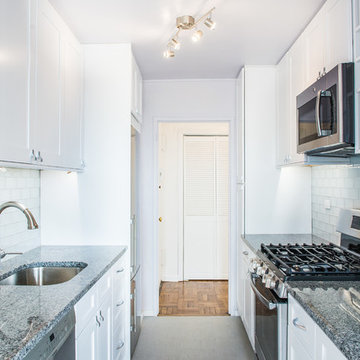
This small kitchen was way too small for this 2 bedrooms, 2 bathrooms apartment. Not only was it a very small kitchen, but the physical location of it made it very difficult to make it any bigger. There wasn't much that could have been done without incurring astronomical cost, which would get little or no return on the investment. The client wanted a kitchen that can be optimized in its current location to add a ton of value for resale.
This was difficult to do, because there was no moving of any mechanical around in the kitchen and even if we wanted to, the management of the building would not allow. For those of you who live in condos, co-ops or apartment building, you know how difficult it is to rework these foot prints. When we showed up, we saw the problems, but we also saw a huge opportunity where we can achieve those goals in the small space. This was accomplished by making some key changes and to incorporate some new things that was not possible when this kitchen was built years ago.
The crucial part of the design that would drive the entire new layout, was selecting the only appliance; that was the Refrigerator. Once we nailed down that refrigerator, we then proceeded to design the kitchen around it. We moved it to the other side of the wall where the sink was so that we can tap into the water line from the sink plumbing. It was crucial that it stays exactly 24" deep, not an inch more because we had to keep the entry as open as possible. Also, it was going to be directly in front of another big storage unit - The pantry. It is not ideal in most cases, but we needed the rest of the space to ramp up the design and open feel towards the side where all of the activities would take place, which happend to be the dining room and the view.
Once all that was figured out, we re-positioned the sink, dishwasher and the range and proceeded to wrap the cabinets around the columns to integrate them into the space. Thirty- six inches cabinets height was used so that they can be installed higher towards the ceiling height to give more room rather than the standard 18" required height between the counter tops. This was done to make the room feel a lot bigger than it really was. Not to mention, we also didn't want the faucet to be buried under the cabinets so that was also a necessary design detail for the space.
We then lowered both knee walls so that the counter top can sit on top of them, by removing that stop point that would have otherwise defined the kitchen area. This allowed us to pick up that extra footprint into the room for added prep space and enabled us to create the illusion of a kitchen that is looking longer than it really is. Every inch mattered when designing this kitchen and we made a conscious decision to use every one of that inch.
White cabinets were selected to do just what white cabinets are design to do; make a small or dark room appear bigger, brighter and more open. In this kitchen, this was amplified the more because of the kitchen location. It was perfect! We knew we did justice to the space because while we were there taking some photos, a few potential buyers walked in and went straight for the kitchen! They said its design just to fit the apartment.
Pantry roll out shelving, Double recycle bin, fancy handles, LED lighting, Quartz counter top, beautiful backslash tiles and grey linen floors finished off the kitchen which looked over a beautiful view of the George Washington Bridge from the top of this lovely 4th floor apartment.
Credit to Masterpiece Tile and Marble (Annmarie on the selection of Tiles and countertop and Val on the Construction to complete this project).
Davor Kokic Photography
 SKP Design
Located in a wooded setting which backs up to a golf course, The Woods is a vacation condo community in Canadian Lakes, Michigan. The owners asked us to create a comfortable modern design that would appeal to golfers and also families visiting relatives in the area. This complete renovation brought the design from 80's basic to rustic transitional. Colors and design elements echo the natural area surrounding the property.
SKP Design was involved in multiple aspects of this project. Our services included:
space planning for kitchen and both bathrooms
selecting finishes for walls, floors, trim, cabinets and countertops
reviewing construction details and electrical plans
specification of plumbing fixtures, appliances and accent lighting
furniture layout, specification and purchasing
fireplace design and stone selection
reviewing branding and signage ideas
In the great room, wrought iron accents are featured in a new staircase handrail system. Other metal accents are found in the new chandelier, barstools and the legs of the live edge coffee table. An open area under the staircase was enclosed with recessed shelving which gives a focal point to the dinette area. Recessed built-in cabinets near the fireplace store TV technology and accessories. The original tiled hearth was replaced by poured concrete with stone accents.
A queen sleeper sofa from Edgecomb provides additional sleeping. Fabrics and upholstery throughout the condo were selected for durability and cleanability.
Basic white laminate kitchen cabinets were replaced with beautiful dark stained wood. Floor tile is a wood-look porcelain from Daltile called Saddle Brook. Countertops in the kitchen and bathrooms are solid surface Corian Quartz (formerly called DuPont Zodiaq). Broadloom carpet is from Durkan. The first floor bedroom is Mona Vista pattern from Modesto Collection; all other carpet is Inviting Spaces pattern from Timeless Compositions. Walls are painted with Sherwin Williams 7647 Crushed Ice.
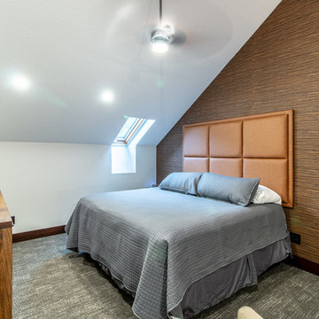
The main floor bedroom has a custom headboard mounted on a feature wall with plaid wallcovering. A freestanding vanity with undermount sink was added to the alcove area, creating space for a larger walk-in tiled shower with custom bench. On both levels, backlit mirrors highlight the sink areas. The upstairs bath has a blue tile feature wall and vessel sink.
A fiberglass bathtub surround was removed and replaced by a custom tiled shower. Vinyl wallcovering from D.L. Couch provides a focal point behind the king headboard in the loft bedroom. A twin sleeper chair adds an extra bed.
 Roeser Home Remodeling
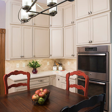
Older homes are filled with charm, but often the kitchen has been overlooked. Originally, it was a work area– not made for public view. Today it truly is the center of all that goes on in the family. Today’s active homeowners are no different. Although their children may be grown, cooking and baking are still considered top priorities. Storage and counter space were issues that needed to be addressed and being aware of the aging process of the kitchen, lighting also needed to be considered. Although the kitchen is only a 13’ X 13’ space, it had other challenges. A back staircase, three doorways, and a large window took away from the wall space, however the 9’ ceilings were an unused potential for storage. Choosing Wellborn’s Select Series Cabinets in a Maple with a sandstone slate finish brightened the space immediately. Stacking the cabinets and taking them all the way to the ceiling gave this homeowner more storage than ever imagined for items of occasional use. Under counter LED Tape lighting brightened the task areas of the kitchen without causing additional heat from too many lights. A new table light on a dimmer sets the right mood for dining and provides just enough additional lighting. Installing a Sharp, stainless steel, 24” microwave drawer freed up some counter space for prep work near the cooktop (a GE, stainless steel 30” gas cooktop with four burners) and next to the sink (a new Elkay Gourmet Double Bowl with aqua DVD). Also, adding a new Kohler Sensate kitchen faucet which is hands free, a Kohler contemporary soap/lotion dispenser and a new ISE 3/4 horsepower disposal– helps to make clean-up a breeze. A new GE dishwasher, a new Broan stainless steel 30” hood, and a new GE 30” double oven both standard oven sizes, not only allows our homeowner to cook dinner and dessert, but the stainless steel reflects light while adding a design element tying the cabinet hardware and light fixture into the overall look. The countertop is Caesarstone’s Dreamy Marfil and is always a bold statement for any size Kitchen. Mixing the backsplash tile up without appearing busy came together with the beautiful combination of Sandlewood polished Amafi 30cm from countertops to base cabinets and Jinsen Coffee Bone in a diamond pattern framed in the Sandlewood polish and a Amafi Pencil liner above the cooktop. The soft addition of a new six panel Pine door stained and finished to match the other doors within the home added to the overall beauty of this stunning kitchen.
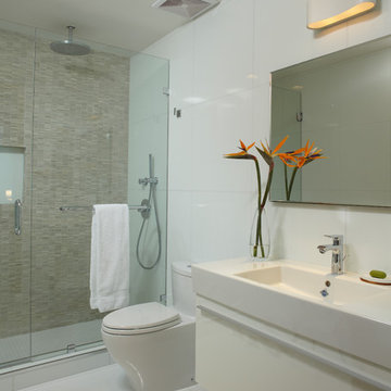
 J Design Group - Interior Designers Miami - Modern
AVENTURA MAGAZINE selected our client’s Bath Club luxury 5000 Sf ocean front apartment in Miami Beach, to publish it in their issue and they Said:
Story by Linda Marx, Photography by Daniel Newcomb
Light & Bright!
…… I wanted more open space, light and a supreme airy feeling,” she says. “With the glass design making a statement, it quickly became the star of the show.”…….
….. To add texture and depth, Corredor custom created wood doors here, and in other areas of the home. They provide a nice contrast to the open Florida tropical feel. “I added character to the openness by using exotic cherry wood,” she says. “I repeated this throughout the home and it works well.”
Known for capturing the client’s vision while adding her own innovative twists, Corredor lightened the family room, giving it a contemporary and modern edge with colorful art and matching throw pillows on the sofas. She added a large beige leather ottoman as the center coffee table in the room. This round piece was punctuated with a bold-toned flowering plant atop. It effortlessly matches the pillows and colors of the contemporary canvas.
Miami,
Miami Interior Designers,
Miami Interior Designer,
Interior Designers Miami,
Interior Designer Miami,
Modern Interior Designers,
Modern Interior Designer,
Modern interior decorators,
Modern interior decorator,
Contemporary Interior Designers,
Contemporary Interior Designer,
Interior design decorators,
Interior design decorator,
Interior Decoration and Design,
Black Interior Designers,
Black Interior Designer,
Interior designer,
Interior designers,
Interior design decorators,
Interior design decorator,
Home interior designers,
Home interior designer,
Interior design companies,
Interior decorators,
Interior decorator,
Decorators,
Decorator,
Miami Decorators,
Miami Decorator,
Decorators Miami,
Decorator Miami,
Interior Design Firm,
Interior Design Firms,
Interior Designer Firm,
Interior Designer Firms,
Interior design,
Interior designs,
Home decorators,
Interior decorating Miami,
Best Interior Designers,
Interior design decorator,
Modern,
Pent house design,
white interiors,
Miami, South Miami, Miami Beach, South Beach, Williams Island, Sunny Isles, Surfside, Fisher Island, Aventura, Brickell, Brickell Key, Key Biscayne, Coral Gables, CocoPlum, Coconut Grove, Pinecrest, Miami Design District, Golden Beach, Downtown Miami, Miami Interior Designers, Miami Interior Designer, Interior Designers Miami, Modern Interior Designers, Modern Interior Designer, Modern interior decorators, Contemporary Interior Designers, Interior decorators, Interior decorator , Interior designer, Interior designers, Luxury, modern, best, unique, real estate, decor
J Design Group – Miami Interior Design Firm – Modern – Contemporary
Contact us: (305) 444-4611
http://www.JDesignGroup.com

Sponsored
Columbus, OH

Structural Remodeling
Franklin County's Heavy Timber Specialists | Best of Houzz 2020!
 Penny Black Interiors LLC.
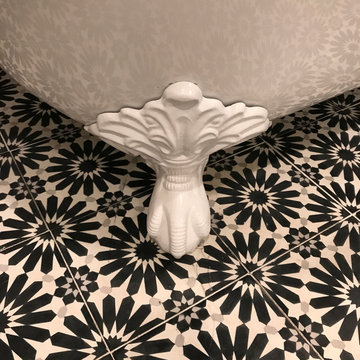
This 1896 Italianate Victorian home in Portland Heights was all but derelict in 2017.
We partnered with Look Construction LLC. to save this iconic home that sits atop a steep embankment—a huge challenge for the necessary new foundation. The house was lifted and new foundation poured adding 4 feet and a whole new floor to boot.
It had been stripped of all its original interior character over the years, so the design replaced and added to what was there originally. We re-designed the home’s layout, reconfiguring the kitchen, moving the lower staircase, adding a staircase to the loft room and rebuilding the widows walk roof deck. All doorways were raised to 9 feet to add to the sense of space.
Finally, we splurged on a selection of incredible wallpapers to add drama and romance to this stunning show piece of a home.
The Penny Black House is featured in Gray Magazine #39, April 2018.
 RAJ Kitchen and Bath, LLC
**Check out the video of this transformation on our website**
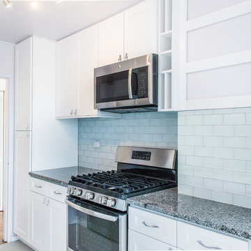
This small kitchen was way too small for this 2 bedrooms, 2 bathrooms apartment. Not only was it a very small kitchen, but the physical location of it made it very difficult to make it any bigger. There wasn't much that could have been done without incurring astronomical cost, which would get little or no return on the investment. The client wanted a kitchen that can be optimized in its current location to add a ton of value for resale.
This was difficult to do, because there was no moving of any mechanical around in the kitchen and even if we wanted to, the management of the building would not allow. For those of you who live in condos, co-ops or apartment building, you know how difficult it is to rework these foot prints. When we showed up, we saw the problems, but we also saw a huge opportunity where we can achieve those goals in the small space. This was accomplished by making some key changes and to incorporate some new things that was not possible when this kitchen was built years ago.
The crucial part of the design that would drive the entire new layout, was selecting the only appliance; that was the Refrigerator. Once we nailed down that refrigerator, we then proceeded to design the kitchen around it. We moved it to the other side of the wall where the sink was so that we can tap into the water line from the sink plumbing. It was crucial that it stays exactly 24" deep, not an inch more because we had to keep the entry as open as possible. Also, it was going to be directly in front of another big storage unit - The pantry. It is not ideal in most cases, but we needed the rest of the space to ramp up the design and open feel towards the side where all of the activities would take place, which happend to be the dining room and the view.
Once all that was figured out, we re-positioned the sink, dishwasher and the range and proceeded to wrap the cabinets around the columns to integrate them into the space. Thirty- six inches cabinets height was used so that they can be installed higher towards the ceiling height to give more room rather than the standard 18" required height between the counter tops. This was done to make the room feel a lot bigger than it really was. Not to mention, we also didn't want the faucet to be buried under the cabinets so that was also a necessary design detail for the space.
We then lowered both knee walls so that the counter top can sit on top of them, by removing that stop point that would have otherwise defined the kitchen area. This allowed us to pick up that extra footprint into the room for added prep space and enabled us to create the illusion of a kitchen that is looking longer than it really is. Every inch mattered when designing this kitchen and we made a conscious decision to use every one of that inch.
White cabinets were selected to do just what white cabinets are design to do; make a small or dark room appear bigger, brighter and more open. In this kitchen, this was amplified the more because of the kitchen location. It was perfect! We knew we did justice to the space because while we were there taking some photos, a few potential buyers walked in and went straight for the kitchen! They said its design just to fit the apartment.
Pantry roll out shelving, Double recycle bin, fancy handles, LED lighting, Quartz counter top, beautiful backslash tiles and grey linen floors finished off the kitchen which looked over a beautiful view of the George Washington Bridge from the top of this lovely 4th floor apartment.
Credit to Masterpiece Tile and Marble (Annmarie on the selection of Tiles and countertop and Val on the Construction to complete this project).
Davor Kokic Photography
 HIGOLD Outdoor Furniture
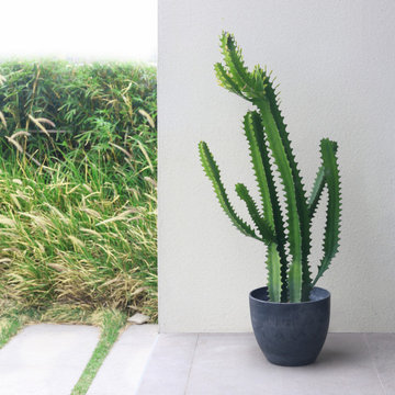
Introducing a gray flower pot can be a great way to add some stylish and modern flair to your home decor. Here are a few tips on how to do it:
Choose the right location: Before placing the gray flower pot, you should think about the best location for it. Consider the lighting in the room and how the pot will look with the other decor.
Select the right plant: Choosing the right plant for your gray flower pot is key. Consider the lighting and humidity levels in the room, as well as your own personal style preferences.
Pick complementary decor: Once you have chosen the right spot for your gray flower pot and the perfect plant, it's time to add some complementary decor. You can place the pot on a decorative tray or stand, or add some decorative stones or moss to the top of the soil.
Experiment with placement: Don't be afraid to experiment with different placements of your gray flower pot. You can try placing it on a bookshelf, a side table, or even on a windowsill to see where it looks best.
Overall, introducing a gray flower pot is a great way to add some modern style and natural beauty to your home decor. With a little bit of creativity and some careful thought, you can create a beautiful and stylish display that you will love.
110