
Search results for "Select 'adding'" in Home Design Ideas
 Milgard Windows & Doors
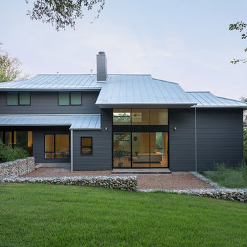
The Kiguchi family moved into their Austin, Texas home in 1994. Built in the 1980’s as part of a neighborhood development, they happily raised their family here but longed for something more contemporary. Once they became empty nesters, they decided it was time for a major remodel. After spending many years visiting Austin AIA Home Tours that highlight contemporary residential architecture, they had a lot of ideas and in 2013 were ready to interview architects and get their renovation underway.
The project turned into a major remodel due to an unstable foundation. Architects Ben Arbib and Ed Hughey, of Arbib Hughey Design were hired to solve the structural issue and look for inspiration in the bones of the house, which sat on top of a hillside and was surrounded by great views.
Unfortunately, with the old floor plan, the beautiful views were hidden by small windows that were poorly placed. In order to bring more natural light into the house the window sizes and configurations had to be addressed, all while keeping in mind the homeowners desire for a modern look and feel.
To achieve a more contemporary and sophisticated front of house, a new entry was designed that included removing a two-story bay window and porch. The entrance of the home also became more integrated with the landscape creating a template for new foliage to be planted. Older exterior materials were updated to incorporate a more muted palette of colors with a metal roof, dark grey siding in the back and white stucco in the front. Deep eaves were added over many of the new large windows for clean lines and sun protection.
“Inside it was about opening up the floor plan, expanding the views throughout the house, and updating the material palette to get a modern look that was also warm and inviting,” said Ben from Arbib Hughey Design. “Prior to the remodel, the house had the typical separation of rooms. We removed the walls between them and changed all of the windows to Milgard Thermally Improved Aluminum to connect the inside with the outside. No matter where you are you get nice views and natural light.”
The architects wanted to create some drama, which they accomplished with the window placement and opening up the interior floor plan to an open concept approach. Cabinetry was used to help delineate intimate spaces. To add warmth to an all-white living room, white-washed oak wood floors were installed and pine planks were used around the fireplace. The large windows served as artwork bringing the color of nature into the space.
An octagon shaped, elevated dining room, (named “the turret”), had a big impact on the design of the house. They architects rounded the corners and added larger window openings overlooking a new sunken garden. The great room was also softened by rounding out the corners and that circular theme continued throughout the house, being picked up in skylight wells and kitchen cabinetry. A staircase leading to a catwalk was added and the result was a two-story window wall that flooded the home with natural light.
When asked why Milgard® Thermally Improved Aluminum windows were selected, the architectural team listed many reasons:
1) Aesthetics: “We liked the slim profiles and narrow sightlines. The window frames never get in the way of the view and that was important to us. They also have a very contemporary look that went well with our design.”
2) Options: “We liked that we could get large sliding doors that matched the windows, giving us a very cohesive look and feel throughout the project.”
3) Cost Effective: “Milgard windows are affordable. You get a good product at a good price.”
4) Custom Sizes: “Milgard windows are customizable, which allowed us to get the right window for each location.”
Ready to take on your own traditional to modern home remodeling project? Arbib Hughey Design advises, “Work with a good architect. That means picking a team that is creative, communicative, listens well and is responsive. We think it’s important for an architect to listen to their clients and give them something they want, not something the architect thinks they should have. At the same time you want an architect who is willing and able to think outside the box and offer up design options that you may not have considered. Design is about a lot of back and forth, trying out ideas, getting feedback and trying again.”
The home was completely transformed into a unique, contemporary house perfectly integrated with its site. Internally the home has a natural flow for the occupants and externally it is integrated with the surroundings taking advantage of great natural light. As a side note, it was highly praised as part of the Austin AIA homes tour.
 Progressive Design Build
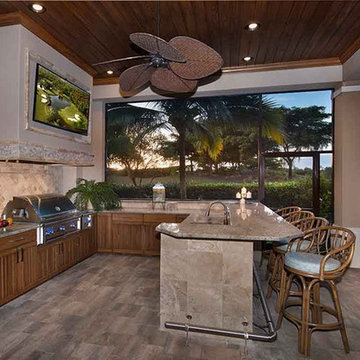
Here in Florida, we’re blessed with great weather year-round. So it’s no surprise that outdoor entertaining areas are an extremely popular way to enhance outdoor living. When our clients requested an update to their existing outdoor kitchen while they were away on vacation, we were ready to hit the ground running. While their beautiful 2-story home on a golf course had a pool and covered lanai area, the existing outdoor kitchen just didn’t function well for their needs. Mainly, they craved additional counter space and more seating. And, as avid football fans, with a son playing on a renown Division 1 college team, they also wanted a large screen TV to watch games. After all, what better way to share game day excitement than at a barbecue with family and friends?
A Bigger, Better Kitchen Layout
Our brilliant design team came up with a much larger, u-shaped outdoor kitchen layout for increased functionality. The extra base cabinets provided plenty of storage as well as a foundation for additional countertop space. Adjacent to the sink, we added a 24” outdoor refrigerator to keep food and beverages chilled, and the high top bar allowed for more seating around the perimeter.
For cooking, our clients selected a much larger Lynx grill and side burner to replace the original grill. While the kitchen was already set up for a grilling area, it required a hood, so we built and installed a custom hood for proper ventilation. Then, we added a large screen TV above the hood for easy viewing.
Finishing Touches
To softly illuminate the entire space at night, we installed additional recessed light fixtures into the ceiling and under the grill hood. We also tied the Cypress wood ceiling and the crown molding together into the design with a luxurious cabinet stain. Along with these finishing touches, we added a decorative travertine stone backsplash behind the grill and homogenized the front face of the bar for a polished, matching look.
Ventilation Challenges
With the outdoor kitchen lanai located directly under a second-floor living area, we had expected to tuck away ventilation ductwork between the second-level floor joists and the exterior wall running parallel to the grill hood. However, upon further investigation, we discovered the second floor joist system, in fact, ran perpendicular to the grill hood. In short, we needed a new way to hide the venting without compromising the original design.
Our team came up with an inspired solution: Construction of a false wall behind the outdoor kitchen allowed us to run ductwork without creating a visible chase for the vent, thus maintaining a symmetrical look on both sides of the grill and decorative hood.
Exceeding Expectations
In the end, we didn’t just meet our clients’ needs for a beautiful outdoor kitchen update – we exceeded them. As planned, we completed the new outdoor kitchen while they were out of town. But when our clients returned from vacation, they were so impressed with the results (and the stress-free design/build experience) that they promptly hired us for another extensive remodel – a stunning home addition!
 Paintzen, Inc.
Everyone needs a little space of their own. Whether it’s a cozy reading nook for a busy mom to curl up in at the end of a long day, a quiet corner of a living room for an artist to get inspired, or a mancave where die-hard sports fans can watch the game without distraction. Even Emmy-award winning “This Is Us” actor Sterling K. Brown was feeling like he needed a place where he could go to be productive (as well as get some peace and quiet). Sterling’s Los Angeles house is home to him, his wife, and two of their two sons – so understandably, it can feel a little crazy.
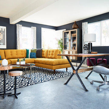
Sterling reached out to interior designer Kyle Schuneman of Apt2B to help convert his garage into a man-cave / office into a space where he could conduct some of his day-to-day tasks, run his lines, or just relax after a long day. As Schuneman began to visualize Sterling’s “creative workspace”, he and the Apt2B team reached out Paintzen to make the process a little more colorful.
The room was full of natural light, which meant we could go bolder with color. Schuneman selected a navy blue – one of the season’s most popular shades (especially for mancaves!) in a flat finish for the walls. The color was perfect for the space; it paired well with the concrete flooring, which was covered with a blue-and-white patterned area rug, and had plenty of personality. (Not to mention it makes a lovely backdrop for an Emmy, don’t you think?)
Schuneman’s furniture selection was done with the paint color in mind. He chose a bright, bold sofa in a mustard color, and used lots of wood and metal accents throughout to elevate the space and help it feel more modern and sophisticated. A work table was added – where we imagine Sterling will spend time reading scripts and getting work done – and there is plenty of space on the walls and in glass-faced cabinets, of course, to display future Emmy’s in the years to come. However, the large mounted TV and ample seating in the room means this space can just as well be used hosting get-togethers with friends.
We think you’ll agree that the final product was stunning. The rich navy walls paired with Schuneman’s decor selections resulted in a space that is smart, stylish, and masculine. Apt2B turned a standard garage into a sleek home office and Mancave for Sterling K. Brown, and our team at Paintzen was thrilled to be a part of the process.
Find the right local pro for your project
 Schroeder Design/Build, Inc.
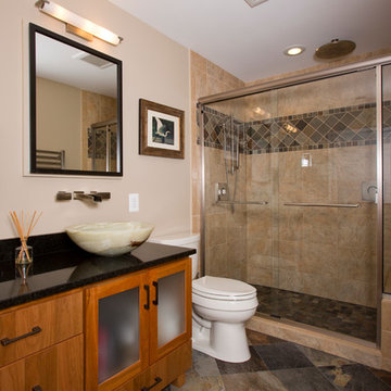
It's hard to believe that this gorgeous master bath was once a small, dull bathroom. Our clients wanted a luxurious, yet practical bath. To accommodate a double vanity, we re-claimed space from an existing closet and replaced the lost space by adding a cantilever on the other side of the room.
The material selections bring the mission style aesthetic to life - natural cherry cabinets, black pearl granite, oil rubbed bronze medicine cabinets, vessel sink, multi-color slate floors and shower tile surround.
 Dura Supreme Cabinetry
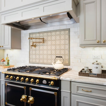
With an ideal location in the Pacific Heights neighborhood of San Francisco, this dated Victorian residence had "beautiful bones" but had been sitting on the market for a year before being purchased with plans to revitalize the interior. Interior designer, Noel Han, explained, "Historical Victorian homes in this area often have beautiful architectural elements that I aim to preserve, but the floor plan and layout tend to be stuffy, not live-able and not light filled. Modern families want bright, light-filled, spacious rooms that take advantage of outdoor views and living spaces, and function well for storage, meals and entertaining."
Preserving the architectural integrity and special features of the home was one of Han's goals but at the same time, she re-designed the space, moving walls and adding windows to create an open floorplan that flowed easily between the kitchen and outdoor living spaces. Where the range once stood in the original design, now an entire wall of windows provides panoramic views of the outdoors and fills the kitchen with light. Below the windows, Han designed a long bank of base cabinets with drawers to provide plenty of storage and work surface. Light now pours into the space even on foggy days. The range was moved to the opposite wall so that beautiful window views could be added to the kitchen.
Han selected a palette of finishes with an eye toward creating a "soft color aesthetic". "White painted finishes are very popular right now but would have felt stark and cold in this space," she explained. "The French grey paint from Dura Supreme was a perfect complement for this vintage Victorian home, to create a classic color scheme".
"This beautiful home already had hardware elements with a vintage brass finish, so I carefully selected antiqued, brushed brass hardware, plumbing and metal finishes to blend with the original elements," said Han. She continued, "The La Cornue French Range adds modern function with a French antique look."
"I appreciate working with Dura Supreme cabinetry because of the quality of the cabinetry, fast delivery and the custom options. I'm able to create beautiful architectural details like the pull-out columns on both sides of the range and the curved mullion doors on the furniture hutch, and they offer a stunning palette of finishes and styles," explained Han. For the bath cabinetry, Han created a similar palette of finishes and styles to create a complementary look throughout the entire home.
Product Details:
Perimeter: Dura Supreme Cabinetry shown in the St. Augustine door style and Mullion Pattern #15 door style with a “Zinc” painted finish.
Kitchen Island: Dura Supreme Cabinetry shown in the St. Augustine door style with a Clove stain and Black Accent finish on Cherry wood.
For more information about Noel Han, Interior Designer, click to her website here www.atelnoel.com.
For more information about Gilmans Kitchens and Baths, click to their website here www.gkandb.com.
Photography by: Ned Bonzi www.nedbonzi.com.
Request a FREE Dura Supreme Brochure Packet:
http://www.durasupreme.com/request-brochure
 Michael Nash Design, Build & Homes
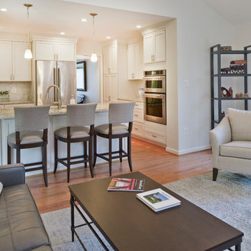
For this couple, planning to move back to their rambler home in Arlington after living overseas for few years, they were ready to get rid of clutter, clean up their grown-up kids’ boxes, and transform their home into their dream home for their golden years.
The old home included a box-like 8 feet x 10 feet kitchen, no family room, three small bedrooms and two back to back small bathrooms. The laundry room was located in a small dark space of the unfinished basement.
This home is located in a cul-de-sac, on an uphill lot, of a very secluded neighborhood with lots of new homes just being built around them.
The couple consulted an architectural firm in past but never were satisfied with the final plans. They approached Michael Nash Custom Kitchens hoping for fresh ideas.
The backyard and side yard are wooded and the existing structure was too close to building restriction lines. We developed design plans and applied for special permits to achieve our client’s goals.
The remodel includes a family room, sunroom, breakfast area, home office, large master bedroom suite, large walk-in closet, main level laundry room, lots of windows, front porch, back deck, and most important than all an elevator from lower to upper level given them and their close relative a necessary easier access.
The new plan added extra dimensions to this rambler on all four sides. Starting from the front, we excavated to allow a first level entrance, storage, and elevator room. Building just above it, is a 12 feet x 30 feet covered porch with a leading brick staircase. A contemporary cedar rail with horizontal stainless steel cable rail system on both the front porch and the back deck sets off this project from any others in area. A new foyer with double frosted stainless-steel door was added which contains the elevator.
The garage door was widened and a solid cedar door was installed to compliment the cedar siding.
The left side of this rambler was excavated to allow a storage off the garage and extension of one of the old bedrooms to be converted to a large master bedroom suite, master bathroom suite and walk-in closet.
We installed matching brick for a seam-less exterior look.
The entire house was furnished with new Italian imported highly custom stainless-steel windows and doors. We removed several brick and block structure walls to put doors and floor to ceiling windows.
A full walk in shower with barn style frameless glass doors, double vanities covered with selective stone, floor to ceiling porcelain tile make the master bathroom highly accessible.
The other two bedrooms were reconfigured with new closets, wider doorways, new wood floors and wider windows. Just outside of the bedroom, a new laundry room closet was a major upgrade.
A second HVAC system was added in the attic for all new areas.
The back side of the master bedroom was covered with floor to ceiling windows and a door to step into a new deck covered in trex and cable railing. This addition provides a view to wooded area of the home.
By excavating and leveling the backyard, we constructed a two story 15’x 40’ addition that provided the tall ceiling for the family room just adjacent to new deck, a breakfast area a few steps away from the remodeled kitchen. Upscale stainless-steel appliances, floor to ceiling white custom cabinetry and quartz counter top, and fun lighting improved this back section of the house with its increased lighting and available work space. Just below this addition, there is extra space for exercise and storage room. This room has a pair of sliding doors allowing more light inside.
The right elevation has a trapezoid shape addition with floor to ceiling windows and space used as a sunroom/in-home office. Wide plank wood floors were installed throughout the main level for continuity.
The hall bathroom was gutted and expanded to allow a new soaking tub and large vanity. The basement half bathroom was converted to a full bathroom, new flooring and lighting in the entire basement changed the purpose of the basement for entertainment and spending time with grandkids.
Off white and soft tone were used inside and out as the color schemes to make this rambler spacious and illuminated.
Final grade and landscaping, by adding a few trees, trimming the old cherry and walnut trees in backyard, saddling the yard, and a new concrete driveway and walkway made this home a unique and charming gem in the neighborhood.
 Progressive Design Build
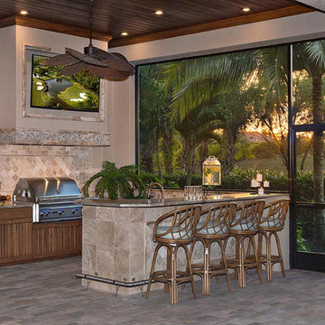
Here in Florida, we’re blessed with great weather year-round. So it’s no surprise that outdoor entertaining areas are an extremely popular way to enhance outdoor living. When our clients requested an update to their existing outdoor kitchen while they were away on vacation, we were ready to hit the ground running. While their beautiful 2-story home on a golf course had a pool and covered lanai area, the existing outdoor kitchen just didn’t function well for their needs. Mainly, they craved additional counter space and more seating. And, as avid football fans, with a son playing on a renown Division 1 college team, they also wanted a large screen TV to watch games. After all, what better way to share game day excitement than at a barbecue with family and friends?
A Bigger, Better Kitchen Layout
Our brilliant design team came up with a much larger, u-shaped outdoor kitchen layout for increased functionality. The extra base cabinets provided plenty of storage as well as a foundation for additional countertop space. Adjacent to the sink, we added a 24” outdoor refrigerator to keep food and beverages chilled, and the high top bar allowed for more seating around the perimeter.
For cooking, our clients selected a much larger Lynx grill and side burner to replace the original grill. While the kitchen was already set up for a grilling area, it required a hood, so we built and installed a custom hood for proper ventilation. Then, we added a large screen TV above the hood for easy viewing.
Finishing Touches
To softly illuminate the entire space at night, we installed additional recessed light fixtures into the ceiling and under the grill hood. We also tied the Cypress wood ceiling and the crown molding together into the design with a luxurious cabinet stain. Along with these finishing touches, we added a decorative travertine stone backsplash behind the grill and homogenized the front face of the bar for a polished, matching look.
Ventilation Challenges
With the outdoor kitchen lanai located directly under a second-floor living area, we had expected to tuck away ventilation ductwork between the second-level floor joists and the exterior wall running parallel to the grill hood. However, upon further investigation, we discovered the second floor joist system, in fact, ran perpendicular to the grill hood. In short, we needed a new way to hide the venting without compromising the original design.
Our team came up with an inspired solution: Construction of a false wall behind the outdoor kitchen allowed us to run ductwork without creating a visible chase for the vent, thus maintaining a symmetrical look on both sides of the grill and decorative hood.
Exceeding Expectations
In the end, we didn’t just meet our clients’ needs for a beautiful outdoor kitchen update – we exceeded them. As planned, we completed the new outdoor kitchen while they were out of town. But when our clients returned from vacation, they were so impressed with the results (and the stress-free design/build experience) that they promptly hired us for another extensive remodel – a stunning home addition!

Sponsored
Columbus, OH

Hope Restoration & General Contracting
Columbus Design-Build, Kitchen & Bath Remodeling, Historic Renovations
 Fabco Sanctuary
The architect and designer Guy Derwent was approached by his client with a clear and compelling brief: to completely transform a grand Victorian terrace house they were planning to renovate. The client envisioned something far beyond a standard renovation – this was to be a bold and dramatic reimagining of a family home that could grow with them over time.
With the property having remained largely untouched for more than fifty years, the architects saw an opportunity to unlock its potential and deliver a contemporary design that would contrast beautifully with its Victorian heritage.
The existing layout consisted of a series of small, disconnected rooms to the rear of the house. To respond to the client’s need for openness and flexibility, the architect proposed a radical restructuring of the ground floor:
The rear rooms were completely removed
Suspended timber floors were lowered by up to two metres to align with the garden
Two bold extensions were added
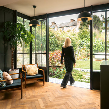
The first extension filled in the side return with a London stock brick facade and a glazed roof, while the second – a striking black steel and glass pavilion was glazed on three sides and placed along the garden elevation.
This new pavilion redefined the building’s relationship with the garden. Its steel-framed glazing created a seamless dialogue between interior and exterior, offering a sense of immersion in the surrounding landscape.
At the heart of the plan sits a dramatic, five-metre-tall dining space that acts as a transition from the original entrance hall into the new addition. A large, circular cast-glass window, framed in steel, provides a visual and spatial link between old and new, allowing light and movement to travel through the depth of the home.
Throughout the project, a series of black metal elements were introduced as sculptural interventions – each marking moments of transformation within the house. These included the bespoke steel framed circular window, a custom metal staircase, a cylindrical support column, and the striking steel and glass garden pavilion. Together, they formed a coherent architectural language that underscored the project’s bold intent.
Our steel windows and doors played a vital role in delivering the project’s vision. The architects chose steel for its refined sight lines and distinctive material character, which helped bridge the gap between the historical context of the building and the bold new additions.
The black steel frames provided a crisp contrast to the pale London stock brick and added definition to the glazed pavilion, reinforcing the sense of architectural precision. In particular, the fine steel profiles of the garden room allowed the extension to feel both lightweight and immersive, blurring the boundary between the house and its garden.
The architect drew inspiration from the Bauhaus Movement, particularly the work of Walter Gropius, whose approach to functional beauty and industrial materials informed the design of the garden pavilion.
Here, our glazing system was used not just for transparency, but as an expressive architectural element. The carefully proportioned panels help to conceal the roof thickness and reinforce the pavilion’s industrial yet abstract character – a deliberate nod to product design and modernist detailing.
Sustainability was an important factor in the selection of materials. Our steel systems, made from 99% recycled content and 100% recyclable, aligned with the project’s broader environmental goals.
The architects noted that this commitment to material longevity and circularity was central to their decision to use steel. The durability and recyclability of the windows and doors ensured the project met both aesthetic and ethical criteria.
This London terrace house now stands as a celebration of contrast – between heritage and innovation, solidity and transparency, tradition and transformation. Our steel windows and doors were not simply components; they were essential tools in crafting a home that is as bold and expressive as it is functional.
The result is a home designed for modern family life, where light, space, and materiality come together in perfect harmony.
 Dura Supreme Cabinetry
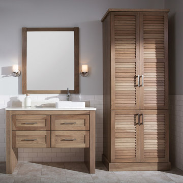
Cleanse the clutter in your bathroom by selecting a coordinated collection of bath furniture with spare sensibility. Dura Supreme’s “Style Six” furniture series is designed to create sleek, minimalist appeal. Bookended on both sides and across the top, a set of doors and/or drawers are suspended beneath the countertop. If preferred, a floating shelf can be added for additional and attractive storage underneath.
An offset sink is sensitive to space limitations and maximizes countertop capacity in this small bathroom. Louvered linen storage adds drama and coordinated beautifully with the vanity style. Style Six furniture series offers 10 different configurations (for single sink vanities, double sink vanities, or offset sinks), and an optional floating shelf (vanity floor). Any combination of Dura Supreme’s many door styles, wood species, and finishes can be selected to create a one-of-a-kind bath furniture collection.
The bathroom has evolved from its purist utilitarian roots to a more intimate and reflective sanctuary in which to relax and reconnect. A refreshing spa-like environment offers a brisk welcome at the dawning of a new day or a soothing interlude as your day concludes.
Our busy and hectic lifestyles leave us yearning for a private place where we can truly relax and indulge. With amenities that pamper the senses and design elements inspired by luxury spas, bathroom environments are being transformed from the mundane and utilitarian to the extravagant and luxurious.
Bath cabinetry from Dura Supreme offers myriad design directions to create the personal harmony and beauty that are a hallmark of the bath sanctuary. Immerse yourself in our expansive palette of finishes and wood species to discover the look that calms your senses and soothes your soul. Your Dura Supreme designer will guide you through the selections and transform your bath into a beautiful retreat.
Request a FREE Dura Supreme Brochure Packet:
http://www.durasupreme.com/request-brochure
Find a Dura Supreme Showroom near you today:
http://www.durasupreme.com/dealer-locator
 Legendary Real Estate
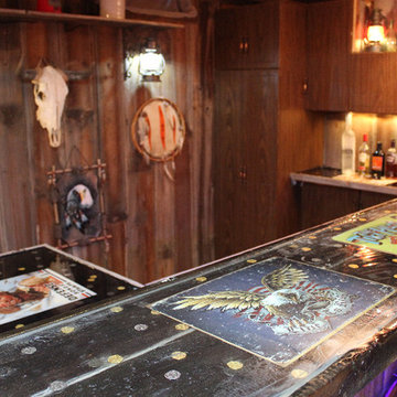
A lower level bar and entertaining area was added, by repurposing the old kitchen cabinets, adding some 100 year old barn wood, installing a custom poured epoxy counterop and decorative accents, the entertaining area was the favorite room in the new renovation - adding a ton of living/entertaining space to this home!
{Featured Story} Spring, 2015 – This condo was purchased from the estate of the new owner’s parents and refurbished with trendy new touches. There were no close comparables in the Farmington neighborhood with within walking distance to the urban downtown area, so the approach for selling was to create an entirely new set of comparables when the new owner was found. On the market for just days, the renovation, marketing and finishing touches made this a highly sought after, and quick to sell property at top dollar, establishing a new trend in the neighborhood.
{Our Process for this Featured Property}: Assessed the initial investment condo, offered suggestions for rehab and renovation. Assisted with Color Theory through color selection and process (no beige in this condo!). Helped select floor and counter materials, tile selection and features in the kitchen and bath. Final staging of the property was done with antiques and housewares, and created a cozy and lived in feel. As a final touch, a party was thrown when the property was completed to invite in friends and family, as well as an open house with freshly baking chocolate chip cookies to make the prospective buyers feel right at home!
{Outcome} This property sold in days as a cash sale, at a higher price than anything in the neighborhood – and closed quickly. Both the seller and buyer were thrilled with this transaction!
 Kitchens by Good Guys
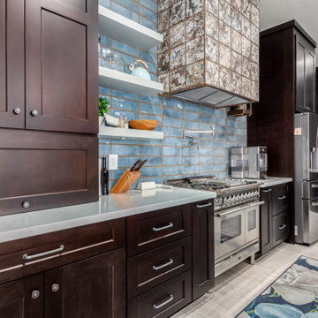
Before, the kitchen was clustered into one corner and wasted a lot of space. We re-arranged everything to create this more linear layout, creating significantly more storage and a much more functional layout. We removed all the travertine flooring throughout the entrance and in the kitchen and installed new porcelain tile flooring that matched the new color palette.
As artists themselves, our clients brought in very creative, hand selected pieces and incorporated their love for flying by adding airplane elements into the design that you see throughout.
For the cabinetry, they selected an espresso color for the perimeter that goes all the way to the 10' high ceilings along with marble quartz countertops. We incorporated lift up appliance garage systems, utensil pull outs, roll out shelving and pull out trash for ease of use and organization. The 12' island has grey painted cabinetry with tons of storage, seating and tying back in the espresso cabinetry with the legs and decorative island end cap along with "chicken feeder" pendants they created. The range wall is the biggest focal point with the accent tile our clients found that is meant to duplicate the look of vintage metal pressed ceilings, along with a gorgeous Italian range, pot filler and fun blue accent tile.
When re-arranging the kitchen and removing walls, we added a custom stained French door that allows them to close off the other living areas on that side of the house. There was this unused space in that corner, that now became a fun coffee bar station with stained turquoise cabinetry, butcher block counter for added warmth and the fun accent tile backsplash our clients found. We white-washed the fireplace to have it blend more in with the new color palette and our clients re-incorporated their wood feature wall that was in a previous home and each piece was hand selected.
Everything came together in such a fun, creative way that really shows their personality and character.
 Kitchens by Good Guys
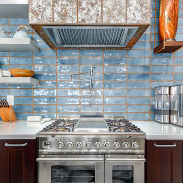
Before, the kitchen was clustered into one corner and wasted a lot of space. We re-arranged everything to create this more linear layout, creating significantly more storage and a much more functional layout. We removed all the travertine flooring throughout the entrance and in the kitchen and installed new porcelain tile flooring that matched the new color palette.
As artists themselves, our clients brought in very creative, hand selected pieces and incorporated their love for flying by adding airplane elements into the design that you see throughout.
For the cabinetry, they selected an espresso color for the perimeter that goes all the way to the 10' high ceilings along with marble quartz countertops. We incorporated lift up appliance garage systems, utensil pull outs, roll out shelving and pull out trash for ease of use and organization. The 12' island has grey painted cabinetry with tons of storage, seating and tying back in the espresso cabinetry with the legs and decorative island end cap along with "chicken feeder" pendants they created. The range wall is the biggest focal point with the accent tile our clients found that is meant to duplicate the look of vintage metal pressed ceilings, along with a gorgeous Italian range, pot filler and fun blue accent tile.
When re-arranging the kitchen and removing walls, we added a custom stained French door that allows them to close off the other living areas on that side of the house. There was this unused space in that corner, that now became a fun coffee bar station with stained turquoise cabinetry, butcher block counter for added warmth and the fun accent tile backsplash our clients found. We white-washed the fireplace to have it blend more in with the new color palette and our clients re-incorporated their wood feature wall that was in a previous home and each piece was hand selected.
Everything came together in such a fun, creative way that really shows their personality and character.
 Kitchens by Good Guys
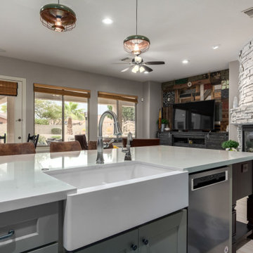
Before, the kitchen was clustered into one corner and wasted a lot of space. We re-arranged everything to create this more linear layout, creating significantly more storage and a much more functional layout. We removed all the travertine flooring throughout the entrance and in the kitchen and installed new porcelain tile flooring that matched the new color palette.
As artists themselves, our clients brought in very creative, hand selected pieces and incorporated their love for flying by adding airplane elements into the design that you see throughout.
For the cabinetry, they selected an espresso color for the perimeter that goes all the way to the 10' high ceilings along with marble quartz countertops. We incorporated lift up appliance garage systems, utensil pull outs, roll out shelving and pull out trash for ease of use and organization. The 12' island has grey painted cabinetry with tons of storage, seating and tying back in the espresso cabinetry with the legs and decorative island end cap along with "chicken feeder" pendants they created. The range wall is the biggest focal point with the accent tile our clients found that is meant to duplicate the look of vintage metal pressed ceilings, along with a gorgeous Italian range, pot filler and fun blue accent tile.
When re-arranging the kitchen and removing walls, we added a custom stained French door that allows them to close off the other living areas on that side of the house. There was this unused space in that corner, that now became a fun coffee bar station with stained turquoise cabinetry, butcher block counter for added warmth and the fun accent tile backsplash our clients found. We white-washed the fireplace to have it blend more in with the new color palette and our clients re-incorporated their wood feature wall that was in a previous home and each piece was hand selected.
Everything came together in such a fun, creative way that really shows their personality and character.

Sponsored
Columbus, OH

Structural Remodeling
Franklin County's Heavy Timber Specialists | Best of Houzz 2020!
 Kitchens by Good Guys
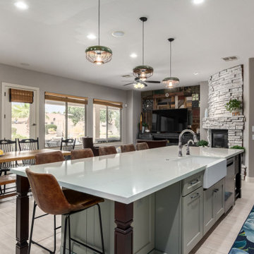
Before, the kitchen was clustered into one corner and wasted a lot of space. We re-arranged everything to create this more linear layout, creating significantly more storage and a much more functional layout. We removed all the travertine flooring throughout the entrance and in the kitchen and installed new porcelain tile flooring that matched the new color palette.
As artists themselves, our clients brought in very creative, hand selected pieces and incorporated their love for flying by adding airplane elements into the design that you see throughout.
For the cabinetry, they selected an espresso color for the perimeter that goes all the way to the 10' high ceilings along with marble quartz countertops. We incorporated lift up appliance garage systems, utensil pull outs, roll out shelving and pull out trash for ease of use and organization. The 12' island has grey painted cabinetry with tons of storage, seating and tying back in the espresso cabinetry with the legs and decorative island end cap along with "chicken feeder" pendants they created. The range wall is the biggest focal point with the accent tile our clients found that is meant to duplicate the look of vintage metal pressed ceilings, along with a gorgeous Italian range, pot filler and fun blue accent tile.
When re-arranging the kitchen and removing walls, we added a custom stained French door that allows them to close off the other living areas on that side of the house. There was this unused space in that corner, that now became a fun coffee bar station with stained turquoise cabinetry, butcher block counter for added warmth and the fun accent tile backsplash our clients found. We white-washed the fireplace to have it blend more in with the new color palette and our clients re-incorporated their wood feature wall that was in a previous home and each piece was hand selected.
Everything came together in such a fun, creative way that really shows their personality and character.
 Blackline Renovations
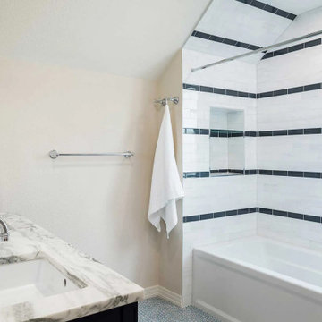
For the master bathroom, we created a new layout that better suited the homeowners’ needs, incorporating updated finishes for a more luxurious feel. Unique and playful tile selections added a touch of personality, making the space both elegant and fun.
 Kitchens by Good Guys
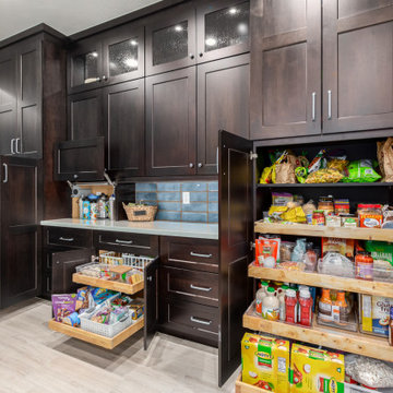
Before, the kitchen was clustered into one corner and wasted a lot of space. We re-arranged everything to create this more linear layout, creating significantly more storage and a much more functional layout. We removed all the travertine flooring throughout the entrance and in the kitchen and installed new porcelain tile flooring that matched the new color palette.
As artists themselves, our clients brought in very creative, hand selected pieces and incorporated their love for flying by adding airplane elements into the design that you see throughout.
For the cabinetry, they selected an espresso color for the perimeter that goes all the way to the 10' high ceilings along with marble quartz countertops. We incorporated lift up appliance garage systems, utensil pull outs, roll out shelving and pull out trash for ease of use and organization. The 12' island has grey painted cabinetry with tons of storage, seating and tying back in the espresso cabinetry with the legs and decorative island end cap along with "chicken feeder" pendants they created. The range wall is the biggest focal point with the accent tile our clients found that is meant to duplicate the look of vintage metal pressed ceilings, along with a gorgeous Italian range, pot filler and fun blue accent tile.
When re-arranging the kitchen and removing walls, we added a custom stained French door that allows them to close off the other living areas on that side of the house. There was this unused space in that corner, that now became a fun coffee bar station with stained turquoise cabinetry, butcher block counter for added warmth and the fun accent tile backsplash our clients found. We white-washed the fireplace to have it blend more in with the new color palette and our clients re-incorporated their wood feature wall that was in a previous home and each piece was hand selected.
Everything came together in such a fun, creative way that really shows their personality and character.
 Medina Exteriors & Remodeling
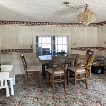
This kitchen was a huge transformation. Dark luxury vinyl plank flooring from the back door through the kitchen. Off white cabinets, deep blue island and light countertops. White subway tile along the perimeter cabinets, with an accent tile behind the stainless steel hood and above the range.
Before, the kitchen was outdated and was very closed off from the living room. The homeowners wanted to open the space up so it was a great space for entertaining. In order to optimize the space and make this happen, we did a few things..
1) Removed the wall separating the kitchen from the dining room
2) Removal of the ceiling in the kitchen and dining room so it was one level and height maximized
3) Drywalled in a window that was out to the 3 seasons room
This allowed us to maximize the space for a lot of cabinets, storage, and functionality. The biggest feature of this new kitchen is the 10‘ wide two toned island with overhangs on all sides, allowing for 5 to 6 seats along the backside. The homeowners did a wonderful job with their selections, adding their special touches with décor and even a few projects of their own to finish out their new kitchen space!

Sponsored
Columbus, OH

Wannemacher Interiors
Customized Award-Winning Interior Design Solutions in Franklin Cnty OH
 Medina Exteriors & Remodeling
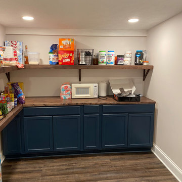
This kitchen was a huge transformation. Dark luxury vinyl plank flooring from the back door through the kitchen. Off white cabinets, deep blue island and light countertops. White subway tile along the perimeter cabinets, with an accent tile behind the stainless steel hood and above the range.
Before, the kitchen was outdated and was very closed off from the living room. The homeowners wanted to open the space up so it was a great space for entertaining. In order to optimize the space and make this happen, we did a few things..
1) Removed the wall separating the kitchen from the dining room
2) Removal of the ceiling in the kitchen and dining room so it was one level and height maximized
3) Drywalled in a window that was out to the 3 seasons room
This allowed us to maximize the space for a lot of cabinets, storage, and functionality. The biggest feature of this new kitchen is the 10‘ wide two toned island with overhangs on all sides, allowing for 5 to 6 seats along the backside. The homeowners did a wonderful job with their selections, adding their special touches with décor and even a few projects of their own to finish out their new kitchen space!
 Medina Exteriors & Remodeling
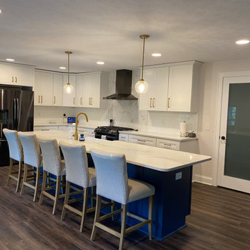
This kitchen was a huge transformation. Dark luxury vinyl plank flooring from the back door through the kitchen. Off white cabinets, deep blue island and light countertops. White subway tile along the perimeter cabinets, with an accent tile behind the stainless steel hood and above the range.
Before, the kitchen was outdated and was very closed off from the living room. The homeowners wanted to open the space up so it was a great space for entertaining. In order to optimize the space and make this happen, we did a few things..
1) Removed the wall separating the kitchen from the dining room
2) Removal of the ceiling in the kitchen and dining room so it was one level and height maximized
3) Drywalled in a window that was out to the 3 seasons room
This allowed us to maximize the space for a lot of cabinets, storage, and functionality. The biggest feature of this new kitchen is the 10‘ wide two toned island with overhangs on all sides, allowing for 5 to 6 seats along the backside. The homeowners did a wonderful job with their selections, adding their special touches with décor and even a few projects of their own to finish out their new kitchen space!
 Medina Exteriors & Remodeling
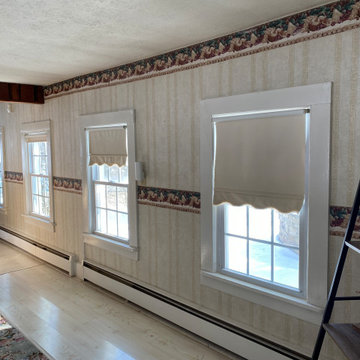
This kitchen was a huge transformation. Dark luxury vinyl plank flooring from the back door through the kitchen. Off white cabinets, deep blue island and light countertops. White subway tile along the perimeter cabinets, with an accent tile behind the stainless steel hood and above the range.
Before, the kitchen was outdated and was very closed off from the living room. The homeowners wanted to open the space up so it was a great space for entertaining. In order to optimize the space and make this happen, we did a few things..
1) Removed the wall separating the kitchen from the dining room
2) Removal of the ceiling in the kitchen and dining room so it was one level and height maximized
3) Drywalled in a window that was out to the 3 seasons room
This allowed us to maximize the space for a lot of cabinets, storage, and functionality. The biggest feature of this new kitchen is the 10‘ wide two toned island with overhangs on all sides, allowing for 5 to 6 seats along the backside. The homeowners did a wonderful job with their selections, adding their special touches with décor and even a few projects of their own to finish out their new kitchen space!
26