
Search results for "Select 'adding'" in Home Design Ideas
 JK interior living
Raquel Langworthy
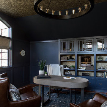
Example of a mid-sized eclectic freestanding desk dark wood floor and brown floor study room design in New York with blue walls
Example of a mid-sized eclectic freestanding desk dark wood floor and brown floor study room design in New York with blue walls
 Linette Dai Design
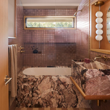
Example of a 1950s pink tile multicolored floor and single-sink bathroom design in Los Angeles with an undermount tub, a vessel sink and a floating vanity
 Barbara Wilson Landscape Architect, LLC
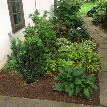
This cute backyard patio was renovated to provide an outdoor seating area with a firepit by Benintoshape, bar seating for entertaining and a cozy dining area adjacent to the kitchen. Barbara designed perennials and bulbs to be added to the existing shade garden spaces and new plantings were incorporated to provide more seasonal color and interest in the rose garden. New shade tolerant shrubs and groundcovers were added under a large Norway Maple tree that cast considerable shade in the backyard. A new stepping stone path provided access to the nearby sunny lawn and playscape in the side yard. The back and side yards were enclosed with a picket fence to keep the pets and children safe. Comfortable lounge furniture by Janus et Cie and pillows by Elaine Smith were placed in the renovated patio space. The dining area was covered with a Tuuci cantilever umbrella for additional shade in the afternoon.
Find the right local pro for your project
 Ryann Reed Design Build
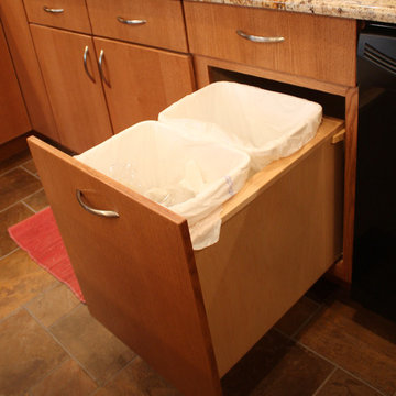
We opened up this kitchen into the dining area which added more natural light. The family wanted to make sure the kitchen was handicap accessible for their son. We made sure that the aisle were wide enough for the wheelchair. The open shelf island was made specifically for the customer's son. This is his place that he can store his belonging with easy access. The customer fell in love with the Typhoon Bordeaux granite and we helped him select cabinets that would compliment the granite. We selected the flat panel cabinets in oak for a modern look but also for durability. Photographer: Ilona Kalimov
 Che Bella Interiors Design + Remodeling
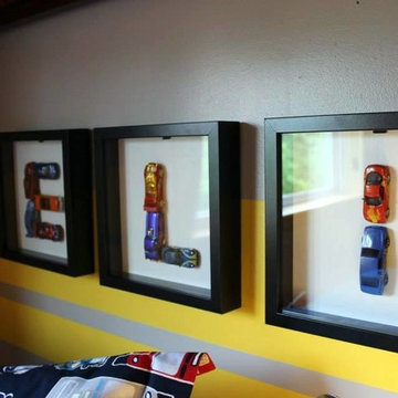
This bedroom was completed after our design was selected by BATC / Special Spaces for their 2014 Design Competition to design a bedroom for four-year-old Eli. Our design focused on creating a fun room for this little boy with a love of all things with wheels (and Ninja Turtles!). The carpet was replaced with durable luxury vinyl planks that mimic wood. A loft bed was added along with a race car bed so that the room can grow with Eli. We incorporated racing stripes along with racing decals. A closet system was added to help keep Eli organized.
 Simply Home Decorating
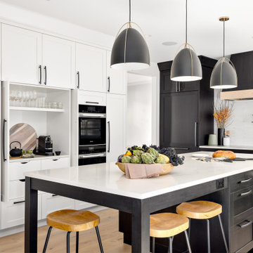
This beautiful North Vancouver home belongs to a nature-loving and health-conscious couple, Emma and Vince (names changed), their two young children, and their dog, Jasper. When they contacted us about renovating and furnishing their kitchen and family room, we walked in and saw a world of potential waiting to be uncovered.
Before: Larkhall Crescent Home:
Like many original North Vancouver homes, the interior was definitely dated. We encountered late ‘80s finishes in powder pink and teal green, old carpet, and a kitchen that wasn’t maximized to suit this family’s modern-day lifestyle. However, the size of the rooms offered us a ton of space with which to get creative.
Knowing our clients’ love of cooking, need for work spaces (Emma and Vince both work remotely), and growing family, we developed a design concept that would increase usable space, optimize storage, and create intimacy in this large area. As for the style, we were inspired by their European roots, inventing a new and modern take on “Belgian Farmhouse” style. Now, the home is truly one-of-a-kind.
After: Warm & Cozy Family Room:
Fresh, bright, and comfortable, this living area has been transformed! We started with the fireplace as a focal point, selecting aged brick tiles for added texture and a crisp wood mantle. The taupe-coloured sectional infuses the room with visual warmth and serves the added purpose of separating the family room from the kitchen.
Emma and Vince were also keen on using non-toxic materials in their home, and we were happy to oblige. To meet their needs, we sourced natural wood elements and sought out Canadian-made products - that adhere to high health standards - whenever possible.
Look closer at the elements of this space, and you will find this stunning, honeycomb-patterned rug in earthy gold, beige, and charcoal tones. It’s plush to the touch and full of visual texture that brings this room’s colour palette together. We sourced these two-tone chairs with caning, petrified wood side table, black sconces, and botanical prints in greyscale from local artist, Heather Johnston.
We topped off the space with this dark wood and rattan console that offers storage facing the kitchen and presents an opportunity to display cherished items. The result is a cozy lounging space brimming with comfort and functionality. It’s perfect for enjoying quality family time, or Emma can simply slide the coffee table away to make room for her morning yoga practice.
Now, let’s turn around and give some attention to the kitchen. Do you remember what the original kitchen looked like? If not, scroll back up, because the transformation is shocking…
Moody & Welcoming Kitchen for Healthy Living:
This kitchen looks very different from how it started, right? Though we didn’t touch any walls, the kitchen has almost doubled in usable space! We created a long, extended island with storage, an outlet for small appliances, and seating for comfortable prep, after-school snacking, or mingling among friends.
On the other side of the island, the family has even more storage and an integrated dishwasher within easy reach of the sink, perfect for quick clean-up. From this angle, you can also see the expansive custom Shaker cabinetry in white and the integrated double ovens. These facilitate their cooking experience and gave us the opportunity to add an additional surprise…
A coffee garage station and more hidden storage! Keeping these items located along the perimeter allows them to be accessed by the family or their guests without someone getting under the cook’s feet. These are the little details that make everyday life easier and more enjoyable.
Moving deeper into the kitchen, the seamless induction cooktop topped with a freestanding concealed hood fan commands attention in a soft yet prominent way. The natural wood accent mirrors the fireplace mantle, and the choice of off-black wood-grain cabinets not only continues our black-and-white colour palette but adds a sense of depth and contrast. The corner sink is located to the right and perfectly positioned with a view of their thriving backyard.
To invite more of this family’s character into the space, we mixed metals for interest — matte black, dark pewter, and warm brass — and created open shelves in white oak for their plants and decor. You can also glimpse the tumbled edge of the backsplash tile, which echoes the rustic brick of the fireplace. It adds that farmhouse charm while still feeling timeless and sophisticated.
Last but not least, we designed this dining banquette in the bay window (with integrated bench storage, of course), where the family can share a meal together, the kids can do homework, or Emma and Vince can work and enjoy a change of scenery from their offices. Like the other spaces in the home, it was designed to be beautiful, multi-functional, and long-lasting.
Praise from Our Clients:
It is clear that we love this home, but what did our clients have to say?
“Lori is a visionary and masters execution to the finest detail all at the same time. When she first met us to know more about who we are and how we live, she could right away envision how we could use the space in our kitchen and living room…The results exceeded our expectations.
Lori and her team were also a delight to work with — coordination with all the trades, fast problem-solving, regular updates, professional and friendly attitude of her entire team — made it the dream team. Thank you SHD for making our space so beautiful!”
In turn, we are so grateful for this family’s trust, their open communication, and for being wonderful people with whom to work. (So, thank you!)
 Milgard Windows & Doors
The Kiguchi family moved into their Austin, Texas home in 1994. Built in the 1980’s as part of a neighborhood development, they happily raised their family here but longed for something more contemporary. Once they became empty nesters, they decided it was time for a major remodel. After spending many years visiting Austin AIA Home Tours that highlight contemporary residential architecture, they had a lot of ideas and in 2013 were ready to interview architects and get their renovation underway.
The project turned into a major remodel due to an unstable foundation. Architects Ben Arbib and Ed Hughey, of Arbib Hughey Design were hired to solve the structural issue and look for inspiration in the bones of the house, which sat on top of a hillside and was surrounded by great views.
Unfortunately, with the old floor plan, the beautiful views were hidden by small windows that were poorly placed. In order to bring more natural light into the house the window sizes and configurations had to be addressed, all while keeping in mind the homeowners desire for a modern look and feel.
To achieve a more contemporary and sophisticated front of house, a new entry was designed that included removing a two-story bay window and porch. The entrance of the home also became more integrated with the landscape creating a template for new foliage to be planted. Older exterior materials were updated to incorporate a more muted palette of colors with a metal roof, dark grey siding in the back and white stucco in the front. Deep eaves were added over many of the new large windows for clean lines and sun protection.
“Inside it was about opening up the floor plan, expanding the views throughout the house, and updating the material palette to get a modern look that was also warm and inviting,” said Ben from Arbib Hughey Design. “Prior to the remodel, the house had the typical separation of rooms. We removed the walls between them and changed all of the windows to Milgard Thermally Improved Aluminum to connect the inside with the outside. No matter where you are you get nice views and natural light.”
The architects wanted to create some drama, which they accomplished with the window placement and opening up the interior floor plan to an open concept approach. Cabinetry was used to help delineate intimate spaces. To add warmth to an all-white living room, white-washed oak wood floors were installed and pine planks were used around the fireplace. The large windows served as artwork bringing the color of nature into the space.
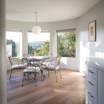
An octagon shaped, elevated dining room, (named “the turret”), had a big impact on the design of the house. They architects rounded the corners and added larger window openings overlooking a new sunken garden. The great room was also softened by rounding out the corners and that circular theme continued throughout the house, being picked up in skylight wells and kitchen cabinetry. A staircase leading to a catwalk was added and the result was a two-story window wall that flooded the home with natural light.
When asked why Milgard® Thermally Improved Aluminum windows were selected, the architectural team listed many reasons:
1) Aesthetics: “We liked the slim profiles and narrow sightlines. The window frames never get in the way of the view and that was important to us. They also have a very contemporary look that went well with our design.”
2) Options: “We liked that we could get large sliding doors that matched the windows, giving us a very cohesive look and feel throughout the project.”
3) Cost Effective: “Milgard windows are affordable. You get a good product at a good price.”
4) Custom Sizes: “Milgard windows are customizable, which allowed us to get the right window for each location.”
Ready to take on your own traditional to modern home remodeling project? Arbib Hughey Design advises, “Work with a good architect. That means picking a team that is creative, communicative, listens well and is responsive. We think it’s important for an architect to listen to their clients and give them something they want, not something the architect thinks they should have. At the same time you want an architect who is willing and able to think outside the box and offer up design options that you may not have considered. Design is about a lot of back and forth, trying out ideas, getting feedback and trying again.”
The home was completely transformed into a unique, contemporary house perfectly integrated with its site. Internally the home has a natural flow for the occupants and externally it is integrated with the surroundings taking advantage of great natural light. As a side note, it was highly praised as part of the Austin AIA homes tour.


 G. M. Roth Design Remodeling, Inc.
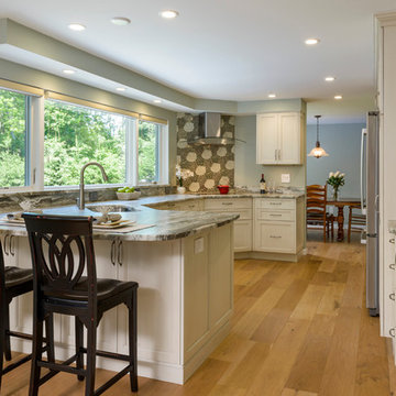
Our Nashua client needed a radical kitchen, dining room and living room re-design. The dining room was closed off from the kitchen, the living room was very dark and was dominated by lots of dark brick, and the kitchen itself had the original oak cabinets and an ineffective layout. They wanted a very sleek look, and good flow between the rooms. We started by opening up the wall between the dining room and kitchen and getting the refrigerator out of the way of the opening. In the kitchen area, we used Ultracraft frameless cabinetry with clean lines and minimalistic details to maximize storage and provide the look they were going for using maple with a melted brie with brown linen glaze finish. Framing floor to ceiling pantry cabinets with hutches on either side on the wall across from the windows provided storage and made the space flow from the living room to the dining room. New windows that climbed from the Fantasy Brown Leathered Quartzite countertop all the way to the ceiling provided tons of natural light to the space. To further simplify the design, we ran the sheetrock right to the windows without a casing, creating a nice, clean look above the countertop material we used as a windowsill. Full height Estrella Silver backsplash over the cooktop added just the right pop. By resurfacing the old brick fireplace with Golden Sand tile, replacing the hearth with a solid slab of slate, adding windows and built in cabinets on either side of the fireplace, and installing a large French door leading out to the three season room, we brightened up the living room and tied it into the kitchen itself. Creating a recess in the new fireplace for a wide screen TV created a logical furniture placement that made the space as useful as it is attractive. Wide plank, rustic oak flooring throughout the space offset the cabinets beautifully and added to the continuity of the space overall. The clients are thrilled with the look and flow of their new space.
 Drewett Works
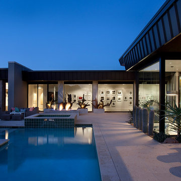
Believe it or not, this award-winning home began as a speculative project. Typically speculative projects involve a rather generic design that would appeal to many in a style that might be loved by the masses. But the project’s developer loved modern architecture and his personal residence was the first project designed by architect C.P. Drewett when Drewett Works launched in 2001. Together, the architect and developer envisioned a fictitious art collector who would one day purchase this stunning piece of desert modern architecture to showcase their magnificent collection.
The primary views from the site were southwest. Therefore, protecting the interior spaces from the southwest sun while making the primary views available was the greatest challenge. The views were very calculated and carefully managed. Every room needed to not only capture the vistas of the surrounding desert, but also provide viewing spaces for the potential collection to be housed within its walls.
The core of the material palette is utilitarian including exposed masonry and locally quarried cantera stone. An organic nature was added to the project through millwork selections including walnut and red gum veneers.
The eventual owners saw immediately that this could indeed become a home for them as well as their magnificent collection, of which pieces are loaned out to museums around the world. Their decision to purchase the home was based on the dimensions of one particular wall in the dining room which was EXACTLY large enough for one particular painting not yet displayed due to its size. The owners and this home were, as the saying goes, a perfect match!
Project Details | Desert Modern for the Magnificent Collection, Estancia, Scottsdale, AZ
Architecture: C.P. Drewett, Jr., AIA, NCARB | Drewett Works, Scottsdale, AZ
Builder: Shannon Construction | Phoenix, AZ
Interior Selections: Janet Bilotti, NCIDQ, ASID | Naples, FL
Custom Millwork: Linear Fine Woodworking | Scottsdale, AZ
Photography: Dino Tonn | Scottsdale, AZ
Awards: 2014 Gold Nugget Award of Merit
Feature Article: Luxe. Interiors and Design. Winter 2015, “Lofty Exposure”
 Thyme & Place Design LLC
The client requested a kitchen that would not only provide a great space to cook and enjoy family meals but one that would fit in with her unique design sense. An avid collector of contemporary art, she wanted something unexpected in her 100-year-old home in both color and finishes but still providing a great layout with improved lighting, storage, and superior cooking abilities. The existing kitchen was in a closed off space trapped between the family room and the living. If you were in the kitchen, you were isolated from the rest of the house. Making the kitchen an integrated part of the home was a paramount request.
Step one, remove the wall separating the kitchen from the other rooms in the home which allowed the new kitchen to become an integrated space instead of an isolation room for the cook. Next, we relocated the pantry access which was in the family room to the kitchen integrating a poorly used recess which had become a catch all area which did not provide any usable space for storage or working area. To add valuable function in the kitchen we began by capturing unused "cubbies", adding a walk-in pantry from the kitchen, increasing the storage lost to un-needed drop ceilings and bring light and design to the space with a new large awning window, improved lighting, and combining interesting finishes and colors to reflect the artistic attitude of the client.
A bathroom located above the kitchen had been leaking into the plaster ceiling for several years. That along with knob and tube wiring, rotted beams and a brick wall from the back of the fireplace in the adjacent living room all needed to be brought to code. The walls, ceiling and floors in this 100+ year old home were completely out of level and the room’s foot print could not be increased.
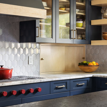
The choice of a Sub-Zero wolf product is a standard in my kitchen designs. The quality of the product, its manufacturing and commitment to food preservation is the reason I specify Sub Zero Wolf. For the cook top, the integrated line of the contemporary cooktop and the signature red knobs against the navy blue of the cabinets added to the design vibe of the kitchen. The cooking performance and the large continuous grate on the cooktop makes it an obvious choice for a cook looking for a great cook top with professional results in a more streamlined profile. We selected a Sharp microwave drawer for the island, an XO wine refrigerator, Bosch dishwasher and Kitchen Aid double convection wall ovens to round out the appliance package.
A recess created by the fireplace was outfitted with a cabinet which now holds small appliances within easy reach of my very petite client. Natural maple accents were used inside all the wall cabinets and repeated on the front of the hood and for the sliding door appliance cabinet and the floating shelves. This allows a brighter interior for the painted cabinets instead of the traditional same interior as exterior finish choice. The was an amazing transformation from the old to the new.
The final touches are the honey bronze hardware from Top Knobs, Mitzi pendants from Hudson Valley Lighting group,
a fabulous faucet from Brizo. To eliminate the old freestanding bottled water cooler, we specified a matching water filter faucet.
 123 Remodeling Inc.
123remodeling.com - High-End Remodels in Chicago, IL and Scottsdale, AZ
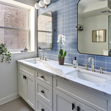
Our main goal for this master bathroom was to optimize the footprint with a large functional shower and a double vanity to gain storage space. We chose unique tile selections and mixed metals to create a personalized bathroom with a spa-like ambiance. The large format porcelain tile in the shower gives a bold punch of color and character. The veining in the countertop emulates the movement of the shower which ties the spaces together. We also added a heated tile flooring system and rainfall shower head to help create additional comfort and functionality.
 Homestyle Select Decor
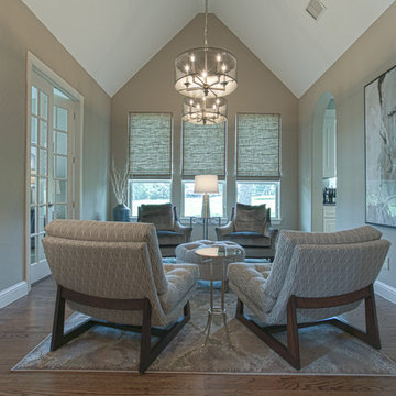
Homeowners wanted to convert their dining room into a sitting room for entertaining and conversation. They wanted to open up the space into the office to allow for light and to enjoy the view from a large office window. We opened up the wall across from the window, adding french doors to maintain separation yet frame the view and allow for more light into the room. Using two different styles of chairs in different colors and patterns adds interest to this cozy conversation area used for entertaining and as a quiet space away from the rest of the family. Roman shades soften the windows and an updated rug, artwork and accessories finish off the room.
 Homestyle Select Decor
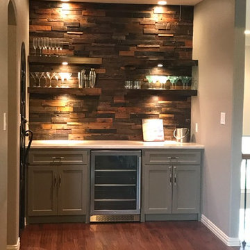
Client house had a dated office and cabinet space adjacent to game room. We converted the space into a dry bar with a rustic wood backsplash and added a wine closet with Chicago brick tile for that old look. Floating shelves with lighting create modern storage

Sponsored
Columbus, OH

Hope Restoration & General Contracting
Columbus Design-Build, Kitchen & Bath Remodeling, Historic Renovations
 Homescapes of New England, LLC
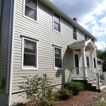
This is a traditional colonial found in the region. We removed the old wood siding and replaced it with 6 ¼” HardiePlank lap siding, Select Cedarmill in Monterey Taupe, with HardieTrim and HardieSoffits in Arctic White. We also added a Portico to the front with Trex Transcend railings in white. This really made a difference in the curb appeal.
Homescapes of New England
 Homestyle Select Decor
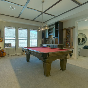
Client wanted a dry bar built into their game room so we designed this unit and had it built for the client. Now guests can enjoy refreshments while playing music or pool in this music-themed game room. To add to the interest in the room we added wood accents on the ceiling, whimsical guitar racks and fun accessories
 Vermont Plank Flooring
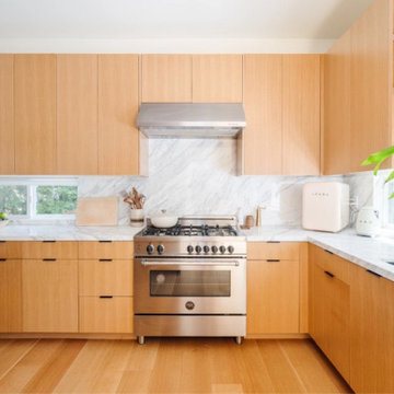
This bright and airy Mar Vista home features Select Grade Rift & Quarter Sawn White Oak Plank Flooring, oak built-ins, and custom cabinetry. An open floor plan with vaulted ceilings and skylights creates a sunny and spacious SoCal ambiance.
Flooring: Select Rift & Quarter Sawn White Oak in 10″ Widths
Finish: Vermont Plank Flooring Landgrove Finish
Construction: Remodel by Mallis Workshop
 Deb's Inviting Interiors LLC
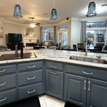
This kitchen had a good footprint but was 20 years old. The oak cabinets were dated. The client was ready for updated function & conveniences. We replaced the standard stove with microwave with a built-in combination. This area was enhanced with upper display cabinets. A cooktop was added to the peninsula and the refrigerator zone was updated with a more function deep upper cabinet & beverage fridge. An angled cabinet was added to add symmetry as well as glass doors. We selected a classic shade blue for the paint color to make the kitchen pop in the open floor plan. The florescent light box was updated, LED lights were added to create ambient & task lighting options. The cabinets were updated with soft-close hinges and roll-out shelves. The finishing elements were updated wall paint and stunning quartzite counter tops!

Sponsored
Columbus, OH
Hope Restoration & General Contracting
Columbus Design-Build, Kitchen & Bath Remodeling, Historic Renovations
 Home Expressions Interiors by Laura Bloom Inc.
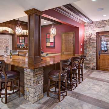
This client wanted their Terrace Level to be comprised of the warm finishes and colors found in a true Tuscan home. Basement was completely unfinished so once we space planned for all necessary areas including pre-teen media area and game room, adult media area, home bar and wine cellar guest suite and bathroom; we started selecting materials that were authentic and yet low maintenance since the entire space opens to an outdoor living area with pool. The wood like porcelain tile used to create interest on floors was complimented by custom distressed beams on the ceilings. Real stucco walls and brick floors lit by a wrought iron lantern create a true wine cellar mood. A sloped fireplace designed with brick, stone and stucco was enhanced with the rustic wood beam mantle to resemble a fireplace seen in Italy while adding a perfect and unexpected rustic charm and coziness to the bar area. Finally decorative finishes were applied to columns for a layered and worn appearance. Tumbled stone backsplash behind the bar was hand painted for another one of a kind focal point. Some other important features are the double sided iron railed staircase designed to make the space feel more unified and open and the barrel ceiling in the wine cellar. Carefully selected furniture and accessories complete the look.
 Jordan Design Build Group
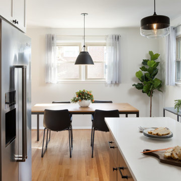
The kitchen was at the top of the list for a total overhaul – the worn oak cabinets, dated appliances, and clunky layout all had to go. Removing the decorative soffits allowed us to take the new cabinetry all the way to the ceiling, adding functional storage and visually extending the room’s height. We reconfigured the layout from a modified U to an L-shape which accomplished several things – it opened up the kitchen to the dining room, redirected circulation, and most importantly, created space for an island. Now the kitchen easily flows into the adjacent dining room. T
The finish selections and clean lines give a nod to the home’s mid-century bones. The wood island provides warmth and the light quartz countertops, textured backsplash and white cabinets keep the kitchen feeling light and bright. The matte black faucet, hardware and decorative pendants add another level of visual interest to the modern kitchen. To unify the kitchen and dining room, we replaced the drab kitchen flooring with select red oak hardwoods that were expertly installed and refinished to match the gorgeous wood flooring throughout the home.
 KitchenLab Interiors
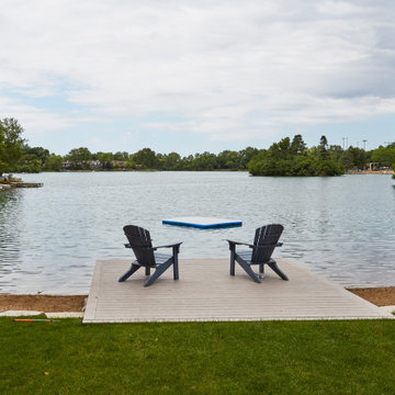
KitchenLab Interiors’ first, entirely new construction project in collaboration with GTH architects who designed the residence. KLI was responsible for all interior finishes, fixtures, furnishings, and design including the stairs, casework, interior doors, moldings and millwork. KLI also worked with the client on selecting the roof, exterior stucco and paint colors, stone, windows, and doors. The homeowners had purchased the existing home on a lakefront lot of the Valley Lo community in Glenview, thinking that it would be a gut renovation, but when they discovered a host of issues including mold, they decided to tear it down and start from scratch. The minute you look out the living room windows, you feel as though you're on a lakeside vacation in Wisconsin or Michigan. We wanted to help the homeowners achieve this feeling throughout the house - merging the causal vibe of a vacation home with the elegance desired for a primary residence. This project is unique and personal in many ways - Rebekah and the homeowner, Lorie, had grown up together in a small suburb of Columbus, Ohio. Lorie had been Rebekah's babysitter and was like an older sister growing up. They were both heavily influenced by the style of the late 70's and early 80's boho/hippy meets disco and 80's glam, and both credit their moms for an early interest in anything related to art, design, and style. One of the biggest challenges of doing a new construction project is that it takes so much longer to plan and execute and by the time tile and lighting is installed, you might be bored by the selections of feel like you've seen them everywhere already. “I really tried to pull myself, our team and the client away from the echo-chamber of Pinterest and Instagram. We fell in love with counter stools 3 years ago that I couldn't bring myself to pull the trigger on, thank god, because then they started showing up literally everywhere", Rebekah recalls. Lots of one of a kind vintage rugs and furnishings make the home feel less brand-spanking new. The best projects come from a team slightly outside their comfort zone. One of the funniest things Lorie says to Rebekah, "I gave you everything you wanted", which is pretty hilarious coming from a client to a designer.
88