
Search results for "Select 'adding'" in Home Design Ideas
 Milgard Windows & Doors
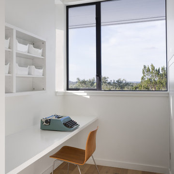
The Kiguchi family moved into their Austin, Texas home in 1994. Built in the 1980’s as part of a neighborhood development, they happily raised their family here but longed for something more contemporary. Once they became empty nesters, they decided it was time for a major remodel. After spending many years visiting Austin AIA Home Tours that highlight contemporary residential architecture, they had a lot of ideas and in 2013 were ready to interview architects and get their renovation underway.
The project turned into a major remodel due to an unstable foundation. Architects Ben Arbib and Ed Hughey, of Arbib Hughey Design were hired to solve the structural issue and look for inspiration in the bones of the house, which sat on top of a hillside and was surrounded by great views.
Unfortunately, with the old floor plan, the beautiful views were hidden by small windows that were poorly placed. In order to bring more natural light into the house the window sizes and configurations had to be addressed, all while keeping in mind the homeowners desire for a modern look and feel.
To achieve a more contemporary and sophisticated front of house, a new entry was designed that included removing a two-story bay window and porch. The entrance of the home also became more integrated with the landscape creating a template for new foliage to be planted. Older exterior materials were updated to incorporate a more muted palette of colors with a metal roof, dark grey siding in the back and white stucco in the front. Deep eaves were added over many of the new large windows for clean lines and sun protection.
“Inside it was about opening up the floor plan, expanding the views throughout the house, and updating the material palette to get a modern look that was also warm and inviting,” said Ben from Arbib Hughey Design. “Prior to the remodel, the house had the typical separation of rooms. We removed the walls between them and changed all of the windows to Milgard Thermally Improved Aluminum to connect the inside with the outside. No matter where you are you get nice views and natural light.”
The architects wanted to create some drama, which they accomplished with the window placement and opening up the interior floor plan to an open concept approach. Cabinetry was used to help delineate intimate spaces. To add warmth to an all-white living room, white-washed oak wood floors were installed and pine planks were used around the fireplace. The large windows served as artwork bringing the color of nature into the space.
An octagon shaped, elevated dining room, (named “the turret”), had a big impact on the design of the house. They architects rounded the corners and added larger window openings overlooking a new sunken garden. The great room was also softened by rounding out the corners and that circular theme continued throughout the house, being picked up in skylight wells and kitchen cabinetry. A staircase leading to a catwalk was added and the result was a two-story window wall that flooded the home with natural light.
When asked why Milgard® Thermally Improved Aluminum windows were selected, the architectural team listed many reasons:
1) Aesthetics: “We liked the slim profiles and narrow sightlines. The window frames never get in the way of the view and that was important to us. They also have a very contemporary look that went well with our design.”
2) Options: “We liked that we could get large sliding doors that matched the windows, giving us a very cohesive look and feel throughout the project.”
3) Cost Effective: “Milgard windows are affordable. You get a good product at a good price.”
4) Custom Sizes: “Milgard windows are customizable, which allowed us to get the right window for each location.”
Ready to take on your own traditional to modern home remodeling project? Arbib Hughey Design advises, “Work with a good architect. That means picking a team that is creative, communicative, listens well and is responsive. We think it’s important for an architect to listen to their clients and give them something they want, not something the architect thinks they should have. At the same time you want an architect who is willing and able to think outside the box and offer up design options that you may not have considered. Design is about a lot of back and forth, trying out ideas, getting feedback and trying again.”
The home was completely transformed into a unique, contemporary house perfectly integrated with its site. Internally the home has a natural flow for the occupants and externally it is integrated with the surroundings taking advantage of great natural light. As a side note, it was highly praised as part of the Austin AIA homes tour.
 User
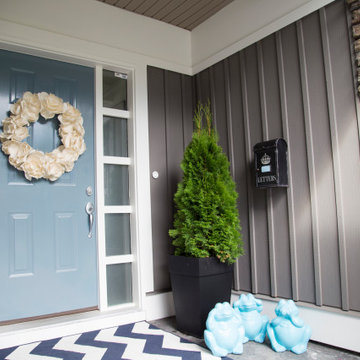
UserWe were thrilled to partner with Sherwin-Williams to have this homes tired brown exterior painted a fresh warm gray (Gauntlet Gray SW 7019), for the body and a beautiful creamy white for the trim (Greek villa SW 7551). We love it and hope that you do as well!
@sherwinwilliams #swcolorlove, #sponsorship #ad
 Drewett Works
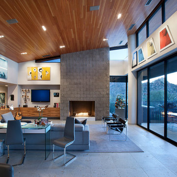
Believe it or not, this award-winning home began as a speculative project. Typically speculative projects involve a rather generic design that would appeal to many in a style that might be loved by the masses. But the project’s developer loved modern architecture and his personal residence was the first project designed by architect C.P. Drewett when Drewett Works launched in 2001. Together, the architect and developer envisioned a fictitious art collector who would one day purchase this stunning piece of desert modern architecture to showcase their magnificent collection.
The primary views from the site were southwest. Therefore, protecting the interior spaces from the southwest sun while making the primary views available was the greatest challenge. The views were very calculated and carefully managed. Every room needed to not only capture the vistas of the surrounding desert, but also provide viewing spaces for the potential collection to be housed within its walls.
The core of the material palette is utilitarian including exposed masonry and locally quarried cantera stone. An organic nature was added to the project through millwork selections including walnut and red gum veneers.
The eventual owners saw immediately that this could indeed become a home for them as well as their magnificent collection, of which pieces are loaned out to museums around the world. Their decision to purchase the home was based on the dimensions of one particular wall in the dining room which was EXACTLY large enough for one particular painting not yet displayed due to its size. The owners and this home were, as the saying goes, a perfect match!
Project Details | Desert Modern for the Magnificent Collection, Estancia, Scottsdale, AZ
Architecture: C.P. Drewett, Jr., AIA, NCARB | Drewett Works, Scottsdale, AZ
Builder: Shannon Construction | Phoenix, AZ
Interior Selections: Janet Bilotti, NCIDQ, ASID | Naples, FL
Custom Millwork: Linear Fine Woodworking | Scottsdale, AZ
Photography: Dino Tonn | Scottsdale, AZ
Awards: 2014 Gold Nugget Award of Merit
Feature Article: Luxe. Interiors and Design. Winter 2015, “Lofty Exposure”
Find the right local pro for your project

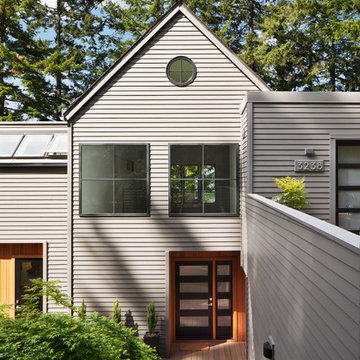
 Jenni Leasia Interior Design
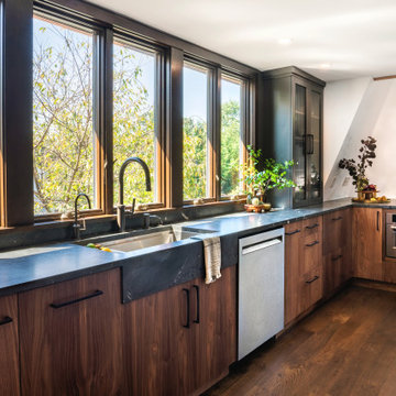
Beautiful pieces from the clients’ international collection of art & decor items complement the sophisticated interiors of this Portland home.
Project by Portland interior design studio Jenni Leasia Interior Design. Also serving Lake Oswego, West Linn, Vancouver, Sherwood, Camas, Oregon City, Beaverton, and the whole of Greater Portland.
For more about Jenni Leasia Interior Design, click here: https://www.jennileasiadesign.com/
To learn more about this project, click here:
https://www.jennileasiadesign.com/council-crest-portland-remodel
 Milgard Windows & Doors
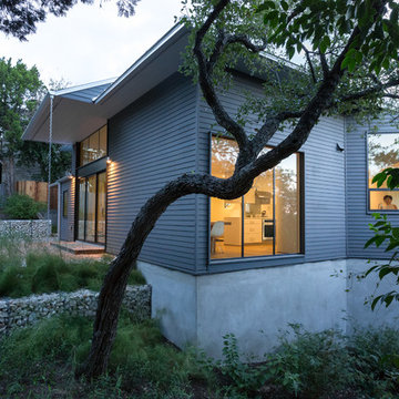
The Kiguchi family moved into their Austin, Texas home in 1994. Built in the 1980’s as part of a neighborhood development, they happily raised their family here but longed for something more contemporary. Once they became empty nesters, they decided it was time for a major remodel. After spending many years visiting Austin AIA Home Tours that highlight contemporary residential architecture, they had a lot of ideas and in 2013 were ready to interview architects and get their renovation underway.
The project turned into a major remodel due to an unstable foundation. Architects Ben Arbib and Ed Hughey, of Arbib Hughey Design were hired to solve the structural issue and look for inspiration in the bones of the house, which sat on top of a hillside and was surrounded by great views.
Unfortunately, with the old floor plan, the beautiful views were hidden by small windows that were poorly placed. In order to bring more natural light into the house the window sizes and configurations had to be addressed, all while keeping in mind the homeowners desire for a modern look and feel.
To achieve a more contemporary and sophisticated front of house, a new entry was designed that included removing a two-story bay window and porch. The entrance of the home also became more integrated with the landscape creating a template for new foliage to be planted. Older exterior materials were updated to incorporate a more muted palette of colors with a metal roof, dark grey siding in the back and white stucco in the front. Deep eaves were added over many of the new large windows for clean lines and sun protection.
“Inside it was about opening up the floor plan, expanding the views throughout the house, and updating the material palette to get a modern look that was also warm and inviting,” said Ben from Arbib Hughey Design. “Prior to the remodel, the house had the typical separation of rooms. We removed the walls between them and changed all of the windows to Milgard Thermally Improved Aluminum to connect the inside with the outside. No matter where you are you get nice views and natural light.”
The architects wanted to create some drama, which they accomplished with the window placement and opening up the interior floor plan to an open concept approach. Cabinetry was used to help delineate intimate spaces. To add warmth to an all-white living room, white-washed oak wood floors were installed and pine planks were used around the fireplace. The large windows served as artwork bringing the color of nature into the space.
An octagon shaped, elevated dining room, (named “the turret”), had a big impact on the design of the house. They architects rounded the corners and added larger window openings overlooking a new sunken garden. The great room was also softened by rounding out the corners and that circular theme continued throughout the house, being picked up in skylight wells and kitchen cabinetry. A staircase leading to a catwalk was added and the result was a two-story window wall that flooded the home with natural light.
When asked why Milgard® Thermally Improved Aluminum windows were selected, the architectural team listed many reasons:
1) Aesthetics: “We liked the slim profiles and narrow sightlines. The window frames never get in the way of the view and that was important to us. They also have a very contemporary look that went well with our design.”
2) Options: “We liked that we could get large sliding doors that matched the windows, giving us a very cohesive look and feel throughout the project.”
3) Cost Effective: “Milgard windows are affordable. You get a good product at a good price.”
4) Custom Sizes: “Milgard windows are customizable, which allowed us to get the right window for each location.”
Ready to take on your own traditional to modern home remodeling project? Arbib Hughey Design advises, “Work with a good architect. That means picking a team that is creative, communicative, listens well and is responsive. We think it’s important for an architect to listen to their clients and give them something they want, not something the architect thinks they should have. At the same time you want an architect who is willing and able to think outside the box and offer up design options that you may not have considered. Design is about a lot of back and forth, trying out ideas, getting feedback and trying again.”
The home was completely transformed into a unique, contemporary house perfectly integrated with its site. Internally the home has a natural flow for the occupants and externally it is integrated with the surroundings taking advantage of great natural light. As a side note, it was highly praised as part of the Austin AIA homes tour.
 TKS Design Group
Free ebook, Creating the Ideal Kitchen. DOWNLOAD NOW
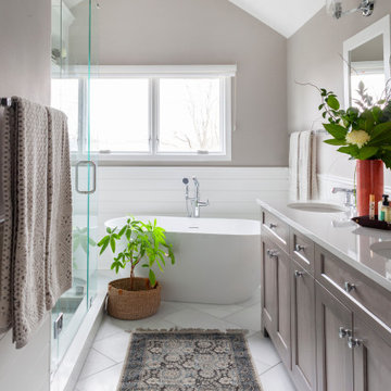
This client came to us wanting some help with updating the master bath in their home. Their primary goals were to increase the size of the shower, add a rain head, add a freestanding tub and overall freshen the feel of the space.
The existing layout of the bath worked well, so we left the basic footprint the same, but increased the size of the shower and added a freestanding tub on a bit of an angle which allowed for some additional storage.
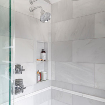
One of the most important things on the wish list was adding a rainhead in the shower, but this was not an easy task with the angled ceiling. We came up with the solution of using an extra long wall-mounted shower arm that was reinforced with a meal bracket attached the ceiling. This did the trick, and no extra framing or insulation was required to make it work.
The materials selected for the space are classic and fresh. Large format white oriental marble is used throughout the bath, on the floor in a herrinbone pattern and in a staggered brick pattern on the walls. Alder cabinets with a gray stain contrast nicely with the white marble, while shiplap detail helps unify the space and gives it a casual and cozy vibe. Storage solutions include an area for towels and other necessities at the foot of the tub, roll out shelves and out storage in the vanities and a custom niche and shaving ledge in the shower. We love how just a few simple changes can make such a great impact!
Designed by: Susan Klimala, CKBD
Photography by: LOMA Studios
For more information on kitchen and bath design ideas go to: www.kitchenstudio-ge.com

Sponsored
Columbus, OH

Hope Restoration & General Contracting
Columbus Design-Build, Kitchen & Bath Remodeling, Historic Renovations
 Crystal Kitchen + Bath
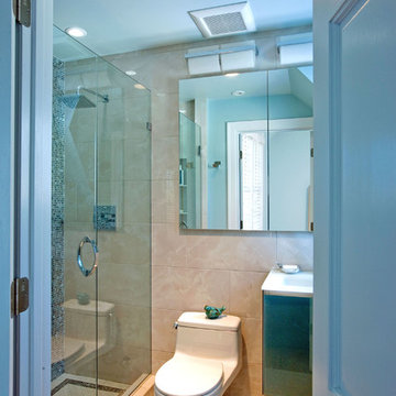
Everything about this bathroom was small, including the amount of storage. The homeowner’s wanted a new design for their Master Bathroom that would create the illusion of a larger space. With a sloped ceiling and a small footprint that could not be enlarged, Mary Maney had quite a challenge to meet all the storage needs that the homeowner’s requested. A fresh, contemporary color palette and contemporary designs for the plumbing fixtures were a must.
To give the illusion of a larger space, a large format porcelain tile that looks like a natural white marble was selected for the floor and runs up one entire wall of the bathroom. A frameless shower door was added to give a clear view of the new tiled shower and shows off the iridescent glass tile on the back wall. The glass tile adds a glitzy shimmer to the room. A soft, blue paint color was selected for the walls and ceiling to coordinate with the tile.
To open up the floor space as much as possible, a compact toilet was installed and a contemporary wall mounted vanity in a beautiful blue tone that accents the shower tile nicely. The floating vanity has one large drawer that pulls out and has hidden compartments and an electrical supply for a hair dryer and other hair care tools. Two side by-side recessed medicine cabinets visually open up the room and gain additional storage for make-up and hair care products.
This Master Bathroom may be small in square footage, but it is now big on storage. With the soft blue and white color palette, the space is refreshing and the sleek contemporary plumbing fixtures add the element of contemporary design the homeowner’s were looking to achieve.
 TKS Design Group
Free ebook, Creating the Ideal Kitchen. DOWNLOAD NOW
This client came to us wanting some help with updating the master bath in their home. Their primary goals were to increase the size of the shower, add a rain head, add a freestanding tub and overall freshen the feel of the space.
The existing layout of the bath worked well, so we left the basic footprint the same, but increased the size of the shower and added a freestanding tub on a bit of an angle which allowed for some additional storage.
One of the most important things on the wish list was adding a rainhead in the shower, but this was not an easy task with the angled ceiling. We came up with the solution of using an extra long wall-mounted shower arm that was reinforced with a meal bracket attached the ceiling. This did the trick, and no extra framing or insulation was required to make it work.
The materials selected for the space are classic and fresh. Large format white oriental marble is used throughout the bath, on the floor in a herrinbone pattern and in a staggered brick pattern on the walls. Alder cabinets with a gray stain contrast nicely with the white marble, while shiplap detail helps unify the space and gives it a casual and cozy vibe. Storage solutions include an area for towels and other necessities at the foot of the tub, roll out shelves and out storage in the vanities and a custom niche and shaving ledge in the shower. We love how just a few simple changes can make such a great impact!
Designed by: Susan Klimala, CKBD
Photography by: LOMA Studios
For more information on kitchen and bath design ideas go to: www.kitchenstudio-ge.com
 Susan Yeley Homes
We honored the building’s history where possible, keeping original bones and character wherever possible, then layered in the clients’ distinct creative identity. On the main floor, we designed spaces that shift seamlessly from workday to reception-ready. Lighting was planned with intention, to preserve the original plaster ceilings and spotlight rotating installations without sacrificing ambient warmth. Custom built-ins maximize functionality while maintaining a distinctly un-officey feel. Upstairs, the artist apartment is a thoughtful retreat: adaptable, light-filled, and comfortable, with just enough quirk to spark inspiration. Even the basement—home to a full photography studio and workroom—balances technical needs with aesthetic ease. Throughout, we used color, texture, and collected pieces to ensure each room feels curated, not staged. Personal, not polished.
 Simply Home Decorating
This beautiful North Vancouver home belongs to a nature-loving and health-conscious couple, Emma and Vince (names changed), their two young children, and their dog, Jasper. When they contacted us about renovating and furnishing their kitchen and family room, we walked in and saw a world of potential waiting to be uncovered.
Before: Larkhall Crescent Home:
Like many original North Vancouver homes, the interior was definitely dated. We encountered late ‘80s finishes in powder pink and teal green, old carpet, and a kitchen that wasn’t maximized to suit this family’s modern-day lifestyle. However, the size of the rooms offered us a ton of space with which to get creative.
Knowing our clients’ love of cooking, need for work spaces (Emma and Vince both work remotely), and growing family, we developed a design concept that would increase usable space, optimize storage, and create intimacy in this large area. As for the style, we were inspired by their European roots, inventing a new and modern take on “Belgian Farmhouse” style. Now, the home is truly one-of-a-kind.
After: Warm & Cozy Family Room:
Fresh, bright, and comfortable, this living area has been transformed! We started with the fireplace as a focal point, selecting aged brick tiles for added texture and a crisp wood mantle. The taupe-coloured sectional infuses the room with visual warmth and serves the added purpose of separating the family room from the kitchen.
Emma and Vince were also keen on using non-toxic materials in their home, and we were happy to oblige. To meet their needs, we sourced natural wood elements and sought out Canadian-made products - that adhere to high health standards - whenever possible.
Look closer at the elements of this space, and you will find this stunning, honeycomb-patterned rug in earthy gold, beige, and charcoal tones. It’s plush to the touch and full of visual texture that brings this room’s colour palette together. We sourced these two-tone chairs with caning, petrified wood side table, black sconces, and botanical prints in greyscale from local artist, Heather Johnston.
We topped off the space with this dark wood and rattan console that offers storage facing the kitchen and presents an opportunity to display cherished items. The result is a cozy lounging space brimming with comfort and functionality. It’s perfect for enjoying quality family time, or Emma can simply slide the coffee table away to make room for her morning yoga practice.
Now, let’s turn around and give some attention to the kitchen. Do you remember what the original kitchen looked like? If not, scroll back up, because the transformation is shocking…
Moody & Welcoming Kitchen for Healthy Living:
This kitchen looks very different from how it started, right? Though we didn’t touch any walls, the kitchen has almost doubled in usable space! We created a long, extended island with storage, an outlet for small appliances, and seating for comfortable prep, after-school snacking, or mingling among friends.
On the other side of the island, the family has even more storage and an integrated dishwasher within easy reach of the sink, perfect for quick clean-up. From this angle, you can also see the expansive custom Shaker cabinetry in white and the integrated double ovens. These facilitate their cooking experience and gave us the opportunity to add an additional surprise…
A coffee garage station and more hidden storage! Keeping these items located along the perimeter allows them to be accessed by the family or their guests without someone getting under the cook’s feet. These are the little details that make everyday life easier and more enjoyable.
Moving deeper into the kitchen, the seamless induction cooktop topped with a freestanding concealed hood fan commands attention in a soft yet prominent way. The natural wood accent mirrors the fireplace mantle, and the choice of off-black wood-grain cabinets not only continues our black-and-white colour palette but adds a sense of depth and contrast. The corner sink is located to the right and perfectly positioned with a view of their thriving backyard.
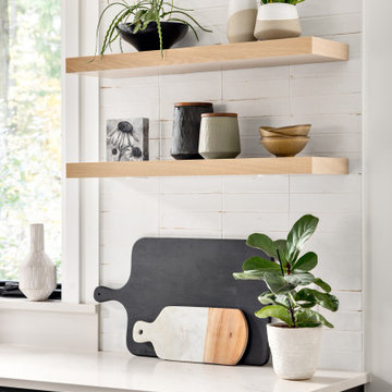
To invite more of this family’s character into the space, we mixed metals for interest — matte black, dark pewter, and warm brass — and created open shelves in white oak for their plants and decor. You can also glimpse the tumbled edge of the backsplash tile, which echoes the rustic brick of the fireplace. It adds that farmhouse charm while still feeling timeless and sophisticated.
Last but not least, we designed this dining banquette in the bay window (with integrated bench storage, of course), where the family can share a meal together, the kids can do homework, or Emma and Vince can work and enjoy a change of scenery from their offices. Like the other spaces in the home, it was designed to be beautiful, multi-functional, and long-lasting.
Praise from Our Clients:
It is clear that we love this home, but what did our clients have to say?
“Lori is a visionary and masters execution to the finest detail all at the same time. When she first met us to know more about who we are and how we live, she could right away envision how we could use the space in our kitchen and living room…The results exceeded our expectations.
Lori and her team were also a delight to work with — coordination with all the trades, fast problem-solving, regular updates, professional and friendly attitude of her entire team — made it the dream team. Thank you SHD for making our space so beautiful!”
In turn, we are so grateful for this family’s trust, their open communication, and for being wonderful people with whom to work. (So, thank you!)
 TVL Creative Ltd.
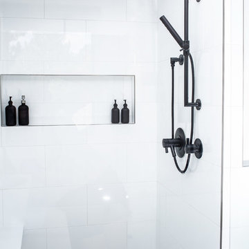
Our clients were looking to erase the 90s from their master bathroom and create a space that blended their contemporary tastes with natural elements. This bathroom had wonderful bones with a high ceiling and plenty of space, but we were able to work with our clients to create a design that better met their needs and utilized the space to its full potential. We wanted to create a sense of warmth in this large master bathroom and adding a fireplace to the space did the trick. By moving the tub location, we were able to create a stunning accent wall of stacked stone that provided a home for the fireplace and a perfectly dramatic backdrop for the new freestanding bathtub. The sculptural copper light fixture helps to soften the stone wall and allowed us to emphasize those vaulted ceiling. Playing with metal finishes is one of our favorite pastimes, and this bathroom was the perfect opportunity to blend sleek matte black plumbing fixtures with a mirrored copper finish on the light fixtures. We tied the vanity wall sconces in with a dramatic sculptural chandelier above the bath tub by using copper finishes on both and allowing the light fixtures to be the shining stars of this space. We selected a clean white finish for the custom vanity cabinets and lit them from below to accentuate their floating design. We then completed the look with a waterfall quartz counter to add an elegant texture to the area and extended the stone onto the shower bench to bring the two elements together. The existing shower had been on the small side, so we expanded it into the room and gave them a more spacious shower complete with a built-in bench and recessed niche. Hard surfaces play an important role in any bathroom design, and we wanted to use this opportunity to create an interesting layer of texture through our tile selections. The bathroom floor utilizes a large-scale plank tile installed in a herringbone pattern, while the shower and walls are tiled in a polished white tile to add a bit of reflectivity. The newly transformed bathroom is now a sophisticated space the brings together sleek contemporary finishes with textured natural elements and provides the perfect retreat from the outside world.
 TKS Design Group
Free ebook, Creating the Ideal Kitchen. DOWNLOAD NOW
This client came to us wanting some help with updating the master bath in their home. Their primary goals were to increase the size of the shower, add a rain head, add a freestanding tub and overall freshen the feel of the space.
The existing layout of the bath worked well, so we left the basic footprint the same, but increased the size of the shower and added a freestanding tub on a bit of an angle which allowed for some additional storage.
One of the most important things on the wish list was adding a rainhead in the shower, but this was not an easy task with the angled ceiling. We came up with the solution of using an extra long wall-mounted shower arm that was reinforced with a meal bracket attached the ceiling. This did the trick, and no extra framing or insulation was required to make it work.
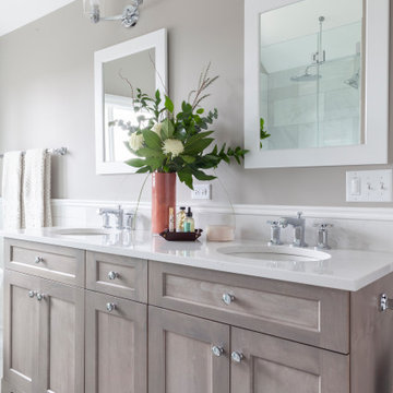
The materials selected for the space are classic and fresh. Large format white oriental marble is used throughout the bath, on the floor in a herrinbone pattern and in a staggered brick pattern on the walls. Alder cabinets with a gray stain contrast nicely with the white marble, while shiplap detail helps unify the space and gives it a casual and cozy vibe. Storage solutions include an area for towels and other necessities at the foot of the tub, roll out shelves and out storage in the vanities and a custom niche and shaving ledge in the shower. We love how just a few simple changes can make such a great impact!
Designed by: Susan Klimala, CKBD
Photography by: LOMA Studios
For more information on kitchen and bath design ideas go to: www.kitchenstudio-ge.com

Sponsored
Columbus, OH
Hope Restoration & General Contracting
Columbus Design-Build, Kitchen & Bath Remodeling, Historic Renovations
 Thomas J. Pearson, Inc.
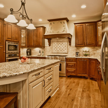
The owners of this traditional home sought to update and expand their somewhat dated and crowded kitchen. The former kitchen had a corner sink and a modified U-shape, but with the only entry intersecting the refrigerator and bar passage, it did not allow for multiple cooks in the kitchen. The existing kitchen was separated from the family room by a wall which included a see-through fireplace, but in reality the two areas were distinctly separate. As this family enjoys cooking and entertaining, they sought to open the space to accommodate a large island in the kitchen and opening the space to the adjoining family room. Additionally, they wanted the cooking surfaces and appliances to be state of the art, but with a style reminiscent of Tuscany.
To achieve the effect, color groups and materials were selected to create the Tuscan region’s theme. Round shapes were included throughout the space including the island top and the custom archway opening to the family room. The owners selected cherry cabinetry with a dark brown stain, granite counters with some hues of blue-green, and a natural stone tumbled subway tile backsplash. The island color is fossil beige, and the owners re-purposed their existing bar stools using the same color. With the serious emphasis on cooking, the range selected is a 36” gas Thermador® with custom exhaust hood. A separate Thermador® baking oven and microwave are built-in on the adjoining wall. Bela Cera® hand-scraped hardwood flooring ties together the kitchen, eating area, and family room.
The existing stone fireplace was taken down and set aside for re-installation at project completion. As the wall separating the kitchen and family room was eliminated, the stone fireplace has been reinstalled at its new location on the home’s east-wall. Windows and built-in cabinetry flank the fireplace, with the flat screen mounted above it. With added windows, additional can lighting, and antique white trim, the rooms are bright and airy.
 Milgard Windows & Doors
The Kiguchi family moved into their Austin, Texas home in 1994. Built in the 1980’s as part of a neighborhood development, they happily raised their family here but longed for something more contemporary. Once they became empty nesters, they decided it was time for a major remodel. After spending many years visiting Austin AIA Home Tours that highlight contemporary residential architecture, they had a lot of ideas and in 2013 were ready to interview architects and get their renovation underway.
The project turned into a major remodel due to an unstable foundation. Architects Ben Arbib and Ed Hughey, of Arbib Hughey Design were hired to solve the structural issue and look for inspiration in the bones of the house, which sat on top of a hillside and was surrounded by great views.
Unfortunately, with the old floor plan, the beautiful views were hidden by small windows that were poorly placed. In order to bring more natural light into the house the window sizes and configurations had to be addressed, all while keeping in mind the homeowners desire for a modern look and feel.
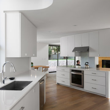
To achieve a more contemporary and sophisticated front of house, a new entry was designed that included removing a two-story bay window and porch. The entrance of the home also became more integrated with the landscape creating a template for new foliage to be planted. Older exterior materials were updated to incorporate a more muted palette of colors with a metal roof, dark grey siding in the back and white stucco in the front. Deep eaves were added over many of the new large windows for clean lines and sun protection.
“Inside it was about opening up the floor plan, expanding the views throughout the house, and updating the material palette to get a modern look that was also warm and inviting,” said Ben from Arbib Hughey Design. “Prior to the remodel, the house had the typical separation of rooms. We removed the walls between them and changed all of the windows to Milgard Thermally Improved Aluminum to connect the inside with the outside. No matter where you are you get nice views and natural light.”
The architects wanted to create some drama, which they accomplished with the window placement and opening up the interior floor plan to an open concept approach. Cabinetry was used to help delineate intimate spaces. To add warmth to an all-white living room, white-washed oak wood floors were installed and pine planks were used around the fireplace. The large windows served as artwork bringing the color of nature into the space.
An octagon shaped, elevated dining room, (named “the turret”), had a big impact on the design of the house. They architects rounded the corners and added larger window openings overlooking a new sunken garden. The great room was also softened by rounding out the corners and that circular theme continued throughout the house, being picked up in skylight wells and kitchen cabinetry. A staircase leading to a catwalk was added and the result was a two-story window wall that flooded the home with natural light.
When asked why Milgard® Thermally Improved Aluminum windows were selected, the architectural team listed many reasons:
1) Aesthetics: “We liked the slim profiles and narrow sightlines. The window frames never get in the way of the view and that was important to us. They also have a very contemporary look that went well with our design.”
2) Options: “We liked that we could get large sliding doors that matched the windows, giving us a very cohesive look and feel throughout the project.”
3) Cost Effective: “Milgard windows are affordable. You get a good product at a good price.”
4) Custom Sizes: “Milgard windows are customizable, which allowed us to get the right window for each location.”
Ready to take on your own traditional to modern home remodeling project? Arbib Hughey Design advises, “Work with a good architect. That means picking a team that is creative, communicative, listens well and is responsive. We think it’s important for an architect to listen to their clients and give them something they want, not something the architect thinks they should have. At the same time you want an architect who is willing and able to think outside the box and offer up design options that you may not have considered. Design is about a lot of back and forth, trying out ideas, getting feedback and trying again.”
The home was completely transformed into a unique, contemporary house perfectly integrated with its site. Internally the home has a natural flow for the occupants and externally it is integrated with the surroundings taking advantage of great natural light. As a side note, it was highly praised as part of the Austin AIA homes tour.
 Designs by Cheryl
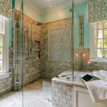
What a beautiful transformation of the before and after photo's. Tearing down the walls and adding the custom tall frameless doors made the space larger than before. It gives it an open and airy look to our design. The wall colors my client's love. They wanted a clean and fresh tranquil color. I brought the colors in more with the selection of the custom flat roman shades, which brings clean lines to the room. We added porcelain crown to bring more detail to the eye, and finishing off the top edges of the wall tile.
 Zag Built LLC
3House Media
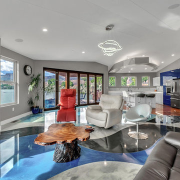
Example of a mid-sized trendy open concept concrete floor and multicolored floor living room design in Denver with gray walls, a metal fireplace and a wall-mounted tv
Example of a mid-sized trendy open concept concrete floor and multicolored floor living room design in Denver with gray walls, a metal fireplace and a wall-mounted tv
Sponsored
Columbus, OH
Hope Restoration & General Contracting
Columbus Design-Build, Kitchen & Bath Remodeling, Historic Renovations
 ZeroEnergy Design
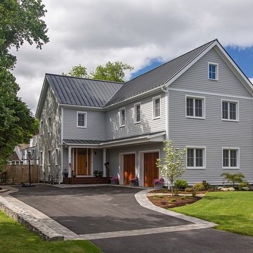
This LEED Platinum certified house reflects the homeowner's desire for an exceptionally healthy and comfortable living environment, within a traditional neighborhood.
INFILL SITE. The family, who moved from another area of Wellesley, sought out this property to be within walking distance of the high school and downtown area. An existing structure on the tight lot was removed to make way for the new home. 84% of the construction waste, from both the previous structure and the new home, was diverted from a landfill. ZED designed to preserve the existing mature trees on the perimeter of the property to minimize site impacts, and to maintain the character of the neighborhood as well as privacy on the site.
EXTERIOR EXPRESSION. The street facade of the home relates to the local New England vernacular. The rear uses contemporary language, a nod to the family’s Californian roots, to incorporate a roof deck, solar panels, outdoor living space, and the backyard swimming pool. ZED’s careful planning avoided to the need to face the garage doors towards the street, a common syndrome of a narrow lot.
THOUGHTFUL SPACE. Homes with dual entries can often result in duplicate and unused spaces. In this home, the everyday and formal entry areas are one and the same; the front and garage doors share the entry program of coat closets, mudroom storage with bench for removing your shoes, and a laundry room with generous closets for the children's sporting equipment. The entry area leads directly to the living space, encompassing the kitchen, dining and sitting area areas in an L-shaped open plan arrangement. The kitchen is placed at the south-west corner of the space to allow for a strong connection to the dining, sitting and outdoor living spaces. A fire pit on the deck satisfies the family’s desire for an open flame while a sealed gas fireplace is used indoors - ZED’s preference after omitting gas burning appliances completely from an airtight home. A small study, with a window seat, is conveniently located just off of the living space. A first floor guest bedroom includes an accessible bathroom for aging visitors and can be used as a master suite to accommodate aging in place.
HEALTHY LIVING. The client requested a home that was easy to clean and would provide a respite from seasonal allergies and common contaminants that are found in many indoor spaces. ZED selected easy to clean solid surface flooring throughout, provided ample space for cleaning supplies on each floor, and designed a mechanical system with ventilation that provides a constant supply of fresh outdoor air. ZED selected durable materials, finishes, cabinetry, and casework with low or no volatile organic compounds (VOCs) and no added urea formaldehyde.
YEAR-ROUND COMFORT. The home is super insulated and air-tight, paired with high performance triple-paned windows, to ensure it is draft-free throughout the winter (even when in front of the large windows and doors). ZED designed a right-sized heating and cooling system to pair with the thermally improved building enclosure to ensure year-round comfort. The glazing on the home maximizes passive solar gains, and facilitates cross ventilation and daylighting.
ENERGY EFFICIENT. As one of the most energy efficient houses built to date in Wellesley, the home highlights a practical solution for Massachusetts. First, the building enclosure reduces the largest energy requirement for typical houses (heating). Super-insulation, exceptional air sealing, a thermally broken wall assembly, triple pane windows, and passive solar gain combine for a sizable heating load reduction. Second, within the house only efficient systems consume energy. These include an air source heat pump for heating & cooling, a heat pump hot water heater, LED lighting, energy recovery ventilation, and high efficiency appliances. Lastly, photovoltaics provide renewable energy help offset energy consumption. The result is an 89% reduction in energy use compared to a similar brand new home built to code requirements.
RESILIENT. The home will fare well in extreme weather events. During a winter power outage, heat loss will be very slow due to the super-insulated and airtight envelope– taking multiple days to drop to 60 degrees even with no heat source. An engineered drainage system, paired with careful the detailing of the foundation, will help to keep the finished basement dry. A generator will provide full operation of the all-electric house during a power outage.
OVERALL. The home is a reflection of the family goals and an expression of their values, beautifully enabling health, comfort, safety, resilience, and utility, all while respecting the planet.
ZED - Architect & Mechanical Designer
Bevilacqua Builders Inc - Contractor
Creative Land & Water Engineering - Civil Engineering
Barbara Peterson Landscape - Landscape Design
Nest & Company - Interior Furnishings
Eric Roth Photography - Photography

 JK interior living
Raquel Langworthy
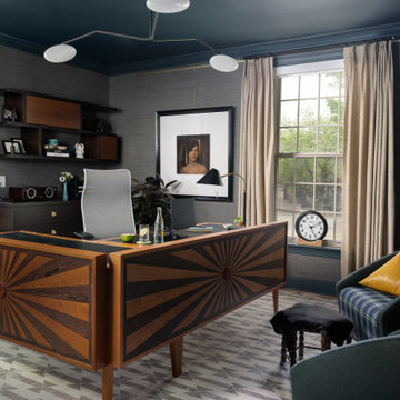
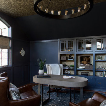
Example of a mid-sized eclectic freestanding desk dark wood floor and brown floor study room design in New York with blue walls
Example of a mid-sized eclectic freestanding desk dark wood floor and brown floor study room design in New York with blue walls
87