
Search results for "Separated couples" in Home Design Ideas

 Michael Nash Design, Build & Homes
2011 CAPITAL COTY AWARD HONORABLE MENTION AWARD WINNER
Built circa 1980, a young couple with three children originally purchased this home for their growing family. After four years of karate, soccer, piano and other activities, however, the home was becoming too small to meet their needs.
Problems started upon entering the front foyer. A 25-foot long dark hallway separated the family room and the kitchen, ending in a tiny powder room stuck in the middle of the layout. The kitchen was especially isolated, a cramped L-shaped design with a box bay breakfast bump out that was literally falling apart.
The new design started with the core of the problem—the maze and separation created by the long hallways.
First, the 25’ load bearing wall separating the foyer from family room was totally taken out and replaced with a long supporting beam. A French door replaced a small door and window leading to a screen porch . This action allowed lots of light to get into family and foyer. Then, the powder room was removed and the partition wall between the kitchen and family room was taken down. This created a large open concept design and greatly increased the size of the kitchen.
The box bay was demolished and replaced with new walls and a large window. The plumbing for main sink and dishwasher got relocated into this box bay allowing a total transformation of the space. Now there are cabinets and counters on all sides.
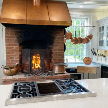
The doorway to the dining room was reconfigured to allow a butler area on its left. While the right side was occupied with new 36” gas range top with a decorative wood hood above it. The refrigerator, microwave/oven and pantries—the space’s tall elements—occupy one wall..
A large Island with a prep sink and beverage center for the kids occupies the center of the layout. Capable of seating up to four, family and friends can now keep the cook company. A large built-in desk area lets the kids do their homework so the parents can supervise while they prepare meals.
Light cabinetry with a touch of caramel glazing and exotic granite countertops by our designers contributed to this kitchen’s elegant design. The contrasting distressed island’s darker finish matches the dinette set and other furnishings.
New hardwood floors were installed throughout the first floor for a seamless look, while recess, pendant and task lighting make the space even brighter. Importantly, there’s plenty of space for parents and kids to hang out together. The kitchen is truly the heart of their home.

 Wiedemann Architects LLC
This project is a new 5,900 sf. primary residence for a couple with three children. The site is slightly elevated above the residential street and enjoys winter views of the Potomac River.
The family’s requirements included five bedrooms, five full baths, a powder room, family room, dining room, eat-in kitchen, walk-in pantry, mudroom, lower level recreation room, exercise room, media room and numerous storage spaces. Also included was the request for an outdoor terrace and adequate outdoor storage, including provision for the storage of bikes and kayaks. The family needed a home that would have two entrances, the primary entrance, and a mudroom entry that would provide generous storage spaces for the family’s active lifestyle. Due to the small lot size, the challenge was to accommodate the family’s requirements, while remaining sympathetic to the scale of neighboring homes.
The residence employs a “T” shaped plan to aid in minimizing the massing visible from the street, while organizing interior spaces around a private outdoor terrace space accessible from the living and dining spaces. A generous front porch and a gambrel roof diminish the home’s scale, providing a welcoming view along the street front. A path along the right side of the residence leads to the family entrance and a small outbuilding that provides ready access to the bikes and kayaks while shielding the rear terrace from view of neighboring homes.
The two entrances join a central stair hall that leads to the eat-in kitchen overlooking the great room. Window seats and a custom built banquette provide gathering spaces, while the French doors connect the great room to the terrace where the arbor transitions to the garden. A first floor guest suite, separate from the family areas of the home, affords privacy for both guests and hosts alike. The second floor Master Suite enjoys views of the Potomac River through a second floor arched balcony visible from the front.
The exterior is composed of a board and batten first floor with a cedar shingled second floor and gambrel roof. These two contrasting materials and the inclusion of a partially recessed front porch contribute to the perceived diminution of the home’s scale relative to its smaller neighbors. The overall intention was to create a close fit between the residence and the neighboring context, both built and natural.
Builder: E.H. Johnstone Builders
Anice Hoachlander Photography

 Olamar Interiors
This condo in Sterling, VA belongs to a couple about to enter into retirement. They own this home in Sterling, along with a weekend home in West Virginia, a vacation home on Emerald Isle in North Carolina and a vacation home in St. John. They want to use this home as their "home-base" during their retirement, when they need to be in the metro area for business or to see family. The condo is small and they felt it was too "choppy," it didn't have good flow and the rooms were too separated and confined. They wondered if it could have more of an open concept feel but were doubtful due to the size and layout of the home. The furnishings they owned from their previous home were very traditional and heavy. They wanted a much lighter, more open and more contemporary feel to this home. They wanted it to feel clean, light, airy and much bigger then it is.
The first thing we tackled was an unsightly, and very heavy stone veneered fireplace wall that separated the family room from the office space. It made both rooms look heavy and dark. We took down the stone and opened up parts of the wall so that the two spaces would flow into each other.
We added a view thru fireplace and gave the fireplace wall a faux marble finish to lighten it and make it much more contemporary. Glass shelves bounce light and keep the wall feeling light and streamlined. Custom built ins add hidden storage and make great use of space in these small rooms.
Our strategy was to open as much as possible and to lighten the space through the use of color, fabric and glass. New furnishings in lighter colors and soft textures help keep the feeling light and modernize the space. Sheer linen draperies soften the hard lines and add to the light, airy feel. Tinius Photography
Find the right local pro for your project

 David Moulton AIA
Creating a bridge between buildings at The Sea Ranch is an unusual undertaking. Though several residential, elevated walkways and a couple of residential bridges do exist, in general, the design elements of The Sea Ranch favor smaller, separate buildings. However, to make all of these buildings work for the owners and their pets, they really needed a bridge. Early on David Moulton AIA consulted The Sea Ranch Design Review Committee on their receptiveness to this project. Many different ideas were discussed with the Design Committee but ultimately, given the strong need for the bridge, they asked that it be designed in a way that expressed the organic nature of the landscape. There was strong opposition to creating a straight, longitudinal structure. Soon it became apparent that a central tower sporting a small viewing deck and screened window seat provided the owners with key wildlife viewing spots and gave the bridge a central structural point from which the adjacent, angled arms could reach west between the trees to the main house and east between the trees to the new master suite. The result is a precise and carefully designed expression of the landscape: an enclosed bridge elevated above wildlife paths and woven within inches of towering redwood trees.

 Horizon Interior Design
The wall separating the kitchen from the living room was removed, creating this beautiful open concept living area. The kitchen floor plan was redesigned to showcase the new island and the glass backsplash in a deep blue-gray color. The new dining set was grounded with a beautiful round navy rug, and the frosted glass shades added a touch of sparkle.
Gugel Photography
A couple living in Washington Township wanted to completely open up their kitchen, dining, and living room space, replace dated materials and finishes and add brand-new furnishings, lighting, and décor to reimagine their space.
They were dreaming of a complete kitchen remodel with a new footprint to make it more functional, as their old floor plan wasn't working for them anymore, and a modern fireplace remodel to breathe new life into their living room area.
Our first step was to create a great room space for this couple by removing a wall to open up the space and redesigning the kitchen so that the refrigerator, cooktop, and new island were placed in the right way to increase functionality and prep surface area. Rain glass tile backsplash made for a stunning wow factor in the kitchen, as did the pendant lighting added above the island and new fixtures in the dining area and foyer.
Since the client's favorite color was blue, we sprinkled it throughout the space with a calming gray and white palette to ground the colorful pops. Wood flooring added warmth and uniformity, while new dining and living room furnishings, rugs, and décor created warm, welcoming, and comfortable gathering areas with enough seating to entertain guests. Finally, we replaced the fireplace tile and mantel with modern white stacked stone for a contemporary update.
 Olamar Interiors
This condo in Sterling, VA belongs to a couple about to enter into retirement. They own this home in Sterling, along with a weekend home in West Virginia, a vacation home on Emerald Isle in North Carolina and a vacation home in St. John. They want to use this home as their "home-base" during their retirement, when they need to be in the metro area for business or to see family. The condo is small and they felt it was too "choppy," it didn't have good flow and the rooms were too separated and confined. They wondered if it could have more of an open concept feel but were doubtful due to the size and layout of the home. The furnishings they owned from their previous home were very traditional and heavy. They wanted a much lighter, more open and more contemporary feel to this home. They wanted it to feel clean, light, airy and much bigger then it is.
The first thing we tackled was an unsightly, and very heavy stone veneered fireplace wall that separated the family room from the office space. It made both rooms look heavy and dark. We took down the stone and opened up parts of the wall so that the two spaces would flow into each other.
We added a view thru fireplace and gave the fireplace wall a faux marble finish to lighten it and make it much more contemporary. Glass shelves bounce light and keep the wall feeling light and streamlined. Custom built ins add hidden storage and make great use of space in these small rooms.
Our strategy was to open as much as possible and to lighten the space through the use of color, fabric and glass. New furnishings in lighter colors and soft textures help keep the feeling light and modernize the space. Sheer linen draperies soften the hard lines and add to the light, airy feel. Tinius Photography

 JRP Design & Remodel
Joe and Denise purchased a large Tudor style home that never truly fit their needs. While interviewing contractors to replace the roof and stucco on their home, it prompted them to consider a complete remodel. With two young daughters and pets in the home, our clients were convinced they needed an open concept to entertain and enjoy family and friends together. The couple also desired a blend of traditional and contemporary styles with sophisticated finishes for the project.
JRP embarked on a new floor plan design for both stories of the home. The top floor would include a complete rearrangement of the master suite allowing for separate vanities, spacious master shower, soaking tub, and bigger walk-in closet. On the main floor, walls separating the kitchen and formal dining room would come down. Steel beams and new SQFT was added to open the spaces up to one another. Central to the open-concept layout is a breathtaking great room with an expansive 6-panel bi-folding door creating a seamless view to the gorgeous hills. It became an entirely new space with structural changes, additional living space, and all-new finishes, inside and out to embody our clients’ dream home.
PROJECT DETAILS:
• Style: Transitional
• Colors: Gray & White
• Countertops: Kitchen = Quartzite / Bathrooms = Calacatta Nuvo (Caesarstone)
• Cabinets: Kitchen = Frameless Shaker, White & Slate Gray / Bathrooms = Frameless Shaker, White (DeWils) *fully integrated dishwasher & fridge = blend seamlessly with cabinetry as if they aren’t even there
• Hardware/Plumbing Fixture Finish: Chrome
• Lighting Fixtures: unique and bold lighting fixtures throughout every room in the house (pendant lighting, chandeliers, sconces, etc)
• Flooring: White Oak (Titanium wash)
• Tile/Backsplash: varies throughout home – specialty areas noted below
o Kitchen: Calacatta Borghini Marble - Circle Mosaic Tiles
o Bathroom Walls: Calacatta Marble
• Photographer: Andrew (Open House VC)
Sponsored
Sunbury, OH

J.Holderby - Renovations
Franklin County's Leading General Contractors - 2X Best of Houzz!

 Corinthian Fine Homes
This couple approached us to design and renovate their existing master suite on their adorable Broad Ripple area home. Their goals were to update, open up and improve the function of their space. The ceilings were very low and the space was tight with an inefficient master bath and separate closet. We began by removing the ceiling and providing a high cathedral space for an expanded feel in the bedroom. We removed a side door and picture window and installed a sliding glass door to improve the natural lighting of the space and allow access to their landscaped patio on the back of the home. We stole space from the large master bedroom and eliminated the door that led into the closet, to allow for a larger bathroom and walk-in master closet with dressing area. This permitted a larger shower with a bench and the addition of a make-up vanity area. We also enlarged the window in the bathroom to allow more natural light into the space. The final design element was a floating step outside the sliding door onto their patio which is clean, modern and enhances the entrance to their serene master suite from the exterior.
 Corinthian Fine Homes
This couple approached us to design and renovate their existing master suite on their adorable Broad Ripple area home. Their goals were to update, open up and improve the function of their space. The ceilings were very low and the space was tight with an inefficient master bath and separate closet. We began by removing the ceiling and providing a high cathedral space for an expanded feel in the bedroom. We removed a side door and picture window and installed a sliding glass door to improve the natural lighting of the space and allow access to their landscaped patio on the back of the home. We stole space from the large master bedroom and eliminated the door that led into the closet, to allow for a larger bathroom and walk-in master closet with dressing area. This permitted a larger shower with a bench and the addition of a make-up vanity area. We also enlarged the window in the bathroom to allow more natural light into the space. The final design element was a floating step outside the sliding door onto their patio which is clean, modern and enhances the entrance to their serene master suite from the exterior.

 MANDARINA STUDIO interior design
Summary of Scope: gut renovation/reconfiguration of kitchen, coffee bar, mudroom, powder room, 2 kids baths, guest bath, master bath and dressing room, kids study and playroom, study/office, laundry room, restoration of windows, adding wallpapers and window treatments
Background/description: The house was built in 1908, my clients are only the 3rd owners of the house. The prior owner lived there from 1940s until she died at age of 98! The old home had loads of character and charm but was in pretty bad condition and desperately needed updates. The clients purchased the home a few years ago and did some work before they moved in (roof, HVAC, electrical) but decided to live in the house for a 6 months or so before embarking on the next renovation phase. I had worked with the clients previously on the wife's office space and a few projects in a previous home including the nursery design for their first child so they reached out when they were ready to start thinking about the interior renovations. The goal was to respect and enhance the historic architecture of the home but make the spaces more functional for this couple with two small kids. Clients were open to color and some more bold/unexpected design choices. The design style is updated traditional with some eclectic elements. An early design decision was to incorporate a dark colored french range which would be the focal point of the kitchen and to do dark high gloss lacquered cabinets in the adjacent coffee bar, and we ultimately went with dark green.

 Balestri Architects
This project combines two existing studio apartments into a compact 800 sqft. live/work space for a young professional couple in the heart of Chelsea, New York.
The design required some creative space planning to meet the Owner’s requested program for an open plan solution with a private master bedroom suite and separate study that also allowed for entertaining small parties, including the ability to provide a sleeping space for guests.
The solution was to identify areas of overlap within the program that could be addressed with dual-function custom millwork pieces. A bar-stool counter at the open kitchen folds out to become a bench and dining table for formal entertaining. A custom desk folds down with a murphy bed to convert a private study into a guest bedroom area. A series of pocket door connecting the spaces provide both privacy to the master bedroom area when closed, and the option for a completely open layout when opened.
A carefully selected material palette brings a warm, tranquil feel to the space. Reclaimed teak floors run seamlessly through the main spaces to accentuate the open layout. Warm gray lacquered millwork, Centaurus granite slabs, and custom oxidized stainless steel details, give an elegant counterpoint to the natural teak floors. The master bedroom suite and study feature custom Afromosia millwork. The bathrooms are finished with cool toned ceramic tile, custom Afromosia vanities, and minimalist chrome fixtures. Custom LED lighting provides dynamic, energy efficient illumination throughout.
Photography: Mikiko Kikuyama

 Jami Abbadessa
This young couple was ready to make some changes to their master bedroom. They already laid a great foundation for me: beautiful wall color, carpet and trim. We just needed to update their furnishings and make this space feel more like them. They requested a bedroom that was more classic than trendy and a space that feels relaxing and spa-like. I started with the big pieces. I know they liked the light, upholstered bed look, which is awesome because I get so many clients who shy away from this option for fear of it getting dirty. Next up were the case pieces: dresser, night stands, high boy. I know a lot of designers who favor designing a bedroom with non-matching sets, but in this case, I thought opting for matching nightstands and dressers was the most classic choice and will stand the test of time best. They also a requested an area for the wive to do her make up and hair separate from the bathroom with ample light. I found a vanity, replaced the matching stool with an accent chair in a grey ikat print and used a pair of existing lamps. Extra seating is provided at the end of the bed on a tufted grey bench. The inverted pleat drapes are custom made with black out lining. Accessories and wall art were added to infuse personality and warm up the space.

 Gilmans Kitchens and Baths
These empty-nesters were looking to create a brighter and less cluttered kitchen for entertaining. The designer began with simplifying the space, while giving more storage solutions. An extra-long island was created to create a large base for entertaining. A separate bar was inserted for appetizers and drinks to generate a better flow within the kitchen. Finally, over-head and under-cabinet lighting was added to animate the space well into the night.
Treve Johnson Photography
Sponsored
Columbus, OH

Structural Remodeling
Franklin County's Heavy Timber Specialists | Best of Houzz 2020!


 Caves Kitchens
The homeowners came up with the idea of having a small office attached to the kitchen so the couple can work on two separate things, but still spend time together.
The office cabinets are made of the same cherry with the black glaze and oil rubbed bronze hardware.
-Allison Caves, CKD
Caves Kitchens


 House to Home Solutions
This young couple spends part of the year in Japan and part of the year in the US. Their request was to fit a traditional Japanese bathroom into their tight space on a budget and create additional storage. The footprint remained the same on the vanity/toilet side of the room. In the place of the existing shower, we created a linen closet and in the place of the original built in tub we created a wet room with a shower area and a deep soaking tub.
Sponsored
Columbus, OH
Structural Remodeling
Franklin County's Heavy Timber Specialists | Best of Houzz 2020!

 Jami Abbadessa
This young couple was ready to make some changes to their master bedroom. They already laid a great foundation for me: beautiful wall color, carpet and trim. We just needed to update their furnishings and make this space feel more like them. They requested a bedroom that was more classic than trendy and a space that feels relaxing and spa-like. I started with the big pieces. I know they liked the light, upholstered bed look, which is awesome because I get so many clients who shy away from this option for fear of it getting dirty. Next up were the case pieces: dresser, night stands, high boy. I know a lot of designers who favor designing a bedroom with non-matching sets, but in this case, I thought opting for matching nightstands and dressers was the most classic choice and will stand the test of time best. They also a requested an area for the wive to do her make up and hair separate from the bathroom with ample light. I found a vanity, replaced the matching stool with an accent chair in a grey ikat print and used a pair of existing lamps. Extra seating is provided at the end of the bed on a tufted grey bench. The inverted pleat drapes are custom made with black out lining. Accessories and wall art were added to infuse personality and warm up the space.

 Kowalske Kitchen & Bath
 was hired as the bathroom remodeling contractor for this Delafield master bath and closet. This black and white boho bathrooom has industrial touches and warm wood accents.
The original space was like a labyrinth, with a complicated layout of walls and doors. The homeowners wanted to improve the functionality and modernize the space.
The main entry of the bathroom/closet was a single door that lead to the vanity. Around the left was the closet and around the right was the rest of the bathroom. The bathroom area consisted of two separate closets, a bathtub/shower combo, a small walk-in shower and a toilet.
To fix the choppy layout, we separated the two spaces with separate doors – one to the master closet and one to the bathroom. We installed pocket doors for each doorway to keep a streamlined look and save space.
BLACK & WHITE BOHO BATHROOM
This master bath is a light, airy space with a boho vibe. The couple opted for a large walk-in shower featuring a Dreamline Shower enclosure. Moving the shower to the corner gave us room for a black vanity, quartz counters, two sinks, and plenty of storage and counter space. The toilet is tucked in the far corner behind a half wall.
BOHO DESIGN
The design is contemporary and features black and white finishes. We used a white cararra marble hexagon tile for the backsplash and the shower floor. The Hinkley light fixtures are matte black and chrome. The space is warmed up with luxury vinyl plank wood flooring and a teak shelf in the shower.
HOMEOWNER REVIEW
“Kowalske just finished our master bathroom/closet and left us very satisfied. Within a few weeks of involving Kowalske, they helped us finish our designs and planned out the whole project. Once they started, they finished work before deadlines, were so easy to communicate with, and kept expectations clear. They didn’t leave us wondering when their skilled craftsmen (all of which were professional and great guys) were coming and going or how far away the finish line was, each week was planned. Lastly, the quality of the finished product is second to none and worth every penny. I highly recommend Kowalske.” – Mitch, Facebook Review
101