
Search results for "Separated couples" in Home Design Ideas

 Olamar Interiors
This condo in Sterling, VA belongs to a couple about to enter into retirement. They own this home in Sterling, along with a weekend home in West Virginia, a vacation home on Emerald Isle in North Carolina and a vacation home in St. John. They want to use this home as their "home-base" during their retirement, when they need to be in the metro area for business or to see family. The condo is small and they felt it was too "choppy," it didn't have good flow and the rooms were too separated and confined. They wondered if it could have more of an open concept feel but were doubtful due to the size and layout of the home. The furnishings they owned from their previous home were very traditional and heavy. They wanted a much lighter, more open and more contemporary feel to this home. They wanted it to feel clean, light, airy and much bigger then it is.
The first thing we tackled was an unsightly, and very heavy stone veneered fireplace wall that separated the family room from the office space. It made both rooms look heavy and dark. We took down the stone and opened up parts of the wall so that the two spaces would flow into each other.
We added a view thru fireplace and gave the fireplace wall a faux marble finish to lighten it and make it much more contemporary. Glass shelves bounce light and keep the wall feeling light and streamlined. Custom built ins add hidden storage and make great use of space in these small rooms.
Our strategy was to open as much as possible and to lighten the space through the use of color, fabric and glass. New furnishings in lighter colors and soft textures help keep the feeling light and modernize the space. Sheer linen draperies soften the hard lines and add to the light, airy feel. Tinius Photography

 JRP Design & Remodel
Joe and Denise purchased a large Tudor style home that never truly fit their needs. While interviewing contractors to replace the roof and stucco on their home, it prompted them to consider a complete remodel. With two young daughters and pets in the home, our clients were convinced they needed an open concept to entertain and enjoy family and friends together. The couple also desired a blend of traditional and contemporary styles with sophisticated finishes for the project.
JRP embarked on a new floor plan design for both stories of the home. The top floor would include a complete rearrangement of the master suite allowing for separate vanities, spacious master shower, soaking tub, and bigger walk-in closet. On the main floor, walls separating the kitchen and formal dining room would come down. Steel beams and new SQFT was added to open the spaces up to one another. Central to the open-concept layout is a breathtaking great room with an expansive 6-panel bi-folding door creating a seamless view to the gorgeous hills. It became an entirely new space with structural changes, additional living space, and all-new finishes, inside and out to embody our clients’ dream home.
PROJECT DETAILS:
• Style: Transitional
• Colors: Gray & White
• Countertops: Quartzite
• Cabinets: DeWils Frameless Shaker, White & Slate Gray
*fully integrated dishwasher & fridge blend seamlessly with cabinetry as if they aren’t even there
• Hardware/Plumbing Fixture Finish: Chrome
• Lighting Fixtures: unique and bold lighting fixtures throughout every room in the house (pendant lighting, chandeliers, sconces, etc)
• Flooring: White Oak (Titanium wash)
• Tile/Backsplash: Calacatta Borghini Marble - Circle Mosaic Tiles
• Photographer: Andrew (Open House VC)

 Susan Yeley Homes
Two years before this photo shoot, a Bloomington couple came to SYI wondering whether to renovate their dated bi-level or upgrade to a new house entirely: the classic love-it-or-list-it dilemma. The whole house needed to be touched, really: bathrooms and kitchen, lighting and flooring and paint everywhere, not to mention new furniture to fill in and improve the living spaces. We spent a year with this family, considering options that were less transformative but allowed for the whole house to be upgraded, as well as options that dramatically changed the main living space but meant the rest of the house would have to wait. Meanwhile, they kept an eye out for better digs in town: a house at their price point, that met their family's needs and matched their aesthetic without major construction.
After a year of hunting, hemming and hawing: they pulled the trigger. Give us the whole enchilada in the kitchen and main living space, they said. There's no other house for us. The bathrooms and basement can wait. Make this space, where we spend all our time, a place we love to be.
Walls and ceilings came down; clerestory windows went in. A stunning 4-panel sliding door-cum-window wall replaced two separate doors in two separate rooms, and the sun streaming in now gives this house in Indiana a California-like access to the outdoors. The central custom screen does triple duty: displaying the client's objets d'art, hiding an HVAC chase, and holding up the ceiling. The gas fireplace is completely new, with custom shelving on either side. Of course, in 2017, the kitchen anchors everything. Family Central, it features custom cabinetry, honed quartz, a new window wall, and a huge island. Materials are earthy and natural, lending a warm modern effect to the space. The medium stain of the wood and overall horizontality of the design are a nod to the home's era (1967), while white cabinetry and charcoal tile provide a neutral but crisp backdrop for the family's stunning and colorful art collection.
The result: an ordinary bi-level is now an extraordinary home, unlike any other in Bloomington.
Contractor: Rusty Peterson Construction
Cabinetry: Tim Graber Furniture
Photography: Gina Rogers
Find the right local pro for your project
 Olamar Interiors
This condo in Sterling, VA belongs to a couple about to enter into retirement. They own this home in Sterling, along with a weekend home in West Virginia, a vacation home on Emerald Isle in North Carolina and a vacation home in St. John. They want to use this home as their "home-base" during their retirement, when they need to be in the metro area for business or to see family. The condo is small and they felt it was too "choppy," it didn't have good flow and the rooms were too separated and confined. They wondered if it could have more of an open concept feel but were doubtful due to the size and layout of the home. The furnishings they owned from their previous home were very traditional and heavy. They wanted a much lighter, more open and more contemporary feel to this home. They wanted it to feel clean, light, airy and much bigger then it is.
The first thing we tackled was an unsightly, and very heavy stone veneered fireplace wall that separated the family room from the office space. It made both rooms look heavy and dark. We took down the stone and opened up parts of the wall so that the two spaces would flow into each other.
We added a view thru fireplace and gave the fireplace wall a faux marble finish to lighten it and make it much more contemporary. Glass shelves bounce light and keep the wall feeling light and streamlined. Custom built ins add hidden storage and make great use of space in these small rooms.
Our strategy was to open as much as possible and to lighten the space through the use of color, fabric and glass. New furnishings in lighter colors and soft textures help keep the feeling light and modernize the space. Sheer linen draperies soften the hard lines and add to the light, airy feel. Tinius Photography
 Mark Brand Architecture
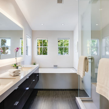
For a couple of young web developers buying their first home in Redwood Shores, we were hired to do a complete interior remodel of a cookie cutter house originally built in 1996. The original finishes looked more like the 80s than the 90s, consisting of raised-panel oak cabinets, 12 x 12 yellow-beige floor tiles, tile counters and brown-beige wall to wall carpeting. The kitchen and bathrooms were utterly basic and the doors, fireplace and TV niche were also very dated. We selected all new finishes in tones of gray and silver per our clients’ tastes and created new layouts for the kitchen and bathrooms. We also designed a custom accent wall for their TV (very important for gamers) and track-mounted sliding 3-Form resin doors to separate their living room from their office. To animate the two story living space we customized a Mizu pendant light by Terzani and in the kitchen we selected an accent wall of seamless Caesarstone, Fuscia lights designed by Achille Castiglioni (one of our favorite modernist pendants) and designed a two-level island and a drop-down ceiling accent “cloud: to coordinate with the color of the accent wall. The master bath features a minimalist bathtub and floating vanity, an internally lit Electric Mirror and Porcelanosa tile.

 Wiedemann Architects LLC
This project is a new 5,900 sf. primary residence for a couple with three children. The site is slightly elevated above the residential street and enjoys winter views of the Potomac River.
The family’s requirements included five bedrooms, five full baths, a powder room, family room, dining room, eat-in kitchen, walk-in pantry, mudroom, lower level recreation room, exercise room, media room and numerous storage spaces. Also included was the request for an outdoor terrace and adequate outdoor storage, including provision for the storage of bikes and kayaks. The family needed a home that would have two entrances, the primary entrance, and a mudroom entry that would provide generous storage spaces for the family’s active lifestyle. Due to the small lot size, the challenge was to accommodate the family’s requirements, while remaining sympathetic to the scale of neighboring homes.
The residence employs a “T” shaped plan to aid in minimizing the massing visible from the street, while organizing interior spaces around a private outdoor terrace space accessible from the living and dining spaces. A generous front porch and a gambrel roof diminish the home’s scale, providing a welcoming view along the street front. A path along the right side of the residence leads to the family entrance and a small outbuilding that provides ready access to the bikes and kayaks while shielding the rear terrace from view of neighboring homes.
The two entrances join a central stair hall that leads to the eat-in kitchen overlooking the great room. Window seats and a custom built banquette provide gathering spaces, while the French doors connect the great room to the terrace where the arbor transitions to the garden. A first floor guest suite, separate from the family areas of the home, affords privacy for both guests and hosts alike. The second floor Master Suite enjoys views of the Potomac River through a second floor arched balcony visible from the front.
The exterior is composed of a board and batten first floor with a cedar shingled second floor and gambrel roof. These two contrasting materials and the inclusion of a partially recessed front porch contribute to the perceived diminution of the home’s scale relative to its smaller neighbors. The overall intention was to create a close fit between the residence and the neighboring context, both built and natural.
Builder: E.H. Johnstone Builders
Anice Hoachlander Photography

 Stanton Homes
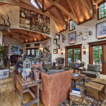
This two story living room has multiple overlooks with plenty of windows to open up the design. Triple arched doorways open to the breakfast nook and kitchen.
Sponsored
Plain City, OH

The Creative Kitchen Company
Columbus Area Kitchen Remodeling and Refacing Professional
 JRP Design & Remodel
Joe and Denise purchased a large Tudor style home that never truly fit their needs. While interviewing contractors to replace the roof and stucco on their home, it prompted them to consider a complete remodel. With two young daughters and pets in the home, our clients were convinced they needed an open concept to entertain and enjoy family and friends together. The couple also desired a blend of traditional and contemporary styles with sophisticated finishes for the project.
JRP embarked on a new floor plan design for both stories of the home. The top floor would include a complete rearrangement of the master suite allowing for separate vanities, spacious master shower, soaking tub, and bigger walk-in closet. On the main floor, walls separating the kitchen and formal dining room would come down. Steel beams and new SQFT was added to open the spaces up to one another. Central to the open-concept layout is a breathtaking great room with an expansive 6-panel bi-folding door creating a seamless view to the gorgeous hills. It became an entirely new space with structural changes, additional living space, and all-new finishes, inside and out to embody our clients’ dream home.
PROJECT DETAILS:
• Style: Transitional
• Colors: Gray & White
• Countertops: Quartzite
• Cabinets: DeWils Frameless Shaker, White & Slate Gray
*fully integrated dishwasher & fridge blend seamlessly with cabinetry as if they aren’t even there
• Hardware/Plumbing Fixture Finish: Chrome
• Lighting Fixtures: unique and bold lighting fixtures throughout every room in the house (pendant lighting, chandeliers, sconces, etc)
• Flooring: White Oak (Titanium wash)
• Tile/Backsplash: Calacatta Borghini Marble - Circle Mosaic Tiles
• Photographer: Andrew (Open House VC)

 Corinthian Fine Homes
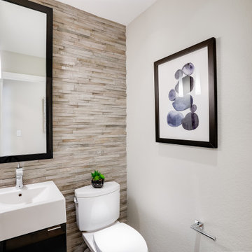
This couple approached us to design and renovate their existing master suite on their adorable Broad Ripple area home. Their goals were to update, open up and improve the function of their space. The ceilings were very low and the space was tight with an inefficient master bath and separate closet. We began by removing the ceiling and providing a high cathedral space for an expanded feel in the bedroom. We removed a side door and picture window and installed a sliding glass door to improve the natural lighting of the space and allow access to their landscaped patio on the back of the home. We stole space from the large master bedroom and eliminated the door that led into the closet, to allow for a larger bathroom and walk-in master closet with dressing area. This permitted a larger shower with a bench and the addition of a make-up vanity area. We also enlarged the window in the bathroom to allow more natural light into the space. The final design element was a floating step outside the sliding door onto their patio which is clean, modern and enhances the entrance to their serene master suite from the exterior.

 AoDK Inc.
A couple wanted a weekend retreat without spending a majority of their getaway in an automobile. Therefore, a lot was purchased along the Rocky River with the vision of creating a nearby escape less than five miles away from their home. This 1,300 sf 24’ x 24’ dwelling is divided into a four square quadrant with the goal to create a variety of interior and exterior experiences while maintaining a rather small footprint.
Typically, when going on a weekend retreat one has the drive time to decompress. However, without this, the goal was to create a procession from the car to the house to signify such change of context. This concept was achieved through the use of a wood slatted screen wall which must be passed through. After winding around a collection of poured concrete steps and walls one comes to a wood plank bridge and crosses over a Japanese garden leaving all the stresses of the daily world behind.
The house is structured around a nine column steel frame grid, which reinforces the impression one gets of the four quadrants. The two rear quadrants intentionally house enclosed program space but once passed through, the floor plan completely opens to long views down to the mouth of the river into Lake Erie.
On the second floor the four square grid is stacked with one quadrant removed for the two story living area on the first floor to capture heightened views down the river. In a move to create complete separation there is a one quadrant roof top office with surrounding roof top garden space. The rooftop office is accessed through a unique approach by exiting onto a steel grated staircase which wraps up the exterior facade of the house. This experience provides an additional retreat within their weekend getaway, and serves as the apex of the house where one can completely enjoy the views of Lake Erie disappearing over the horizon.
Visually the house extends into the riverside site, but the four quadrant axis also physically extends creating a series of experiences out on the property. The Northeast kitchen quadrant extends out to become an exterior kitchen & dining space. The two-story Northwest living room quadrant extends out to a series of wrap around steps and lounge seating. A fire pit sits in this quadrant as well farther out in the lawn. A fruit and vegetable garden sits out in the Southwest quadrant in near proximity to the shed, and the entry sequence is contained within the Southeast quadrant extension. Internally and externally the whole house is organized in a simple and concise way and achieves the ultimate goal of creating many different experiences within a rationally sized footprint.
Photo: Sergiu Stoian
 Corinthian Fine Homes
This couple approached us to design and renovate their existing master suite on their adorable Broad Ripple area home. Their goals were to update, open up and improve the function of their space. The ceilings were very low and the space was tight with an inefficient master bath and separate closet. We began by removing the ceiling and providing a high cathedral space for an expanded feel in the bedroom. We removed a side door and picture window and installed a sliding glass door to improve the natural lighting of the space and allow access to their landscaped patio on the back of the home. We stole space from the large master bedroom and eliminated the door that led into the closet, to allow for a larger bathroom and walk-in master closet with dressing area. This permitted a larger shower with a bench and the addition of a make-up vanity area. We also enlarged the window in the bathroom to allow more natural light into the space. The final design element was a floating step outside the sliding door onto their patio which is clean, modern and enhances the entrance to their serene master suite from the exterior.
 Mark Brand Architecture
For a couple of young web developers buying their first home in Redwood Shores, we were hired to do a complete interior remodel of a cookie cutter house originally built in 1996. The original finishes looked more like the 80s than the 90s, consisting of raised-panel oak cabinets, 12 x 12 yellow-beige floor tiles, tile counters and brown-beige wall to wall carpeting. The kitchen and bathrooms were utterly basic and the doors, fireplace and TV niche were also very dated. We selected all new finishes in tones of gray and silver per our clients’ tastes and created new layouts for the kitchen and bathrooms. We also designed a custom accent wall for their TV (very important for gamers) and track-mounted sliding 3-Form resin doors to separate their living room from their office. To animate the two story living space we customized a Mizu pendant light by Terzani and in the kitchen we selected an accent wall of seamless Caesarstone, Fuscia lights designed by Achille Castiglioni (one of our favorite modernist pendants) and designed a two-level island and a drop-down ceiling accent “cloud: to coordinate with the color of the accent wall. The master bath features a minimalist bathtub and floating vanity, an internally lit Electric Mirror and Porcelanosa tile.

 Advance Design Studio, Ltd.
Karen and Chad of Tower Lakes, IL were tired of their unfinished basement functioning as nothing more than a storage area and depressing gym. They wanted to increase the livable square footage of their home with a cohesive finished basement design, while incorporating space for the kids and adults to hang out.
“We wanted to make sure that upon renovating the basement, that we can have a place where we can spend time and watch movies, but also entertain and showcase the wine collection that we have,” Karen said.
After a long search comparing many different remodeling companies, Karen and Chad found Advance Design Studio. They were drawn towards the unique “Common Sense Remodeling” process that simplifies the renovation experience into predictable steps focused on customer satisfaction.
“There are so many other design/build companies, who may not have transparency, or a focused process in mind and I think that is what separated Advance Design Studio from the rest,” Karen said.
Karen loved how designer Claudia Pop was able to take very high-level concepts, “non-negotiable items” and implement them in the initial 3D drawings. Claudia and Project Manager DJ Yurik kept the couple in constant communication through the project. “Claudia was very receptive to the ideas we had, but she was also very good at infusing her own points and thoughts, she was very responsive, and we had an open line of communication,” Karen said.
A very important part of the basement renovation for the couple was the home gym and sauna. The “high-end hotel” look and feel of the openly blended work out area is both highly functional and beautiful to look at. The home sauna gives them a place to relax after a long day of work or a tough workout. “The gym was a very important feature for us,” Karen said. “And I think (Advance Design) did a very great job in not only making the gym a functional area, but also an aesthetic point in our basement”.
An extremely unique wow-factor in this basement is the walk in glass wine cellar that elegantly displays Karen and Chad’s extensive wine collection. Immediate access to the stunning wet bar accompanies the wine cellar to make this basement a popular spot for friends and family.
The custom-built wine bar brings together two natural elements; Calacatta Vicenza Quartz and thick distressed Black Walnut. Sophisticated yet warm Graphite Dura Supreme cabinetry provides contrast to the soft beige walls and the Calacatta Gold backsplash. An undermount sink across from the bar in a matching Calacatta Vicenza Quartz countertop adds functionality and convenience to the bar, while identical distressed walnut floating shelves add an interesting design element and increased storage. Rich true brown Rustic Oak hardwood floors soften and warm the space drawing all the areas together.
Across from the bar is a comfortable living area perfect for the family to sit down at a watch a movie. A full bath completes this finished basement with a spacious walk-in shower, Cocoa Brown Dura Supreme vanity with Calacatta Vicenza Quartz countertop, a crisp white sink and a stainless-steel Voss faucet.
Advance Design’s Common Sense process gives clients the opportunity to walk through the basement renovation process one step at a time, in a completely predictable and controlled environment. “Everything was designed and built exactly how we envisioned it, and we are really enjoying it to it’s full potential,” Karen said.
Constantly striving for customer satisfaction, Advance Design’s success is heavily reliant upon happy clients referring their friends and family. “We definitely will and have recommended Advance Design Studio to friends who are looking to embark on a remodeling project small or large,” Karen exclaimed at the completion of her project.
Sponsored
Columbus, OH

Structural Remodeling
Franklin County's Heavy Timber Specialists | Best of Houzz 2020!
 Olamar Interiors
This condo in Sterling, VA belongs to a couple about to enter into retirement. They own this home in Sterling, along with a weekend home in West Virginia, a vacation home on Emerald Isle in North Carolina and a vacation home in St. John. They want to use this home as their "home-base" during their retirement, when they need to be in the metro area for business or to see family. The condo is small and they felt it was too "choppy," it didn't have good flow and the rooms were too separated and confined. They wondered if it could have more of an open concept feel but were doubtful due to the size and layout of the home. The furnishings they owned from their previous home were very traditional and heavy. They wanted a much lighter, more open and more contemporary feel to this home. They wanted it to feel clean, light, airy and much bigger then it is.
The first thing we tackled was an unsightly, and very heavy stone veneered fireplace wall that separated the family room from the office space. It made both rooms look heavy and dark. We took down the stone and opened up parts of the wall so that the two spaces would flow into each other.
We added a view thru fireplace and gave the fireplace wall a faux marble finish to lighten it and make it much more contemporary. Glass shelves bounce light and keep the wall feeling light and streamlined. Custom built ins add hidden storage and make great use of space in these small rooms.
Our strategy was to open as much as possible and to lighten the space through the use of color, fabric and glass. New furnishings in lighter colors and soft textures help keep the feeling light and modernize the space. Sheer linen draperies soften the hard lines and add to the light, airy feel. Tinius Photography

 TKS Design Group
Free ebook, Creating the Ideal Kitchen. DOWNLOAD NOW
This project started out as a kitchen remodel but ended up as so much more. As the original plan started to take shape, some water damage provided the impetus to remodel a small upstairs hall bath. Once this bath was complete, the homeowners enjoyed the result so much that they decided to set aside the kitchen and complete a large master bath remodel. Once that was completed, we started planning for the kitchen!
The original kitchen was just large enough to accommodate an island and a separate pantry but felt a little cramped, especially during the weekends when the couple likes to entertain. The primary goal was to maintain the functionality of the current space, but to add some breathing room as well as to provide a view to the homeowner’s side yard and substantial Hosta garden.
The solution was to bump out the space about 10 feet which provided ample room for large pro appliances, a large island for gathering and an upgraded pantry space. It was important to the homeowners to create a space that felt like it belonged in their historic 1866 home. Details such as matching new trim to the existing large custom profiles in the original home and re-purposing an existing door to be used for the new pantry, provided these touches. A large window at the main sink provides that view into the yard and a beautiful focal point for the room.
A mix of painted wood and stained cabinetry gives the new kitchen a sense of belonging in the older home, as do the Super White quartzite that has the look of marble, subway tile backsplash, polished nickel lanterns and glass and mirrored doors. The large pantry, filled with custom shelving built to the homeowner’s specifications, stainless steel appliances and the two Galley Workstations – sinks that do double duty as prep space – ensure that not only does the kitchen look great, but also functions in a personalized manner that works perfectly for the occupants.
Doing the bump out also allowed the opportunity for a small mudroom and powder room right off the kitchen as well as re-arranging some openings to allow for better traffic flow throughout the entire first floor. The result is a comfortable up-to-date home that feels both steeped in history yet allows for today’s style of living.
Designed by: Susan Klimala, CKD, CBD
Photography by: Michael Alan Kaskel
For more information on kitchen and bath design ideas go to: www.kitchenstudio-ge.com
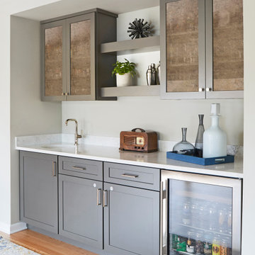 TKS Design Group
Download our free ebook, Creating the Ideal Kitchen. DOWNLOAD NOW
Lakefront property in the northwest suburbs of Chicago is hard to come by, so when we were hired by this young family with exactly that, we were immediately inspired by not just the unusually large footprint of this 1950’s colonial revival but also the lovely views of the manmade lake it was sited on. The large 5-bedroom home was solidly stuck in the 1980’s, but we saw tons of potential. We started out by updating the existing staircase with a fresh coat of paint and adding new herringbone slate to the entry hall.
The powder room off the entryway also got a refresh - new flooring, new cabinets and fixtures. We ran the new slate right through into this space for some consistency. A fun wallpaper and shiplap trim add a welcoming feel and set the tone for the home.
Next, we tackled the kitchen. Located away from the rest of the first floor, the kitchen felt a little isolated, so we immediately began planning for how to better connect it to the rest of the first floor. We landed on removing the wall between the kitchen and dining room and designed a modified galley style space with separate cooking and clean up zones. The cooking zone consists of the refrigerator, prep sink and cooktop, along with a nice long run of prep space at the island. The cleanup side of the kitchen consists of the main sink and dishwasher. Both areas are situated so that the user can view the lake during prep work and cleanup!
One of the home’s main puzzles was how to incorporate the mudroom and area in front of the patio doors at the back of the house. We already had a breakfast table area, so the space by the patio doors was a bit of a no man’s land. We decided to separate the kitchen proper from what became the new mudroom with a large set of barn doors. That way you can quickly hide any mudroom messes but have easy access to the light coming in through the patio doors as well as the outdoor grilling station. We also love the impact the barn doors add to the overall space.
The homeowners’ first words to us were “it’s time to ditch the brown,” so we did! We chose a lovely blue pallet that reflects the home’s location on the lake which is also vibrant yet easy on the eye. Countertops are white quartz, and the natural oak floor works well with the other honey accents. The breakfast table was given a refresh with new chairs, chandelier and window treatments that frame the gorgeous views of the lake out the back.
We coordinated the slate mudroom flooring with that used in the home’s main entrance for a consistent feel. The storage area consists of open and closed storage to allow for some clutter control as needed.
Next on our “to do” list was revamping the dated brown bar area in the neighboring dining room. We eliminated the clutter by adding some closed cabinets and did some easy updates to help the space feel more current. One snag we ran into here was the discovery of a beam above the existing open shelving that had to be modified with a smaller structural beam to allow for our new design to work. This was an unexpected surprise, but in the end we think it was well worth it!
We kept the colors here a bit more muted to blend with the homeowner’s existing furnishings. Open shelving and polished nickel hardware add some simple detail to the new entertainment zone which also looks out onto the lake!
Next we tackled the upstairs starting with the homeowner’s son’s bath. The bath originally had both a tub shower and a separate shower, so we decided to swap out the shower for a new laundry area. This freed up some space downstairs in what used to be the mudroom/laundry room and is much more convenient for daily laundry needs.
We continued the blue palette here with navy cabinetry and the navy tile in the shower. Porcelain floor tile and chrome fixtures keep maintenance to a minimum while matte black mirrors and lighting add some depth the design. A low maintenance runner adds some warmth underfoot and ties the whole space together.
We added a pocket door to the bathroom to minimize interference with the door swings. The left door of the laundry closet is on a 180 degree hinge to allow for easy full access to the machines. Next we tackled the master bath which is an en suite arrangement. The original was typical of the 1980’s with the vanity outside of the bathroom, situated near the master closet. And the brown theme continued here with multiple shades of brown.
Our first move was to segment off the bath and the closet from the master bedroom. We created a short hall from the bedroom to the bathroom with his and hers walk-in closets on the left and right as well as a separate toilet closet outside of the main bathroom for privacy and flexibility.
The original bathroom had a giant soaking tub with steps (dangerous!) as well as a small shower that did not work well for our homeowner who is 6’3”. With other bathtubs in the home, they decided to eliminate the tub and create an oversized shower which takes up the space where the old tub was located. The double vanity is on the opposite wall and a bench is located under the window for morning conversations and a place to set a couple of towels.
The pallet in here is light and airy with a mix of blond wood, creamy porcelain and marble tile, and brass accents. A simple roman shade adds some texture and it’s top-down mechanism allows for light and privacy.
This large whole house remodel gave our homeowners not only the ability to maximize the potential of their home but also created a lovely new frame from which to view their fabulous lake views.
Designed by: Susan Klimala, CKD, CBD
Photography by: Michael Kaskel
For more information on kitchen and bath design ideas go to: www.kitchenstudio-ge.com
 AoDK Inc.
A couple wanted a weekend retreat without spending a majority of their getaway in an automobile. Therefore, a lot was purchased along the Rocky River with the vision of creating a nearby escape less than five miles away from their home. This 1,300 sf 24’ x 24’ dwelling is divided into a four square quadrant with the goal to create a variety of interior and exterior experiences while maintaining a rather small footprint.
Typically, when going on a weekend retreat one has the drive time to decompress. However, without this, the goal was to create a procession from the car to the house to signify such change of context. This concept was achieved through the use of a wood slatted screen wall which must be passed through. After winding around a collection of poured concrete steps and walls one comes to a wood plank bridge and crosses over a Japanese garden leaving all the stresses of the daily world behind.
The house is structured around a nine column steel frame grid, which reinforces the impression one gets of the four quadrants. The two rear quadrants intentionally house enclosed program space but once passed through, the floor plan completely opens to long views down to the mouth of the river into Lake Erie.
On the second floor the four square grid is stacked with one quadrant removed for the two story living area on the first floor to capture heightened views down the river. In a move to create complete separation there is a one quadrant roof top office with surrounding roof top garden space. The rooftop office is accessed through a unique approach by exiting onto a steel grated staircase which wraps up the exterior facade of the house. This experience provides an additional retreat within their weekend getaway, and serves as the apex of the house where one can completely enjoy the views of Lake Erie disappearing over the horizon.
Visually the house extends into the riverside site, but the four quadrant axis also physically extends creating a series of experiences out on the property. The Northeast kitchen quadrant extends out to become an exterior kitchen & dining space. The two-story Northwest living room quadrant extends out to a series of wrap around steps and lounge seating. A fire pit sits in this quadrant as well farther out in the lawn. A fruit and vegetable garden sits out in the Southwest quadrant in near proximity to the shed, and the entry sequence is contained within the Southeast quadrant extension. Internally and externally the whole house is organized in a simple and concise way and achieves the ultimate goal of creating many different experiences within a rationally sized footprint.
Photo: Sergiu Stoian
Sponsored
Sunbury, OH

J.Holderby - Renovations
Franklin County's Leading General Contractors - 2X Best of Houzz!

 Jami Abbadessa
This young couple was ready to make some changes to their master bedroom. They already laid a great foundation for me: beautiful wall color, carpet and trim. We just needed to update their furnishings and make this space feel more like them. They requested a bedroom that was more classic than trendy and a space that feels relaxing and spa-like. I started with the big pieces. I know they liked the light, upholstered bed look, which is awesome because I get so many clients who shy away from this option for fear of it getting dirty. Next up were the case pieces: dresser, night stands, high boy. I know a lot of designers who favor designing a bedroom with non-matching sets, but in this case, I thought opting for matching nightstands and dressers was the most classic choice and will stand the test of time best. They also a requested an area for the wive to do her make up and hair separate from the bathroom with ample light. I found a vanity, replaced the matching stool with an accent chair in a grey ikat print and used a pair of existing lamps. Extra seating is provided at the end of the bed on a tufted grey bench. The inverted pleat drapes are custom made with black out lining. Accessories and wall art were added to infuse personality and warm up the space.
 Mark Brand Architecture
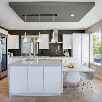
For a couple of young web developers buying their first home in Redwood Shores, we were hired to do a complete interior remodel of a cookie cutter house originally built in 1996. The original finishes looked more like the 80s than the 90s, consisting of raised-panel oak cabinets, 12 x 12 yellow-beige floor tiles, tile counters and brown-beige wall to wall carpeting. The kitchen and bathrooms were utterly basic and the doors, fireplace and TV niche were also very dated. We selected all new finishes in tones of gray and silver per our clients’ tastes and created new layouts for the kitchen and bathrooms. We also designed a custom accent wall for their TV (very important for gamers) and track-mounted sliding 3-Form resin doors to separate their living room from their office. To animate the two story living space we customized a Mizu pendant light by Terzani and in the kitchen we selected an accent wall of seamless Caesarstone, Fuscia lights designed by Achille Castiglioni (one of our favorite modernist pendants) and designed a two-level island and a drop-down ceiling accent “cloud: to coordinate with the color of the accent wall. The master bath features a minimalist bathtub and floating vanity, an internally lit Electric Mirror and Porcelanosa tile.

 Kim Teron Design Studio
Our clients were an energetic and outgoing couple that loved life, laughter and their family including two well-loved Dachshund dogs.
Their home on a lushly treed cul de sac in Manor Park boasts plenty of character, with pockets of rooms devoted to their artistic and musical passions.
As a trained chef, the husband proudly and naturally commanded the lions share of the kitchen, leaving little room for his wife’s love of baking and crafting. Fine food, good wine and a myriad of guitars are at the root of their impromptu and casual
gatherings.
The original design request was to update the kitchen in functionality and
appearance. With one look at the adjacent space which was not visible to the kitchen but commanded a stunning view with south facing windows - and this project morphed into combining two separate spaces into one.
We opened up the kitchen to incorporate the sunroom and create one large open
concept sun-filled happy space with direct access to the rear yard and seating areas. The kitchen was designed to act as one space with clearly delineated zones, where each person could cook autonomously while being together. Additionally, we maintained a soft seating lounge area and a desk for crafting in natural light.
At the heart of the kitchen is a 6’ x 8’ solid black cherry island which serves as the
social hub for gatherings. We used different materials and textures in each zone to clearly represent the two uniquely individual and dynamic personalities of this
couple. A black and white glass mosaic tile backsplash speaks to the glass fused
hobby that is created in the same space while creating a dramatic statement of a
playful artistic expression.
The custom designed wine niches introduce abstract rectilinear forms. The use of
rich materials, two-toned cabinets, custom floating black cherry shelving and a
classic colour palette of black and white act as a backdrop or canvas, which intentionally allows room for each personal expression to shine.
We doubled the storage capacity within the kitchen which is still discreet and still allows for an abundance of glass front interior lit cabinets to showcase their treasured collections.
105