
Search results for "Separated couples" in Home Design Ideas

 Michael Nash Design, Build & Homes
2010 NARI CAPITAL COTY MERIT AWARD WINNER
Baby boomers residing in this single-family colonial in Mclean, Virginia, wanted to make big changes indoors and out. First, they were tired of their back yard and old wooden deck. The neighboring lot sloped steeply downward, creating significant run-off that prevented any semblance of a lawn or landscaping from taking hold. Worse, it prevented the couple from letting their grandchildren or dog out to play.
To address the issue, Michael Nash Design, Build & Homes excavated their entire yard so it was level. Then they designed and built a 5’ x 40’ retaining wall covered with ledger stone to separate the lots, installing an underground drainage system to keep runoff away from a new flagstone patio and surrounding plants and shrubs.
Above the stone patio is a large no-maintenance deck reached via a wide stairway with matching railing. A 12’ x 18’ screened in porch sits to one side featuring cedar beaded ceiling panels and French doors that lead into the home’s dining room.
Highlighting the interior renovations is a new gourmet kitchen with a custom-made wood cabinets and exotic granite countertops. The room’s focal point is a large island with a two-tier countertop and bar seating. Professional-grade stainless steel appliances include a gas cooktop, double-wall ovens, built-in microwave and dishwasher and large refrigerator. Other features include a porcelain tile floor, tile backsplash and a tray ceiling.
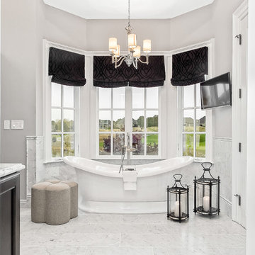
A new master bathroom features floor-to-ceiling cabinets, a dark marble countertop and his and hers sinks. Contrasting light-colored marble floor and wall tile leads to a glass-enclosed shower. An adjoining walk-in closet completes the design.

 Haifa Architects
Duplex Y is located in a multi apartment building, typical to the Carmel mountain neighborhoods. The building has several entrances due to the slope it sits on.
Duplex Y has its own separate entrance and a beautiful view towards Haifa bay and the Golan Heights that can be seen on a clear weather day.
The client - a computer high-tech couple, with their two small daughters asked us for a simple and functional design that could remind them of their frequent visits to central and northern Europe. Their request has been accepted.
Our planning approach was simple indeed, maybe even simple in a radical way:
We followed the principle of clean and ultra minimal spaces, that serve their direct mission only.
Complicated geometry of the rooms has been simplified by implementing built-in wood furniture into numerous niches.
The most 'complicated' room (due to its broken geometry, narrow proportions and sloped ceiling) has been turned into a kid's room shaped as a clean 'wood box' for fun, games and 'edutainment'.
The storage room has been refurbished to maximize it's purpose by creating enough space to store 90% of the entire family's demand.
We've tried to avoid unnecessary decoration. 97% of the design has its functional use in addition to its atmospheric qualities.
Several elements like the structural cylindrical column were exposed to show their original material - concrete.
Photos: Julia Berezina

 The Lifestyle Lab
The Kitchen
The previous kitchen was a dated plan which cutoff the family room and living room / dining room area with walls and arch ways to enter each room. The space had a lot of cabinets, but was too small and felt crowded with more than a couple people in the kitchen at once. The client loved that the kitchen had a lot of natural light with a huge window looking out to the yard and wanted to incorporate a design that had as much natural light but included a more open feel with an island everyone could sit around. She also wanted a nice big vent hood over a cooktop. The challenge was on!
Our NEW and Improved design gave our client 2 new tall windows with a brand new custom wood vent hood in the middle of both of them. We moved her cooktop to where the original sink was once located and created a whole new kitchen setting. The sink went on the island along with a pull out microwave drawer and the dishwasher. We made sure to add a lot of storage pull outs throughout the kitchen and nitched out the island for bar stools to not take away space from the family room. Both walls separating the family room and living / dining room areas came down and the family room was reinforced with a new wood beam that we stained to match the flooring. Cabinets are a white shaker on the perimeter with glass cabinets by her kitchen table. On the island we chose a Grey Stone shaker with shiplap on each finished side. The countertops are a Calacatta Verona Quartz with really pretty veining that we took up the walls on each side of the windows and vent hood. Hardware is in a brushed nickel and faucet by Brizio. A new pantry complete with barn door was also added under the stairs for more storage. This kitchen is now an open plan that gives our homeowners everything they wished for.
Find the right local pro for your project

 Clairmont∙Design∙Remodeling
This kitchen replaced the one original to this 1963 built residence. The now empty nester couple entertain frequently including their large extended family during the holidays. Separating work and social spaces was as important as crafting a space that was conducive to their love of cooking and hanging with family and friends. Simple lines, simple cleanup, and classic tones create an environment that will be in style for many years. Subtle unique touches like the painted wood ceiling, pop up island receptacle/usb and receptacles/usb hidden at the bottom of the upper cabinets add functionality and intrigue. Ample LED lighting on dimmers both ceiling and undercabinet mounted provide ample task lighting. SubZero 42” refrigerator, 36” Viking Range, island pendant lights by Restoration Hardware. The ceiling is framed with white cove molding, the dark colored beadboard actually elevates the feeling of height. It was sanded and spray painted offsite with professional automotive paint equipment. It reflects light beautifully. No one expects this kind of detail and it has been quite fun watching people’s reactions to it. There are white painted perimeter cabinets and Walnut stained island cabinets. A high gloss, mostly white floor was installed from the front door, down the foyer hall and into the kitchen. It contrasts beautifully with the existing dark hardwood floors.Designers Patrick Franz and Kimberly Robbins. Photography by Tom Maday.

 JRP Design & Remodel
After purchasing their ideal ranch style home built in the ‘70s, our clients had requested some major updates and needs throughout the house. The couple loved to cook and desired a large kitchen with professional appliances and a space that connects with the family room for ultimate entertaining. The husband wanted a retreat of his own with office space and a separate bathroom. Both clients disliked the ‘70s aesthetic of their outdated master suite and agreed that too would need a complete update.
The JRP Team focused on the strategic removal of several walls between the entrance, living room, and kitchen to establish a new balance by creating an open floor plan that embraces the natural flow of the home. The luxurious kitchen turned out to be the highlight of the home with beautifully curated materials and double islands. The expanded master bedroom creates space for a relocated and enlarged master bath with walk-in closet. Adding new four panel doors to the backyard of the master suite anchors the room, filling the space with natural light. A large addition was necessary to accommodate the "Man Cave" which provides an exclusive retreat complete with wet bar– perfect for entertaining or relaxing. The remodel took a dated, choppy and disconnected floor plan to a bespoke haven sparkling with natural light and gorgeous finishes.
PROJECT DETAILS:
• Style: Traditional
• Countertops: Quartzite - White Pearl (Cloudy)
• Cabinets: Dewils, Lakewood (Frameless), Maple, Shadow Gray
• Hardware Fixture Finish: Polished Chrome
• Flooring: White Oak – Galleher, Limestone / Brushed
• Paint Colors: Sea Salt / Shadow Gray
• Photographer: J.R. Maddox

 Susan Yeley Homes
Two years before this photo shoot, a Bloomington couple came to SYI wondering whether to renovate their dated bi-level or upgrade to a new house entirely: the classic love-it-or-list-it dilemma. The whole house needed to be touched, really: bathrooms and kitchen, lighting and flooring and paint everywhere, not to mention new furniture to fill in and improve the living spaces. We spent a year with this family, considering options that were less transformative but allowed for the whole house to be upgraded, as well as options that dramatically changed the main living space but meant the rest of the house would have to wait. Meanwhile, they kept an eye out for better digs in town: a house at their price point, that met their family's needs and matched their aesthetic without major construction.
After a year of hunting, hemming and hawing: they pulled the trigger. Give us the whole enchilada in the kitchen and main living space, they said. There's no other house for us. The bathrooms and basement can wait. Make this space, where we spend all our time, a place we love to be.
Walls and ceilings came down; clerestory windows went in. A stunning 4-panel sliding door-cum-window wall replaced two separate doors in two separate rooms, and the sun streaming in now gives this house in Indiana a California-like access to the outdoors. The central custom screen does triple duty: displaying the client's objets d'art, hiding an HVAC chase, and holding up the ceiling. The gas fireplace is completely new, with custom shelving on either side. Of course, in 2017, the kitchen anchors everything. Family Central, it features custom cabinetry, honed quartz, a new window wall, and a huge island. Materials are earthy and natural, lending a warm modern effect to the space. The medium stain of the wood and overall horizontality of the design are a nod to the home's era (1967), while white cabinetry and charcoal tile provide a neutral but crisp backdrop for the family's stunning and colorful art collection.
The result: an ordinary bi-level is now an extraordinary home, unlike any other in Bloomington.
Contractor: Rusty Peterson Construction
Cabinetry: Tim Graber Furniture
Photography: Gina Rogers
 Michael Nash Design, Build & Homes
2013 NARI CAPITAL COTY, GRAND AWARD WINNER, RESIDENTIAL KTICHEN $80,001 -$120,000
This Old Town Alexandria home was ready for a major kitchen renovation. After 20 years of putting up with the dark, short cabinets and a dysfunctional traffic pattern and layout, the owners were ready to roll up their sleeves and throw this kitchen out the window.
Design challenges include a peninsula that was too big for the space, appliance locations that were all over, a stackable washer and dryer in the middle of the kitchen and a lack of storage.
The first step toward a remodeling solution was to move the washer and dryer to a new lower level laundry area. That created space for a new built-in refrigerator, microwave/oven cabinet, pantry and angular end cabinets. This move also created more room on the walls of kitchen for added cabinetry and countertops.
The cook top was moved to one of the walls with a custom wood hood over it. Having removed the old bulkheads, there was space for taller cabinets and some glass front cabinetry (with inside lights) to display china. Large crown molding, along with big arched valances, legs and corbels made this brushed stoke custom cabinetry really stand out.
A big knee wall and a middle post made the breakfast room too closed in and separated from adjacent family room. By installing a couple of structural beams, the space was opened up and dressed up with a large arch opening to replicate the front hall columns.
Similarly, the front door separating the front hall to the kitchen was taken off, widened and then had the same panel arch treatment done. Now all the doorways in the home have a very classy, yet sophisticated detailed molding.
A previously wasted corner area is now home to a custom hutch cabinet. The middle island, not only improved the traffic flow, but also dressed up this kitchen with its furniture look. The expansion of hardwood flooring, from the front hall into the kitchen and beyond, created a seamless transition to the entire first floor.
Use of this highly custom brushed stroke glazed cabinetry in a soft vanilla tone complemented the uniqueness of a slab of granite. The light color tumbled marble backsplash made the glazing of this cabinetry stand out. The transformation of this kitchen was so incredible that no one believes the before photos.
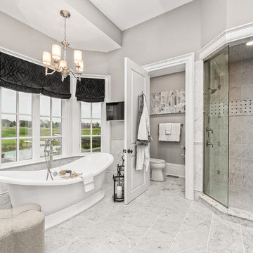
Sponsored
Sunbury, OH

J.Holderby - Renovations
Franklin County's Leading General Contractors - 2X Best of Houzz!
 Michael Nash Design, Build & Homes
2010 NARI CAPITAL COTY GRAND AWARD WINNER
A young couple with toddlers purchased this home and decided to do extensive renovations before they moved in. The existing galley kitchen and dining room were too small and separated by a load bearing wall. The sunken family room floor was less than ideal for small children to have to climb up and down.
The first step in the renovation involved eliminating the load bearing walls and replacing them with a new steel beam capable of handling the load. By doing so, Michael Nash Design, Build & Homes was able to combine the galley kitchen and dining room into one large family kitchen with an eating area.
The focal point of the new space is a large multi-purpose island with a cooktop. Cherry stained cabinetry with a dark granite countertop provides plenty of storage and workspace, as well as bar seating. The same materials are used around the perimeter of the kitchen.
One wall features upper and lower cabinets which surround a stainless steel refrigerator and double wall ovens. A large pantry is included on this wall. The second wall houses the main kitchen sink and built-in dishwasher. A large window sits above the sink area allowing the parents to watch over children playing in the backyard. A butler area features a utility sink and an under-the-counter beverage refrigerator that is easy for the kids to access.
The family room floor was raised to be level with the rest of the first floor and Brazilian cherry wood floors provide continuity and richness throughout the space. Archways were built for style and pleasant viewing from each room.
The end result of the project is that this kitchen is the heart of the home. The living and dining area is now large enough for family gatherings and entertaining.

 Kristy Mastrandonas Interior Design & Styling
Hill Country Retreat with Rustic Transitional Family Room
Kristy Mastrandonas Interior Design & Styling
Family room - large rustic open concept dark wood floor family room idea in Austin with beige walls, a stone fireplace and a wall-mounted tv
Family room - large rustic open concept dark wood floor family room idea in Austin with beige walls, a stone fireplace and a wall-mounted tv
 JRP Design & Remodel
After purchasing their ideal ranch style home built in the ‘70s, our clients had requested some major updates and needs throughout the house. The couple loved to cook and desired a large kitchen with professional appliances and a space that connects with the family room for ultimate entertaining. The husband wanted a retreat of his own with office space and a separate bathroom. Both clients disliked the ‘70s aesthetic of their outdated master suite and agreed that too would need a complete update.
The JRP Team focused on the strategic removal of several walls between the entrance, living room, and kitchen to establish a new balance by creating an open floor plan that embraces the natural flow of the home. The luxurious kitchen turned out to be the highlight of the home with beautifully curated materials and double islands. The expanded master bedroom creates space for a relocated and enlarged master bath with walk-in closet. Adding new four panel doors to the backyard of the master suite anchors the room, filling the space with natural light. A large addition was necessary to accommodate the "Man Cave" which provides an exclusive retreat complete with wet bar– perfect for entertaining or relaxing. The remodel took a dated, choppy and disconnected floor plan to a bespoke haven sparkling with natural light and gorgeous finishes.
PROJECT DETAILS: **These should be simplified and basic project details**
• Style: Traditional
• Flooring: White Oak – Galleher, Limestone / Brushed
• Other Details: Coffered Ceiling & Fireplace
• Photographer: J.R. Maddox

 J.P. Hoffman Design Build
This project hits very close to home for us. Not your typical office space, we re-purposed a 19th century carriage barn into our office and workshop. With no heat, minimum electricity and few windows (most of which were broken), a priority for CEO and Designer Jason Hoffman was to create a space that honors its historic architecture, era and purpose but still offers elements of understated sophistication.
The building is nearly 140 years old, built before many of the trees towering around it had begun growing. It was originally built as a simple, Victorian carriage barn, used to store the family’s horse and buggy. Later, it housed 2,000 chickens when the Owners worked the property as their farm. Then, for many years, it was storage space. Today, it couples as a workshop for our carpentry team, building custom projects and storing equipment, as well as an office loft space ready to welcome clients, visitors and trade partners. We added a small addition onto the existing barn to offer a separate entry way for the office. New stairs and an entrance to the workshop provides for a small, yet inviting foyer space.
From the beginning, even is it’s dark state, Jason loved the ambiance of the old hay loft with its unfinished, darker toned timbers. He knew he wanted to find a way to refinish the space with a focus on those timbers, evident in the statement they make when walking up the stairs. On the exterior, the building received new siding, a new roof and even a new foundation which is a story for another post. Inside, we added skylights, larger windows and a French door, with a small balcony. Along with heat, electricity, WiFi and office furniture, we’re ready for visitors!
 JRP Design & Remodel
After purchasing their ideal ranch style home built in the ‘70s, our clients had requested some major updates and needs throughout the house. The couple loved to cook and desired a large kitchen with professional appliances and a space that connects with the family room for ultimate entertaining. The husband wanted a retreat of his own with office space and a separate bathroom. Both clients disliked the ‘70s aesthetic of their outdated master suite and agreed that too would need a complete update.
The JRP Team focused on the strategic removal of several walls between the entrance, living room, and kitchen to establish a new balance by creating an open floor plan that embraces the natural flow of the home. The luxurious kitchen turned out to be the highlight of the home with beautifully curated materials and double islands. The expanded master bedroom creates space for a relocated and enlarged master bath with walk-in closet. Adding new four panel doors to the backyard of the master suite anchors the room, filling the space with natural light. A large addition was necessary to accommodate the "Man Cave" which provides an exclusive retreat complete with wet bar– perfect for entertaining or relaxing. The remodel took a dated, choppy and disconnected floor plan to a bespoke haven sparkling with natural light and gorgeous finishes.
PROJECT DETAILS:
• Style: Traditional
• Hardware/Plumbing Fixture Finish: Polished Chrome
• Flooring: White Oak – Galleher, Limestone / Brushed
• Photographer: J.R. Maddox
 Remake Architecture LLC
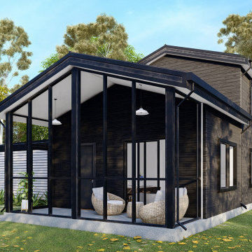
Seward Street is an Accessory Dwelling Unit (ADU) designed for an older couple to age in place – to live independently and comfortably, regardless of age. The fully livable ground floor has an open-flow kitchen, living, and dining room under a cathedral ceiling, with a separate bedroom, full bathroom, and laundry. This is complimented by an upstairs loft with a second full bathroom and a large open space that doubles as either a guest suite or office space.
The ADU is designed within an efficient building footprint to maximize the available back yard. Built from Structurally Insulated Panels (SIPs) it is detailed to be airtight and well insulated, with extremely efficient space heating & cooling (ductless mini-split air source heat pump) and an Energy Recovery Ventilator (ERV) to provide continuous fresh air while recapturing the indoor heating and cooling. It has a 400% efficient air source heat pump water heater, induction cooking, heat pump clothes dryer, and is an all-electric home.
ENERGY EFFICIENCY:
Ultra-High Efficiency Air Source Heat Pump Heating & Cooling System
Energy Recovery Ventilator
Air Source Heat Pump Water Heater
Heat Pump Clothes Dryer
Low-E Glazing
All LED Lighting
Induction Cooktop
Energy Star Certified Appliances
WATER EFFICIENCY:
WaterSense High Efficiency Plumbing Fixtures
Front-Loading Clothes Washer
INDOOR AIR QUALITY:
All-Electric Home (no gas combustion)
Energy Recovery Ventilator with MERV 13 filter
Low and no-VOC materials and finishes
High-Efficiency Kitchen Exhaust Fan
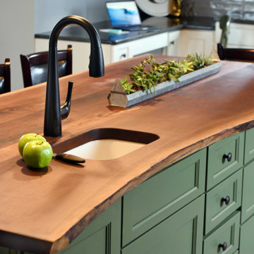
Sponsored
Plain City, OH

The Creative Kitchen Company
Columbus Area Kitchen Remodeling and Refacing Professional
 Clairmont∙Design∙Remodeling
This kitchen replaced the one original to this 1963 built residence. The now empty nester couple entertain frequently including their large extended family during the holidays. Separating work and social spaces was as important as crafting a space that was conducive to their love of cooking and hanging with family and friends. Simple lines, simple cleanup, and classic tones create an environment that will be in style for many years. Subtle unique touches like the painted wood ceiling, pop up island receptacle/usb and receptacles/usb hidden at the bottom of the upper cabinets add functionality and intrigue. Ample LED lighting on dimmers both ceiling and undercabinet mounted provide ample task lighting. SubZero 42” refrigerator, 36” Viking Range, island pendant lights by Restoration Hardware. The ceiling is framed with white cove molding, the dark colored beadboard actually elevates the feeling of height. It was sanded and spray painted offsite with professional automotive paint equipment. It reflects light beautifully. No one expects this kind of detail and it has been quite fun watching people’s reactions to it. There are white painted perimeter cabinets and Walnut stained island cabinets. A high gloss, mostly white floor was installed from the front door, down the foyer hall and into the kitchen. It contrasts beautifully with the existing dark hardwood floors.Designers Patrick Franz and Kimberly Robbins. Photography by Tom Maday.

 Interlocking Concrete Pavement Institute
2018 HNA Awards Honorable Mention - Outdoor Living Features
Contractor: Artisan Exteriors
Producer: CST Pavers
Designer: Joey Hafner
Design: Slate pavers, in a rich Sierra Blend, coupled with Versa-Lok Standard wall units to create multiple outdoor living spaces; masterfully meeting the entertainment requirements of the homeowner. Pavers and wall units, through use of color and texture, provided both definition and an effortless flow – creating a true outdoor oasis.
Quality of Construction and Craftsmanship: Expert workmanship is showcased in the precise paver and wall integration with the pool, spa and outdoor living features. Having a large entertainment space was a must for the homeowners, so the team carved out elevated areas to separate spaces for the pool deck, stage, spa and outdoor kitchen.
Compatibility with Related Construction Materials and Systems: The pool and coping were in great condition but the existing aggregate concrete pool deck was dangerously damaged. Paver and wall units were selected to replace, complement and expand the outdoor living space. Curved steps, coming off the home’s morning room, were added for visual integration and a welcoming element.
Construction Innovation: Vents and basement windows provided several obstacles to construction. To accommodate, designers opted to incorporate a raised patio on a pressure treated lumber frame and utilize the Silca System. To capitalize on the elevation, a portable spa was incorporated into the raised patio.
Overall Excellence: What began as a refurbishment of an existing swimming pool; evolved into a total backyard transformation. Slate pavers and Versa-Lok wall units helped create an outdoor paradise for family and entertainment use with a new pool deck, raised fire pit, raised stage to host musicians, outdoor kitchen and more.
 Mike Hughes Fitted Interiors
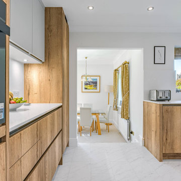
A couple retiring early to a Lake District property asked us to modernise their kitchen and utility space.
They wanted to keep the areas separate, with the utility serving as their working space for laundry and for storing their walking boots after long walks in the fells.
For their kitchen, they chose a handleless Keller Bronx Kitchen in Wild Oak, finished in an Ultra Matt Mist light grey colour. This was beautifully paired with 20mm quartz worktops, featuring an undermounted sink and matching splashback panels. We aimed to give the room character while maintaining a modern appeal. The clients love the new drawer systems, finding everything easily accessible. The kitchen is visually pleasing and simple to keep clean.
The clean design created plenty of clear worktop space, complemented by a Quooker tap for instant boiling water, adding a touch of luxury. Modern Siemens appliances, including an inductAir vented hob, were seamlessly integrated into the layout to ensure an efficient kitchen workflow.
Through the door, the utility room features matching furniture but with handled doors, prioritising practicality. It includes a stainless steel sink with a pull-down spray tap, while compact laminate worktops and splashbacks proved an excellent choice for this space.
An integrated utility unit for cleaning products and laundry was a useful addition, with the washer and tumble dryer built-in to keep the room organised. A small boot unit made from the same Keller furniture was designed to sit on when putting boots on, alongside coat hooks for outdoor wear.
Both rooms were finished with LVT tile-effect flooring installed by our trusted partner tradesmen. The flooring creating a seamless flow between the rooms. We also added under-wall unit LED lighting in both rooms, complementing the recently updated ceiling lights.
 Clairmont∙Design∙Remodeling
This kitchen replaced the one original to this 1963 built residence. The now empty nester couple entertain frequently including their large extended family during the holidays. Separating work and social spaces was as important as crafting a space that was conducive to their love of cooking and hanging with family and friends. Simple lines, simple cleanup, and classic tones create an environment that will be in style for many years. Subtle unique touches like the painted wood ceiling, pop up island receptacle/usb and receptacles/usb hidden at the bottom of the upper cabinets add functionality and intrigue. Ample LED lighting on dimmers both ceiling and undercabinet mounted provide ample task lighting. SubZero 42” refrigerator, 36” Viking Range, island pendant lights by Restoration Hardware. The ceiling is framed with white cove molding, the dark colored beadboard actually elevates the feeling of height. It was sanded and spray painted offsite with professional automotive paint equipment. It reflects light beautifully. No one expects this kind of detail and it has been quite fun watching people’s reactions to it. There are white painted perimeter cabinets and Walnut stained island cabinets. A high gloss, mostly white floor was installed from the front door, down the foyer hall and into the kitchen. It contrasts beautifully with the existing dark hardwood floors.Designers Patrick Franz and Kimberly Robbins. Photography by Tom Maday.
Sponsored
Sunbury, OH
J.Holderby - Renovations
Franklin County's Leading General Contractors - 2X Best of Houzz!

 Olamar Interiors
The clients are a younger couple with no pets or children. They asked me to help them with the Great Room in their brand new townhouse. The space is open concept with 9-foot ceilings. When the clients moved in they had very little furniture and the walls were white and bare. The husband had his eye on a very large original work of art that he wanted to purchase and incorporate into the design. They love to cook and entertain. They asked for a tranquil, neutral space with some color accents, comfortable and flexible seating, a wall-mounted TV with some storage for media equipment, and a bar. The room has several large windows and two sets of sliding glass doors so there is a lot of natural light, which the clients didn’t want to block, but also a lack of privacy. The couple also requested lighting over the kitchen island and some counter stools.
I was challenged by the lack of architectural detail in the room and a tight budget. I decided to choose furniture and accessories with classic modern lines so they would last for a long time. To offset all of the straight lines and neutral colors of the main furniture pieces, and to add visual interest, I introduced organic elements, texture and movement. I did this with wallpaper on the fireplace wall and on the kitchen island (in the case of the island, I railroaded the paper for some interest), a textured rug, some greenery, rough wood on the pedestals next to the fireplace, window shades in natural woven wood, and accessories (particularly two ceramic vases) in interesting shapes. I used the husband’s art piece as the starting point for the color scheme and overall design. I added balance and harmony by adding a large art piece and large pedestals across the room from the large art piece and carrying the teal color across the room in the sofa cushion and ottoman fabrics, art above the mantel and a vase in the niche next to the fireplace. I chose large green glass pendant lights for the kitchen to add color and to match the scale of the room.
One major challenge was that the clients wanted ottomans so they could put their feet up while watching TV. I couldn’t accommodate ottomans and a coffee table, so I opted just to have one large ottoman and added casters so it could be moved closer to the sofa; however, the husband is very tall and the wife is very petite so they wanted separate ottomans to accommodate their different leg lengths. My solution was to design an ottoman that provides maximum flexibility: the two pieces can be joined and a tray added to make it a coffee table, or pulled apart and used either as party seating or individual ottomans for the homeowners. They were thrilled with the solution.
Photographer:
Jon W. Miller
 Olamar Interiors
The clients are a younger couple with no pets or children. They asked me to help them with the Great Room in their brand new townhouse. The space is open concept with 9-foot ceilings. When the clients moved in they had very little furniture and the walls were white and bare. The husband had his eye on a very large original work of art that he wanted to purchase and incorporate into the design. They love to cook and entertain. They asked for a tranquil, neutral space with some color accents, comfortable and flexible seating, a wall-mounted TV with some storage for media equipment, and a bar. The room has several large windows and two sets of sliding glass doors so there is a lot of natural light, which the clients didn’t want to block, but also a lack of privacy. The couple also requested lighting over the kitchen island and some counter stools.
I was challenged by the lack of architectural detail in the room and a tight budget. I decided to choose furniture and accessories with classic modern lines so they would last for a long time. To offset all of the straight lines and neutral colors of the main furniture pieces, and to add visual interest, I introduced organic elements, texture and movement. I did this with wallpaper on the fireplace wall and on the kitchen island (in the case of the island, I railroaded the paper for some interest), a textured rug, some greenery, rough wood on the pedestals next to the fireplace, window shades in natural woven wood, and accessories (particularly two ceramic vases) in interesting shapes. I used the husband’s art piece as the starting point for the color scheme and overall design. I added balance and harmony by adding a large art piece and large pedestals across the room from the large art piece and carrying the teal color across the room in the sofa cushion and ottoman fabrics, art above the mantel and a vase in the niche next to the fireplace. I chose large green glass pendant lights for the kitchen to add color and to match the scale of the room.
One major challenge was that the clients wanted ottomans so they could put their feet up while watching TV. I couldn’t accommodate ottomans and a coffee table, so I opted just to have one large ottoman and added casters so it could be moved closer to the sofa; however, the husband is very tall and the wife is very petite so they wanted separate ottomans to accommodate their different leg lengths. My solution was to design an ottoman that provides maximum flexibility: the two pieces can be joined and a tray added to make it a coffee table, or pulled apart and used either as party seating or individual ottomans for the homeowners. They were thrilled with the solution.
Photography: Jon W. Miller
 Olamar Interiors
The clients are a younger couple with no pets or children. They asked me to help them with the Great Room in their brand new townhouse. The space is open concept with 9-foot ceilings. When the clients moved in they had very little furniture and the walls were white and bare. The husband had his eye on a very large original work of art that he wanted to purchase and incorporate into the design. They love to cook and entertain. They asked for a tranquil, neutral space with some color accents, comfortable and flexible seating, a wall-mounted TV with some storage for media equipment, and a bar. The room has several large windows and two sets of sliding glass doors so there is a lot of natural light, which the clients didn’t want to block, but also a lack of privacy. The couple also requested lighting over the kitchen island and some counter stools.
I was challenged by the lack of architectural detail in the room and a tight budget. I decided to choose furniture and accessories with classic modern lines so they would last for a long time. To offset all of the straight lines and neutral colors of the main furniture pieces, and to add visual interest, I introduced organic elements, texture and movement. I did this with wallpaper on the fireplace wall and on the kitchen island (in the case of the island, I railroaded the paper for some interest), a textured rug, some greenery, rough wood on the pedestals next to the fireplace, window shades in natural woven wood, and accessories (particularly two ceramic vases) in interesting shapes. I used the husband’s art piece as the starting point for the color scheme and overall design. I added balance and harmony by adding a large art piece and large pedestals across the room from the large art piece and carrying the teal color across the room in the sofa cushion and ottoman fabrics, art above the mantel and a vase in the niche next to the fireplace. I chose large green glass pendant lights for the kitchen to add color and to match the scale of the room.
One major challenge was that the clients wanted ottomans so they could put their feet up while watching TV. I couldn’t accommodate ottomans and a coffee table, so I opted just to have one large ottoman and added casters so it could be moved closer to the sofa; however, the husband is very tall and the wife is very petite so they wanted separate ottomans to accommodate their different leg lengths. My solution was to design an ottoman that provides maximum flexibility: the two pieces can be joined and a tray added to make it a coffee table, or pulled apart and used either as party seating or individual ottomans for the homeowners. They were thrilled with the solution.
Photographer: Jon W. Miller
113