
Search results for "Separated couples" in Home Design Ideas

 Olamar Interiors
The clients are a younger couple with no pets or children. They asked me to help them with the Great Room in their brand new townhouse. The space is open concept with 9-foot ceilings. When the clients moved in they had very little furniture and the walls were white and bare. The husband had his eye on a very large original work of art that he wanted to purchase and incorporate into the design. They love to cook and entertain. They asked for a tranquil, neutral space with some color accents, comfortable and flexible seating, a wall-mounted TV with some storage for media equipment, and a bar. The room has several large windows and two sets of sliding glass doors so there is a lot of natural light, which the clients didn’t want to block, but also a lack of privacy. The couple also requested lighting over the kitchen island and some counter stools.
I was challenged by the lack of architectural detail in the room and a tight budget. I decided to choose furniture and accessories with classic modern lines so they would last for a long time. To offset all of the straight lines and neutral colors of the main furniture pieces, and to add visual interest, I introduced organic elements, texture and movement. I did this with wallpaper on the fireplace wall and on the kitchen island (in the case of the island, I railroaded the paper for some interest), a textured rug, some greenery, rough wood on the pedestals next to the fireplace, window shades in natural woven wood, and accessories (particularly two ceramic vases) in interesting shapes. I used the husband’s art piece as the starting point for the color scheme and overall design. I added balance and harmony by adding a large art piece and large pedestals across the room from the large art piece and carrying the teal color across the room in the sofa cushion and ottoman fabrics, art above the mantel and a vase in the niche next to the fireplace. I chose large green glass pendant lights for the kitchen to add color and to match the scale of the room.
One major challenge was that the clients wanted ottomans so they could put their feet up while watching TV. I couldn’t accommodate ottomans and a coffee table, so I opted just to have one large ottoman and added casters so it could be moved closer to the sofa; however, the husband is very tall and the wife is very petite so they wanted separate ottomans to accommodate their different leg lengths. My solution was to design an ottoman that provides maximum flexibility: the two pieces can be joined and a tray added to make it a coffee table, or pulled apart and used either as party seating or individual ottomans for the homeowners. They were thrilled with the solution.
Photographer: Jon W. Miller
 Olamar Interiors
The clients are a younger couple with no pets or children. They asked me to help them with the Great Room in their brand new townhouse. The space is open concept with 9-foot ceilings. When the clients moved in they had very little furniture and the walls were white and bare. The husband had his eye on a very large original work of art that he wanted to purchase and incorporate into the design. They love to cook and entertain. They asked for a tranquil, neutral space with some color accents, comfortable and flexible seating, a wall-mounted TV with some storage for media equipment, and a bar. The room has several large windows and two sets of sliding glass doors so there is a lot of natural light, which the clients didn’t want to block, but also a lack of privacy. The couple also requested lighting over the kitchen island and some counter stools.
I was challenged by the lack of architectural detail in the room and a tight budget. I decided to choose furniture and accessories with classic modern lines so they would last for a long time. To offset all of the straight lines and neutral colors of the main furniture pieces, and to add visual interest, I introduced organic elements, texture and movement. I did this with wallpaper on the fireplace wall and on the kitchen island (in the case of the island, I railroaded the paper for some interest), a textured rug, some greenery, rough wood on the pedestals next to the fireplace, window shades in natural woven wood, and accessories (particularly two ceramic vases) in interesting shapes. I used the husband’s art piece as the starting point for the color scheme and overall design. I added balance and harmony by adding a large art piece and large pedestals across the room from the large art piece and carrying the teal color across the room in the sofa cushion and ottoman fabrics, art above the mantel and a vase in the niche next to the fireplace. I chose large green glass pendant lights for the kitchen to add color and to match the scale of the room.
One major challenge was that the clients wanted ottomans so they could put their feet up while watching TV. I couldn’t accommodate ottomans and a coffee table, so I opted just to have one large ottoman and added casters so it could be moved closer to the sofa; however, the husband is very tall and the wife is very petite so they wanted separate ottomans to accommodate their different leg lengths. My solution was to design an ottoman that provides maximum flexibility: the two pieces can be joined and a tray added to make it a coffee table, or pulled apart and used either as party seating or individual ottomans for the homeowners. They were thrilled with the solution.
Photographer: Jon W. Miller
 Mike Hughes Fitted Interiors
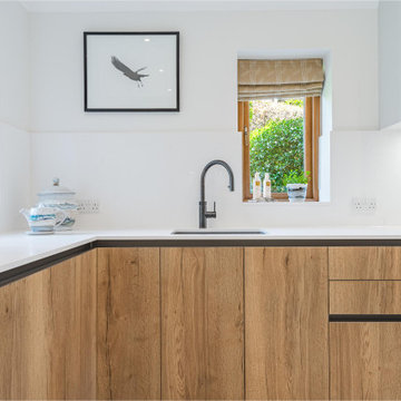
A couple retiring early to a Lake District property asked us to modernise their kitchen and utility space.
They wanted to keep the areas separate, with the utility serving as their working space for laundry and for storing their walking boots after long walks in the fells.
For their kitchen, they chose a handleless Keller Bronx Kitchen in Wild Oak, finished in an Ultra Matt Mist light grey colour. This was beautifully paired with 20mm quartz worktops, featuring an undermounted sink and matching splashback panels. We aimed to give the room character while maintaining a modern appeal. The clients love the new drawer systems, finding everything easily accessible. The kitchen is visually pleasing and simple to keep clean.
The clean design created plenty of clear worktop space, complemented by a Quooker tap for instant boiling water, adding a touch of luxury. Modern Siemens appliances, including an inductAir vented hob, were seamlessly integrated into the layout to ensure an efficient kitchen workflow.
Through the door, the utility room features matching furniture but with handled doors, prioritising practicality. It includes a stainless steel sink with a pull-down spray tap, while compact laminate worktops and splashbacks proved an excellent choice for this space.
An integrated utility unit for cleaning products and laundry was a useful addition, with the washer and tumble dryer built-in to keep the room organised. A small boot unit made from the same Keller furniture was designed to sit on when putting boots on, alongside coat hooks for outdoor wear.
Both rooms were finished with LVT tile-effect flooring installed by our trusted partner tradesmen. The flooring creating a seamless flow between the rooms. We also added under-wall unit LED lighting in both rooms, complementing the recently updated ceiling lights.
Find the right local pro for your project


 Susan Yeley Homes
Two years before this photo shoot, a Bloomington couple came to SYI wondering whether to renovate their dated bi-level or upgrade to a new house entirely: the classic love-it-or-list-it dilemma. The whole house needed to be touched, really: bathrooms and kitchen, lighting and flooring and paint everywhere, not to mention new furniture to fill in and improve the living spaces. We spent a year with this family, considering options that were less transformative but allowed for the whole house to be upgraded, as well as options that dramatically changed the main living space but meant the rest of the house would have to wait. Meanwhile, they kept an eye out for better digs in town: a house at their price point, that met their family's needs and matched their aesthetic without major construction.
After a year of hunting, hemming and hawing: they pulled the trigger. Give us the whole enchilada in the kitchen and main living space, they said. There's no other house for us. The bathrooms and basement can wait. Make this space, where we spend all our time, a place we love to be.
Walls and ceilings came down; clerestory windows went in. A stunning 4-panel sliding door-cum-window wall replaced two separate doors in two separate rooms, and the sun streaming in now gives this house in Indiana a California-like access to the outdoors. The central custom screen does triple duty: displaying the client's objets d'art, hiding an HVAC chase, and holding up the ceiling. The gas fireplace is completely new, with custom shelving on either side. Of course, in 2017, the kitchen anchors everything. Family Central, it features custom cabinetry, honed quartz, a new window wall, and a huge island. Materials are earthy and natural, lending a warm modern effect to the space. The medium stain of the wood and overall horizontality of the design are a nod to the home's era (1967), while white cabinetry and charcoal tile provide a neutral but crisp backdrop for the family's stunning and colorful art collection.
The result: an ordinary bi-level is now an extraordinary home, unlike any other in Bloomington.
Contractor: Rusty Peterson Construction
Cabinetry: Tim Graber Furniture
Photography: Gina Rogers

 Michael Nash Design, Build & Homes
2010 NARI CAPITAL COTY GRAND AWARD WINNER
A young couple with toddlers purchased this home and decided to do extensive renovations before they moved in. The existing galley kitchen and dining room were too small and separated by a load bearing wall. The sunken family room floor was less than ideal for small children to have to climb up and down.
The first step in the renovation involved eliminating the load bearing walls and replacing them with a new steel beam capable of handling the load. By doing so, Michael Nash Design, Build & Homes was able to combine the galley kitchen and dining room into one large family kitchen with an eating area.
The focal point of the new space is a large multi-purpose island with a cooktop. Cherry stained cabinetry with a dark granite countertop provides plenty of storage and workspace, as well as bar seating. The same materials are used around the perimeter of the kitchen.
One wall features upper and lower cabinets which surround a stainless steel refrigerator and double wall ovens. A large pantry is included on this wall. The second wall houses the main kitchen sink and built-in dishwasher. A large window sits above the sink area allowing the parents to watch over children playing in the backyard. A butler area features a utility sink and an under-the-counter beverage refrigerator that is easy for the kids to access.
The family room floor was raised to be level with the rest of the first floor and Brazilian cherry wood floors provide continuity and richness throughout the space. Archways were built for style and pleasant viewing from each room.
The end result of the project is that this kitchen is the heart of the home. The living and dining area is now large enough for family gatherings and entertaining.

 Dellfina Homes
This truly magnificent King City Project is the ultra-luxurious family home you’ve been dreaming of! This immaculate 5 bedroom residence has stunning curb appeal, with a beautifully designed white Cape Cod wood siding, professionally landscaped gardens, precisely positioned home on 3 acre lot and a private driveway leading up to the 4 car garage including workshop.
This beautiful 8200 square foot Georgian style home is every homeowners dream plus a beautiful 5800 square foot walkout basement. The English inspired exterior cladding and landscaping has an endless array of attention and detail. The handpicked materials of the interior has endless exceptional unfinished oak hardwood throughout, varying 9” to 12” plaster crown mouldings throughout and see each room accented with upscale interior light fixtures. Spend the end of your hard worked days in our beautiful Conservatory walking out of the kitchen/family room, this open concept room his met with high ceilings and 60 linear feet of glass looking out onto 3 acres of land.
Our exquisite Bloomsbury Kitchen designed kitchen is a hand painted work of art. Simple but stunning craftsmanship for this gourmet kitchen with a 10ft calacatta island and countertops. 2 apron sinks incorporated into counter and islands with 2-Georgian Bridge polished nickel faucets. Our 60” range will help every meal taste better than the last. 3 stainless steel fridges. The bright breakfast area is ideal for enjoying morning meals and conversation while overlooking the verdant backyard, or step out to the conservatory to savor your meals under the stars. All accented with Carrara backsplash.
Also, on the main level is the expansive Master Suite with stunning views of the countryside, and a magnificent ensuite washroom, featuring built-in cabinetry, a makeup counter, an oversized glass shower, and a separate free standing tub. All is sitting on a beautifully layout of carrara floor tiles. All bedrooms have abundant walk-in closet space, large windows and full ensuites with heated floor in all tiled areas.
Hardwood floors throughout have been such an important detail in this home. We take a lot of pride in the finish as well as the planning that went into designing the floors. We have a wide variety of French parque flooring, herringbone in main areas as well as chevron in our dining room and eating areas. Feel the texture on your feet as this oak hardwood comes to life with its beautiful stained finished.
75% of the home is a paneling heaven. The entire first floor leading up to the second floor has extensive recessed panels, archways and bead board from floor to ceiling to give it that country feel. Our main floor spiral staircase is nothing but luxury with its simple handrails and beautifully stained steps.
Walk out onto two Garden Walkways, one off of the kitchen and the other off of the master bedroom hallway. BBQ area or just relaxing in front of a wood burning fireplace looking off of a porch with clean cut glass railings.
Our wood burning fireplace can be seen in the basement, first floor and exterior of the garden walkway terrace. These fireplaces are cladded with Owen Sound limestone and having a herringbone designed box. To help enjoy these fireplaces, take full advantage of the two storey electronic dumbwaiter elevator for the firewood.
Get work done in our 600 square foot office, that is surrounded by oak recessed paneling, custom crafted built ins and hand carved oak desk, all looking onto 3 acres of country side.
Enjoy wine? See our beautifully designed wine cellar finished with marble border and pebble stone floor to give you that authentic feel of a real winery. This handcrafted room holds up to 3000 bottles of wine and is a beautiful feature every home should have. Wine enthusiasts will love the climatized wine room for displaying and preserving your extensive collection. This wine room has floor to ceiling glass looking onto the family room of the basement with a wood burning fireplace.
After your long meal and couple glasses of wine, see our 1500 square foot gym with all the latest equipment and rubber floor and surrounded in floor to ceiling mirrors. Once you’re done with your workout, you have the option of using our traditional sauna, infrared sauna or taking a dip in the hot tub.
Extras include a side entrance to the mudroom, two spacious cold rooms, a CVAC system throughout, 400 AMP Electrical service with generator for entire home, a security system, built-in speakers throughout and Control4 Home automation system that includes lighting, audio & video and so much more. A true pride of ownership and masterpiece built and managed by Dellfina Homes Inc.
Sponsored
Sunbury, OH

J.Holderby - Renovations
Franklin County's Leading General Contractors - 2X Best of Houzz!
 Olamar Interiors
The clients are a younger couple with no pets or children. They asked me to help them with the Great Room in their brand new townhouse. The space is open concept with 9-foot ceilings. When the clients moved in they had very little furniture and the walls were white and bare. The husband had his eye on a very large original work of art that he wanted to purchase and incorporate into the design. They love to cook and entertain. They asked for a tranquil, neutral space with some color accents, comfortable and flexible seating, a wall-mounted TV with some storage for media equipment, and a bar. The room has several large windows and two sets of sliding glass doors so there is a lot of natural light, which the clients didn’t want to block, but also a lack of privacy. The couple also requested lighting over the kitchen island and some counter stools.
I was challenged by the lack of architectural detail in the room and a tight budget. I decided to choose furniture and accessories with classic modern lines so they would last for a long time. To offset all of the straight lines and neutral colors of the main furniture pieces, and to add visual interest, I introduced organic elements, texture and movement. I did this with wallpaper on the fireplace wall and on the kitchen island (in the case of the island, I railroaded the paper for some interest), a textured rug, some greenery, rough wood on the pedestals next to the fireplace, window shades in natural woven wood, and accessories (particularly two ceramic vases) in interesting shapes. I used the husband’s art piece as the starting point for the color scheme and overall design. I added balance and harmony by adding a large art piece and large pedestals across the room from the large art piece and carrying the teal color across the room in the sofa cushion and ottoman fabrics, art above the mantel and a vase in the niche next to the fireplace. I chose large green glass pendant lights for the kitchen to add color and to match the scale of the room.
One major challenge was that the clients wanted ottomans so they could put their feet up while watching TV. I couldn’t accommodate ottomans and a coffee table, so I opted just to have one large ottoman and added casters so it could be moved closer to the sofa; however, the husband is very tall and the wife is very petite so they wanted separate ottomans to accommodate their different leg lengths. My solution was to design an ottoman that provides maximum flexibility: the two pieces can be joined and a tray added to make it a coffee table, or pulled apart and used either as party seating or individual ottomans for the homeowners. They were thrilled with the solution.
Photographer:
Jon W. Miller

 Balestri Architects
This project combines two existing studio apartments into a compact 800 sqft. live/work space for a young professional couple in the heart of Chelsea, New York.
The design required some creative space planning to meet the Owner’s requested program for an open plan solution with a private master bedroom suite and separate study that also allowed for entertaining small parties, including the ability to provide a sleeping space for guests.
The solution was to identify areas of overlap within the program that could be addressed with dual-function custom millwork pieces. A bar-stool counter at the open kitchen folds out to become a bench and dining table for formal entertaining. A custom desk folds down with a murphy bed to convert a private study into a guest bedroom area. A series of pocket door connecting the spaces provide both privacy to the master bedroom area when closed, and the option for a completely open layout when opened.
A carefully selected material palette brings a warm, tranquil feel to the space. Reclaimed teak floors run seamlessly through the main spaces to accentuate the open layout. Warm gray lacquered millwork, Centaurus granite slabs, and custom oxidized stainless steel details, give an elegant counterpoint to the natural teak floors. The master bedroom suite and study feature custom Afromosia millwork. The bathrooms are finished with cool toned ceramic tile, custom Afromosia vanities, and minimalist chrome fixtures. Custom LED lighting provides dynamic, energy efficient illumination throughout.
Photography: Mikiko Kikuyama

 Kitchen Design Services
Bar with Cambria Quartz, Laneshaw
Mid-sized transitional medium tone wood floor eat-in kitchen photo in San Francisco with an undermount sink, shaker cabinets, white cabinets, quartzite countertops, gray backsplash, glass tile backsplash, stainless steel appliances and two islands
Mid-sized transitional medium tone wood floor eat-in kitchen photo in San Francisco with an undermount sink, shaker cabinets, white cabinets, quartzite countertops, gray backsplash, glass tile backsplash, stainless steel appliances and two islands
 Michael Nash Design, Build & Homes
2010 NARI CAPITAL COTY GRAND AWARD WINNER
A young couple with toddlers purchased this home and decided to do extensive renovations before they moved in. The existing galley kitchen and dining room were too small and separated by a load bearing wall. The sunken family room floor was less than ideal for small children to have to climb up and down.
The first step in the renovation involved eliminating the load bearing walls and replacing them with a new steel beam capable of handling the load. By doing so, Michael Nash Design, Build & Homes was able to combine the galley kitchen and dining room into one large family kitchen with an eating area.
The focal point of the new space is a large multi-purpose island with a cooktop. Cherry stained cabinetry with a dark granite countertop provides plenty of storage and workspace, as well as bar seating. The same materials are used around the perimeter of the kitchen.
One wall features upper and lower cabinets which surround a stainless steel refrigerator and double wall ovens. A large pantry is included on this wall. The second wall houses the main kitchen sink and built-in dishwasher. A large window sits above the sink area allowing the parents to watch over children playing in the backyard. A butler area features a utility sink and an under-the-counter beverage refrigerator that is easy for the kids to access.
The family room floor was raised to be level with the rest of the first floor and Brazilian cherry wood floors provide continuity and richness throughout the space. Archways were built for style and pleasant viewing from each room.
The end result of the project is that this kitchen is the heart of the home. The living and dining area is now large enough for family gatherings and entertaining.
 Olamar Interiors
The clients are a younger couple with no pets or children. They asked me to help them with the Great Room in their brand new townhouse. The space is open concept with 9-foot ceilings. When the clients moved in they had very little furniture and the walls were white and bare. The husband had his eye on a very large original work of art that he wanted to purchase and incorporate into the design. They love to cook and entertain. They asked for a tranquil, neutral space with some color accents, comfortable and flexible seating, a wall-mounted TV with some storage for media equipment, and a bar. The room has several large windows and two sets of sliding glass doors so there is a lot of natural light, which the clients didn’t want to block, but also a lack of privacy. The couple also requested lighting over the kitchen island and some counter stools.
I was challenged by the lack of architectural detail in the room and a tight budget. I decided to choose furniture and accessories with classic modern lines so they would last for a long time. To offset all of the straight lines and neutral colors of the main furniture pieces, and to add visual interest, I introduced organic elements, texture and movement. I did this with wallpaper on the fireplace wall and on the kitchen island (in the case of the island, I railroaded the paper for some interest), a textured rug, some greenery, rough wood on the pedestals next to the fireplace, window shades in natural woven wood, and accessories (particularly two ceramic vases) in interesting shapes. I used the husband’s art piece as the starting point for the color scheme and overall design. I added balance and harmony by adding a large art piece and large pedestals across the room from the large art piece and carrying the teal color across the room in the sofa cushion and ottoman fabrics, art above the mantel and a vase in the niche next to the fireplace. I chose large green glass pendant lights for the kitchen to add color and to match the scale of the room.
One major challenge was that the clients wanted ottomans so they could put their feet up while watching TV. I couldn’t accommodate ottomans and a coffee table, so I opted just to have one large ottoman and added casters so it could be moved closer to the sofa; however, the husband is very tall and the wife is very petite so they wanted separate ottomans to accommodate their different leg lengths. My solution was to design an ottoman that provides maximum flexibility: the two pieces can be joined and a tray added to make it a coffee table, or pulled apart and used either as party seating or individual ottomans for the homeowners. They were thrilled with the solution.
Phoographer: Jon W. Miller
 Olamar Interiors
The clients are a younger couple with no pets or children. They asked me to help them with the Great Room in their brand new townhouse. The space is open concept with 9-foot ceilings. When the clients moved in they had very little furniture and the walls were white and bare. The husband had his eye on a very large original work of art that he wanted to purchase and incorporate into the design. They love to cook and entertain. They asked for a tranquil, neutral space with some color accents, comfortable and flexible seating, a wall-mounted TV with some storage for media equipment, and a bar. The room has several large windows and two sets of sliding glass doors so there is a lot of natural light, which the clients didn’t want to block, but also a lack of privacy. The couple also requested lighting over the kitchen island and some counter stools.
I was challenged by the lack of architectural detail in the room and a tight budget. I decided to choose furniture and accessories with classic modern lines so they would last for a long time. To offset all of the straight lines and neutral colors of the main furniture pieces, and to add visual interest, I introduced organic elements, texture and movement. I did this with wallpaper on the fireplace wall and on the kitchen island (in the case of the island, I railroaded the paper for some interest), a textured rug, some greenery, rough wood on the pedestals next to the fireplace, window shades in natural woven wood, and accessories (particularly two ceramic vases) in interesting shapes. I used the husband’s art piece as the starting point for the color scheme and overall design. I added balance and harmony by adding a large art piece and large pedestals across the room from the large art piece and carrying the teal color across the room in the sofa cushion and ottoman fabrics, art above the mantel and a vase in the niche next to the fireplace. I chose large green glass pendant lights for the kitchen to add color and to match the scale of the room.
One major challenge was that the clients wanted ottomans so they could put their feet up while watching TV. I couldn’t accommodate ottomans and a coffee table, so I opted just to have one large ottoman and added casters so it could be moved closer to the sofa; however, the husband is very tall and the wife is very petite so they wanted separate ottomans to accommodate their different leg lengths. My solution was to design an ottoman that provides maximum flexibility: the two pieces can be joined and a tray added to make it a coffee table, or pulled apart and used either as party seating or individual ottomans for the homeowners. They were thrilled with the solution.
Photographer: Jon W. Miller
Sponsored
Sunbury, OH
J.Holderby - Renovations
Franklin County's Leading General Contractors - 2X Best of Houzz!

 J.P. Hoffman Design Build
This project hits very close to home for us. Not your typical office space, we re-purposed a 19th century carriage barn into our office and workshop. With no heat, minimum electricity and few windows (most of which were broken), a priority for CEO and Designer Jason Hoffman was to create a space that honors its historic architecture, era and purpose but still offers elements of understated sophistication.
The building is nearly 140 years old, built before many of the trees towering around it had begun growing. It was originally built as a simple, Victorian carriage barn, used to store the family’s horse and buggy. Later, it housed 2,000 chickens when the Owners worked the property as their farm. Then, for many years, it was storage space. Today, it couples as a workshop for our carpentry team, building custom projects and storing equipment, as well as an office loft space ready to welcome clients, visitors and trade partners. We added a small addition onto the existing barn to offer a separate entry way for the office. New stairs and an entrance to the workshop provides for a small, yet inviting foyer space.
From the beginning, even is it’s dark state, Jason loved the ambiance of the old hay loft with its unfinished, darker toned timbers. He knew he wanted to find a way to refinish the space with a focus on those timbers, evident in the statement they make when walking up the stairs. On the exterior, the building received new siding, a new roof and even a new foundation which is a story for another post. Inside, we added skylights, larger windows and a French door, with a small balcony. Along with heat, electricity, WiFi and office furniture, we’re ready for visitors!
 Susan Yeley Homes
Two years before this photo shoot, a Bloomington couple came to SYI wondering whether to renovate their dated bi-level or upgrade to a new house entirely: the classic love-it-or-list-it dilemma. The whole house needed to be touched, really: bathrooms and kitchen, lighting and flooring and paint everywhere, not to mention new furniture to fill in and improve the living spaces. We spent a year with this family, considering options that were less transformative but allowed for the whole house to be upgraded, as well as options that dramatically changed the main living space but meant the rest of the house would have to wait. Meanwhile, they kept an eye out for better digs in town: a house at their price point, that met their family's needs and matched their aesthetic without major construction.
After a year of hunting, hemming and hawing: they pulled the trigger. Give us the whole enchilada in the kitchen and main living space, they said. There's no other house for us. The bathrooms and basement can wait. Make this space, where we spend all our time, a place we love to be.
Walls and ceilings came down; clerestory windows went in. A stunning 4-panel sliding door-cum-window wall replaced two separate doors in two separate rooms, and the sun streaming in now gives this house in Indiana a California-like access to the outdoors. The central custom screen does triple duty: displaying the client's objets d'art, hiding an HVAC chase, and holding up the ceiling. The gas fireplace is completely new, with custom shelving on either side. Of course, in 2017, the kitchen anchors everything. Family Central, it features custom cabinetry, honed quartz, a new window wall, and a huge island. Materials are earthy and natural, lending a warm modern effect to the space. The medium stain of the wood and overall horizontality of the design are a nod to the home's era (1967), while white cabinetry and charcoal tile provide a neutral but crisp backdrop for the family's stunning and colorful art collection.
The result: an ordinary bi-level is now an extraordinary home, unlike any other in Bloomington.
Contractor: Rusty Peterson Construction
Cabinetry: Tim Graber Furniture
Photography: Gina Rogers

 Advance Design Studio, Ltd.
Karen and Chad of Tower Lakes, IL were tired of their unfinished basement functioning as nothing more than a storage area and depressing gym. They wanted to increase the livable square footage of their home with a cohesive finished basement design, while incorporating space for the kids and adults to hang out.
“We wanted to make sure that upon renovating the basement, that we can have a place where we can spend time and watch movies, but also entertain and showcase the wine collection that we have,” Karen said.
After a long search comparing many different remodeling companies, Karen and Chad found Advance Design Studio. They were drawn towards the unique “Common Sense Remodeling” process that simplifies the renovation experience into predictable steps focused on customer satisfaction.
“There are so many other design/build companies, who may not have transparency, or a focused process in mind and I think that is what separated Advance Design Studio from the rest,” Karen said.
Karen loved how designer Claudia Pop was able to take very high-level concepts, “non-negotiable items” and implement them in the initial 3D drawings. Claudia and Project Manager DJ Yurik kept the couple in constant communication through the project. “Claudia was very receptive to the ideas we had, but she was also very good at infusing her own points and thoughts, she was very responsive, and we had an open line of communication,” Karen said.
A very important part of the basement renovation for the couple was the home gym and sauna. The “high-end hotel” look and feel of the openly blended work out area is both highly functional and beautiful to look at. The home sauna gives them a place to relax after a long day of work or a tough workout. “The gym was a very important feature for us,” Karen said. “And I think (Advance Design) did a very great job in not only making the gym a functional area, but also an aesthetic point in our basement”.
An extremely unique wow-factor in this basement is the walk in glass wine cellar that elegantly displays Karen and Chad’s extensive wine collection. Immediate access to the stunning wet bar accompanies the wine cellar to make this basement a popular spot for friends and family.
The custom-built wine bar brings together two natural elements; Calacatta Vicenza Quartz and thick distressed Black Walnut. Sophisticated yet warm Graphite Dura Supreme cabinetry provides contrast to the soft beige walls and the Calacatta Gold backsplash. An undermount sink across from the bar in a matching Calacatta Vicenza Quartz countertop adds functionality and convenience to the bar, while identical distressed walnut floating shelves add an interesting design element and increased storage. Rich true brown Rustic Oak hardwood floors soften and warm the space drawing all the areas together.
Across from the bar is a comfortable living area perfect for the family to sit down at a watch a movie. A full bath completes this finished basement with a spacious walk-in shower, Cocoa Brown Dura Supreme vanity with Calacatta Vicenza Quartz countertop, a crisp white sink and a stainless-steel Voss faucet.
Advance Design’s Common Sense process gives clients the opportunity to walk through the basement renovation process one step at a time, in a completely predictable and controlled environment. “Everything was designed and built exactly how we envisioned it, and we are really enjoying it to it’s full potential,” Karen said.
Constantly striving for customer satisfaction, Advance Design’s success is heavily reliant upon happy clients referring their friends and family. “We definitely will and have recommended Advance Design Studio to friends who are looking to embark on a remodeling project small or large,” Karen exclaimed at the completion of her project.
 Michael Nash Design, Build & Homes
2013 NARI CAPITAL COTY, GRAND AWARD WINNER, RESIDENTIAL KTICHEN $80,001 -$120,000
This Old Town Alexandria home was ready for a major kitchen renovation. After 20 years of putting up with the dark, short cabinets and a dysfunctional traffic pattern and layout, the owners were ready to roll up their sleeves and throw this kitchen out the window.
Design challenges include a peninsula that was too big for the space, appliance locations that were all over, a stackable washer and dryer in the middle of the kitchen and a lack of storage.
The first step toward a remodeling solution was to move the washer and dryer to a new lower level laundry area. That created space for a new built-in refrigerator, microwave/oven cabinet, pantry and angular end cabinets. This move also created more room on the walls of kitchen for added cabinetry and countertops.
The cook top was moved to one of the walls with a custom wood hood over it. Having removed the old bulkheads, there was space for taller cabinets and some glass front cabinetry (with inside lights) to display china. Large crown molding, along with big arched valances, legs and corbels made this brushed stoke custom cabinetry really stand out.
A big knee wall and a middle post made the breakfast room too closed in and separated from adjacent family room. By installing a couple of structural beams, the space was opened up and dressed up with a large arch opening to replicate the front hall columns.
Similarly, the front door separating the front hall to the kitchen was taken off, widened and then had the same panel arch treatment done. Now all the doorways in the home have a very classy, yet sophisticated detailed molding.
A previously wasted corner area is now home to a custom hutch cabinet. The middle island, not only improved the traffic flow, but also dressed up this kitchen with its furniture look. The expansion of hardwood flooring, from the front hall into the kitchen and beyond, created a seamless transition to the entire first floor.
Use of this highly custom brushed stroke glazed cabinetry in a soft vanilla tone complemented the uniqueness of a slab of granite. The light color tumbled marble backsplash made the glazing of this cabinetry stand out. The transformation of this kitchen was so incredible that no one believes the before photos.
Sponsored
Sunbury, OH
J.Holderby - Renovations
Franklin County's Leading General Contractors - 2X Best of Houzz!
 TKS Design Group
Download our free ebook, Creating the Ideal Kitchen. DOWNLOAD NOW
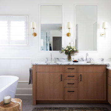
A tired primary bathroom, with varying ceiling heights and a beige-on-beige color scheme, was screaming for love. Squaring the room and adding natural materials erased the memory of the lack luster space and converted it to a bright and welcoming spa oasis. The home was a new build in 2005 and it looked like all the builder’s material choices remained. The client was clear on their design direction but were challenged by the differing ceiling heights and were looking to hire a design-build firm that could resolve that issue.
This local Glen Ellyn couple found us on Instagram (@kitchenstudioge, follow us ?). They loved our designs and felt like we fit their style. They requested a full primary bath renovation to include a large shower, soaking tub, double vanity with storage options, and heated floors. The wife also really wanted a separate make-up vanity. The biggest challenge presented to us was to architecturally marry the various ceiling heights and deliver a streamlined design.
The existing layout worked well for the couple, so we kept everything in place, except we enlarged the shower and replaced the built-in tub with a lovely free-standing model. We also added a sitting make-up vanity. We were able to eliminate the awkward ceiling lines by extending all the walls to the highest level. Then, to accommodate the sprinklers and HVAC, lowered the ceiling height over the entrance and shower area which then opens to the 2-story vanity and tub area. Very dramatic!
This high-end home deserved high-end fixtures. The homeowners also quickly realized they loved the look of natural marble and wanted to use as much of it as possible in their new bath. They chose a marble slab from the stone yard for the countertops and back splash, and we found complimentary marble tile for the shower. The homeowners also liked the idea of mixing metals in their new posh bathroom and loved the look of black, gold, and chrome.
Although our clients were very clear on their style, they were having a difficult time pulling it all together and envisioning the final product. As interior designers it is our job to translate and elevate our clients’ ideas into a deliverable design. We presented the homeowners with mood boards and 3D renderings of our modern, clean, white marble design. Since the color scheme was relatively neutral, at the homeowner’s request, we decided to add of interest with the patterns and shapes in the room.
We were first inspired by the shower floor tile with its circular/linear motif. We designed the cabinetry, floor and wall tiles, mirrors, cabinet pulls, and wainscoting to have a square or rectangular shape, and then to create interest we added perfectly placed circles to contrast with the rectangular shapes. The globe shaped chandelier against the square wall trim is a delightful yet subtle juxtaposition.
The clients were overjoyed with our interpretation of their vision and impressed with the level of detail we brought to the project. It’s one thing to know how you want a space to look, but it takes a special set of skills to create the design and see it thorough to implementation. Could hiring The Kitchen Studio be the first step to making your home dreams come to life?
 Michael Nash Design, Build & Homes
2010 NARI CAPITAL COTY MERIT AWARD WINNER
Baby boomers residing in this single-family colonial in Mclean, Virginia, wanted to make big changes indoors and out. First, they were tired of their back yard and old wooden deck. The neighboring lot sloped steeply downward, creating significant run-off that prevented any semblance of a lawn or landscaping from taking hold. Worse, it prevented the couple from letting their grandchildren or dog out to play.
To address the issue, Michael Nash Design, Build & Homes excavated their entire yard so it was level. Then they designed and built a 5’ x 40’ retaining wall covered with ledger stone to separate the lots, installing an underground drainage system to keep runoff away from a new flagstone patio and surrounding plants and shrubs.
Above the stone patio is a large no-maintenance deck reached via a wide stairway with matching railing. A 12’ x 18’ screened in porch sits to one side featuring cedar beaded ceiling panels and French doors that lead into the home’s dining room.
Highlighting the interior renovations is a new gourmet kitchen with a custom-made wood cabinets and exotic granite countertops. The room’s focal point is a large island with a two-tier countertop and bar seating. Professional-grade stainless steel appliances include a gas cooktop, double-wall ovens, built-in microwave and dishwasher and large refrigerator. Other features include a porcelain tile floor, tile backsplash and a tray ceiling.
A new master bathroom features floor-to-ceiling cabinets, a dark marble countertop and his and hers sinks. Contrasting light-colored marble floor and wall tile leads to a glass-enclosed shower. An adjoining walk-in closet completes the design.

 AoDK Inc.
A couple wanted a weekend retreat without spending a majority of their getaway in an automobile. Therefore, a lot was purchased along the Rocky River with the vision of creating a nearby escape less than five miles away from their home. This 1,300 sf 24’ x 24’ dwelling is divided into a four square quadrant with the goal to create a variety of interior and exterior experiences while maintaining a rather small footprint.
Typically, when going on a weekend retreat one has the drive time to decompress. However, without this, the goal was to create a procession from the car to the house to signify such change of context. This concept was achieved through the use of a wood slatted screen wall which must be passed through. After winding around a collection of poured concrete steps and walls one comes to a wood plank bridge and crosses over a Japanese garden leaving all the stresses of the daily world behind.
The house is structured around a nine column steel frame grid, which reinforces the impression one gets of the four quadrants. The two rear quadrants intentionally house enclosed program space but once passed through, the floor plan completely opens to long views down to the mouth of the river into Lake Erie.
On the second floor the four square grid is stacked with one quadrant removed for the two story living area on the first floor to capture heightened views down the river. In a move to create complete separation there is a one quadrant roof top office with surrounding roof top garden space. The rooftop office is accessed through a unique approach by exiting onto a steel grated staircase which wraps up the exterior facade of the house. This experience provides an additional retreat within their weekend getaway, and serves as the apex of the house where one can completely enjoy the views of Lake Erie disappearing over the horizon.
Visually the house extends into the riverside site, but the four quadrant axis also physically extends creating a series of experiences out on the property. The Northeast kitchen quadrant extends out to become an exterior kitchen & dining space. The two-story Northwest living room quadrant extends out to a series of wrap around steps and lounge seating. A fire pit sits in this quadrant as well farther out in the lawn. A fruit and vegetable garden sits out in the Southwest quadrant in near proximity to the shed, and the entry sequence is contained within the Southeast quadrant extension. Internally and externally the whole house is organized in a simple and concise way and achieves the ultimate goal of creating many different experiences within a rationally sized footprint.
Photo: Sergiu Stoian
116