
Search results for "Separated couples" in Home Design Ideas

 AoDK Inc.
A couple wanted a weekend retreat without spending a majority of their getaway in an automobile. Therefore, a lot was purchased along the Rocky River with the vision of creating a nearby escape less than five miles away from their home. This 1,300 sf 24’ x 24’ dwelling is divided into a four square quadrant with the goal to create a variety of interior and exterior experiences while maintaining a rather small footprint.
Typically, when going on a weekend retreat one has the drive time to decompress. However, without this, the goal was to create a procession from the car to the house to signify such change of context. This concept was achieved through the use of a wood slatted screen wall which must be passed through. After winding around a collection of poured concrete steps and walls one comes to a wood plank bridge and crosses over a Japanese garden leaving all the stresses of the daily world behind.
The house is structured around a nine column steel frame grid, which reinforces the impression one gets of the four quadrants. The two rear quadrants intentionally house enclosed program space but once passed through, the floor plan completely opens to long views down to the mouth of the river into Lake Erie.
On the second floor the four square grid is stacked with one quadrant removed for the two story living area on the first floor to capture heightened views down the river. In a move to create complete separation there is a one quadrant roof top office with surrounding roof top garden space. The rooftop office is accessed through a unique approach by exiting onto a steel grated staircase which wraps up the exterior facade of the house. This experience provides an additional retreat within their weekend getaway, and serves as the apex of the house where one can completely enjoy the views of Lake Erie disappearing over the horizon.
Visually the house extends into the riverside site, but the four quadrant axis also physically extends creating a series of experiences out on the property. The Northeast kitchen quadrant extends out to become an exterior kitchen & dining space. The two-story Northwest living room quadrant extends out to a series of wrap around steps and lounge seating. A fire pit sits in this quadrant as well farther out in the lawn. A fruit and vegetable garden sits out in the Southwest quadrant in near proximity to the shed, and the entry sequence is contained within the Southeast quadrant extension. Internally and externally the whole house is organized in a simple and concise way and achieves the ultimate goal of creating many different experiences within a rationally sized footprint.
Photo: Sergiu Stoian

 E. F. San Juan
Coastal Shingle Style on St. Andrew Bay
Private Residence / Panama City Beach, Florida
Architect: Eric Watson
Builder: McIntosh-Myers Construction
For this lovely Coastal Shingle–style home, E. F. San Juan supplied Loewen impact-rated windows and doors, E. F. San Juan Invincia® impact-rated custom mahogany entry doors, exterior board-and-batten siding, exterior shingles, and exterior trim and millwork. We also supplied all the interior doors, stair parts, paneling, mouldings, and millwork.
Challenges:
At over 10,000 square feet, the sheer size of this home—coupled with the extensive amount of materials we produced and provided—made for a great scheduling challenge. Another significant challenge for the E. F. San Juan team was the homeowner’s desire for an electronic locking system on numerous Invincia® doors we custom manufactured for the home. This was a first-time request for us, but a challenge we gladly accepted!
Solution:
We worked closely with the builder, Cliff Myers of McIntosh-Myers Construction, as well as the architect, Eric Watson, to ensure the timeliness of decisions as they related to the home’s critical production timeline. We also worked closely with our design engineer and the home’s engineer of record, Allen Barnes of Apex Engineering Group, to provide a solution that allowed for an electronic lock on our custom Invincia® mahogany doors. The completed home is a stunning example of coastal architecture that is as safe and secure as it is beautiful.
---
Photography by Jack Gardner

 TKS Design Group
Free ebook, Creating the Ideal Kitchen. DOWNLOAD NOW
This project started out as a kitchen remodel but ended up as so much more. As the original plan started to take shape, some water damage provided the impetus to remodel a small upstairs hall bath. Once this bath was complete, the homeowners enjoyed the result so much that they decided to set aside the kitchen and complete a large master bath remodel. Once that was completed, we started planning for the kitchen!
The original kitchen was just large enough to accommodate an island and a separate pantry but felt a little cramped, especially during the weekends when the couple likes to entertain. The primary goal was to maintain the functionality of the current space, but to add some breathing room as well as to provide a view to the homeowner’s side yard and substantial Hosta garden.
The solution was to bump out the space about 10 feet which provided ample room for large pro appliances, a large island for gathering and an upgraded pantry space. It was important to the homeowners to create a space that felt like it belonged in their historic 1866 home. Details such as matching new trim to the existing large custom profiles in the original home and re-purposing an existing door to be used for the new pantry, provided these touches. A large window at the main sink provides that view into the yard and a beautiful focal point for the room.
A mix of painted wood and stained cabinetry gives the new kitchen a sense of belonging in the older home, as do the Super White quartzite that has the look of marble, subway tile backsplash, polished nickel lanterns and glass and mirrored doors. The large pantry, filled with custom shelving built to the homeowner’s specifications, stainless steel appliances and the two Galley Workstations – sinks that do double duty as prep space – ensure that not only does the kitchen look great, but also functions in a personalized manner that works perfectly for the occupants.
Doing the bump out also allowed the opportunity for a small mudroom and powder room right off the kitchen as well as re-arranging some openings to allow for better traffic flow throughout the entire first floor. The result is a comfortable up-to-date home that feels both steeped in history yet allows for today’s style of living.
Designed by: Susan Klimala, CKD, CBD
Photography by: Michael Alan Kaskel
For more information on kitchen and bath design ideas go to: www.kitchenstudio-ge.com
Find the right local pro for your project

 Clairmont∙Design∙Remodeling
This kitchen replaced the one original to this 1963 built residence. The now empty nester couple entertain frequently including their large extended family during the holidays. Separating work and social spaces was as important as crafting a space that was conducive to their love of cooking and hanging with family and friends. Simple lines, simple cleanup, and classic tones create an environment that will be in style for many years. Subtle unique touches like the painted wood ceiling, pop up island receptacle/usb and receptacles/usb hidden at the bottom of the upper cabinets add functionality and intrigue. Ample LED lighting on dimmers both ceiling and undercabinet mounted provide ample task lighting. SubZero 42” refrigerator, 36” Viking Range, island pendant lights by Restoration Hardware. The ceiling is framed with white cove molding, the dark colored beadboard actually elevates the feeling of height. It was sanded and spray painted offsite with professional automotive paint equipment. It reflects light beautifully. No one expects this kind of detail and it has been quite fun watching people’s reactions to it. There are white painted perimeter cabinets and Walnut stained island cabinets. A high gloss, mostly white floor was installed from the front door, down the foyer hall and into the kitchen. It contrasts beautifully with the existing dark hardwood floors.Designers Patrick Franz and Kimberly Robbins. Photography by Tom Maday.

 Stephanie Charest Interior Design
We completed this kitchen renovation for a SW. Calgary couple and as you’ll see, it was a much needed update after their 20+ years in the home.
Clearly the look of the cabinets needed to be brought up to date, but function was on the top of the list for this client. She enjoys cooking and often hosts several friends over for canning and other big cooking parties so countertop space was a priority. Seeing as they also host large family gatherings, the cook didn’t want to feel abandoned in the kitchen when everyone else was in the next room so opening up the space was crucial.
Here is what we did to change the way this space works for them…
We revised the layout of the appliances and cabinets and relocated the plumbing so she could look out the window while she stood at the sink. Taking the cabinets up to the ceiling also gave them more storage as does the large pantry next to the fridge. An island wouldn’t fit, so we added a peninsula which gave them a spot to sit to have their morning coffee and a significant amount of additional counter space. By removing the walls between the kitchen and dining room it eliminated a small hallway that separated the kitchen and dining room and allowed for an open concept in their 1960’s home.
To add visual interest to the space and to define the dining room, we added a coffered celing. Now, typically a coffered ceiling is done when you have three or four walls to anchor it in. It was a bit of a risk to add a “floating” coffered ceiling! However, it turned out beautifully. It wasn’t without it issues but I’m glad we added this element as it wouldn’t have been as interesting with a typical flat ceiling.
In the dining room, a buffet was added for additional storage as well as new drapery panels, lighting and furniture. The peacock blue end chairs are stunning! Without that punch of color the dining room just wouldn’t be as outstanding. They are so lovely and really pushed the client out of her comfort zone – but she loves them and is glad she trusted us with that design decision.
The result is a much more usable space that is also classic in style and just darn pretty to look at and be in! And I know this client is enjoying her new kitchen day to day and on special family occasions.
Adrian Shellard Photography
 TKS Design Group
Download our free ebook, Creating the Ideal Kitchen. DOWNLOAD NOW
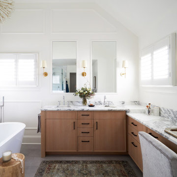
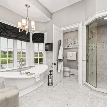
A tired primary bathroom, with varying ceiling heights and a beige-on-beige color scheme, was screaming for love. Squaring the room and adding natural materials erased the memory of the lack luster space and converted it to a bright and welcoming spa oasis. The home was a new build in 2005 and it looked like all the builder’s material choices remained. The client was clear on their design direction but were challenged by the differing ceiling heights and were looking to hire a design-build firm that could resolve that issue.
This local Glen Ellyn couple found us on Instagram (@kitchenstudioge, follow us ?). They loved our designs and felt like we fit their style. They requested a full primary bath renovation to include a large shower, soaking tub, double vanity with storage options, and heated floors. The wife also really wanted a separate make-up vanity. The biggest challenge presented to us was to architecturally marry the various ceiling heights and deliver a streamlined design.
The existing layout worked well for the couple, so we kept everything in place, except we enlarged the shower and replaced the built-in tub with a lovely free-standing model. We also added a sitting make-up vanity. We were able to eliminate the awkward ceiling lines by extending all the walls to the highest level. Then, to accommodate the sprinklers and HVAC, lowered the ceiling height over the entrance and shower area which then opens to the 2-story vanity and tub area. Very dramatic!
This high-end home deserved high-end fixtures. The homeowners also quickly realized they loved the look of natural marble and wanted to use as much of it as possible in their new bath. They chose a marble slab from the stone yard for the countertops and back splash, and we found complimentary marble tile for the shower. The homeowners also liked the idea of mixing metals in their new posh bathroom and loved the look of black, gold, and chrome.
Although our clients were very clear on their style, they were having a difficult time pulling it all together and envisioning the final product. As interior designers it is our job to translate and elevate our clients’ ideas into a deliverable design. We presented the homeowners with mood boards and 3D renderings of our modern, clean, white marble design. Since the color scheme was relatively neutral, at the homeowner’s request, we decided to add of interest with the patterns and shapes in the room.
We were first inspired by the shower floor tile with its circular/linear motif. We designed the cabinetry, floor and wall tiles, mirrors, cabinet pulls, and wainscoting to have a square or rectangular shape, and then to create interest we added perfectly placed circles to contrast with the rectangular shapes. The globe shaped chandelier against the square wall trim is a delightful yet subtle juxtaposition.
The clients were overjoyed with our interpretation of their vision and impressed with the level of detail we brought to the project. It’s one thing to know how you want a space to look, but it takes a special set of skills to create the design and see it thorough to implementation. Could hiring The Kitchen Studio be the first step to making your home dreams come to life?

 River Valley Landscapes
After many years of having no outdoor living space and dealing with overgrown plants and trees the owner’s decided it was time to revitalize their backyard. They knew they wanted a large sitting area with a wood burning fireplace, room for outdoor dining and a place for the grill. A connecting walk would be needed to get guests from the driveway to the outdoor space. Last but not least, the owners wanted the ability to and a reason for stepping out of their unusable patio doors.
The designers decided from the start the fireplace would be the prominent feature and focal point for the entire project. A large fireplace accented with sitting walls and arbors was positioned to anchor the corner of the patio. Stone was chosen to set the fireplace apart as its own element. Brick was used for the sitting walls and brick accents were added to the fireplace to tie into the house. An inlaid herringbone brick detail was incorporated above the stone mantle to simulate artwork which is typically found above indoor fireplaces. Flagstone was used for the wall caps and hearth to match the patio and thicker flagstone tread stock was used for the mantle and top. The arbors were added to visually balance the pergolas at the opposite side of the patio.
For the patio the designers created a series of offset spaces to help subtly divide the space into two areas, sitting and dining. Two large existing trees also help dictate the shape of the patio. Cut flagstone was chosen for the surface bordered by a double soldier edge of brick. The brick edging also surrounds a decorative gravel area topped with an urn fountain which provides a secondary focal point and the sound of water. Large flagstone treads were used for the steps leading to the previously unused patio doors. Opposite the fireplace a short walk leads to a square transition area with a statue chosen by the owner. The statue provides a strong focal point when entering from the driveway. A longer walk leads from this space along the house to the driveway.
The pergolas and arbors were designed by the landscape designer as part of this project but were ultimately contracted separately by the owner. The larger square pergola was intended as an area for a bench or two separate from the main patio. The longer pergola was added later in the design phase to help provide shade to the interior of the house. The arbors at the fireplace were added to balance out the wood elements at the opposite side while adding additional architectural interest to the fireplace.
While this project was predominantly hardscaping, planting and lighting were also incorporated into the design. Several large existing trees were retained and serious of smaller understory trees were added to help enclose the space. The designer’s took advantage of the large trees to place down lights on the branches to achieve a moonlight effect at night. Additional lighting was used on the pergola, to accent focal points, to up light the smaller trees and around the patio. Massed planting of Japanese forest grass provides bold foliage color for the shady garden. A mulch path leads off behind the fireplace to another garden and a secluded area ideal for a bench or small table and chairs. Additional plantings were added along the rear property line to screen and unsightly fence.
This project has obviously completely changed the way the owners use their backyard. They now have a seamless transition from indoors to outdoors with the use of the patio doors. The large patio allows for entertaining small gatherings outdoors for the first time. The fireplace has definitely become the primary gathering place for family and friends.
Sponsored
Sunbury, OH

J.Holderby - Renovations
Franklin County's Leading General Contractors - 2X Best of Houzz!

 Wiedemann Architects LLC
This project is a new 5,900 sf. primary residence for a couple with three children. The site is slightly elevated above the residential street and enjoys winter views of the Potomac River.
The family’s requirements included five bedrooms, five full baths, a powder room, family room, dining room, eat-in kitchen, walk-in pantry, mudroom, lower level recreation room, exercise room, media room and numerous storage spaces. Also included was the request for an outdoor terrace and adequate outdoor storage, including provision for the storage of bikes and kayaks. The family needed a home that would have two entrances, the primary entrance, and a mudroom entry that would provide generous storage spaces for the family’s active lifestyle. Due to the small lot size, the challenge was to accommodate the family’s requirements, while remaining sympathetic to the scale of neighboring homes.
The residence employs a “T” shaped plan to aid in minimizing the massing visible from the street, while organizing interior spaces around a private outdoor terrace space accessible from the living and dining spaces. A generous front porch and a gambrel roof diminish the home’s scale, providing a welcoming view along the street front. A path along the right side of the residence leads to the family entrance and a small outbuilding that provides ready access to the bikes and kayaks while shielding the rear terrace from view of neighboring homes.
The two entrances join a central stair hall that leads to the eat-in kitchen overlooking the great room. Window seats and a custom built banquette provide gathering spaces, while the French doors connect the great room to the terrace where the arbor transitions to the garden. A first floor guest suite, separate from the family areas of the home, affords privacy for both guests and hosts alike. The second floor Master Suite enjoys views of the Potomac River through a second floor arched balcony visible from the front.
The exterior is composed of a board and batten first floor with a cedar shingled second floor and gambrel roof. These two contrasting materials and the inclusion of a partially recessed front porch contribute to the perceived diminution of the home’s scale relative to its smaller neighbors. The overall intention was to create a close fit between the residence and the neighboring context, both built and natural.
Builder: E.H. Johnstone Builders
Anice Hoachlander Photography
 Drury Design
THE SETUP
Client Background: Our clients, a couple who have transitioned into the empty nest phase, have cherished their home for over three decades without undergoing any significant renovations. With a newfound desire to adapt their living space to better suit their current lifestyle, they’ve embarked on a journey to reimagine their kitchen — the heart of their home. Their aspiration is to cultivate a serene, neutral-toned sanctuary on the first floor that seamlessly merges with their family room, ensuring a harmonious and inviting environment.
Design Inspiration: The renovation is inspired by the couple’s penchant for soft, calming neutrals, using their cherished family room and the kitchen’s existing tile flooring as the cornerstone for the color scheme. This approach aims to foster a sense of warmth and tranquility throughout.
Design Objectives:
Harmonize the kitchen with the family room by adopting a soothing, neutral color scheme, ensuring a seamless flow across the first floor.
Enhance kitchen functionality with thoughtfully designed cabinetry, providing a designated place for every item and maximizing storage efficiency.
Cultivate an inviting and comfortable atmosphere that reflects the homeowners’ desire for a calm and relaxing space.
Design Challenges:
The homeowners wish to retain the existing kitchen tile flooring and integrate it into a refreshed, modern design.
Accommodating a dining area spacious enough for family visits without compromising the kitchen’s open feel or functional layout.
Despite liking the current placement of plumbing and appliances, the homeowners aspire for a more open floor plan to facilitate better movement and interaction.
The need to amplify natural light in the kitchen, especially around the sink area, where existing lighting is insufficient.
Preserving the half-wall between the kitchen and family room, a feature the homeowners want to keep, while ensuring it complements the new design.
THE RENEWED SPACE
Design Solutions:
By choosing a neutral color palette that complements the existing tile, the design unifies the kitchen with the adjacent spaces. The tile’s grout was cleaned and restored, enhancing the floor’s appearance and integrating it seamlessly with the new kitchen aesthetic.
The inclusion of a larger island with seating for two, alongside maintaining a substantial dining table, was achieved by optimizing the spatial layout. This allowed for a sociable yet functional kitchen, accommodating large family gatherings without feeling crowded.
Minor adjustments to the kitchen’s layout maintained the preferred locations for plumbing and appliances while introducing an ‘open’ design concept. Strategic modifications, such as angling the pantry wall, improved the flow and accessibility within the space.
Replacing the garden window with a broader, standard window significantly increased natural light, transforming the sink area into a bright, welcoming space with enhanced views of the outdoors.
The decision to keep the half-wall was ingeniously leveraged to define the dining area while maintaining an open connection to the family room. This feature not only serves as a visual separator but also ties the two spaces together through the shared color scheme and design elements.
The homeowners are thrilled with their newly remodeled kitchen, which has become a hub of warmth and hospitality. Hosting a wedding shower and a birthday party, they have shared their renewed space with friends and family, who have been equally enamored. This remodel has not only met their functional and aesthetic desires but has also enriched their home with a fresh sense of serenity and joy.
The upstairs part of the home is shaping up nicely. Here’s their newly remodeled primary bathroom.

 Michael Nash Design, Build & Homes
NARI CAPITAL COTY, HONORABLE MENTION AWARD WINNER, RESIDENTIAL KITCHEN $50,000 TO $100,000
The owners of this Mount Vernon home purchased it with plans to remodel the kitchen. The original space was tired, dark and disorganized. A peninsula separated the kitchen from the breakfast area and the adjacent sunroom was only accessed via a single door. The back pantry was poorly designed and there was no logic to the kitchen’s work space.
The first step in this stunning transformation involved replacing the original peninsula with a large central island. Built using espresso stained furniture-quality cabinets with icon legs, open bottoms and exotic dark granite countertops, all kitchen traffic now flows around the island.
The outside wall of the kitchen, featuring a 48” Thermador range, stainless steel range hood and glass tile backsplash, is the focal point of the new space. A stainless steel farm-style sink sits beneath one of two large windows that provide lots of natural light into the room. To the right, sits a 48” Sub Zero refrigerator/freezer.
The wall adjacent to the family room was never used properly. Now it is home to two tall pantries, double ovens and a microwave. Creative pass through arches let the homeowner attend to guests while preparing food in the kitchen. The butler area adjacent to the dining room is filled with glass front cabinetry and additional cabinetry for extra storage.
The kitchen is now part of an open concept design flowing from kitchen to dining room to sun room. By replacing a bearing wall with a structural header, traffic can flow from one room to the next making it brighter and more conducive to entertaining.
More spacious than ever, this new kitchen is the hub of the home for this couple who love to cook and entertain.
 Clairmont∙Design∙Remodeling
This kitchen replaced the one original to this 1963 built residence. The now empty nester couple entertain frequently including their large extended family during the holidays. Separating work and social spaces was as important as crafting a space that was conducive to their love of cooking and hanging with family and friends. Simple lines, simple cleanup, and classic tones create an environment that will be in style for many years. Subtle unique touches like the painted wood ceiling, pop up island receptacle/usb and receptacles/usb hidden at the bottom of the upper cabinets add functionality and intrigue. Ample LED lighting on dimmers both ceiling and undercabinet mounted provide ample task lighting. SubZero 42” refrigerator, 36” Viking Range, island pendant lights by Restoration Hardware. The ceiling is framed with white cove molding, the dark colored beadboard actually elevates the feeling of height. It was sanded and spray painted offsite with professional automotive paint equipment. It reflects light beautifully. No one expects this kind of detail and it has been quite fun watching people’s reactions to it. There are white painted perimeter cabinets and Walnut stained island cabinets. A high gloss, mostly white floor was installed from the front door, down the foyer hall and into the kitchen. It contrasts beautifully with the existing dark hardwood floors.Designers Patrick Franz and Kimberly Robbins. Photography by Tom Maday.

 Advance Design Studio, Ltd.
Karen and Chad of Tower Lakes, IL were tired of their unfinished basement functioning as nothing more than a storage area and depressing gym. They wanted to increase the livable square footage of their home with a cohesive finished basement design, while incorporating space for the kids and adults to hang out.
“We wanted to make sure that upon renovating the basement, that we can have a place where we can spend time and watch movies, but also entertain and showcase the wine collection that we have,” Karen said.
After a long search comparing many different remodeling companies, Karen and Chad found Advance Design Studio. They were drawn towards the unique “Common Sense Remodeling” process that simplifies the renovation experience into predictable steps focused on customer satisfaction.
“There are so many other design/build companies, who may not have transparency, or a focused process in mind and I think that is what separated Advance Design Studio from the rest,” Karen said.
Karen loved how designer Claudia Pop was able to take very high-level concepts, “non-negotiable items” and implement them in the initial 3D drawings. Claudia and Project Manager DJ Yurik kept the couple in constant communication through the project. “Claudia was very receptive to the ideas we had, but she was also very good at infusing her own points and thoughts, she was very responsive, and we had an open line of communication,” Karen said.
A very important part of the basement renovation for the couple was the home gym and sauna. The “high-end hotel” look and feel of the openly blended work out area is both highly functional and beautiful to look at. The home sauna gives them a place to relax after a long day of work or a tough workout. “The gym was a very important feature for us,” Karen said. “And I think (Advance Design) did a very great job in not only making the gym a functional area, but also an aesthetic point in our basement”.
An extremely unique wow-factor in this basement is the walk in glass wine cellar that elegantly displays Karen and Chad’s extensive wine collection. Immediate access to the stunning wet bar accompanies the wine cellar to make this basement a popular spot for friends and family.
The custom-built wine bar brings together two natural elements; Calacatta Vicenza Quartz and thick distressed Black Walnut. Sophisticated yet warm Graphite Dura Supreme cabinetry provides contrast to the soft beige walls and the Calacatta Gold backsplash. An undermount sink across from the bar in a matching Calacatta Vicenza Quartz countertop adds functionality and convenience to the bar, while identical distressed walnut floating shelves add an interesting design element and increased storage. Rich true brown Rustic Oak hardwood floors soften and warm the space drawing all the areas together.
Across from the bar is a comfortable living area perfect for the family to sit down at a watch a movie. A full bath completes this finished basement with a spacious walk-in shower, Cocoa Brown Dura Supreme vanity with Calacatta Vicenza Quartz countertop, a crisp white sink and a stainless-steel Voss faucet.
Advance Design’s Common Sense process gives clients the opportunity to walk through the basement renovation process one step at a time, in a completely predictable and controlled environment. “Everything was designed and built exactly how we envisioned it, and we are really enjoying it to it’s full potential,” Karen said.
Constantly striving for customer satisfaction, Advance Design’s success is heavily reliant upon happy clients referring their friends and family. “We definitely will and have recommended Advance Design Studio to friends who are looking to embark on a remodeling project small or large,” Karen exclaimed at the completion of her project.

 Balestri Architects
This project combines two existing studio apartments into a compact 800 sqft. live/work space for a young professional couple in the heart of Chelsea, New York.
The design required some creative space planning to meet the Owner’s requested program for an open plan solution with a private master bedroom suite and separate study that also allowed for entertaining small parties, including the ability to provide a sleeping space for guests.
The solution was to identify areas of overlap within the program that could be addressed with dual-function custom millwork pieces. A bar-stool counter at the open kitchen folds out to become a bench and dining table for formal entertaining. A custom desk folds down with a murphy bed to convert a private study into a guest bedroom area. A series of pocket door connecting the spaces provide both privacy to the master bedroom area when closed, and the option for a completely open layout when opened.
A carefully selected material palette brings a warm, tranquil feel to the space. Reclaimed teak floors run seamlessly through the main spaces to accentuate the open layout. Warm gray lacquered millwork, Centaurus granite slabs, and custom oxidized stainless steel details, give an elegant counterpoint to the natural teak floors. The master bedroom suite and study feature custom Afromosia millwork. The bathrooms are finished with cool toned ceramic tile, custom Afromosia vanities, and minimalist chrome fixtures. Custom LED lighting provides dynamic, energy efficient illumination throughout.
Photography: Mikiko Kikuyama
Sponsored
Plain City, OH

The Creative Kitchen Company
Columbus Area Kitchen Remodeling and Refacing Professional
 Balestri Architects
This project combines two existing studio apartments into a compact 800 sqft. live/work space for a young professional couple in the heart of Chelsea, New York.
The design required some creative space planning to meet the Owner’s requested program for an open plan solution with a private master bedroom suite and separate study that also allowed for entertaining small parties, including the ability to provide a sleeping space for guests.
The solution was to identify areas of overlap within the program that could be addressed with dual-function custom millwork pieces. A bar-stool counter at the open kitchen folds out to become a bench and dining table for formal entertaining. A custom desk folds down with a murphy bed to convert a private study into a guest bedroom area. A series of pocket door connecting the spaces provide both privacy to the master bedroom area when closed, and the option for a completely open layout when opened.
A carefully selected material palette brings a warm, tranquil feel to the space. Reclaimed teak floors run seamlessly through the main spaces to accentuate the open layout. Warm gray lacquered millwork, Centaurus granite slabs, and custom oxidized stainless steel details, give an elegant counterpoint to the natural teak floors. The master bedroom suite and study feature custom Afromosia millwork. The bathrooms are finished with cool toned ceramic tile, custom Afromosia vanities, and minimalist chrome fixtures. Custom LED lighting provides dynamic, energy efficient illumination throughout.
Photography: Mikiko Kikuyama

 C.E. Pontz Sons
When homeowners Garry and Sherry bought their 1799 farmhouse in Lancaster, they prepared themselves for many years of renovation: 28 years, to be exact. They gradually tackled inside projects like the master bath, basement, a recent kitchen remodel and even an office-turned-Irish pub. During one painfully hot summer, they installed a pool that became their go-to for summer entertainment and parties. Now, Garry and Sherry’s four children have grown and the couple has found free time in not devoting their days to hockey, volleyball and softball games. So several years ago, they decided to take on the outdoor space.
The couple contacted Bobby Kenyon and Adrian Kapp of C.E. Pontz (www.cepontzsons.com) to create a design that would blend with the rustic look of their farmhouse. They hoped to increase the amount of entertaining space by enlarging the patio area and adding a pavilion and outdoor kitchen. Another must-have was a covered area that could ensure the party would not end even if the weather would not cooperate. After brainstorming with Bobby and Adrian, they decided to include a gas fireplace, an outdoor television in the pavilion, and a Kegerator in the kitchen.
For the outdoor overhaul, C.E. Pontz began by adding two separate patios of flagstone and natural stone that combine to a total area of 1,100 square feet. They laid large stone slabs to create a walkway connecting the kitchen and living area. For sunny days, C.E. Pontz installed an outdoor kitchen complete with granite countertops, sink, gas burner, grill and storage area. A pergola above the grill offers shade to whomever is tending the tongs that night. Sherry said that having an outdoor kitchen has made entertaining a time for sharing and enjoying food rather than preparing and serving it. When their indoor kitchen was being remodeled last summer, the family prepared nearly all of their meals outdoors, from eggs at breakfast to pasta at dinner. And they still love the summer staple of anything with grill marks. Because the perfect addition to charred meats and veggies is usually a cold draft, C.E. Pontz completed the kitchen with a Kegerator, placed conveniently in arm’s reach of the guest seating.
Across the walkway and above the adjoining stone patio, C.E. Pontz built a 16- by 20-foot pavilion, or, essentially, a living room under the trees. A fan hanging from the vaulted ceiling keeps guests cool while they lounge in plush wicker chairs, watching television. Sherry and Garry furnished the space with dark wicker seating from Wicker Imports in Lancaster (www.wickerimportsonline.com). They added pillows and cushions in earth-toned patterns for extra comfort and color. To keep the space alive after the sun sets, they decorated with lots of candles as well as copper lighting that Garry, having an electrical background, installed himself. Plus, C.E. Pontz constructed a gas-fed stone fireplace just outside the pavilion that illuminates the living area and provides a cozy warmth in colder months.
Garry, who has a green thumb according to his wife, sets out 18 to 20 large planters around the pool and patio in the summer. These complement the roses, nandina and various grasses that C.E. Pontz used to landscape around the patios. In spring, the couple works to beautify the beds so that in summer, they simply need to water the plants and enjoy the flora.
“It is truly an outdoor oasis that we utilize during the warm months and are sorry to see closed during the winter months,” Sherry says. After nearly thirty years of transformation, their 217-year-old home is the entertaining hot spot for friends, family and grandkids.
Fun Facts:
A Kegerator? Simpler than it sounds, a Kegerator is a dispensing device connected to a keg (typically of beer) that is kept in a refrigerated container. It maintains the quality of the beer for longer periods of time, even for several months.
Approximately 60 tons of stone base material were used for this project.
Two patios were added that combined a total area of 1,100 square feet of natural flagstone.
This landscape features about 18,000 pounds of flagstone.
This article appears in the April 2016 issue of Susquehanna Style
Did you like what you read here? Subscribe to Susquehanna Style »
http://www.susquehannastyle.com/April-2016/Historic-Hot-Spot/
 Roeser Home Remodeling
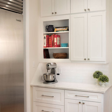
This client makes every meal at home and wanted an all-white kitchen with lots of storage. We reconfigured the kitchen to maximize the available space. The new kitchen includes a seating peninsula, bar area, a dedicated baking area, and high-end stainless steel appliances.
The cabinets are Wellborn Select Line, Prairie Door Style in Bright White. A custom pantry was installed from our partner in the project, Closet Factory. Custom doors were made to match the rest of the kitchen.
LG Viatera Minuet countertops are throughout the kitchen. The backsplash is Alyssa Edwards “Tongue in Chic You Don’t Snow Me, 2.5 x 10.5 glossy finish from countertops to the bottom of the wall cabinets.
The client chose a five-burner, 36” gas cooktop from Wolf, along with a Faber stainless steel range hood. The 24” microwave, 30” double ovens and dishwasher with wood front are all from Bosch. A Sub-Zero 42” French door refrigerator was installed.
Separated by a peninsula with room for a couple of stools is the bar area. A stream-lined 15” under-counter beverage center from U-Line keeps beverages cold and nearby.
Green patterned custom drapes add a pop of color to the all-white kitchen.
 C.E. Pontz Sons
When homeowners Garry and Sherry bought their 1799 farmhouse in Lancaster, they prepared themselves for many years of renovation: 28 years, to be exact. They gradually tackled inside projects like the master bath, basement, a recent kitchen remodel and even an office-turned-Irish pub. During one painfully hot summer, they installed a pool that became their go-to for summer entertainment and parties. Now, Garry and Sherry’s four children have grown and the couple has found free time in not devoting their days to hockey, volleyball and softball games. So several years ago, they decided to take on the outdoor space.
The couple contacted Bobby Kenyon and Adrian Kapp of C.E. Pontz (www.cepontzsons.com) to create a design that would blend with the rustic look of their farmhouse. They hoped to increase the amount of entertaining space by enlarging the patio area and adding a pavilion and outdoor kitchen. Another must-have was a covered area that could ensure the party would not end even if the weather would not cooperate. After brainstorming with Bobby and Adrian, they decided to include a gas fireplace, an outdoor television in the pavilion, and a Kegerator in the kitchen.
For the outdoor overhaul, C.E. Pontz began by adding two separate patios of flagstone and natural stone that combine to a total area of 1,100 square feet. They laid large stone slabs to create a walkway connecting the kitchen and living area. For sunny days, C.E. Pontz installed an outdoor kitchen complete with granite countertops, sink, gas burner, grill and storage area. A pergola above the grill offers shade to whomever is tending the tongs that night. Sherry said that having an outdoor kitchen has made entertaining a time for sharing and enjoying food rather than preparing and serving it. When their indoor kitchen was being remodeled last summer, the family prepared nearly all of their meals outdoors, from eggs at breakfast to pasta at dinner. And they still love the summer staple of anything with grill marks. Because the perfect addition to charred meats and veggies is usually a cold draft, C.E. Pontz completed the kitchen with a Kegerator, placed conveniently in arm’s reach of the guest seating.
Across the walkway and above the adjoining stone patio, C.E. Pontz built a 16- by 20-foot pavilion, or, essentially, a living room under the trees. A fan hanging from the vaulted ceiling keeps guests cool while they lounge in plush wicker chairs, watching television. Sherry and Garry furnished the space with dark wicker seating from Wicker Imports in Lancaster (www.wickerimportsonline.com). They added pillows and cushions in earth-toned patterns for extra comfort and color. To keep the space alive after the sun sets, they decorated with lots of candles as well as copper lighting that Garry, having an electrical background, installed himself. Plus, C.E. Pontz constructed a gas-fed stone fireplace just outside the pavilion that illuminates the living area and provides a cozy warmth in colder months.
Garry, who has a green thumb according to his wife, sets out 18 to 20 large planters around the pool and patio in the summer. These complement the roses, nandina and various grasses that C.E. Pontz used to landscape around the patios. In spring, the couple works to beautify the beds so that in summer, they simply need to water the plants and enjoy the flora.
“It is truly an outdoor oasis that we utilize during the warm months and are sorry to see closed during the winter months,” Sherry says. After nearly thirty years of transformation, their 217-year-old home is the entertaining hot spot for friends, family and grandkids.
Fun Facts:
A Kegerator? Simpler than it sounds, a Kegerator is a dispensing device connected to a keg (typically of beer) that is kept in a refrigerated container. It maintains the quality of the beer for longer periods of time, even for several months.
Approximately 60 tons of stone base material were used for this project.
Two patios were added that combined a total area of 1,100 square feet of natural flagstone.
This landscape features about 18,000 pounds of flagstone.
This article appears in the April 2016 issue of Susquehanna Style
Did you like what you read here? Subscribe to Susquehanna Style »
http://www.susquehannastyle.com/April-2016/Historic-Hot-Spot/
Sponsored
Sunbury, OH
J.Holderby - Renovations
Franklin County's Leading General Contractors - 2X Best of Houzz!
 Michael Nash Design, Build & Homes
2013 NARI CAPITAL COTY, GRAND AWARD WINNER, RESIDENTIAL KTICHEN $80,001 -$120,000
This Old Town Alexandria home was ready for a major kitchen renovation. After 20 years of putting up with the dark, short cabinets and a dysfunctional traffic pattern and layout, the owners were ready to roll up their sleeves and throw this kitchen out the window.
Design challenges include a peninsula that was too big for the space, appliance locations that were all over, a stackable washer and dryer in the middle of the kitchen and a lack of storage.
The first step toward a remodeling solution was to move the washer and dryer to a new lower level laundry area. That created space for a new built-in refrigerator, microwave/oven cabinet, pantry and angular end cabinets. This move also created more room on the walls of kitchen for added cabinetry and countertops.
The cook top was moved to one of the walls with a custom wood hood over it. Having removed the old bulkheads, there was space for taller cabinets and some glass front cabinetry (with inside lights) to display china. Large crown molding, along with big arched valances, legs and corbels made this brushed stoke custom cabinetry really stand out.
A big knee wall and a middle post made the breakfast room too closed in and separated from adjacent family room. By installing a couple of structural beams, the space was opened up and dressed up with a large arch opening to replicate the front hall columns.
Similarly, the front door separating the front hall to the kitchen was taken off, widened and then had the same panel arch treatment done. Now all the doorways in the home have a very classy, yet sophisticated detailed molding.
A previously wasted corner area is now home to a custom hutch cabinet. The middle island, not only improved the traffic flow, but also dressed up this kitchen with its furniture look. The expansion of hardwood flooring, from the front hall into the kitchen and beyond, created a seamless transition to the entire first floor.
Use of this highly custom brushed stroke glazed cabinetry in a soft vanilla tone complemented the uniqueness of a slab of granite. The light color tumbled marble backsplash made the glazing of this cabinetry stand out. The transformation of this kitchen was so incredible that no one believes the before photos.
 Clairmont∙Design∙Remodeling
This kitchen replaced the one original to this 1963 built residence. The now empty nester couple entertain frequently including their large extended family during the holidays. Separating work and social spaces was as important as crafting a space that was conducive to their love of cooking and hanging with family and friends. Simple lines, simple cleanup, and classic tones create an environment that will be in style for many years. Subtle unique touches like the painted wood ceiling, pop up island receptacle/usb and receptacles/usb hidden at the bottom of the upper cabinets add functionality and intrigue. Ample LED lighting on dimmers both ceiling and undercabinet mounted provide ample task lighting. SubZero 42” refrigerator, 36” Viking Range, island pendant lights by Restoration Hardware. The ceiling is framed with white cove molding, the dark colored beadboard actually elevates the feeling of height. It was sanded and spray painted offsite with professional automotive paint equipment. It reflects light beautifully. No one expects this kind of detail and it has been quite fun watching people’s reactions to it. There are white painted perimeter cabinets and Walnut stained island cabinets. A high gloss, mostly white floor was installed from the front door, down the foyer hall and into the kitchen. It contrasts beautifully with the existing dark hardwood floors.Designers Patrick Franz and Kimberly Robbins. Photography by Tom Maday.

 Haifa Architects
Duplex Y is located in a multi apartment building, typical to the Carmel mountain neighborhoods. The building has several entrances due to the slope it sits on.
Duplex Y has its own separate entrance and a beautiful view towards Haifa bay and the Golan Heights that can be seen on a clear weather day.
The client - a computer high-tech couple, with their two small daughters asked us for a simple and functional design that could remind them of their frequent visits to central and northern Europe. Their request has been accepted.
Our planning approach was simple indeed, maybe even simple in a radical way:
We followed the principle of clean and ultra minimal spaces, that serve their direct mission only.
Complicated geometry of the rooms has been simplified by implementing built-in wood furniture into numerous niches.
The most 'complicated' room (due to its broken geometry, narrow proportions and sloped ceiling) has been turned into a kid's room shaped as a clean 'wood box' for fun, games and 'edutainment'.
The storage room has been refurbished to maximize it's purpose by creating enough space to store 90% of the entire family's demand.
We've tried to avoid unnecessary decoration. 97% of the design has its functional use in addition to its atmospheric qualities.
Several elements like the structural cylindrical column were exposed to show their original material - concrete.
Photos: Julia Berezina
112