
Search results for "Separated couples" in Home Design Ideas
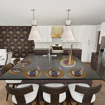
 Horizon Interior Design
This couple was itching for a brand new kitchen and fireplace remodel to breathe new life into their home, making it an inviting place for themselves, their kids, and their grandkids. During the initial phase, they wanted to knock down a wall to open up their kitchen and extend their cabinets to maintain more storage space.
Desiring a light, bright, and modern kitchen with organic accents to add warmth, they also tasked us with adding new lighting, paint colors, flooring, and materials to transform their space and replace their heavy-looking fireplace surround with modern floor-to-ceiling tile.We incorporated warm-toned barstools, light fixtures, and lighter flooring to add beautiful organic elements to their new kitchen. We placed the living room furniture closer to the TV in front of the brand-new fireplace to create a conversation area. Remodeled with tile in an argyle pattern, the fireplace created a dramatic wow factor that harmonized nicely with a contemporary sputnik chandelier.
By removing the wall separating the kitchen and living room, we created a more open-plan living space with a large island that allowed seating for up to five people and an abundance of prep space for entertaining their large family. With marble mosaic backsplash playing off the angles in the fireplace tile and contrasting the dark gray countertops, we created a modern feel to their kitchen space. New and improved lighting, decorative pendants, and luxury vinyl flooring created a contemporary feel throughout the area, while beige accents brought back that organic feel.

 Clairmont∙Design∙Remodeling
This kitchen replaced the one original to this 1963 built residence. The now empty nester couple entertain frequently including their large extended family during the holidays. Separating work and social spaces was as important as crafting a space that was conducive to their love of cooking and hanging with family and friends. Simple lines, simple cleanup, and classic tones create an environment that will be in style for many years. Subtle unique touches like the painted wood ceiling, pop up island receptacle/usb and receptacles/usb hidden at the bottom of the upper cabinets add functionality and intrigue. Ample LED lighting on dimmers both ceiling and undercabinet mounted provide ample task lighting. SubZero 42” refrigerator, 36” Viking Range, island pendant lights by Restoration Hardware. The ceiling is framed with white cove molding, the dark colored beadboard actually elevates the feeling of height. It was sanded and spray painted offsite with professional automotive paint equipment. It reflects light beautifully. No one expects this kind of detail and it has been quite fun watching people’s reactions to it. There are white painted perimeter cabinets and Walnut stained island cabinets. A high gloss, mostly white floor was installed from the front door, down the foyer hall and into the kitchen. It contrasts beautifully with the existing dark hardwood floors.Designers Patrick Franz and Kimberly Robbins. Photography by Tom Maday.

 Cabinet-S-Top
This stunning black and white kitchen with its punch of yellow was designed for a couple who love to cook and maintain a kosher kitchen. The attention to detail is incredible and evident - the storage use, amenities, the perimeter crown molding treatment, the convection double French door ovens, induction cooktop and cordless control blinds. The cabinets installed on the perimeter are Custom Wood Products Maple Vinyl, Bright White, Dull Rubbed and for the Islands custom painted to match Golden Orchards #329 Benjamin Moore accented with Chareau Collection ! Chalet knobs and pulls. Cambria Whitecliff Quartz was installed on the countertops with two Franke Fireclay Undermount sinks. Delta Brizo Venuto in Black faucets were installed. Jenn Aire 42" French door panel refrigerator, G.E. 36" Induction Cooktop and Downdraft, American Range 30" Yellow Double Ovens, Bosch dishwashers and Wolf 30" Warming drawer.
Find the right local pro for your project
 Drury Design
THE SETUP
Client Background: Our clients, a couple who have transitioned into the empty nest phase, have cherished their home for over three decades without undergoing any significant renovations. With a newfound desire to adapt their living space to better suit their current lifestyle, they’ve embarked on a journey to reimagine their kitchen — the heart of their home. Their aspiration is to cultivate a serene, neutral-toned sanctuary on the first floor that seamlessly merges with their family room, ensuring a harmonious and inviting environment.
Design Inspiration: The renovation is inspired by the couple’s penchant for soft, calming neutrals, using their cherished family room and the kitchen’s existing tile flooring as the cornerstone for the color scheme. This approach aims to foster a sense of warmth and tranquility throughout.
Design Objectives:
Harmonize the kitchen with the family room by adopting a soothing, neutral color scheme, ensuring a seamless flow across the first floor.
Enhance kitchen functionality with thoughtfully designed cabinetry, providing a designated place for every item and maximizing storage efficiency.
Cultivate an inviting and comfortable atmosphere that reflects the homeowners’ desire for a calm and relaxing space.
Design Challenges:
The homeowners wish to retain the existing kitchen tile flooring and integrate it into a refreshed, modern design.
Accommodating a dining area spacious enough for family visits without compromising the kitchen’s open feel or functional layout.
Despite liking the current placement of plumbing and appliances, the homeowners aspire for a more open floor plan to facilitate better movement and interaction.
The need to amplify natural light in the kitchen, especially around the sink area, where existing lighting is insufficient.
Preserving the half-wall between the kitchen and family room, a feature the homeowners want to keep, while ensuring it complements the new design.
THE RENEWED SPACE
Design Solutions:
By choosing a neutral color palette that complements the existing tile, the design unifies the kitchen with the adjacent spaces. The tile’s grout was cleaned and restored, enhancing the floor’s appearance and integrating it seamlessly with the new kitchen aesthetic.
The inclusion of a larger island with seating for two, alongside maintaining a substantial dining table, was achieved by optimizing the spatial layout. This allowed for a sociable yet functional kitchen, accommodating large family gatherings without feeling crowded.
Minor adjustments to the kitchen’s layout maintained the preferred locations for plumbing and appliances while introducing an ‘open’ design concept. Strategic modifications, such as angling the pantry wall, improved the flow and accessibility within the space.
Replacing the garden window with a broader, standard window significantly increased natural light, transforming the sink area into a bright, welcoming space with enhanced views of the outdoors.
The decision to keep the half-wall was ingeniously leveraged to define the dining area while maintaining an open connection to the family room. This feature not only serves as a visual separator but also ties the two spaces together through the shared color scheme and design elements.
The homeowners are thrilled with their newly remodeled kitchen, which has become a hub of warmth and hospitality. Hosting a wedding shower and a birthday party, they have shared their renewed space with friends and family, who have been equally enamored. This remodel has not only met their functional and aesthetic desires but has also enriched their home with a fresh sense of serenity and joy.
The upstairs part of the home is shaping up nicely. Here’s their newly remodeled primary bathroom.

 AoDK Inc.
A couple wanted a weekend retreat without spending a majority of their getaway in an automobile. Therefore, a lot was purchased along the Rocky River with the vision of creating a nearby escape less than five miles away from their home. This 1,300 sf 24’ x 24’ dwelling is divided into a four square quadrant with the goal to create a variety of interior and exterior experiences while maintaining a rather small footprint.
Typically, when going on a weekend retreat one has the drive time to decompress. However, without this, the goal was to create a procession from the car to the house to signify such change of context. This concept was achieved through the use of a wood slatted screen wall which must be passed through. After winding around a collection of poured concrete steps and walls one comes to a wood plank bridge and crosses over a Japanese garden leaving all the stresses of the daily world behind.
The house is structured around a nine column steel frame grid, which reinforces the impression one gets of the four quadrants. The two rear quadrants intentionally house enclosed program space but once passed through, the floor plan completely opens to long views down to the mouth of the river into Lake Erie.
On the second floor the four square grid is stacked with one quadrant removed for the two story living area on the first floor to capture heightened views down the river. In a move to create complete separation there is a one quadrant roof top office with surrounding roof top garden space. The rooftop office is accessed through a unique approach by exiting onto a steel grated staircase which wraps up the exterior facade of the house. This experience provides an additional retreat within their weekend getaway, and serves as the apex of the house where one can completely enjoy the views of Lake Erie disappearing over the horizon.
Visually the house extends into the riverside site, but the four quadrant axis also physically extends creating a series of experiences out on the property. The Northeast kitchen quadrant extends out to become an exterior kitchen & dining space. The two-story Northwest living room quadrant extends out to a series of wrap around steps and lounge seating. A fire pit sits in this quadrant as well farther out in the lawn. A fruit and vegetable garden sits out in the Southwest quadrant in near proximity to the shed, and the entry sequence is contained within the Southeast quadrant extension. Internally and externally the whole house is organized in a simple and concise way and achieves the ultimate goal of creating many different experiences within a rationally sized footprint.
Photo: Sergiu Stoian
 Mike Hughes Fitted Interiors
A couple retiring early to a Lake District property asked us to modernise their kitchen and utility space.
They wanted to keep the areas separate, with the utility serving as their working space for laundry and for storing their walking boots after long walks in the fells.
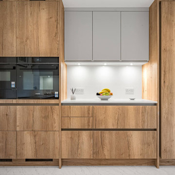
For their kitchen, they chose a handleless Keller Bronx Kitchen in Wild Oak, finished in an Ultra Matt Mist light grey colour. This was beautifully paired with 20mm quartz worktops, featuring an undermounted sink and matching splashback panels. We aimed to give the room character while maintaining a modern appeal. The clients love the new drawer systems, finding everything easily accessible. The kitchen is visually pleasing and simple to keep clean.
The clean design created plenty of clear worktop space, complemented by a Quooker tap for instant boiling water, adding a touch of luxury. Modern Siemens appliances, including an inductAir vented hob, were seamlessly integrated into the layout to ensure an efficient kitchen workflow.
Through the door, the utility room features matching furniture but with handled doors, prioritising practicality. It includes a stainless steel sink with a pull-down spray tap, while compact laminate worktops and splashbacks proved an excellent choice for this space.
An integrated utility unit for cleaning products and laundry was a useful addition, with the washer and tumble dryer built-in to keep the room organised. A small boot unit made from the same Keller furniture was designed to sit on when putting boots on, alongside coat hooks for outdoor wear.
Both rooms were finished with LVT tile-effect flooring installed by our trusted partner tradesmen. The flooring creating a seamless flow between the rooms. We also added under-wall unit LED lighting in both rooms, complementing the recently updated ceiling lights.
 AoDK Inc.
A couple wanted a weekend retreat without spending a majority of their getaway in an automobile. Therefore, a lot was purchased along the Rocky River with the vision of creating a nearby escape less than five miles away from their home. This 1,300 sf 24’ x 24’ dwelling is divided into a four square quadrant with the goal to create a variety of interior and exterior experiences while maintaining a rather small footprint.
Typically, when going on a weekend retreat one has the drive time to decompress. However, without this, the goal was to create a procession from the car to the house to signify such change of context. This concept was achieved through the use of a wood slatted screen wall which must be passed through. After winding around a collection of poured concrete steps and walls one comes to a wood plank bridge and crosses over a Japanese garden leaving all the stresses of the daily world behind.
The house is structured around a nine column steel frame grid, which reinforces the impression one gets of the four quadrants. The two rear quadrants intentionally house enclosed program space but once passed through, the floor plan completely opens to long views down to the mouth of the river into Lake Erie.
On the second floor the four square grid is stacked with one quadrant removed for the two story living area on the first floor to capture heightened views down the river. In a move to create complete separation there is a one quadrant roof top office with surrounding roof top garden space. The rooftop office is accessed through a unique approach by exiting onto a steel grated staircase which wraps up the exterior facade of the house. This experience provides an additional retreat within their weekend getaway, and serves as the apex of the house where one can completely enjoy the views of Lake Erie disappearing over the horizon.
Visually the house extends into the riverside site, but the four quadrant axis also physically extends creating a series of experiences out on the property. The Northeast kitchen quadrant extends out to become an exterior kitchen & dining space. The two-story Northwest living room quadrant extends out to a series of wrap around steps and lounge seating. A fire pit sits in this quadrant as well farther out in the lawn. A fruit and vegetable garden sits out in the Southwest quadrant in near proximity to the shed, and the entry sequence is contained within the Southeast quadrant extension. Internally and externally the whole house is organized in a simple and concise way and achieves the ultimate goal of creating many different experiences within a rationally sized footprint.
Photo: Sergiu Stoian
Sponsored
Sunbury, OH

J.Holderby - Renovations
Franklin County's Leading General Contractors - 2X Best of Houzz!
 Horizon Interior Design
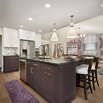
This couple was itching for a brand new kitchen and fireplace remodel to breathe new life into their home, making it an inviting place for themselves, their kids, and their grandkids. During the initial phase, they wanted to knock down a wall to open up their kitchen and extend their cabinets to maintain more storage space.
Desiring a light, bright, and modern kitchen with organic accents to add warmth, they also tasked us with adding new lighting, paint colors, flooring, and materials to transform their space and replace their heavy-looking fireplace surround with modern floor-to-ceiling tile.We incorporated warm-toned barstools, light fixtures, and lighter flooring to add beautiful organic elements to their new kitchen. We placed the living room furniture closer to the TV in front of the brand-new fireplace to create a conversation area. Remodeled with tile in an argyle pattern, the fireplace created a dramatic wow factor that harmonized nicely with a contemporary sputnik chandelier.
By removing the wall separating the kitchen and living room, we created a more open-plan living space with a large island that allowed seating for up to five people and an abundance of prep space for entertaining their large family. With marble mosaic backsplash playing off the angles in the fireplace tile and contrasting the dark gray countertops, we created a modern feel to their kitchen space. New and improved lighting, decorative pendants, and luxury vinyl flooring created a contemporary feel throughout the area, while beige accents brought back that organic feel.
 Remake Architecture LLC
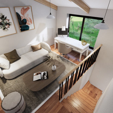
Seward Street is an Accessory Dwelling Unit (ADU) designed for an older couple to age in place – to live independently and comfortably, regardless of age. The fully livable ground floor has an open-flow kitchen, living, and dining room under a cathedral ceiling, with a separate bedroom, full bathroom, and laundry. This is complimented by an upstairs loft with a second full bathroom and a large open space that doubles as either a guest suite or office space.
The ADU is designed within an efficient building footprint to maximize the available back yard. Built from Structurally Insulated Panels (SIPs) it is detailed to be airtight and well insulated, with extremely efficient space heating & cooling (ductless mini-split air source heat pump) and an Energy Recovery Ventilator (ERV) to provide continuous fresh air while recapturing the indoor heating and cooling. It has a 400% efficient air source heat pump water heater, induction cooking, heat pump clothes dryer, and is an all-electric home.
ENERGY EFFICIENCY:
Ultra-High Efficiency Air Source Heat Pump Heating & Cooling System
Energy Recovery Ventilator
Air Source Heat Pump Water Heater
Heat Pump Clothes Dryer
Low-E Glazing
All LED Lighting
Induction Cooktop
Energy Star Certified Appliances
WATER EFFICIENCY:
WaterSense High Efficiency Plumbing Fixtures
Front-Loading Clothes Washer
INDOOR AIR QUALITY:
All-Electric Home (no gas combustion)
Energy Recovery Ventilator with MERV 13 filter
Low and no-VOC materials and finishes
High-Efficiency Kitchen Exhaust Fan

 The Lifestyle Lab
The Kitchen
The previous kitchen was a dated plan which cutoff the family room and living room / dining room area with walls and arch ways to enter each room. The space had a lot of cabinets, but was too small and felt crowded with more than a couple people in the kitchen at once. The client loved that the kitchen had a lot of natural light with a huge window looking out to the yard and wanted to incorporate a design that had as much natural light but included a more open feel with an island everyone could sit around. She also wanted a nice big vent hood over a cooktop. The challenge was on!
Our NEW and Improved design gave our client 2 new tall windows with a brand new custom wood vent hood in the middle of both of them. We moved her cooktop to where the original sink was once located and created a whole new kitchen setting. The sink went on the island along with a pull out microwave drawer and the dishwasher. We made sure to add a lot of storage pull outs throughout the kitchen and nitched out the island for bar stools to not take away space from the family room. Both walls separating the family room and living / dining room areas came down and the family room was reinforced with a new wood beam that we stained to match the flooring. Cabinets are a white shaker on the perimeter with glass cabinets by her kitchen table. On the island we chose a Grey Stone shaker with shiplap on each finished side. The countertops are a Calacatta Verona Quartz with really pretty veining that we took up the walls on each side of the windows and vent hood. Hardware is in a brushed nickel and faucet by Brizio. A new pantry complete with barn door was also added under the stairs for more storage. This kitchen is now an open plan that gives our homeowners everything they wished for.
 Drury Design
THE SETUP
Client Background: Our clients, a couple who have transitioned into the empty nest phase, have cherished their home for over three decades without undergoing any significant renovations. With a newfound desire to adapt their living space to better suit their current lifestyle, they’ve embarked on a journey to reimagine their kitchen — the heart of their home. Their aspiration is to cultivate a serene, neutral-toned sanctuary on the first floor that seamlessly merges with their family room, ensuring a harmonious and inviting environment.
Design Inspiration: The renovation is inspired by the couple’s penchant for soft, calming neutrals, using their cherished family room and the kitchen’s existing tile flooring as the cornerstone for the color scheme. This approach aims to foster a sense of warmth and tranquility throughout.
Design Objectives:
Harmonize the kitchen with the family room by adopting a soothing, neutral color scheme, ensuring a seamless flow across the first floor.
Enhance kitchen functionality with thoughtfully designed cabinetry, providing a designated place for every item and maximizing storage efficiency.
Cultivate an inviting and comfortable atmosphere that reflects the homeowners’ desire for a calm and relaxing space.
Design Challenges:
The homeowners wish to retain the existing kitchen tile flooring and integrate it into a refreshed, modern design.
Accommodating a dining area spacious enough for family visits without compromising the kitchen’s open feel or functional layout.
Despite liking the current placement of plumbing and appliances, the homeowners aspire for a more open floor plan to facilitate better movement and interaction.
The need to amplify natural light in the kitchen, especially around the sink area, where existing lighting is insufficient.
Preserving the half-wall between the kitchen and family room, a feature the homeowners want to keep, while ensuring it complements the new design.
THE RENEWED SPACE
Design Solutions:
By choosing a neutral color palette that complements the existing tile, the design unifies the kitchen with the adjacent spaces. The tile’s grout was cleaned and restored, enhancing the floor’s appearance and integrating it seamlessly with the new kitchen aesthetic.
The inclusion of a larger island with seating for two, alongside maintaining a substantial dining table, was achieved by optimizing the spatial layout. This allowed for a sociable yet functional kitchen, accommodating large family gatherings without feeling crowded.
Minor adjustments to the kitchen’s layout maintained the preferred locations for plumbing and appliances while introducing an ‘open’ design concept. Strategic modifications, such as angling the pantry wall, improved the flow and accessibility within the space.
Replacing the garden window with a broader, standard window significantly increased natural light, transforming the sink area into a bright, welcoming space with enhanced views of the outdoors.
The decision to keep the half-wall was ingeniously leveraged to define the dining area while maintaining an open connection to the family room. This feature not only serves as a visual separator but also ties the two spaces together through the shared color scheme and design elements.
The homeowners are thrilled with their newly remodeled kitchen, which has become a hub of warmth and hospitality. Hosting a wedding shower and a birthday party, they have shared their renewed space with friends and family, who have been equally enamored. This remodel has not only met their functional and aesthetic desires but has also enriched their home with a fresh sense of serenity and joy.
The upstairs part of the home is shaping up nicely. Here’s their newly remodeled primary bathroom.

 TOC design & construction inc.
Tania Scardellato from TOC design
This young couple needs adult time, a space that they can retreat in from their very busy lives, a place they can be grown up in. Funny how this house was laid out; all the rooms are small but the master was more like a dance floor. I decided to add an island wall, dividing the space so that they could have the look and feel of a walk in leading them to on suite bathroom and using the opposite side the wall to house yet another dresser and TV. The bay window was the perfect space to add 2 very yellow swivel chairs to sit and relax and enjoy the peaceful view. Centering the bed with 2 small dressers instead of night tables not only gives more storage, but more surface as well as makes the space appear larger than it is. I wanted this room to be relaxing but cheerful as well, hence the yellow, It is like bringing the outdoor nature in to the room and blending it to perfection.
 Remake Architecture LLC
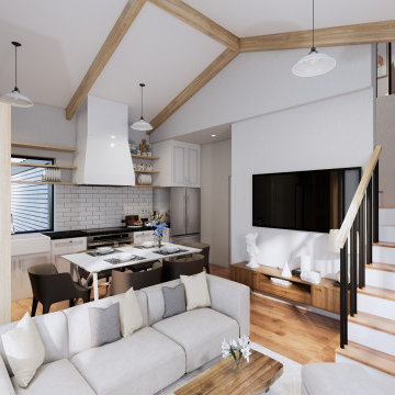
Seward Street is an Accessory Dwelling Unit (ADU) designed for an older couple to age in place – to live independently and comfortably, regardless of age. The fully livable ground floor has an open-flow kitchen, living, and dining room under a cathedral ceiling, with a separate bedroom, full bathroom, and laundry. This is complimented by an upstairs loft with a second full bathroom and a large open space that doubles as either a guest suite or office space.
The ADU is designed within an efficient building footprint to maximize the available back yard. Built from Structurally Insulated Panels (SIPs) it is detailed to be airtight and well insulated, with extremely efficient space heating & cooling (ductless mini-split air source heat pump) and an Energy Recovery Ventilator (ERV) to provide continuous fresh air while recapturing the indoor heating and cooling. It has a 400% efficient air source heat pump water heater, induction cooking, heat pump clothes dryer, and is an all-electric home.
ENERGY EFFICIENCY:
Ultra-High Efficiency Air Source Heat Pump Heating & Cooling System
Energy Recovery Ventilator
Air Source Heat Pump Water Heater
Heat Pump Clothes Dryer
Low-E Glazing
All LED Lighting
Induction Cooktop
Energy Star Certified Appliances
WATER EFFICIENCY:
WaterSense High Efficiency Plumbing Fixtures
Front-Loading Clothes Washer
INDOOR AIR QUALITY:
All-Electric Home (no gas combustion)
Energy Recovery Ventilator with MERV 13 filter
Low and no-VOC materials and finishes
High-Efficiency Kitchen Exhaust Fan
Sponsored
Sunbury, OH
J.Holderby - Renovations
Franklin County's Leading General Contractors - 2X Best of Houzz!
 Mike Hughes Fitted Interiors
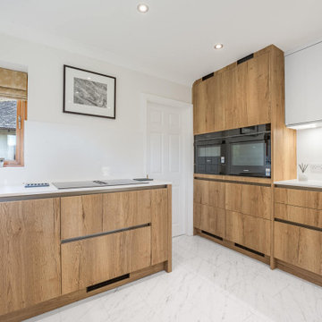
A couple retiring early to a Lake District property asked us to modernise their kitchen and utility space.
They wanted to keep the areas separate, with the utility serving as their working space for laundry and for storing their walking boots after long walks in the fells.
For their kitchen, they chose a handleless Keller Bronx Kitchen in Wild Oak, finished in an Ultra Matt Mist light grey colour. This was beautifully paired with 20mm quartz worktops, featuring an undermounted sink and matching splashback panels. We aimed to give the room character while maintaining a modern appeal. The clients love the new drawer systems, finding everything easily accessible. The kitchen is visually pleasing and simple to keep clean.
The clean design created plenty of clear worktop space, complemented by a Quooker tap for instant boiling water, adding a touch of luxury. Modern Siemens appliances, including an inductAir vented hob, were seamlessly integrated into the layout to ensure an efficient kitchen workflow.
Through the door, the utility room features matching furniture but with handled doors, prioritising practicality. It includes a stainless steel sink with a pull-down spray tap, while compact laminate worktops and splashbacks proved an excellent choice for this space.
An integrated utility unit for cleaning products and laundry was a useful addition, with the washer and tumble dryer built-in to keep the room organised. A small boot unit made from the same Keller furniture was designed to sit on when putting boots on, alongside coat hooks for outdoor wear.
Both rooms were finished with LVT tile-effect flooring installed by our trusted partner tradesmen. The flooring creating a seamless flow between the rooms. We also added under-wall unit LED lighting in both rooms, complementing the recently updated ceiling lights.

 Michael Nash Design, Build & Homes
2010 NARI CAPITAL COTY MERIT AWARD WINNER
Baby boomers residing in this single-family colonial in Mclean, Virginia, wanted to make big changes indoors and out. First, they were tired of their back yard and old wooden deck. The neighboring lot sloped steeply downward, creating significant run-off that prevented any semblance of a lawn or landscaping from taking hold. Worse, it prevented the couple from letting their grandchildren or dog out to play.
To address the issue, Michael Nash Design, Build & Homes excavated their entire yard so it was level. Then they designed and built a 5’ x 40’ retaining wall covered with ledger stone to separate the lots, installing an underground drainage system to keep runoff away from a new flagstone patio and surrounding plants and shrubs.
Above the stone patio is a large no-maintenance deck reached via a wide stairway with matching railing. A 12’ x 18’ screened in porch sits to one side featuring cedar beaded ceiling panels and French doors that lead into the home’s dining room.
Highlighting the interior renovations is a new gourmet kitchen with a custom-made wood cabinets and exotic granite countertops. The room’s focal point is a large island with a two-tier countertop and bar seating. Professional-grade stainless steel appliances include a gas cooktop, double-wall ovens, built-in microwave and dishwasher and large refrigerator. Other features include a porcelain tile floor, tile backsplash and a tray ceiling.
A new master bathroom features floor-to-ceiling cabinets, a dark marble countertop and his and hers sinks. Contrasting light-colored marble floor and wall tile leads to a glass-enclosed shower. An adjoining walk-in closet completes the design.
 Roeser Home Remodeling
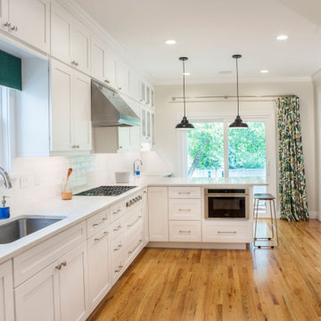
This client makes every meal at home and wanted an all-white kitchen with lots of storage. We reconfigured the kitchen to maximize the available space. The new kitchen includes a seating peninsula, bar area, a dedicated baking area, and high-end stainless steel appliances.
The cabinets are Wellborn Select Line, Prairie Door Style in Bright White. A custom pantry was installed from our partner in the project, Closet Factory. Custom doors were made to match the rest of the kitchen.
LG Viatera Minuet countertops are throughout the kitchen. The backsplash is Alyssa Edwards “Tongue in Chic You Don’t Snow Me, 2.5 x 10.5 glossy finish from countertops to the bottom of the wall cabinets.
The client chose a five-burner, 36” gas cooktop from Wolf, along with a Faber stainless steel range hood. The 24” microwave, 30” double ovens and dishwasher with wood front are all from Bosch. A Sub-Zero 42” French door refrigerator was installed.
Separated by a peninsula with room for a couple of stools is the bar area. A stream-lined 15” under-counter beverage center from U-Line keeps beverages cold and nearby.
Green patterned custom drapes add a pop of color to the all-white kitchen.
 Clairmont∙Design∙Remodeling
This kitchen replaced the one original to this 1963 built residence. The now empty nester couple entertain frequently including their large extended family during the holidays. Separating work and social spaces was as important as crafting a space that was conducive to their love of cooking and hanging with family and friends. Simple lines, simple cleanup, and classic tones create an environment that will be in style for many years. Subtle unique touches like the painted wood ceiling, pop up island receptacle/usb and receptacles/usb hidden at the bottom of the upper cabinets add functionality and intrigue. Ample LED lighting on dimmers both ceiling and undercabinet mounted provide ample task lighting. SubZero 42” refrigerator, 36” Viking Range, island pendant lights by Restoration Hardware. The ceiling is framed with white cove molding, the dark colored beadboard actually elevates the feeling of height. It was sanded and spray painted offsite with professional automotive paint equipment. It reflects light beautifully. No one expects this kind of detail and it has been quite fun watching people’s reactions to it. There are white painted perimeter cabinets and Walnut stained island cabinets. A high gloss, mostly white floor was installed from the front door, down the foyer hall and into the kitchen. It contrasts beautifully with the existing dark hardwood floors.Designers Patrick Franz and Kimberly Robbins. Photography by Tom Maday.
Sponsored
Sunbury, OH
J.Holderby - Renovations
Franklin County's Leading General Contractors - 2X Best of Houzz!

 Olamar Interiors
The clients are a younger couple with no pets or children. They asked me to help them with the Great Room in their brand new townhouse. The space is open concept with 9-foot ceilings. When the clients moved in they had very little furniture and the walls were white and bare. The husband had his eye on a very large original work of art that he wanted to purchase and incorporate into the design. They love to cook and entertain. They asked for a tranquil, neutral space with some color accents, comfortable and flexible seating, a wall-mounted TV with some storage for media equipment, and a bar. The room has several large windows and two sets of sliding glass doors so there is a lot of natural light, which the clients didn’t want to block, but also a lack of privacy. The couple also requested lighting over the kitchen island and some counter stools.
I was challenged by the lack of architectural detail in the room and a tight budget. I decided to choose furniture and accessories with classic modern lines so they would last for a long time. To offset all of the straight lines and neutral colors of the main furniture pieces, and to add visual interest, I introduced organic elements, texture and movement. I did this with wallpaper on the fireplace wall and on the kitchen island (in the case of the island, I railroaded the paper for some interest), a textured rug, some greenery, rough wood on the pedestals next to the fireplace, window shades in natural woven wood, and accessories (particularly two ceramic vases) in interesting shapes. I used the husband’s art piece as the starting point for the color scheme and overall design. I added balance and harmony by adding a large art piece and large pedestals across the room from the large art piece and carrying the teal color across the room in the sofa cushion and ottoman fabrics, art above the mantel and a vase in the niche next to the fireplace. I chose large green glass pendant lights for the kitchen to add color and to match the scale of the room.
One major challenge was that the clients wanted ottomans so they could put their feet up while watching TV. I couldn’t accommodate ottomans and a coffee table, so I opted just to have one large ottoman and added casters so it could be moved closer to the sofa; however, the husband is very tall and the wife is very petite so they wanted separate ottomans to accommodate their different leg lengths. My solution was to design an ottoman that provides maximum flexibility: the two pieces can be joined and a tray added to make it a coffee table, or pulled apart and used either as party seating or individual ottomans for the homeowners. They were thrilled with the solution.
Photographer: Jon W. Miller
 Michael Nash Design, Build & Homes
2010 NARI CAPITAL COTY MERIT AWARD WINNER
Baby boomers residing in this single-family colonial in Mclean, Virginia, wanted to make big changes indoors and out. First, they were tired of their back yard and old wooden deck. The neighboring lot sloped steeply downward, creating significant run-off that prevented any semblance of a lawn or landscaping from taking hold. Worse, it prevented the couple from letting their grandchildren or dog out to play.
To address the issue, Michael Nash Design, Build & Homes excavated their entire yard so it was level. Then they designed and built a 5’ x 40’ retaining wall covered with ledger stone to separate the lots, installing an underground drainage system to keep runoff away from a new flagstone patio and surrounding plants and shrubs.
Above the stone patio is a large no-maintenance deck reached via a wide stairway with matching railing. A 12’ x 18’ screened in porch sits to one side featuring cedar beaded ceiling panels and French doors that lead into the home’s dining room.
Highlighting the interior renovations is a new gourmet kitchen with a custom-made wood cabinets and exotic granite countertops. The room’s focal point is a large island with a two-tier countertop and bar seating. Professional-grade stainless steel appliances include a gas cooktop, double-wall ovens, built-in microwave and dishwasher and large refrigerator. Other features include a porcelain tile floor, tile backsplash and a tray ceiling.
A new master bathroom features floor-to-ceiling cabinets, a dark marble countertop and his and hers sinks. Contrasting light-colored marble floor and wall tile leads to a glass-enclosed shower. An adjoining walk-in closet completes the design.
 Twelve Stones Designs, LLC
The owners of this kitchen had spent the money to upgrade the finishes in their kitchen upon building the home 12 years ago, but after living in the space for several years they realized how nonfunctional the layout really was. The (then) two preschool aged children had grown into busy, hungry teenagers with many friends who also liked to hang out at the house. So the family needed a more functional kitchen with better traffic flow, space for daily activities revolving around the kitchen at different times of day, and a kitchen that could accommodate cooking for and serving large groups. Furthermore, the dark, traditional finishes no longer reflected the homeowners’ style. They requested a brighter, more relaxed, coastal style that reflected their love of the seaside cities they like to visit.
Originally, the kitchen was U-shaped with a narrow island in the middle. The island created narrow aisles that bottle-necked at the dishwasher, refrigerator, and cooktop areas. There was a pass-through from the foyer into the kitchen, but the owners never liked that the pass-through was also located so close to the powder room. The awkward proximity was unappealing and made guests feel uncomfortable.
The kitchen’s storage was made up of lots of narrow cabinets, apothecary drawers, clipped corner units, and very few drawers. It lacked useful storage for the larger items the family used on a daily basis. And the kitchen’s only pantry was small closet that had only builder-grade, narrow shelving with no illumination to be able to see the contents inside.
Overall, the kitchen’s lighting plan was poorly executed. Only six recessed cans illuminated the entire kitchen and nook areas. The under cabinet lighting was not evenly distributed either. In fact, the builder had mis-placed the under cabinet lighting around the decorative pilasters which made for choppy, dark cubbies. Further, the builder didn’t include any lighting over the sink or the bar area, which meant whoever was doing the dishes was always in their own shadow. That, coupled with the steep overhang of the game room above made the bar area feel like a dim, cavernous space that wasn’t inviting or task oriented. The kitchen looked out into the main living space, but the raised bar and a narrow wall (which held the only large cabinet in the kitchen) created more of a barrier than a relationship to the living room or breakfast nook. In fact, one couldn’t even see the breakfast nook from the cooktop or sink areas due to its orientation. The raised bar top was too narrow to comfortably sit to either dine at or chat from due to the lack of knee space. The the homeowners confided that the kitchen felt more like a dark, dirty prison than place where the family, or their guests, wanted to gather and commune.
The clients' needs and desires were:
➢ to create a kitchen that would be a space the family loved to be in; to relate to the adjacent spaces all around, and to have better flow for entertaining large groups
➢ to remove the walls between the breakfast nook and living area and to be able to utilize the natural light from the windows in both those areas
➢ to incorporate a functional chopping block for prepping fresh food for home cooked meals, an island with a large sink and drain board, 2 pull out trash cans, and seating for at least the 2 teens to eat or do homework
➢ to design a kitchen and breakfast nook with an airy, coastal, relaxed vibe that blended with the rest of the house's coastal theme
➢ to integrate a layered lighting plan which would include ample general illumination, specific task lighting, decorative lighting, and lots of illuminated storage
➢ to design a kitchen with not only more storage for all the husband’s kitchen gadgets and collection of oils and spices, but smart storage, including a coffee/breakfast bar and a place to store and conceal the toaster oven and microwave
➢ to find a way to utilize the large open space between the kitchen, pantry area, and breakfast nook
Twelve Stones Designs achieved the owner's goals by:
➢ removing the walls between the kitchen and living room to allow the natural light to filter in from the adjacent rooms and to create a connection between the kitchen, nook, and living spaces for a sense of unity and communion
➢ removing the existing pantry and designing 3 large pantry style cabinets with LED tape lights and rollout drawers to house lots of kitchen appliances, gadgets, and tons of groceries. We also took the cabinets all the way up to the 9’ ceiling for additional storage for seasonal items and bulk storage.
➢ designing 2 islands - 1 with a gorgeous black walnut chopping block that houses a drawer for chopping and carving knives and a custom double pull out trash unit for point of use utilization - and 1 that houses the dishwasher, a large Blanco Gourmet sink with integrated drain board, woven baskets for fresh root vegetables and kitchen towels, plenty of drawer storage for kitchen items, and bar seating for up to 4 diners.
➢ closing off the space between the kitchen and the powder room to create a beautiful new private alcove for the powder room as well as adding some decorative storage. This also gave us space to include more tall storage near the new range for precision placement of the husband’s extensive oil and spice collection as well as a location for a combo-steam oven the wife wanted for baking and cooking healthy meals.
The project is enhanced functionally by:
➢ incorporated USB and standard receptacles for the kids’ laptops and phone charging in the large island
➢ designing the small island to include additional open shelving for items used on a daily basis such as a variety of bowls, plates, and colanders. This set up also works well for the husband who prefers to “plate” his dinners in restaurant-style fashion before presenting them to the table.
➢ the integration of specific storage units, such as double stacked cutlery drawers, a custom spice pull-out, a Kuerig coffee and tea pod drawer, and custom double stacked utensil drawers
➢ moving the refrigerator to the old oven location - this eliminated the bottle neck as well as created a better relationship to the eating table. It also utilizes the floor space between the pantry, nook, and kitchen
➢ creating a banquet style breakfast nook - this banquette seating not only doubles the amount of seating for large gatherings but it better utilizes the odd space between the kitchen and the previous nook area. It also helps to create a distinct pathway from the mudroom room through the pantry area, kitchen, nook, and living room.
➢ the coffee/breakfast bar area which includes the perfect location for the concealed microwave and toaster oven, convenient storage for the coffee pods and tea accoutrements. Roll-out drawers below also house the smoothie maker, hot water kettle, and a plethora of smoothie-making ingredients such as protein powders, smoothie additives, etc. Furthermore, the drawers below the Keurig house measuring utensil, cutlery, baking supplies and tupperware storage.
➢ incorporating lots of wide drawers and pullouts to accommodate large cookware.
➢ utilizing as much vertical space as possible by building storage to the ceiling which accommodates the family’s abundant amount of serving platters, baking sheets, bakeware, casserole dishes, and additional cutting boards.
The project is enhanced aesthetically by:
➢ new 5-piece Versailles pattern porcelain tile that now seamlessly joins the entire down stairs area together creating a bright, cohesiveness feeling instead of choppy separated spaces - it also adds a coastal feeling
➢ designing a cabinet to conceal the microwave and toaster oven
➢ the coastal influenced light fixtures over the nook table and island
➢ the sandy colors of the Langdon Cambria countertops. The swirling pattern and sparkling quartz pieces remind the homeowner of black-and-tan sandy beaches
➢ the striped banquet seating whose creamy white background and blue-green stripes were the inspiration for the cabinet and wall colors.
➢ All the interior doors were painted black to coordinate with the blacks and grays in the backsplash tile and countertop. This also adds a hint of tailored formality to an otherwise casual space.
➢ the use of WAC's Oculux small aperture LED units for the overhead lighting complimented with Diode LED strips for task lighting under the cabinets and inside the pantry and glass wall cabinets. All of the lighting applications are on separate dimmer switches.
Innovative uses of materials or construction methods by Realty Restoration LLC:
➢ Each 1-1/2” x 3” block of reclaimed end-grain black walnut that makes up the center island chopping block was hand milled and built in the shop. It was designed to look substantial and proportional to the surrounding elements, executed by creating the 4 inch tall top with a solid wood chamfered edge band.
➢ The metal doors on either side of the vent hood were also custom designed for this project and built in the Realty Restoration LLC shop. They are made 1x2, 11-gauge mild steel with ribbed glass. Weighing 60 lbs a piece, heavy duty cabinet hinges were added to support the weight of the door and keep them from sagging.
➢ Under-cabinet receptacles were added along the range wall in order to have a clean, uninterrupted backsplash.
Design obstacles to overcome:
➢ Because we were removing the demising walls between the kitchen and living room, we had to find a way to plumb and vent the new island. We did this by tunneling through the slab (the slab had post tension cables which prevented us from just trenching) to run a new wet vent through a nearby structural wall. We pulled the existing hot and cold lines between upper floor joists and ran them down the structural wall as well and up through a conduit in the tunnel.
➢ Since we were converting from wall overs to a gas range it allowed us to utilize the 220 feed for the wall ovens to provide a new sub panel for all the new kitchen circuits
➢ Due to framing deficiencies inherited from the original build there was a 1-1/2” differential in the floor-to-ceiling height over a 20 foot span; by utilizing the process of cutting and furring coupled with the crown moulding details on the cabinet elevations we were able to mask the problem and provide seamless transitions between the cabinet components.
Evidence of superior craftsmanship:
➢ uniquely designed, one-of-a-kind metal “X” end panels on the large island. The end panels were custom made in the Realty Restoration LLC shop and fitted to the exact dimensions of the island. The welding seams are completely indistinguishable - the posts look like they are cut from a single sheet of metal
➢ square metal posts on the small island were also custom made and designed to compliment and carry through the metal element s throughout the kitchen
➢ the beautiful, oversized end panels on the pantry cabinets which give the breakfast nook a tailored look
➢ integrating a large format 5 piece Versailles tile pattern to seamlessly flow from the existing spaces into the new kitchen space
➢ By constructing a custom cabinet that jogged around a corner we could not remodel (housing the entry way coat closet) we were able to camouflage the adjacent wall offset within the upper and lower cabinets. By designing around the existing jog in the structural walls we accomplished a few things: we were able to find the space to house, and hide, the microwave and toaster oven yet still have a clean cohesive appearance from the kitchen side. Additionally, the owners were able to keep their much needed coat closet and we didn’t have to increase the budget with unnecessary structural work.
114