
Search results for "Separated couples" in Home Design Ideas

 Clifton Leung Design Workshop - CLDW.com.hk
With a thoughtful use of lighting and carefully curated furniture, this 1,000 sq ft Mid-Levels apartment with unsightly columns and beams is transformed into a cosy Scandinavian home with a Japanese touch.
When you think of designing a home, one does not usually put Japanese and Nordic together. But Clifton was inspired by the compatibility of the two cultures, which both emphasise minimalism, to bring out this eye-catching fusion project.
Earth tones reminiscent of Scandinavian design are used throughout the apartment, allowing it to look more spacious and comfortable.
Upon entering the apartment, one is quickly greeted by the Japanese style living room, which oozes Zen with a faux fur carpet and flatter furniture pieces including a Fritz Hansen sofa in pink, side table from Habitat, dining table from HAY and pendent lamps from Louis Poulsen.
The apartment is blessed with a high ceiling, but nonetheless, its columns and beams originally made it appear smaller. But with a clever use of lighting, such as indirect lighting on top of the beams and strategic placement of lamps on the columns, the flaws are concealed and the unit appears taller, bigger and more comfortable.
Similarly, the kitchen is transformed into an open one with an island, so the owners, both social butterflies, can invite their friends over for gatherings.
Besides catering to the two adult owners, Clifton did not forget about their fur friend Buddy, a Bichon Frise. To ensure that Buddy does not feel left out at night, while ensuring the couple can have some privacy in their bedroom, a small square hole was made in the door for him to freely move in and out.

 Michael Nash Design, Build & Homes
2010 NARI CAPITAL COTY MERIT AWARD WINNER
Baby boomers residing in this single-family colonial in Mclean, Virginia, wanted to make big changes indoors and out. First, they were tired of their back yard and old wooden deck. The neighboring lot sloped steeply downward, creating significant run-off that prevented any semblance of a lawn or landscaping from taking hold. Worse, it prevented the couple from letting their grandchildren or dog out to play.
To address the issue, Michael Nash Design, Build & Homes excavated their entire yard so it was level. Then they designed and built a 5’ x 40’ retaining wall covered with ledger stone to separate the lots, installing an underground drainage system to keep runoff away from a new flagstone patio and surrounding plants and shrubs.
Above the stone patio is a large no-maintenance deck reached via a wide stairway with matching railing. A 12’ x 18’ screened in porch sits to one side featuring cedar beaded ceiling panels and French doors that lead into the home’s dining room.
Highlighting the interior renovations is a new gourmet kitchen with a custom-made wood cabinets and exotic granite countertops. The room’s focal point is a large island with a two-tier countertop and bar seating. Professional-grade stainless steel appliances include a gas cooktop, double-wall ovens, built-in microwave and dishwasher and large refrigerator. Other features include a porcelain tile floor, tile backsplash and a tray ceiling.
A new master bathroom features floor-to-ceiling cabinets, a dark marble countertop and his and hers sinks. Contrasting light-colored marble floor and wall tile leads to a glass-enclosed shower. An adjoining walk-in closet completes the design.
 Michael Nash Design, Build & Homes
This custom home in heart of Great Falls Village, has been an elder couple's home for years. Since moving to this large home, they had a different vision for the main level of the home, specifically the kitchen, sunroom and laundry area.
The wife loves modern arts, modern cabinets, sleek counter tops and floors.
The breakfast room was separated by a bearing wall from the kitchen space. The kitchen was confined with surrounding walls and disconnected from rest of the main level.
Tall eleven foot ceiling with large scale coved crown molding was a signature mark of this home and she wanted to continue that look throughout the new remodeled area.
We took down the middle bearing wall by inserting structural beams, moved the back wall into the laundry space to create a pantry and a space for wall cabinets, and on the opposite side created space for a desk area.
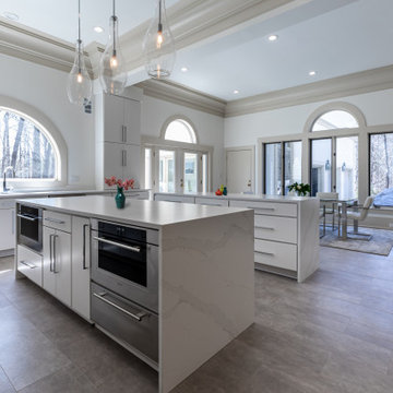
We implemented two large scale islands with all kinds of amenities such as an espresso maker, warming drawer, steam oven all wrapped in waterfall quartz.
We relocated major soil stack and duct chases to allow taller cabinetry and open the flow between the two new spaces,
Our expert designers cleverly implemented French doors and used long plank porcelain tile for seamless connections among all new space.
Modern style glossy white cabinetry with exquisite selection of hardware and carefully selected quartz top brightens up this new kitchen.
A new and modern laundry room was designed and got added to front side of the kitchen.
Clever placement of LED lighting, pendent lights and under cabinet lights, brightens up this kitchen.
The new kitchen space is perfectly suited for friendly gatherings.
Find the right local pro for your project

 ZeroEnergy Design
This renovated brick rowhome in Boston’s South End offers a modern aesthetic within a historic structure, creative use of space, exceptional thermal comfort, a reduced carbon footprint, and a passive stream of income.
DESIGN PRIORITIES. The goals for the project were clear - design the primary unit to accommodate the family’s modern lifestyle, rework the layout to create a desirable rental unit, improve thermal comfort and introduce a modern aesthetic. We designed the street-level entry as a shared entrance for both the primary and rental unit. The family uses it as their everyday entrance - we planned for bike storage and an open mudroom with bench and shoe storage to facilitate the change from shoes to slippers or bare feet as they enter their home. On the main level, we expanded the kitchen into the dining room to create an eat-in space with generous counter space and storage, as well as a comfortable connection to the living space. The second floor serves as master suite for the couple - a bedroom with a walk-in-closet and ensuite bathroom, and an adjacent study, with refinished original pumpkin pine floors. The upper floor, aside from a guest bedroom, is the child's domain with interconnected spaces for sleeping, work and play. In the play space, which can be separated from the work space with new translucent sliding doors, we incorporated recreational features inspired by adventurous and competitive television shows, at their son’s request.
MODERN MEETS TRADITIONAL. We left the historic front facade of the building largely unchanged - the security bars were removed from the windows and the single pane windows were replaced with higher performing historic replicas. We designed the interior and rear facade with a vision of warm modernism, weaving in the notable period features. Each element was either restored or reinterpreted to blend with the modern aesthetic. The detailed ceiling in the living space, for example, has a new matte monochromatic finish, and the wood stairs are covered in a dark grey floor paint, whereas the mahogany doors were simply refinished. New wide plank wood flooring with a neutral finish, floor-to-ceiling casework, and bold splashes of color in wall paint and tile, and oversized high-performance windows (on the rear facade) round out the modern aesthetic.
RENTAL INCOME. The existing rowhome was zoned for a 2-family dwelling but included an undesirable, single-floor studio apartment at the garden level with low ceiling heights and questionable emergency egress. In order to increase the quality and quantity of space in the rental unit, we reimagined it as a two-floor, 1 or 2 bedroom, 2 bathroom apartment with a modern aesthetic, increased ceiling height on the lowest level and provided an in-unit washer/dryer. The apartment was listed with Jackie O'Connor Real Estate and rented immediately, providing the owners with a source of passive income.
ENCLOSURE WITH BENEFITS. The homeowners sought a minimal carbon footprint, enabled by their urban location and lifestyle decisions, paired with the benefits of a high-performance home. The extent of the renovation allowed us to implement a deep energy retrofit (DER) to address air tightness, insulation, and high-performance windows. The historic front facade is insulated from the interior, while the rear facade is insulated on the exterior. Together with these building enclosure improvements, we designed an HVAC system comprised of continuous fresh air ventilation, and an efficient, all-electric heating and cooling system to decouple the house from natural gas. This strategy provides optimal thermal comfort and indoor air quality, improved acoustic isolation from street noise and neighbors, as well as a further reduced carbon footprint. We also took measures to prepare the roof for future solar panels, for when the South End neighborhood’s aging electrical infrastructure is upgraded to allow them.
URBAN LIVING. The desirable neighborhood location allows the both the homeowners and tenant to walk, bike, and use public transportation to access the city, while each charging their respective plug-in electric cars behind the building to travel greater distances.
OVERALL. The understated rowhouse is now ready for another century of urban living, offering the owners comfort and convenience as they live life as an expression of their values.
Eric Roth Photo
 Michael Nash Design, Build & Homes
2011 NARI CAPITAL COTY MERIT AWARD WINNER; 2012 QUALIFIED REMODELER MASTER DESIGN AWARD
This 1950 brick colonial featured a floor plan typical of homes of that era--small boxy rooms, each separated by four walls. The young couple who owned the home loved its potential, but needed more space.
The main goal of this project was to create a seamless and open floor plan on the first floor, adding a family room and enlarging the kitchen. A master bedroom and bathroom suite were planned to make better use of the second level. To accomplish these goals, a 20’ x 20’ two-story addition was designed by Michael Nash Design, Build & Homes.
The new expanded kitchen and family room features limestone floors, a new gas fireplace surrounded with built-ins and glass stone hearth to complement the kitchen countertops and backsplash. Use of espresso colored cabinetry topped by a light granite countertop with brown veins running through it is one of the decorative touches that make this project stunning. The large middle island which consists of a second sink, wine chiller and seating space is another bonus point of this kitchen. Commercial quality appliances assure gourmet cooking at its finest. Large first floor windows face the home’s new flagstone patio, which can be accessed via a French door.
The second floor consists of the master bedroom with a sitting area , French doors leading into a French balcony facing back yard, double-sided stoned gas fireplace (between the bedroom and master bath) and a cathedral ceiling. The master bathroom features a large steam shower, body sprays and rain shower, a large double person Jacuzzi, tumbled marble floor and wall tiles with accents. The use of wide plank exotic tiger wood has beautified this master suite.
Keeping the homeowners’ contemporary style in mind and achieving their wishes has transformed this old 1950 colonial into a fully functional 21st Century dream home.
 kimberly peck architect
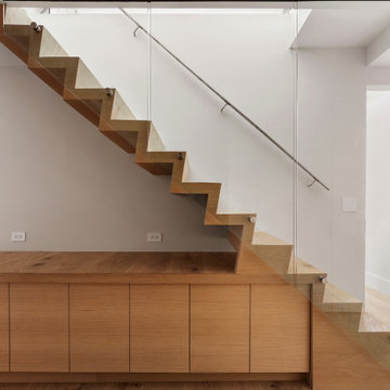
For this project we were hired by a young couple to convert a dated duplex apartment into a modern loft-like space for their growing family. The apartment occupied the first and second floor of a building that originally was a series of row houses. The row houses had been combined to create a large apartment complex. the individual units lacked flow and were composed of many small rooms. The main stair connecting the two levels of the apartment was directly inside the entry. Because the stair could not be relocated we decided to make it a focal point. We removed the original stair and replaced it with a sculptural open oak stair with a glass guardrail. Beneath the stair we created an oak cabinet that acts as a landing spot for belongings upon entering the apartment. This foyer space created by this stair entity is separated from the kitchen/dining area by a floating wall. This was done to keep the space visually open when you enter the apartment and to create better flow. The wall shared with the stair acts as the rear wall of the kitchen which is completed by an island. The space segues into a dining area. One of the selling points of the apartment was an under utilized private patio space. The space was previously accessed by sliding glass doors in multiple rooms. By opening up the entire space, the kitchen dining area now has a strong connection to the outdoors and the renovated patio feels like part of the apartment’s floor area. The rest of the first floor is a large primary suite. The suite was designed with ample walk in closets, a small room for a baby’s crib and a large primary bath. The primary bath features a custom stone sink and shower bench. The second floor of the apartment features two bedrooms, a bathroom and a spacious living room with double height ceilings. By using a limited palette of materials and customized builtins we were able to create multiple uses in the existing living room while keeping a cohesive overall look. Walnut cabinetry paired with “Calcutta green" porcelain and black accents were used for the fireplace feature, large media/book shelf, and the wet bar.

 CairnsCraft Design & Remodel
This adorable kitchen in Point Loma, CA is now open to the family room, small in spaces but united with a nature-inspired color palette. The kitchen went through an extensive remodel removing walls, raised ceiling, exposing the beam and a new glass door for the back entry and now this small kitchen feel open and spacious. The cabinetry features shaker elements―clean lines, plain trim, and little ornamentation― great for transitional decor.
Functional fixtures and modern appliances peacefully coexist with the mosaic marble backsplash. Hidden behind the door panels is a 30” Subzero refrigerator/freezer integrated nicely to keep the kitchen plan, clean and understated. The corner sink is recessed back adding a nice detail but even more importantly a more accessible corner access to the kitchen windows.
Accessories and details added to the kitchen cabinets give this chef everything she was looking for with a spice pullout, knife block pullout and rollouts to top off the new cabinets.
When space is tight it is a great option for a small family to open up the walls and add a counter where the family can dine. On the walls, neutral gray painted create a soothing atmosphere.
Adjacent to the kitchen was a cramped room that functioned as a workout room and laundry room. By changing some wall space, closing in a door and removing a closet the new space has great storage and is more open and functional for a quick workout.
In the family room the fireplace was re-tiled with a concrete looking porcelain tile topped off with a rustic beam mantle. Combined with new home furnishings to make the most of a small space this new family room is both functional and a great place for the couple to spend time with each other on a daily basis and to entertain guest and a new space has been created with the feel of a comfortable cozy space for all to enjoy.
Contractor: CairnsCraft Remodeling
Designer: Bonnie Bagley Catlin
Photogtapher: Jon Upson
Sponsored
Columbus, OH

Structural Remodeling
Franklin County's Heavy Timber Specialists | Best of Houzz 2020!
 Michael Nash Design, Build & Homes
NARI CAPITAL COTY, HONORABLE MENTION AWARD WINNER, RESIDENTIAL KITCHEN $50,000 TO $100,000
The owners of this Mount Vernon home purchased it with plans to remodel the kitchen. The original space was tired, dark and disorganized. A peninsula separated the kitchen from the breakfast area and the adjacent sunroom was only accessed via a single door. The back pantry was poorly designed and there was no logic to the kitchen’s work space.
The first step in this stunning transformation involved replacing the original peninsula with a large central island. Built using espresso stained furniture-quality cabinets with icon legs, open bottoms and exotic dark granite countertops, all kitchen traffic now flows around the island.
The outside wall of the kitchen, featuring a 48” Thermador range, stainless steel range hood and glass tile backsplash, is the focal point of the new space. A stainless steel farm-style sink sits beneath one of two large windows that provide lots of natural light into the room. To the right, sits a 48” Sub Zero refrigerator/freezer.
The wall adjacent to the family room was never used properly. Now it is home to two tall pantries, double ovens and a microwave. Creative pass through arches let the homeowner attend to guests while preparing food in the kitchen. The butler area adjacent to the dining room is filled with glass front cabinetry and additional cabinetry for extra storage.
The kitchen is now part of an open concept design flowing from kitchen to dining room to sun room. By replacing a bearing wall with a structural header, traffic can flow from one room to the next making it brighter and more conducive to entertaining.
More spacious than ever, this new kitchen is the hub of the home for this couple who love to cook and entertain.

 Stephanie Charest Interior Design
We completed this kitchen renovation for a SW. Calgary couple and as you’ll see, it was a much needed update after their 20+ years in the home.
Clearly the look of the cabinets needed to be brought up to date, but function was on the top of the list for this client. She enjoys cooking and often hosts several friends over for canning and other big cooking parties so countertop space was a priority. Seeing as they also host large family gatherings, the cook didn’t want to feel abandoned in the kitchen when everyone else was in the next room so opening up the space was crucial.
Here is what we did to change the way this space works for them…
We revised the layout of the appliances and cabinets and relocated the plumbing so she could look out the window while she stood at the sink. Taking the cabinets up to the ceiling also gave them more storage as does the large pantry next to the fridge. An island wouldn’t fit, so we added a peninsula which gave them a spot to sit to have their morning coffee and a significant amount of additional counter space. By removing the walls between the kitchen and dining room it eliminated a small hallway that separated the kitchen and dining room and allowed for an open concept in their 1960’s home.
To add visual interest to the space and to define the dining room, we added a coffered celing. Now, typically a coffered ceiling is done when you have three or four walls to anchor it in. It was a bit of a risk to add a “floating” coffered ceiling! However, it turned out beautifully. It wasn’t without it issues but I’m glad we added this element as it wouldn’t have been as interesting with a typical flat ceiling.
In the dining room, a buffet was added for additional storage as well as new drapery panels, lighting and furniture. The peacock blue end chairs are stunning! Without that punch of color the dining room just wouldn’t be as outstanding. They are so lovely and really pushed the client out of her comfort zone – but she loves them and is glad she trusted us with that design decision.
The result is a much more usable space that is also classic in style and just darn pretty to look at and be in! And I know this client is enjoying her new kitchen day to day and on special family occasions.
Adrian Shellard Photography
 Michael Nash Design, Build & Homes
2011 NARI CAPITAL COTY MERIT AWARD WINNER; 2012 QUALIFIED REMODELER MASTER DESIGN AWARD
This 1950 brick colonial featured a floor plan typical of homes of that era--small boxy rooms, each separated by four walls. The young couple who owned the home loved its potential, but needed more space.
The main goal of this project was to create a seamless and open floor plan on the first floor, adding a family room and enlarging the kitchen. A master bedroom and bathroom suite were planned to make better use of the second level. To accomplish these goals, a 20’ x 20’ two-story addition was designed by Michael Nash Design, Build & Homes.
The new expanded kitchen and family room features limestone floors, a new gas fireplace surrounded with built-ins and glass stone hearth to complement the kitchen countertops and backsplash. Use of espresso colored cabinetry topped by a light granite countertop with brown veins running through it is one of the decorative touches that make this project stunning. The large middle island which consists of a second sink, wine chiller and seating space is another bonus point of this kitchen. Commercial quality appliances assure gourmet cooking at its finest. Large first floor windows face the home’s new flagstone patio, which can be accessed via a French door.
The second floor consists of the master bedroom with a sitting area , French doors leading into a French balcony facing back yard, double-sided stoned gas fireplace (between the bedroom and master bath) and a cathedral ceiling. The master bathroom features a large steam shower, body sprays and rain shower, a large double person Jacuzzi, tumbled marble floor and wall tiles with accents. The use of wide plank exotic tiger wood has beautified this master suite.
Keeping the homeowners’ contemporary style in mind and achieving their wishes has transformed this old 1950 colonial into a fully functional 21st Century dream home.
 Michael Nash Design, Build & Homes
2011 NARI CAPITAL COTY MERIT AWARD WINNER; 2012 QUALIFIED REMODELER MASTER DESIGN AWARD
This 1950 brick colonial featured a floor plan typical of homes of that era--small boxy rooms, each separated by four walls. The young couple who owned the home loved its potential, but needed more space.
The main goal of this project was to create a seamless and open floor plan on the first floor, adding a family room and enlarging the kitchen. A master bedroom and bathroom suite were planned to make better use of the second level. To accomplish these goals, a 20’ x 20’ two-story addition was designed by Michael Nash Design, Build & Homes.
The new expanded kitchen and family room features limestone floors, a new gas fireplace surrounded with built-ins and glass stone hearth to complement the kitchen countertops and backsplash. Use of espresso colored cabinetry topped by a light granite countertop with brown veins running through it is one of the decorative touches that make this project stunning. The large middle island which consists of a second sink, wine chiller and seating space is another bonus point of this kitchen. Commercial quality appliances assure gourmet cooking at its finest. Large first floor windows face the home’s new flagstone patio, which can be accessed via a French door.
The second floor consists of the master bedroom with a sitting area , French doors leading into a French balcony facing back yard, double-sided stoned gas fireplace (between the bedroom and master bath) and a cathedral ceiling. The master bathroom features a large steam shower, body sprays and rain shower, a large double person Jacuzzi, tumbled marble floor and wall tiles with accents. The use of wide plank exotic tiger wood has beautified this master suite.
Keeping the homeowners’ contemporary style in mind and achieving their wishes has transformed this old 1950 colonial into a fully functional 21st Century dream home.
 Michael Nash Design, Build & Homes
NARI CAPITAL COTY, HONORABLE MENTION AWARD WINNER, RESIDENTIAL KITCHEN $50,000 TO $100,000
The owners of this Mount Vernon home purchased it with plans to remodel the kitchen. The original space was tired, dark and disorganized. A peninsula separated the kitchen from the breakfast area and the adjacent sunroom was only accessed via a single door. The back pantry was poorly designed and there was no logic to the kitchen’s work space.
The first step in this stunning transformation involved replacing the original peninsula with a large central island. Built using espresso stained furniture-quality cabinets with icon legs, open bottoms and exotic dark granite countertops, all kitchen traffic now flows around the island.
The outside wall of the kitchen, featuring a 48” Thermador range, stainless steel range hood and glass tile backsplash, is the focal point of the new space. A stainless steel farm-style sink sits beneath one of two large windows that provide lots of natural light into the room. To the right, sits a 48” Sub Zero refrigerator/freezer.
The wall adjacent to the family room was never used properly. Now it is home to two tall pantries, double ovens and a microwave. Creative pass through arches let the homeowner attend to guests while preparing food in the kitchen. The butler area adjacent to the dining room is filled with glass front cabinetry and additional cabinetry for extra storage.
The kitchen is now part of an open concept design flowing from kitchen to dining room to sun room. By replacing a bearing wall with a structural header, traffic can flow from one room to the next making it brighter and more conducive to entertaining.
More spacious than ever, this new kitchen is the hub of the home for this couple who love to cook and entertain.
 Stephanie Charest Interior Design
We completed this kitchen renovation for a SW. Calgary couple and as you’ll see, it was a much needed update after their 20+ years in the home.
Clearly the look of the cabinets needed to be brought up to date, but function was on the top of the list for this client. She enjoys cooking and often hosts several friends over for canning and other big cooking parties so countertop space was a priority. Seeing as they also host large family gatherings, the cook didn’t want to feel abandoned in the kitchen when everyone else was in the next room so opening up the space was crucial.
Here is what we did to change the way this space works for them…
We revised the layout of the appliances and cabinets and relocated the plumbing so she could look out the window while she stood at the sink. Taking the cabinets up to the ceiling also gave them more storage as does the large pantry next to the fridge. An island wouldn’t fit, so we added a peninsula which gave them a spot to sit to have their morning coffee and a significant amount of additional counter space. By removing the walls between the kitchen and dining room it eliminated a small hallway that separated the kitchen and dining room and allowed for an open concept in their 1960’s home.
To add visual interest to the space and to define the dining room, we added a coffered celing. Now, typically a coffered ceiling is done when you have three or four walls to anchor it in. It was a bit of a risk to add a “floating” coffered ceiling! However, it turned out beautifully. It wasn’t without it issues but I’m glad we added this element as it wouldn’t have been as interesting with a typical flat ceiling.
In the dining room, a buffet was added for additional storage as well as new drapery panels, lighting and furniture. The peacock blue end chairs are stunning! Without that punch of color the dining room just wouldn’t be as outstanding. They are so lovely and really pushed the client out of her comfort zone – but she loves them and is glad she trusted us with that design decision.
The result is a much more usable space that is also classic in style and just darn pretty to look at and be in! And I know this client is enjoying her new kitchen day to day and on special family occasions.
Adrian Shellard Photography
Sponsored
Sunbury, OH

J.Holderby - Renovations
Franklin County's Leading General Contractors - 2X Best of Houzz!

 AoDK Inc.
A couple wanted a weekend retreat without spending a majority of their getaway in an automobile. Therefore, a lot was purchased along the Rocky River with the vision of creating a nearby escape less than five miles away from their home. This 1,300 sf 24’ x 24’ dwelling is divided into a four square quadrant with the goal to create a variety of interior and exterior experiences while maintaining a rather small footprint.
Typically, when going on a weekend retreat one has the drive time to decompress. However, without this, the goal was to create a procession from the car to the house to signify such change of context. This concept was achieved through the use of a wood slatted screen wall which must be passed through. After winding around a collection of poured concrete steps and walls one comes to a wood plank bridge and crosses over a Japanese garden leaving all the stresses of the daily world behind.
The house is structured around a nine column steel frame grid, which reinforces the impression one gets of the four quadrants. The two rear quadrants intentionally house enclosed program space but once passed through, the floor plan completely opens to long views down to the mouth of the river into Lake Erie.
On the second floor the four square grid is stacked with one quadrant removed for the two story living area on the first floor to capture heightened views down the river. In a move to create complete separation there is a one quadrant roof top office with surrounding roof top garden space. The rooftop office is accessed through a unique approach by exiting onto a steel grated staircase which wraps up the exterior facade of the house. This experience provides an additional retreat within their weekend getaway, and serves as the apex of the house where one can completely enjoy the views of Lake Erie disappearing over the horizon.
Visually the house extends into the riverside site, but the four quadrant axis also physically extends creating a series of experiences out on the property. The Northeast kitchen quadrant extends out to become an exterior kitchen & dining space. The two-story Northwest living room quadrant extends out to a series of wrap around steps and lounge seating. A fire pit sits in this quadrant as well farther out in the lawn. A fruit and vegetable garden sits out in the Southwest quadrant in near proximity to the shed, and the entry sequence is contained within the Southeast quadrant extension. Internally and externally the whole house is organized in a simple and concise way and achieves the ultimate goal of creating many different experiences within a rationally sized footprint.
Photo: Sergiu Stoian

 Brett Design
This New York City apartment is located in the much coveted Time Warner Building. Take one look at the floor to ceiling windows and those million dollar views of the Big Apple and you’ll know why! Our client was a young, single woman. Her desires for the space were “Rustic Modern”. What better choice than iconic sea grass sling chairs from 1968 coupled with sateen cocoa hued wool covered couches and tribal statues to achieve this goal?
Time Warner Building Apartment | Interior design by Brett Design
 Michael Nash Design, Build & Homes
2010 NARI CAPITAL COTY MERIT AWARD WINNER
Baby boomers residing in this single-family colonial in Mclean, Virginia, wanted to make big changes indoors and out. First, they were tired of their back yard and old wooden deck. The neighboring lot sloped steeply downward, creating significant run-off that prevented any semblance of a lawn or landscaping from taking hold. Worse, it prevented the couple from letting their grandchildren or dog out to play.
To address the issue, Michael Nash Design, Build & Homes excavated their entire yard so it was level. Then they designed and built a 5’ x 40’ retaining wall covered with ledger stone to separate the lots, installing an underground drainage system to keep runoff away from a new flagstone patio and surrounding plants and shrubs.
Above the stone patio is a large no-maintenance deck reached via a wide stairway with matching railing. A 12’ x 18’ screened in porch sits to one side featuring cedar beaded ceiling panels and French doors that lead into the home’s dining room.
Highlighting the interior renovations is a new gourmet kitchen with a custom-made wood cabinets and exotic granite countertops. The room’s focal point is a large island with a two-tier countertop and bar seating. Professional-grade stainless steel appliances include a gas cooktop, double-wall ovens, built-in microwave and dishwasher and large refrigerator. Other features include a porcelain tile floor, tile backsplash and a tray ceiling.
A new master bathroom features floor-to-ceiling cabinets, a dark marble countertop and his and hers sinks. Contrasting light-colored marble floor and wall tile leads to a glass-enclosed shower. An adjoining walk-in closet completes the design.
 AoDK Inc.
A couple wanted a weekend retreat without spending a majority of their getaway in an automobile. Therefore, a lot was purchased along the Rocky River with the vision of creating a nearby escape less than five miles away from their home. This 1,300 sf 24’ x 24’ dwelling is divided into a four square quadrant with the goal to create a variety of interior and exterior experiences while maintaining a rather small footprint.
Typically, when going on a weekend retreat one has the drive time to decompress. However, without this, the goal was to create a procession from the car to the house to signify such change of context. This concept was achieved through the use of a wood slatted screen wall which must be passed through. After winding around a collection of poured concrete steps and walls one comes to a wood plank bridge and crosses over a Japanese garden leaving all the stresses of the daily world behind.
The house is structured around a nine column steel frame grid, which reinforces the impression one gets of the four quadrants. The two rear quadrants intentionally house enclosed program space but once passed through, the floor plan completely opens to long views down to the mouth of the river into Lake Erie.
On the second floor the four square grid is stacked with one quadrant removed for the two story living area on the first floor to capture heightened views down the river. In a move to create complete separation there is a one quadrant roof top office with surrounding roof top garden space. The rooftop office is accessed through a unique approach by exiting onto a steel grated staircase which wraps up the exterior facade of the house. This experience provides an additional retreat within their weekend getaway, and serves as the apex of the house where one can completely enjoy the views of Lake Erie disappearing over the horizon.
Visually the house extends into the riverside site, but the four quadrant axis also physically extends creating a series of experiences out on the property. The Northeast kitchen quadrant extends out to become an exterior kitchen & dining space. The two-story Northwest living room quadrant extends out to a series of wrap around steps and lounge seating. A fire pit sits in this quadrant as well farther out in the lawn. A fruit and vegetable garden sits out in the Southwest quadrant in near proximity to the shed, and the entry sequence is contained within the Southeast quadrant extension. Internally and externally the whole house is organized in a simple and concise way and achieves the ultimate goal of creating many different experiences within a rationally sized footprint.
Sponsored
Sunbury, OH
J.Holderby - Renovations
Franklin County's Leading General Contractors - 2X Best of Houzz!
 Michael Nash Design, Build & Homes
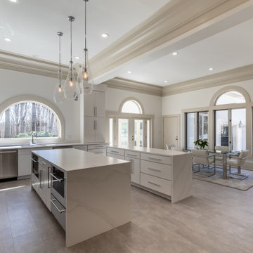
This custom home in heart of Great Falls Village, has been an elder couple's home for years. Since moving to this large home, they had a different vision for the main level of the home, specifically the kitchen, sunroom and laundry area.
The wife loves modern arts, modern cabinets, sleek counter tops and floors.
The breakfast room was separated by a bearing wall from the kitchen space. The kitchen was confined with surrounding walls and disconnected from rest of the main level.
Tall eleven foot ceiling with large scale coved crown molding was a signature mark of this home and she wanted to continue that look throughout the new remodeled area.
We took down the middle bearing wall by inserting structural beams, moved the back wall into the laundry space to create a pantry and a space for wall cabinets, and on the opposite side created space for a desk area.
We implemented two large scale islands with all kinds of amenities such as an espresso maker, warming drawer, steam oven all wrapped in waterfall quartz.
We relocated major soil stack and duct chases to allow taller cabinetry and open the flow between the two new spaces,
Our expert designers cleverly implemented French doors and used long plank porcelain tile for seamless connections among all new space.
Modern style glossy white cabinetry with exquisite selection of hardware and carefully selected quartz top brightens up this new kitchen.
A new and modern laundry room was designed and got added to front side of the kitchen.
Clever placement of LED lighting, pendent lights and under cabinet lights, brightens up this kitchen.
The new kitchen space is perfectly suited for friendly gatherings.

 Benson Homes LLC
This remodeling story is a wonderful example of how removing and shifting walls can have an amazing impact on the functionality and visual appeal of an entire level of a home. When our clients reached out to us, they were looking to create an open concept Kitchen that would allow for easy entertaining. The couple had recently purchased this townhome so his mother could be closer to the family.
The existing floorplan offered first floor living, but the Kitchen was tucked in the back and was separated from the rest of the living space by a full wall with a small pass through into the Dining Room. Our design involved removing the dividing wall between the Dining Room and Kitchen as well as the fake columns and beam that separated the Dining Room and Living Room. The entire space was opened up to allow for easy flow and view throughout the first floor living space. The wall shared by the Kitchen and large Master Bedroom was shifted back just enough to provide a full wall of additional cabinetry including a much-needed large double Pantry cabinet. Now that we had opened up the Kitchen area we could focus on the cabinetry layout and selections.
The existing wood toned cabinets were replaced with white cabinets and crown molding to match the rest of the home. The larger, open space allowed for more cabinetry and the addition of an island with new undermount sink, dishwasher and convenient trash pullout along with seating for the grandchildren. A new range hood was installed and vented to the exterior of the house to replace the old recirculating hood. We were able to repurpose the some of the existing cabinets for use above the washer and dryer in the adjoining Laundry Room and swapped out the existing swinging door for a pocket door to free up traffic flow when doing Laundry and working in the Kitchen. The slate-look ceramic tile was replaced with a pre-engineered hardwood floor that creates a sense of warmth while easy to clean. The new Cambria countertop compliments the slate-look tile found in the Dining Room and Living Room and a natural field tile backsplash offsets the cabinets beautifully.
The single fluorescent ceiling light was outdated and did not provide adequate lighting for the new Kitchen. The new lighting plan was carefully thought out to provide general illumination through well placed recessed lighting; task lighting through pendant lighting over the island and under cabinet lighting; and aesthetic fluidity with an eye-catching chandelier for the Dining Room table. Special details include a touch faucet, under counter microwave and glass front cabinetry for displaying dishes.
By removing and shifting walls, we improved the entire flow of the first floor visually as well as functionally and created a beautiful, light-filled space for cooking and entertaining. Grandma can easily prepare meals in her new Kitchen and still chat with her guests and grandchildren who love to sit at the island as well as in the adjoining Dining Room and Living Room.
The Benson Homes team really enjoyed creating this space for this family and we hope they will enjoy spending time with friends and family for years to come.
 Stephanie Charest Interior Design
We completed this kitchen renovation for a SW. Calgary couple and as you’ll see, it was a much needed update after their 20+ years in the home.
Clearly the look of the cabinets needed to be brought up to date, but function was on the top of the list for this client. She enjoys cooking and often hosts several friends over for canning and other big cooking parties so countertop space was a priority. Seeing as they also host large family gatherings, the cook didn’t want to feel abandoned in the kitchen when everyone else was in the next room so opening up the space was crucial.
Here is what we did to change the way this space works for them…
We revised the layout of the appliances and cabinets and relocated the plumbing so she could look out the window while she stood at the sink. Taking the cabinets up to the ceiling also gave them more storage as does the large pantry next to the fridge. An island wouldn’t fit, so we added a peninsula which gave them a spot to sit to have their morning coffee and a significant amount of additional counter space. By removing the walls between the kitchen and dining room it eliminated a small hallway that separated the kitchen and dining room and allowed for an open concept in their 1960’s home.
To add visual interest to the space and to define the dining room, we added a coffered celing. Now, typically a coffered ceiling is done when you have three or four walls to anchor it in. It was a bit of a risk to add a “floating” coffered ceiling! However, it turned out beautifully. It wasn’t without it issues but I’m glad we added this element as it wouldn’t have been as interesting with a typical flat ceiling.
In the dining room, a buffet was added for additional storage as well as new drapery panels, lighting and furniture. The peacock blue end chairs are stunning! Without that punch of color the dining room just wouldn’t be as outstanding. They are so lovely and really pushed the client out of her comfort zone – but she loves them and is glad she trusted us with that design decision.
The result is a much more usable space that is also classic in style and just darn pretty to look at and be in! And I know this client is enjoying her new kitchen day to day and on special family occasions.
Adrian Shellard Photography
127