
Search results for "Separated couples" in Home Design Ideas
 TKS Design Group
Download our free ebook, Creating the Ideal Kitchen. DOWNLOAD NOW
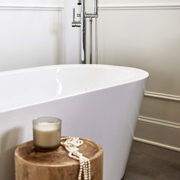
A tired primary bathroom, with varying ceiling heights and a beige-on-beige color scheme, was screaming for love. Squaring the room and adding natural materials erased the memory of the lack luster space and converted it to a bright and welcoming spa oasis. The home was a new build in 2005 and it looked like all the builder’s material choices remained. The client was clear on their design direction but were challenged by the differing ceiling heights and were looking to hire a design-build firm that could resolve that issue.
This local Glen Ellyn couple found us on Instagram (@kitchenstudioge, follow us ?). They loved our designs and felt like we fit their style. They requested a full primary bath renovation to include a large shower, soaking tub, double vanity with storage options, and heated floors. The wife also really wanted a separate make-up vanity. The biggest challenge presented to us was to architecturally marry the various ceiling heights and deliver a streamlined design.
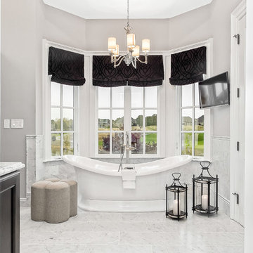
The existing layout worked well for the couple, so we kept everything in place, except we enlarged the shower and replaced the built-in tub with a lovely free-standing model. We also added a sitting make-up vanity. We were able to eliminate the awkward ceiling lines by extending all the walls to the highest level. Then, to accommodate the sprinklers and HVAC, lowered the ceiling height over the entrance and shower area which then opens to the 2-story vanity and tub area. Very dramatic!
This high-end home deserved high-end fixtures. The homeowners also quickly realized they loved the look of natural marble and wanted to use as much of it as possible in their new bath. They chose a marble slab from the stone yard for the countertops and back splash, and we found complimentary marble tile for the shower. The homeowners also liked the idea of mixing metals in their new posh bathroom and loved the look of black, gold, and chrome.
Although our clients were very clear on their style, they were having a difficult time pulling it all together and envisioning the final product. As interior designers it is our job to translate and elevate our clients’ ideas into a deliverable design. We presented the homeowners with mood boards and 3D renderings of our modern, clean, white marble design. Since the color scheme was relatively neutral, at the homeowner’s request, we decided to add of interest with the patterns and shapes in the room.
We were first inspired by the shower floor tile with its circular/linear motif. We designed the cabinetry, floor and wall tiles, mirrors, cabinet pulls, and wainscoting to have a square or rectangular shape, and then to create interest we added perfectly placed circles to contrast with the rectangular shapes. The globe shaped chandelier against the square wall trim is a delightful yet subtle juxtaposition.
The clients were overjoyed with our interpretation of their vision and impressed with the level of detail we brought to the project. It’s one thing to know how you want a space to look, but it takes a special set of skills to create the design and see it thorough to implementation. Could hiring The Kitchen Studio be the first step to making your home dreams come to life?
 Christensen Design Management
History:
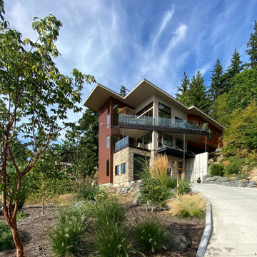
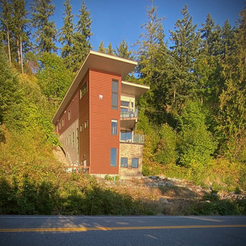
Client was given a property, that was extremely difficult to build on, with a very steep, 25-30' drop. They tried to sell the property for many years, with no luck. They finally decided that they should build something on it, for themselves, to prove it could be done. No access was allowed at the top of the steep incline. Client assumed it would be an expensive foundation built parallel to the hillside, somehow.
Program:
The program involved a level for one floor living, (LR/DR/KIT/MBR/UTILITY) as an age-in-place for this recently retired couple. Any other levels should have additional bedrooms that could also feel like a separate AirBnB space, or allow for a future caretaker. There was also a desire for a garage with a recreational vehicle and regular car. The main floor should take advantage of the primary views to the southwest, even though the lot faces due west. Also a desire for easy access to an upper level trail and low maintenance materials with easy maintenance access to roof. The preferred style was a fresher, contemporary feel.
Solution:
A concept design was presented, initially desired by the client, parallel to the hillside, as they had originally envisioned.
An alternate idea was also presented, that was perpendicular to the steep hillside. This avoided having difficult foundations on the steep hillside, by spanning... over it. It also allowed the top, main floor to be farther out on the west end of the site to avoid neighboring view blockage & to better see the primary southwest view. Savings in foundation costs allowed the installation of a residential elevator to get from the garage to the top, main living level. Stairs were also available for regular exercise. An exterior deck was angled towards the primary SW view to the San Juan Islands. The roof was originally desired to be a hip style on all sides, but a better solution allowed for a simple slope back to the 10' high east side for easier maintenance & access, since the west side was almost 50' high!
The clients undertook this home as a speculative, temporary project, intending for it to add value, to sell. However, the unexpected solution, and experience in living here, has them wanting to stay forever.

 Michael Nash Design, Build & Homes
2010 NARI CAPITAL COTY MERIT AWARD WINNER
Baby boomers residing in this single-family colonial in Mclean, Virginia, wanted to make big changes indoors and out. First, they were tired of their back yard and old wooden deck. The neighboring lot sloped steeply downward, creating significant run-off that prevented any semblance of a lawn or landscaping from taking hold. Worse, it prevented the couple from letting their grandchildren or dog out to play.
To address the issue, Michael Nash Design, Build & Homes excavated their entire yard so it was level. Then they designed and built a 5’ x 40’ retaining wall covered with ledger stone to separate the lots, installing an underground drainage system to keep runoff away from a new flagstone patio and surrounding plants and shrubs.
Above the stone patio is a large no-maintenance deck reached via a wide stairway with matching railing. A 12’ x 18’ screened in porch sits to one side featuring cedar beaded ceiling panels and French doors that lead into the home’s dining room.
Highlighting the interior renovations is a new gourmet kitchen with a custom-made wood cabinets and exotic granite countertops. The room’s focal point is a large island with a two-tier countertop and bar seating. Professional-grade stainless steel appliances include a gas cooktop, double-wall ovens, built-in microwave and dishwasher and large refrigerator. Other features include a porcelain tile floor, tile backsplash and a tray ceiling.
A new master bathroom features floor-to-ceiling cabinets, a dark marble countertop and his and hers sinks. Contrasting light-colored marble floor and wall tile leads to a glass-enclosed shower. An adjoining walk-in closet completes the design.
Find the right local pro for your project
 TKS Design Group
Free ebook, Creating the Ideal Kitchen. DOWNLOAD NOW
This Glen Ellyn couple wanted to transform their dated kitchen into a more family-friendly space to use on a daily basis for cooking family meals and for entertaining friends. The existing kitchen was quite chopped up with strange soffits and different ceiling heights. To make the space flow in a more logical manner, we borrowed an unused desk area from the adjoining hallway and reconfigured a neighboring bath. Getting it to work on paper was fairly straightforward, but there was a bit of complicated beam work involved as the new kitchen flows through what was an old exterior wall. The new ceiling is now completely flush as we were able to hide the support in the ceiling joists.
A new, larger window was added at the sink, the doorway to the room was widened and the resulting space creates a more easy flow from dining room to family room.
The clients chose white inset cabinets, white marble tops and an apron sink to keep the space feeling simple yet original to the home's Colonial styling.
Ship lap siding on the back of the island and at the pantry storage ceiling, a walnut butcher block, and antique brass details give the space an updated look.
Professional stainless appliances are functional and beautiful. In addition to a large built-in fridge and 36" range, a second oven is housed in the island for flexibility.
The pantry area has a convenience station that houses the family's espresso machine along with the microwave drawer. Another large bank of cabinets in the same area serves as pantry storage for dry goods.
The bathroom was also remodeled as part of this project. The full bath has a vanity, shower and convenient baby changing area.
The floor is encaustic tile, a type of concrete tile recognizable by its bold graphics. The mirror and lighting add a few modern touches to keep it in line with the Owner's personal style.
Designed by: Susan Klimala, CKD, CBD
Photography by: Carlos Vergara
For more information on kitchen and bath design ideas go to: www.kitchenstudio-ge.com
 Michael Nash Design, Build & Homes
2010 NARI CAPITAL COTY MERIT AWARD WINNER
Baby boomers residing in this single-family colonial in Mclean, Virginia, wanted to make big changes indoors and out. First, they were tired of their back yard and old wooden deck. The neighboring lot sloped steeply downward, creating significant run-off that prevented any semblance of a lawn or landscaping from taking hold. Worse, it prevented the couple from letting their grandchildren or dog out to play.
To address the issue, Michael Nash Design, Build & Homes excavated their entire yard so it was level. Then they designed and built a 5’ x 40’ retaining wall covered with ledger stone to separate the lots, installing an underground drainage system to keep runoff away from a new flagstone patio and surrounding plants and shrubs.
Above the stone patio is a large no-maintenance deck reached via a wide stairway with matching railing. A 12’ x 18’ screened in porch sits to one side featuring cedar beaded ceiling panels and French doors that lead into the home’s dining room.
Highlighting the interior renovations is a new gourmet kitchen with a custom-made wood cabinets and exotic granite countertops. The room’s focal point is a large island with a two-tier countertop and bar seating. Professional-grade stainless steel appliances include a gas cooktop, double-wall ovens, built-in microwave and dishwasher and large refrigerator. Other features include a porcelain tile floor, tile backsplash and a tray ceiling.
A new master bathroom features floor-to-ceiling cabinets, a dark marble countertop and his and hers sinks. Contrasting light-colored marble floor and wall tile leads to a glass-enclosed shower. An adjoining walk-in closet completes the design.

 Benson Interiors, Inc.
Photo taken by Greg Premru
Study room - traditional freestanding desk carpeted study room idea in Boston with blue walls
Study room - traditional freestanding desk carpeted study room idea in Boston with blue walls

 Bruns Architecture
Tricia Shay Photography
Mid-sized trendy black two-story mixed siding flat roof photo in Milwaukee
Mid-sized trendy black two-story mixed siding flat roof photo in Milwaukee
Sponsored
Sunbury, OH

J.Holderby - Renovations
Franklin County's Leading General Contractors - 2X Best of Houzz!
 Michael Nash Design, Build & Homes
2011 NARI CAPITAL COTY MERIT AWARD WINNER; 2012 QUALIFIED REMODELER MASTER DESIGN AWARD
This 1950 brick colonial featured a floor plan typical of homes of that era--small boxy rooms, each separated by four walls. The young couple who owned the home loved its potential, but needed more space.
The main goal of this project was to create a seamless and open floor plan on the first floor, adding a family room and enlarging the kitchen. A master bedroom and bathroom suite were planned to make better use of the second level. To accomplish these goals, a 20’ x 20’ two-story addition was designed by Michael Nash Design, Build & Homes.
The new expanded kitchen and family room features limestone floors, a new gas fireplace surrounded with built-ins and glass stone hearth to complement the kitchen countertops and backsplash. Use of espresso colored cabinetry topped by a light granite countertop with brown veins running through it is one of the decorative touches that make this project stunning. The large middle island which consists of a second sink, wine chiller and seating space is another bonus point of this kitchen. Commercial quality appliances assure gourmet cooking at its finest. Large first floor windows face the home’s new flagstone patio, which can be accessed via a French door.
The second floor consists of the master bedroom with a sitting area , French doors leading into a French balcony facing back yard, double-sided stoned gas fireplace (between the bedroom and master bath) and a cathedral ceiling. The master bathroom features a large steam shower, body sprays and rain shower, a large double person Jacuzzi, tumbled marble floor and wall tiles with accents. The use of wide plank exotic tiger wood has beautified this master suite.
Keeping the homeowners’ contemporary style in mind and achieving their wishes has transformed this old 1950 colonial into a fully functional 21st Century dream home.
 kimberly peck architect
This landmarked brownstone on Prospect Park West already had extraordinary bones—and the rare advantage of windows on three sides. That natural light allowed us to rethink the traditional parlor-floor layout into something more open, connected, and reflective of the way the family lives today, while still honoring the building’s historic character.
The original sequence—a front parlor, a formal dining room in the center, and a closed-off kitchen at the rear—was replaced with a single, flowing main level anchored by a generous slate-blue kitchen. The cabinetry forms a C-shaped configuration that maximizes storage, creates a natural dining zone, and maintains easy circulation to the backyard through the existing glass French door. A full-height marble backsplash with brass inlay adds subtle drama, extending to the ceiling around the windows, and a built-in desk niche creates a casual workspace that feels fully integrated into the design.
Because storage was a priority, the kitchen includes multiple pantry cabinets and deep pull-outs to keep daily life efficient and uncluttered.
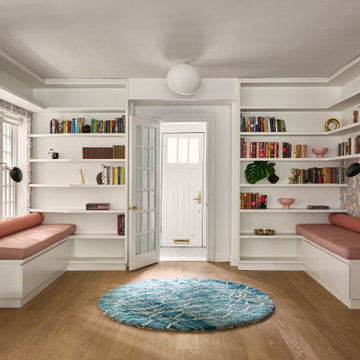
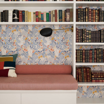
The living room now occupies the center of the plan, serving as a shared hub between the kitchen and the front of the home. Just inside the entry, we designed a custom reading nook framed by floor-to-ceiling bookcases with integrated bench seating—an intentional space for the couple and their teenage daughter, who value reading and wanted their books to be both displayed and actively used.
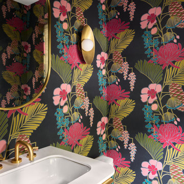
The entry itself was also reimagined. Now separated from the main living space by a wall and door, it functions as a true vestibule with a built-in storage wall for coats and shoes. Tucked beside it is a playful powder room featuring a green vanity, floral wallpaper, and a grey-and-white mosaic tile floor—continued throughout the entry to visually tie the front of the house together and add a moment of personality within the historic shell.
The result is a garden level that remains rooted in its 19th-century architecture but fully supports modern life—light-filled, functional, and thoughtfully layered.

 Wiedemann Architects LLC
This project is a new 5,900 sf. primary residence for a couple with three children. The site is slightly elevated above the residential street and enjoys winter views of the Potomac River.
The family’s requirements included five bedrooms, five full baths, a powder room, family room, dining room, eat-in kitchen, walk-in pantry, mudroom, lower level recreation room, exercise room, media room and numerous storage spaces. Also included was the request for an outdoor terrace and adequate outdoor storage, including provision for the storage of bikes and kayaks. The family needed a home that would have two entrances, the primary entrance, and a mudroom entry that would provide generous storage spaces for the family’s active lifestyle. Due to the small lot size, the challenge was to accommodate the family’s requirements, while remaining sympathetic to the scale of neighboring homes.
The residence employs a “T” shaped plan to aid in minimizing the massing visible from the street, while organizing interior spaces around a private outdoor terrace space accessible from the living and dining spaces. A generous front porch and a gambrel roof diminish the home’s scale, providing a welcoming view along the street front. A path along the right side of the residence leads to the family entrance and a small outbuilding that provides ready access to the bikes and kayaks while shielding the rear terrace from view of neighboring homes.
The two entrances join a central stair hall that leads to the eat-in kitchen overlooking the great room. Window seats and a custom built banquette provide gathering spaces, while the French doors connect the great room to the terrace where the arbor transitions to the garden. A first floor guest suite, separate from the family areas of the home, affords privacy for both guests and hosts alike. The second floor Master Suite enjoys views of the Potomac River through a second floor arched balcony visible from the front.
The exterior is composed of a board and batten first floor with a cedar shingled second floor and gambrel roof. These two contrasting materials and the inclusion of a partially recessed front porch contribute to the perceived diminution of the home’s scale relative to its smaller neighbors. The overall intention was to create a close fit between the residence and the neighboring context, both built and natural.
Builder: E.H. Johnstone Builders
Anice Hoachlander Photography
 O'Brien Harris LLC
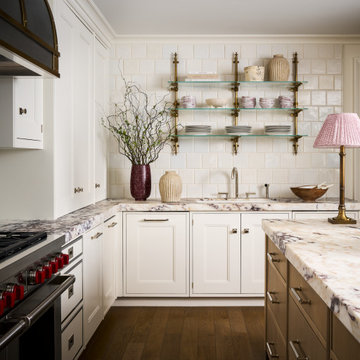
This Lakeview renovation takes place in a mid-rise building with sweeping views of Lake Michigan. Designed for a couple who loves to entertain, the kitchen was reimagined to maximize storage and counterspace without compromising its airy feel.
Custom inserts were used to organize utensils and dinnerware, while pocket doors conceal small appliances—keeping the compact layout clean and clutter-free. The cabinetry is painted in a crisp white, anchored by a stained London Oak island that adds warmth and contrast.
To maintain a light, open atmosphere, the design team opted for open shelving with Parisian detailing in lieu of upper cabinetry. Hardwired tabletop lamps were chosen over decorative pendants, reinforcing O’Brien Harris’s philosophy of blending the kitchen seamlessly into the living space.
The design strikes a balance between contemporary and traditional. Polished metal-banded drawers bring a modern edge, while the shelving and lamps introduce classic character. A peninsula provides visual separation from the dining area—serving as both a prep surface and a buffet when entertaining.
This tailored, multi-functional kitchen reflects O’Brien Harris’s signature approach: timeless design, refined detail, and thoughtful living.
Location: Lakeview, Chicago, IL | Custom Cabinetry: O’Brien Harris | Interior Designer: James Thomas Interiors | Builder: Bill Wangler | Photography: Ryan McDonald | Kitchen & Dining Room Cabinetry: Painted finish with natural walnut interiors. Island is white oak in London Oak finish. Door style is Refectory | Butler’s Pantry Cabinetry: Painted in a vintage wine finish using the Refectory door style with natural walnut interiors
Featured Article: Luxe Interiors + Design

 AoDK Inc.
A couple wanted a weekend retreat without spending a majority of their getaway in an automobile. Therefore, a lot was purchased along the Rocky River with the vision of creating a nearby escape less than five miles away from their home. This 1,300 sf 24’ x 24’ dwelling is divided into a four square quadrant with the goal to create a variety of interior and exterior experiences while maintaining a rather small footprint.
Typically, when going on a weekend retreat one has the drive time to decompress. However, without this, the goal was to create a procession from the car to the house to signify such change of context. This concept was achieved through the use of a wood slatted screen wall which must be passed through. After winding around a collection of poured concrete steps and walls one comes to a wood plank bridge and crosses over a Japanese garden leaving all the stresses of the daily world behind.
The house is structured around a nine column steel frame grid, which reinforces the impression one gets of the four quadrants. The two rear quadrants intentionally house enclosed program space but once passed through, the floor plan completely opens to long views down to the mouth of the river into Lake Erie.
On the second floor the four square grid is stacked with one quadrant removed for the two story living area on the first floor to capture heightened views down the river. In a move to create complete separation there is a one quadrant roof top office with surrounding roof top garden space. The rooftop office is accessed through a unique approach by exiting onto a steel grated staircase which wraps up the exterior facade of the house. This experience provides an additional retreat within their weekend getaway, and serves as the apex of the house where one can completely enjoy the views of Lake Erie disappearing over the horizon.
Visually the house extends into the riverside site, but the four quadrant axis also physically extends creating a series of experiences out on the property. The Northeast kitchen quadrant extends out to become an exterior kitchen & dining space. The two-story Northwest living room quadrant extends out to a series of wrap around steps and lounge seating. A fire pit sits in this quadrant as well farther out in the lawn. A fruit and vegetable garden sits out in the Southwest quadrant in near proximity to the shed, and the entry sequence is contained within the Southeast quadrant extension. Internally and externally the whole house is organized in a simple and concise way and achieves the ultimate goal of creating many different experiences within a rationally sized footprint.
Photo: Sergiu Stoian

 JRP Design & Remodel
After purchasing their ideal ranch style home built in the ‘70s, our clients had requested some major updates and needs throughout the house. The couple loved to cook and desired a large kitchen with professional appliances and a space that connects with the family room for ultimate entertaining. The husband wanted a retreat of his own with office space and a separate bathroom. Both clients disliked the ‘70s aesthetic of their outdated master suite and agreed that too would need a complete update.
The JRP Team focused on the strategic removal of several walls between the entrance, living room, and kitchen to establish a new balance by creating an open floor plan that embraces the natural flow of the home. The luxurious kitchen turned out to be the highlight of the home with beautifully curated materials and double islands. The expanded master bedroom creates space for a relocated and enlarged master bath with walk-in closet. Adding new four panel doors to the backyard of the master suite anchors the room, filling the space with natural light. A large addition was necessary to accommodate the "Man Cave" which provides an exclusive retreat complete with wet bar– perfect for entertaining or relaxing. The remodel took a dated, choppy and disconnected floor plan to a bespoke haven sparkling with natural light and gorgeous finishes.
PROJECT DETAILS:
• Style: Traditional
• Countertops: Quartzite - White Pearl (Cloudy)
• Cabinets: Dewils, Lakewood (Frameless), Maple, Just White / Brittany Blue / Shadow Gray
• Hardware/Plumbing Fixture Finish: Polished Chrome
• Lighting Fixtures: Chandeliers
• Flooring: White Oak – Galleher, Limestone / Brushed
• Tile/Backsplash: Ceramic – Emser, Craft, Garft Gray in Gloss
• Paint Color: Perspective
• Other Details: Pot Filler / Coffered Ceiling & Fireplace in Dining Room
• Photographer: J.R. Maddox
Sponsored
Plain City, OH

The Creative Kitchen Company
Columbus Area Kitchen Remodeling and Refacing Professional
 kimberly peck architect
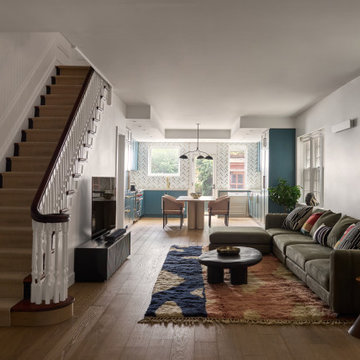
This landmarked brownstone on Prospect Park West already had extraordinary bones—and the rare advantage of windows on three sides. That natural light allowed us to rethink the traditional parlor-floor layout into something more open, connected, and reflective of the way the family lives today, while still honoring the building’s historic character.
The original sequence—a front parlor, a formal dining room in the center, and a closed-off kitchen at the rear—was replaced with a single, flowing main level anchored by a generous slate-blue kitchen. The cabinetry forms a C-shaped configuration that maximizes storage, creates a natural dining zone, and maintains easy circulation to the backyard through the existing glass French door. A full-height marble backsplash with brass inlay adds subtle drama, extending to the ceiling around the windows, and a built-in desk niche creates a casual workspace that feels fully integrated into the design.
Because storage was a priority, the kitchen includes multiple pantry cabinets and deep pull-outs to keep daily life efficient and uncluttered.
The living room now occupies the center of the plan, serving as a shared hub between the kitchen and the front of the home. Just inside the entry, we designed a custom reading nook framed by floor-to-ceiling bookcases with integrated bench seating—an intentional space for the couple and their teenage daughter, who value reading and wanted their books to be both displayed and actively used.
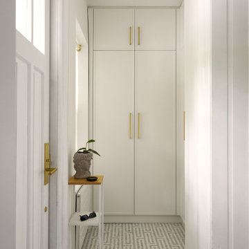
The entry itself was also reimagined. Now separated from the main living space by a wall and door, it functions as a true vestibule with a built-in storage wall for coats and shoes. Tucked beside it is a playful powder room featuring a green vanity, floral wallpaper, and a grey-and-white mosaic tile floor—continued throughout the entry to visually tie the front of the house together and add a moment of personality within the historic shell.
The result is a garden level that remains rooted in its 19th-century architecture but fully supports modern life—light-filled, functional, and thoughtfully layered.
 kimberly peck architect
This landmarked brownstone on Prospect Park West already had extraordinary bones—and the rare advantage of windows on three sides. That natural light allowed us to rethink the traditional parlor-floor layout into something more open, connected, and reflective of the way the family lives today, while still honoring the building’s historic character.
The original sequence—a front parlor, a formal dining room in the center, and a closed-off kitchen at the rear—was replaced with a single, flowing main level anchored by a generous slate-blue kitchen. The cabinetry forms a C-shaped configuration that maximizes storage, creates a natural dining zone, and maintains easy circulation to the backyard through the existing glass French door. A full-height marble backsplash with brass inlay adds subtle drama, extending to the ceiling around the windows, and a built-in desk niche creates a casual workspace that feels fully integrated into the design.
Because storage was a priority, the kitchen includes multiple pantry cabinets and deep pull-outs to keep daily life efficient and uncluttered.
The living room now occupies the center of the plan, serving as a shared hub between the kitchen and the front of the home. Just inside the entry, we designed a custom reading nook framed by floor-to-ceiling bookcases with integrated bench seating—an intentional space for the couple and their teenage daughter, who value reading and wanted their books to be both displayed and actively used.
The entry itself was also reimagined. Now separated from the main living space by a wall and door, it functions as a true vestibule with a built-in storage wall for coats and shoes. Tucked beside it is a playful powder room featuring a green vanity, floral wallpaper, and a grey-and-white mosaic tile floor—continued throughout the entry to visually tie the front of the house together and add a moment of personality within the historic shell.
The result is a garden level that remains rooted in its 19th-century architecture but fully supports modern life—light-filled, functional, and thoughtfully layered.
 Christensen Design Management
History:
Client was given a property, that was extremely difficult to build on, with a very steep, 25-30' drop. They tried to sell the property for many years, with no luck. They finally decided that they should build something on it, for themselves, to prove it could be done. No access was allowed at the top of the steep incline. Client assumed it would be an expensive foundation built parallel to the hillside, somehow.
Program:
The program involved a level for one floor living, (LR/DR/KIT/MBR/UTILITY) as an age-in-place for this recently retired couple. Any other levels should have additional bedrooms that could also feel like a separate AirBnB space, or allow for a future caretaker. There was also a desire for a garage with a recreational vehicle and regular car. The main floor should take advantage of the primary views to the southwest, even though the lot faces due west. Also a desire for easy access to an upper level trail and low maintenance materials with easy maintenance access to roof. The preferred style was a fresher, contemporary feel.
Solution:
A concept design was presented, initially desired by the client, parallel to the hillside, as they had originally envisioned.
An alternate idea was also presented, that was perpendicular to the steep hillside. This avoided having difficult foundations on the steep hillside, by spanning... over it. It also allowed the top, main floor to be farther out on the west end of the site to avoid neighboring view blockage & to better see the primary southwest view. Savings in foundation costs allowed the installation of a residential elevator to get from the garage to the top, main living level. Stairs were also available for regular exercise. An exterior deck was angled towards the primary SW view to the San Juan Islands. The roof was originally desired to be a hip style on all sides, but a better solution allowed for a simple slope back to the 10' high east side for easier maintenance & access, since the west side was almost 50' high!
The clients undertook this home as a speculative, temporary project, intending for it to add value, to sell. However, the unexpected solution, and experience in living here, has them wanting to stay forever.

 ZeroEnergy Design
This renovated brick rowhome in Boston’s South End offers a modern aesthetic within a historic structure, creative use of space, exceptional thermal comfort, a reduced carbon footprint, and a passive stream of income.
DESIGN PRIORITIES. The goals for the project were clear - design the primary unit to accommodate the family’s modern lifestyle, rework the layout to create a desirable rental unit, improve thermal comfort and introduce a modern aesthetic. We designed the street-level entry as a shared entrance for both the primary and rental unit. The family uses it as their everyday entrance - we planned for bike storage and an open mudroom with bench and shoe storage to facilitate the change from shoes to slippers or bare feet as they enter their home. On the main level, we expanded the kitchen into the dining room to create an eat-in space with generous counter space and storage, as well as a comfortable connection to the living space. The second floor serves as master suite for the couple - a bedroom with a walk-in-closet and ensuite bathroom, and an adjacent study, with refinished original pumpkin pine floors. The upper floor, aside from a guest bedroom, is the child's domain with interconnected spaces for sleeping, work and play. In the play space, which can be separated from the work space with new translucent sliding doors, we incorporated recreational features inspired by adventurous and competitive television shows, at their son’s request.
MODERN MEETS TRADITIONAL. We left the historic front facade of the building largely unchanged - the security bars were removed from the windows and the single pane windows were replaced with higher performing historic replicas. We designed the interior and rear facade with a vision of warm modernism, weaving in the notable period features. Each element was either restored or reinterpreted to blend with the modern aesthetic. The detailed ceiling in the living space, for example, has a new matte monochromatic finish, and the wood stairs are covered in a dark grey floor paint, whereas the mahogany doors were simply refinished. New wide plank wood flooring with a neutral finish, floor-to-ceiling casework, and bold splashes of color in wall paint and tile, and oversized high-performance windows (on the rear facade) round out the modern aesthetic.
RENTAL INCOME. The existing rowhome was zoned for a 2-family dwelling but included an undesirable, single-floor studio apartment at the garden level with low ceiling heights and questionable emergency egress. In order to increase the quality and quantity of space in the rental unit, we reimagined it as a two-floor, 1 or 2 bedroom, 2 bathroom apartment with a modern aesthetic, increased ceiling height on the lowest level and provided an in-unit washer/dryer. The apartment was listed with Jackie O'Connor Real Estate and rented immediately, providing the owners with a source of passive income.
ENCLOSURE WITH BENEFITS. The homeowners sought a minimal carbon footprint, enabled by their urban location and lifestyle decisions, paired with the benefits of a high-performance home. The extent of the renovation allowed us to implement a deep energy retrofit (DER) to address air tightness, insulation, and high-performance windows. The historic front facade is insulated from the interior, while the rear facade is insulated on the exterior. Together with these building enclosure improvements, we designed an HVAC system comprised of continuous fresh air ventilation, and an efficient, all-electric heating and cooling system to decouple the house from natural gas. This strategy provides optimal thermal comfort and indoor air quality, improved acoustic isolation from street noise and neighbors, as well as a further reduced carbon footprint. We also took measures to prepare the roof for future solar panels, for when the South End neighborhood’s aging electrical infrastructure is upgraded to allow them.
URBAN LIVING. The desirable neighborhood location allows the both the homeowners and tenant to walk, bike, and use public transportation to access the city, while each charging their respective plug-in electric cars behind the building to travel greater distances.
OVERALL. The understated rowhouse is now ready for another century of urban living, offering the owners comfort and convenience as they live life as an expression of their values.
Eric Roth Photo
Sponsored
Columbus, OH

Structural Remodeling
Franklin County's Heavy Timber Specialists | Best of Houzz 2020!
 kimberly peck architect
This landmarked brownstone on Prospect Park West already had extraordinary bones—and the rare advantage of windows on three sides. That natural light allowed us to rethink the traditional parlor-floor layout into something more open, connected, and reflective of the way the family lives today, while still honoring the building’s historic character.
The original sequence—a front parlor, a formal dining room in the center, and a closed-off kitchen at the rear—was replaced with a single, flowing main level anchored by a generous slate-blue kitchen. The cabinetry forms a C-shaped configuration that maximizes storage, creates a natural dining zone, and maintains easy circulation to the backyard through the existing glass French door. A full-height marble backsplash with brass inlay adds subtle drama, extending to the ceiling around the windows, and a built-in desk niche creates a casual workspace that feels fully integrated into the design.
Because storage was a priority, the kitchen includes multiple pantry cabinets and deep pull-outs to keep daily life efficient and uncluttered.
The living room now occupies the center of the plan, serving as a shared hub between the kitchen and the front of the home. Just inside the entry, we designed a custom reading nook framed by floor-to-ceiling bookcases with integrated bench seating—an intentional space for the couple and their teenage daughter, who value reading and wanted their books to be both displayed and actively used.
The entry itself was also reimagined. Now separated from the main living space by a wall and door, it functions as a true vestibule with a built-in storage wall for coats and shoes. Tucked beside it is a playful powder room featuring a green vanity, floral wallpaper, and a grey-and-white mosaic tile floor—continued throughout the entry to visually tie the front of the house together and add a moment of personality within the historic shell.
The result is a garden level that remains rooted in its 19th-century architecture but fully supports modern life—light-filled, functional, and thoughtfully layered.
 kimberly peck architect
This landmarked brownstone on Prospect Park West already had extraordinary bones—and the rare advantage of windows on three sides. That natural light allowed us to rethink the traditional parlor-floor layout into something more open, connected, and reflective of the way the family lives today, while still honoring the building’s historic character.
The original sequence—a front parlor, a formal dining room in the center, and a closed-off kitchen at the rear—was replaced with a single, flowing main level anchored by a generous slate-blue kitchen. The cabinetry forms a C-shaped configuration that maximizes storage, creates a natural dining zone, and maintains easy circulation to the backyard through the existing glass French door. A full-height marble backsplash with brass inlay adds subtle drama, extending to the ceiling around the windows, and a built-in desk niche creates a casual workspace that feels fully integrated into the design.
Because storage was a priority, the kitchen includes multiple pantry cabinets and deep pull-outs to keep daily life efficient and uncluttered.
The living room now occupies the center of the plan, serving as a shared hub between the kitchen and the front of the home. Just inside the entry, we designed a custom reading nook framed by floor-to-ceiling bookcases with integrated bench seating—an intentional space for the couple and their teenage daughter, who value reading and wanted their books to be both displayed and actively used.
The entry itself was also reimagined. Now separated from the main living space by a wall and door, it functions as a true vestibule with a built-in storage wall for coats and shoes. Tucked beside it is a playful powder room featuring a green vanity, floral wallpaper, and a grey-and-white mosaic tile floor—continued throughout the entry to visually tie the front of the house together and add a moment of personality within the historic shell.
The result is a garden level that remains rooted in its 19th-century architecture but fully supports modern life—light-filled, functional, and thoughtfully layered.

 Finesse Design Remodeling
The perfect place to entertain or relax and read a book with natural lighting. Ken Wyner Photography
Inspiration for a small transitional open concept medium tone wood floor and brown floor family room library remodel in DC Metro with gray walls and no fireplace
Inspiration for a small transitional open concept medium tone wood floor and brown floor family room library remodel in DC Metro with gray walls and no fireplace
125