
Search results for "Separated couples" in Home Design Ideas

 JRP Design & Remodel
After purchasing their ideal ranch style home built in the ‘70s, our clients had requested some major updates and needs throughout the house. The couple loved to cook and desired a large kitchen with professional appliances and a space that connects with the family room for ultimate entertaining. The husband wanted a retreat of his own with office space and a separate bathroom. Both clients disliked the ‘70s aesthetic of their outdated master suite and agreed that too would need a complete update.
The JRP Team focused on the strategic removal of several walls between the entrance, living room, and kitchen to establish a new balance by creating an open floor plan that embraces the natural flow of the home. The luxurious kitchen turned out to be the highlight of the home with beautifully curated materials and double islands. The expanded master bedroom creates space for a relocated and enlarged master bath with walk-in closet. Adding new four panel doors to the backyard of the master suite anchors the room, filling the space with natural light. A large addition was necessary to accommodate the "Man Cave" which provides an exclusive retreat complete with wet bar– perfect for entertaining or relaxing. The remodel took a dated, choppy and disconnected floor plan to a bespoke haven sparkling with natural light and gorgeous finishes.
PROJECT DETAILS:
• Style: Traditional
• Countertops: Quartzite - White Pearl (Cloudy)
• Cabinets: Dewils, Lakewood (Frameless), Maple, Just White / Brittany Blue / Shadow Gray
• Hardware/Plumbing Fixture Finish: Polished Chrome
• Lighting Fixtures: Chandeliers
• Flooring: White Oak – Galleher, Limestone / Brushed
• Tile/Backsplash: Ceramic – Emser, Craft, Garft Gray in Gloss
• Paint Color: Perspective
• Other Details: Pot Filler / Coffered Ceiling & Fireplace in Dining Room
• Photographer: J.R. Maddox
 Simply Home Decorating
This beautiful North Vancouver home belongs to a nature-loving and health-conscious couple, Emma and Vince (names changed), their two young children, and their dog, Jasper. When they contacted us about renovating and furnishing their kitchen and family room, we walked in and saw a world of potential waiting to be uncovered.
Before: Larkhall Crescent Home:
Like many original North Vancouver homes, the interior was definitely dated. We encountered late ‘80s finishes in powder pink and teal green, old carpet, and a kitchen that wasn’t maximized to suit this family’s modern-day lifestyle. However, the size of the rooms offered us a ton of space with which to get creative.
Knowing our clients’ love of cooking, need for work spaces (Emma and Vince both work remotely), and growing family, we developed a design concept that would increase usable space, optimize storage, and create intimacy in this large area. As for the style, we were inspired by their European roots, inventing a new and modern take on “Belgian Farmhouse” style. Now, the home is truly one-of-a-kind.
After: Warm & Cozy Family Room:
Fresh, bright, and comfortable, this living area has been transformed! We started with the fireplace as a focal point, selecting aged brick tiles for added texture and a crisp wood mantle. The taupe-coloured sectional infuses the room with visual warmth and serves the added purpose of separating the family room from the kitchen.
Emma and Vince were also keen on using non-toxic materials in their home, and we were happy to oblige. To meet their needs, we sourced natural wood elements and sought out Canadian-made products - that adhere to high health standards - whenever possible.
Look closer at the elements of this space, and you will find this stunning, honeycomb-patterned rug in earthy gold, beige, and charcoal tones. It’s plush to the touch and full of visual texture that brings this room’s colour palette together. We sourced these two-tone chairs with caning, petrified wood side table, black sconces, and botanical prints in greyscale from local artist, Heather Johnston.
We topped off the space with this dark wood and rattan console that offers storage facing the kitchen and presents an opportunity to display cherished items. The result is a cozy lounging space brimming with comfort and functionality. It’s perfect for enjoying quality family time, or Emma can simply slide the coffee table away to make room for her morning yoga practice.
Now, let’s turn around and give some attention to the kitchen. Do you remember what the original kitchen looked like? If not, scroll back up, because the transformation is shocking…
Moody & Welcoming Kitchen for Healthy Living:
This kitchen looks very different from how it started, right? Though we didn’t touch any walls, the kitchen has almost doubled in usable space! We created a long, extended island with storage, an outlet for small appliances, and seating for comfortable prep, after-school snacking, or mingling among friends.
On the other side of the island, the family has even more storage and an integrated dishwasher within easy reach of the sink, perfect for quick clean-up. From this angle, you can also see the expansive custom Shaker cabinetry in white and the integrated double ovens. These facilitate their cooking experience and gave us the opportunity to add an additional surprise…
A coffee garage station and more hidden storage! Keeping these items located along the perimeter allows them to be accessed by the family or their guests without someone getting under the cook’s feet. These are the little details that make everyday life easier and more enjoyable.
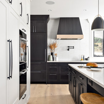
Moving deeper into the kitchen, the seamless induction cooktop topped with a freestanding concealed hood fan commands attention in a soft yet prominent way. The natural wood accent mirrors the fireplace mantle, and the choice of off-black wood-grain cabinets not only continues our black-and-white colour palette but adds a sense of depth and contrast. The corner sink is located to the right and perfectly positioned with a view of their thriving backyard.
To invite more of this family’s character into the space, we mixed metals for interest — matte black, dark pewter, and warm brass — and created open shelves in white oak for their plants and decor. You can also glimpse the tumbled edge of the backsplash tile, which echoes the rustic brick of the fireplace. It adds that farmhouse charm while still feeling timeless and sophisticated.
Last but not least, we designed this dining banquette in the bay window (with integrated bench storage, of course), where the family can share a meal together, the kids can do homework, or Emma and Vince can work and enjoy a change of scenery from their offices. Like the other spaces in the home, it was designed to be beautiful, multi-functional, and long-lasting.
Praise from Our Clients:
It is clear that we love this home, but what did our clients have to say?
“Lori is a visionary and masters execution to the finest detail all at the same time. When she first met us to know more about who we are and how we live, she could right away envision how we could use the space in our kitchen and living room…The results exceeded our expectations.
Lori and her team were also a delight to work with — coordination with all the trades, fast problem-solving, regular updates, professional and friendly attitude of her entire team — made it the dream team. Thank you SHD for making our space so beautiful!”
In turn, we are so grateful for this family’s trust, their open communication, and for being wonderful people with whom to work. (So, thank you!)
 kimberly peck architect
This landmarked brownstone on Prospect Park West already had extraordinary bones—and the rare advantage of windows on three sides. That natural light allowed us to rethink the traditional parlor-floor layout into something more open, connected, and reflective of the way the family lives today, while still honoring the building’s historic character.
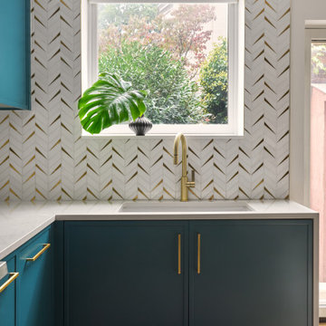
The original sequence—a front parlor, a formal dining room in the center, and a closed-off kitchen at the rear—was replaced with a single, flowing main level anchored by a generous slate-blue kitchen. The cabinetry forms a C-shaped configuration that maximizes storage, creates a natural dining zone, and maintains easy circulation to the backyard through the existing glass French door. A full-height marble backsplash with brass inlay adds subtle drama, extending to the ceiling around the windows, and a built-in desk niche creates a casual workspace that feels fully integrated into the design.
Because storage was a priority, the kitchen includes multiple pantry cabinets and deep pull-outs to keep daily life efficient and uncluttered.
The living room now occupies the center of the plan, serving as a shared hub between the kitchen and the front of the home. Just inside the entry, we designed a custom reading nook framed by floor-to-ceiling bookcases with integrated bench seating—an intentional space for the couple and their teenage daughter, who value reading and wanted their books to be both displayed and actively used.
The entry itself was also reimagined. Now separated from the main living space by a wall and door, it functions as a true vestibule with a built-in storage wall for coats and shoes. Tucked beside it is a playful powder room featuring a green vanity, floral wallpaper, and a grey-and-white mosaic tile floor—continued throughout the entry to visually tie the front of the house together and add a moment of personality within the historic shell.
The result is a garden level that remains rooted in its 19th-century architecture but fully supports modern life—light-filled, functional, and thoughtfully layered.
Find the right local pro for your project

 Advance Design Studio, Ltd.
Karen and Chad of Tower Lakes, IL were tired of their unfinished basement functioning as nothing more than a storage area and depressing gym. They wanted to increase the livable square footage of their home with a cohesive finished basement design, while incorporating space for the kids and adults to hang out.
“We wanted to make sure that upon renovating the basement, that we can have a place where we can spend time and watch movies, but also entertain and showcase the wine collection that we have,” Karen said.
After a long search comparing many different remodeling companies, Karen and Chad found Advance Design Studio. They were drawn towards the unique “Common Sense Remodeling” process that simplifies the renovation experience into predictable steps focused on customer satisfaction.
“There are so many other design/build companies, who may not have transparency, or a focused process in mind and I think that is what separated Advance Design Studio from the rest,” Karen said.
Karen loved how designer Claudia Pop was able to take very high-level concepts, “non-negotiable items” and implement them in the initial 3D drawings. Claudia and Project Manager DJ Yurik kept the couple in constant communication through the project. “Claudia was very receptive to the ideas we had, but she was also very good at infusing her own points and thoughts, she was very responsive, and we had an open line of communication,” Karen said.
A very important part of the basement renovation for the couple was the home gym and sauna. The “high-end hotel” look and feel of the openly blended work out area is both highly functional and beautiful to look at. The home sauna gives them a place to relax after a long day of work or a tough workout. “The gym was a very important feature for us,” Karen said. “And I think (Advance Design) did a very great job in not only making the gym a functional area, but also an aesthetic point in our basement”.
An extremely unique wow-factor in this basement is the walk in glass wine cellar that elegantly displays Karen and Chad’s extensive wine collection. Immediate access to the stunning wet bar accompanies the wine cellar to make this basement a popular spot for friends and family.
The custom-built wine bar brings together two natural elements; Calacatta Vicenza Quartz and thick distressed Black Walnut. Sophisticated yet warm Graphite Dura Supreme cabinetry provides contrast to the soft beige walls and the Calacatta Gold backsplash. An undermount sink across from the bar in a matching Calacatta Vicenza Quartz countertop adds functionality and convenience to the bar, while identical distressed walnut floating shelves add an interesting design element and increased storage. Rich true brown Rustic Oak hardwood floors soften and warm the space drawing all the areas together.
Across from the bar is a comfortable living area perfect for the family to sit down at a watch a movie. A full bath completes this finished basement with a spacious walk-in shower, Cocoa Brown Dura Supreme vanity with Calacatta Vicenza Quartz countertop, a crisp white sink and a stainless-steel Voss faucet.
Advance Design’s Common Sense process gives clients the opportunity to walk through the basement renovation process one step at a time, in a completely predictable and controlled environment. “Everything was designed and built exactly how we envisioned it, and we are really enjoying it to it’s full potential,” Karen said.
Constantly striving for customer satisfaction, Advance Design’s success is heavily reliant upon happy clients referring their friends and family. “We definitely will and have recommended Advance Design Studio to friends who are looking to embark on a remodeling project small or large,” Karen exclaimed at the completion of her project.

 Bella Domicile
Dale Hall Photography
Cushman Construction LLC
Trendy l-shaped eat-in kitchen photo in Milwaukee with an undermount sink, flat-panel cabinets, medium tone wood cabinets, glass tile backsplash and stainless steel appliances
Trendy l-shaped eat-in kitchen photo in Milwaukee with an undermount sink, flat-panel cabinets, medium tone wood cabinets, glass tile backsplash and stainless steel appliances

 Michael Nash Design, Build & Homes
Kitchen Over 150K
If you ever found yourself shopping for a new home, finding a model home, falling in love with this model home and immediately signing on the dotted line. Yet after a few months of moving into your new home you realize that the kitchen and the layout of main level will not work out for your lifestyle. The model home you fell in love with was furnished with beautiful furniture distracting you from concentrating on what is really important to you. This is what happened to this couple in Ashburn, VA, after purchasing their dream home.
The kitchen lacked natural light, while its location was not ideal and was disrupting their daily routine. After a careful review of the kitchen design, a plan was formed to upgrade the kitchen.
Their kitchen was moved to a location between the two-story family room and front dining room. To the left of the family room there was a breakfast eating area that was not serving any purpose.
Our design incorporated the breakfast area placed along a couple feet from an adjacent pantry space to create this new dream kitchen.
By knocking down a few bearing walls, we have placed the main sink area under large backside windows. Now the kitchen can look into their beautiful backyard. A major load bearing wall between the old breakfast room and adjacent two-story family was taken down and a big steel beam took the place of that, creating a large seamless connection between the new kitchen and the rest of the home.
A large island was implemented with a prep sink, microwave, and with lots of seating space around it. Large scale professional appliances along with stunning mosaic backsplash tiles complement this amazing kitchen design.
Double barn style door in front of the pantry area sets off this storage space tucked away from rest of the kitchen. All the old tile was removed and a matching wide plank distressed wood floor was installed to create a seamless connection to rest of the home. A matching butler pantry cabinet area just outside of dining room and a wine station/drink serving area between family room and main foyer were added to better utilize the multi-function needs of the family.
The custom inset cabinetry with double layers and exotic stone counter top, distressed ceiling beams, and other amenities are just a few standouts of this project.
 TKS Design Group
Download our free ebook, Creating the Ideal Kitchen. DOWNLOAD NOW
Lakefront property in the northwest suburbs of Chicago is hard to come by, so when we were hired by this young family with exactly that, we were immediately inspired by not just the unusually large footprint of this 1950’s colonial revival but also the lovely views of the manmade lake it was sited on. The large 5-bedroom home was solidly stuck in the 1980’s, but we saw tons of potential. We started out by updating the existing staircase with a fresh coat of paint and adding new herringbone slate to the entry hall.
The powder room off the entryway also got a refresh - new flooring, new cabinets and fixtures. We ran the new slate right through into this space for some consistency. A fun wallpaper and shiplap trim add a welcoming feel and set the tone for the home.
Next, we tackled the kitchen. Located away from the rest of the first floor, the kitchen felt a little isolated, so we immediately began planning for how to better connect it to the rest of the first floor. We landed on removing the wall between the kitchen and dining room and designed a modified galley style space with separate cooking and clean up zones. The cooking zone consists of the refrigerator, prep sink and cooktop, along with a nice long run of prep space at the island. The cleanup side of the kitchen consists of the main sink and dishwasher. Both areas are situated so that the user can view the lake during prep work and cleanup!
One of the home’s main puzzles was how to incorporate the mudroom and area in front of the patio doors at the back of the house. We already had a breakfast table area, so the space by the patio doors was a bit of a no man’s land. We decided to separate the kitchen proper from what became the new mudroom with a large set of barn doors. That way you can quickly hide any mudroom messes but have easy access to the light coming in through the patio doors as well as the outdoor grilling station. We also love the impact the barn doors add to the overall space.
The homeowners’ first words to us were “it’s time to ditch the brown,” so we did! We chose a lovely blue pallet that reflects the home’s location on the lake which is also vibrant yet easy on the eye. Countertops are white quartz, and the natural oak floor works well with the other honey accents. The breakfast table was given a refresh with new chairs, chandelier and window treatments that frame the gorgeous views of the lake out the back.
We coordinated the slate mudroom flooring with that used in the home’s main entrance for a consistent feel. The storage area consists of open and closed storage to allow for some clutter control as needed.
Next on our “to do” list was revamping the dated brown bar area in the neighboring dining room. We eliminated the clutter by adding some closed cabinets and did some easy updates to help the space feel more current. One snag we ran into here was the discovery of a beam above the existing open shelving that had to be modified with a smaller structural beam to allow for our new design to work. This was an unexpected surprise, but in the end we think it was well worth it!
We kept the colors here a bit more muted to blend with the homeowner’s existing furnishings. Open shelving and polished nickel hardware add some simple detail to the new entertainment zone which also looks out onto the lake!
Next we tackled the upstairs starting with the homeowner’s son’s bath. The bath originally had both a tub shower and a separate shower, so we decided to swap out the shower for a new laundry area. This freed up some space downstairs in what used to be the mudroom/laundry room and is much more convenient for daily laundry needs.
We continued the blue palette here with navy cabinetry and the navy tile in the shower. Porcelain floor tile and chrome fixtures keep maintenance to a minimum while matte black mirrors and lighting add some depth the design. A low maintenance runner adds some warmth underfoot and ties the whole space together.
We added a pocket door to the bathroom to minimize interference with the door swings. The left door of the laundry closet is on a 180 degree hinge to allow for easy full access to the machines. Next we tackled the master bath which is an en suite arrangement. The original was typical of the 1980’s with the vanity outside of the bathroom, situated near the master closet. And the brown theme continued here with multiple shades of brown.
Our first move was to segment off the bath and the closet from the master bedroom. We created a short hall from the bedroom to the bathroom with his and hers walk-in closets on the left and right as well as a separate toilet closet outside of the main bathroom for privacy and flexibility.
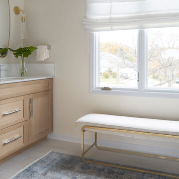
The original bathroom had a giant soaking tub with steps (dangerous!) as well as a small shower that did not work well for our homeowner who is 6’3”. With other bathtubs in the home, they decided to eliminate the tub and create an oversized shower which takes up the space where the old tub was located. The double vanity is on the opposite wall and a bench is located under the window for morning conversations and a place to set a couple of towels.
The pallet in here is light and airy with a mix of blond wood, creamy porcelain and marble tile, and brass accents. A simple roman shade adds some texture and it’s top-down mechanism allows for light and privacy.
This large whole house remodel gave our homeowners not only the ability to maximize the potential of their home but also created a lovely new frame from which to view their fabulous lake views.
Designed by: Susan Klimala, CKD, CBD
Photography by: Michael Kaskel
For more information on kitchen and bath design ideas go to: www.kitchenstudio-ge.com
Sponsored
Sunbury, OH

J.Holderby - Renovations
Franklin County's Leading General Contractors - 2X Best of Houzz!
 Advance Design Studio, Ltd.
Karen and Chad of Tower Lakes, IL were tired of their unfinished basement functioning as nothing more than a storage area and depressing gym. They wanted to increase the livable square footage of their home with a cohesive finished basement design, while incorporating space for the kids and adults to hang out.
“We wanted to make sure that upon renovating the basement, that we can have a place where we can spend time and watch movies, but also entertain and showcase the wine collection that we have,” Karen said.
After a long search comparing many different remodeling companies, Karen and Chad found Advance Design Studio. They were drawn towards the unique “Common Sense Remodeling” process that simplifies the renovation experience into predictable steps focused on customer satisfaction.
“There are so many other design/build companies, who may not have transparency, or a focused process in mind and I think that is what separated Advance Design Studio from the rest,” Karen said.
Karen loved how designer Claudia Pop was able to take very high-level concepts, “non-negotiable items” and implement them in the initial 3D drawings. Claudia and Project Manager DJ Yurik kept the couple in constant communication through the project. “Claudia was very receptive to the ideas we had, but she was also very good at infusing her own points and thoughts, she was very responsive, and we had an open line of communication,” Karen said.
A very important part of the basement renovation for the couple was the home gym and sauna. The “high-end hotel” look and feel of the openly blended work out area is both highly functional and beautiful to look at. The home sauna gives them a place to relax after a long day of work or a tough workout. “The gym was a very important feature for us,” Karen said. “And I think (Advance Design) did a very great job in not only making the gym a functional area, but also an aesthetic point in our basement”.
An extremely unique wow-factor in this basement is the walk in glass wine cellar that elegantly displays Karen and Chad’s extensive wine collection. Immediate access to the stunning wet bar accompanies the wine cellar to make this basement a popular spot for friends and family.
The custom-built wine bar brings together two natural elements; Calacatta Vicenza Quartz and thick distressed Black Walnut. Sophisticated yet warm Graphite Dura Supreme cabinetry provides contrast to the soft beige walls and the Calacatta Gold backsplash. An undermount sink across from the bar in a matching Calacatta Vicenza Quartz countertop adds functionality and convenience to the bar, while identical distressed walnut floating shelves add an interesting design element and increased storage. Rich true brown Rustic Oak hardwood floors soften and warm the space drawing all the areas together.
Across from the bar is a comfortable living area perfect for the family to sit down at a watch a movie. A full bath completes this finished basement with a spacious walk-in shower, Cocoa Brown Dura Supreme vanity with Calacatta Vicenza Quartz countertop, a crisp white sink and a stainless-steel Voss faucet.
Advance Design’s Common Sense process gives clients the opportunity to walk through the basement renovation process one step at a time, in a completely predictable and controlled environment. “Everything was designed and built exactly how we envisioned it, and we are really enjoying it to it’s full potential,” Karen said.
Constantly striving for customer satisfaction, Advance Design’s success is heavily reliant upon happy clients referring their friends and family. “We definitely will and have recommended Advance Design Studio to friends who are looking to embark on a remodeling project small or large,” Karen exclaimed at the completion of her project.
 Drury Design
The Setup
After 25+ years in their home, these long-time clients were ready to upgrade their outdated primary bath into something more modern, functional, and reflective of their personal taste. The original space had all the hallmarks of a ’90s builder-grade bathroom — bulky built-in tub, undersized shower, and a layout that wasn’t making the most of the square footage. With the kids grown and a successful kitchen remodel already under their belt, the couple returned to Drury Design for a complete bathroom transformation.
Design objectives:
Create a contemporary, personalized retreat with clean lines and a calming palette
Incorporate the husband’s favorite color (blue) in a bold but tasteful way
Add more efficient storage, including a long-desired linen closet
Improve lighting and ventilation
Make better use of space, especially in the old tub-and-shower zone
Maintain dual sinks and a dedicated makeup area
Add heated floors for extra comfort
The Remodel
Design challenges to be solved:
Reimagine a large but awkward separate shower/tub room to feel more intentional and spa-like
Integrate bold color in a way that felt stylish, not overpowering
Combine two previously separate sinks into one shared vanity without losing the “his and hers” feel
Maintain a sense of flow and cohesion across two adjoining zones of the bathroom
Create a makeup area that feels set apart without breaking design continuity
Maximize comfort in winter without dramatically inflating the project budget
The Renewed Space
Design solutions:
Shifted the location of the tub and expanded the shower to reconfigure the secondary room into a functional spa space; introduced floating shelves and a linen cabinet to tie it all together
Let the rich blue shower tile take center stage as a statement piece while keeping the rest of the palette subdued and modern with layered grays
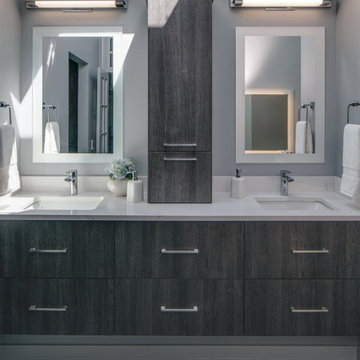
Centered a tall cabinet between the two sinks to provide extra storage and gently divide the shared vanity wall into his-and-hers zones
Chose a freestanding-style tub that installs flush against the wall—preserving the aesthetic while optimizing space and maximizing flow between rooms
Added subtle glam touches — like jewelry-inspired drawer pulls — at the makeup station to give it identity without disrupting the flow
Installed heated floors with programmable settings, offering hotel-level comfort without blowing the budget
Final Thoughts:
The finished space is a stylish blend of utility and serenity. Clean lines, modern finishes, and pops of bold color reflect the homeowners’ taste without overwhelming the design. What was once a dated, underused space is now a calm, contemporary retreat with thoughtful details throughout – from the integrated makeup zone to the just-right splash of color and the luxurious heated floors. Another successful collaboration with Drury Design, this project proves that remodeling isn’t just about resale — it’s about finally getting the space you’ve always wanted, and loving it every day.

 Benson Homes LLC
This remodeling story is a wonderful example of how removing and shifting walls can have an amazing impact on the functionality and visual appeal of an entire level of a home. When our clients reached out to us, they were looking to create an open concept Kitchen that would allow for easy entertaining. The couple had recently purchased this townhome so his mother could be closer to the family.
The existing floorplan offered first floor living, but the Kitchen was tucked in the back and was separated from the rest of the living space by a full wall with a small pass through into the Dining Room. Our design involved removing the dividing wall between the Dining Room and Kitchen as well as the fake columns and beam that separated the Dining Room and Living Room. The entire space was opened up to allow for easy flow and view throughout the first floor living space. The wall shared by the Kitchen and large Master Bedroom was shifted back just enough to provide a full wall of additional cabinetry including a much-needed large double Pantry cabinet. Now that we had opened up the Kitchen area we could focus on the cabinetry layout and selections.
The existing wood toned cabinets were replaced with white cabinets and crown molding to match the rest of the home. The larger, open space allowed for more cabinetry and the addition of an island with new undermount sink, dishwasher and convenient trash pullout along with seating for the grandchildren. A new range hood was installed and vented to the exterior of the house to replace the old recirculating hood. We were able to repurpose the some of the existing cabinets for use above the washer and dryer in the adjoining Laundry Room and swapped out the existing swinging door for a pocket door to free up traffic flow when doing Laundry and working in the Kitchen. The slate-look ceramic tile was replaced with a pre-engineered hardwood floor that creates a sense of warmth while easy to clean. The new Cambria countertop compliments the slate-look tile found in the Dining Room and Living Room and a natural field tile backsplash offsets the cabinets beautifully.
The single fluorescent ceiling light was outdated and did not provide adequate lighting for the new Kitchen. The new lighting plan was carefully thought out to provide general illumination through well placed recessed lighting; task lighting through pendant lighting over the island and under cabinet lighting; and aesthetic fluidity with an eye-catching chandelier for the Dining Room table. Special details include a touch faucet, under counter microwave and glass front cabinetry for displaying dishes.
By removing and shifting walls, we improved the entire flow of the first floor visually as well as functionally and created a beautiful, light-filled space for cooking and entertaining. Grandma can easily prepare meals in her new Kitchen and still chat with her guests and grandchildren who love to sit at the island as well as in the adjoining Dining Room and Living Room.
The Benson Homes team really enjoyed creating this space for this family and we hope they will enjoy spending time with friends and family for years to come.

 Robb & Stucky
This newly completed, one-of-a-kind, island inspired home features generously proportioned rooms including a 46' x 26' great room, 4 bedroom suites, spacious den, study, a double and single garage, all included in a 5,808 sq ft living space.
Robb & Stucky’s Susan Bleda, acted as the Interior Designer on this project and furnished the interior of the home with a coastal style in mind, and a clean fresh look that incorporates the color story of living on the gulf.

 ZeroEnergy Design
Lincoln Farmhouse
LEED-H Platinum, Net-Positive Energy
OVERVIEW. This LEED Platinum certified modern farmhouse ties into the cultural landscape of Lincoln, Massachusetts - a town known for its rich history, farming traditions, conservation efforts, and visionary architecture. The goal was to design and build a new single family home on 1.8 acres that respects the neighborhood’s agrarian roots, produces more energy than it consumes, and provides the family with flexible spaces to live-play-work-entertain. The resulting 2,800 SF home is proof that families do not need to compromise on style, space or comfort in a highly energy-efficient and healthy home.
CONNECTION TO NATURE. The attached garage is ubiquitous in new construction in New England’s cold climate. This home’s barn-inspired garage is intentionally detached from the main dwelling. A covered walkway connects the two structures, creating an intentional connection with the outdoors between auto and home.
FUNCTIONAL FLEXIBILITY. With a modest footprint, each space must serve a specific use, but also be flexible for atypical scenarios. The Mudroom serves everyday use for the couple and their children, but is also easy to tidy up to receive guests, eliminating the need for two entries found in most homes. A workspace is conveniently located off the mudroom; it looks out on to the back yard to supervise the children and can be closed off with a sliding door when not in use. The Away Room opens up to the Living Room for everyday use; it can be closed off with its oversized pocket door for secondary use as a guest bedroom with en suite bath.
NET POSITIVE ENERGY. The all-electric home consumes 70% less energy than a code-built house, and with measured energy data produces 48% more energy annually than it consumes, making it a 'net positive' home. Thick walls and roofs lack thermal bridging, windows are high performance, triple-glazed, and a continuous air barrier yields minimal leakage (0.27ACH50) making the home among the tightest in the US. Systems include an air source heat pump, an energy recovery ventilator, and a 13.1kW photovoltaic system to offset consumption and support future electric cars.
ACTUAL PERFORMANCE. -6.3 kBtu/sf/yr Energy Use Intensity (Actual monitored project data reported for the firm’s 2016 AIA 2030 Commitment. Average single family home is 52.0 kBtu/sf/yr.)
o 10,900 kwh total consumption (8.5 kbtu/ft2 EUI)
o 16,200 kwh total production
o 5,300 kwh net surplus, equivalent to 15,000-25,000 electric car miles per year. 48% net positive.
WATER EFFICIENCY. Plumbing fixtures and water closets consume a mere 60% of the federal standard, while high efficiency appliances such as the dishwasher and clothes washer also reduce consumption rates.
FOOD PRODUCTION. After clearing all invasive species, apple, pear, peach and cherry trees were planted. Future plans include blueberry, raspberry and strawberry bushes, along with raised beds for vegetable gardening. The house also offers a below ground root cellar, built outside the home's thermal envelope, to gain the passive benefit of long term energy-free food storage.
RESILIENCY. The home's ability to weather unforeseen challenges is predictable - it will fare well. The super-insulated envelope means during a winter storm with power outage, heat loss will be slow - taking days to drop to 60 degrees even with no heat source. During normal conditions, reduced energy consumption plus energy production means shelter from the burden of utility costs. Surplus production can power electric cars & appliances. The home exceeds snow & wind structural requirements, plus far surpasses standard construction for long term durability planning.
ARCHITECT: ZeroEnergy Design http://zeroenergy.com/lincoln-farmhouse
CONTRACTOR: Thoughtforms http://thoughtforms-corp.com/
PHOTOGRAPHER: Chuck Choi http://www.chuckchoi.com/
 JRP Design & Remodel
After purchasing their ideal ranch style home built in the ‘70s, our clients had requested some major updates and needs throughout the house. The couple loved to cook and desired a large kitchen with professional appliances and a space that connects with the family room for ultimate entertaining. The husband wanted a retreat of his own with office space and a separate bathroom. Both clients disliked the ‘70s aesthetic of their outdated master suite and agreed that too would need a complete update.
The JRP Team focused on the strategic removal of several walls between the entrance, living room, and kitchen to establish a new balance by creating an open floor plan that embraces the natural flow of the home. The luxurious kitchen turned out to be the highlight of the home with beautifully curated materials and double islands. The expanded master bedroom creates space for a relocated and enlarged master bath with walk-in closet. Adding new four panel doors to the backyard of the master suite anchors the room, filling the space with natural light. A large addition was necessary to accommodate the "Man Cave" which provides an exclusive retreat complete with wet bar– perfect for entertaining or relaxing. The remodel took a dated, choppy and disconnected floor plan to a bespoke haven sparkling with natural light and gorgeous finishes.
PROJECT DETAILS:
• Style: Traditional
• Countertops: Quartzite - White Pearl (Cloudy)
• Cabinets: Dewils, Lakewood (Frameless), Maple, Just White / Brittany Blue / Shadow Gray
• Hardware/Plumbing Fixture Finish: Polished Chrome
• Lighting Fixtures: Chandeliers
• Flooring: White Oak – Galleher, Limestone / Brushed
• Tile/Backsplash: Ceramic – Emser, Craft, Garft Gray in Gloss
• Paint Color: Perspective
• Other Details: Pot Filler / Coffered Ceiling & Fireplace in Dining Room
• Photographer: J.R. Maddox
Sponsored
Columbus, OH

Structural Remodeling
Franklin County's Heavy Timber Specialists | Best of Houzz 2020!

 AoDK Inc.
A couple wanted a weekend retreat without spending a majority of their getaway in an automobile. Therefore, a lot was purchased along the Rocky River with the vision of creating a nearby escape less than five miles away from their home. This 1,300 sf 24’ x 24’ dwelling is divided into a four square quadrant with the goal to create a variety of interior and exterior experiences while maintaining a rather small footprint.
Typically, when going on a weekend retreat one has the drive time to decompress. However, without this, the goal was to create a procession from the car to the house to signify such change of context. This concept was achieved through the use of a wood slatted screen wall which must be passed through. After winding around a collection of poured concrete steps and walls one comes to a wood plank bridge and crosses over a Japanese garden leaving all the stresses of the daily world behind.
The house is structured around a nine column steel frame grid, which reinforces the impression one gets of the four quadrants. The two rear quadrants intentionally house enclosed program space but once passed through, the floor plan completely opens to long views down to the mouth of the river into Lake Erie.
On the second floor the four square grid is stacked with one quadrant removed for the two story living area on the first floor to capture heightened views down the river. In a move to create complete separation there is a one quadrant roof top office with surrounding roof top garden space. The rooftop office is accessed through a unique approach by exiting onto a steel grated staircase which wraps up the exterior facade of the house. This experience provides an additional retreat within their weekend getaway, and serves as the apex of the house where one can completely enjoy the views of Lake Erie disappearing over the horizon.
Visually the house extends into the riverside site, but the four quadrant axis also physically extends creating a series of experiences out on the property. The Northeast kitchen quadrant extends out to become an exterior kitchen & dining space. The two-story Northwest living room quadrant extends out to a series of wrap around steps and lounge seating. A fire pit sits in this quadrant as well farther out in the lawn. A fruit and vegetable garden sits out in the Southwest quadrant in near proximity to the shed, and the entry sequence is contained within the Southeast quadrant extension. Internally and externally the whole house is organized in a simple and concise way and achieves the ultimate goal of creating many different experiences within a rationally sized footprint.

 Paradise Found Construction
A small pinhole in the coupling of the hot water supply line from the Hot Water Heater developed and began leaking and spraying hot steamy mist. Because of its location in the seldom used Finished Full Basement, it initially went unnoticed.
By the time the homeowners noticed the leaking water, the moisture content in the ceiling sheetrock and well down the walls read 100%. The moist, warm environment proved to be ideal for colonies of mold spores to spread throughout the basement, aided by the HVAC systems return and supply lines circulating the mold spores. It didn’t take long before mold patches eventually covered all of the exposed materials and surfaces, furniture included.
The homeowners’ had protection from their insurance policy and were able to have repairs done after this unfortunate disaster.
Construction ensued. The ceiling, floors, and all of the interior and exterior walls were stripped down to the wood framing and masonry and disposed of. The 1st and 2nd Floor HVAC Ductwork was removed, and the entire existing Full Bath was gutted.
The remodeling included increasing the size of the full bath and removing the shower/tub as well as installing a large and comfortable tile shower. We added a small towel closet, and a separate entry into the adjoining room, which would now be reconfigured into a bedroom. A new EPA Water Sense-rated commode, a vanity cabinet with a natural granite countertop and an under-mount sink, a wall-hung mirror, and new sconce lights rounded out the update.
We turned the adjoining room next to the full bath into a bedroom. We added generous closet storage space and new lighting.
We finally turned our attention to the old kitchenette / wet bar. We took away some of the footprint to add to the full bath and designed an efficient and handsome wet bar / kitchenette.
Porcelain tile, no VOC interior paints, a complete replacement of the basement and 1st Floor HVAC ducting, air handler equipment cleaning, and green-certified carpet and pad combined to create a healthy and light-filled living environment.

 Three Roses Interiors
View from front entry of open concept living area, pocket doors leading out to expansive lanai and pool/spa areas.
Inspiration for a huge tropical open concept limestone floor family room remodel in Hawaii with white walls
Inspiration for a huge tropical open concept limestone floor family room remodel in Hawaii with white walls
 Michael Nash Design, Build & Homes
NARI CAPITAL COTY, HONORABLE MENTION AWARD WINNER, RESIDENTIAL KITCHEN $50,000 TO $100,000
The owners of this Mount Vernon home purchased it with plans to remodel the kitchen. The original space was tired, dark and disorganized. A peninsula separated the kitchen from the breakfast area and the adjacent sunroom was only accessed via a single door. The back pantry was poorly designed and there was no logic to the kitchen’s work space.
The first step in this stunning transformation involved replacing the original peninsula with a large central island. Built using espresso stained furniture-quality cabinets with icon legs, open bottoms and exotic dark granite countertops, all kitchen traffic now flows around the island.
The outside wall of the kitchen, featuring a 48” Thermador range, stainless steel range hood and glass tile backsplash, is the focal point of the new space. A stainless steel farm-style sink sits beneath one of two large windows that provide lots of natural light into the room. To the right, sits a 48” Sub Zero refrigerator/freezer.
The wall adjacent to the family room was never used properly. Now it is home to two tall pantries, double ovens and a microwave. Creative pass through arches let the homeowner attend to guests while preparing food in the kitchen. The butler area adjacent to the dining room is filled with glass front cabinetry and additional cabinetry for extra storage.
The kitchen is now part of an open concept design flowing from kitchen to dining room to sun room. By replacing a bearing wall with a structural header, traffic can flow from one room to the next making it brighter and more conducive to entertaining.
More spacious than ever, this new kitchen is the hub of the home for this couple who love to cook and entertain.
Sponsored
Plain City, OH

The Creative Kitchen Company
Columbus Area Kitchen Remodeling and Refacing Professional
 Paradise Found Construction
A small pinhole in the coupling of the hot water supply line from the Hot Water Heater developed and began leaking and spraying hot steamy mist. Because of its location in the seldom used Finished Full Basement, it initially went unnoticed.
By the time the homeowners noticed the leaking water, the moisture content in the ceiling sheetrock and well down the walls read 100%. The moist, warm environment proved to be ideal for colonies of mold spores to spread throughout the basement, aided by the HVAC systems return and supply lines circulating the mold spores. It didn’t take long before mold patches eventually covered all of the exposed materials and surfaces, furniture included.
The homeowners’ had protection from their insurance policy and were able to have repairs done after this unfortunate disaster.
Construction ensued. The ceiling, floors, and all of the interior and exterior walls were stripped down to the wood framing and masonry and disposed of. The 1st and 2nd Floor HVAC Ductwork was removed, and the entire existing Full Bath was gutted.
The remodeling included increasing the size of the full bath and removing the shower/tub as well as installing a large and comfortable tile shower. We added a small towel closet, and a separate entry into the adjoining room, which would now be reconfigured into a bedroom. A new EPA Water Sense-rated commode, a vanity cabinet with a natural granite countertop and an under-mount sink, a wall-hung mirror, and new sconce lights rounded out the update.
We turned the adjoining room next to the full bath into a bedroom. We added generous closet storage space and new lighting.
We finally turned our attention to the old kitchenette / wet bar. We took away some of the footprint to add to the full bath and designed an efficient and handsome wet bar / kitchenette.
Porcelain tile, no VOC interior paints, a complete replacement of the basement and 1st Floor HVAC ducting, air handler equipment cleaning, and green-certified carpet and pad combined to create a healthy and light-filled living environment.

 Dura Supreme Cabinetry
Plunge in your new bath with darling design elements to create a coordinated bathroom with a surprising appeal. Small spaces call for big design details like the ornate turn posts that frame the sink area to create a compelling look for the bath vanity. Select the most inviting and luxurious materials to create a relaxing space that rejuvenates as it soothes and calms. Coordinating bath furniture from Dura Supreme brings all the details together with your choice of beautiful styles and finishes.
A linen cabinet with a mirrored back beautifully displays stacks of towels and bathroom sundries. These furniture vanities showcase Dura Supreme’s “Style Five” furniture series. Style Five is designed with a selection of turned posts for iconic furniture style to meet your personal tastes. The two individual vanities separated by the free-standing linen cabinet provide each spouse their own divided space to organize their personal bath supplies, while the linen cabinet provides universal storage for items the couple will both use.
Style Five furniture series offers 10 different configurations (for single sink vanities, double sink vanities, or offset sinks), 15 turn post designs and an optional floor with either plain or slatted detail. A selection of classic post designs offers personalized design choices. Any combination of Dura Supreme’s many door styles, wood species, and finishes can be selected to create a one-of-a-kind bath furniture collection.
The bathroom has evolved from its purist utilitarian roots to a more intimate and reflective sanctuary in which to relax and reconnect. A refreshing spa-like environment offers a brisk welcome at the dawning of a new day or a soothing interlude as your day concludes.
Our busy and hectic lifestyles leave us yearning for a private place where we can truly relax and indulge. With amenities that pamper the senses and design elements inspired by luxury spas, bathroom environments are being transformed from the mundane and utilitarian to the extravagant and luxurious.
Bath cabinetry from Dura Supreme offers myriad design directions to create the personal harmony and beauty that are a hallmark of the bath sanctuary. Immerse yourself in our expansive palette of finishes and wood species to discover the look that calms your senses and soothes your soul. Your Dura Supreme designer will guide you through the selections and transform your bath into a beautiful retreat.
Request a FREE Dura Supreme Brochure Packet:
http://www.durasupreme.com/request-brochure
Find a Dura Supreme Showroom near you today:
http://www.durasupreme.com/dealer-locator

 Bilotta Kitchen & Home
This clean and classic Northern Westchester kitchen features a mix of colors and finishes. The perimeter of the kitchen including the desk area is painted in Benjamin Moore’s Nordic White with satin chrome hardware. The island features Benjamin Moore’s Blue Toile with satin brass hardware. The focal point of the space is the Cornu Fe range and custom hood in satin black with brass and chrome trim. Crisp white subway tile covers the backwall behind the cooking area and all the way up the sink wall to the ceiling. In place of wall cabinets, the client opted for thick white open shelves on either side of the window above the sink to keep the space more open and airier. Countertops are a mix of Neolith’s Estatuario on the island and Ash Grey marble on the perimeter. Hanging above the island are Circa Lighting’s the “Hicks Large Pendants” by designer Thomas O’Brien; above the dining table is Tom Dixon’s “Fat Pendant”.
Just off of the kitchen is a wet bar conveniently located next to the living area, perfect for entertaining guests. They opted for a contemporary look in the space. The cabinetry is Yosemite Bronzato laminate in a high gloss finish coupled with open glass shelves and a mirrored backsplash. The mirror and the abundance of windows makes the room appear larger than it is.
Bilotta Senior Designer: Rita LuisaGarces
Architect: Hirshson Design & Architecture
Photographer: Stefan Radtke
126