
Search results for "Separation matters" in Home Design Ideas
 Ania Omski-Talwar Interior Design
Ania Omski-Talwar
Location: Lincoln Park, Chicago, IL, USA
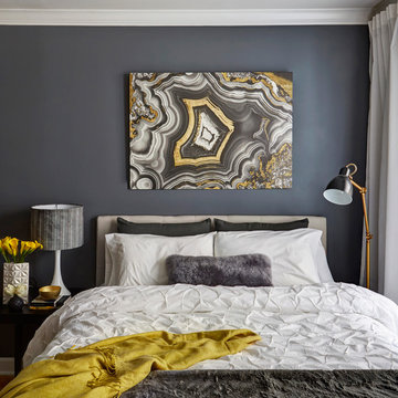
At 166 sq ft, the size of the living/sleeping area in this studio apartment was quite challenging. We made it work by taking careful dimensions of the space as well as every piece of furniture before purchasing. Even the height of the printer mattered as it had to fit between the filing cabinet and the desk. The busy student who lives here had two primary needs: sleeping and studying. Upon completion we felt we met those needs quite well.
https://www.houzz.com/ideabooks/76468333/list/room-of-the-day-quick-turnaround-for-a-studio-apartment
Mike Kaskel Photo
 Sustainable Home
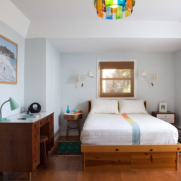
The vintage desk creates a compact space to do work. The bright colors of the lucite panel chandelier and the hand stiched Indian bedspread pick up the colors of the surfboards in the large format photo of Avila Beach. The client wanted guests to feel welcomed by a California vibe.
Photos by- Michele Lee Willson
 Vision Interiors
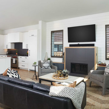
As a conceptual urban infill project, the Wexley is designed for a narrow lot in the center of a city block. The 26’x48’ floor plan is divided into thirds from front to back and from left to right. In plan, the left third is reserved for circulation spaces and is reflected in elevation by a monolithic block wall in three shades of gray. Punching through this block wall, in three distinct parts, are the main levels windows for the stair tower, bathroom, and patio. The right two-thirds of the main level are reserved for the living room, kitchen, and dining room. At 16’ long, front to back, these three rooms align perfectly with the three-part block wall façade. It’s this interplay between plan and elevation that creates cohesion between each façade, no matter where it’s viewed. Given that this project would have neighbors on either side, great care was taken in crafting desirable vistas for the living, dining, and master bedroom. Upstairs, with a view to the street, the master bedroom has a pair of closets and a skillfully planned bathroom complete with soaker tub and separate tiled shower. Main level cabinetry and built-ins serve as dividing elements between rooms and framing elements for views outside.
Architect: Visbeen Architects
Builder: J. Peterson Homes
Photographer: Ashley Avila Photography
Find the right local pro for your project
 Dichotomy Interiors
megan oldenburger
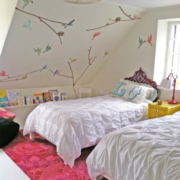
Kids' bedroom - contemporary girl kids' bedroom idea in New York with white walls
Kids' bedroom - contemporary girl kids' bedroom idea in New York with white walls
 Heidi Kreske Photography
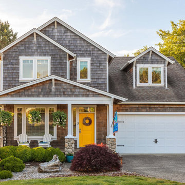
Example of a classic brown two-story wood and shingle exterior home design in Portland with a shingle roof and a brown roof
 Vision Interiors
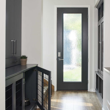
As a conceptual urban infill project, the Wexley is designed for a narrow lot in the center of a city block. The 26’x48’ floor plan is divided into thirds from front to back and from left to right. In plan, the left third is reserved for circulation spaces and is reflected in elevation by a monolithic block wall in three shades of gray. Punching through this block wall, in three distinct parts, are the main levels windows for the stair tower, bathroom, and patio. The right two-thirds of the main level are reserved for the living room, kitchen, and dining room. At 16’ long, front to back, these three rooms align perfectly with the three-part block wall façade. It’s this interplay between plan and elevation that creates cohesion between each façade, no matter where it’s viewed. Given that this project would have neighbors on either side, great care was taken in crafting desirable vistas for the living, dining, and master bedroom. Upstairs, with a view to the street, the master bedroom has a pair of closets and a skillfully planned bathroom complete with soaker tub and separate tiled shower. Main level cabinetry and built-ins serve as dividing elements between rooms and framing elements for views outside.
Architect: Visbeen Architects
Builder: J. Peterson Homes
Photographer: Ashley Avila Photography
 Vision Interiors
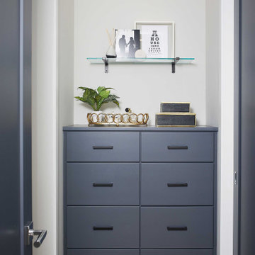
As a conceptual urban infill project, the Wexley is designed for a narrow lot in the center of a city block. The 26’x48’ floor plan is divided into thirds from front to back and from left to right. In plan, the left third is reserved for circulation spaces and is reflected in elevation by a monolithic block wall in three shades of gray. Punching through this block wall, in three distinct parts, are the main levels windows for the stair tower, bathroom, and patio. The right two-thirds of the main level are reserved for the living room, kitchen, and dining room. At 16’ long, front to back, these three rooms align perfectly with the three-part block wall façade. It’s this interplay between plan and elevation that creates cohesion between each façade, no matter where it’s viewed. Given that this project would have neighbors on either side, great care was taken in crafting desirable vistas for the living, dining, and master bedroom. Upstairs, with a view to the street, the master bedroom has a pair of closets and a skillfully planned bathroom complete with soaker tub and separate tiled shower. Main level cabinetry and built-ins serve as dividing elements between rooms and framing elements for views outside.
Architect: Visbeen Architects
Builder: J. Peterson Homes
Photographer: Ashley Avila Photography

Sponsored
Sunbury, OH

J.Holderby - Renovations
Franklin County's Leading General Contractors - 2X Best of Houzz!
 Vision Interiors
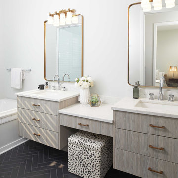
As a conceptual urban infill project, the Wexley is designed for a narrow lot in the center of a city block. The 26’x48’ floor plan is divided into thirds from front to back and from left to right. In plan, the left third is reserved for circulation spaces and is reflected in elevation by a monolithic block wall in three shades of gray. Punching through this block wall, in three distinct parts, are the main levels windows for the stair tower, bathroom, and patio. The right two-thirds of the main level are reserved for the living room, kitchen, and dining room. At 16’ long, front to back, these three rooms align perfectly with the three-part block wall façade. It’s this interplay between plan and elevation that creates cohesion between each façade, no matter where it’s viewed. Given that this project would have neighbors on either side, great care was taken in crafting desirable vistas for the living, dining, and master bedroom. Upstairs, with a view to the street, the master bedroom has a pair of closets and a skillfully planned bathroom complete with soaker tub and separate tiled shower. Main level cabinetry and built-ins serve as dividing elements between rooms and framing elements for views outside.
Architect: Visbeen Architects
Builder: J. Peterson Homes
Photographer: Ashley Avila Photography
 John Webb Construction and Design
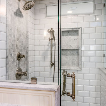
This countryside farmhouse was remodeled and added on to by removing an interior wall separating the kitchen from the dining/living room, putting an addition at the porch to extend the kitchen by 10', installing an IKEA kitchen cabinets and custom built island using IKEA boxes, custom IKEA fronts, panels, trim, copper and wood trim exhaust wood, wolf appliances, apron front sink, and quartz countertop. The bathroom was redesigned with relocation of the walk-in shower, and installing a pottery barn vanity. the main space of the house was completed with luxury vinyl plank flooring throughout. A beautiful transformation with gorgeous views of the Willamette Valley.
 Cascade Builders & Associates Inc.
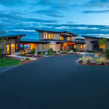
Some refer to this home as a Pacific Northwest Modern while others Mountain Contemporary and others consider it as modern ranch home, no matter your preference this home is tied to its surroundings, enhancing the ability to experience both home and nature together.
This home is in Central Oregon where the homeowners enjoy panoramic views of the Cascade mountain range.
The primary residence is under 2700 square feet, with a guest casita just over 700 square feet. As you enter the home, you cannot help but notice the mountain views, and modern-contemporary interior. Separating, the living room from the dining room is a beautiful contemporary fireplace. Entering the dining room and kitchen, you cannot help but know the homeowners have a passion for wine as you see the glassed-in elegant wine cellar. Greyed woods and metal are a feature of the stairs leading up to the bridge where you can enjoy breathtaking views. Across from the staircase is a home office. The main level also features a spacious master suite and dressing closet with pass-thru for convenient laundering. Upstairs there is another office facing the barn, where the homeowner can look in on their horses. Also upstairs there is another flexible space room and full bathroom.
A guest casita is separate from the primary residence by a covered outdoor kitchen, living and entertaining space. The casita features an open kitchen with island/bar seating and living room with a bedroom and bath.
 Vision Interiors
As a conceptual urban infill project, the Wexley is designed for a narrow lot in the center of a city block. The 26’x48’ floor plan is divided into thirds from front to back and from left to right. In plan, the left third is reserved for circulation spaces and is reflected in elevation by a monolithic block wall in three shades of gray. Punching through this block wall, in three distinct parts, are the main levels windows for the stair tower, bathroom, and patio. The right two-thirds of the main level are reserved for the living room, kitchen, and dining room. At 16’ long, front to back, these three rooms align perfectly with the three-part block wall façade. It’s this interplay between plan and elevation that creates cohesion between each façade, no matter where it’s viewed. Given that this project would have neighbors on either side, great care was taken in crafting desirable vistas for the living, dining, and master bedroom. Upstairs, with a view to the street, the master bedroom has a pair of closets and a skillfully planned bathroom complete with soaker tub and separate tiled shower. Main level cabinetry and built-ins serve as dividing elements between rooms and framing elements for views outside.
Architect: Visbeen Architects
Builder: J. Peterson Homes
Photographer: Ashley Avila Photography
 Klopf Architecture
Built for the Bluff, A Sea Ranch Home is Remade from the Inside Out
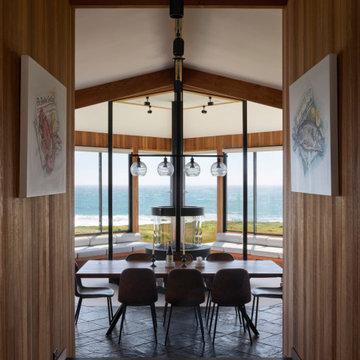
The house had always been grounded, on an ocean bluff at The Sea Ranch. It sits unencumbered, adjacent to one of the most dramatic stretches of the Sonoma coast with protected commons meadow to the east, uninterrupted Pacific views to the west, and a bluff trail running alongside. What it lacked was the feeling of home, one that could hold up its own against the natural landscape.
The owners are entrepreneurs with deep involvement across tech, real estate, and development and they know how things are built. The Sea Ranch house had been in their lives for years, a second residence and a place for family to gather. Built for a different time, it felt more compromising than comfortable. Sitting in a closed off nook, the kitchen fit one cook at a time and turned its back on the rest of the house. The entry was dim and compressed, divided by a structural column that presented itself at exactly the wrong moment. The primary suite was small relative to the view outside it. A large rear bedroom sat behind a lowered ceiling with a bathroom that had never been added. The house was certainly worth the trouble of doing it right.
What followed was not one project but four, each with its own design challenge, each addressed over a period of time.
Where the House Meets the Ocean
The most complex piece of the project, in both structural and spatial terms, was the kitchen expansion. The existing room was a single-person galley squeezed in as an afterthought with no meaningful connection to the dining room, the living space, or the deck outside. To make it useful for a family that cooks and gathers, it needed to grow outward into an existing patio and flow into the rooms around it.
A big challenge was the roofline. Several planes at different pitches and angles converged directly where additional volume was needed. A new form had to join that geometry without reading as a correction. The solution found the simplest possible connection between the existing angles, a roofline that from outside the structure, appears entirely original. From the bluff trail where the addition is visible, there is no discernible seam.
Inside, the kitchen is now open to the living and dining rooms without interruption. A large sliding glass door connects the space onto the rear deck. The deck itself was expanded and oriented so that the body of the house shields it from the coastal wind which is a common consideration that determines whether outdoor space at The Sea Ranch actually gets used. The result is a room that works for large family gatherings where no one feels cutoff, and one that makes the boundary between being inside and outside easy to ignore.
Welcoming Light
A structural column stood at the convergence of eight distinct roof planes in the entry. It was load-bearing, but it was also the reason the entry had always felt like a hallway rather than a welcoming arrival.
With the structural engineer, a custom steel connector was designed to receive beams from six separate directions, redistributing the load through a single new continuous beam. The column was surgically removed. Three triangular skylights were then cut into the roof above, their shapes drawn from the
existing geometry of the planes around them. The entry is now bright and open. The skylights feel native to the structure because they follow the logic already present in the roof.
Two Suites, Two Views
At opposite ends of the house, the two bedroom suites were each reconfigured, and each found a different way to introduce more of the landscape into the room.
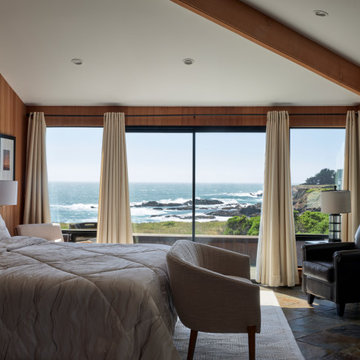
An addition to the primary suite extended the structure outward to create a wraparound plan with a loop from the bedroom through bath and closet that had not been possible before. The expansion opened a slot view from the tub and shower toward the ocean. The view is precise and private. The ocean view is present and deliberate.
The rear bedroom absorbed an adjacent storage room to transform it into a full second suite with a vaulted ceiling, a large bathroom with a tub, a shower, and a sauna. A private fenced garden courtyard sits just beyond the glass bringing the outdoors inside. The tub was placed so that, looking past the courtyard and through the bedroom beyond, the ocean is visible at the far end. It is a long view and it makes the room feel larger and more settled than its footprint would suggest.
Glass on Four Sides, Fire at the Center
The main living and gathering room had always been caught between two competing facts: glass on four sides meant exceptional views but at The Sea Ranch, it also meant a cold room. A 360-degree cylindrical fireplace was added at the center on a raised stone base, providing radiant heat in every direction and giving the room a focal point around which a group naturally orients itself, whether that means two people at the end of the day or the whole family after dinner.
Owners Who Picked Up the Tools
The owner was not a passive client. they came with construction knowledge, specific ideas, and the desire to be an active part of the process, a dynamic that other architects may had found difficult, which Klopf Architecture accepted as an asset. They took it upon themselves to complete some of the work during construction, including the installation of a new radiant heating system beneath the floors.
The radiant system added to the older and less-desirable forced-air setup. At The Sea Ranch, that change matters as the house sits close enough to the ocean and moving air competes with the sound of it, where radiant heat does not. Solar panels were added to the roof as part of the new system. Insulation was upgraded throughout the walls, roof, and crawl space. The house that had always had the right setting now holds warmth the way a house on the bluff should.
They were also deeply involved in the design and selections throughout, and the finished house reflects both of them in ways that are specific rather than generic. The process took longer and moved through more iterations than a more arms-length relationship might have allowed. The result is more defined and personal because of it.
The Landscape Holds Priority
Every exterior decision was shaped by The Sea Ranch Design Standards, which require that buildings defer to the landscape around them rather than compete with it. Because this house sits on the bluff and is visible from the public trail, the additions faced a close review. Existing materials were matched. Geometries were resolved. The additions had to become indistinguishable from the original building.
From the trail, the house reads exactly as it always has — low, cedar-clad, secondary to the meadow and the water. The setting holds priority. Inside, the house has been remade.
Klopf Architecture Project Team: Geoff Campen and Trenton Jewett
Contractor: Shawn Bettega Construction
Photography: ©2025 Mariko Reed
Year Completed: 2023
Location: The Sea Ranch, CA
 Klopf Architecture
Built for the Bluff, A Sea Ranch Home is Remade from the Inside Out
The house had always been grounded, on an ocean bluff at The Sea Ranch. It sits unencumbered, adjacent to one of the most dramatic stretches of the Sonoma coast with protected commons meadow to the east, uninterrupted Pacific views to the west, and a bluff trail running alongside. What it lacked was the feeling of home, one that could hold up its own against the natural landscape.
The owners are entrepreneurs with deep involvement across tech, real estate, and development and they know how things are built. The Sea Ranch house had been in their lives for years, a second residence and a place for family to gather. Built for a different time, it felt more compromising than comfortable. Sitting in a closed off nook, the kitchen fit one cook at a time and turned its back on the rest of the house. The entry was dim and compressed, divided by a structural column that presented itself at exactly the wrong moment. The primary suite was small relative to the view outside it. A large rear bedroom sat behind a lowered ceiling with a bathroom that had never been added. The house was certainly worth the trouble of doing it right.
What followed was not one project but four, each with its own design challenge, each addressed over a period of time.
Where the House Meets the Ocean
The most complex piece of the project, in both structural and spatial terms, was the kitchen expansion. The existing room was a single-person galley squeezed in as an afterthought with no meaningful connection to the dining room, the living space, or the deck outside. To make it useful for a family that cooks and gathers, it needed to grow outward into an existing patio and flow into the rooms around it.
A big challenge was the roofline. Several planes at different pitches and angles converged directly where additional volume was needed. A new form had to join that geometry without reading as a correction. The solution found the simplest possible connection between the existing angles, a roofline that from outside the structure, appears entirely original. From the bluff trail where the addition is visible, there is no discernible seam.
Inside, the kitchen is now open to the living and dining rooms without interruption. A large sliding glass door connects the space onto the rear deck. The deck itself was expanded and oriented so that the body of the house shields it from the coastal wind which is a common consideration that determines whether outdoor space at The Sea Ranch actually gets used. The result is a room that works for large family gatherings where no one feels cutoff, and one that makes the boundary between being inside and outside easy to ignore.
Welcoming Light
A structural column stood at the convergence of eight distinct roof planes in the entry. It was load-bearing, but it was also the reason the entry had always felt like a hallway rather than a welcoming arrival.
With the structural engineer, a custom steel connector was designed to receive beams from six separate directions, redistributing the load through a single new continuous beam. The column was surgically removed. Three triangular skylights were then cut into the roof above, their shapes drawn from the
existing geometry of the planes around them. The entry is now bright and open. The skylights feel native to the structure because they follow the logic already present in the roof.
Two Suites, Two Views
At opposite ends of the house, the two bedroom suites were each reconfigured, and each found a different way to introduce more of the landscape into the room.
An addition to the primary suite extended the structure outward to create a wraparound plan with a loop from the bedroom through bath and closet that had not been possible before. The expansion opened a slot view from the tub and shower toward the ocean. The view is precise and private. The ocean view is present and deliberate.
The rear bedroom absorbed an adjacent storage room to transform it into a full second suite with a vaulted ceiling, a large bathroom with a tub, a shower, and a sauna. A private fenced garden courtyard sits just beyond the glass bringing the outdoors inside. The tub was placed so that, looking past the courtyard and through the bedroom beyond, the ocean is visible at the far end. It is a long view and it makes the room feel larger and more settled than its footprint would suggest.
Glass on Four Sides, Fire at the Center
The main living and gathering room had always been caught between two competing facts: glass on four sides meant exceptional views but at The Sea Ranch, it also meant a cold room. A 360-degree cylindrical fireplace was added at the center on a raised stone base, providing radiant heat in every direction and giving the room a focal point around which a group naturally orients itself, whether that means two people at the end of the day or the whole family after dinner.
Owners Who Picked Up the Tools
The owner was not a passive client. they came with construction knowledge, specific ideas, and the desire to be an active part of the process, a dynamic that other architects may had found difficult, which Klopf Architecture accepted as an asset. They took it upon themselves to complete some of the work during construction, including the installation of a new radiant heating system beneath the floors.
The radiant system added to the older and less-desirable forced-air setup. At The Sea Ranch, that change matters as the house sits close enough to the ocean and moving air competes with the sound of it, where radiant heat does not. Solar panels were added to the roof as part of the new system. Insulation was upgraded throughout the walls, roof, and crawl space. The house that had always had the right setting now holds warmth the way a house on the bluff should.
They were also deeply involved in the design and selections throughout, and the finished house reflects both of them in ways that are specific rather than generic. The process took longer and moved through more iterations than a more arms-length relationship might have allowed. The result is more defined and personal because of it.
The Landscape Holds Priority
Every exterior decision was shaped by The Sea Ranch Design Standards, which require that buildings defer to the landscape around them rather than compete with it. Because this house sits on the bluff and is visible from the public trail, the additions faced a close review. Existing materials were matched. Geometries were resolved. The additions had to become indistinguishable from the original building.
From the trail, the house reads exactly as it always has — low, cedar-clad, secondary to the meadow and the water. The setting holds priority. Inside, the house has been remade.
Klopf Architecture Project Team: Geoff Campen and Trenton Jewett
Contractor: Shawn Bettega Construction
Photography: ©2025 Mariko Reed
Year Completed: 2023
Location: The Sea Ranch, CA
Sponsored
Sunbury, OH
J.Holderby - Renovations
Franklin County's Leading General Contractors - 2X Best of Houzz!

 danielle colding design, inc.
Study room - contemporary built-in desk dark wood floor study room idea in New York with blue walls
 ZeroEnergy Design
OVERVIEW
Set into a mature Boston area neighborhood, this sophisticated 2900SF home offers efficient use of space, expression through form, and myriad of green features.
MULTI-GENERATIONAL LIVING
Designed to accommodate three family generations, paired living spaces on the first and second levels are architecturally expressed on the facade by window systems that wrap the front corners of the house. Included are two kitchens, two living areas, an office for two, and two master suites.
CURB APPEAL
The home includes both modern form and materials, using durable cedar and through-colored fiber cement siding, permeable parking with an electric charging station, and an acrylic overhang to shelter foot traffic from rain.
FEATURE STAIR
An open stair with resin treads and glass rails winds from the basement to the third floor, channeling natural light through all the home’s levels.
LEVEL ONE
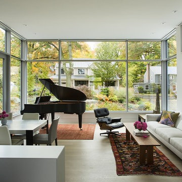
The first floor kitchen opens to the living and dining space, offering a grand piano and wall of south facing glass. A master suite and private ‘home office for two’ complete the level.
LEVEL TWO
The second floor includes another open concept living, dining, and kitchen space, with kitchen sink views over the green roof. A full bath, bedroom and reading nook are perfect for the children.
LEVEL THREE
The third floor provides the second master suite, with separate sink and wardrobe area, plus a private roofdeck.
ENERGY
The super insulated home features air-tight construction, continuous exterior insulation, and triple-glazed windows. The walls and basement feature foam-free cavity & exterior insulation. On the rooftop, a solar electric system helps offset energy consumption.
WATER
Cisterns capture stormwater and connect to a drip irrigation system. Inside the home, consumption is limited with high efficiency fixtures and appliances.
TEAM
Architecture & Mechanical Design – ZeroEnergy Design
Contractor – Aedi Construction
Photos – Eric Roth Photography

 safe ZOnea
Every year, the same thing happens. The first real snowfall arrives, demand for de-icing materials spikes overnight, and the businesses that waited too long find themselves scrambling for supply at the worst possible moment. Facility managers, property owners, contractors, and municipalities all depend on a steady supply of salt and ice melt to keep their properties safe and operational through winter. The ones who plan ahead sail through. The ones who don't pay more, wait longer, and take on real risk.
Sourcing de-icing materials well is not complicated, but it does require thinking ahead and understanding the options. The choices you make about what to buy, how to buy it, and who to buy it from have a direct effect on your costs, your reliability, and your ability to keep people safe when conditions turn dangerous. This article lays out what matters.
Why Your Choice of Supplier Matters More Than You Think
It is easy to treat de-icing material as a commodity, something you grab whenever you need it without much thought about where it comes from. That works fine until the moment it doesn't, usually in the middle of a storm when everyone needs supply at once and the casual sources have run dry. At that point, the relationships you built before the season become the difference between staying stocked and being stuck.
Reliable supply is the whole game in winter operations. A property that runs out of ice melt during a storm faces safety hazards, liability exposure, and disruption, none of which can wait for a back-ordered shipment. This is why establishing relationships with dependable rock salt suppliers before the season starts is one of the smartest moves a facility manager or contractor can make. It locks in supply, often locks in better pricing, and removes a major source of mid-winter stress.
The lesson here is to treat sourcing as a planning decision rather than a last-minute errand. The businesses that come through winter smoothly are almost always the ones that secured their supply chain early, chose suppliers who could actually deliver when it counted, and never had to gamble on finding material during a shortage. Reliability bought in advance is far cheaper than scarcity paid for in a crisis.
Bagged or Bulk: Matching the Material to the Job
One of the first practical decisions is whether to buy de-icing material in bags or in bulk, and the right answer depends entirely on the operation. Each format has clear advantages, and many operations end up using both for different purposes.
Bagged material offers convenience, control, and easy storage. It is simple to handle, easy to distribute to different locations or crews, straightforward to store without special equipment, and convenient for spot application by hand. It suits smaller properties, businesses without bulk storage, and situations where portion control and tidiness matter. Bulk material, on the other hand, tends to make sense for large operations that go through high volumes, where buying in quantity lowers the per-unit cost and the operation has the equipment and space to store and handle it. The tradeoff is between the convenience and flexibility of bags and the volume economics of bulk.
For many operations, the right approach is a mix: bulk for the high-volume core of the work and bags for flexibility, spot treatment, and locations where bulk handling is impractical. The key is to match the format to how the material will actually be stored, moved, and applied, rather than defaulting to one or the other out of habit. Thinking this through in advance avoids both the waste of over-buying bulk you can't handle and the expense of relying entirely on bags for a large operation.
Rock Salt Is Not Your Only Option
Rock salt, or sodium chloride, is the workhorse of winter de-icing for good reason. It is effective, widely available, and cost-efficient, which makes it the default choice for most operations most of the time. But it has limits, and understanding the alternatives helps you choose the right material for the conditions you actually face.
The most important limitation is temperature. Rock salt becomes less effective as temperatures drop, and in genuinely cold conditions it can struggle to do the job at all. This is where alternatives come in. Calcium chloride, for instance, works at much lower temperatures than rock salt and acts quickly, which makes it valuable when conditions are severe or when fast melting matters. Operations that face hard freezes or need dependable performance in extreme cold often keep calcium chloride for sale on hand for exactly those situations, using it alongside rock salt rather than instead of it.
The practical approach is to understand the conditions your property faces and stock accordingly. For many operations, rock salt handles the bulk of the work while a faster, colder-rated material like calcium chloride covers the extreme days when ordinary salt falls short. Matching the material to the temperature and the urgency of the situation is what separates an operation that stays ahead of winter from one that is constantly reacting to it.
Securing Your Supply Before the Season
Knowing what to buy is only half the equation. The other half is making sure you can actually get it when you need it, which means securing your supply before winter arrives rather than after it has already started. Timing is one of the most underrated factors in winter operations.
The logic is simple. Demand for de-icing materials is highly seasonal and spikes sharply during storms, when everyone needs supply simultaneously. Prices and availability both move against the buyer at exactly those moments. By contrast, planning ahead, estimating your needs and arranging supply before the season, puts you in a far stronger position. Working with established rock salt suppliers ahead of time means your material is accounted for before the rush, often at better pricing and with the confidence that it will be there when the first storm hits.
This kind of planning also lets you think clearly rather than react under pressure. You can estimate your seasonal needs based on your property and past winters, decide on the right mix of materials and formats, and arrange storage in advance. Operations that do this consistently spend less, worry less, and never find themselves making frantic calls during a storm. The effort of planning ahead is modest, and the payoff in reliability and cost savings is substantial.
Storing and Handling What You Buy
Securing supply is not much use if the material degrades before you can use it, which makes proper storage and handling an important and often overlooked part of the equation. De-icing materials are sensitive to moisture, and poor storage can turn a good supply into a clumped, hardened mess that is difficult to apply.
The fundamentals are straightforward. Keep material dry and protected from moisture, since salt and ice melt readily absorb water and can harden if exposed. Store it in a way that suits the format, whether that means a proper bulk storage area or a dry space for stacked bags. Keep it accessible, so crews can get to it quickly when a storm hits and time is short. And handle it with the right equipment for the format and volume, which protects both the material and the people working with it. None of this is complicated, but neglecting it can undermine even a well-planned supply.
Good storage practices protect the investment you made in securing supply early. There is little point in arranging your materials ahead of the season only to have them degrade before use. Treating storage and handling as part of the overall plan, rather than an afterthought, ensures that the material you secured is actually usable when the moment comes. It is the final link in a supply chain built to perform under winter conditions.
Estimating How Much You Actually Need
One question trips up operations of every size: how much de-icing material to buy. Order too little and you risk running short during a storm. Order too much and you tie up money and storage space in material you may not use. Getting the estimate reasonably right is a meaningful part of sourcing well.
Several factors shape the answer. The size and type of the areas you treat, sidewalks, lots, entrances, and drive lanes, set the baseline for how much material each application consumes. The local climate matters too, since colder regions and those with frequent snowfall go through far more material than milder ones. Application frequency depends on how often storms hit and how quickly surfaces need to be cleared, which varies with the kind of property and the expectations of the people who use it. And the type of material plays a role, since different products are applied at different rates.
Past experience is often the best guide. Operations that track what they used in previous winters, adjusted for the size of the property and the severity of the season, can estimate their needs with reasonable confidence. For newer operations without that history, it helps to plan conservatively and to work with a supplier who can replenish stock reliably, so that a low estimate does not turn into a mid-storm shortage.
The goal is not perfect precision but a sound, slightly cautious estimate paired with a dependable supply relationship. That combination lets an operation keep enough material on hand to handle the season without over-committing to volume it cannot store or use. Thinking this through before winter, rather than guessing during it, is one more way that planning ahead pays off when the snow starts to fall.
The Bottom Line
Sourcing de-icing materials well comes down to a few straightforward principles: plan ahead, choose reliable suppliers before the season, match your materials and formats to your actual needs and conditions, and store what you buy properly. The operations that follow these principles move through winter with confidence, while those that improvise pay more and take on needless risk.
Winter is predictable in one respect: it arrives every year, and demand for de-icing material spikes the moment it does. The businesses that prepare for that reality, rather than being surprised by it, are the ones that keep their properties safe, their costs controlled, and their operations running no matter what the season throws at them. A little foresight before the first snowfall pays off through every storm that follows.
 EnvironmentalLights.com
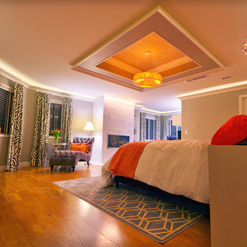
Layering light is a beautiful way to design. Add LED lighting to your cove ceilings to create height and depth to any room, in addition to traditional floor lamps and ceiling lights.
You can create dramatic lighting effects easily and efficiently with energy-saving LED lighting. Easy to install and available in a range of color temperatures, LED strip light is flexible and dimmable so you can have bright light when you want it and soft lighting to create any mood.
Great for master bedrooms, living rooms, kitchen cabinet lighting and more.
Sponsored
Sunbury, OH
J.Holderby - Renovations
Franklin County's Leading General Contractors - 2X Best of Houzz!
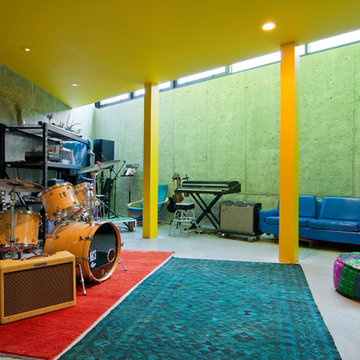
 Lucy Call
Photo: Lucy Call © 2014 Houzz
Design: Imbue Design
Inspiration for a contemporary look-out concrete floor basement remodel in Salt Lake City with gray walls
Inspiration for a contemporary look-out concrete floor basement remodel in Salt Lake City with gray walls
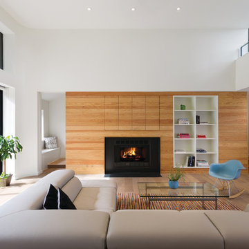
 Milgard Windows & Doors
The Kiguchi family moved into their Austin, Texas home in 1994. Built in the 1980’s as part of a neighborhood development, they happily raised their family here but longed for something more contemporary. Once they became empty nesters, they decided it was time for a major remodel. After spending many years visiting Austin AIA Home Tours that highlight contemporary residential architecture, they had a lot of ideas and in 2013 were ready to interview architects and get their renovation underway.
The project turned into a major remodel due to an unstable foundation. Architects Ben Arbib and Ed Hughey, of Arbib Hughey Design were hired to solve the structural issue and look for inspiration in the bones of the house, which sat on top of a hillside and was surrounded by great views.
Unfortunately, with the old floor plan, the beautiful views were hidden by small windows that were poorly placed. In order to bring more natural light into the house the window sizes and configurations had to be addressed, all while keeping in mind the homeowners desire for a modern look and feel.
To achieve a more contemporary and sophisticated front of house, a new entry was designed that included removing a two-story bay window and porch. The entrance of the home also became more integrated with the landscape creating a template for new foliage to be planted. Older exterior materials were updated to incorporate a more muted palette of colors with a metal roof, dark grey siding in the back and white stucco in the front. Deep eaves were added over many of the new large windows for clean lines and sun protection.
“Inside it was about opening up the floor plan, expanding the views throughout the house, and updating the material palette to get a modern look that was also warm and inviting,” said Ben from Arbib Hughey Design. “Prior to the remodel, the house had the typical separation of rooms. We removed the walls between them and changed all of the windows to Milgard Thermally Improved Aluminum to connect the inside with the outside. No matter where you are you get nice views and natural light.”
The architects wanted to create some drama, which they accomplished with the window placement and opening up the interior floor plan to an open concept approach. Cabinetry was used to help delineate intimate spaces. To add warmth to an all-white living room, white-washed oak wood floors were installed and pine planks were used around the fireplace. The large windows served as artwork bringing the color of nature into the space.
An octagon shaped, elevated dining room, (named “the turret”), had a big impact on the design of the house. They architects rounded the corners and added larger window openings overlooking a new sunken garden. The great room was also softened by rounding out the corners and that circular theme continued throughout the house, being picked up in skylight wells and kitchen cabinetry. A staircase leading to a catwalk was added and the result was a two-story window wall that flooded the home with natural light.
When asked why Milgard® Thermally Improved Aluminum windows were selected, the architectural team listed many reasons:
1) Aesthetics: “We liked the slim profiles and narrow sightlines. The window frames never get in the way of the view and that was important to us. They also have a very contemporary look that went well with our design.”
2) Options: “We liked that we could get large sliding doors that matched the windows, giving us a very cohesive look and feel throughout the project.”
3) Cost Effective: “Milgard windows are affordable. You get a good product at a good price.”
4) Custom Sizes: “Milgard windows are customizable, which allowed us to get the right window for each location.”
Ready to take on your own traditional to modern home remodeling project? Arbib Hughey Design advises, “Work with a good architect. That means picking a team that is creative, communicative, listens well and is responsive. We think it’s important for an architect to listen to their clients and give them something they want, not something the architect thinks they should have. At the same time you want an architect who is willing and able to think outside the box and offer up design options that you may not have considered. Design is about a lot of back and forth, trying out ideas, getting feedback and trying again.”
The home was completely transformed into a unique, contemporary house perfectly integrated with its site. Internally the home has a natural flow for the occupants and externally it is integrated with the surroundings taking advantage of great natural light. As a side note, it was highly praised as part of the Austin AIA homes tour.
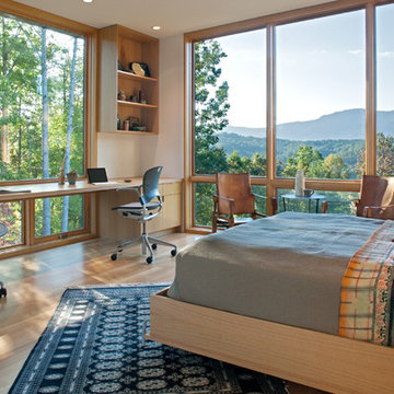
 Carlton Edwards
This modern lake house is located in the foothills of the Blue Ridge Mountains. The residence overlooks a mountain lake with expansive mountain views beyond. The design ties the home to its surroundings and enhances the ability to experience both home and nature together. The entry level serves as the primary living space and is situated into three groupings; the Great Room, the Guest Suite and the Master Suite. A glass connector links the Master Suite, providing privacy and the opportunity for terrace and garden areas.
Won a 2013 AIANC Design Award. Featured in the Austrian magazine, More Than Design. Featured in Carolina Home and Garden, Summer 2015.
3