
Search results for "Sequence" in Home Design Ideas
 Atelier Renata Santos Machado
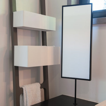
Dressing area with a tall mirror, black bench and white closet storage near the window. The furniture is arranged for a compact dressing sequence.
Trendy bathroom photo in Other
Trendy bathroom photo in Other
 Woolems Luxury Builders
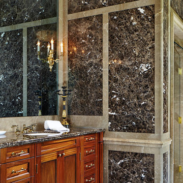
New 2-story residence consisting of; kitchen, breakfast room, laundry room, butler’s pantry, wine room, living room, dining room, study, 4 guest bedroom and master suite. Exquisite custom fabricated, sequenced and book-matched marble, granite and onyx, walnut wood flooring with stone cabochons, bronze frame exterior doors to the water view, custom interior woodwork and cabinetry, mahogany windows and exterior doors, teak shutters, custom carved and stenciled exterior wood ceilings, custom fabricated plaster molding trim and groin vaults.
 Sound Plus Wood, Inc.
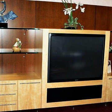
Sequenced matched and numbered Figured maple with Australian Lacewood accent panels. Finish in satin lacquer. Project includes an HDTV, Dolby Surround sound system and Universal Remote control Color touch Panel Remote.
Find the right local pro for your project
 Shuler Architecture
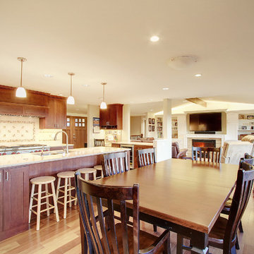
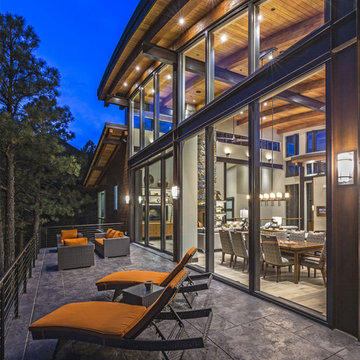
This classic 1970's rambler was purchased by our clients as their 'forever' retirement home and as a gathering place for their large, extended family. Situated on a large, verdant lot, the house was burdened with extremely dated finishes and poorly conceived spaces. These flaws were more than offset by the overwhelming advantages of a single level plan and spectacular sunset views. Weighing their options, our clients executed their purchase fully intending to hire us to immediately remodel this structure for them.
Our first task was to open up this plan and give the house a fresh, contemporary look that emphasizes views toward Lake Washington and the Olympic Mountains in the distance. Our initial response was to recreate our favorite Great Room plan. This started with the elimination of a large, masonry fireplace awkwardly located in the middle of the plan and to then tear out all the walls. We then flipped the Kitchen and Dining Room and inserted a walk-in pantry between the Garage and new Kitchen location.
While our clients' initial intention was to execute a simple Kitchen remodel, the project scope grew during the design phase. We convinced them that the original ill-conceived entry needed a make-over as well as both bathrooms on the main level. Now, instead of an entry sequence that looks like an afterthought, there is a formal court on axis with an entry art wall that arrests views before moving into the heart of the plan. The master suite was updated by sliding the wall between the bedroom and Great Room into the family area and then placing closets along this wall - in essence, using these closets as an acoustical buffer between the Master Suite and the Great Room. Moving these closets then freed up space for a 5-piece master bath, a more efficient hall bath and a stacking washer/dryer in a closet at the top of the stairs.

 Dynia Architects
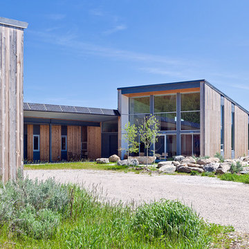
The site of this single story residence is at the base of the Teton Mountain range with views of canyons and peaks. To respond to this topographical edge condition, the form of the primary living space rises to capture this view. The entry sequence begins by arrival into a south facing “courtyard” defined by the house and an outbuilding. A linear porch accessed from the garage or the exterior leads to the entry. This ‘tail’ of the scheme wraps around itself, culminating at the expansive glazed wall and terrace beyond.
Project Year: 2008
 Studio TOOP
design: Studio TOOP, 2008
location: Driebergen, NL
status: built in 2008, Tuinvreugd
photo: Jolanthe Lalkens, 2010
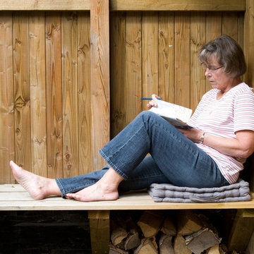
A letter from the town of Driebergen explaining that there were subsidies available if residents wanted to build a rainwater catchment in their garden was the impulse necessary for Ben and Ine to finally redo their garden. About to start retirement they had more time to garden and enjoy being at home. Ine hd been a gardener for years and looked for the opportunity to spend more time on the hobby and Ben was already working out the technical details of the rainwater catchment and ponds.
Studio TOOP helped them translate their wishes and interests into a clear design that made smart use of the small elevation change in the garden. Sequences of steps and raised beds separate each section of the garden. Three lines - a row of three ponds, a row of crab apple trees and a rose covered pergola - emphasize the gardens length. Each pond is 15 cm lower than the next, allowing the water to flows from one to another, and then to another lower lying pond at the end of the pergola. Under a lid that works as a bench integrated into two of the raised beds are the rainwater tanks.
 NSPJ Architects
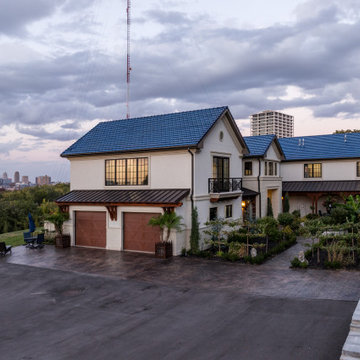
The driveway experience was redesigned to create a strong sense of arrival while maintaining privacy from the street. A new approach sequence guides visitors toward the home through refined hardscape and soft landscape elements subtly revealing the residence on arrival. Clean lines thoughtful materials and controlled sightlines transform the driveway into a welcoming entry that sets the tone for the modern renovation beyond.
 Native Landscapes
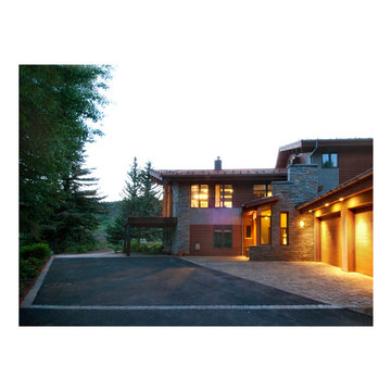
Moving the garage east of the house created a dramatically improved entry and arrival sequence. Mixed paving materials in directional patterns reflecting the geometry of the house reduce the impact of the driveway and direct guests to the front door.

 Sarah Lawson Design
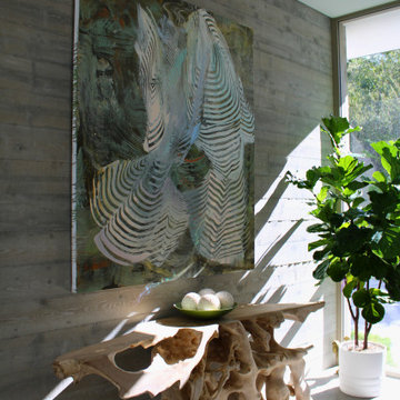
The entry sequence sets the tone for the home through a restrained material palette and sculptural furnishings. A concrete wall backdrop, natural wood console, and large-format artwork establish a quiet, architectural moment that connects the interior to the surrounding landscape through light and view.
 Miles Enterprises Inc
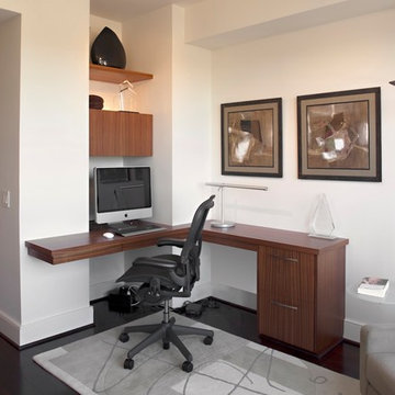
The owners of this Bethesda condominium were scaling down from a large single-family home. This master bedroom features sequenced matched Sapele mahogany and high-gloss closet cabinetry around the perimeter of the room. The curtains and the nightstand continue behind the floor to ceiling head board. The bookcases and desk were made from ribbon striped Sapele
 BBA Architects
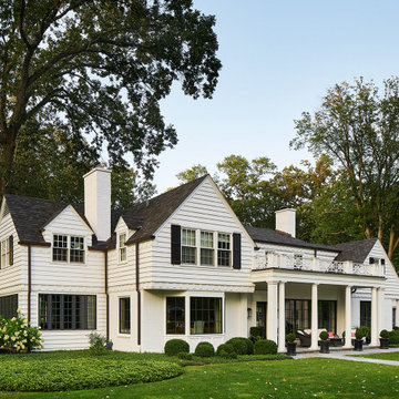
This colonial home renovation reimagines the original character of the house by adding a light-filled entry gallery overlooking the covered front porch. The revised circulation plan opens up the interior to frame views and improve the flow between spaces while maintaining the traditionally defined rooms throughout. New large-paned casement windows replace the modest double-hung units to enhance the scale of the exterior facade and streamline the architectural detailing. The arrival sequence is improved by relocating a brick-lined driveway southward to extend the lawn and allow boxwood clouds set in ground cover to frame new bluestone walks. Overlooking the idyllic golf course beyond, the new rear garden and bluestone terrace better defines the yard and provides a generous outdoor living space.
View more of this home through #BBAFocusOnTheFairway on Instagram
 EAG Studio
Refined Continuity: Bridging Classical Architecture and Modern Living
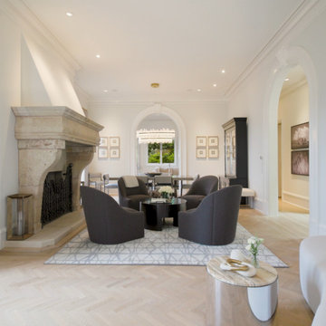
This comprehensive remodel of a grand Cow Hollow residence reimagines a historically expressive envelope through a lens of contemporary livability, precision detailing, and material restraint. The design approach carefully balances the home’s classical proportions and ornamental heritage with a refined, modern sensibility—evident in the disciplined palette of warm neutrals, soft plasters, pale oak flooring, and tailored millwork. Circulation has been clarified and subtly expanded to enhance spatial flow, while openings are leveraged to capture light, garden outlooks, and distant water views. Throughout, architectural interventions are executed with a high level of craft, ensuring that new insertions—whether cabinetry, railings, or apertures—read as seamless continuations of the original structure rather than applied elements.
The kitchen serves as the operational and visual anchor of the home, conceived as a sculptural yet highly functional environment. Custom rift-cut cabinetry, softened through a desaturated finish, is paired with honed stone surfaces and integrated brass hardware to create a quiet, tactile richness. A monolithic island establishes a central gathering point, while perimeter work zones are carefully layered with concealed storage, integrated appliances, and open, backlit shelving that elevates everyday objects into curated displays. The adjacent bar and entertaining areas extend this language, reinforcing a cohesive hospitality-driven program. In parallel, the primary bathroom is designed as a serene, spa-like retreat, where bookmatched stone, frameless glass enclosures, and finely detailed metalwork converge. The composition prioritizes symmetry, clarity, and light—balancing generous volumes with intimate moments through integrated lighting, custom vanities, and a restrained material hierarchy.
The library and ancillary living spaces introduce a more intimate scale, anchored by bespoke built-ins that combine closed storage with illuminated display niches, creating depth and rhythm along the walls. Here, material transitions and furniture integration are handled with particular nuance, allowing the architecture to support both quiet retreat and social gathering. A continuous language of custom railings—executed in refined metal profiles—threads through the interior and extends outward, where the exterior gate and garden elements have been reinterpreted to align with the home’s renewed identity. The entry sequence is now defined by a calibrated interplay of solidity and transparency, with sculptural metalwork and landscape integration establishing a sense of arrival that is both secure and elegant. Collectively, the project reflects a holistic transformation—one that elevates performance, livability, and aesthetic clarity while preserving the inherent dignity of the original architecture.
 d KISER design.construct, inc.
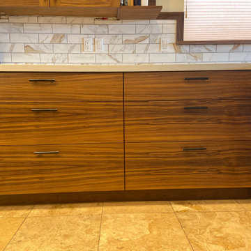
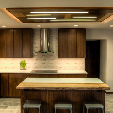
grain matched fronts with sequenced panels.
Design by Doug Kiser, d KISER design.construct, inc.
Photos by Scott Drickey. www.scottdrickey.com
Example of a mid-sized minimalist l-shaped porcelain tile eat-in kitchen design in Omaha with an undermount sink, flat-panel cabinets, dark wood cabinets, concrete countertops, white backsplash, ceramic backsplash, stainless steel appliances and an island
Example of a mid-sized minimalist l-shaped porcelain tile eat-in kitchen design in Omaha with an undermount sink, flat-panel cabinets, dark wood cabinets, concrete countertops, white backsplash, ceramic backsplash, stainless steel appliances and an island
 Newport Avenue Landscaping
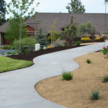
Finished Landscaping includes; small mossy boulder bubbler, decomposed granite beds, & lots of munstead Lavender!
This is an example of a small craftsman landscaping in Other.
This is an example of a small craftsman landscaping in Other.
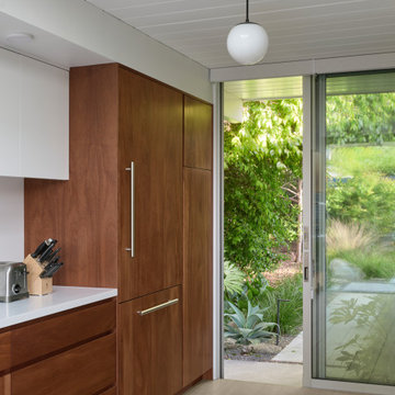
 Klopf Architecture
From Mid-Century Classic to the Present
An iconic design updated with comfort, function, and flow for today.
A Remodel That Balances Past and Present
What started as a desire to update a classic Eichler soon became an exploration of how Mid-Century Modern design can successfully evolve for today. The client, a tech professional with a passion for scuba diving and underwater photography, wanted a home that would both honor its original character and feel tailored to his daily life. A lifelong technology enthusiast, he still owns the very first Mac desktop he saved up for as a teenager working at Radio Shack, a detail that underscores his appreciation for design that melds function and form.
Honoring Separation While Expanding Possibility
Unlike many contemporary remodels where walls are opened up to create expansive living spaces, this project took a more restrained approach. The client valued the defined rooms of the original plan and wanted to preserve as much wall space as possible for displaying his large-format underwater photography. The emphasis was not on dramatic spatial reinvention, but on thoughtful refinements. Klopf Architecture shaped a gallery-like backdrop while also expanding the primary suite, modernizing materials and fixtures throughout the home, and improving the functionality and layout of the kitchen. The finished home feels at once timeless and renewed, an Eichler that continues to inspire while fully supporting the lifestyle of its present-day owner.
A major turning point came mid-design. The original project brief had not included an addition, but as the reconfiguration of the primary bedroom and bath unfolded, it became clear that an expansion was the best approach to achieve the client’s vision of a more spacious suite. Fortunately, the adjustment came at a stage when revisions were still manageable and was integrated seamlessly, showing how thoughtful course corrections can strengthen a project rather than hinder it.
Navigating Challenges With Precision
The design development included multiple conceptual rounds, balancing preservation with subtle expansion. During construction, an existing post previously thought to be load-bearing turned out not to be. The structural engineer was able to pivot quickly, and both the post and the cross beam that had been intended to replace it could be omitted, allowing the original rhythm of the Eichler beam bays to be preserved.
Sustainability was not just a checklist item, but a way to align the home with the client’s values of simplicity, efficiency, and long-term functionality. R-38 roof insulation reduced energy usage, solar panels with battery storage provided independence and resilience, and passive comfort strategies eliminated the need forenergy-intensive air conditioning. An electric vehicle charger and an on-demand hot water recirculation system (with call buttons as opposed to having constant circulation) add to the home’s long-term efficiency factors. Together, these moves created a home that is quieter, more comfortable, and better equipped for the future, qualities that supported the client’s pragmatic approach to design and living lightly.
Details That Respect the Eichler DNA
The remodel carries forward the Eichler’s original spirit while introducing new layers of modern livability. Originally, the house was approached along a deep, narrow walk, with the garage on one side and the house on the other, leaving the front door tucked far back within this chasm-like space. By pulling the entry forward, the design reshaped the arrival experience, creating a clearer threshold and a natural drop-off zone for bags, shoes, and keys. This shift also made room for a custom bench at the entry that extends seamlessly through the glass sidelight. The bench and drop-off zone now work together as a single, integrated sequence that supports everyday living while offering a tactile reminder of Eichler’s philosophy of connectedness.
At the client’s request, Klopf reintroduced a classic Eichler gesture by extending the exterior siding into the entry and living room. The detail reinforces a sense of indoor/outdoor continuity while providing a subtle architectural surface that allows the client’s photography to take visual precedence.
The signature concrete masonry wall at the front was reconstructed using blocks sourced to match the originals, now strengthened with rebar for seismic resilience while maintaining a private outdoor courtyard, visually extending the kitchen outward. A decorative trellis element, a detail borrowed from a neighboring Eichler, restores a familiar mid-century modern architectural motif. At the courtyard entry door, a custom etched glass sidelight with an ocean-themed design featuring kelp and jellyfish serves as a subtle homage to the client’s passion for deep-sea diving.
Landscaping became an integral part of the overall transformation. The homeowner engaged landscape architect Randi Johnsen of Third Nature Studio to shape a series of calm, inviting outdoor rooms that read as a natural extension of the interiors. While technically outside of the core construction scope, the landscape design proved central to achieving a sense of completeness and connectedness across the property. Such whole-property considerations often emerge as design ideas take shape, underscoring the importance of flexibility in planning and budgeting, as well as close collaboration among the design team starting early in the process.
The Value of Evolving Scope
As with many custom residential projects, the scope evolved during the design process. What began as a targeted remodel grew to include a new/expanded primary suite, a rebuilt CMU patio wall for strength and longevity, and a solar panel array and battery storage for energy resilience and carbon-reduction. Each thoughtful decision represented a conscious investment in the home’s performance and character, rather than a cost overrun.
The result was a project delivered on schedule, tailored precisely to the client’s lifestyle, and positioned to add long-term value both functionally and aesthetically. By embracing scope evolution as an opportunity rather than a challenge, and relying on good design paired with transparent communication, this remodel demonstrates how Eichler homes can be adapted for contemporary living without erasing their DNA.
Klopf Architecture project team: John Klopf, AIA, and Klara Kevane, Elise Webb and Nicholas LaNasa.
Contractor: Golden Cove Construction
Landscape Design: Third Nature Studio
Structural Engineer: Daniel Bastiao Design
Photography: ©2025 Mariko Reed
Year Completed: 2024
Location: Sunnyvale, CA
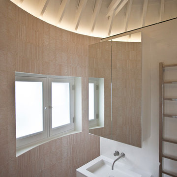
 Amos Goldreich Architecture
Occupying a prominent property in Notting Hill, the brief for this 120 sq m apartment was to rationalise a sequence of disconnected spaces in order to create a coherent design.
The palette of materials is restrained in order to provide a neutral backdrop for the client’s collection of furniture and artworks. High quality finishes and detailing include shadow gaps, full height door apertures, concealed storage and limed oak flooring, together with a library area equipped with bespoke storage to display books and objets d’art.
A notable feature of the apartment is the corner ‘rotunda’, now accommodating a shower-room; the rotunda’s roof structure has been exposed to add architectural interest.
Throughout the apartment, great care has been taken to maximise natural light
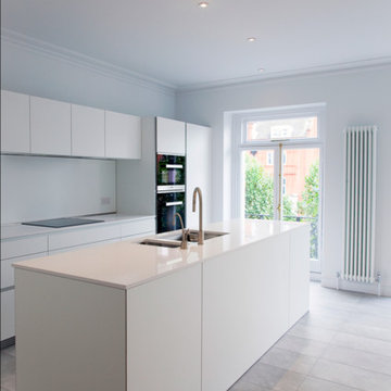 Amos Goldreich Architecture
The apartment occupies the third floor of a prominent corner property originally constructed in 1860.
The building was formerly two neighbouring town houses, reconfigured in 1939 as a residential school for girls. In 1968, the State of Kuwait purchased the property which became their London Embassy until 2000 at which time the two houses were converted into 13 flats.
Amos Goldreich Architecture was appointed as lead architects to create a contemporary 3 bedroom home within this Grade II Listed Building.
AGA has sought to rationalise the formerly over-complex configuration, clarifying spatial sequences and creating a coherent visual palette. The apartment is finished to a high standard, with bespoke joinery and ingenious storage solutions.
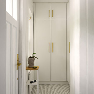
 kimberly peck architect
This landmarked brownstone on Prospect Park West already had extraordinary bones—and the rare advantage of windows on three sides. That natural light allowed us to rethink the traditional parlor-floor layout into something more open, connected, and reflective of the way the family lives today, while still honoring the building’s historic character.
The original sequence—a front parlor, a formal dining room in the center, and a closed-off kitchen at the rear—was replaced with a single, flowing main level anchored by a generous slate-blue kitchen. The cabinetry forms a C-shaped configuration that maximizes storage, creates a natural dining zone, and maintains easy circulation to the backyard through the existing glass French door. A full-height marble backsplash with brass inlay adds subtle drama, extending to the ceiling around the windows, and a built-in desk niche creates a casual workspace that feels fully integrated into the design.
Because storage was a priority, the kitchen includes multiple pantry cabinets and deep pull-outs to keep daily life efficient and uncluttered.
The living room now occupies the center of the plan, serving as a shared hub between the kitchen and the front of the home. Just inside the entry, we designed a custom reading nook framed by floor-to-ceiling bookcases with integrated bench seating—an intentional space for the couple and their teenage daughter, who value reading and wanted their books to be both displayed and actively used.
The entry itself was also reimagined. Now separated from the main living space by a wall and door, it functions as a true vestibule with a built-in storage wall for coats and shoes. Tucked beside it is a playful powder room featuring a green vanity, floral wallpaper, and a grey-and-white mosaic tile floor—continued throughout the entry to visually tie the front of the house together and add a moment of personality within the historic shell.
The result is a garden level that remains rooted in its 19th-century architecture but fully supports modern life—light-filled, functional, and thoughtfully layered.
55