
Search results for "Sequence" in Home Design Ideas
 Winder Gibson Architects
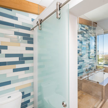
This home is in Noe Valley, a highly desirable and growing neighborhood of San Francisco. As young highly-educated families move into the area, we are remodeling and adding on to the aging homes found there. This project remodeled the entire existing two story house and added a third level, capturing the incredible views toward downtown. The design features integral color stucco, zinc roofing, an International Orange staircase, eco-teak cabinets and concrete counters. A flowing sequence of spaces were choreographed from the entry through to the family room.
 EAG Studio
Refined Continuity: Bridging Classical Architecture and Modern Living
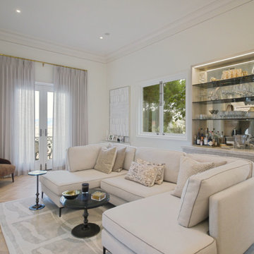
This comprehensive remodel of a grand Cow Hollow residence reimagines a historically expressive envelope through a lens of contemporary livability, precision detailing, and material restraint. The design approach carefully balances the home’s classical proportions and ornamental heritage with a refined, modern sensibility—evident in the disciplined palette of warm neutrals, soft plasters, pale oak flooring, and tailored millwork. Circulation has been clarified and subtly expanded to enhance spatial flow, while openings are leveraged to capture light, garden outlooks, and distant water views. Throughout, architectural interventions are executed with a high level of craft, ensuring that new insertions—whether cabinetry, railings, or apertures—read as seamless continuations of the original structure rather than applied elements.
The kitchen serves as the operational and visual anchor of the home, conceived as a sculptural yet highly functional environment. Custom rift-cut cabinetry, softened through a desaturated finish, is paired with honed stone surfaces and integrated brass hardware to create a quiet, tactile richness. A monolithic island establishes a central gathering point, while perimeter work zones are carefully layered with concealed storage, integrated appliances, and open, backlit shelving that elevates everyday objects into curated displays. The adjacent bar and entertaining areas extend this language, reinforcing a cohesive hospitality-driven program. In parallel, the primary bathroom is designed as a serene, spa-like retreat, where bookmatched stone, frameless glass enclosures, and finely detailed metalwork converge. The composition prioritizes symmetry, clarity, and light—balancing generous volumes with intimate moments through integrated lighting, custom vanities, and a restrained material hierarchy.
The library and ancillary living spaces introduce a more intimate scale, anchored by bespoke built-ins that combine closed storage with illuminated display niches, creating depth and rhythm along the walls. Here, material transitions and furniture integration are handled with particular nuance, allowing the architecture to support both quiet retreat and social gathering. A continuous language of custom railings—executed in refined metal profiles—threads through the interior and extends outward, where the exterior gate and garden elements have been reinterpreted to align with the home’s renewed identity. The entry sequence is now defined by a calibrated interplay of solidity and transparency, with sculptural metalwork and landscape integration establishing a sense of arrival that is both secure and elegant. Collectively, the project reflects a holistic transformation—one that elevates performance, livability, and aesthetic clarity while preserving the inherent dignity of the original architecture.

 Banyon Tree Design Studio
Entry Gate, stucco privacy wall, outdoor lighting, custom iron trellis, rose arbor, climbing roses, Broadmoor street lighting, formal
Design ideas for a mediterranean full sun front yard stone and metal fence landscaping in Seattle for summer.
Design ideas for a mediterranean full sun front yard stone and metal fence landscaping in Seattle for summer.
Find the right local pro for your project
 Tile Doctor Ltd
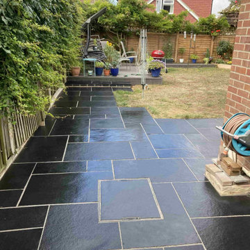
We were called out to look at this new Black Limestone patio in Ashford which was not looking as it should. The client had laid it himself but unfortunately had not managed to polish off all the grout from the surface of the Limestone thereby degrading the appearance of the stone.
Grout Smearing or Grout Haze is a common problem when it comes to tiling and this problem seems to be on the increase due to new grout formula’s which are tougher but dry a lot faster. Usually, the excess grout can be removed using a mild acid however it is not possible to do that on Limestone as this Stone is acid sensitive and as well as etching the stone can cause it to turn white. I know Tile Doctor has resolved a few jobs like this in the past for builders who do not always understand the unique characteristics of the stone.
I discussed with the client how Tile Doctor could help and gave him a quote for the work to be carried out. He was happy to go ahead so having consulted the weather forecast for a couple of dry days we agreed a date to return.
To remove the Grout Haze and clean the appearance of the Limestone I applied a Tile Doctor Brick and Patio Cleaner and worked it in with a coarse 400 grit diamond encrusted burnishing pad. The coarse pad does leave the stone looking a little rough, so the surface was then renovated using the finer burnishing pads of 800 and 1500 grit using water for lubrication. By using the pads in sequence, it gradually smooths the surface of the stone. Once done the tiles were rinsed with water and the soil removed with an industrial wet vacuum. The patio was looking good, the day was nice and bright, so we left the patio for a few hours to dry in the sun.
Once the stone was dry the patio was sealed with single coat of Tile Doctor Stone Oil which is an impregnating sealer that improves strength and restores colour to the stone.
Once dry the Stone Oil was followed by a coat of Tile Doctor Colour Grow sealer which like the Stone Oil penetrates the pores of the stone improving colour and adding protection. The treatment and combination of products transformed the appearance of the patio and provided the client with exactly the look he required.
As you can see from the after pictures the patio had a rich black colour and looked as it should. The client was over the moon with the result and was thankful that we had managed to rescue his work. Lesson learned for any future project he might take on, beware of grout haze!
Michael Conlon
South Kent Tile Doctor
 Martin Tratt
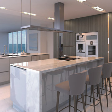
The wrap around ocean view was the focal point for this large Singer Island modern kitchen in a combination of soft grey hi gloss lacquer and gray stained sequence matched rift cut white oak. There is a prep and clean up island along with and a second cooking island that provides for storage on the kitchen side and for 4 stools on the outside side. The counter tops are in gloss white Cesarstone with the seating top in Calacatta with waterfall side overhangs.
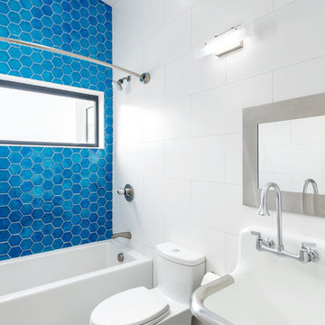 Winder Gibson Architects
This home is in Noe Valley, a highly desirable and growing neighborhood of San Francisco. As young highly-educated families move into the area, we are remodeling and adding on to the aging homes found there. This project remodeled the entire existing two story house and added a third level, capturing the incredible views toward downtown. The design features integral color stucco, zinc roofing, an International Orange staircase, eco-teak cabinets and concrete counters. A flowing sequence of spaces were choreographed from the entry through to the family room.
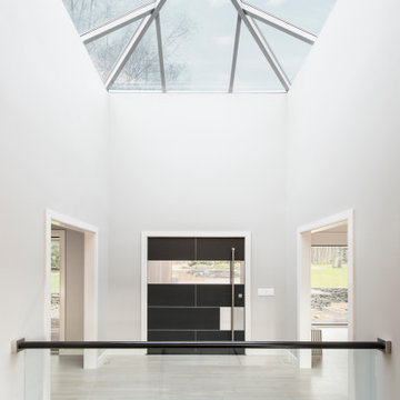
 Nautilus Architects
Located on a marsh in the upper reaches of the Lieutenant River in Old Lyme, the existing house was well-sited and well-built, but the design failed to exploit the views and more importantly was a confused combination of contemporary and traditional elements. The new homeowners, a successful businesswoman and an accomplished artist and photographer, were interested in creating a fully-contemporary environment to open up space, connect indoors with outdoors, display artwork and showcase the husband’s distinctive photographs.
One glaring deficiency was the curb appeal and approach sequence: the grade sloped down and the path to the house followed, but this led to an uncomfortable dip and abrupt rise to the front door. By creating a virtual “moat,” occupied by a grid of raised-bed grasses contained in aluminum-clad boxes, and spanning the moat with an ipe bridge, the approach becomes level and engaging. The façade of the existing house was blank and bland, and with no cover. Adding a deep overhang with a wide porch creates a welcoming, covered condition, accentuated by a 6’ wide pivoting front door that feels more like a moving piece of wall.
Another deficiency was the connection to the outdoors. By adding glass to the front and back of the house, and removing interior walls selectively, the house takes on a diaphanous quality that allows one to see through to the marsh beyond, even when in the driveway. The raised-bed grasses act as abstract, geometric versions of the marsh beyond. A large, pyramidal skylight establishes a spatial hierarchy around which the rooms revolve.
The house featured several tray-ceilinged spaces – living room, kitchen, and master bedroom – that were poorly-proportioned and with panels at the top that resembled inset flat panel doors. The solution was to use a different strategy for each: the bedroom turns the ceiling into an eggshell through the use of a creative trim detail; the living room has an oversized sculptural, backlit lighting element; and the kitchen has a collage of painted rectangular forms that support or include lighting pieces.
A palette of concrete, blackened steel, stainless steel and colors carefully chosen by homeowner and architect create an interior and exterior environment punctuated by moments that are as artistic as the featured works in the black-ceilinged gallery.
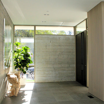
 Sarah Lawson Design
A restrained entry sequence defined by material continuity and controlled natural light. Board-formed concrete walls, vertical wood paneling, and a custom pivot door with integrated hardware establish a calm arrival experience while maintaining privacy from the street. The wood paneling extends from interior to exterior as siding, reinforcing the home’s indoor–outdoor architectural language and setting the tone for the spaces beyond.
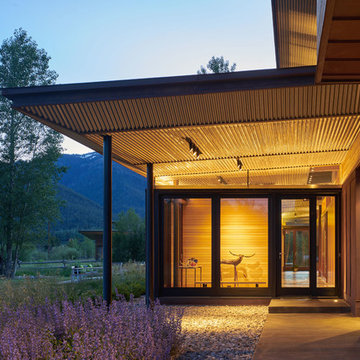
 Dynia Architects
This residence is situated on a flat site with views north and west to the mountain range. The opposing roof forms open the primary living spaces on the ground floor to these views, while the upper floor captures the sun and view to the south. The integrity of these two forms are emphasized by a linear skylight at their meeting point. The sequence of entry to the house begins at the south of the property adjacent to a vast conservation easement, and is fortified by a wall that defines a path of movement and connects the interior spaces to the outdoors. The addition of the garage outbuilding creates an arrival courtyard.
A.I.A Wyoming Chapter Design Award of Merit 2014
Project Year: 2008
 Plum Architects
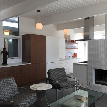
We opened this living room up by relocating the kitchen which allowed for views of the sequencing of exterior space from the front yard to the atrium to the living room, to the patio, landscaping and hills beyond.
 birdRock Project Studio Inc.
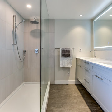
Ever heard some say “It has good bones?” Well, no one had ever said that about this house; it needed a major overhaul - “A TOTAL GUT.”
It’s saving grace was:
1. It’s enthusiastic new homeowners.
2. The expansive and gorgeous views of Okanagan Lake.
We were asked to assist our clients with big-picture-planning for their newest investment property.
Upon initial walk through of the home, it was immediately evident there were many previous ‘bandaid-type’ updates that it had gone through over the years.
This house was in prime need of an overhaul inside and out:
- multiple dropped Ceilings with layers of Plumbing add ons
- wall to wall Carpet
-a tired Bathtub directly inside the Master Bedroom
- a “dreaded” Corner Kitchen Sink
-multiple add ons involving three confusing front entry doors
Discovering what was previously done and the quandary of why these things were done is always so interesting to discover and can be very overwhelming for clients.
A big part of what we love most about Design is helping to propose new ideas to revitalize and improve all that has come before. It is one of the most challenging and rewarding parts of our work.
Our Renovation Strategy began in Layout Design for optimizing Interior & Exterior flow, moving into Concept & Style Planning, Millwork and Finish Selections.
We then created an ordered implementation sequence which would allow the homeowners to live on one floor while the other was being renovated Later they would move to the finished floor and renovate the remaining areas.
Once complete, the home quickly sold and we look forwards to assisting these happy investors on their next endeavour.
 Shuler Architecture
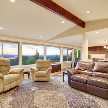
This classic 1970's rambler was purchased by our clients as their 'forever' retirement home and as a gathering place for their large, extended family. Situated on a large, verdant lot, the house was burdened with extremely dated finishes and poorly conceived spaces. These flaws were more than offset by the overwhelming advantages of a single level plan and spectacular sunset views. Weighing their options, our clients executed their purchase fully intending to hire us to immediately remodel this structure for them.
Our first task was to open up this plan and give the house a fresh, contemporary look that emphasizes views toward Lake Washington and the Olympic Mountains in the distance. Our initial response was to recreate our favorite Great Room plan. This started with the elimination of a large, masonry fireplace awkwardly located in the middle of the plan and to then tear out all the walls. We then flipped the Kitchen and Dining Room and inserted a walk-in pantry between the Garage and new Kitchen location.
While our clients' initial intention was to execute a simple Kitchen remodel, the project scope grew during the design phase. We convinced them that the original ill-conceived entry needed a make-over as well as both bathrooms on the main level. Now, instead of an entry sequence that looks like an afterthought, there is a formal court on axis with an entry art wall that arrests views before moving into the heart of the plan. The master suite was updated by sliding the wall between the bedroom and Great Room into the family area and then placing closets along this wall - in essence, using these closets as an acoustical buffer between the Master Suite and the Great Room. Moving these closets then freed up space for a 5-piece master bath, a more efficient hall bath and a stacking washer/dryer in a closet at the top of the stairs.
 User
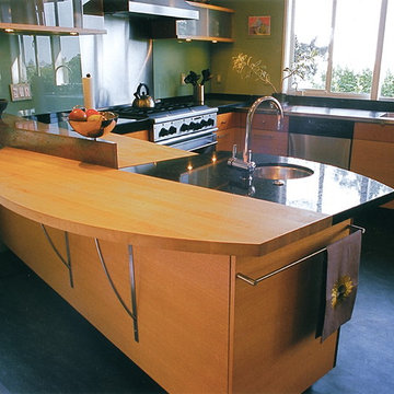
UserMost of us like lots of storage in our kitchens, usually resulting in large banks of monotonous cabinets. But by considering the various tasks that take place in the kitchen, their sequence, individual requirements, required storage, and preferred surfaces to perform the tasks, you can get a kitchen that is not only more efficient but also delightful to be in.
Here we see different countertop materials according to the tasks to be performed at that area: granite around the prep sink for splash; wood cutting board adjacent to the prep sink; wood counter at the sitting area; granite and glass at the stove; and continuous stainless steel counter/sink at the clean-up sink
 Tile Doctor Ltd
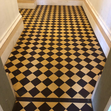
I thought I would share this case history of a Yellow and Black Victorian Tiled floor that we worked on at a large house in Lancaster last year. It’s a great example of the typical problems we face with old Victorian floors, especially around door thresholds where the transition between the different foundation invariable cause problems.
I didn’t know the full history of the floor, but it was now in quite a state and recent renovation work had left the floor unstable with loose and cracked tiles. The tiles needed to be removed and then the damaged subfloor carefully scraped out and replaced. Once that was done the floor would need relaying and then cleaned and sealed so everything would blend in.
After visiting the property and providing a quotation we were given the go ahead and agreed a date to do the work.
We returned on the agreed date and set about carefully removing the loose and cracked Victorian tiles and put them aside for later use. Some would need replacing however this would not present a problem and they are still widely available, and I have several contacts I can turn to for this.
Once this was done and the subfloor exposed and cleaned up, I used self-levelling cement to bring the floor level up and in-line with the existing. This now needed to set hard, so the rest of the day was spent cleaning up the tiles we removed earlier with Tile Doctor Grout Clean-up and Pro-clean. Our goal is to reuse as many of the original tiles as possible to preserve the heritage of the floor.
The next day with the new subfloor set it was ready for tiling. This involves laying out the tiles first without adhesive carefully cutting and fitting new tiles as needed to maintain the overall pattern of the floor. Once I was happy the tiles were moved to a board and then fitted with fresh adhesive.
I came back on day three with the aim of cleaning the floor so it could be sealed however whilst inspecting my new tiling I was disappointed to discover some were not as level as I had hoped. I had noticed the replacement tiles were not the same thickness as the originals the previous day but I had worked around this by using different levels of adhesive, clearly this plan was not as effective as I had hoped for.
To counter this problem, I used a set of 50-Grit, 100-grit and then 200-grit diamond pads in sequence to mill the floor flat and remove the lippage between them. This is done with water to lubricate the process and a weighted floor buffer. The pads generate a lot of slurry and so you need to rinse this off with more water and extract all the soil after each pad.
I followed this up with various Diamond burnishing pads of increasingly finer grits across the whole floor until we achieved a consistent finish and had the added benefit of getting the whole floor clean. More water is used to rinse the tiles after burnishing and the soil extracted with a wet vacuum as before. Once done and inspected the floor was left to dry off overnight.
Tile Doctor Colour Grow was applied to enhance the appearance of the tiles and protect them going forward. This product copes well with damp which can always be a problem with old floors like this one with no damp proof membrane present.
The floor looked amazing when finished and our attention to detail had really paid off, in fact you simply could not tell we had done any tiling work or replaced any tiles. For aftercare I recommend the use of Tile Doctor Neutral Cleaner which is designed for the regular cleaning of sealed tiles.
Russell Taylor
Lancashire Tile Doctor
 Sundberg Kennedy Ly-Au Young Architects
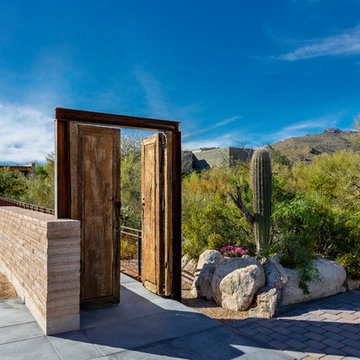
The home is oriented around a natural alignment of several saguaro cacti that lead you through the site. A stand alone antique door in a modern steel frame marks to beginning of the entray sequence to the home which continues over a bridge that connects the garage with the main house and preserves a natural arroyo that runs through the property.
Steven Meckler Photographer
 Closet Organizing Systems
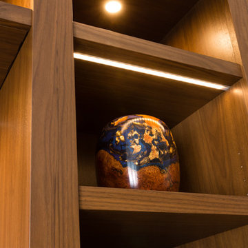
This office display unit was designed to achieve a modern high end look using AAA grade plain sliced sequenced matched walnut veneer. The cabinetry was lightly stained to more closely match the existing wood work in the home. Slotted upper fascia sections were used for ventilation openings and rebound style touch latches were used to eliminate the need for visible hardware. LED light strips and puck lighting aid in showcasing display areas.
Designed by Bill Curran for Closet Organizing Sytems
 Timberline Patio Covers
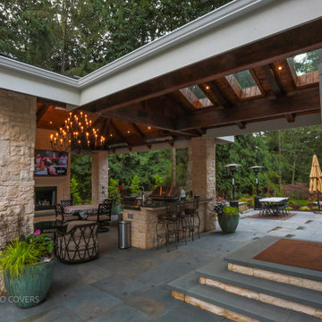
This outdoor living transformation brought together multiple phases of construction to create a seamless, year-round entertaining space. The project began with dry rot repairs and termite remediation, followed by framing a custom outdoor fireplace, completing the chimney, and preparing it for a beautiful stone finish. A custom soffit with skylights and detailed trim was installed to create a warm, finished ceiling that complements the home's architecture.
The existing deck was removed and replaced with a newly framed deck featuring custom stairs, durable decking, and modern railing. New siding and trim were completed around the home and breezeway, tying the addition into the existing exterior for a cohesive look.
The outdoor living area was further enhanced with a fully equipped outdoor kitchen, including cabinetry, shelving, appliances, a kegerator, and a wine temperature control system. Electrical work included recessed lighting, heaters, fireplace power, dimmers, and a dedicated subpanel to support the space's amenities. A new fence and gate were also constructed and painted to match the homeowner's preferences, providing both privacy and a polished finish.
Throughout the project, our team coordinated closely with specialty contractors, including the stone mason and paver installer, ensuring each phase was completed in the proper sequence. The result is a thoughtfully designed outdoor living space that blends craftsmanship, functionality, and lasting quality—creating the perfect setting for entertaining family and friends throughout every season.
 Randolph Landscapes
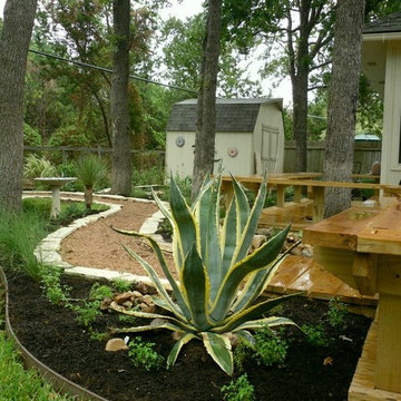
This project began with a simple sketch plan, followed with deck addition and sequenced plantings over the year using native grasses, shrubs, ferns,and perennials. The sunniest spaces were given a xeric treatment with a small rock garden near a serpentine granite path to the greenbelt behind the home. An original metal arbor-saloon door feature will be the new gate to the greenbelt.
 Samuel Design Group
Jonathan Tercero with Narrative Media
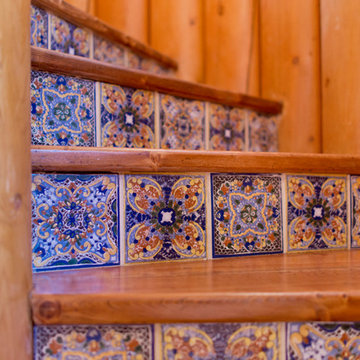
Staircase - southwestern staircase idea in Albuquerque
Staircase - southwestern staircase idea in Albuquerque
 Design DCA
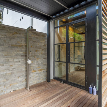
The indoor outdoor shower sequence a freestanding stainless rain head and hand shower mounted against a coursed ledgestone wall on the open air deck, finished with teak decking underfoot.
52