
Search results for "Sharpening problem solving" in Home Design Ideas
 Swatch Design Group
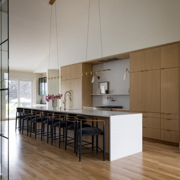
As a part of a larger transformation, the kitchen served as an anchor for rethinking how the home could feel and function. The goal was to create a space that felt truly integrated, flowed naturally within itself, and connected seamlessly to the outdoors. Storage was a top priority, with an emphasis on keeping countertops clean and the space feeling calm and open. Flow was equally important. What began as a layout optimized for entertaining evolved into a more intentional approach, where every sightline and transition was thoughtfully considered. The clients also needed the kitchen to work hard for their lifestyle, with a commercial-size refrigerator and freezer, generous prep space, and room to gather. The challenge was to bring purpose and polish to a space that didn’t quite feel like it belonged. The result is a kitchen that’s not only highly functional but finally feels like part of the home.
Project challenges:
- Maximizing storage was a primary challenge, especially with the inclusion of a commercial-sized fridge and freezer that occupied valuable cabinetry space.
- The need for clean, uninterrupted lines throughout the kitchen required thoughtful detailing, especially around cabinetry transitions and appliance integration.
- The oversized island design required two stone slabs and waterfall edges on both sides which posed both visual and logistical challenges.
- Incorporating electrical outlets into the island in a way that felt intentional and unobtrusive demanded creative problem-solving.
- The unique rooflines created strong visual angles that required a considered design approach to ensure the space felt cohesive rather than disjointed.
- Balancing symmetry and flow in a kitchen with structural constraints required precise layout planning to maintain a cohesive visual rhythm.
- Creating an intentional indoor/outdoor living flow, especially in the transitional space between the sliding doors to the backyard and the kitchen.
Project solutions:
- To balance the visual weight of the commercial-grade fridge and freezer, we flanked the range and hood with full-height pocket cabinetry, which created symmetry while reclaiming storage space. We also took a look into internal organization and carefully mapped out where every kitchen item would live. This allowed us to make informed decisions about drawer versus door configurations, and when to incorporate features like roll-out shelving to maximize accessibility and function.
- Linear light fixtures above the island were chosen for their low visual impact, allowing sightlines to remain clear and emphasizing the thoughtful spatial layout.
- The oversized island was carefully executed using two coordinated slabs, with a subtle brass inlay detail between them to turn a logistical challenge into a design feature.
- Pop-up electrical outlets were integrated into the island to keep surfaces clutter-free while maintaining easy access, which combined form and function seamlessly.
- With multiple focal points and a peaked vaulted ceiling, layout precision was key. The island, hood, and adjacent staircase were all perfectly centered on the vault, creating a sense of alignment across the open space.
- In the transitional area between kitchen and backyard, we added a wet bar that visually and functionally connects the indoor space with the outdoors. This addition provides extra storage and creates a dedicated entertainment spot for guests, enhancing the overall flow and usability of the home.

 Sloan Polish Design
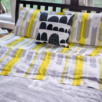
Working in small or awkward spaces is often the most rewarding because the problem solving required calls on one’s creativity. The slanted ceiling nook in this tween bedroom is a great example of how to turn a demerit into an asset. Instead of trying to ignore it, the feature is played up here with the bold stripe treatment. The nook’s utility is maximized by using a corner desk and creating custom wood shelves affixed to the wall using plumbing piping.
Storage space remained a challenge in the room, and if we added a tall storage unit to the wall where one could fit, we would be blocking the light and views of the windows. The solution was to create a long, built-in bench with drawer storage below and two long wooden shelves, higher up the wall, for books and personal items. To bring in an industrial vibe and complement the iron bed, we distressed the wood and used plumbing pipes and fixtures for shelf support.
Pops of yellow as a repeating element bring energy and personality to the space. Custom bedding, pillows, and window seat fabric from Spoonflower.
Images ©Spoonflower and ©Sloan Polish Design.
Find the right local pro for your project
 SignalBooster.com
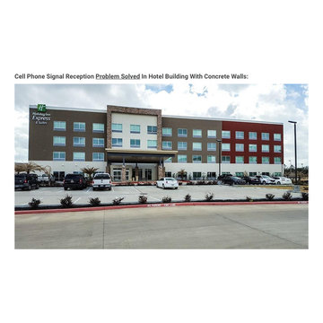
Cell Phone Signal Reception Problem Solved In Hotel Building With Concrete Walls.
Example of a large urban home design design in Houston
Example of a large urban home design design in Houston
 Vesel Contemporary Kitchens
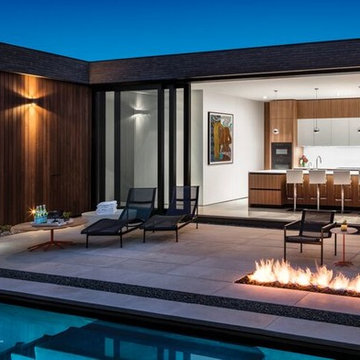
BRICK CITY HOUSE
This client with the help of their architect, studio b architects / Aspen designed a program that
interconnected the interior, and courtyard / pool spaces with the beautiful colorado sky above.
simple clean, walnut wall paneling creates a warm and timeless feel that flows through this home.
The kitchen uses the full height of the interior, while staying in proportion to the space. The ease of
access to this dynamic area allows its multi purpose island to function as a pool party bar,
or gourmet kitchen for entertaining large groups… and as always a work zone for daily problem solving.
This extremely functional, but friendly kitchen was kept simple with small precise details to mimic the overall home.
veselbrand™ met the design challenges of this unique space using their Europa line of cabinetry with integrated horizontal pulls in tactical matte black
keeping the design simple & streamlined, beveled top drawer fronts mimic the knife edge krion countertop giving the large top the structural stability while looking light and minimal.
white matte glass upper cabinet doors and backsplashes accent the walnut and create a perfect place in the backsplash for the patented veselbrand power ports / invisible electrical receptacles.
project details:
brushed walnut veneer
white matte glass
snow white krion tops
veselbrand " stick " tall pulls
veselbrand power ports
miele appliances

 User
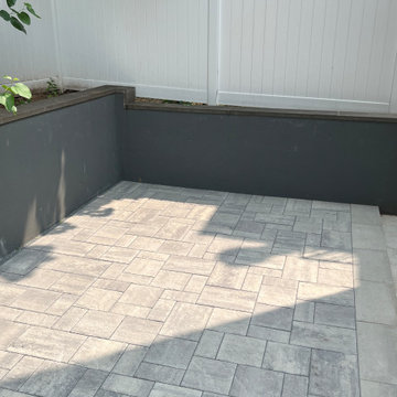
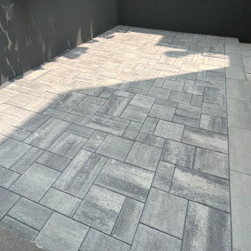
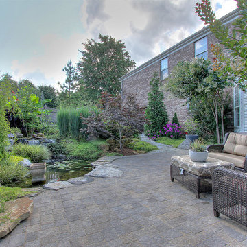
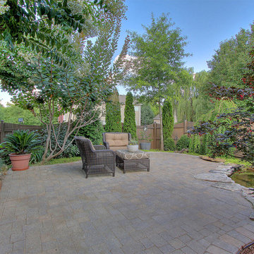
UserOpen Graded crushed stone base with proper drainage grid was installed to effectively address water accumulation. Quality Permeable Concrete Paver Patio was installed to successfully absorb any rain water AND re-route raising ground water to the new drainage system. Another water problem solved, and Owners gained a beautiful hard surface patio to enjoy.
 J Brewer and Associates, INC.
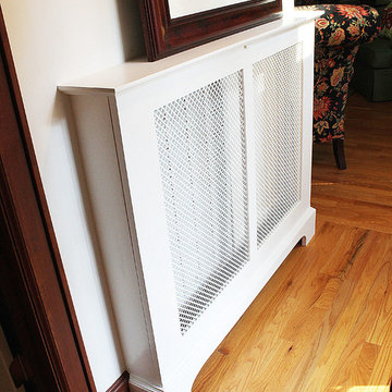
An eye sore in the very entry of your home, what do you do? For this homeowner, our team built a custom solution with the appearance of a craftsman mantle, but with the function of a working cabinet so that the radiator is covered but accessible. Photo by Jillian Dolberry
 User
UserOpen Graded crushed stone base with proper drainage grid was installed to effectively address water accumulation. Quality Permeable Concrete Paver Patio was installed to successfully absorb any rain water AND re-route raising ground water to the new drainage system. Another water problem solved, and Owners gained a beautiful hard surface patio to enjoy.
 Che Bella Interiors Design + Remodeling
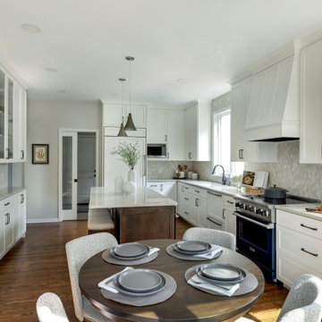
This kitchen renovation began with the clients questioning whether an addition was needed to meet their wishlist. By carefully rethinking the layout, the design team showed that everything could be accomplished within the existing footprint, maximizing function, storage, and flow while keeping the home’s balance intact. Small but strategic moves, like borrowing a touch of space from the laundry room and resizing a dining room window, opened the door to a larger island, improved circulation, and better placement for the range and sink.
The result is a kitchen that feels expansive and beautifully composed. Thoughtful adjustments to the structure created just enough breathing room for a layout that now supports daily life. A natural marble braided mosaic backsplash, soft and organic in texture, carries gracefully to the ceiling as a focal point, complemented by classic subway tile on adjacent wall. Every detail was executed with craftsmanship in mind, from the refined cabinetry to the layered finishes that give the space its timeless character.
Blending problem-solving with design, this kitchen delivers everything the homeowners envisioned, a bright, functional centerpiece that enhances both everyday living and special occasions alike.

 Artisan Kitchen & Bath GC License #107583
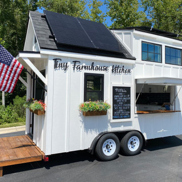
The Tiny Farmhouse Kitchen is by far one of the most complex, rewarding, and unforgettable projects we’ve ever completed. Designed to be fully mobile and 100% solar-powered, this one-of-a-kind kitchen on wheels pushed our creativity, craftsmanship, and problem-solving skills to new heights. Every time we transported it through town, it turned heads—people would literally stop in their tracks just to get a closer look.
Building a fully functional commercial kitchen in such a small footprint required precision in every detail. We carefully selected each piece of equipment to minimize electrical draw, including a commercial refrigerator and four recessed induction food warmers—all powered entirely by solar energy. Onboard water storage, filtration, and gray water management were meticulously engineered to maximize both functionality and space.
The Tiny Farmhouse Kitchen features:
• Custom handcrafted cabinetry
• Granite countertops
• Vaulted ceilings with dimmable LED lighting
• A full POS system with a built-in Wi-Fi hotspot
• A gas-shock lift service window with a live-edge oak flip-down counter, finished with crystal-clear epoxy for a stunning, natural look
Every inch of this mobile kitchen was designed for both beauty and efficiency, blending farmhouse charm with modern utility. It’s a project we are immensely proud of—and one that perfectly captures the spirit of what we do at Artisan Kitchen & Bath: bringing bold ideas to life with craftsmanship, innovation, and heart.

 All Buttoned Up - Smart Organization Solutions
Ever irritated that you cannot easily access the bottle of oil at the back of your shelf? Problem solved by this genius system by Vertical Spice. Installed by All Buttoned Up.
 Klopf Architecture
Malibu Glass Box House by Klopf Architecture
Following the devastating Woolsey Fire of 2018, the site in Malibu offered a unique opportunity to rebuild not just a home, but a new architectural composition that highlighted the property’s potential while navigating strict fire-rebuild codes in the area. Designed by Klopf Architecture, this project embraced a set of limitations and translated them into an architectural asset.
The city’s fire-rebuild process required the new structure to remain close to the original footprint, size and bulk, a constraint that ultimately clarified the architectural direction. Perched near the front of a long, narrow lot, the new home frames and overlooks a private, park-like rear expanse, an uncommon luxury especially in this part of Malibu .
Without a fixed program, the design process allowed for a different kind of creative focus allowing Klopf Architecture the opportunity to explore how a modernist home could best respond to this site. The team approached the project not with a list of requirements, but with a question: How might a modernist live here? What spatial qualities would inspire calm, connection, and a sense of wonder in this setting? The process became less about problem-solving and more about architectural storytelling—letting the site, the light, and the principles of modern design guide the form and flow of the home.
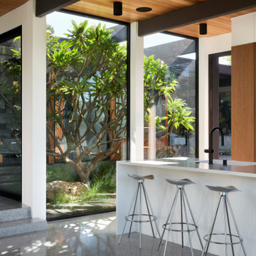
The response emerged in the form of a glass-box pavilion, an open, Mid-Century Modern inspired living, dining, and kitchen space that floats at the edge of the property’s natural descent. Connected to the more enclosed, private areas of the home by a glass-walled hallway, the living pavilion becomes a distinct centerpiece of the design. It opens on all four sides to the landscape with decks and patios on the flanks, an internal garden and water feature to the north, and a dramatic unguarded view of the expansive backyard and ocean horizon to the south.
Because of the mandated footprint, careful planning was required to ensure every space could still engage with light, landscape, or both. Strategic voids in the form of atriums and courtyards allow daylight to filter deep into the home’s core, while offering moments of surprise and retreat. These design gestures allow natural light to filter deep into the interior, creating a sense of brightness and openness throughout the day. At the same time, they expand the perceptual boundaries between inside and out, making the home feel more expansive while anchoring its connection to the surrounding landscape.
The siting of the house is what gives it its unique character. Rather than receding into the backyard like the neighboring homes, the house holds a slight prominence. From the central living pavilion, stepping down into the landscape feels more like entering a secluded park where a separate existing accessory structure, trail, and recreational areas await. The home’s modest street presence gives way to this unfolding drama of space, view, and nature.
Fire-resilient materials and assemblies are integrated seamlessly throughout including triple-pane glazing, under-slab and roof insulation, and locally sourced fire-rated cladding ensure the house not only meets Calfornia’s rigorous wildland-urban interface (WUI) standards, but feels effortlessly aligned with them. While technical decisions like fire-hardening and mechanical systems presented some construction challenges, particularly around the cantilevered glass box, the team found a functional compromise that preserved the integrity of the design.
Inside, a restrained palette and exposed post and beam design celebrate the ethos of mid-century modernism. A central circulation spine extends from the entry to the rear glass wall, offering a continuous visual link from street to ocean. Spaces such as the library and office, though more intimate in scale, are never cut off from nature as each opens to its own unique courtyard or garden view.
Though born out of a strict regulatory framework and developed without a specific client, the rebuild design unfolded with remarkable clarity. Grounded in site logic, refined by limitations and an emphasis on timeless spatial relationships – light, proportion, and a strong connection to nature, the resulting design feels both effortless and uplifting. The home lives lightly on the land, opens generously to its surroundings, and strikes a careful balance between privacy, openness, and calm. For Klopf Architecture, it stands as a compelling case study in how site, code, and circumstantial constraints can inspire enduring, modernist architecture. With years of experience reimagining mid-century modern design for how people live today, the firm took the project’s limitations as an opportunity. The result is a home shaped by open, flowing spaces, strong indoor-outdoor connections, and a calm, clear sense of structure. It’s a good reminder that even with strict constraints, there’s still room for architecture to breathe—and for modernism to keep moving forward.
Klopf Architecture project team: Geoff Campen, John Klopf, AIA, and Sherry Tan
Structural Engineer: ZFA
Contractor: Maison D’Artiste
Photography: ©2025 Mariko Reed
Year Completed: 2023
 Klopf Architecture
Malibu Glass Box House by Klopf Architecture
Following the devastating Woolsey Fire of 2018, the site in Malibu offered a unique opportunity to rebuild not just a home, but a new architectural composition that highlighted the property’s potential while navigating strict fire-rebuild codes in the area. Designed by Klopf Architecture, this project embraced a set of limitations and translated them into an architectural asset.
The city’s fire-rebuild process required the new structure to remain close to the original footprint, size and bulk, a constraint that ultimately clarified the architectural direction. Perched near the front of a long, narrow lot, the new home frames and overlooks a private, park-like rear expanse, an uncommon luxury especially in this part of Malibu .
Without a fixed program, the design process allowed for a different kind of creative focus allowing Klopf Architecture the opportunity to explore how a modernist home could best respond to this site. The team approached the project not with a list of requirements, but with a question: How might a modernist live here? What spatial qualities would inspire calm, connection, and a sense of wonder in this setting? The process became less about problem-solving and more about architectural storytelling—letting the site, the light, and the principles of modern design guide the form and flow of the home.
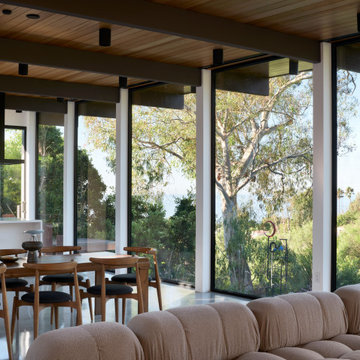
The response emerged in the form of a glass-box pavilion, an open, Mid-Century Modern inspired living, dining, and kitchen space that floats at the edge of the property’s natural descent. Connected to the more enclosed, private areas of the home by a glass-walled hallway, the living pavilion becomes a distinct centerpiece of the design. It opens on all four sides to the landscape with decks and patios on the flanks, an internal garden and water feature to the north, and a dramatic unguarded view of the expansive backyard and ocean horizon to the south.
Because of the mandated footprint, careful planning was required to ensure every space could still engage with light, landscape, or both. Strategic voids in the form of atriums and courtyards allow daylight to filter deep into the home’s core, while offering moments of surprise and retreat. These design gestures allow natural light to filter deep into the interior, creating a sense of brightness and openness throughout the day. At the same time, they expand the perceptual boundaries between inside and out, making the home feel more expansive while anchoring its connection to the surrounding landscape.
The siting of the house is what gives it its unique character. Rather than receding into the backyard like the neighboring homes, the house holds a slight prominence. From the central living pavilion, stepping down into the landscape feels more like entering a secluded park where a separate existing accessory structure, trail, and recreational areas await. The home’s modest street presence gives way to this unfolding drama of space, view, and nature.
Fire-resilient materials and assemblies are integrated seamlessly throughout including triple-pane glazing, under-slab and roof insulation, and locally sourced fire-rated cladding ensure the house not only meets Calfornia’s rigorous wildland-urban interface (WUI) standards, but feels effortlessly aligned with them. While technical decisions like fire-hardening and mechanical systems presented some construction challenges, particularly around the cantilevered glass box, the team found a functional compromise that preserved the integrity of the design.
Inside, a restrained palette and exposed post and beam design celebrate the ethos of mid-century modernism. A central circulation spine extends from the entry to the rear glass wall, offering a continuous visual link from street to ocean. Spaces such as the library and office, though more intimate in scale, are never cut off from nature as each opens to its own unique courtyard or garden view.
Though born out of a strict regulatory framework and developed without a specific client, the rebuild design unfolded with remarkable clarity. Grounded in site logic, refined by limitations and an emphasis on timeless spatial relationships – light, proportion, and a strong connection to nature, the resulting design feels both effortless and uplifting. The home lives lightly on the land, opens generously to its surroundings, and strikes a careful balance between privacy, openness, and calm. For Klopf Architecture, it stands as a compelling case study in how site, code, and circumstantial constraints can inspire enduring, modernist architecture. With years of experience reimagining mid-century modern design for how people live today, the firm took the project’s limitations as an opportunity. The result is a home shaped by open, flowing spaces, strong indoor-outdoor connections, and a calm, clear sense of structure. It’s a good reminder that even with strict constraints, there’s still room for architecture to breathe—and for modernism to keep moving forward.
Klopf Architecture project team: Geoff Campen, John Klopf, AIA, and Sherry Tan
Structural Engineer: ZFA
Contractor: Maison D’Artiste
Photography: ©2025 Mariko Reed
Year Completed: 2023
 The Homeowners Helper LLC
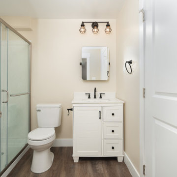
We transformed an unfinished basement into a functional oasis, our recent project encompassed the creation of a recreation room, bedroom, and a jack and jill bathroom with a tile look vinyl surround. We also completed the staircase, addressing plumbing issues that emerged during the process with expert problem-solving. Customizing the layout to work around structural beams, we optimized every inch of space, resulting in a harmonious and spacious living area.

 Bynum Design Group
As master of the perfect mix, LaMont Bynum can magically transform a raw space or breathe new life into what already exists.
His education in interior design combined with his penchant for problem solving and passion for transforming lives led to him following his calling to become a designer. Lamont thrives on working with clients to refine a vision and make it reality. He believes happiness is not something you postpone for the future; it is something you design for the present.
LaMont is a native of Suffolk, VA, a small town with a rich heritage. A Southern gentleman, he developed an eye for color, good design and great style early on. He grew up in a family whose love for interior design led to friendly family design competitions. The “creative types” who raised him served as his primary source of inspiration.
A graduate of Howard University, Lamont worked in hospitality sales and marketing before opening Rite At Home, Atlanta‘s premier consignment furniture boutique, in 2012. He serves on the Board of Directors for Rebuilding Together Atlanta, an organization working to ensure that low-income homeowners — particularly older adults, military veterans, people with disabilities and families with children — are able to live in warmth, safety and independence. Also, he chairs the Board of Directors for the Adamsville Business and Community Partnership. Lamont is always looking for ways to impact communities through engagement and design.
He has worked with Fortune 500 companies to develop their work and fun spaces for employees and even designed their CEO’s personal living spaces. LaMont believes no project is too small or too big, everyone deserves an environment conducive to dream, relax and make life happen.
With timeless, sophisticated taste, LaMont’s design style is classy, inviting, and also incredibly detail oriented. His ability to transform both residential homes and commercial projects by layering rich textures, colors, and fabrics has placed him on Atlanta’s Top 25 Designer List four times.
 Lars Remodeling & Design
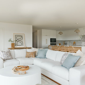
The completely reimagined floorplan included relocating the kitchen and Master Suite to the opposite side of the home to take better advantage of the views and natural light. All bathrooms and the laundry room were completely remodeled along with installing new doors, windows, and flooring throughout the home and completely upgrading all electrical and plumbing.
The end result is simply stunning. Light, bright, and modern, the new version of this home demonstrates the power of thoughtful architectural planning, creative problem solving, and expert design details.
22