
Search results for "Shifting object" in Home Design Ideas
 Drury Design
The Setup
For this primary bathroom project, the homeowners sought to transform their outdated, beige-toned space into a bright, functional sanctuary. The existing bathroom felt cramped and lifeless, with a small shower and limited storage options. The goal was to create a fresh, updated bathroom that maximizes the existing footprint while addressing specific desires for a more open, organized space with timeless materials.
Design objectives:
Brighten the bathroom and eliminate the dated beige color scheme
Install a freestanding tub in a compact space
Create a larger, more open shower without encroaching on the existing foot print too much
Incorporate hidden storage solutions
Maintain the existing bathroom layout while improving functionality
Update lighting and fixtures to create a contemporary feel
The Remodel
Design challenges to be solved:
- Compact Space Utilization – The small bathroom required careful planning to accommodate a freestanding tub while maintaining functionality and avoiding overcrowding.
- Hidden Storage Integration – The clients wanted a discreet hamper solution that wouldn’t clutter the limited floor space.
- Shower Niche Placement – With plumbing limitations and the clients’ desire to preserve their wavy accent tile wall, finding the perfect niche spot became a creative puzzle.
- Tile and Finish Coordination – Selecting complementary white tile and floor materials that worked harmoniously together.
- Larger Shower Space – Make the shower feel more open and brighter
The Renewed Space
Design solutions:
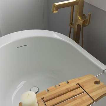
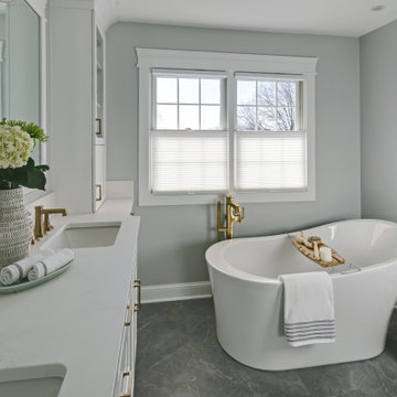
- Strategic Tub Placement – The freestanding tub was carefully positioned to maximize space, with its faucet strategically placed to allow easy access while preserving walking room. We reduced the counter depth just a bit by the tub, allowing more room for hamper cabinet and window access.
- Concealed Hamper Storage – A custom pull-out hamper was integrated into the vanity (right side, by tub), providing discreet storage within an 18-inch depth constraint.
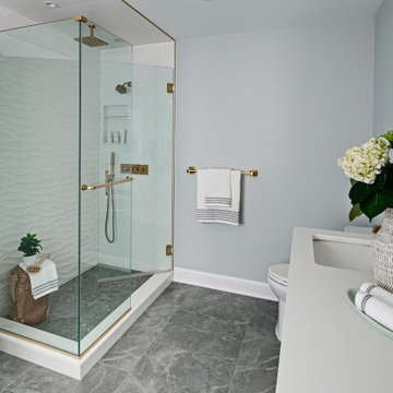
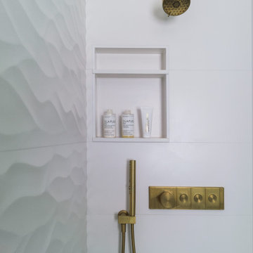
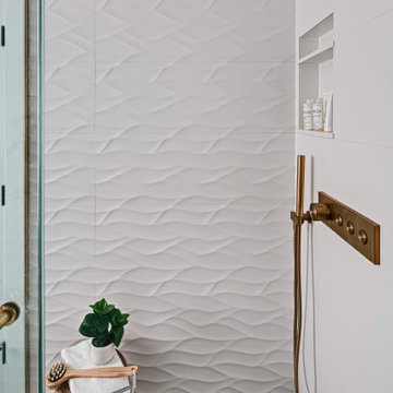
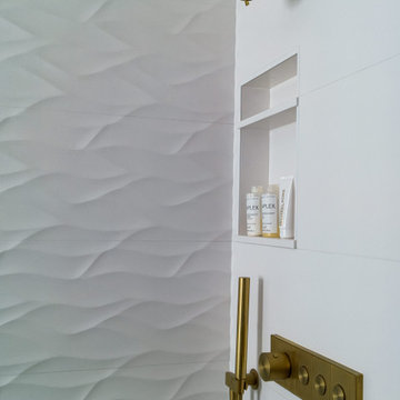
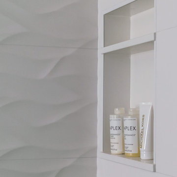
- Shower Plumbing Wall Niche – We shifted the niche left, just enough to work around the plumbing infrastructure and still score a roomy storage spot that looks intentional.
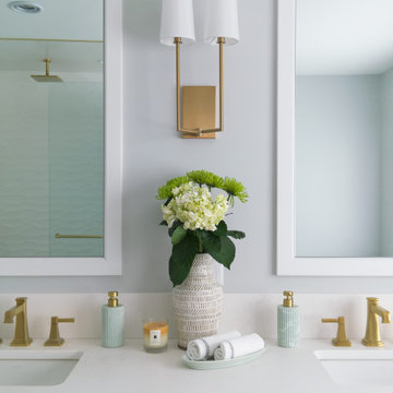
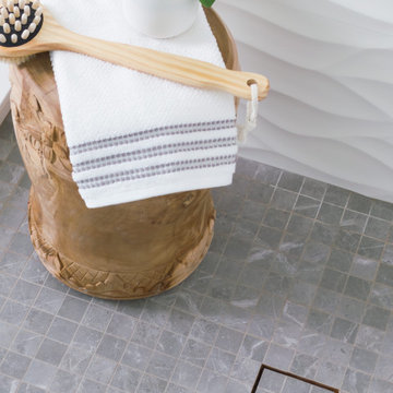
- Sophisticated Selections – Porcelanosa curvy white tile, Kohler brushed gold fixtures, and a neutral grey tile floor created a simple, timeless aesthetic that will be loved years to come.
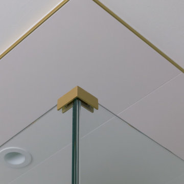
- Open Shower – Replacing the side wall with a clear glass surround, continuing the tile on the ceiling and extending the footprint opened up this area to the room while allowing more natural lighting into the shower space.
This bathroom transformation shows how thoughtful design turns challenges into opportunities. Brushed gold fixtures add warmth to the fresh white palette, while the perfectly balanced floor tile brings just the right depth. A partially glass-fronted vanity introduces subtle charm, giving the space a unique edge. Once cramped and outdated, this bathroom now feels bright, spacious, and serene—a testament to how every design detail makes a difference.
 Drury Design
The Setup
For this primary bathroom project, the homeowners sought to transform their outdated, beige-toned space into a bright, functional sanctuary. The existing bathroom felt cramped and lifeless, with a small shower and limited storage options. The goal was to create a fresh, updated bathroom that maximizes the existing footprint while addressing specific desires for a more open, organized space with timeless materials.
Design objectives:
Brighten the bathroom and eliminate the dated beige color scheme
Install a freestanding tub in a compact space
Create a larger, more open shower without encroaching on the existing foot print too much
Incorporate hidden storage solutions
Maintain the existing bathroom layout while improving functionality
Update lighting and fixtures to create a contemporary feel
The Remodel
Design challenges to be solved:
- Compact Space Utilization – The small bathroom required careful planning to accommodate a freestanding tub while maintaining functionality and avoiding overcrowding.
- Hidden Storage Integration – The clients wanted a discreet hamper solution that wouldn’t clutter the limited floor space.
- Shower Niche Placement – With plumbing limitations and the clients’ desire to preserve their wavy accent tile wall, finding the perfect niche spot became a creative puzzle.
- Tile and Finish Coordination – Selecting complementary white tile and floor materials that worked harmoniously together.
- Larger Shower Space – Make the shower feel more open and brighter
The Renewed Space
Design solutions:
- Strategic Tub Placement – The freestanding tub was carefully positioned to maximize space, with its faucet strategically placed to allow easy access while preserving walking room. We reduced the counter depth just a bit by the tub, allowing more room for hamper cabinet and window access.
- Concealed Hamper Storage – A custom pull-out hamper was integrated into the vanity (right side, by tub), providing discreet storage within an 18-inch depth constraint.
- Shower Plumbing Wall Niche – We shifted the niche left, just enough to work around the plumbing infrastructure and still score a roomy storage spot that looks intentional.
- Sophisticated Selections – Porcelanosa curvy white tile, Kohler brushed gold fixtures, and a neutral grey tile floor created a simple, timeless aesthetic that will be loved years to come.
- Open Shower – Replacing the side wall with a clear glass surround, continuing the tile on the ceiling and extending the footprint opened up this area to the room while allowing more natural lighting into the shower space.
This bathroom transformation shows how thoughtful design turns challenges into opportunities. Brushed gold fixtures add warmth to the fresh white palette, while the perfectly balanced floor tile brings just the right depth. A partially glass-fronted vanity introduces subtle charm, giving the space a unique edge. Once cramped and outdated, this bathroom now feels bright, spacious, and serene—a testament to how every design detail makes a difference.
 Drury Design
The Setup
For this primary bathroom project, the homeowners sought to transform their outdated, beige-toned space into a bright, functional sanctuary. The existing bathroom felt cramped and lifeless, with a small shower and limited storage options. The goal was to create a fresh, updated bathroom that maximizes the existing footprint while addressing specific desires for a more open, organized space with timeless materials.
Design objectives:
Brighten the bathroom and eliminate the dated beige color scheme
Install a freestanding tub in a compact space
Create a larger, more open shower without encroaching on the existing foot print too much
Incorporate hidden storage solutions
Maintain the existing bathroom layout while improving functionality
Update lighting and fixtures to create a contemporary feel
The Remodel
Design challenges to be solved:
- Compact Space Utilization – The small bathroom required careful planning to accommodate a freestanding tub while maintaining functionality and avoiding overcrowding.
- Hidden Storage Integration – The clients wanted a discreet hamper solution that wouldn’t clutter the limited floor space.
- Shower Niche Placement – With plumbing limitations and the clients’ desire to preserve their wavy accent tile wall, finding the perfect niche spot became a creative puzzle.
- Tile and Finish Coordination – Selecting complementary white tile and floor materials that worked harmoniously together.
- Larger Shower Space – Make the shower feel more open and brighter
The Renewed Space
Design solutions:
- Strategic Tub Placement – The freestanding tub was carefully positioned to maximize space, with its faucet strategically placed to allow easy access while preserving walking room. We reduced the counter depth just a bit by the tub, allowing more room for hamper cabinet and window access.
- Concealed Hamper Storage – A custom pull-out hamper was integrated into the vanity (right side, by tub), providing discreet storage within an 18-inch depth constraint.
- Shower Plumbing Wall Niche – We shifted the niche left, just enough to work around the plumbing infrastructure and still score a roomy storage spot that looks intentional.
- Sophisticated Selections – Porcelanosa curvy white tile, Kohler brushed gold fixtures, and a neutral grey tile floor created a simple, timeless aesthetic that will be loved years to come.
- Open Shower – Replacing the side wall with a clear glass surround, continuing the tile on the ceiling and extending the footprint opened up this area to the room while allowing more natural lighting into the shower space.
This bathroom transformation shows how thoughtful design turns challenges into opportunities. Brushed gold fixtures add warmth to the fresh white palette, while the perfectly balanced floor tile brings just the right depth. A partially glass-fronted vanity introduces subtle charm, giving the space a unique edge. Once cramped and outdated, this bathroom now feels bright, spacious, and serene—a testament to how every design detail makes a difference.
Find the right local pro for your project
 Drury Design
The Setup
For this primary bathroom project, the homeowners sought to transform their outdated, beige-toned space into a bright, functional sanctuary. The existing bathroom felt cramped and lifeless, with a small shower and limited storage options. The goal was to create a fresh, updated bathroom that maximizes the existing footprint while addressing specific desires for a more open, organized space with timeless materials.
Design objectives:
Brighten the bathroom and eliminate the dated beige color scheme
Install a freestanding tub in a compact space
Create a larger, more open shower without encroaching on the existing foot print too much
Incorporate hidden storage solutions
Maintain the existing bathroom layout while improving functionality
Update lighting and fixtures to create a contemporary feel
The Remodel
Design challenges to be solved:
- Compact Space Utilization – The small bathroom required careful planning to accommodate a freestanding tub while maintaining functionality and avoiding overcrowding.
- Hidden Storage Integration – The clients wanted a discreet hamper solution that wouldn’t clutter the limited floor space.
- Shower Niche Placement – With plumbing limitations and the clients’ desire to preserve their wavy accent tile wall, finding the perfect niche spot became a creative puzzle.
- Tile and Finish Coordination – Selecting complementary white tile and floor materials that worked harmoniously together.
- Larger Shower Space – Make the shower feel more open and brighter
The Renewed Space
Design solutions:
- Strategic Tub Placement – The freestanding tub was carefully positioned to maximize space, with its faucet strategically placed to allow easy access while preserving walking room. We reduced the counter depth just a bit by the tub, allowing more room for hamper cabinet and window access.
- Concealed Hamper Storage – A custom pull-out hamper was integrated into the vanity (right side, by tub), providing discreet storage within an 18-inch depth constraint.
- Shower Plumbing Wall Niche – We shifted the niche left, just enough to work around the plumbing infrastructure and still score a roomy storage spot that looks intentional.
- Sophisticated Selections – Porcelanosa curvy white tile, Kohler brushed gold fixtures, and a neutral grey tile floor created a simple, timeless aesthetic that will be loved years to come.
- Open Shower – Replacing the side wall with a clear glass surround, continuing the tile on the ceiling and extending the footprint opened up this area to the room while allowing more natural lighting into the shower space.
This bathroom transformation shows how thoughtful design turns challenges into opportunities. Brushed gold fixtures add warmth to the fresh white palette, while the perfectly balanced floor tile brings just the right depth. A partially glass-fronted vanity introduces subtle charm, giving the space a unique edge. Once cramped and outdated, this bathroom now feels bright, spacious, and serene—a testament to how every design detail makes a difference.
 Drury Design
The Setup
For this primary bathroom project, the homeowners sought to transform their outdated, beige-toned space into a bright, functional sanctuary. The existing bathroom felt cramped and lifeless, with a small shower and limited storage options. The goal was to create a fresh, updated bathroom that maximizes the existing footprint while addressing specific desires for a more open, organized space with timeless materials.
Design objectives:
Brighten the bathroom and eliminate the dated beige color scheme
Install a freestanding tub in a compact space
Create a larger, more open shower without encroaching on the existing foot print too much
Incorporate hidden storage solutions
Maintain the existing bathroom layout while improving functionality
Update lighting and fixtures to create a contemporary feel
The Remodel
Design challenges to be solved:
- Compact Space Utilization – The small bathroom required careful planning to accommodate a freestanding tub while maintaining functionality and avoiding overcrowding.
- Hidden Storage Integration – The clients wanted a discreet hamper solution that wouldn’t clutter the limited floor space.
- Shower Niche Placement – With plumbing limitations and the clients’ desire to preserve their wavy accent tile wall, finding the perfect niche spot became a creative puzzle.
- Tile and Finish Coordination – Selecting complementary white tile and floor materials that worked harmoniously together.
- Larger Shower Space – Make the shower feel more open and brighter
The Renewed Space
Design solutions:
- Strategic Tub Placement – The freestanding tub was carefully positioned to maximize space, with its faucet strategically placed to allow easy access while preserving walking room. We reduced the counter depth just a bit by the tub, allowing more room for hamper cabinet and window access.
- Concealed Hamper Storage – A custom pull-out hamper was integrated into the vanity (right side, by tub), providing discreet storage within an 18-inch depth constraint.
- Shower Plumbing Wall Niche – We shifted the niche left, just enough to work around the plumbing infrastructure and still score a roomy storage spot that looks intentional.
- Sophisticated Selections – Porcelanosa curvy white tile, Kohler brushed gold fixtures, and a neutral grey tile floor created a simple, timeless aesthetic that will be loved years to come.
- Open Shower – Replacing the side wall with a clear glass surround, continuing the tile on the ceiling and extending the footprint opened up this area to the room while allowing more natural lighting into the shower space.
This bathroom transformation shows how thoughtful design turns challenges into opportunities. Brushed gold fixtures add warmth to the fresh white palette, while the perfectly balanced floor tile brings just the right depth. A partially glass-fronted vanity introduces subtle charm, giving the space a unique edge. Once cramped and outdated, this bathroom now feels bright, spacious, and serene—a testament to how every design detail makes a difference.
 Drury Design
The Setup
For this primary bathroom project, the homeowners sought to transform their outdated, beige-toned space into a bright, functional sanctuary. The existing bathroom felt cramped and lifeless, with a small shower and limited storage options. The goal was to create a fresh, updated bathroom that maximizes the existing footprint while addressing specific desires for a more open, organized space with timeless materials.
Design objectives:
Brighten the bathroom and eliminate the dated beige color scheme
Install a freestanding tub in a compact space
Create a larger, more open shower without encroaching on the existing foot print too much
Incorporate hidden storage solutions
Maintain the existing bathroom layout while improving functionality
Update lighting and fixtures to create a contemporary feel
The Remodel
Design challenges to be solved:
- Compact Space Utilization – The small bathroom required careful planning to accommodate a freestanding tub while maintaining functionality and avoiding overcrowding.
- Hidden Storage Integration – The clients wanted a discreet hamper solution that wouldn’t clutter the limited floor space.
- Shower Niche Placement – With plumbing limitations and the clients’ desire to preserve their wavy accent tile wall, finding the perfect niche spot became a creative puzzle.
- Tile and Finish Coordination – Selecting complementary white tile and floor materials that worked harmoniously together.
- Larger Shower Space – Make the shower feel more open and brighter
The Renewed Space
Design solutions:
- Strategic Tub Placement – The freestanding tub was carefully positioned to maximize space, with its faucet strategically placed to allow easy access while preserving walking room. We reduced the counter depth just a bit by the tub, allowing more room for hamper cabinet and window access.
- Concealed Hamper Storage – A custom pull-out hamper was integrated into the vanity (right side, by tub), providing discreet storage within an 18-inch depth constraint.
- Shower Plumbing Wall Niche – We shifted the niche left, just enough to work around the plumbing infrastructure and still score a roomy storage spot that looks intentional.
- Sophisticated Selections – Porcelanosa curvy white tile, Kohler brushed gold fixtures, and a neutral grey tile floor created a simple, timeless aesthetic that will be loved years to come.
- Open Shower – Replacing the side wall with a clear glass surround, continuing the tile on the ceiling and extending the footprint opened up this area to the room while allowing more natural lighting into the shower space.
This bathroom transformation shows how thoughtful design turns challenges into opportunities. Brushed gold fixtures add warmth to the fresh white palette, while the perfectly balanced floor tile brings just the right depth. A partially glass-fronted vanity introduces subtle charm, giving the space a unique edge. Once cramped and outdated, this bathroom now feels bright, spacious, and serene—a testament to how every design detail makes a difference.
 Drury Design
The Setup
For this primary bathroom project, the homeowners sought to transform their outdated, beige-toned space into a bright, functional sanctuary. The existing bathroom felt cramped and lifeless, with a small shower and limited storage options. The goal was to create a fresh, updated bathroom that maximizes the existing footprint while addressing specific desires for a more open, organized space with timeless materials.
Design objectives:
Brighten the bathroom and eliminate the dated beige color scheme
Install a freestanding tub in a compact space
Create a larger, more open shower without encroaching on the existing foot print too much
Incorporate hidden storage solutions
Maintain the existing bathroom layout while improving functionality
Update lighting and fixtures to create a contemporary feel
The Remodel
Design challenges to be solved:
- Compact Space Utilization – The small bathroom required careful planning to accommodate a freestanding tub while maintaining functionality and avoiding overcrowding.
- Hidden Storage Integration – The clients wanted a discreet hamper solution that wouldn’t clutter the limited floor space.
- Shower Niche Placement – With plumbing limitations and the clients’ desire to preserve their wavy accent tile wall, finding the perfect niche spot became a creative puzzle.
- Tile and Finish Coordination – Selecting complementary white tile and floor materials that worked harmoniously together.
- Larger Shower Space – Make the shower feel more open and brighter
The Renewed Space
Design solutions:
- Strategic Tub Placement – The freestanding tub was carefully positioned to maximize space, with its faucet strategically placed to allow easy access while preserving walking room. We reduced the counter depth just a bit by the tub, allowing more room for hamper cabinet and window access.
- Concealed Hamper Storage – A custom pull-out hamper was integrated into the vanity (right side, by tub), providing discreet storage within an 18-inch depth constraint.
- Shower Plumbing Wall Niche – We shifted the niche left, just enough to work around the plumbing infrastructure and still score a roomy storage spot that looks intentional.
- Sophisticated Selections – Porcelanosa curvy white tile, Kohler brushed gold fixtures, and a neutral grey tile floor created a simple, timeless aesthetic that will be loved years to come.
- Open Shower – Replacing the side wall with a clear glass surround, continuing the tile on the ceiling and extending the footprint opened up this area to the room while allowing more natural lighting into the shower space.
This bathroom transformation shows how thoughtful design turns challenges into opportunities. Brushed gold fixtures add warmth to the fresh white palette, while the perfectly balanced floor tile brings just the right depth. A partially glass-fronted vanity introduces subtle charm, giving the space a unique edge. Once cramped and outdated, this bathroom now feels bright, spacious, and serene—a testament to how every design detail makes a difference.
 Drury Design
The Setup
For this primary bathroom project, the homeowners sought to transform their outdated, beige-toned space into a bright, functional sanctuary. The existing bathroom felt cramped and lifeless, with a small shower and limited storage options. The goal was to create a fresh, updated bathroom that maximizes the existing footprint while addressing specific desires for a more open, organized space with timeless materials.
Design objectives:
Brighten the bathroom and eliminate the dated beige color scheme
Install a freestanding tub in a compact space
Create a larger, more open shower without encroaching on the existing foot print too much
Incorporate hidden storage solutions
Maintain the existing bathroom layout while improving functionality
Update lighting and fixtures to create a contemporary feel
The Remodel
Design challenges to be solved:
- Compact Space Utilization – The small bathroom required careful planning to accommodate a freestanding tub while maintaining functionality and avoiding overcrowding.
- Hidden Storage Integration – The clients wanted a discreet hamper solution that wouldn’t clutter the limited floor space.
- Shower Niche Placement – With plumbing limitations and the clients’ desire to preserve their wavy accent tile wall, finding the perfect niche spot became a creative puzzle.
- Tile and Finish Coordination – Selecting complementary white tile and floor materials that worked harmoniously together.
- Larger Shower Space – Make the shower feel more open and brighter
The Renewed Space
Design solutions:
- Strategic Tub Placement – The freestanding tub was carefully positioned to maximize space, with its faucet strategically placed to allow easy access while preserving walking room. We reduced the counter depth just a bit by the tub, allowing more room for hamper cabinet and window access.
- Concealed Hamper Storage – A custom pull-out hamper was integrated into the vanity (right side, by tub), providing discreet storage within an 18-inch depth constraint.
- Shower Plumbing Wall Niche – We shifted the niche left, just enough to work around the plumbing infrastructure and still score a roomy storage spot that looks intentional.
- Sophisticated Selections – Porcelanosa curvy white tile, Kohler brushed gold fixtures, and a neutral grey tile floor created a simple, timeless aesthetic that will be loved years to come.
- Open Shower – Replacing the side wall with a clear glass surround, continuing the tile on the ceiling and extending the footprint opened up this area to the room while allowing more natural lighting into the shower space.
This bathroom transformation shows how thoughtful design turns challenges into opportunities. Brushed gold fixtures add warmth to the fresh white palette, while the perfectly balanced floor tile brings just the right depth. A partially glass-fronted vanity introduces subtle charm, giving the space a unique edge. Once cramped and outdated, this bathroom now feels bright, spacious, and serene—a testament to how every design detail makes a difference.
 Drury Design
The Setup
For this primary bathroom project, the homeowners sought to transform their outdated, beige-toned space into a bright, functional sanctuary. The existing bathroom felt cramped and lifeless, with a small shower and limited storage options. The goal was to create a fresh, updated bathroom that maximizes the existing footprint while addressing specific desires for a more open, organized space with timeless materials.
Design objectives:
Brighten the bathroom and eliminate the dated beige color scheme
Install a freestanding tub in a compact space
Create a larger, more open shower without encroaching on the existing foot print too much
Incorporate hidden storage solutions
Maintain the existing bathroom layout while improving functionality
Update lighting and fixtures to create a contemporary feel
The Remodel
Design challenges to be solved:
- Compact Space Utilization – The small bathroom required careful planning to accommodate a freestanding tub while maintaining functionality and avoiding overcrowding.
- Hidden Storage Integration – The clients wanted a discreet hamper solution that wouldn’t clutter the limited floor space.
- Shower Niche Placement – With plumbing limitations and the clients’ desire to preserve their wavy accent tile wall, finding the perfect niche spot became a creative puzzle.
- Tile and Finish Coordination – Selecting complementary white tile and floor materials that worked harmoniously together.
- Larger Shower Space – Make the shower feel more open and brighter
The Renewed Space
Design solutions:
- Strategic Tub Placement – The freestanding tub was carefully positioned to maximize space, with its faucet strategically placed to allow easy access while preserving walking room. We reduced the counter depth just a bit by the tub, allowing more room for hamper cabinet and window access.
- Concealed Hamper Storage – A custom pull-out hamper was integrated into the vanity (right side, by tub), providing discreet storage within an 18-inch depth constraint.
- Shower Plumbing Wall Niche – We shifted the niche left, just enough to work around the plumbing infrastructure and still score a roomy storage spot that looks intentional.
- Sophisticated Selections – Porcelanosa curvy white tile, Kohler brushed gold fixtures, and a neutral grey tile floor created a simple, timeless aesthetic that will be loved years to come.
- Open Shower – Replacing the side wall with a clear glass surround, continuing the tile on the ceiling and extending the footprint opened up this area to the room while allowing more natural lighting into the shower space.
This bathroom transformation shows how thoughtful design turns challenges into opportunities. Brushed gold fixtures add warmth to the fresh white palette, while the perfectly balanced floor tile brings just the right depth. A partially glass-fronted vanity introduces subtle charm, giving the space a unique edge. Once cramped and outdated, this bathroom now feels bright, spacious, and serene—a testament to how every design detail makes a difference.
 Drury Design
The Setup
For this primary bathroom project, the homeowners sought to transform their outdated, beige-toned space into a bright, functional sanctuary. The existing bathroom felt cramped and lifeless, with a small shower and limited storage options. The goal was to create a fresh, updated bathroom that maximizes the existing footprint while addressing specific desires for a more open, organized space with timeless materials.
Design objectives:
Brighten the bathroom and eliminate the dated beige color scheme
Install a freestanding tub in a compact space
Create a larger, more open shower without encroaching on the existing foot print too much
Incorporate hidden storage solutions
Maintain the existing bathroom layout while improving functionality
Update lighting and fixtures to create a contemporary feel
The Remodel
Design challenges to be solved:
- Compact Space Utilization – The small bathroom required careful planning to accommodate a freestanding tub while maintaining functionality and avoiding overcrowding.
- Hidden Storage Integration – The clients wanted a discreet hamper solution that wouldn’t clutter the limited floor space.
- Shower Niche Placement – With plumbing limitations and the clients’ desire to preserve their wavy accent tile wall, finding the perfect niche spot became a creative puzzle.
- Tile and Finish Coordination – Selecting complementary white tile and floor materials that worked harmoniously together.
- Larger Shower Space – Make the shower feel more open and brighter
The Renewed Space
Design solutions:
- Strategic Tub Placement – The freestanding tub was carefully positioned to maximize space, with its faucet strategically placed to allow easy access while preserving walking room. We reduced the counter depth just a bit by the tub, allowing more room for hamper cabinet and window access.
- Concealed Hamper Storage – A custom pull-out hamper was integrated into the vanity (right side, by tub), providing discreet storage within an 18-inch depth constraint.
- Shower Plumbing Wall Niche – We shifted the niche left, just enough to work around the plumbing infrastructure and still score a roomy storage spot that looks intentional.
- Sophisticated Selections – Porcelanosa curvy white tile, Kohler brushed gold fixtures, and a neutral grey tile floor created a simple, timeless aesthetic that will be loved years to come.
- Open Shower – Replacing the side wall with a clear glass surround, continuing the tile on the ceiling and extending the footprint opened up this area to the room while allowing more natural lighting into the shower space.
This bathroom transformation shows how thoughtful design turns challenges into opportunities. Brushed gold fixtures add warmth to the fresh white palette, while the perfectly balanced floor tile brings just the right depth. A partially glass-fronted vanity introduces subtle charm, giving the space a unique edge. Once cramped and outdated, this bathroom now feels bright, spacious, and serene—a testament to how every design detail makes a difference.
 Drury Design
The Setup
For this primary bathroom project, the homeowners sought to transform their outdated, beige-toned space into a bright, functional sanctuary. The existing bathroom felt cramped and lifeless, with a small shower and limited storage options. The goal was to create a fresh, updated bathroom that maximizes the existing footprint while addressing specific desires for a more open, organized space with timeless materials.
Design objectives:
Brighten the bathroom and eliminate the dated beige color scheme
Install a freestanding tub in a compact space
Create a larger, more open shower without encroaching on the existing foot print too much
Incorporate hidden storage solutions
Maintain the existing bathroom layout while improving functionality
Update lighting and fixtures to create a contemporary feel
The Remodel
Design challenges to be solved:
- Compact Space Utilization – The small bathroom required careful planning to accommodate a freestanding tub while maintaining functionality and avoiding overcrowding.
- Hidden Storage Integration – The clients wanted a discreet hamper solution that wouldn’t clutter the limited floor space.
- Shower Niche Placement – With plumbing limitations and the clients’ desire to preserve their wavy accent tile wall, finding the perfect niche spot became a creative puzzle.
- Tile and Finish Coordination – Selecting complementary white tile and floor materials that worked harmoniously together.
- Larger Shower Space – Make the shower feel more open and brighter
The Renewed Space
Design solutions:
- Strategic Tub Placement – The freestanding tub was carefully positioned to maximize space, with its faucet strategically placed to allow easy access while preserving walking room. We reduced the counter depth just a bit by the tub, allowing more room for hamper cabinet and window access.
- Concealed Hamper Storage – A custom pull-out hamper was integrated into the vanity (right side, by tub), providing discreet storage within an 18-inch depth constraint.
- Shower Plumbing Wall Niche – We shifted the niche left, just enough to work around the plumbing infrastructure and still score a roomy storage spot that looks intentional.
- Sophisticated Selections – Porcelanosa curvy white tile, Kohler brushed gold fixtures, and a neutral grey tile floor created a simple, timeless aesthetic that will be loved years to come.
- Open Shower – Replacing the side wall with a clear glass surround, continuing the tile on the ceiling and extending the footprint opened up this area to the room while allowing more natural lighting into the shower space.
This bathroom transformation shows how thoughtful design turns challenges into opportunities. Brushed gold fixtures add warmth to the fresh white palette, while the perfectly balanced floor tile brings just the right depth. A partially glass-fronted vanity introduces subtle charm, giving the space a unique edge. Once cramped and outdated, this bathroom now feels bright, spacious, and serene—a testament to how every design detail makes a difference.

 Santa Barbara Home Design
Design Consultant Jeff Doubét is the author of Creating Spanish Style Homes: Before & After – Techniques – Designs – Insights. The 240 page “Design Consultation in a Book” is now available. Please visit SantaBarbaraHomeDesigner.com for more info.
Jeff Doubét specializes in Santa Barbara style home and landscape designs. To learn more info about the variety of custom design services I offer, please visit SantaBarbaraHomeDesigner.com
Jeff Doubét is the Founder of Santa Barbara Home Design - a design studio based in Santa Barbara, California USA.
 Drury Design
The Setup
After 25+ years in their home, these long-time clients were ready to upgrade their outdated primary bath into something more modern, functional, and reflective of their personal taste. The original space had all the hallmarks of a ’90s builder-grade bathroom — bulky built-in tub, undersized shower, and a layout that wasn’t making the most of the square footage. With the kids grown and a successful kitchen remodel already under their belt, the couple returned to Drury Design for a complete bathroom transformation.
Design objectives:
Create a contemporary, personalized retreat with clean lines and a calming palette
Incorporate the husband’s favorite color (blue) in a bold but tasteful way
Add more efficient storage, including a long-desired linen closet
Improve lighting and ventilation
Make better use of space, especially in the old tub-and-shower zone
Maintain dual sinks and a dedicated makeup area
Add heated floors for extra comfort
The Remodel
Design challenges to be solved:
Reimagine a large but awkward separate shower/tub room to feel more intentional and spa-like
Integrate bold color in a way that felt stylish, not overpowering
Combine two previously separate sinks into one shared vanity without losing the “his and hers” feel
Maintain a sense of flow and cohesion across two adjoining zones of the bathroom
Create a makeup area that feels set apart without breaking design continuity
Maximize comfort in winter without dramatically inflating the project budget
The Renewed Space
Design solutions:
Shifted the location of the tub and expanded the shower to reconfigure the secondary room into a functional spa space; introduced floating shelves and a linen cabinet to tie it all together
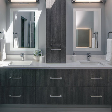
Let the rich blue shower tile take center stage as a statement piece while keeping the rest of the palette subdued and modern with layered grays
Centered a tall cabinet between the two sinks to provide extra storage and gently divide the shared vanity wall into his-and-hers zones
Chose a freestanding-style tub that installs flush against the wall—preserving the aesthetic while optimizing space and maximizing flow between rooms
Added subtle glam touches — like jewelry-inspired drawer pulls — at the makeup station to give it identity without disrupting the flow
Installed heated floors with programmable settings, offering hotel-level comfort without blowing the budget
Final Thoughts:
The finished space is a stylish blend of utility and serenity. Clean lines, modern finishes, and pops of bold color reflect the homeowners’ taste without overwhelming the design. What was once a dated, underused space is now a calm, contemporary retreat with thoughtful details throughout – from the integrated makeup zone to the just-right splash of color and the luxurious heated floors. Another successful collaboration with Drury Design, this project proves that remodeling isn’t just about resale — it’s about finally getting the space you’ve always wanted, and loving it every day.
 Drury Design
Relocating from San Francisco, this young family immediately zeroed in on the wonderful historic homes around downtown Chicago. Most of the properties they saw checked a lot of wish list boxes, but none of them checked every box. The house they landed on had beautiful curb appeal, a dramatic entry with a welcoming porch and front hall, and a really nice yard. Unfortunately, it did not have a kitchen that was well set-up for cooking and entertaining. Reworking the kitchen area was the top priority.
The family had met with a few other designers and even had an architect take a crack at the space, but they were not able to come up with a viable solution. Here’s how Senior Designer Diana Burton approached the project…
Design Objectives:
Respect the home’s vintage feel while bringing the kitchen up to date
Open up the kitchen area to create an open space for gathering and entertaining
Upgrade appliances to top-of-the-line models
Include a large island with seating
Include seating for casual family meals in a space that won’t be a replacement for the adjacent formal dining room
THE REMODEL
Design Challenges:
Remove a load-bearing wall and combine smaller rooms to create one big kitchen
A powder room in the back corner of the existing kitchen was a huge obstacle to updating the layout
Maintain large windows with views of the yard while still providing ample storage
Design Solutions:
Relocating the powder room to another part of the first floor (a large closet under the stairs) opened up the space dramatically
Create space for a larger island by recessing the fridge/freezer and shifting the pantry to a space adjacent to the kitchen
A banquette saves space and offers a perfect solution for casual dining
The walnut banquette table beautifully complements the fridge/freezer armoire
Utilize a gap created by the new fridge location to create a tall shallow cabinet for liquor storage w/ a wine cubby
Closing off one doorway into the dining room and using the “between the studs” space for a tall storage cabinet
Dish organizing drawers offer handy storage for plates, bowls, and serving dishes right by main sink and dishwasher
Cabinetry backing up to the dining room offers ample storage for glassware and functions both as a coffee station and cocktail bar
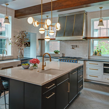
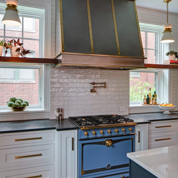
Open shelves flanking the hood add storage without blocking views and daylight
A beam was required where the wall was removed. Additional beams added architectural interest and helped integrate the beams into the space
Statement lighting adds drama and personality to the space
THE RENEWED SPACE
This project exemplifies the transformative power of good design. Simply put, good design allows you to live life artfully. The newly remodeled kitchen effortlessly combines functionality and aesthetic appeal, providing a delightful space for cooking and spending quality time together. It’s comfy for regular meals but ultimately outfitted for those special gatherings. Infused with classic finishes and a timeless charm, the kitchen emanates an enduring atmosphere that will never go out of style.
 Drury Design
Relocating from San Francisco, this young family immediately zeroed in on the wonderful historic homes around downtown Chicago. Most of the properties they saw checked a lot of wish list boxes, but none of them checked every box. The house they landed on had beautiful curb appeal, a dramatic entry with a welcoming porch and front hall, and a really nice yard. Unfortunately, it did not have a kitchen that was well set-up for cooking and entertaining. Reworking the kitchen area was the top priority.
The family had met with a few other designers and even had an architect take a crack at the space, but they were not able to come up with a viable solution. Here’s how Senior Designer Diana Burton approached the project…
Design Objectives:
Respect the home’s vintage feel while bringing the kitchen up to date
Open up the kitchen area to create an open space for gathering and entertaining
Upgrade appliances to top-of-the-line models
Include a large island with seating
Include seating for casual family meals in a space that won’t be a replacement for the adjacent formal dining room
THE REMODEL
Design Challenges:
Remove a load-bearing wall and combine smaller rooms to create one big kitchen
A powder room in the back corner of the existing kitchen was a huge obstacle to updating the layout
Maintain large windows with views of the yard while still providing ample storage
Design Solutions:
Relocating the powder room to another part of the first floor (a large closet under the stairs) opened up the space dramatically
Create space for a larger island by recessing the fridge/freezer and shifting the pantry to a space adjacent to the kitchen
A banquette saves space and offers a perfect solution for casual dining
The walnut banquette table beautifully complements the fridge/freezer armoire
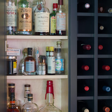
Utilize a gap created by the new fridge location to create a tall shallow cabinet for liquor storage w/ a wine cubby
Closing off one doorway into the dining room and using the “between the studs” space for a tall storage cabinet
Dish organizing drawers offer handy storage for plates, bowls, and serving dishes right by main sink and dishwasher
Cabinetry backing up to the dining room offers ample storage for glassware and functions both as a coffee station and cocktail bar
Open shelves flanking the hood add storage without blocking views and daylight
A beam was required where the wall was removed. Additional beams added architectural interest and helped integrate the beams into the space
Statement lighting adds drama and personality to the space
THE RENEWED SPACE
This project exemplifies the transformative power of good design. Simply put, good design allows you to live life artfully. The newly remodeled kitchen effortlessly combines functionality and aesthetic appeal, providing a delightful space for cooking and spending quality time together. It’s comfy for regular meals but ultimately outfitted for those special gatherings. Infused with classic finishes and a timeless charm, the kitchen emanates an enduring atmosphere that will never go out of style.
This photo illuminates the gorgeous La Cornue range, and the custom stainless and brass range hood.
 Drury Design
Relocating from San Francisco, this young family immediately zeroed in on the wonderful historic homes around downtown Chicago. Most of the properties they saw checked a lot of wish list boxes, but none of them checked every box. The house they landed on had beautiful curb appeal, a dramatic entry with a welcoming porch and front hall, and a really nice yard. Unfortunately, it did not have a kitchen that was well set-up for cooking and entertaining. Reworking the kitchen area was the top priority.
The family had met with a few other designers and even had an architect take a crack at the space, but they were not able to come up with a viable solution. Here’s how Senior Designer Diana Burton approached the project…
Design Objectives:
Respect the home’s vintage feel while bringing the kitchen up to date
Open up the kitchen area to create an open space for gathering and entertaining
Upgrade appliances to top-of-the-line models
Include a large island with seating
Include seating for casual family meals in a space that won’t be a replacement for the adjacent formal dining room
THE REMODEL
Design Challenges:
Remove a load-bearing wall and combine smaller rooms to create one big kitchen
A powder room in the back corner of the existing kitchen was a huge obstacle to updating the layout
Maintain large windows with views of the yard while still providing ample storage
Design Solutions:
Relocating the powder room to another part of the first floor (a large closet under the stairs) opened up the space dramatically
Create space for a larger island by recessing the fridge/freezer and shifting the pantry to a space adjacent to the kitchen
A banquette saves space and offers a perfect solution for casual dining
The walnut banquette table beautifully complements the fridge/freezer armoire
Utilize a gap created by the new fridge location to create a tall shallow cabinet for liquor storage w/ a wine cubby
Closing off one doorway into the dining room and using the “between the studs” space for a tall storage cabinet
Dish organizing drawers offer handy storage for plates, bowls, and serving dishes right by main sink and dishwasher
Cabinetry backing up to the dining room offers ample storage for glassware and functions both as a coffee station and cocktail bar
Open shelves flanking the hood add storage without blocking views and daylight
A beam was required where the wall was removed. Additional beams added architectural interest and helped integrate the beams into the space
Statement lighting adds drama and personality to the space
THE RENEWED SPACE
This project exemplifies the transformative power of good design. Simply put, good design allows you to live life artfully. The newly remodeled kitchen effortlessly combines functionality and aesthetic appeal, providing a delightful space for cooking and spending quality time together. It’s comfy for regular meals but ultimately outfitted for those special gatherings. Infused with classic finishes and a timeless charm, the kitchen emanates an enduring atmosphere that will never go out of style.
This is the special feature utilized a gap created by the new fridge location to create a tall shallow cabinet for liquor storage w/ a wine cubby
 Neumann & Rudy Architecture
## I. Spatial Composition & Architectural Volume
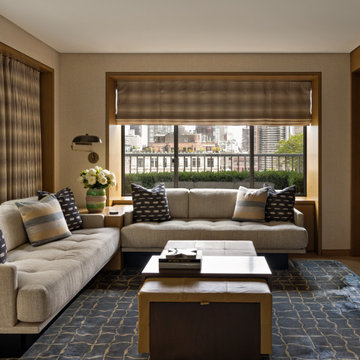
This is a compact urban salon organized with almost Miesian discipline around a single, decisive gesture: the L-configuration of low, tuxedo-armed banquette seating that hugs two perimeter walls and turns the room inward upon itself. The plan reads as a conversation pit without excavation—the seat heights are deliberately suppressed, the backs held low, so that the horizon of upholstery never competes with the aperture behind it. Above, a flat, unadorned plaster soffit-plane is held tight to the wall line, its perimeter reveal drawing a crisp shadow-gap that lets the ceiling appear to float free of the fabric-wrapped walls. The architectural protagonist is the millwork: a deep-jambed picture window recessed within a wide, radiused casing of pale rift-sawn oak, its returns thickened into a continuous window seat and low credenza that transitions seamlessly into flanking cabinetry. This joinery performs double duty as tectonic frame and furniture, resolving the corner where the sofa arm meets the wall with a fitted oak console rather than a leftover void. On the right, a taller oak portal—part case-goods, part passage—houses a monolithic dark media volume, its recessive blackness anchoring the composition's east edge and countering the pull of the glazing. Sightlines are carefully triangulated: the low furniture, the horizontal blind valance, and the parapet railing beyond stack into a series of registers that push the eye out over the rooftops, borrowing the cityscape as a fourth wall.
## II. Materiality, Color & Texture
The palette is a study in warm neutrality calibrated across a very narrow tonal band, where interest is generated by texture rather than chroma. Walls are sheathed in a woven grasscloth or linen-weave wallcovering in oatmeal-taupe, its subtle grain absorbing light and lending the envelope a matte, tactile softness that reads almost suede-like in raking illumination. Against this, the oak millwork supplies a honeyed mid-tone with visible cathedral figure, satin-lacquered rather than glossed, so the wood glows without reflecting. Upholstery is a heavy natural linen in flax, deeply channel-tufted and biscuit-quilted—an insistent geometry of dimples and seams that catches light and prevents the mass from flattening. The textile program is where the room permits itself wit: indigo-and-ecru ikat or resist-dyed pillows introduce the only true saturation and the only irregular, hand-made mark; a wool blanket-stripe cushion in wheat, dove, and slate mediates between them; and the tailored roman shade and pinch-pleat drapery, in a subtly striated ombré weave of bronze, sand, and pewter, act as a tonal bridge between wall and wood. Below, the field shifts cool—an abrasi or silk-and-wool rug in ink and petrol blue, overlaid with a sinuous ogee lattice in muted gold, whose viscose sheen produces directional shimmer against the room's otherwise matte disposition. Leather appears twice, in caramel-toned saddle upholstery on the twin benches and ottoman, its topstitched panels and strap-pull detailing offering the crispest edge in the room; the espresso-stained coffee table and plinths supply the necessary chromatic bass note. A single celadon-and-blush ceramic vessel, with its banded, glazed belly, functions as a deliberate polychrome accent—an object of arrested attention within a rigorously restrained field.
## III. Lighting, Atmosphere & Style Profile
Daylight is the primary luminaire and it is meticulously managed. The roman shade is dropped to roughly one-third, cropping the sky and glare while framing the mid-ground rooftops—a device that converts an ordinary window into a horizontal, cinematic panorama. Concealed cove or integrated LED lighting within the oak jamb washes the reveal from within, so the window surround reads as a self-illuminated frame and the transition from interior brightness to exterior daylight is softened rather than silhouetted; the same strategy grazes the wall panel behind the sofa, producing a gentle vertical gradient. Artificial light is otherwise almost entirely decorative and directional: a swing-arm wall sconce in antiqued brass with a domed, spun-metal shade cantilevers over the corner console, its low placement establishing a task-scaled pool of warmth and reinforcing the room's insistent horizontality. The resultant atmosphere is hushed, enveloping, and distinctly crepuscular—a lounge tuned for late-afternoon light and low conversation. Stylistically, the project synthesizes a mid-century modern armature—low-slung planar seating, tuxedo arms, brass and dark wood—with the tactile restraint of contemporary Warm Minimalism and a discernible strain of Japanese-influenced spatial editing: deep reveals, floating planes, an appreciation for the void, and objects placed with ikebana-like economy. One might classify it as Refined Urban Modernism, or a bespoke Warm Minimalism, in which luxury is expressed not through ornament but through the precision of joinery, the depth of the material palette, and the discipline with which the view is framed.

 safe ZOnea
Staging a home for sale or for a major transition is a strange in-between state. You are still living in the space, but you are also preparing it to impress strangers, support showings, and remain functional until the final move-out day. That tension between “home” and “product” is where storage quietly becomes one of your smartest tools. Used well, storage lets you reduce clutter, protect important items, and create the kind of rooms that photograph beautifully and feel calm when buyers walk through the door.
A staged move is rarely just about shifting boxes from one address to another. It is about managing timing, presentation, and stress at the same time. When storage is built into the plan from day one, the entire process feels less rushed and more strategic. Rooms open up gradually, essentials stay accessible, and you never feel like you are drowning in half-packed chaos. Understanding how to use storage as a staging partner, not just a place to dump excess stuff, is what turns a messy transition into a controlled, professional-looking move.
Why Storage Is the Backbone of Every Staged Move
Visual space is emotional space. When every surface is covered, and every corner is full, buyers feel crowded before they have even evaluated the layout. Storage gives you a way to pull back without making drastic decisions about what to keep or donate. Seasonal décor, bulky furniture, duplicate items, archives, and personal collections can be moved out early, so the home reads cleaner and more open while still feeling lived-in. That balance between warmth and simplicity is exactly what good staging tries to achieve.
In more complex situations, such as live-work properties or home offices, storage becomes even more important. You may need to keep a business running while also presenting a polished environment to viewers. Partnering with local movers in Boston makes it easier to shift equipment, files, and nonessential pieces into storage in phases, so work can continue while the visible areas of the property stay controlled and presentable.
How Staging and Storage Work Together to Control Visual Impact
Staging works best when every object in a room has a clear purpose. A sofa frames a conversation. A table suggests gathering. A lamp softens the mood. Everything else that is not essential to that story competes for attention. Storage supports staging by giving you a clean staging bench off-site, where nonessential items can wait without being constantly shuffled between rooms or piled into overstuffed closets.
The art lies in deciding what stays and what goes. Family photos, extensive collections, excess seating, and rarely used appliances often move into storage first. What remains should be enough to show scale, comfort, and function without revealing the full weight of daily life. Commercial properties go through a similar filtering process. Extra desks, surplus equipment, outdated signage, and inactive files often move out early so the active workspace feels lean, efficient, and future-ready before a relocation supported by commercial movers takes place.
Strategic Timing of Storage before the Actual Move
The worst time to think about storage is when boxes are already stacked in the hallway. In a staged move, storage decisions ideally begin as soon as you know the property will be listed or the space will be transitioned. That might be a month or more before the main moving date. Starting early gives you time to sort, label, and prioritize instead of throwing things together in a panic.
An early storage phase also helps you test how the home feels with less in it. You may discover that removing a few large pieces transforms a cramped room into an open, inviting space. For commercial spaces, early storage lets operations continue with fewer interruptions. Departments can send nonessential items out in waves. When the main relocation comes, much of the excess is already safely stored, and what remains is easier for a commercial movers Boston team to handle with speed and care.
The Emotional Psychology behind Letting Storage Hold Your Belongings
Letting belongings leave the house ahead of you can feel unsettling. There is always a quiet fear that once something is out of sight, it will be forgotten, damaged, or harder to reclaim. That is why some people resist using storage even when they know it would make the staging process easier. Acknowledging that emotion instead of dismissing it helps you plan more honestly and avoids last-minute regret.
The reality is that good storage is not a black hole; it is a temporary pause. When items are packed thoughtfully, labeled clearly, and placed in an environment you trust, they become easier to manage than when they are tucked into random cupboards or stacked in spare rooms. For many people, living with fewer visible possessions during staging actually reduces tension. The home feels lighter and easier to maintain. Businesses notice the same effect when storage removes outdated equipment and clutter from the floor. The workspace looks more focused, and staff can concentrate on current tasks instead of navigating around accumulated history.
Protecting Assets While They Live in Storage
Sending belongings into storage is only a good idea if they come back in the same or better condition. That is where quality control matters. Furniture, textiles, electronics, files, and artwork each have different vulnerabilities. Moisture, temperature swings, dust, and rough handling can all damage them in ways that only become obvious later. Choosing the right type of storage and packing accordingly is central to the genius of using storage as part of a staged move rather than as a desperate overflow container.
Climate-controlled units, padded wrapping, elevated pallets, careful stacking, and clearly marked boxes all reduce risk. The goal is to handle items fewer times, not more. When storage is integrated into the move plan, belongings can travel directly from the home to storage and later from storage to the new address with minimal extra movement. Many owners coordinate those transfers through a well trusted movers in Boston, so the same team that moves items out early also manages their final delivery, preserving continuity and accountability.
How Storage Reduces Risk during Multi-Phase Moves
Few staged moves happen in a single clean step. There are often gaps between listing and selling, between selling and closing, between closing and final move-out. If renovations, inspections, or office reconfigurations are involved, the timeline becomes even more layered. Storage absorbs those gaps, so you are not forced to live among towers of boxes or stack equipment in hallways waiting for the next phase.
By treating storage as a flexible middle ground, you can move things out gradually while still having access when needed. For example, archived files can go first, followed by seasonal décor, then surplus furniture. As each stage ends, fewer items remain to be shifted on the final date. This phased approach reduces the risk of rushed, late-night packing sessions, careless stacking, and damaged items. It also makes it easier for commercial moving crews to work efficiently because they are handling a manageable volume of goods at each phase rather than everything at once.
Using Storage to Maintain Clean Show-Ready Conditions
One of the hardest parts of staging is keeping the property consistently show-ready. Every viewing becomes its own small event. Floors need to be cleared, surfaces wiped, and personal items tucked away. When too many belongings remain in the home, each showing takes a heavy amount of effort. Storage cuts that workload dramatically by taking nonessentials completely off the stage.
With fewer items to move and hide, maintaining a neutral, inviting look becomes much more realistic. You are not scrambling to stuff things into closets or push items under the bed. Instead, the home sits closer to show condition all the time, and the final touches before a viewing are minimal. In commercial environments, using storage helps maintain a professional appearance for clients and staff, even while the space is being prepared for a larger transition. Active tools and furniture stay in play, while inactive pieces quietly support the future from storage.
Storage as a Strategic Tool in Business Relocation Planning
For businesses, storage is more than a convenience; it is part of risk management. Office relocations and staged commercial moves have to juggle lease deadlines, equipment deliveries, IT cutovers, and staffing realities. Trying to shift everything in one move often results in downtime, lost files, and strained teams. Storage turns the move into a series of controlled steps instead of a single disruptive jump.
Unused furniture, archived documents, and non-critical inventory can be moved into storage weeks ahead of the main relocation. As the new space becomes ready, items can move out of storage and directly into position. This reduces double-handling and keeps the old and new locations from filling with half-unpacked material. A business that coordinates these flows with professional commercial movers in Boston usually experiences smoother transitions, because storage is treated as a working part of the operational plan rather than a leftover problem.
The Hidden Cost Benefits of Proper Storage Planning
On paper, storage looks like an extra expense. In reality, poorly managed moves cost far more. When everything is rushed into boxes at the last minute, items are damaged, misplaced, or transported multiple times. Extra labor hours, emergency packing supplies, replacement furniture, and extended timelines quickly outweigh the cost of well-used storage. Staging without storage also tends to keep homes and offices crowded longer, which can hurt impressions and, in the case of a sale, influence offers.
When storage is integrated from the beginning, you minimize waste. You handle items fewer times, you know where things are, and you avoid paying people to shift the same objects repeatedly. Staged homes that look better often sell faster or draw stronger interest, which helps recover investment on the back end. Businesses benefit from less downtime, safer handling of equipment, and predictable work schedules. Those gains are why many clients prefer partnering with a commercial moving company in Boston that understands storage as a cost-control tool, not just a place to park overflow.
Conclusion
The true genius of using storage during a staged home move is that it quietly rewrites the rules of transition. Instead of treating space as something that must absorb every box and belonging until the last possible moment, you treat storage as a flexible extension of the home or office. This shift in thinking opens rooms, clears sightlines, and makes every phase of the move more intentional. Staging becomes easier, maintenance becomes lighter, and the stress of living in a half-moved environment drops noticeably. When storage is chosen carefully, used early, and coordinated with the overall moving plan, it protects both physical assets and emotional energy. Buyers and visitors see a calm, collected space. You experience a less chaotic path from “here” to “there.” Whether you are selling a home, repositioning a business, or managing a complex phased relocation, storage can turn a disruptive event into a managed, almost elegant process.
For people who want that level of control and care during a staged move, Stairhopper movers have built a strong reputation by treating storage, timing, and transport as parts of one connected strategy. Their team is known for listening closely, planning around real-life constraints, and moving both residential and commercial clients through transitions with calm, steady execution. They approach every project as a partnership, aligning storage use, staging needs, and final delivery so that what matters most arrives safely, on schedule, and with as little disruption as possible.
Frequently Asked Questions
Q1. When should I arrange storage for a staged home move?
Ideally, four to six weeks before listing or transition, so clearing, packing, and staging can happen gradually without rushed decisions or last-minute stress.
Q2. Is climate-controlled storage necessary for staged moves?
It is highly recommended for wood furniture, electronics, artwork, and documents, since temperature and humidity swings can quietly damage materials over time.
Q3. How does storage help keep a home show-ready?
By moving nonessential items off-site, daily tidying becomes simpler, and each room can stay closer to a staged condition between viewings or inspections.
Q4. Can storage reduce the length of the final moving day?
Yes. When many items are moved into storage in advance, the final moving day focuses on essentials, which shortens timelines and reduces physical and mental strain.
Q5. Is storage useful for short-term business relocations?
Even in short relocations, storage helps prevent overcrowded offices and allows departments to move in phases without interrupting everyday operations.
Q6. How do I decide what should go into storage first?
Start with rarely used items, seasonal décor, surplus furniture, and archived materials, then work toward pieces that are visually distracting or make rooms feel cramped.
Q7. Will using storage make it harder to find things later?
Not if packing and labeling are done carefully. Clear categories, room-based labels, and simple inventories make stored items easier to locate than when scattered at home.
Q8. Does storage still make sense if my move happens in one day?
Yes, because staging and preparation begin well before that day. Storage keeps the home functional and attractive during the weeks leading up to the final move.

 McCullough's Flooring
Gorgeous master bath finished with Dal-Tile's Fabrique porcelain tile in the color Noir Linen polished. Tile size is 12"x24" installed in a brick joint pattern. The floor boasts underfloor heating on a timed thermostat.

 Renovisions
 It’s no surprise these Hanover clients reached out to Cathy and Ed of Renovisions for design and build services as they wanted a local professional bath specialist to turn their plain builder-grade bath into a luxurious handicapped accessible master bath.
Renovisions had safety and universal design in mind while creating this customized two-person super shower and well-appointed master bath so their clients could escape to a special place to relax and energize their senses while also helping to conserve time and water as it is used simultaneously by them.
This completely water proofed spacious 4’x8’ walk-in curb-less shower with lineal drain system and larger format porcelain tiles was a must have for our senior client –with larger tiles there are less grout lines, easier to clean and easier to maneuver using a walker to enter and exit the master bath.
Renovisions collaborated with their clients to design a spa-like bath with several amenities and added conveniences with safety considerations. The bench seat that spans the width of the wall was a great addition to the shower. It’s a comfortable place to sit down and stretch out and also to keep warm as electric mesh warming materials were used along with a programmable thermostat to keep these homeowners toasty and cozy!
Careful attention to all of the details in this master suite created a peaceful and elegant environment that, simply put, feels divine. Adding details such as the warming towel rack, mosaic tiled shower niche, shiny polished chrome decorative safety grab bars that also serve as towel racks and a towel rack inside the shower area added a measure of style. A stately framed mirror over the pedestal sink matches the warm white painted finish of the linen storage cabinetry that provides functionality and good looks to this space. Pull-down safety grab bars on either side of the comfort height high-efficiency toilet was essential to keep safety as a top priority.
Water, water everywhere for this well deserving couple – multiple shower heads enhances the bathing experience for our client with mobility issues as 54 soft sprays from each wall jet provide a soothing and cleansing effect – a great choice because they do not require gripping and manipulating handles yet provide a sleek look with easy cleaning. The thermostatic valve maintains desired water temperature and volume controls allows the bather to utilize the adjustable hand-held shower on a slide-bar- an ideal fixture to shower and spray down shower area when done.
A beautiful, frameless clear glass enclosure maintains a clean, open look without taking away from the stunning and richly grained marble-look tiles and decorative elements inside the shower. In addition to its therapeutic value, this shower is truly a design focal point of the master bath with striking tile work, beautiful chrome fixtures including several safety grab bars adding aesthetic value as well as safety benefits.
7