Search results for "Shorter time frames" in Home Design Ideas

This timber frame great room is created by the custom, curved timber trusses, which also open the up to the window prow with amazing lake views.
Photos: Copyright Heidi Long, Longview Studios, Inc.

At the opposite end of the twins' bedroom is the work area. The table was custom made during the time that some of the children were being home schooled, so it needed to be a good size with lots of room to spread out.
Above the workspace, another piece by Ann Carrington creates a dramatic focal point. A portrait of Michael Jordan, the piece is constructed from layers upon layers of old cut basketballs.
Closed storage is kept to a minimum, even in the boys' room. In order to prevent clutter, objects are given away when they have lived out their use by the family. "We hate clutter", says Cortney. "We have no problem getting rid of anything... It's just stuff."
Photo: Adrienne DeRosa Photography © 2014 Houzz
Design: Cortney and Robert Novogratz

The owners of this property had been away from the Bay Area for many years, and looked forward to returning to an elegant mid-century modern house. The one they bought was anything but that. Faced with a “remuddled” kitchen from one decade, a haphazard bedroom / family room addition from another, and an otherwise disjointed and generally run-down mid-century modern house, the owners asked Klopf Architecture and Envision Landscape Studio to re-imagine this house and property as a unified, flowing, sophisticated, warm, modern indoor / outdoor living space for a family of five.
Opening up the spaces internally and from inside to out was the first order of business. The formerly disjointed eat-in kitchen with 7 foot high ceilings were opened up to the living room, re-oriented, and replaced with a spacious cook's kitchen complete with a row of skylights bringing light into the space. Adjacent the living room wall was completely opened up with La Cantina folding door system, connecting the interior living space to a new wood deck that acts as a continuation of the wood floor. People can flow from kitchen to the living / dining room and the deck seamlessly, making the main entertainment space feel at once unified and complete, and at the same time open and limitless.
Klopf opened up the bedroom with a large sliding panel, and turned what was once a large walk-in closet into an office area, again with a large sliding panel. The master bathroom has high windows all along one wall to bring in light, and a large wet room area for the shower and tub. The dark, solid roof structure over the patio was replaced with an open trellis that allows plenty of light, brightening the new deck area as well as the interior of the house.
All the materials of the house were replaced, apart from the framing and the ceiling boards. This allowed Klopf to unify the materials from space to space, running the same wood flooring throughout, using the same paint colors, and generally creating a consistent look from room to room. Located in Lafayette, CA this remodeled single-family house is 3,363 square foot, 4 bedroom, and 3.5 bathroom.
Klopf Architecture Project Team: John Klopf, AIA, Jackie Detamore, and Jeffrey Prose
Landscape Design: Envision Landscape Studio
Structural Engineer: Brian Dotson Consulting Engineers
Contractor: Kasten Builders
Photography ©2015 Mariko Reed
Staging: The Design Shop
Location: Lafayette, CA
Year completed: 2014
Find the right local pro for your project

The owners of this property had been away from the Bay Area for many years, and looked forward to returning to an elegant mid-century modern house. The one they bought was anything but that. Faced with a “remuddled” kitchen from one decade, a haphazard bedroom / family room addition from another, and an otherwise disjointed and generally run-down mid-century modern house, the owners asked Klopf Architecture and Envision Landscape Studio to re-imagine this house and property as a unified, flowing, sophisticated, warm, modern indoor / outdoor living space for a family of five.
Opening up the spaces internally and from inside to out was the first order of business. The formerly disjointed eat-in kitchen with 7 foot high ceilings were opened up to the living room, re-oriented, and replaced with a spacious cook's kitchen complete with a row of skylights bringing light into the space. Adjacent the living room wall was completely opened up with La Cantina folding door system, connecting the interior living space to a new wood deck that acts as a continuation of the wood floor. People can flow from kitchen to the living / dining room and the deck seamlessly, making the main entertainment space feel at once unified and complete, and at the same time open and limitless.
Klopf opened up the bedroom with a large sliding panel, and turned what was once a large walk-in closet into an office area, again with a large sliding panel. The master bathroom has high windows all along one wall to bring in light, and a large wet room area for the shower and tub. The dark, solid roof structure over the patio was replaced with an open trellis that allows plenty of light, brightening the new deck area as well as the interior of the house.
All the materials of the house were replaced, apart from the framing and the ceiling boards. This allowed Klopf to unify the materials from space to space, running the same wood flooring throughout, using the same paint colors, and generally creating a consistent look from room to room. Located in Lafayette, CA this remodeled single-family house is 3,363 square foot, 4 bedroom, and 3.5 bathroom.
Klopf Architecture Project Team: John Klopf, AIA, Jackie Detamore, and Jeffrey Prose
Landscape Design: Envision Landscape Studio
Structural Engineer: Brian Dotson Consulting Engineers
Contractor: Kasten Builders
Photography ©2015 Mariko Reed
Staging: The Design Shop
Location: Lafayette, CA
Year completed: 2014

Renovation of a master bath suite, dressing room and laundry room in a log cabin farm house. Project involved expanding the space to almost three times the original square footage, which resulted in the attractive exterior rock wall becoming a feature interior wall in the bathroom, accenting the stunning copper soaking bathtub.
A two tone brick floor in a herringbone pattern compliments the variations of color on the interior rock and log walls. A large picture window near the copper bathtub allows for an unrestricted view to the farmland. The walk in shower walls are porcelain tiles and the floor and seat in the shower are finished with tumbled glass mosaic penny tile. His and hers vanities feature soapstone counters and open shelving for storage.
Concrete framed mirrors are set above each vanity and the hand blown glass and concrete pendants compliment one another.
Interior Design & Photo ©Suzanne MacCrone Rogers
Architectural Design - Robert C. Beeland, AIA, NCARB

The Kiguchi family moved into their Austin, Texas home in 1994. Built in the 1980’s as part of a neighborhood development, they happily raised their family here but longed for something more contemporary. Once they became empty nesters, they decided it was time for a major remodel. After spending many years visiting Austin AIA Home Tours that highlight contemporary residential architecture, they had a lot of ideas and in 2013 were ready to interview architects and get their renovation underway.
The project turned into a major remodel due to an unstable foundation. Architects Ben Arbib and Ed Hughey, of Arbib Hughey Design were hired to solve the structural issue and look for inspiration in the bones of the house, which sat on top of a hillside and was surrounded by great views.
Unfortunately, with the old floor plan, the beautiful views were hidden by small windows that were poorly placed. In order to bring more natural light into the house the window sizes and configurations had to be addressed, all while keeping in mind the homeowners desire for a modern look and feel.
To achieve a more contemporary and sophisticated front of house, a new entry was designed that included removing a two-story bay window and porch. The entrance of the home also became more integrated with the landscape creating a template for new foliage to be planted. Older exterior materials were updated to incorporate a more muted palette of colors with a metal roof, dark grey siding in the back and white stucco in the front. Deep eaves were added over many of the new large windows for clean lines and sun protection.
“Inside it was about opening up the floor plan, expanding the views throughout the house, and updating the material palette to get a modern look that was also warm and inviting,” said Ben from Arbib Hughey Design. “Prior to the remodel, the house had the typical separation of rooms. We removed the walls between them and changed all of the windows to Milgard Thermally Improved Aluminum to connect the inside with the outside. No matter where you are you get nice views and natural light.”
The architects wanted to create some drama, which they accomplished with the window placement and opening up the interior floor plan to an open concept approach. Cabinetry was used to help delineate intimate spaces. To add warmth to an all-white living room, white-washed oak wood floors were installed and pine planks were used around the fireplace. The large windows served as artwork bringing the color of nature into the space.
An octagon shaped, elevated dining room, (named “the turret”), had a big impact on the design of the house. They architects rounded the corners and added larger window openings overlooking a new sunken garden. The great room was also softened by rounding out the corners and that circular theme continued throughout the house, being picked up in skylight wells and kitchen cabinetry. A staircase leading to a catwalk was added and the result was a two-story window wall that flooded the home with natural light.
When asked why Milgard® Thermally Improved Aluminum windows were selected, the architectural team listed many reasons:
1) Aesthetics: “We liked the slim profiles and narrow sightlines. The window frames never get in the way of the view and that was important to us. They also have a very contemporary look that went well with our design.”
2) Options: “We liked that we could get large sliding doors that matched the windows, giving us a very cohesive look and feel throughout the project.”
3) Cost Effective: “Milgard windows are affordable. You get a good product at a good price.”
4) Custom Sizes: “Milgard windows are customizable, which allowed us to get the right window for each location.”
Ready to take on your own traditional to modern home remodeling project? Arbib Hughey Design advises, “Work with a good architect. That means picking a team that is creative, communicative, listens well and is responsive. We think it’s important for an architect to listen to their clients and give them something they want, not something the architect thinks they should have. At the same time you want an architect who is willing and able to think outside the box and offer up design options that you may not have considered. Design is about a lot of back and forth, trying out ideas, getting feedback and trying again.”
The home was completely transformed into a unique, contemporary house perfectly integrated with its site. Internally the home has a natural flow for the occupants and externally it is integrated with the surroundings taking advantage of great natural light. As a side note, it was highly praised as part of the Austin AIA homes tour.

Family Room for lounging, reading, spending time together, entertaining friends, watching TV. Photo by David Duncan Livingston
Example of a mid-sized transitional family room design in San Francisco with gray walls, a standard fireplace and a wall-mounted tv

Sponsored
Columbus, OH
Wannemacher Interiors
Customized Award-Winning Interior Design Solutions in Franklin Cnty OH

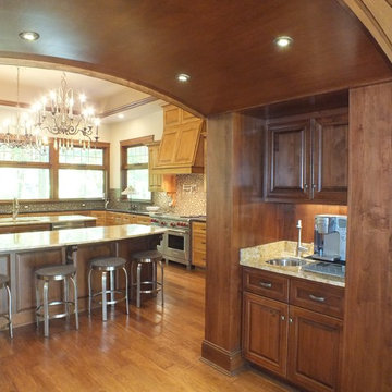
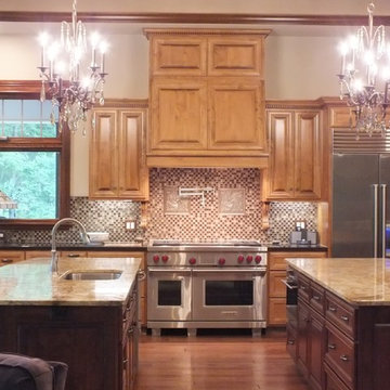
Mountain style eat-in kitchen photo in Other with an undermount sink, shaker cabinets, medium tone wood cabinets, multicolored backsplash, stainless steel appliances and an island

__
We had so much fun designing in this Spanish meets beach style with wonderful clients who travel the world with their 3 sons. The clients had excellent taste and ideas they brought to the table, and were always open to Jamie's suggestions that seemed wildly out of the box at the time. The end result was a stunning mix of traditional, Meditteranean, and updated coastal that reflected the many facets of the clients. The bar area downstairs is a sports lover's dream, while the bright and beachy formal living room upstairs is perfect for book club meetings. One of the son's personal photography is tastefully framed and lines the hallway, and custom art also ensures this home is uniquely and divinely designed just for this lovely family.
__
Design by Eden LA Interiors
Photo by Kim Pritchard Photography

Client Testimonial from project:
John just completed my master bathroom gut as well as refinishing my hardwood floors and powder bath remodel. I can't say enough about John and his team. He is quick to respond, trustworthy, organized, timely, and does beautiful work. I'm an interior designer, so I know exactly how I want the finished project to look and John delivered exactly what I wanted down to the tiniest detail.
My master bath was a complicated project with lots of custom details and he came up with creative ways to implement such a design. It was nice to leave on several week long vacations and not only trust that my house and belongings were safe and watched after, but also to be able to see the progress that he documented daily with photos and notes on BuilderTrend - a website that he uses to communicate with clients.
I will most certainly use Ammirato Construction in the future, and well as recommend them to clients and friends.
Virtual Imagery 360 Photography

This area joins the gym area with the stairway with the sitting area and comes complete with a swing for the lofted area. The project was timber framed from the repurposed timbers of a tobacco barn and utilizes the stone and plank flooring throughout with aluminum ceiling sheets under Structural Insulated Panels. Timer Framer: Lancaster County Timber Frames /General Contractor: Historic Restorations

A little girls room with a pale pink ceiling and pale gray wainscoat
This fast pace second level addition in Lakeview has received a lot of attention in this quite neighborhood by neighbors and house visitors. Ana Borden designed the second level addition on this previous one story residence and drew from her experience completing complicated multi-million dollar institutional projects. The overall project, including designing the second level addition included tieing into the existing conditions in order to preserve the remaining exterior lot for a new pool. The Architect constructed a three dimensional model in Revit to convey to the Clients the design intent while adhering to all required building codes. The challenge also included providing roof slopes within the allowable existing chimney distances, stair clearances, desired room sizes and working with the structural engineer to design connections and structural member sizes to fit the constraints listed above. Also, extensive coordination was required for the second addition, including supports designed by the structural engineer in conjunction with the existing pre and post tensioned slab. The Architect’s intent was also to create a seamless addition that appears to have been part of the existing residence while not impacting the remaining lot. Overall, the final construction fulfilled the Client’s goals of adding a bedroom and bathroom as well as additional storage space within their time frame and, of course, budget.
Smart Media

Dark stone, custom cherry cabinetry, misty forest wallpaper, and a luxurious soaker tub mix together to create this spectacular primary bathroom. These returning clients came to us with a vision to transform their builder-grade bathroom into a showpiece, inspired in part by the Japanese garden and forest surrounding their home. Our designer, Anna, incorporated several accessibility-friendly features into the bathroom design; a zero-clearance shower entrance, a tiled shower bench, stylish grab bars, and a wide ledge for transitioning into the soaking tub. Our master cabinet maker and finish carpenters collaborated to create the handmade tapered legs of the cherry cabinets, a custom mirror frame, and new wood trim.

Kitchen pantry - coastal dark wood floor kitchen pantry idea in Tampa with open cabinets and wood countertops

Overlooking of the surrounding meadows of the historic C Lazy U Ranch, this single family residence was carefully sited on a sloping site to maximize spectacular views of Willow Creek Resevoir and the Indian Peaks mountain range. The project was designed to fulfill budgetary and time frame constraints while addressing the client’s goal of creating a home that would become the backdrop for a very active and growing family for generations to come. In terms of style, the owners were drawn to more traditional materials and intimate spaces of associated with a cabin scale structure.

This four bedroom beach house in Washington's South Sound is all about growing up near the water's edge during summer's freedom from school. The owner's childhood was spent in a small cabin on this site with her parents and siblings. Now married and with children of her own, it was time to savor those childhood memories and create new ones in a house designed for generations to come.
At 3,200 square feet, including a whimsical Crow's Nest, the new summer cabin is much larger than the original cabin. The home is still about family and fun though. Above the 600 square foot water toys filled garage, there is a 500 square foot bunk room for friends and family. The bunk room is connected to the main house by an upper bridge where built-in storage frames a window seat overlooking the property.
Throughout the home are playful details drawing from the waterfront locale. Paddles are integrated into the stair railing, engineered flooring with a weathered look, marine cleats as hardware, a boardwalk to the main entry, and nautical lighting are found throughout the house.
Designed by BC&J Architecture.

The owners of this kitchen had spent the money to upgrade the finishes in their kitchen upon building the home 12 years ago, but after living in the space for several years they realized how nonfunctional the layout really was. The (then) two preschool aged children had grown into busy, hungry teenagers with many friends who also liked to hang out at the house. So the family needed a more functional kitchen with better traffic flow, space for daily activities revolving around the kitchen at different times of day, and a kitchen that could accommodate cooking for and serving large groups. Furthermore, the dark, traditional finishes no longer reflected the homeowners’ style. They requested a brighter, more relaxed, coastal style that reflected their love of the seaside cities they like to visit.
Originally, the kitchen was U-shaped with a narrow island in the middle. The island created narrow aisles that bottle-necked at the dishwasher, refrigerator, and cooktop areas. There was a pass-through from the foyer into the kitchen, but the owners never liked that the pass-through was also located so close to the powder room. The awkward proximity was unappealing and made guests feel uncomfortable.
The kitchen’s storage was made up of lots of narrow cabinets, apothecary drawers, clipped corner units, and very few drawers. It lacked useful storage for the larger items the family used on a daily basis. And the kitchen’s only pantry was small closet that had only builder-grade, narrow shelving with no illumination to be able to see the contents inside.
Overall, the kitchen’s lighting plan was poorly executed. Only six recessed cans illuminated the entire kitchen and nook areas. The under cabinet lighting was not evenly distributed either. In fact, the builder had mis-placed the under cabinet lighting around the decorative pilasters which made for choppy, dark cubbies. Further, the builder didn’t include any lighting over the sink or the bar area, which meant whoever was doing the dishes was always in their own shadow. That, coupled with the steep overhang of the game room above made the bar area feel like a dim, cavernous space that wasn’t inviting or task oriented. The kitchen looked out into the main living space, but the raised bar and a narrow wall (which held the only large cabinet in the kitchen) created more of a barrier than a relationship to the living room or breakfast nook. In fact, one couldn’t even see the breakfast nook from the cooktop or sink areas due to its orientation. The raised bar top was too narrow to comfortably sit to either dine at or chat from due to the lack of knee space. The the homeowners confided that the kitchen felt more like a dark, dirty prison than place where the family, or their guests, wanted to gather and commune.
The clients' needs and desires were:
➢ to create a kitchen that would be a space the family loved to be in; to relate to the adjacent spaces all around, and to have better flow for entertaining large groups
➢ to remove the walls between the breakfast nook and living area and to be able to utilize the natural light from the windows in both those areas
➢ to incorporate a functional chopping block for prepping fresh food for home cooked meals, an island with a large sink and drain board, 2 pull out trash cans, and seating for at least the 2 teens to eat or do homework
➢ to design a kitchen and breakfast nook with an airy, coastal, relaxed vibe that blended with the rest of the house's coastal theme
➢ to integrate a layered lighting plan which would include ample general illumination, specific task lighting, decorative lighting, and lots of illuminated storage
➢ to design a kitchen with not only more storage for all the husband’s kitchen gadgets and collection of oils and spices, but smart storage, including a coffee/breakfast bar and a place to store and conceal the toaster oven and microwave
➢ to find a way to utilize the large open space between the kitchen, pantry area, and breakfast nook
Twelve Stones Designs achieved the owner's goals by:
➢ removing the walls between the kitchen and living room to allow the natural light to filter in from the adjacent rooms and to create a connection between the kitchen, nook, and living spaces for a sense of unity and communion
➢ removing the existing pantry and designing 3 large pantry style cabinets with LED tape lights and rollout drawers to house lots of kitchen appliances, gadgets, and tons of groceries. We also took the cabinets all the way up to the 9’ ceiling for additional storage for seasonal items and bulk storage.
➢ designing 2 islands - 1 with a gorgeous black walnut chopping block that houses a drawer for chopping and carving knives and a custom double pull out trash unit for point of use utilization - and 1 that houses the dishwasher, a large Blanco Gourmet sink with integrated drain board, woven baskets for fresh root vegetables and kitchen towels, plenty of drawer storage for kitchen items, and bar seating for up to 4 diners.
➢ closing off the space between the kitchen and the powder room to create a beautiful new private alcove for the powder room as well as adding some decorative storage. This also gave us space to include more tall storage near the new range for precision placement of the husband’s extensive oil and spice collection as well as a location for a combo-steam oven the wife wanted for baking and cooking healthy meals.
The project is enhanced functionally by:
➢ incorporated USB and standard receptacles for the kids’ laptops and phone charging in the large island
➢ designing the small island to include additional open shelving for items used on a daily basis such as a variety of bowls, plates, and colanders. This set up also works well for the husband who prefers to “plate” his dinners in restaurant-style fashion before presenting them to the table.
➢ the integration of specific storage units, such as double stacked cutlery drawers, a custom spice pull-out, a Kuerig coffee and tea pod drawer, and custom double stacked utensil drawers
➢ moving the refrigerator to the old oven location - this eliminated the bottle neck as well as created a better relationship to the eating table. It also utilizes the floor space between the pantry, nook, and kitchen
➢ creating a banquet style breakfast nook - this banquette seating not only doubles the amount of seating for large gatherings but it better utilizes the odd space between the kitchen and the previous nook area. It also helps to create a distinct pathway from the mudroom room through the pantry area, kitchen, nook, and living room.
➢ the coffee/breakfast bar area which includes the perfect location for the concealed microwave and toaster oven, convenient storage for the coffee pods and tea accoutrements. Roll-out drawers below also house the smoothie maker, hot water kettle, and a plethora of smoothie-making ingredients such as protein powders, smoothie additives, etc. Furthermore, the drawers below the Keurig house measuring utensil, cutlery, baking supplies and tupperware storage.
➢ incorporating lots of wide drawers and pullouts to accommodate large cookware.
➢ utilizing as much vertical space as possible by building storage to the ceiling which accommodates the family’s abundant amount of serving platters, baking sheets, bakeware, casserole dishes, and additional cutting boards.
The project is enhanced aesthetically by:
➢ new 5-piece Versailles pattern porcelain tile that now seamlessly joins the entire down stairs area together creating a bright, cohesiveness feeling instead of choppy separated spaces - it also adds a coastal feeling
➢ designing a cabinet to conceal the microwave and toaster oven
➢ the coastal influenced light fixtures over the nook table and island
➢ the sandy colors of the Langdon Cambria countertops. The swirling pattern and sparkling quartz pieces remind the homeowner of black-and-tan sandy beaches
➢ the striped banquet seating whose creamy white background and blue-green stripes were the inspiration for the cabinet and wall colors.
➢ All the interior doors were painted black to coordinate with the blacks and grays in the backsplash tile and countertop. This also adds a hint of tailored formality to an otherwise casual space.
➢ the use of WAC's Oculux small aperture LED units for the overhead lighting complimented with Diode LED strips for task lighting under the cabinets and inside the pantry and glass wall cabinets. All of the lighting applications are on separate dimmer switches.
Innovative uses of materials or construction methods by Realty Restoration LLC:
➢ Each 1-1/2” x 3” block of reclaimed end-grain black walnut that makes up the center island chopping block was hand milled and built in the shop. It was designed to look substantial and proportional to the surrounding elements, executed by creating the 4 inch tall top with a solid wood chamfered edge band.
➢ The metal doors on either side of the vent hood were also custom designed for this project and built in the Realty Restoration LLC shop. They are made 1x2, 11-gauge mild steel with ribbed glass. Weighing 60 lbs a piece, heavy duty cabinet hinges were added to support the weight of the door and keep them from sagging.
➢ Under-cabinet receptacles were added along the range wall in order to have a clean, uninterrupted backsplash.
Design obstacles to overcome:
➢ Because we were removing the demising walls between the kitchen and living room, we had to find a way to plumb and vent the new island. We did this by tunneling through the slab (the slab had post tension cables which prevented us from just trenching) to run a new wet vent through a nearby structural wall. We pulled the existing hot and cold lines between upper floor joists and ran them down the structural wall as well and up through a conduit in the tunnel.
➢ Since we were converting from wall overs to a gas range it allowed us to utilize the 220 feed for the wall ovens to provide a new sub panel for all the new kitchen circuits
➢ Due to framing deficiencies inherited from the original build there was a 1-1/2” differential in the floor-to-ceiling height over a 20 foot span; by utilizing the process of cutting and furring coupled with the crown moulding details on the cabinet elevations we were able to mask the problem and provide seamless transitions between the cabinet components.
Evidence of superior craftsmanship:
➢ uniquely designed, one-of-a-kind metal “X” end panels on the large island. The end panels were custom made in the Realty Restoration LLC shop and fitted to the exact dimensions of the island. The welding seams are completely indistinguishable - the posts look like they are cut from a single sheet of metal
➢ square metal posts on the small island were also custom made and designed to compliment and carry through the metal element s throughout the kitchen
➢ the beautiful, oversized end panels on the pantry cabinets which give the breakfast nook a tailored look
➢ integrating a large format 5 piece Versailles tile pattern to seamlessly flow from the existing spaces into the new kitchen space
➢ By constructing a custom cabinet that jogged around a corner we could not remodel (housing the entry way coat closet) we were able to camouflage the adjacent wall offset within the upper and lower cabinets. By designing around the existing jog in the structural walls we accomplished a few things: we were able to find the space to house, and hide, the microwave and toaster oven yet still have a clean cohesive appearance from the kitchen side. Additionally, the owners were able to keep their much needed coat closet and we didn’t have to increase the budget with unnecessary structural work.

Sponsored
Fredericksburg, OH
High Point Cabinets
Columbus' Experienced Custom Cabinet Builder | 4x Best of Houzz Winner

The design of this home was driven by the owners’ desire for a three-bedroom waterfront home that showcased the spectacular views and park-like setting. As nature lovers, they wanted their home to be organic, minimize any environmental impact on the sensitive site and embrace nature.
This unique home is sited on a high ridge with a 45° slope to the water on the right and a deep ravine on the left. The five-acre site is completely wooded and tree preservation was a major emphasis. Very few trees were removed and special care was taken to protect the trees and environment throughout the project. To further minimize disturbance, grades were not changed and the home was designed to take full advantage of the site’s natural topography. Oak from the home site was re-purposed for the mantle, powder room counter and select furniture.
The visually powerful twin pavilions were born from the need for level ground and parking on an otherwise challenging site. Fill dirt excavated from the main home provided the foundation. All structures are anchored with a natural stone base and exterior materials include timber framing, fir ceilings, shingle siding, a partial metal roof and corten steel walls. Stone, wood, metal and glass transition the exterior to the interior and large wood windows flood the home with light and showcase the setting. Interior finishes include reclaimed heart pine floors, Douglas fir trim, dry-stacked stone, rustic cherry cabinets and soapstone counters.
Exterior spaces include a timber-framed porch, stone patio with fire pit and commanding views of the Occoquan reservoir. A second porch overlooks the ravine and a breezeway connects the garage to the home.
Numerous energy-saving features have been incorporated, including LED lighting, on-demand gas water heating and special insulation. Smart technology helps manage and control the entire house.
Greg Hadley Photography

Old fixer-uppers often require two competing levels of priorities from their new homeowners. First and foremost is the need to immediately attend to those repairs that ensure the continued functioning and general well being of the house’s structure. By nature, these usually demand “house on fire!” status, especially when compared to other types of remodeling work that simply enhances aesthetics and general comfort.
In the case of a Delaware couple, a structural issue with the front of their 125 year old Victorian (it was sinking!), along with some other more pressing challenges, put a 13 year long hold on getting the bathroom for which they had long dreamed.
The shower enclosure features a base of hexagon patterned tile, bordered by marble subway tiles.
By the time Dave Fox Design Build Remodelers was hired to handle the construction, the couple certainly had put plenty of thought into converting a spare second-floor bedroom into the master bath. Courtney Burnett, Fox’s Interior Design Manager on the project, credits the owners for “having great creative minds, with lots of ideas to contribute.” By the time it came to put a formal design plan into place, the client “drove the look while we devised how the space would function.”
It’s worth noting that there are drawbacks in being given too much time for advance planning. Owners’ tastes in design may change, while a steady stream of new fixtures and building products always demand consideration up to the last minute. “We had been collecting ideas for a while…pictures of what we liked, but as it turned out, when it came time to select fixtures, tile, etc., we used little from those pictures,” the owners admit.
A framed herringbone pattern of subway tiles provides a perfect focal point for the shower.
The finished bath exudes an art deco spirit that isn’t true to the home’s Victorian origins, which Burnett attributes to being more of a reflection of the homeowners’ preferences than the actual era of the structure. Despite that incongruity, everyone feels that they have remained true to the house by selecting vintage style elements, including subway tiles for the walls, hexagonal tile for the floors, and a pedestal sink that served as the focal point for the entire room.
But as with all dreams, once one is achieved, a new one soon beckons. With the bathroom’s strikingly beautiful turquoise paint barely dry, the completion of that long-awaited project has served to kick-start plans for finishing off the remainder of the Victorian’s second floor.

For this project, the initial inspiration for our clients came from seeing a modern industrial design featuring barnwood and metals in our showroom. Once our clients saw this, we were commissioned to completely renovate their outdated and dysfunctional kitchen and our in-house design team came up with this new this space that incorporated old world aesthetics with modern farmhouse functions and sensibilities. Now our clients have a beautiful, one-of-a-kind kitchen which is perfecting for hosting and spending time in.
Modern Farm House kitchen built in Milan Italy. Imported barn wood made and set in gun metal trays mixed with chalk board finish doors and steel framed wired glass upper cabinets. Industrial meets modern farm house
2