
Search results for "Simple short" in Home Design Ideas

 Wolfgang Pichler Design Inc.
The client wanted to have an existing apartment remodeled and the kitchen, the bathroom and the powder room redesigned on a large-scale. For this purpose, the existing kitchen was gutted and also the wall to the storeroom was removed, which created much more space. She wanted a central kitchen element as a meeting place for family, friends and guests, flanked by a simple kitchenette and a wall unit with maximum storage space. A two-sided
access to the kitchen makes it now easy to store purchases on short distances and to reach the nearby dining table in the open plan living area. White was chosen as the basic color for the cabinet furniture, which blends perfectly with the warm wooden elements of the surface material and the floor made of patterned ceramic tiles. All seems cozy and homely. Suspended lamps with vintage settings give the room a special touch.
The existing interior bathroom was also gutted. We replaced the bathtub with a generous shower facility. The vanity unit in a classic oak look provides a lot of storage space, even for a washing machine and a dryer. The opposite wall construction offers additional storage space for a variety of personal items, but also technical units such as a hot water tank. The generous mirror coating creates a greatly enlarged space that turns this small bathroom into a spa oasis.
The open-plan two-floor room concept was elegantly coordinated in terms of colors – white as the dominant color is alternated by delicate shades of gray. The existing wooden staircase was color-adapted with a special coating. Minimalist elements such as a fireplace in a concrete look give the room a modern touch, without neglecting the factor of coziness.

 Accent Window Fashions LLC
Hunter Douglas Eclectic Window Treatments and Draperies
Hunter Douglas Silhouette® Quartette® window shadings with EasyRise™ Cord Loop
Hunter Douglas Silhouette® Quartette® Window Shadings with Easyrise™
Fabric: Originale™
Color: White Diamond
Operating Systems: EasyRise Cord Loop or Specialty Shapes
Room: Living Room
Room Styles: Contemporary, Eclectic
Available from Accent Window Fashions LLC
Hunter Douglas Showcase Priority Dealer
Hunter Douglas Certified Installer
Hunter Douglas Certified Professional Dealer
#Hunter_Douglas #Silhouette #Quartette #window_shadings #EasyRise #Cord_Loop #Specialty_Shapes #Living_Room
#Contemporary #Eclectic #Window_Treatments #HunterDouglas #Accent_Window_Fashions
Copyright 2001-2013 Hunter Douglas, Inc. All rights reserved.

 Upland Homes
Located in the coveted West End of downtown Greenville, SC, Park Place on Hudson St. brings new living to old Greenville. Just a half-mile from Flour Field, a short walk to the Swamp Rabbit Trail, and steps away from the future Unity Park, this community is ideal for families young and old. The craftsman style town home community consists of twenty-three units, thirteen with 3 beds/2.5 baths and ten with 2 beds/2.5baths.
The design concept they came up with was simple – three separate buildings with two basic floors plans that were fully customizable. Each unit came standard with an elevator, hardwood floors, high-end Kitchen Aid appliances, Moen plumbing fixtures, tile showers, granite countertops, wood shelving in all closets, LED recessed lighting in all rooms, private balconies with built-in grill stations and large sliding glass doors. While the outside craftsman design with large front and back porches was set by the city, the interiors were fully customizable. The homeowners would meet with a designer at the Park Place on Hudson Showroom to pick from a selection of standard options, all items that would go in their home. From cabinets to door handles, from tile to paint colors, there was virtually no interior feature that the owners did not have the option to choose. They also had the ability to fully customize their unit with upgrades by meeting with each vendor individually and selecting the products for their home – some of the owners even choose to re-design the floor plans to better fit their lifestyle.
Find the right local pro for your project

 TVL Creative Ltd.
Our wonderful Baker clients were ready to remodel the kitchen in their c.1900 home shortly after moving in. They were looking to undo the 90s remodel that existed, and make the kitchen feel like it belonged in their historic home. We were able to design a balance that incorporated the vintage charm of their home and the modern pops that really give the kitchen its personality. We started by removing the mirrored wall that had separated their kitchen from the breakfast area. This allowed us the opportunity to open up their space dramatically and create a cohesive design that brings the two rooms together. To further our goal of making their kitchen appear more open we removed the wall cabinets along their exterior wall and replaced them with open shelves. We then incorporated a pantry cabinet into their refrigerator wall to balance out their storage needs. This new layout also provided us with the space to include a peninsula with counter seating so that guests can keep the cook company. We struck a fun balance of materials starting with the black & white hexagon tile on the floor to give us a pop of pattern. We then layered on simple grey shaker cabinets and used a butcher block counter top to add warmth to their kitchen. We kept the backsplash clean by utilizing an elongated white subway tile, and painted the walls a rich blue to add a touch of sophistication to the space.

 Fireplace Stone & Patio
This Heat n' Glo 6000 Modern is available at Fireplace Stone & Patio. For more information, visit fireplacestonepatio.com.
Inspiration for a contemporary living room remodel in Omaha
Inspiration for a contemporary living room remodel in Omaha

 Bianchi Design
A complete metamorphosis was needed to bring out the buried treasure hidden beneath this yard, and a family of five rattlesnakes had to find a new home!
Here’s the short list of the awkward elements that had to be remedied:
First, the neighbors’ living room window peered perpetually (like, all the time) and directly into the yard with no privacy whatsoever. None.
Second, the vast deep end swallowed up the patio and provided no place for furniture, or walking. Only tripping and treading water was allowed.
Third, the sunken lawn must have been an arena of some sort! Intentionally excavated from natural grade a full -42″ from the patio, for no good reason.
Fourth, the not-worth-a-visit ramada was the focal point for the entire yard. See it up close! It’s gone.
Fifth, the spa was shoved against the farthest wall and provided no invitation. It was so bad, it never had a photo taken! See the statue peeing between the two short columns? It’s over there. Peeing in the corner as all little boys are want to do.
Sixth, the bbq and fire place were non-functional and equally uninviting, and here’s a better view of just how crowded the furniture is. Don’t fall in!
Last, we will not mention the boulder pile droppings distributed around the yard. Oops! Sorry.
The first order of business was to spend several weeks tearing out everything but the pool shell. Then another few weeks were spent wheelbarrowing in a few hundred yards of top soil (there was no access) to fill the matador pit flush to a more relatable -18″. The large gaping trough was then discretely hidden with large removable stones, so it was out of sight but still serviceable.
Second, the neighbor was screened instantly with a row of mature Texas Ebony trees in a raised planter, that also housed a sculptural ironwood tree as the focal point of the property, soon to be reflected in the pool’s richer Midnight Blue pebble tec finish.
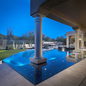
A hundred or so yards of shotcrete filled not only the reclaimed deep end, but also created a sun shelf and spa ledge, now the focal jewel in the foreground as a 360 overflow vanishing edge spa clad in Pewter glass tile from Oceanside Glass, and viewed from all the interior living spaces.
The BBQ was tucked around the corner out of sight but still easy access. The fireplace for two gave way to a large inviting built in banco, with a splashes of colorful fabrics to draw one out. The fire pit serves about 10 people easily, for hours at a time.
Last but not least, the foreground of the pool became a sweeping entry shelf extending the full length of the pool, bedecked with fiberoptic starlights and six glowing bubblers set low, to just barely break the surface of the water, giving a lovely and tranquil sound while sleeping away with all retractable doors wide open.
Simple. Serene. Self-evident. That is the remedy.
If your project needs a similar touch, more or less, drop me a line and we’ll figure out a plan.
 TVL Creative Ltd.
Our wonderful Baker clients were ready to remodel the kitchen in their c.1900 home shortly after moving in. They were looking to undo the 90s remodel that existed, and make the kitchen feel like it belonged in their historic home. We were able to design a balance that incorporated the vintage charm of their home and the modern pops that really give the kitchen its personality. We started by removing the mirrored wall that had separated their kitchen from the breakfast area. This allowed us the opportunity to open up their space dramatically and create a cohesive design that brings the two rooms together. To further our goal of making their kitchen appear more open we removed the wall cabinets along their exterior wall and replaced them with open shelves. We then incorporated a pantry cabinet into their refrigerator wall to balance out their storage needs. This new layout also provided us with the space to include a peninsula with counter seating so that guests can keep the cook company. We struck a fun balance of materials starting with the black & white hexagon tile on the floor to give us a pop of pattern. We then layered on simple grey shaker cabinets and used a butcher block counter top to add warmth to their kitchen. We kept the backsplash clean by utilizing an elongated white subway tile, and painted the walls a rich blue to add a touch of sophistication to the space.
Sponsored
Columbus, OH

Hope Restoration & General Contracting
Columbus Design-Build, Kitchen & Bath Remodeling, Historic Renovations

 Oakley Home Builders
Living/Dining Room
Example of a large arts and crafts formal and open concept carpeted and beige floor living room design in Chicago with beige walls, no fireplace, no tv and a stone fireplace
Example of a large arts and crafts formal and open concept carpeted and beige floor living room design in Chicago with beige walls, no fireplace, no tv and a stone fireplace

 Anderson Design / ErosionZ. Minnesota Landscape.
Approaching the patio from an upper-level deck, the setting unfolds, and invites "sitting a spell". Credit: Tad Anderson. All rights exclusively reserved.
 Upland Homes
Located in the coveted West End of downtown Greenville, SC, Park Place on Hudson St. brings new living to old Greenville. Just a half-mile from Flour Field, a short walk to the Swamp Rabbit Trail, and steps away from the future Unity Park, this community is ideal for families young and old. The craftsman style town home community consists of twenty-three units, thirteen with 3 beds/2.5 baths and ten with 2 beds/2.5baths.
The design concept they came up with was simple – three separate buildings with two basic floors plans that were fully customizable. Each unit came standard with an elevator, hardwood floors, high-end Kitchen Aid appliances, Moen plumbing fixtures, tile showers, granite countertops, wood shelving in all closets, LED recessed lighting in all rooms, private balconies with built-in grill stations and large sliding glass doors. While the outside craftsman design with large front and back porches was set by the city, the interiors were fully customizable. The homeowners would meet with a designer at the Park Place on Hudson Showroom to pick from a selection of standard options, all items that would go in their home. From cabinets to door handles, from tile to paint colors, there was virtually no interior feature that the owners did not have the option to choose. They also had the ability to fully customize their unit with upgrades by meeting with each vendor individually and selecting the products for their home – some of the owners even choose to re-design the floor plans to better fit their lifestyle.

 TKP Architects
This Eclectic Contemporary House keeps a low profile amidst a bold and lively landscape. The home is made up of simple forms stitched together under shallow gable roofs that spread out, rather than stack up. Instead of trying to blend in like camouflage, or to assert itself with stark contrast, This ecelctic house uses bright materials and cheerful colors to compliment the sunny mood of its natural surroundings.
Photos by: David Patterson Photography
 TVL Creative Ltd.
Our wonderful Baker clients were ready to remodel the kitchen in their c.1900 home shortly after moving in. They were looking to undo the 90s remodel that existed, and make the kitchen feel like it belonged in their historic home. We were able to design a balance that incorporated the vintage charm of their home and the modern pops that really give the kitchen its personality. We started by removing the mirrored wall that had separated their kitchen from the breakfast area. This allowed us the opportunity to open up their space dramatically and create a cohesive design that brings the two rooms together. To further our goal of making their kitchen appear more open we removed the wall cabinets along their exterior wall and replaced them with open shelves. We then incorporated a pantry cabinet into their refrigerator wall to balance out their storage needs. This new layout also provided us with the space to include a peninsula with counter seating so that guests can keep the cook company. We struck a fun balance of materials starting with the black & white hexagon tile on the floor to give us a pop of pattern. We then layered on simple grey shaker cabinets and used a butcher block counter top to add warmth to their kitchen. We kept the backsplash clean by utilizing an elongated white subway tile, and painted the walls a rich blue to add a touch of sophistication to the space.
 Upland Homes
Located in the coveted West End of downtown Greenville, SC, Park Place on Hudson St. brings new living to old Greenville. Just a half-mile from Flour Field, a short walk to the Swamp Rabbit Trail, and steps away from the future Unity Park, this community is ideal for families young and old. The craftsman style town home community consists of twenty-three units, thirteen with 3 beds/2.5 baths and ten with 2 beds/2.5baths.
The design concept they came up with was simple – three separate buildings with two basic floors plans that were fully customizable. Each unit came standard with an elevator, hardwood floors, high-end Kitchen Aid appliances, Moen plumbing fixtures, tile showers, granite countertops, wood shelving in all closets, LED recessed lighting in all rooms, private balconies with built-in grill stations and large sliding glass doors. While the outside craftsman design with large front and back porches was set by the city, the interiors were fully customizable. The homeowners would meet with a designer at the Park Place on Hudson Showroom to pick from a selection of standard options, all items that would go in their home. From cabinets to door handles, from tile to paint colors, there was virtually no interior feature that the owners did not have the option to choose. They also had the ability to fully customize their unit with upgrades by meeting with each vendor individually and selecting the products for their home – some of the owners even choose to re-design the floor plans to better fit their lifestyle.

 Upland Homes
Located in the coveted West End of downtown Greenville, SC, Park Place on Hudson St. brings new living to old Greenville. Just a half-mile from Flour Field, a short walk to the Swamp Rabbit Trail, and steps away from the future Unity Park, this community is ideal for families young and old. The craftsman style town home community consists of twenty-three units, thirteen with 3 beds/2.5 baths and ten with 2 beds/2.5baths.
The design concept they came up with was simple – three separate buildings with two basic floors plans that were fully customizable. Each unit came standard with an elevator, hardwood floors, high-end Kitchen Aid appliances, Moen plumbing fixtures, tile showers, granite countertops, wood shelving in all closets, LED recessed lighting in all rooms, private balconies with built-in grill stations and large sliding glass doors. While the outside craftsman design with large front and back porches was set by the city, the interiors were fully customizable. The homeowners would meet with a designer at the Park Place on Hudson Showroom to pick from a selection of standard options, all items that would go in their home. From cabinets to door handles, from tile to paint colors, there was virtually no interior feature that the owners did not have the option to choose. They also had the ability to fully customize their unit with upgrades by meeting with each vendor individually and selecting the products for their home – some of the owners even choose to re-design the floor plans to better fit their lifestyle.
 Bianchi Design
A complete metamorphosis was needed to bring out the buried treasure hidden beneath this yard, and a family of five rattlesnakes had to find a new home!
Here’s the short list of the awkward elements that had to be remedied:
First, the neighbors’ living room window peered perpetually (like, all the time) and directly into the yard with no privacy whatsoever. None.
Second, the vast deep end swallowed up the patio and provided no place for furniture, or walking. Only tripping and treading water was allowed.
Third, the sunken lawn must have been an arena of some sort! Intentionally excavated from natural grade a full -42″ from the patio, for no good reason.
Fourth, the not-worth-a-visit ramada was the focal point for the entire yard. See it up close! It’s gone.
Fifth, the spa was shoved against the farthest wall and provided no invitation. It was so bad, it never had a photo taken! See the statue peeing between the two short columns? It’s over there. Peeing in the corner as all little boys are want to do.
Sixth, the bbq and fire place were non-functional and equally uninviting, and here’s a better view of just how crowded the furniture is. Don’t fall in!
Last, we will not mention the boulder pile droppings distributed around the yard. Oops! Sorry.
The first order of business was to spend several weeks tearing out everything but the pool shell. Then another few weeks were spent wheelbarrowing in a few hundred yards of top soil (there was no access) to fill the matador pit flush to a more relatable -18″. The large gaping trough was then discretely hidden with large removable stones, so it was out of sight but still serviceable.
Second, the neighbor was screened instantly with a row of mature Texas Ebony trees in a raised planter, that also housed a sculptural ironwood tree as the focal point of the property, soon to be reflected in the pool’s richer Midnight Blue pebble tec finish.
A hundred or so yards of shotcrete filled not only the reclaimed deep end, but also created a sun shelf and spa ledge, now the focal jewel in the foreground as a 360 overflow vanishing edge spa clad in Pewter glass tile from Oceanside Glass, and viewed from all the interior living spaces.
The BBQ was tucked around the corner out of sight but still easy access. The fireplace for two gave way to a large inviting built in banco, with a splashes of colorful fabrics to draw one out. The fire pit serves about 10 people easily, for hours at a time.
Last but not least, the foreground of the pool became a sweeping entry shelf extending the full length of the pool, bedecked with fiberoptic starlights and six glowing bubblers set low, to just barely break the surface of the water, giving a lovely and tranquil sound while sleeping away with all retractable doors wide open.
Simple. Serene. Self-evident. That is the remedy.
If your project needs a similar touch, more or less, drop me a line and we’ll figure out a plan.
 TVL Creative Ltd.
Our wonderful Baker clients were ready to remodel the kitchen in their c.1900 home shortly after moving in. They were looking to undo the 90s remodel that existed, and make the kitchen feel like it belonged in their historic home. We were able to design a balance that incorporated the vintage charm of their home and the modern pops that really give the kitchen its personality. We started by removing the mirrored wall that had separated their kitchen from the breakfast area. This allowed us the opportunity to open up their space dramatically and create a cohesive design that brings the two rooms together. To further our goal of making their kitchen appear more open we removed the wall cabinets along their exterior wall and replaced them with open shelves. We then incorporated a pantry cabinet into their refrigerator wall to balance out their storage needs. This new layout also provided us with the space to include a peninsula with counter seating so that guests can keep the cook company. We struck a fun balance of materials starting with the black & white hexagon tile on the floor to give us a pop of pattern. We then layered on simple grey shaker cabinets and used a butcher block counter top to add warmth to their kitchen. We kept the backsplash clean by utilizing an elongated white subway tile, and painted the walls a rich blue to add a touch of sophistication to the space.

 Metropolis Drafting and Construction Inc
This bathroom is part of a new Master suite construction for a traditional house in the city of Burbank.
The space of this lovely bath is only 7.5' by 7.5'
Going for the minimalistic look and a linear pattern for the concept.
The floor tiles are 8"x8" concrete tiles with repetitive pattern imbedded in the, this pattern allows you to play with the placement of the tile and thus creating your own "Labyrinth" pattern.
The two main bathroom walls are covered with 2"x8" white subway tile layout in a Traditional herringbone pattern.
The toilet is wall mounted and has a hidden tank, the hidden tank required a small frame work that created a nice shelve to place decorative items above the toilet.
You can see a nice dark strip of quartz material running on top of the shelve and the pony wall then it continues to run down all the way to the floor, this is the same quartz material as the counter top that is sitting on top of the vanity thus connecting the two elements together.
For the final touch for this style we have used brushed brass plumbing fixtures and accessories.
Sponsored
Columbus, OH
Hope Restoration & General Contracting
Columbus Design-Build, Kitchen & Bath Remodeling, Historic Renovations
 Wolfgang Pichler Design Inc.
The client wanted to have an existing apartment remodeled and the kitchen, the bathroom and the powder room redesigned on a large-scale. For this purpose, the existing kitchen was gutted and also the wall to the storeroom was removed, which created much more space. She wanted a central kitchen element as a meeting place for family, friends and guests, flanked by a simple kitchenette and a wall unit with maximum storage space. A two-sided
access to the kitchen makes it now easy to store purchases on short distances and to reach the nearby dining table in the open plan living area. White was chosen as the basic color for the cabinet furniture, which blends perfectly with the warm wooden elements of the surface material and the floor made of patterned ceramic tiles. All seems cozy and homely. Suspended lamps with vintage settings give the room a special touch.
The existing interior bathroom was also gutted. We replaced the bathtub with a generous shower facility. The vanity unit in a classic oak look provides a lot of storage space, even for a washing machine and a dryer. The opposite wall construction offers additional storage space for a variety of personal items, but also technical units such as a hot water tank. The generous mirror coating creates a greatly enlarged space that turns this small bathroom into a spa oasis.
The open-plan two-floor room concept was elegantly coordinated in terms of colors – white as the dominant color is alternated by delicate shades of gray. The existing wooden staircase was color-adapted with a special coating. Minimalist elements such as a fireplace in a concrete look give the room a modern touch, without neglecting the factor of coziness.

 Hill Country Garage Doors
. Our premium finish doors are meticulously cut, joined and planed. We stain each door with the highest quality exterior stain product available, painting a base sealant material and then hand-rubbing two additional coats of exterior sealant. In short, the fit-and-finish of our Premium Finish - Grade III rivals the quality on the finest custom wood entry door. We have numerous stains including natural, cedar, teak, dark oak and mahogany and we've also custom mixed stain colors to match a custom's existing wood entry door stain. Wirebrushing and other custom texture options are available.
If you want the very best, chose our Grade III Premium Finish garage doors.
 TKS Design Group
Download our free ebook, Creating the Ideal Kitchen. DOWNLOAD NOW
Lakefront property in the northwest suburbs of Chicago is hard to come by, so when we were hired by this young family with exactly that, we were immediately inspired by not just the unusually large footprint of this 1950’s colonial revival but also the lovely views of the manmade lake it was sited on. The large 5-bedroom home was solidly stuck in the 1980’s, but we saw tons of potential. We started out by updating the existing staircase with a fresh coat of paint and adding new herringbone slate to the entry hall.
The powder room off the entryway also got a refresh - new flooring, new cabinets and fixtures. We ran the new slate right through into this space for some consistency. A fun wallpaper and shiplap trim add a welcoming feel and set the tone for the home.
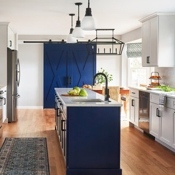
Next, we tackled the kitchen. Located away from the rest of the first floor, the kitchen felt a little isolated, so we immediately began planning for how to better connect it to the rest of the first floor. We landed on removing the wall between the kitchen and dining room and designed a modified galley style space with separate cooking and clean up zones. The cooking zone consists of the refrigerator, prep sink and cooktop, along with a nice long run of prep space at the island. The cleanup side of the kitchen consists of the main sink and dishwasher. Both areas are situated so that the user can view the lake during prep work and cleanup!
One of the home’s main puzzles was how to incorporate the mudroom and area in front of the patio doors at the back of the house. We already had a breakfast table area, so the space by the patio doors was a bit of a no man’s land. We decided to separate the kitchen proper from what became the new mudroom with a large set of barn doors. That way you can quickly hide any mudroom messes but have easy access to the light coming in through the patio doors as well as the outdoor grilling station. We also love the impact the barn doors add to the overall space.
The homeowners’ first words to us were “it’s time to ditch the brown,” so we did! We chose a lovely blue pallet that reflects the home’s location on the lake which is also vibrant yet easy on the eye. Countertops are white quartz, and the natural oak floor works well with the other honey accents. The breakfast table was given a refresh with new chairs, chandelier and window treatments that frame the gorgeous views of the lake out the back.
We coordinated the slate mudroom flooring with that used in the home’s main entrance for a consistent feel. The storage area consists of open and closed storage to allow for some clutter control as needed.
Next on our “to do” list was revamping the dated brown bar area in the neighboring dining room. We eliminated the clutter by adding some closed cabinets and did some easy updates to help the space feel more current. One snag we ran into here was the discovery of a beam above the existing open shelving that had to be modified with a smaller structural beam to allow for our new design to work. This was an unexpected surprise, but in the end we think it was well worth it!
We kept the colors here a bit more muted to blend with the homeowner’s existing furnishings. Open shelving and polished nickel hardware add some simple detail to the new entertainment zone which also looks out onto the lake!
Next we tackled the upstairs starting with the homeowner’s son’s bath. The bath originally had both a tub shower and a separate shower, so we decided to swap out the shower for a new laundry area. This freed up some space downstairs in what used to be the mudroom/laundry room and is much more convenient for daily laundry needs.
We continued the blue palette here with navy cabinetry and the navy tile in the shower. Porcelain floor tile and chrome fixtures keep maintenance to a minimum while matte black mirrors and lighting add some depth the design. A low maintenance runner adds some warmth underfoot and ties the whole space together.
We added a pocket door to the bathroom to minimize interference with the door swings. The left door of the laundry closet is on a 180 degree hinge to allow for easy full access to the machines. Next we tackled the master bath which is an en suite arrangement. The original was typical of the 1980’s with the vanity outside of the bathroom, situated near the master closet. And the brown theme continued here with multiple shades of brown.
Our first move was to segment off the bath and the closet from the master bedroom. We created a short hall from the bedroom to the bathroom with his and hers walk-in closets on the left and right as well as a separate toilet closet outside of the main bathroom for privacy and flexibility.
The original bathroom had a giant soaking tub with steps (dangerous!) as well as a small shower that did not work well for our homeowner who is 6’3”. With other bathtubs in the home, they decided to eliminate the tub and create an oversized shower which takes up the space where the old tub was located. The double vanity is on the opposite wall and a bench is located under the window for morning conversations and a place to set a couple of towels.
The pallet in here is light and airy with a mix of blond wood, creamy porcelain and marble tile, and brass accents. A simple roman shade adds some texture and it’s top-down mechanism allows for light and privacy.
This large whole house remodel gave our homeowners not only the ability to maximize the potential of their home but also created a lovely new frame from which to view their fabulous lake views.
Designed by: Susan Klimala, CKD, CBD
Photography by: Michael Kaskel
For more information on kitchen and bath design ideas go to: www.kitchenstudio-ge.com
219