
Search results for "Simple short" in Home Design Ideas

 TVL Creative Ltd.
Our wonderful Baker clients were ready to remodel the kitchen in their c.1900 home shortly after moving in. They were looking to undo the 90s remodel that existed, and make the kitchen feel like it belonged in their historic home. We were able to design a balance that incorporated the vintage charm of their home and the modern pops that really give the kitchen its personality. We started by removing the mirrored wall that had separated their kitchen from the breakfast area. This allowed us the opportunity to open up their space dramatically and create a cohesive design that brings the two rooms together. To further our goal of making their kitchen appear more open we removed the wall cabinets along their exterior wall and replaced them with open shelves. We then incorporated a pantry cabinet into their refrigerator wall to balance out their storage needs. This new layout also provided us with the space to include a peninsula with counter seating so that guests can keep the cook company. We struck a fun balance of materials starting with the black & white hexagon tile on the floor to give us a pop of pattern. We then layered on simple grey shaker cabinets and used a butcher block counter top to add warmth to their kitchen. We kept the backsplash clean by utilizing an elongated white subway tile, and painted the walls a rich blue to add a touch of sophistication to the space.

 AND Interior Design Studio
Interior Design:
Anne Norton
AND interior Design Studio
Berkeley, CA 94707
Large transitional u-shaped medium tone wood floor and brown floor enclosed dining room photo in San Francisco with an undermount sink, recessed-panel cabinets, white cabinets, soapstone countertops, blue backsplash, glass tile backsplash, stainless steel appliances and an island
Large transitional u-shaped medium tone wood floor and brown floor enclosed dining room photo in San Francisco with an undermount sink, recessed-panel cabinets, white cabinets, soapstone countertops, blue backsplash, glass tile backsplash, stainless steel appliances and an island

 Upland Homes
Located in the coveted West End of downtown Greenville, SC, Park Place on Hudson St. brings new living to old Greenville. Just a half-mile from Flour Field, a short walk to the Swamp Rabbit Trail, and steps away from the future Unity Park, this community is ideal for families young and old. The craftsman style town home community consists of twenty-three units, thirteen with 3 beds/2.5 baths and ten with 2 beds/2.5baths.
The design concept they came up with was simple – three separate buildings with two basic floors plans that were fully customizable. Each unit came standard with an elevator, hardwood floors, high-end Kitchen Aid appliances, Moen plumbing fixtures, tile showers, granite countertops, wood shelving in all closets, LED recessed lighting in all rooms, private balconies with built-in grill stations and large sliding glass doors. While the outside craftsman design with large front and back porches was set by the city, the interiors were fully customizable. The homeowners would meet with a designer at the Park Place on Hudson Showroom to pick from a selection of standard options, all items that would go in their home. From cabinets to door handles, from tile to paint colors, there was virtually no interior feature that the owners did not have the option to choose. They also had the ability to fully customize their unit with upgrades by meeting with each vendor individually and selecting the products for their home – some of the owners even choose to re-design the floor plans to better fit their lifestyle.
Find the right local pro for your project

 Chestwood Kitchens
This white and gray kitchen remodel offers much more storage and counter space than the old kitchen, and even without the lights on, its so much brighter. The raised panel door style and crown molding compliment the traditional feel of the home, while the gray walls and glass subway tile, along with the white cabinets give a truly updated feel. Bold movement in the dark granite counters provide a contrast against the white cabinetry, and tie into the grays, and the wood tone of the floor. A simple mosaic tile picture frame over the cooktop offers extra visual interest, without overpowering the glass subway backsplash. Brushed nickel hardware and finishes also update the space. Levels of lighting include recessed fixtures, pendants over the island, undercabinet LED, and LED inside the glass front cabinets for display. The original island was only about 3' long, so it has been extended, and filled with extra storage, a microwave drawer, and open shelving for cookbooks. Bun feet were added to the toe kick space on the island, and carried over to the cooktop and sink bases. An undermount siligranit sink with accessories creates a desirable workspace. With cabinets extending to the ceiling and an edited layout, there was enough storage to forego an old pantry closet, which became a bar area in the short hall to the dining room.

 Simple Steps
This transitional bathroom has a metallic mosaic tile, recycled granite and glass counter top and bathtub surround. The copper colored tile is called Liberty Amber and the color is also available in the Metropolis cut and subway tiles. There are more colors in this collection. The counter and bathtub surround is made from a recycled granite and glass with copper flecks that compliment the mosaics, the color is called White Copper. The material is stain resistant, heat resistant, impact resistant and it does not need to be sealed. The material is 1/4" thick and can be placed on top of existing counters or on new cabinets. There are many colors and sizes.
 TVL Creative Ltd.
Our wonderful Baker clients were ready to remodel the kitchen in their c.1900 home shortly after moving in. They were looking to undo the 90s remodel that existed, and make the kitchen feel like it belonged in their historic home. We were able to design a balance that incorporated the vintage charm of their home and the modern pops that really give the kitchen its personality. We started by removing the mirrored wall that had separated their kitchen from the breakfast area. This allowed us the opportunity to open up their space dramatically and create a cohesive design that brings the two rooms together. To further our goal of making their kitchen appear more open we removed the wall cabinets along their exterior wall and replaced them with open shelves. We then incorporated a pantry cabinet into their refrigerator wall to balance out their storage needs. This new layout also provided us with the space to include a peninsula with counter seating so that guests can keep the cook company. We struck a fun balance of materials starting with the black & white hexagon tile on the floor to give us a pop of pattern. We then layered on simple grey shaker cabinets and used a butcher block counter top to add warmth to their kitchen. We kept the backsplash clean by utilizing an elongated white subway tile, and painted the walls a rich blue to add a touch of sophistication to the space.
 Upland Homes
Located in the coveted West End of downtown Greenville, SC, Park Place on Hudson St. brings new living to old Greenville. Just a half-mile from Flour Field, a short walk to the Swamp Rabbit Trail, and steps away from the future Unity Park, this community is ideal for families young and old. The craftsman style town home community consists of twenty-three units, thirteen with 3 beds/2.5 baths and ten with 2 beds/2.5baths.
The design concept they came up with was simple – three separate buildings with two basic floors plans that were fully customizable. Each unit came standard with an elevator, hardwood floors, high-end Kitchen Aid appliances, Moen plumbing fixtures, tile showers, granite countertops, wood shelving in all closets, LED recessed lighting in all rooms, private balconies with built-in grill stations and large sliding glass doors. While the outside craftsman design with large front and back porches was set by the city, the interiors were fully customizable. The homeowners would meet with a designer at the Park Place on Hudson Showroom to pick from a selection of standard options, all items that would go in their home. From cabinets to door handles, from tile to paint colors, there was virtually no interior feature that the owners did not have the option to choose. They also had the ability to fully customize their unit with upgrades by meeting with each vendor individually and selecting the products for their home – some of the owners even choose to re-design the floor plans to better fit their lifestyle.
Sponsored
Columbus, OH

Hope Restoration & General Contracting
Columbus Design-Build, Kitchen & Bath Remodeling, Historic Renovations
 TVL Creative Ltd.
Our wonderful Baker clients were ready to remodel the kitchen in their c.1900 home shortly after moving in. They were looking to undo the 90s remodel that existed, and make the kitchen feel like it belonged in their historic home. We were able to design a balance that incorporated the vintage charm of their home and the modern pops that really give the kitchen its personality. We started by removing the mirrored wall that had separated their kitchen from the breakfast area. This allowed us the opportunity to open up their space dramatically and create a cohesive design that brings the two rooms together. To further our goal of making their kitchen appear more open we removed the wall cabinets along their exterior wall and replaced them with open shelves. We then incorporated a pantry cabinet into their refrigerator wall to balance out their storage needs. This new layout also provided us with the space to include a peninsula with counter seating so that guests can keep the cook company. We struck a fun balance of materials starting with the black & white hexagon tile on the floor to give us a pop of pattern. We then layered on simple grey shaker cabinets and used a butcher block counter top to add warmth to their kitchen. We kept the backsplash clean by utilizing an elongated white subway tile, and painted the walls a rich blue to add a touch of sophistication to the space.
 Upland Homes
Located in the coveted West End of downtown Greenville, SC, Park Place on Hudson St. brings new living to old Greenville. Just a half-mile from Flour Field, a short walk to the Swamp Rabbit Trail, and steps away from the future Unity Park, this community is ideal for families young and old. The craftsman style town home community consists of twenty-three units, thirteen with 3 beds/2.5 baths and ten with 2 beds/2.5baths.
The design concept they came up with was simple – three separate buildings with two basic floors plans that were fully customizable. Each unit came standard with an elevator, hardwood floors, high-end Kitchen Aid appliances, Moen plumbing fixtures, tile showers, granite countertops, wood shelving in all closets, LED recessed lighting in all rooms, private balconies with built-in grill stations and large sliding glass doors. While the outside craftsman design with large front and back porches was set by the city, the interiors were fully customizable. The homeowners would meet with a designer at the Park Place on Hudson Showroom to pick from a selection of standard options, all items that would go in their home. From cabinets to door handles, from tile to paint colors, there was virtually no interior feature that the owners did not have the option to choose. They also had the ability to fully customize their unit with upgrades by meeting with each vendor individually and selecting the products for their home – some of the owners even choose to re-design the floor plans to better fit their lifestyle.
 Chestwood Kitchens
This white and gray kitchen remodel offers much more storage and counter space than the old kitchen, and even without the lights on, its so much brighter. The raised panel door style and crown molding compliment the traditional feel of the home, while the gray walls and glass subway tile, along with the white cabinets give a truly updated feel. Bold movement in the dark granite counters provide a contrast against the white cabinetry, and tie into the grays, and the wood tone of the floor. A simple mosaic tile picture frame over the cooktop offers extra visual interest, without overpowering the glass subway backsplash. Brushed nickel hardware and finishes also update the space. Levels of lighting include recessed fixtures, pendants over the island, undercabinet LED, and LED inside the glass front cabinets for display. The original island was only about 3' long, so it has been extended, and filled with extra storage, a microwave drawer, and open shelving for cookbooks. Bun feet were added to the toe kick space on the island, and carried over to the cooktop and sink bases. An undermount siligranit sink with accessories creates a desirable workspace. With cabinets extending to the ceiling and an edited layout, there was enough storage to forego an old pantry closet, which became a bar area in the short hall to the dining room.
 TVL Creative Ltd.
Our wonderful Baker clients were ready to remodel the kitchen in their c.1900 home shortly after moving in. They were looking to undo the 90s remodel that existed, and make the kitchen feel like it belonged in their historic home. We were able to design a balance that incorporated the vintage charm of their home and the modern pops that really give the kitchen its personality. We started by removing the mirrored wall that had separated their kitchen from the breakfast area. This allowed us the opportunity to open up their space dramatically and create a cohesive design that brings the two rooms together. To further our goal of making their kitchen appear more open we removed the wall cabinets along their exterior wall and replaced them with open shelves. We then incorporated a pantry cabinet into their refrigerator wall to balance out their storage needs. This new layout also provided us with the space to include a peninsula with counter seating so that guests can keep the cook company. We struck a fun balance of materials starting with the black & white hexagon tile on the floor to give us a pop of pattern. We then layered on simple grey shaker cabinets and used a butcher block counter top to add warmth to their kitchen. We kept the backsplash clean by utilizing an elongated white subway tile, and painted the walls a rich blue to add a touch of sophistication to the space.

 Visbeen Architects
Builder: Falcon Custom Homes
Interior Designer: Mary Burns - Gallery
Photographer: Mike Buck
A perfectly proportioned story and a half cottage, the Farfield is full of traditional details and charm. The front is composed of matching board and batten gables flanking a covered porch featuring square columns with pegged capitols. A tour of the rear façade reveals an asymmetrical elevation with a tall living room gable anchoring the right and a low retractable-screened porch to the left.
Inside, the front foyer opens up to a wide staircase clad in horizontal boards for a more modern feel. To the left, and through a short hall, is a study with private access to the main levels public bathroom. Further back a corridor, framed on one side by the living rooms stone fireplace, connects the master suite to the rest of the house. Entrance to the living room can be gained through a pair of openings flanking the stone fireplace, or via the open concept kitchen/dining room. Neutral grey cabinets featuring a modern take on a recessed panel look, line the perimeter of the kitchen, framing the elongated kitchen island. Twelve leather wrapped chairs provide enough seating for a large family, or gathering of friends. Anchoring the rear of the main level is the screened in porch framed by square columns that match the style of those found at the front porch. Upstairs, there are a total of four separate sleeping chambers. The two bedrooms above the master suite share a bathroom, while the third bedroom to the rear features its own en suite. The fourth is a large bunkroom above the homes two-stall garage large enough to host an abundance of guests.

 Brooks + Scarpa Architects
Located in a neighborhood characterized by traditional bungalow style single-family residences, Orange Grove is a new landmark for the City of West Hollywood. The building is sensitively designed and compatible with the neighborhood, but differs in material palette and scale from its neighbors. Referencing architectural conventions of modernism rather than the pitched roof forms of traditional domesticity, the project presents a characteristic that is consistent with the eclectic and often unconventional demographic of West Hollywood. Distinct from neighboring structures, the building creates a strong relationship to the street by virtue of its large amount of highly usable balcony area in the front façade.
While there are dramatic and larger scale elements that define the building, it is also broken down into comprehensible human scale parts, and is itself broken down into two different buildings. Orange Grove displays a similar kind of iconoclasm as the Schindler House, an icon of California modernism, located a short distance away. Like the Schindler House, the conventional architectural elements of windows and porches become part of an abstract sculptural ensemble. At the Schindler House, windows are found in the gaps between structural concrete wall panels. At Orange Grove, windows are inserted in gaps between different sections of the building.
The design of Orange Grove is generated by a subtle balance of tensions. Building volumes and the placement of windows, doors and balconies are not static but rather constitute an active three-dimensional composition in motion. Each piece of the building is a strong and clearly defined shape, such as the corrugated metal surround that encloses the second story balcony in the east and north facades. Another example of this clear delineation is the use of two square profile balcony surrounds in the front façade that set up a dialogue between them—one is small, the other large, one is open at the front, the other is veiled with stainless steel slats. At the same time each balcony is balanced and related to other elements in the building, the smaller one to the driveway gate below and the other to the roll-up door and first floor balcony. Each building element is intended to read as an abstract form in itself—such as a window becoming a slit or windows becoming a framed box, while also becoming part of a larger whole. Although this building may not mirror the status quo it answers to the desires of consumers in a burgeoning niche market who want large, simple interior volumes of space, and a paradigm based on space, light and industrial materials of the loft rather than the bungalow.
Sponsored
Columbus, OH
Hope Restoration & General Contracting
Columbus Design-Build, Kitchen & Bath Remodeling, Historic Renovations

 Vanguard Development
The best interior designers & architects in NYC!
Residential interior design, Common area design, Hospitality design, Exterior design, Commercial design - any interior or architectural design basically from a unique design team :)
Our goal is to provide clients in Manhattan, New York, New Jersey & beyond with outstanding architectural & interior design services and installation management through a unique approach and unparalleled work quality.
Our mission is to create Dream Homes that change people's lives!
Working with us is a simple two step process - Design & Installation. The core is that all our design ideas (interior design of an apartment, restaurant, hotel design or architectural design of a building) are presented through exceptionally realistic images, delivering the exact look of your future interior/exterior, before you commit to investing. The Installation then abides to the paradigm of 'What I See Is What I Get', replicating the approved design. All together it gives you full control and eliminates the risk of having an unsatisfactory end product - no other interior designer or architect can offer.
Our team's passion, talent & professionalism brings you the best possible result, while our client-oriented philosophy & determination to make the process easy & convenient, saves you great deal of time and concern.
In short, this is Design as it Should be...
Other services: Lobby design, Store & storefront design, Hotel design, Restaurant design, House design
www.vanguard-development.com
 Bianchi Design
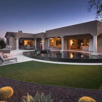
A complete metamorphosis was needed to bring out the buried treasure hidden beneath this yard, and a family of five rattlesnakes had to find a new home!
Here’s the short list of the awkward elements that had to be remedied:
First, the neighbors’ living room window peered perpetually (like, all the time) and directly into the yard with no privacy whatsoever. None.
Second, the vast deep end swallowed up the patio and provided no place for furniture, or walking. Only tripping and treading water was allowed.
Third, the sunken lawn must have been an arena of some sort! Intentionally excavated from natural grade a full -42″ from the patio, for no good reason.
Fourth, the not-worth-a-visit ramada was the focal point for the entire yard. See it up close! It’s gone.
Fifth, the spa was shoved against the farthest wall and provided no invitation. It was so bad, it never had a photo taken! See the statue peeing between the two short columns? It’s over there. Peeing in the corner as all little boys are want to do.
Sixth, the bbq and fire place were non-functional and equally uninviting, and here’s a better view of just how crowded the furniture is. Don’t fall in!
Last, we will not mention the boulder pile droppings distributed around the yard. Oops! Sorry.
The first order of business was to spend several weeks tearing out everything but the pool shell. Then another few weeks were spent wheelbarrowing in a few hundred yards of top soil (there was no access) to fill the matador pit flush to a more relatable -18″. The large gaping trough was then discretely hidden with large removable stones, so it was out of sight but still serviceable.
Second, the neighbor was screened instantly with a row of mature Texas Ebony trees in a raised planter, that also housed a sculptural ironwood tree as the focal point of the property, soon to be reflected in the pool’s richer Midnight Blue pebble tec finish.
A hundred or so yards of shotcrete filled not only the reclaimed deep end, but also created a sun shelf and spa ledge, now the focal jewel in the foreground as a 360 overflow vanishing edge spa clad in Pewter glass tile from Oceanside Glass, and viewed from all the interior living spaces.
The BBQ was tucked around the corner out of sight but still easy access. The fireplace for two gave way to a large inviting built in banco, with a splashes of colorful fabrics to draw one out. The fire pit serves about 10 people easily, for hours at a time.
Last but not least, the foreground of the pool became a sweeping entry shelf extending the full length of the pool, bedecked with fiberoptic starlights and six glowing bubblers set low, to just barely break the surface of the water, giving a lovely and tranquil sound while sleeping away with all retractable doors wide open.
Simple. Serene. Self-evident. That is the remedy.
If your project needs a similar touch, more or less, drop me a line and we’ll figure out a plan.
 TVL Creative Ltd.
Our wonderful Baker clients were ready to remodel the kitchen in their c.1900 home shortly after moving in. They were looking to undo the 90s remodel that existed, and make the kitchen feel like it belonged in their historic home. We were able to design a balance that incorporated the vintage charm of their home and the modern pops that really give the kitchen its personality. We started by removing the mirrored wall that had separated their kitchen from the breakfast area. This allowed us the opportunity to open up their space dramatically and create a cohesive design that brings the two rooms together. To further our goal of making their kitchen appear more open we removed the wall cabinets along their exterior wall and replaced them with open shelves. We then incorporated a pantry cabinet into their refrigerator wall to balance out their storage needs. This new layout also provided us with the space to include a peninsula with counter seating so that guests can keep the cook company. We struck a fun balance of materials starting with the black & white hexagon tile on the floor to give us a pop of pattern. We then layered on simple grey shaker cabinets and used a butcher block counter top to add warmth to their kitchen. We kept the backsplash clean by utilizing an elongated white subway tile, and painted the walls a rich blue to add a touch of sophistication to the space.
 Upland Homes
Located in the coveted West End of downtown Greenville, SC, Park Place on Hudson St. brings new living to old Greenville. Just a half-mile from Flour Field, a short walk to the Swamp Rabbit Trail, and steps away from the future Unity Park, this community is ideal for families young and old. The craftsman style town home community consists of twenty-three units, thirteen with 3 beds/2.5 baths and ten with 2 beds/2.5baths.
The design concept they came up with was simple – three separate buildings with two basic floors plans that were fully customizable. Each unit came standard with an elevator, hardwood floors, high-end Kitchen Aid appliances, Moen plumbing fixtures, tile showers, granite countertops, wood shelving in all closets, LED recessed lighting in all rooms, private balconies with built-in grill stations and large sliding glass doors. While the outside craftsman design with large front and back porches was set by the city, the interiors were fully customizable. The homeowners would meet with a designer at the Park Place on Hudson Showroom to pick from a selection of standard options, all items that would go in their home. From cabinets to door handles, from tile to paint colors, there was virtually no interior feature that the owners did not have the option to choose. They also had the ability to fully customize their unit with upgrades by meeting with each vendor individually and selecting the products for their home – some of the owners even choose to re-design the floor plans to better fit their lifestyle.
Sponsored
Sunbury, OH

J.Holderby - Renovations
Franklin County's Leading General Contractors - 2X Best of Houzz!
 Upland Homes
Located in the coveted West End of downtown Greenville, SC, Park Place on Hudson St. brings new living to old Greenville. Just a half-mile from Flour Field, a short walk to the Swamp Rabbit Trail, and steps away from the future Unity Park, this community is ideal for families young and old. The craftsman style town home community consists of twenty-three units, thirteen with 3 beds/2.5 baths and ten with 2 beds/2.5baths.
The design concept they came up with was simple – three separate buildings with two basic floors plans that were fully customizable. Each unit came standard with an elevator, hardwood floors, high-end Kitchen Aid appliances, Moen plumbing fixtures, tile showers, granite countertops, wood shelving in all closets, LED recessed lighting in all rooms, private balconies with built-in grill stations and large sliding glass doors. While the outside craftsman design with large front and back porches was set by the city, the interiors were fully customizable. The homeowners would meet with a designer at the Park Place on Hudson Showroom to pick from a selection of standard options, all items that would go in their home. From cabinets to door handles, from tile to paint colors, there was virtually no interior feature that the owners did not have the option to choose. They also had the ability to fully customize their unit with upgrades by meeting with each vendor individually and selecting the products for their home – some of the owners even choose to re-design the floor plans to better fit their lifestyle.
 Upland Homes
Located in the coveted West End of downtown Greenville, SC, Park Place on Hudson St. brings new living to old Greenville. Just a half-mile from Flour Field, a short walk to the Swamp Rabbit Trail, and steps away from the future Unity Park, this community is ideal for families young and old. The craftsman style town home community consists of twenty-three units, thirteen with 3 beds/2.5 baths and ten with 2 beds/2.5baths.
The design concept they came up with was simple – three separate buildings with two basic floors plans that were fully customizable. Each unit came standard with an elevator, hardwood floors, high-end Kitchen Aid appliances, Moen plumbing fixtures, tile showers, granite countertops, wood shelving in all closets, LED recessed lighting in all rooms, private balconies with built-in grill stations and large sliding glass doors. While the outside craftsman design with large front and back porches was set by the city, the interiors were fully customizable. The homeowners would meet with a designer at the Park Place on Hudson Showroom to pick from a selection of standard options, all items that would go in their home. From cabinets to door handles, from tile to paint colors, there was virtually no interior feature that the owners did not have the option to choose. They also had the ability to fully customize their unit with upgrades by meeting with each vendor individually and selecting the products for their home – some of the owners even choose to re-design the floor plans to better fit their lifestyle.
 TVL Creative Ltd.
Our wonderful Baker clients were ready to remodel the kitchen in their c.1900 home shortly after moving in. They were looking to undo the 90s remodel that existed, and make the kitchen feel like it belonged in their historic home. We were able to design a balance that incorporated the vintage charm of their home and the modern pops that really give the kitchen its personality. We started by removing the mirrored wall that had separated their kitchen from the breakfast area. This allowed us the opportunity to open up their space dramatically and create a cohesive design that brings the two rooms together. To further our goal of making their kitchen appear more open we removed the wall cabinets along their exterior wall and replaced them with open shelves. We then incorporated a pantry cabinet into their refrigerator wall to balance out their storage needs. This new layout also provided us with the space to include a peninsula with counter seating so that guests can keep the cook company. We struck a fun balance of materials starting with the black & white hexagon tile on the floor to give us a pop of pattern. We then layered on simple grey shaker cabinets and used a butcher block counter top to add warmth to their kitchen. We kept the backsplash clean by utilizing an elongated white subway tile, and painted the walls a rich blue to add a touch of sophistication to the space.
221