
Search results for "Simplest" in Home Design Ideas
 Save home
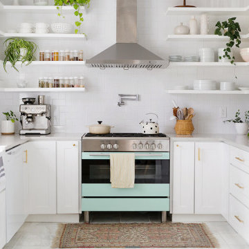
A clean, white, and fresh look never cease to accentuate your kitchen’s interior.
Whether you have a small kitchen or a large one, it is highly unlikely to make a wrong decision with the white color. A white kitchen is a timeless addition to your entire décor, which always radiates more light, a bright look, and an aesthetically soothing aura.
However, although the color white has the power to uplift the look of your kitchen, it is not enough to just paint the walls white. You need to strike a chord between various textures and colors along with kitchen elements, like shaker kitchen cabinets, countertop, etc.
In the following section, we have compiled a list of modern kitchen cabinets ideas. Read on see some of the best white kitchen cabinet styles for your kitchen.
Top 10 Modern White Kitchen Ideas
There’s no doubt in the fact that a white kitchen and RTA cabinets can form the perfect base for your kitchen’s interior. You can add some plants, a pinch of gold, and or a simple black countertop for a different yet appealing look. Below we have discussed some of these ideas. Read on:
1. Airy and Light
The simplest way to design your modern white kitchen is to use a white and timber combination. This can include white cabinets, timber doors, and white wall tiles. Or you can choose timber RTA cabinets paired with white tiles, flooring, and countertop.
2. Sophisticated
Another way is to sophisticatedly turn around your white choices. Here’s an example:
Use white cabinets, steel fittings, and accessories paired with textured white tiles and marble countertop. The flooring can also be white, similar to the countertop. This would give a nice, clean, and refreshing look to your modern white kitchen
.
3. Stone Look
The stone look is always best paired with white cabinets. So, if you utilize shaker kitchen cabinets, which are white, and pair it with everything white stone-like look, then your kitchen would look mesmerizing. This means using marble countertop, marble flooring, and stone-looking back tiles.
4. Monochrome
Black and white appeals to a lot of homeowners. It is the best combination that is unlikely to go wrong. In fact, it helps you move ahead of the ordinary kitchen interior.
You can set your monochrome modern white kitchen in two ways:
Firstly, you have white cabinets paired with black countertop and black fittings. Too much black would reduce lighting and make your kitchen look smaller. So, add white flooring and white back tiles.
Secondly, you can keep the lower RTA cabinets black, and rest everything white, such as textured back tiles, white knobs, etc. You can also pair it with timber upper cabinets.
5. Grey Shade
Similar to monochrome, grey is also amazing. It looks much more sophisticated than monochrome, but a little less bold. So, you can keep your modern white kitchen in these two shades. For example, grey cabinets and white countertop, tiles, and flooring. Here, glossy back tiles can accentuate the look.
6. Brass Touch
Brass touch can literally light up any dull space. If you just add a brass lamp to your living room or kitchen, it can drastically enhance the look. You can use brass in the form of brass windows and lamps. You can also add copper stools and upper cabinets for the same effect.
7. White Countertop
One thing that can make your modern white kitchen look extremely beautiful is the attention to detail. This includes adding a white countertop that really improves the look. A lot of people add a white countertop but making it complement your cabinets can improve the interior a lot.
For example, marble countertop, wooden flooring, white cabinets, and copper knobs.
8. Wood Shelves
The color of wood and timber automatically adds a sense of warmth to your kitchen. So, you can also use either upper or lower timber cabinets. If you are using timber or wood for the upper cabinet and RTA cabinets for the lower cabinets, then you can keep upper cabinets as open shelves. This can also be a bar wood shelf.
9. White Tiles
Basic, old-school white tiles are also great. Earlier, we had small white tiles that used to go with everything. These tiles still complement your kitchen. Use white RTA cabinets, black countertop, and white tiles for a perfect contrast.
10. Light and Bright
Another amazing way to install shaker kitchen cabinets in a modern white kitchen is to keep everything white but add colorful chairs to your dining table. This will add life to your kitchen.
Conclusion
If you are redesigning your kitchen or re-structuring it, modern white kitchen themes are the best option. Simply take inspiration from the above examples and choose a versatile approach for remodeling your kitchen. There’s no shortage of options that you can choose from, such as monochrome, black cabinets, etc. Just remember to check the kitchen size, your budget, and lighting in your kitchen to ensure that you are moving in the right direction.
Whether you have a small kitchen or a large one, it is highly unlikely to make a wrong decision with the white color. A white kitchen is a timeless addition to your entire décor, which always radiates more light, a bright look, and an aesthetically soothing aura.
However, although the color white has the power to uplift the look of your kitchen, it is not enough to just paint the walls white. You need to strike a chord between various textures and colors along with kitchen elements, like shaker kitchen cabinets, countertop, etc.
In the following section, we have compiled a list of modern kitchen cabinets ideas. Read on see some of the best white kitchen cabinet styles for your kitchen.
Top 10 Modern White Kitchen Ideas
There’s no doubt in the fact that a white kitchen and RTA cabinets can form the perfect base for your kitchen’s interior. You can add some plants, a pinch of gold, and or a simple black countertop for a different yet appealing look. Below we have discussed some of these ideas. Read on:
1. Airy and Light
The simplest way to design your modern white kitchen is to use a white and timber combination. This can include white cabinets, timber doors, and white wall tiles. Or you can choose timber RTA cabinets paired with white tiles, flooring, and countertop.
2. Sophisticated
Another way is to sophisticatedly turn around your white choices. Here’s an example:
Use white cabinets, steel fittings, and accessories paired with textured white tiles and marble countertop. The flooring can also be white, similar to the countertop. This would give a nice, clean, and refreshing look to your modern white kitchen
.
3. Stone Look
The stone look is always best paired with white cabinets. So, if you utilize shaker kitchen cabinets, which are white, and pair it with everything white stone-like look, then your kitchen would look mesmerizing. This means using marble countertop, marble flooring, and stone-looking back tiles.
4. Monochrome
Black and white appeals to a lot of homeowners. It is the best combination that is unlikely to go wrong. In fact, it helps you move ahead of the ordinary kitchen interior.
You can set your monochrome modern white kitchen in two ways:
Firstly, you have white cabinets paired with black countertop and black fittings. Too much black would reduce lighting and make your kitchen look smaller. So, add white flooring and white back tiles.
Secondly, you can keep the lower RTA cabinets black, and rest everything white, such as textured back tiles, white knobs, etc. You can also pair it with timber upper cabinets.
5. Grey Shade
Similar to monochrome, grey is also amazing. It looks much more sophisticated than monochrome, but a little less bold. So, you can keep your modern white kitchen in these two shades. For example, grey cabinets and white countertop, tiles, and flooring. Here, glossy back tiles can accentuate the look.
6. Brass Touch
Brass touch can literally light up any dull space. If you just add a brass lamp to your living room or kitchen, it can drastically enhance the look. You can use brass in the form of brass windows and lamps. You can also add copper stools and upper cabinets for the same effect.
7. White Countertop
One thing that can make your modern white kitchen look extremely beautiful is the attention to detail. This includes adding a white countertop that really improves the look. A lot of people add a white countertop but making it complement your cabinets can improve the interior a lot.
For example, marble countertop, wooden flooring, white cabinets, and copper knobs.
8. Wood Shelves
The color of wood and timber automatically adds a sense of warmth to your kitchen. So, you can also use either upper or lower timber cabinets. If you are using timber or wood for the upper cabinet and RTA cabinets for the lower cabinets, then you can keep upper cabinets as open shelves. This can also be a bar wood shelf.
9. White Tiles
Basic, old-school white tiles are also great. Earlier, we had small white tiles that used to go with everything. These tiles still complement your kitchen. Use white RTA cabinets, black countertop, and white tiles for a perfect contrast.
10. Light and Bright
Another amazing way to install shaker kitchen cabinets in a modern white kitchen is to keep everything white but add colorful chairs to your dining table. This will add life to your kitchen.
Conclusion
If you are redesigning your kitchen or re-structuring it, modern white kitchen themes are the best option. Simply take inspiration from the above examples and choose a versatile approach for remodeling your kitchen. There’s no shortage of options that you can choose from, such as monochrome, black cabinets, etc. Just remember to check the kitchen size, your budget, and lighting in your kitchen to ensure that you are moving in the right direction.
 Open Door Furniture
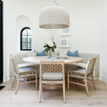
Sometimes the simplest things can be some of the most challenging. We built the base and top of this out of solid white oak. The shape seems simple enough but the way this is built required 48 different sides to line up nicely on the pedestal with floating mortise and tenon joinery to support it. All that on compound angles that are tapered.
The top is connected and supported via steel c channels that are recessed into the table top. This has the added benefit of keeping the table top flat on over the large cantilever.
A lot of math and planning but the end result was so amazing to see come together. And the space that it sat in was such a wonderful backdrop. We couldn't be happier with it.
As with all of our pieces, this custom dining table was hand made in San Diego, CA.
 Belle Maison Living, LLC
Roswell, GA
Marietta, Ga
Alpharetta, GA
Sandy Springs, GA
Johns Creek, GA
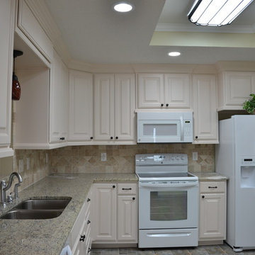
Inspiration for a mid-sized timeless l-shaped porcelain tile enclosed kitchen remodel in Atlanta with a double-bowl sink, raised-panel cabinets, beige cabinets, granite countertops, beige backsplash, stone tile backsplash, white appliances and no island
Inspiration for a mid-sized timeless l-shaped porcelain tile enclosed kitchen remodel in Atlanta with a double-bowl sink, raised-panel cabinets, beige cabinets, granite countertops, beige backsplash, stone tile backsplash, white appliances and no island
Find the right local pro for your project
 Murphy Bros. Design | Build | Remodel
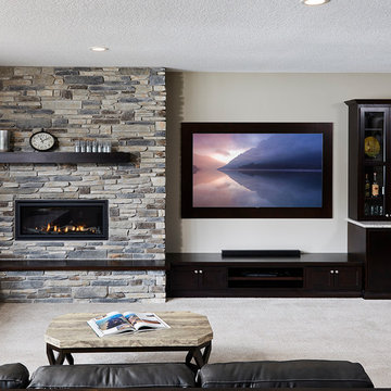
Out with the dated honey oak, and in with the sophisticated ebony shaded cabinetry, millwork and dry-stack stone fireplace, not to mention what started it all—a desire for a bigger TV to take center stage. These Ham Lake residents wanted to upgrade their small, very old TV to a large screen high definition unit. Unfortunately, their 15-year-old corner built in wouldn't accommodate the needed space. Like so many things in remodeling, the simplest desire leads to the most dramatic effects. In this particular case, the old TV cabinet and fireplace was removed and replaced with a sophisticated entertainment cabinet ensemble shaded in a dark ebony glaze and a dry-stack stone surround.
Design/Build Consultant — Nadia Glynn
Photography — Alyssa Lee
 Altair
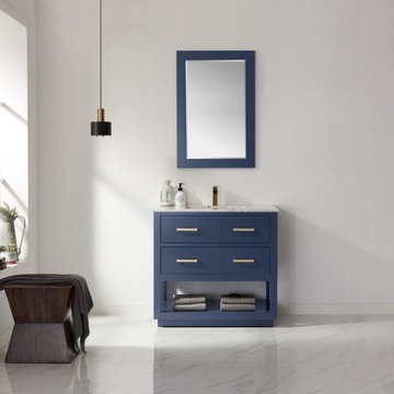
The Remi Vanity is proof that sometimes the simplest designs make the most powerful impact. With its clean silhouette and modern charm, this piece features a genuine marble countertop that contrasts beautifully with the minimalist cabinetry. The open shelf below offers the perfect storage space for spa towels and decorative items.
 Altair
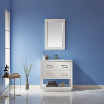
The Remi Vanity is proof that sometimes the simplest designs make the most powerful impact. With its clean silhouette and modern charm, this piece features a genuine marble countertop that contrasts beautifully with the minimalist cabinetry. The open shelf below offers the perfect storage space for spa towels and decorative items.
 Fantini USA
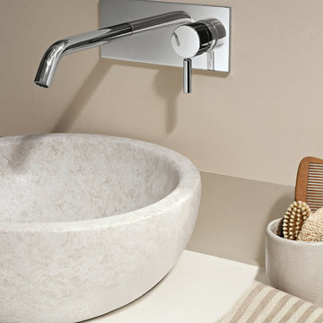
The Nostromo mixer is minimalist in its design and beautifully simple in its operation. This is the result of a long and careful process to create perfect function in its simplest form. Designed by Davide Mercatali for Fantini.
 Tile Club
Made in Spain
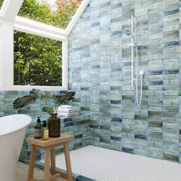
Looking to make a style impact with your space? Our gorgeous new Luna collection's timeless quality, vibrant palette, and subtle texture give even the simplest rooms a stunning, high-end finish. Showcasing a high level of color variation from piece to piece with the look of handmade tile, Luna Arc Sky is a choice for any design lover.
A kitchen backsplash in vibrant blue tones can create an eye-catching accent and contrast wonderfully with the straight lines of cabinetry and appliances. Extend this tile backsplash all the way to the ceiling to boost visual interest without compromising functionality. This blue tile will be a standout feature against white, neutral, and light wood cabinetry.
For a cozy and inviting bathroom perfect for starting and ending the day, glossy subway tiles are a fantastic way to add intriguing detail to the walk-in shower enclosure, bathtub surrounds, and vanity wall. Pair with natural stone floor tiles, wood fittings, and touches of greenery for a coastal vibe that feels both nurturing and joyful.
Luna Arc Sky is the perfect wall finish to punctuate any living room space with something that piques your imagination and lifts your mood. Create a fabulous feature wall, bring unique dimension to the fireplace surround, or add an eye-catching detail around the cocktail bar with a stunning blue tile. Despite its raised 3D arch pattern, this subway ceramic can be cleaned and maintained easily with a soft cloth and water or ceramic tile cleaner.
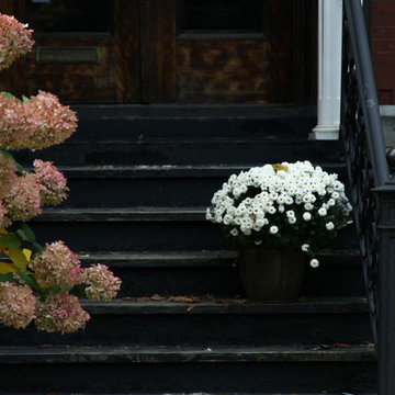
 Rachel Loewen Photography
Rachel Loewen Photography © 2017 Houzz
Elegant exterior home photo in Chicago
Elegant exterior home photo in Chicago
 Altair
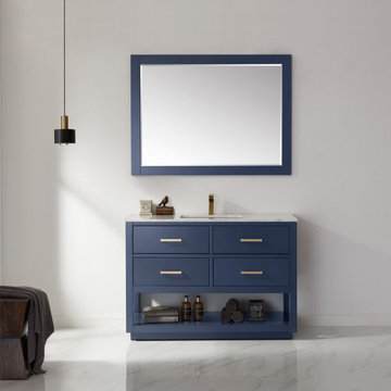
The Remi Vanity is proof that sometimes the simplest designs make the most powerful impact. With its clean silhouette and modern charm, this piece features a genuine marble countertop that contrasts beautifully with the minimalist cabinetry. The open shelf below offers the perfect storage space for spa towels and decorative items.
 Seed
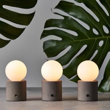
SeedA term derived from Greek mythology, Muses were nine goddesses, that symbolized the greatest of arts and sciences. Today a Muse is defined as a person or object who is the source of inspiration for a creative artist. SEED Design has brought a spark of ingenuity and created our very own MUSE. The CASTLE Muse Table Lamp serves as the light of your life. It can be turned on by a simple flick of a switch. Crafted with a combination of opal glass and concrete, the lamp is stunning even in its simplest state.
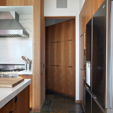
 Klopf Architecture
Built for the Bluff, A Sea Ranch Home is Remade from the Inside Out
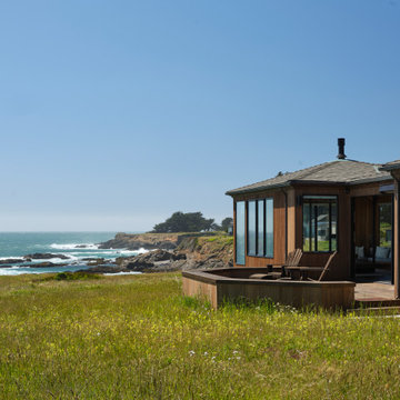
The house had always been grounded, on an ocean bluff at The Sea Ranch. It sits unencumbered, adjacent to one of the most dramatic stretches of the Sonoma coast with protected commons meadow to the east, uninterrupted Pacific views to the west, and a bluff trail running alongside. What it lacked was the feeling of home, one that could hold up its own against the natural landscape.
The owners are entrepreneurs with deep involvement across tech, real estate, and development and they know how things are built. The Sea Ranch house had been in their lives for years, a second residence and a place for family to gather. Built for a different time, it felt more compromising than comfortable. Sitting in a closed off nook, the kitchen fit one cook at a time and turned its back on the rest of the house. The entry was dim and compressed, divided by a structural column that presented itself at exactly the wrong moment. The primary suite was small relative to the view outside it. A large rear bedroom sat behind a lowered ceiling with a bathroom that had never been added. The house was certainly worth the trouble of doing it right.
What followed was not one project but four, each with its own design challenge, each addressed over a period of time.
Where the House Meets the Ocean
The most complex piece of the project, in both structural and spatial terms, was the kitchen expansion. The existing room was a single-person galley squeezed in as an afterthought with no meaningful connection to the dining room, the living space, or the deck outside. To make it useful for a family that cooks and gathers, it needed to grow outward into an existing patio and flow into the rooms around it.
A big challenge was the roofline. Several planes at different pitches and angles converged directly where additional volume was needed. A new form had to join that geometry without reading as a correction. The solution found the simplest possible connection between the existing angles, a roofline that from outside the structure, appears entirely original. From the bluff trail where the addition is visible, there is no discernible seam.
Inside, the kitchen is now open to the living and dining rooms without interruption. A large sliding glass door connects the space onto the rear deck. The deck itself was expanded and oriented so that the body of the house shields it from the coastal wind which is a common consideration that determines whether outdoor space at The Sea Ranch actually gets used. The result is a room that works for large family gatherings where no one feels cutoff, and one that makes the boundary between being inside and outside easy to ignore.
Welcoming Light
A structural column stood at the convergence of eight distinct roof planes in the entry. It was load-bearing, but it was also the reason the entry had always felt like a hallway rather than a welcoming arrival.
With the structural engineer, a custom steel connector was designed to receive beams from six separate directions, redistributing the load through a single new continuous beam. The column was surgically removed. Three triangular skylights were then cut into the roof above, their shapes drawn from the
existing geometry of the planes around them. The entry is now bright and open. The skylights feel native to the structure because they follow the logic already present in the roof.
Two Suites, Two Views
At opposite ends of the house, the two bedroom suites were each reconfigured, and each found a different way to introduce more of the landscape into the room.
An addition to the primary suite extended the structure outward to create a wraparound plan with a loop from the bedroom through bath and closet that had not been possible before. The expansion opened a slot view from the tub and shower toward the ocean. The view is precise and private. The ocean view is present and deliberate.
The rear bedroom absorbed an adjacent storage room to transform it into a full second suite with a vaulted ceiling, a large bathroom with a tub, a shower, and a sauna. A private fenced garden courtyard sits just beyond the glass bringing the outdoors inside. The tub was placed so that, looking past the courtyard and through the bedroom beyond, the ocean is visible at the far end. It is a long view and it makes the room feel larger and more settled than its footprint would suggest.
Glass on Four Sides, Fire at the Center
The main living and gathering room had always been caught between two competing facts: glass on four sides meant exceptional views but at The Sea Ranch, it also meant a cold room. A 360-degree cylindrical fireplace was added at the center on a raised stone base, providing radiant heat in every direction and giving the room a focal point around which a group naturally orients itself, whether that means two people at the end of the day or the whole family after dinner.
Owners Who Picked Up the Tools
The owner was not a passive client. they came with construction knowledge, specific ideas, and the desire to be an active part of the process, a dynamic that other architects may had found difficult, which Klopf Architecture accepted as an asset. They took it upon themselves to complete some of the work during construction, including the installation of a new radiant heating system beneath the floors.
The radiant system added to the older and less-desirable forced-air setup. At The Sea Ranch, that change matters as the house sits close enough to the ocean and moving air competes with the sound of it, where radiant heat does not. Solar panels were added to the roof as part of the new system. Insulation was upgraded throughout the walls, roof, and crawl space. The house that had always had the right setting now holds warmth the way a house on the bluff should.
They were also deeply involved in the design and selections throughout, and the finished house reflects both of them in ways that are specific rather than generic. The process took longer and moved through more iterations than a more arms-length relationship might have allowed. The result is more defined and personal because of it.
The Landscape Holds Priority
Every exterior decision was shaped by The Sea Ranch Design Standards, which require that buildings defer to the landscape around them rather than compete with it. Because this house sits on the bluff and is visible from the public trail, the additions faced a close review. Existing materials were matched. Geometries were resolved. The additions had to become indistinguishable from the original building.
From the trail, the house reads exactly as it always has — low, cedar-clad, secondary to the meadow and the water. The setting holds priority. Inside, the house has been remade.
Klopf Architecture Project Team: Geoff Campen and Trenton Jewett
Contractor: Shawn Bettega Construction
Photography: ©2025 Mariko Reed
Year Completed: 2023
Location: The Sea Ranch, CA
 Klopf Architecture
Built for the Bluff, A Sea Ranch Home is Remade from the Inside Out
The house had always been grounded, on an ocean bluff at The Sea Ranch. It sits unencumbered, adjacent to one of the most dramatic stretches of the Sonoma coast with protected commons meadow to the east, uninterrupted Pacific views to the west, and a bluff trail running alongside. What it lacked was the feeling of home, one that could hold up its own against the natural landscape.
The owners are entrepreneurs with deep involvement across tech, real estate, and development and they know how things are built. The Sea Ranch house had been in their lives for years, a second residence and a place for family to gather. Built for a different time, it felt more compromising than comfortable. Sitting in a closed off nook, the kitchen fit one cook at a time and turned its back on the rest of the house. The entry was dim and compressed, divided by a structural column that presented itself at exactly the wrong moment. The primary suite was small relative to the view outside it. A large rear bedroom sat behind a lowered ceiling with a bathroom that had never been added. The house was certainly worth the trouble of doing it right.
What followed was not one project but four, each with its own design challenge, each addressed over a period of time.
Where the House Meets the Ocean
The most complex piece of the project, in both structural and spatial terms, was the kitchen expansion. The existing room was a single-person galley squeezed in as an afterthought with no meaningful connection to the dining room, the living space, or the deck outside. To make it useful for a family that cooks and gathers, it needed to grow outward into an existing patio and flow into the rooms around it.
A big challenge was the roofline. Several planes at different pitches and angles converged directly where additional volume was needed. A new form had to join that geometry without reading as a correction. The solution found the simplest possible connection between the existing angles, a roofline that from outside the structure, appears entirely original. From the bluff trail where the addition is visible, there is no discernible seam.
Inside, the kitchen is now open to the living and dining rooms without interruption. A large sliding glass door connects the space onto the rear deck. The deck itself was expanded and oriented so that the body of the house shields it from the coastal wind which is a common consideration that determines whether outdoor space at The Sea Ranch actually gets used. The result is a room that works for large family gatherings where no one feels cutoff, and one that makes the boundary between being inside and outside easy to ignore.
Welcoming Light
A structural column stood at the convergence of eight distinct roof planes in the entry. It was load-bearing, but it was also the reason the entry had always felt like a hallway rather than a welcoming arrival.
With the structural engineer, a custom steel connector was designed to receive beams from six separate directions, redistributing the load through a single new continuous beam. The column was surgically removed. Three triangular skylights were then cut into the roof above, their shapes drawn from the
existing geometry of the planes around them. The entry is now bright and open. The skylights feel native to the structure because they follow the logic already present in the roof.
Two Suites, Two Views
At opposite ends of the house, the two bedroom suites were each reconfigured, and each found a different way to introduce more of the landscape into the room.
An addition to the primary suite extended the structure outward to create a wraparound plan with a loop from the bedroom through bath and closet that had not been possible before. The expansion opened a slot view from the tub and shower toward the ocean. The view is precise and private. The ocean view is present and deliberate.
The rear bedroom absorbed an adjacent storage room to transform it into a full second suite with a vaulted ceiling, a large bathroom with a tub, a shower, and a sauna. A private fenced garden courtyard sits just beyond the glass bringing the outdoors inside. The tub was placed so that, looking past the courtyard and through the bedroom beyond, the ocean is visible at the far end. It is a long view and it makes the room feel larger and more settled than its footprint would suggest.
Glass on Four Sides, Fire at the Center
The main living and gathering room had always been caught between two competing facts: glass on four sides meant exceptional views but at The Sea Ranch, it also meant a cold room. A 360-degree cylindrical fireplace was added at the center on a raised stone base, providing radiant heat in every direction and giving the room a focal point around which a group naturally orients itself, whether that means two people at the end of the day or the whole family after dinner.
Owners Who Picked Up the Tools
The owner was not a passive client. they came with construction knowledge, specific ideas, and the desire to be an active part of the process, a dynamic that other architects may had found difficult, which Klopf Architecture accepted as an asset. They took it upon themselves to complete some of the work during construction, including the installation of a new radiant heating system beneath the floors.
The radiant system added to the older and less-desirable forced-air setup. At The Sea Ranch, that change matters as the house sits close enough to the ocean and moving air competes with the sound of it, where radiant heat does not. Solar panels were added to the roof as part of the new system. Insulation was upgraded throughout the walls, roof, and crawl space. The house that had always had the right setting now holds warmth the way a house on the bluff should.
They were also deeply involved in the design and selections throughout, and the finished house reflects both of them in ways that are specific rather than generic. The process took longer and moved through more iterations than a more arms-length relationship might have allowed. The result is more defined and personal because of it.
The Landscape Holds Priority
Every exterior decision was shaped by The Sea Ranch Design Standards, which require that buildings defer to the landscape around them rather than compete with it. Because this house sits on the bluff and is visible from the public trail, the additions faced a close review. Existing materials were matched. Geometries were resolved. The additions had to become indistinguishable from the original building.
From the trail, the house reads exactly as it always has — low, cedar-clad, secondary to the meadow and the water. The setting holds priority. Inside, the house has been remade.
Klopf Architecture Project Team: Geoff Campen and Trenton Jewett
Contractor: Shawn Bettega Construction
Photography: ©2025 Mariko Reed
Year Completed: 2023
Location: The Sea Ranch, CA
 Focal Point Hardware
This Electric Mirror Product Features:
Lead-free, copper-free, corrosion-resistant OmegaMirror glass
Integrated defogger
Suitable for damp bathroom environments
Environmentally sustainable
Fast lead times
ADA compliant
Technology: Defogger
Dimension: 11.75"W x 23.75"H x .44"D
Designed in America and sourced globally
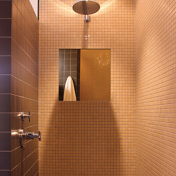
Whether it’s a quick rinse or a clean morning shave, you’ll want to have Aqua in the shower to do it right. This must-have bathroom companion makes even the simplest shower an experience to behold.
 KOZI MEDIA DESIGN
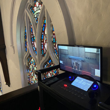
In this church, we took what was a low-resolution, local produced video feed and created a nearly 4K resolution video feed through live streaming of Facebook Live with the simplest of use and operability. Kozi Media Design carefully and professionally installed all the retrofit cabling and equipment through the existing mixer for a professional result to the masses.
 Granite Vision, Inc.
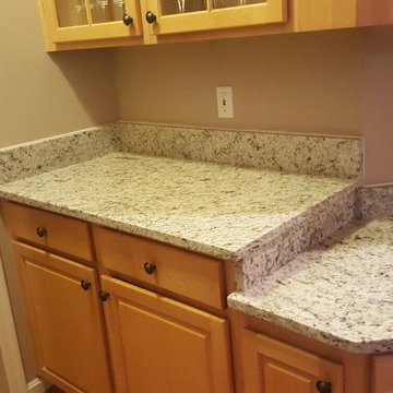
With 20 years of experience in the industry, we are a highly trained team ready to help you in all of your marble and granite needs. We will work with you every step of the way – maximizing the best results you can expect. Ranging from the simplest kitchen top to the more sophisticated style, we will work with you, helping you achieve the best look for your project.
Joseph E. Turker
 Baseboarders
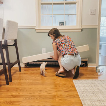
When Carrie Waller, founder of Dream Green DIY, set out to refresh her 1960s ranch-style home in Waynesboro, Virginia, she embraced what she calls the “gentle renovation” — thoughtful upgrades that enhance a space without major construction or chaos.
One of her favorite transformations? Swapping out her outdated, rusted baseboard heaters for clean, modern covers from Baseboarders. The Premium Series in White brought instant cohesion to her freshly painted walls and brightened the entire room. With their powder-coated, galvanized steel and tool-free installation, the covers delivered high design with low effort — a perfect match for Carrie’s refined, approachable style.
This project proves that even the simplest updates can dramatically shift the feel of a space. It’s modern warmth with a timeless finish — all without tearing out the baseboards.
Location: Waynesboro, VA
Homeowner: Carrie Waller | @dreamgreendiy
Product: Baseboarders Premium Series
Finish: White
Install: DIY, no tools required
 House Coach
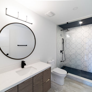
We could not be more pleased with the way that this main bathroom turned out. Sometimes it is the simplest tile that will provide the greatest impact!!
 Arca Unlimited Architects
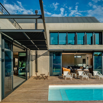
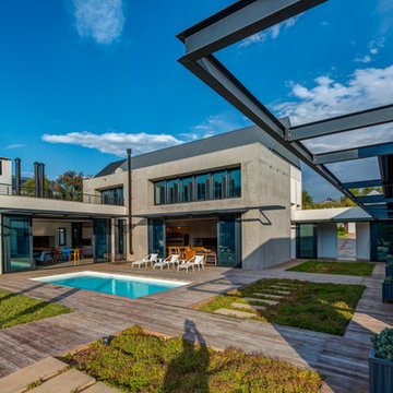
The client commissioned ARCA Unlimited to design their family home in Southdowns Estate. The design had to take advantage of the beautiful surrounds, whilst providing privacy from public spaces. Solid southern- and western street boundaries with perforated aluminium screens provide privacy while allowing filtered natural light into the house. A visual axis extends through the front door and entrance gallery and penetrates this privacy barrier. It links to a formal landscaped courtyard and the views beyond. A deck and seamless floor-to-ceiling sliding glass doors create the threshold between inside and out. The concept of seamless transition is carried through to detailing: the simplest possible transition between different building materials is utilised. Living and bedroom spaces are orientated inward around the internal courtyard. Rhythmic progressing of proportions with honest expression of structure and materials help to orientate the user and make the architecture more intelligible. Photographs by Malan Kotze Photography
 Arca Unlimited Architects
The client commissioned ARCA Unlimited to design their family home in Southdowns Estate. The design had to take advantage of the beautiful surrounds, whilst providing privacy from public spaces. Solid southern- and western street boundaries with perforated aluminium screens provide privacy while allowing filtered natural light into the house. A visual axis extends through the front door and entrance gallery and penetrates this privacy barrier. It links to a formal landscaped courtyard and the views beyond. A deck and seamless floor-to-ceiling sliding glass doors create the threshold between inside and out. The concept of seamless transition is carried through to detailing: the simplest possible transition between different building materials is utilised. Living and bedroom spaces are orientated inward around the internal courtyard. Rhythmic progressing of proportions with honest expression of structure and materials help to orientate the user and make the architecture more intelligible. Photographs by Malan Kotze Photography
17