
Search results for "Simply creating" in Home Design Ideas
 Hallmark Floors
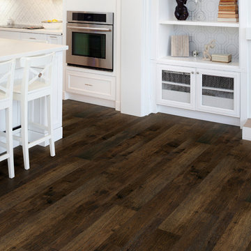
Casita Hickory Monterey Hallmark Floors.
Creating a New demand for random width, by using tomorrows technology, has lead to the development of the Monterey Hardwood Collection. Available in maple and hickory, with a combined width of 4”, 6”, and 8” and random lengths up to 6’. Using proprietary Trueslice® technology, Hallmark is producing a very stable 2mm sliced face on a 1/2” thick (total) engineered plank making it simply savvy.
The slice face visuals mimic that of sawn face with a tighter, higher-end grain look than typical rotary cut products currently offered by the competition. Topped off with our incredibly durable Truemark Glaze Tek Poly Finish, Monterey is a definite game changer.
Simply Better…Discover Why.
www.hallmarkfloors.com
 Simply Home Decorating
This beautiful North Vancouver home belongs to a nature-loving and health-conscious couple, Emma and Vince (names changed), their two young children, and their dog, Jasper. When they contacted us about renovating and furnishing their kitchen and family room, we walked in and saw a world of potential waiting to be uncovered.
Before: Larkhall Crescent Home:
Like many original North Vancouver homes, the interior was definitely dated. We encountered late ‘80s finishes in powder pink and teal green, old carpet, and a kitchen that wasn’t maximized to suit this family’s modern-day lifestyle. However, the size of the rooms offered us a ton of space with which to get creative.
Knowing our clients’ love of cooking, need for work spaces (Emma and Vince both work remotely), and growing family, we developed a design concept that would increase usable space, optimize storage, and create intimacy in this large area. As for the style, we were inspired by their European roots, inventing a new and modern take on “Belgian Farmhouse” style. Now, the home is truly one-of-a-kind.
After: Warm & Cozy Family Room:
Fresh, bright, and comfortable, this living area has been transformed! We started with the fireplace as a focal point, selecting aged brick tiles for added texture and a crisp wood mantle. The taupe-coloured sectional infuses the room with visual warmth and serves the added purpose of separating the family room from the kitchen.
Emma and Vince were also keen on using non-toxic materials in their home, and we were happy to oblige. To meet their needs, we sourced natural wood elements and sought out Canadian-made products - that adhere to high health standards - whenever possible.
Look closer at the elements of this space, and you will find this stunning, honeycomb-patterned rug in earthy gold, beige, and charcoal tones. It’s plush to the touch and full of visual texture that brings this room’s colour palette together. We sourced these two-tone chairs with caning, petrified wood side table, black sconces, and botanical prints in greyscale from local artist, Heather Johnston.
We topped off the space with this dark wood and rattan console that offers storage facing the kitchen and presents an opportunity to display cherished items. The result is a cozy lounging space brimming with comfort and functionality. It’s perfect for enjoying quality family time, or Emma can simply slide the coffee table away to make room for her morning yoga practice.
Now, let’s turn around and give some attention to the kitchen. Do you remember what the original kitchen looked like? If not, scroll back up, because the transformation is shocking…
Moody & Welcoming Kitchen for Healthy Living:
This kitchen looks very different from how it started, right? Though we didn’t touch any walls, the kitchen has almost doubled in usable space! We created a long, extended island with storage, an outlet for small appliances, and seating for comfortable prep, after-school snacking, or mingling among friends.
On the other side of the island, the family has even more storage and an integrated dishwasher within easy reach of the sink, perfect for quick clean-up. From this angle, you can also see the expansive custom Shaker cabinetry in white and the integrated double ovens. These facilitate their cooking experience and gave us the opportunity to add an additional surprise…
A coffee garage station and more hidden storage! Keeping these items located along the perimeter allows them to be accessed by the family or their guests without someone getting under the cook’s feet. These are the little details that make everyday life easier and more enjoyable.
Moving deeper into the kitchen, the seamless induction cooktop topped with a freestanding concealed hood fan commands attention in a soft yet prominent way. The natural wood accent mirrors the fireplace mantle, and the choice of off-black wood-grain cabinets not only continues our black-and-white colour palette but adds a sense of depth and contrast. The corner sink is located to the right and perfectly positioned with a view of their thriving backyard.
To invite more of this family’s character into the space, we mixed metals for interest — matte black, dark pewter, and warm brass — and created open shelves in white oak for their plants and decor. You can also glimpse the tumbled edge of the backsplash tile, which echoes the rustic brick of the fireplace. It adds that farmhouse charm while still feeling timeless and sophisticated.
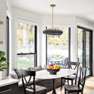
Last but not least, we designed this dining banquette in the bay window (with integrated bench storage, of course), where the family can share a meal together, the kids can do homework, or Emma and Vince can work and enjoy a change of scenery from their offices. Like the other spaces in the home, it was designed to be beautiful, multi-functional, and long-lasting.
Praise from Our Clients:
It is clear that we love this home, but what did our clients have to say?
“Lori is a visionary and masters execution to the finest detail all at the same time. When she first met us to know more about who we are and how we live, she could right away envision how we could use the space in our kitchen and living room…The results exceeded our expectations.
Lori and her team were also a delight to work with — coordination with all the trades, fast problem-solving, regular updates, professional and friendly attitude of her entire team — made it the dream team. Thank you SHD for making our space so beautiful!”
In turn, we are so grateful for this family’s trust, their open communication, and for being wonderful people with whom to work. (So, thank you!)
 Isla Homes
I built this on my property for my aging father who has some health issues. Handicap accessibility was a factor in design. His dream has always been to try retire to a cabin in the woods. This is what he got.
It is a 1 bedroom, 1 bath with a great room. It is 600 sqft of AC space. The footprint is 40' x 26' overall.
The site was the former home of our pig pen. I only had to take 1 tree to make this work and I planted 3 in its place. The axis is set from root ball to root ball. The rear center is aligned with mean sunset and is visible across a wetland.
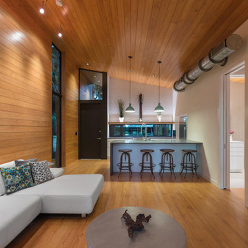
The goal was to make the home feel like it was floating in the palms. The geometry had to simple and I didn't want it feeling heavy on the land so I cantilevered the structure beyond exposed foundation walls. My barn is nearby and it features old 1950's "S" corrugated metal panel walls. I used the same panel profile for my siding. I ran it vertical to match the barn, but also to balance the length of the structure and stretch the high point into the canopy, visually. The wood is all Southern Yellow Pine. This material came from clearing at the Babcock Ranch Development site. I ran it through the structure, end to end and horizontally, to create a seamless feel and to stretch the space. It worked. It feels MUCH bigger than it is.
I milled the material to specific sizes in specific areas to create precise alignments. Floor starters align with base. Wall tops adjoin ceiling starters to create the illusion of a seamless board. All light fixtures, HVAC supports, cabinets, switches, outlets, are set specifically to wood joints. The front and rear porch wood has three different milling profiles so the hypotenuse on the ceilings, align with the walls, and yield an aligned deck board below. Yes, I over did it. It is spectacular in its detailing. That's the benefit of small spaces.
Concrete counters and IKEA cabinets round out the conversation.
For those who cannot live tiny, I offer the Tiny-ish House.
Photos by Ryan Gamma
Staging by iStage Homes
Design Assistance Jimmy Thornton
Find the right local pro for your project
 Amy Troute Inspired Interior Design
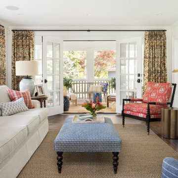
ATIID collaborated with these homeowners to curate new furnishings throughout the home while their down-to-the studs, raise-the-roof renovation, designed by Chambers Design, was underway. Pattern and color were everything to the owners, and classic “Americana” colors with a modern twist appear in the formal dining room, great room with gorgeous new screen porch, and the primary bedroom. Custom bedding that marries not-so-traditional checks and florals invites guests into each sumptuously layered bed. Vintage and contemporary area rugs in wool and jute provide color and warmth, grounding each space. Bold wallpapers were introduced in the powder and guest bathrooms, and custom draperies layered with natural fiber roman shades ala Cindy’s Window Fashions inspire the palettes and draw the eye out to the natural beauty beyond. Luxury abounds in each bathroom with gleaming chrome fixtures and classic finishes. A magnetic shade of blue paint envelops the gourmet kitchen and a buttery yellow creates a happy basement laundry room. No detail was overlooked in this stately home - down to the mudroom’s delightful dutch door and hard-wearing brick floor.
Photography by Meagan Larsen Photography
 Archadeck of Central South Carolina
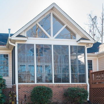
This stunning 3-season room in Chapin, SC, is designed and built using a four-track window system. Archadeck of Central SC uses this window system to create a multi-functional outdoor room for all seasons. By simply clicking the panels in, or out, of a fixed position on their effortless four-track, you can let Mother Nature in, or keep Old Man Winter out!
 Simply Baths & Kitchens
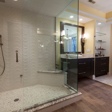
Tired of their outdated and chaotic master bath, this CT couple wanted to create a relaxing at-home spa with an enlarged steam shower, a soaking tub, and a soothing natural Zen aesthetic. With a clear vision of the inviting retreat these homeowners desired, design team Barry Miller & Rachel Peterson of Simply Baths, Inc. transformed the space.
 Simply Baths & Kitchens
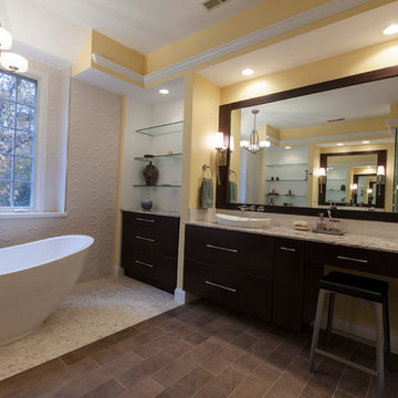
Tired of their outdated and chaotic master bath, this CT couple wanted to create a relaxing at-home spa with an enlarged steam shower, a soaking tub, and a soothing natural Zen aesthetic. With a clear vision of the inviting retreat these homeowners desired, design team Barry Miller & Rachel Peterson of Simply Baths, Inc. transformed the space.

Sponsored
Delaware, OH

Buckeye Basements, Inc.
Central Ohio's Basement Finishing ExpertsBest Of Houzz '13-'21
 Just Basements
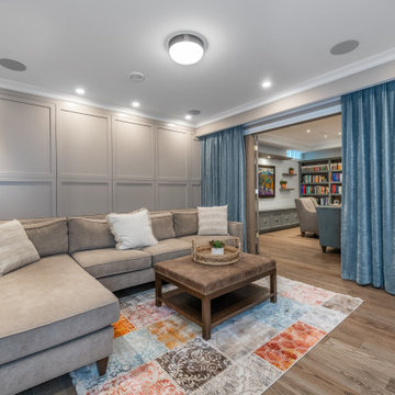
We opted to create a custom wall detail with cabinetry behind the couch in the media room, to both conceal the electrical panel and create additional storage, all the while presenting itself as simply millwork detail.
 Simply Baths & Kitchens
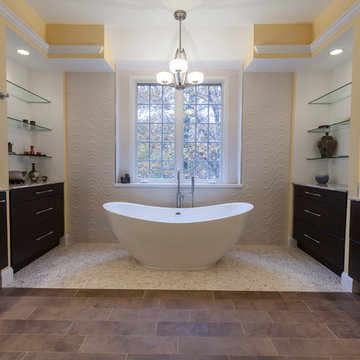
Tired of their outdated and chaotic master bath, this CT couple wanted to create a relaxing at-home spa with an enlarged steam shower, a soaking tub, and a soothing natural Zen aesthetic. With a clear vision of the inviting retreat these homeowners desired, design team Barry Miller & Rachel Peterson of Simply Baths, Inc. transformed the space.
 Barry Harris Studios
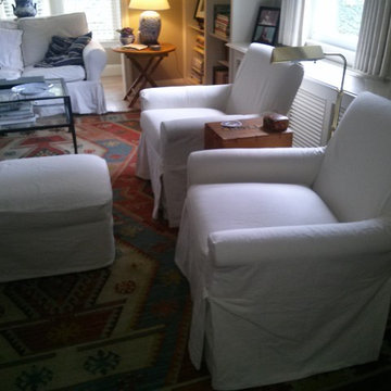
After washing the fabric, I made simply designed slipcovers with no cording. The skirt is created from the main fabric to keep the design simple. The ottoman cover simply pulls over and is hemmed at the bottom. Photo by Barry Harris

 Terrie Koles Design, llc
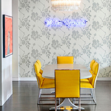
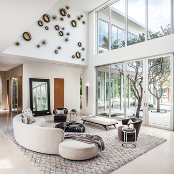
Dining room - contemporary dark wood floor dining room idea in New York with multicolored walls


Sponsored
Columbus, OH

Hope Restoration & General Contracting
Columbus Design-Build, Kitchen & Bath Remodeling, Historic Renovations
 Paper Moon Painting
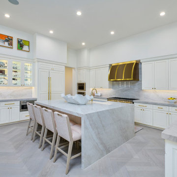
Kitchen walls and cabinets painted in Benjamin Moore "Simply White", creating a fresh, bright, and timeless look.
Kitchen - large kitchen idea with raised-panel cabinets, an island and white cabinets
Kitchen - large kitchen idea with raised-panel cabinets, an island and white cabinets
 Julia Chasman Design
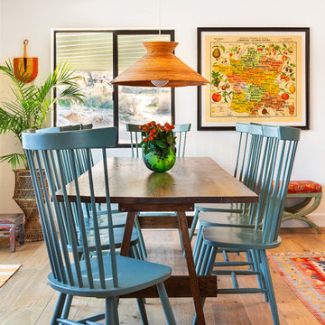
The mid-century slanted ceiling of the open dining room creates a cozy but spacious area for a custom 9' dining table made of reclaimed oak, surrounded by 8 matching vintage Windsor chairs painted in Farrow & Ball's Green Smoke. Vintage mid-century wicker pendant is echoed by Moroccan straw accents with the plant stand, and wall fan. A large French colorful agricultural map adds charm and an unexpected twist to the decor.
Photo by Bet Gum for Flea Market Decor Magazine
 SHS Color
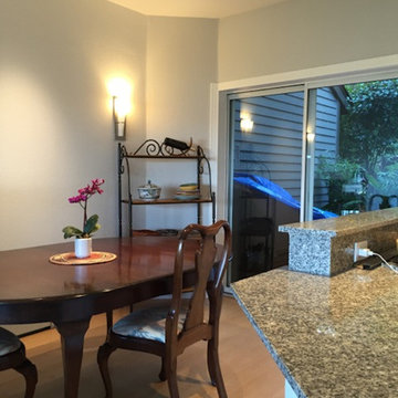
LR: BM Simply White OC-117,
Kitchen: Archival C2-785
Simply White was taken to first "corner", then Archival, a soft gray, full spectrum paint that worked with the counters and cabinets creating a quiet transition and defining kitchen with color.
 Lucile Glessner Design
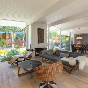
Living room - mid-century modern open concept light wood floor and brown floor living room idea in San Francisco with gray walls, a standard fireplace, a brick fireplace and a tv stand

Sponsored
Delaware, OH
Buckeye Basements, Inc.
Central Ohio's Basement Finishing ExpertsBest Of Houzz '13-'21
 Klopf Architecture
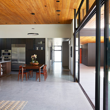
Klopf Architecture, Arterra Landscape Architects and Henry Calvert of Calvert Ventures Designed and built a new warm, modern, Eichler-inspired, open, indoor-outdoor home on a deeper-than-usual San Mateo Highlands property where an original Eichler house had burned to the ground.
The owners wanted multi-generational living and larger spaces than the original home offered, but all parties agreed that the house should respect the neighborhood and blend in stylistically with the other Eichlers. At first the Klopf team considered re-using what little was left of the original home and expanding on it. But after discussions with the owner and builder, all parties agreed that the last few remaining elements of the house were not practical to re-use, so Klopf Architecture designed a new home that pushes the Eichler approach in new directions.
One disadvantage of Eichler production homes is that the house designs were not optimized for each specific lot. A new custom home offered the team a chance to start over. In this case, a longer house that opens up sideways to the south fit the lot better than the original square-ish house that used to open to the rear (west). Accordingly, the Klopf team designed an L-shaped “bar” house with a large glass wall with large sliding glass doors that faces sideways instead of to the rear like a typical Eichler. This glass wall opens to a pool and landscaped yard designed by Arterra Landscape Architects.
Driving by the house, one might assume at first glance it is an Eichler because of the horizontality, the overhanging flat roof eaves, the dark gray vertical siding, and orange solid panel front door, but the house is designed for the 21st Century and is not meant to be a “Likeler.” You won't see any posts and beams in this home. Instead, the ceiling decking is a western red cedar that covers over all the beams. Like Eichlers, this cedar runs continuously from inside to out, enhancing the indoor / outdoor feeling of the house, but unlike Eichlers it conceals a cavity for lighting, wiring, and insulation. Ceilings are higher, rooms are larger and more open, the master bathroom is light-filled and more generous, with a separate tub and shower and a separate toilet compartment, and there is plenty of storage. The garage even easily fits two of today's vehicles with room to spare.
A massive 49-foot by 12-foot wall of glass and the continuity of materials from inside to outside enhance the inside-outside living concept, so the owners and their guests can flow freely from house to pool deck to BBQ to pool and back.
During construction in the rough framing stage, Klopf thought the front of the house appeared too tall even though the house had looked right in the design renderings (probably because the house is uphill from the street). So Klopf Architecture paid the framer to change the roofline from how we had designed it to be lower along the front, allowing the home to blend in better with the neighborhood. One project goal was for people driving up the street to pass the home without immediately noticing there is an "imposter" on this lot, and making that change was essential to achieve that goal.
This 2,606 square foot, 3 bedroom, 3 bathroom Eichler-inspired new house is located in San Mateo in the heart of the Silicon Valley.
Klopf Architecture Project Team: John Klopf, AIA, Klara Kevane
Landscape Architect: Arterra Landscape Architects
Contractor: Henry Calvert of Calvert Ventures
Photography ©2016 Mariko Reed
Location: San Mateo, CA
Year completed: 2016

 Coats Homes
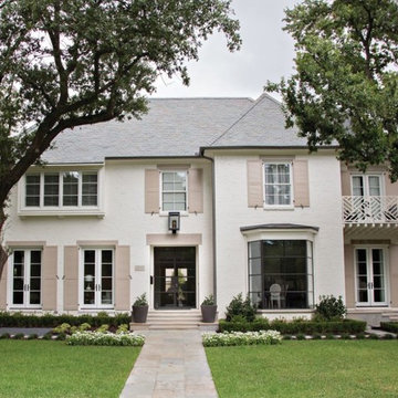
The vision was a gracious Southern home—but with a sleek edge that would create something truly unexpected around each corner. The “formula” was to do something traditional, but with a twist, as often as we could.
Paint color = Benjamin Moore Simply White
26