
Search results for "Sites require" in Home Design Ideas
 Elizabeth Eason Architecture LLC
Bruce Cole Photography
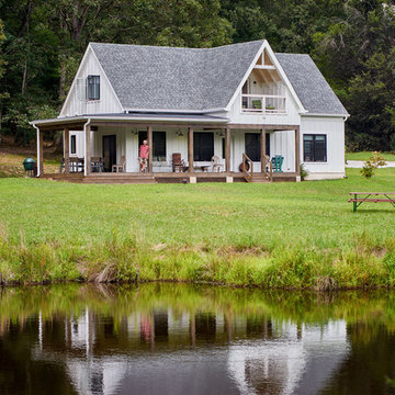
Example of a small farmhouse white gable roof design with a shingle roof
Example of a small farmhouse white gable roof design with a shingle roof
 StudioLAB
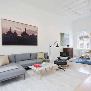
A young couple with three small children purchased this full floor loft in Tribeca in need of a gut renovation. The existing apartment was plagued with awkward spaces, limited natural light and an outdated décor. It was also lacking the required third child’s bedroom desperately needed for their newly expanded family. StudioLAB aimed for a fluid open-plan layout in the larger public spaces while creating smaller, tighter quarters in the rear private spaces to satisfy the family’s programmatic wishes. 3 small children’s bedrooms were carved out of the rear lower level connected by a communal playroom and a shared kid’s bathroom. Upstairs, the master bedroom and master bathroom float above the kid’s rooms on a mezzanine accessed by a newly built staircase. Ample new storage was built underneath the staircase as an extension of the open kitchen and dining areas. A custom pull out drawer containing the food and water bowls was installed for the family’s two dogs to be hidden away out of site when not in use. All wall surfaces, existing and new, were limited to a bright but warm white finish to create a seamless integration in the ceiling and wall structures allowing the spatial progression of the space and sculptural quality of the midcentury modern furniture pieces and colorful original artwork, painted by the wife’s brother, to enhance the space. The existing tin ceiling was left in the living room to maximize ceiling heights and remain a reminder of the historical details of the original construction. A new central AC system was added with an exposed cylindrical duct running along the long living room wall. A small office nook was built next to the elevator tucked away to be out of site.
 Dimensions in Wood Inc
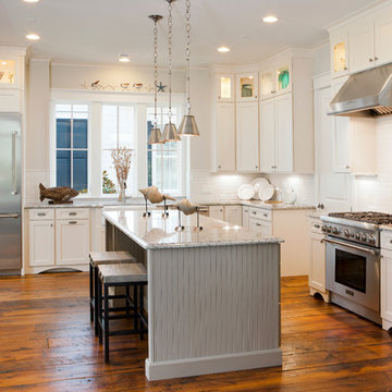
This client’s vision for their kitchen/hearth room remodel was to create a harmonious space for gathering and socializing with family and friends. Without the before and after photos, you would scarcely believe this was the same home.
This huge home renovation perfectly illustrates that Dimensions In Wood’s expert team can handle every aspect of your remodeling project. Plumbing, flooring, electrical wiring, custom cabinets, structural engineering, appliances, windows, interior and exterior doors, entertainment and more. Contact us today to discuss Translating Your Visions into Reality
The client was interested in new appliance technology, cabinetry to the ceiling, and an Island large enough to seat 3. They also wanted a built-in breakfast nook, improved pantry space, more functional storage on either side of their fireplace, and a built-in appearance for the TV above the mantel. The original built-in desk was not used, and they preferred for that space to serve as a small bar area with refrigeration and a place to store their printer. We designed several plans for the space before selecting the final layout.
The new design required the removal of the soffit over the old sink, as well as a small wall beside the old refrigerator. The wall beside the stairwell had to be shortened 13 inches and a new beam installed to carry the load of the home’s 2nd story to gain enough space for the large central island. The existing closet pantry walls were also reconfigured as per the new plan.
This serves as a great reminder that Dimensions In Wood is much more than just custom cabinets.
Central to the entire custom kitchen is an 8-foot Walnut island. The huge island, which comfortably seats three, is topped with Essenza Blue quartzite. The stone’s natural striations are beautiful. Quartzite is harder than granite, and less likely to stain than other stones because of its density. The couple had to look through multiple slabs to find a piece they LOVED. The island’s custom Walnut cabinetry, built to resemble a piece of custom furniture, was stained Bronzed Walnut by Sherwin Williams.
The 4-foot Galley Workstation in the island, handles all the kitchen’s prep, serving, and cleanup needs. The Galley’s culinary tools include an upper tier cutting board, upper tier drying rack, 2 lower tier platforms, 11″ colander with non-slip handles, and 11” mixing bowl with lid and non-slip bottom. Learn more about the amazing Galley Workstation here. A Waterstone gantry faucet in a pewter finish combines a pull-down sprayer for maximum mobility and a articulated swivel spout. A water tap with reverse osmosis filter provides the highest quality drinking water. To keep a clean and sleek counter we installed a raised air switch for the garbage disposal and integrated soap dispenser. The island also houses the Thermador Sapphire 7-Program Dishwasher with a hidden touch control panel and a custom Walnut wood front. The cabinetry under the Galley Workstation features a trash roll out, as well as storage for the culinary tools.
Shortening the stairwell wall, and reframing around the stairs, which included shortening the handrail, also made room for a bi-fold door walk-in pantry with extra roll out storage and space for a small microwave. Above the panty doors is a remote controlled, electric motor powered, lift up cabinet door which hides a flat screen TV, used while the family is cooking.
To the right of the walk-in pantry is cold food storage. The Thermador, 30-inch Freedom Collection refrigerator and 24-inch built-in freezer column with internal ice maker are covered with matching cabinetry fronts. An open display space was designed above the units, creating an aesthetically beautiful wall. To the right of the refrigerator & freezer columns is a tall cabinet designed for the built-in Thermador steam and convection oven. The convention steam oven is a relatively new technology for homes, but its versatility and food quality is amazing. To the right of this is a pull-out appliance pantry which provides easy access and storage for a stand mixer, blender, and any other appliance you do not want to clutter the counter.
The most visible wall of the kitchen features the 36-inch Thermador Professional Series Harmony Gas Range with Griddle. Between the range and custom designed wood hood, a framed mosaic tile accent in the backsplash, creates a focal point. To clear the air, the Professional Series Thermador 42-inch ventilation insert provides excellent exhaust capabilities, as well as providing multi-level, vivid LED lights for beautiful illumination.
The wall cabinetry symmetrically flanks the custom hood, utilizing deeper wall cabinetry on each end, allowing for storage of oversized dishware. The base cabinetry on this wall is made up of drawers, except for the corner, which is a Kesseböhmer LeMans II. This specially designed shelf system allows ease of access in underutilized blind corners. The dual action articulation system with soft close mechanism ensures a smooth open and close.
Rounding the corner to the outside wall, the base cabinetry was built to a narrower depth, providing additional space for the island, as well as easier access to the new larger pass-thru window which serves the screen porch. The client selected Black Vermont granite countertops with an ogee edge to contrast the Linen White painted cabinetry.
The door to the screen porch was replaced with a Marvin Exterior Door with a raised panel at the bottom of the 3⁄4 glass door.
Marvin Windows replaced the other windows in the space increasing the energy efficiency and value of the home. To establish the breakfast nook, a bench with drawers and an upholstered seat was built into the bay area of the room.
Custom bookshelves were built with open shelves, cabinet doors, and drawers on either side of the fireplace. A new stone hearth and fireplace surround were installed. Above the existing mantel we built a recessed space for the flat screen television hiding all wiring inside the walls for a completely clean look.
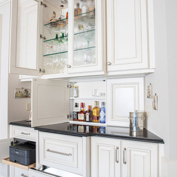
The space that was once a desk was transformed into a bar area. The glass shelves and glass cabinet front liquor cabinet stand out. But this bar area has hidden secrets. Tucked beneath the black granite is a Thermador under-counter double drawer refrigerator with matching wood front panels. They blend in perfectly with the cabinets. A wireless printer is easily accessed on a slide out drawer. Plus, what looks like merely wooden panels on the wall are concealing recessed storage for more bottles and glasses!
Overhead recessed lighting and speaker system provide illumination and entertainment through the entire space.
This luxury home had original, solid oak flooring through most of the first floor which the homeowner obviously wanted to keep but were in desperate need of repair and refinishing. Our master craftsmen wove in new wood flooring to match the old where needed, particularly where walls had been changed and where the floor was damaged. We sanded the floors, smoothing away years of wear and tear. The entire wood floor was then uniformly stained, making it impossible to differentiate where any repairs were made.
If this renovation has inspired you, then contact us today! There is no limit to our Dimensions.
Find the right local pro for your project
 Signature Designs Kitchen | Bath | Interiors
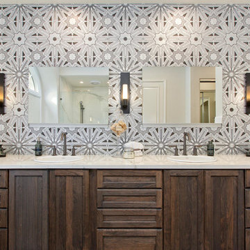
A dramatic master suite flooded with natural light make this master bathroom a visual delight. Long awaited master suite we designed, lets take closer look inside the featuring Ann Sacks Luxe tile add a sense of sumptuous oasis.
The shower is covered in Calacatta ThinSlab Porcelain marble-look slabs, unlike natural marble, ThinSlab Porcelain does not require sealing and will retain its polished or honed finish under all types of high-use conditions. The free standing tub is positioned for drama.
Signature Designs Kitchen Bath
Photos by Jon Upson
 ZeroEnergy Design
This LEED Platinum certified house reflects the homeowner's desire for an exceptionally healthy and comfortable living environment, within a traditional neighborhood.
INFILL SITE. The family, who moved from another area of Wellesley, sought out this property to be within walking distance of the high school and downtown area. An existing structure on the tight lot was removed to make way for the new home. 84% of the construction waste, from both the previous structure and the new home, was diverted from a landfill. ZED designed to preserve the existing mature trees on the perimeter of the property to minimize site impacts, and to maintain the character of the neighborhood as well as privacy on the site.
EXTERIOR EXPRESSION. The street facade of the home relates to the local New England vernacular. The rear uses contemporary language, a nod to the family’s Californian roots, to incorporate a roof deck, solar panels, outdoor living space, and the backyard swimming pool. ZED’s careful planning avoided to the need to face the garage doors towards the street, a common syndrome of a narrow lot.
THOUGHTFUL SPACE. Homes with dual entries can often result in duplicate and unused spaces. In this home, the everyday and formal entry areas are one and the same; the front and garage doors share the entry program of coat closets, mudroom storage with bench for removing your shoes, and a laundry room with generous closets for the children's sporting equipment. The entry area leads directly to the living space, encompassing the kitchen, dining and sitting area areas in an L-shaped open plan arrangement. The kitchen is placed at the south-west corner of the space to allow for a strong connection to the dining, sitting and outdoor living spaces. A fire pit on the deck satisfies the family’s desire for an open flame while a sealed gas fireplace is used indoors - ZED’s preference after omitting gas burning appliances completely from an airtight home. A small study, with a window seat, is conveniently located just off of the living space. A first floor guest bedroom includes an accessible bathroom for aging visitors and can be used as a master suite to accommodate aging in place.
HEALTHY LIVING. The client requested a home that was easy to clean and would provide a respite from seasonal allergies and common contaminants that are found in many indoor spaces. ZED selected easy to clean solid surface flooring throughout, provided ample space for cleaning supplies on each floor, and designed a mechanical system with ventilation that provides a constant supply of fresh outdoor air. ZED selected durable materials, finishes, cabinetry, and casework with low or no volatile organic compounds (VOCs) and no added urea formaldehyde.
YEAR-ROUND COMFORT. The home is super insulated and air-tight, paired with high performance triple-paned windows, to ensure it is draft-free throughout the winter (even when in front of the large windows and doors). ZED designed a right-sized heating and cooling system to pair with the thermally improved building enclosure to ensure year-round comfort. The glazing on the home maximizes passive solar gains, and facilitates cross ventilation and daylighting.
ENERGY EFFICIENT. As one of the most energy efficient houses built to date in Wellesley, the home highlights a practical solution for Massachusetts. First, the building enclosure reduces the largest energy requirement for typical houses (heating). Super-insulation, exceptional air sealing, a thermally broken wall assembly, triple pane windows, and passive solar gain combine for a sizable heating load reduction. Second, within the house only efficient systems consume energy. These include an air source heat pump for heating & cooling, a heat pump hot water heater, LED lighting, energy recovery ventilation, and high efficiency appliances. Lastly, photovoltaics provide renewable energy help offset energy consumption. The result is an 89% reduction in energy use compared to a similar brand new home built to code requirements.
RESILIENT. The home will fare well in extreme weather events. During a winter power outage, heat loss will be very slow due to the super-insulated and airtight envelope– taking multiple days to drop to 60 degrees even with no heat source. An engineered drainage system, paired with careful the detailing of the foundation, will help to keep the finished basement dry. A generator will provide full operation of the all-electric house during a power outage.
OVERALL. The home is a reflection of the family goals and an expression of their values, beautifully enabling health, comfort, safety, resilience, and utility, all while respecting the planet.
ZED - Architect & Mechanical Designer
Bevilacqua Builders Inc - Contractor
Creative Land & Water Engineering - Civil Engineering
Barbara Peterson Landscape - Landscape Design
Nest & Company - Interior Furnishings
Eric Roth Photography - Photography

 SV Design
When full-time Massachusetts residents contemplate building a second home in Telluride, Colorado the question immediately arises; does it make most sense to hire a regionally based Rocky Mountain architect or a sea level architect conveniently located for all of the rigorous collaboration required for successful bespoke home design. Determined to prove the latter true, Siemasko + Verbridge accompanied the potential client as they scoured the undulating Telluride landscape in search of the perfect house site.
The selected site’s harmonious balance of untouched meadow rising up to meet the edge of an aspen grove and the opposing 180 degree view of Wilson’s Range spoke to everyone. A plateau just beyond a fork in the meadow provided a natural flatland, requiring little excavation and yet the right amount of upland slope to capture the views. The intrinsic character of the site was only enriched by an elk trail and snake-rail fence.
Establishing the expanse of Wilson’s range would be best served by rejecting the notion of selected views, the central sweeping curve of the roof inverts a small saddle in the range with which it is perfectly aligned. The soaring wave of custom windows and the open floor plan make the relatively modest house feel sizable despite its footprint of just under 2,000 square feet. Officially a two bedroom home, the bunk room and loft allow the home to comfortably sleep ten, encouraging large gatherings of family and friends. The home is completely off the grid in response to the unique and fragile qualities of the landscape. Great care was taken to respect the regions vernacular through the use of mostly native materials and a palette derived from the terrain found at 9,820 feet above sea level.
Photographer: Gibeon Photography


 Kaplan Thompson Architects
We created an almost crystalline form that reflected the push and pull of the most important factors on the site: views directly to the NNW, an approach from the ESE, and of course, sun from direct south. To keep the size modest, we peeled away the excess spaces and scaled down any rooms that desired intimacy (the bedrooms) or did not require height (the pool room).
Photographer credit: Irvin Serrano
 Kathleen Jennison
An Arts & Crafts Bungalow is one of my favorite styles of homes. We have quite a few of them in our Stockton Mid-Town area. And when C&L called us to help them remodel their 1923 American Bungalow, I was beyond thrilled.
As per usual, when we get a new inquiry, we quickly Google the project location while we are talking to you on the phone. My excitement escalated when I saw the Google Earth Image of the sweet Sage Green bungalow in Mid-Town Stockton. "Yes, we would be interested in working with you," I said trying to keep my cool.
But what made it even better was meeting C&L and touring their home, because they are the nicest young couple, eager to make their home period perfect. Unfortunately, it had been slightly molested by some bad house-flippers, and we needed to bring the bathroom back to it "roots."
We knew we had to banish the hideous brown tile and cheap vanity quickly. But C&L complained about the condensation problems and the constant fight with mold. This immediately told me that improper remodeling had occurred and we needed to remedy that right away.
The Before: Frustrations with a Botched Remodel
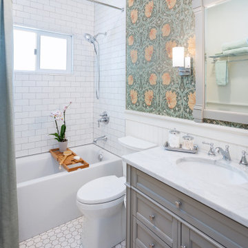
The bathroom needed to be brought back to period appropriate design with all the functionality of a modern bathroom. We thought of things like marble countertop, white mosaic floor tiles, white subway tile, board and batten molding, and of course a fabulous wallpaper.
This small (and only) bathroom on a tight budget required a little bit of design sleuthing to figure out how we could get the proper look and feel. Our goal was to determine where to splurge and where to economize and how to complete the remodel as quickly as possible because C&L would have to move out while construction was going on.
The Process: Hard Work to Remedy Design and Function
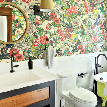
During our initial design study, (which included 2 hours in the owners’ home), we noticed framed images of William Morris Arts and Crafts textile patterns and knew this would be our design inspiration. We presented C&L with three options and they quickly selected the Pimpernel Design Concept.
We had originally selected the Black and Olive colors with a black vanity, mirror, and black and white floor tile. C&L liked it but weren’t quite sure about the black, We went back to the drawing board and decided the William & Co Pimpernel Wallpaper in Bayleaf and Manilla color with a softer gray painted vanity and mirror and white floor tile was more to their liking.
After the Design Concept was approved, we went to work securing the building permit, procuring all the elements, and scheduling our trusted tradesmen to perform the work.
We did uncover some shoddy work by the flippers such as live electrical wires hidden behind the wall, plumbing venting cut-off and buried in the walls (hence the constant dampness), the tub barely balancing on two fence boards across the floor joist, and no insulation on the exterior wall.
All of the previous blunders were fixed and the bathroom put back to its previous glory. We could feel the house thanking us for making it pretty again.
The After Reveal: Cohesive Design Decisions
We selected a simple white subway tile for the tub/shower. This is always classic and in keeping with the style of the house.
We selected a pre-fab vanity and mirror, but they look rich with the quartz countertop. There is much more storage in this small vanity than you would think.
The Transformation: A Period Perfect Refresh
We began the remodel just as the pandemic reared and stay-in-place orders went into effect. As C&L were already moved out and living with relatives, we got the go-ahead from city officials to get the work done (after all, how can you shelter in place without a bathroom?).
All our tradesmen were scheduled to work so that only one crew was on the job site at a time. We stayed on the original schedule with only a one week delay.
The end result is the sweetest little bathroom I've ever seen (and I can't wait to start work on C&L's kitchen next).
Thank you for joining me in this project transformation. I hope this inspired you to think about being creative with your design projects, determining what works best in keeping with the architecture of your space, and carefully assessing how you can have the best life in your home.

 ODS Architecture
A 6,000 square foot 2-story new home complex in Milpitas was designed to facilitate the owners’ large business parties and gatherings, to have rooms for the kids to come back to upstairs, and a ground floor master suite with a huge walk-in closet. Several separate structures make up the dwelling: The main house, 3-car garage with carport for overflow parking, and a separate entertainment and recreation building separated by a courtyard from the main house.
The business activities include gatherings in the hundreds of people, so parking was maximized and guests can flow in through a separate gate to party in the courtyard and recreation building. Inside this structure is a wet bar, billiard room, workout gym and home theater. The main house ground floor has formal and informal living rooms, open kitchen and master suite with views and expansive windows in every direction. The house is sited on the crestline of a hill with views of the San Francisco Bay and private golf course below. The indoor-outdoor aspect of the house is further accentuated with outside living and dining areas.
High ceilings and expansive glass walls dissolve the sense of enclosure taking advantage of the site’s openness and privacy. The owner’s suite is downstairs in anticipation of aging-in-place, and upstairs there are three bedrooms and four bathrooms plus a sitting area lounge and casual TV loft area.
The house sits on one acre at the top of a low hill range overlooking Milpitas. The city was very cognizant of the importance of keeping a low profile at this crestline and required extensive story poles and photo evidence of the proper height and siting so as not to be seen from certain selected vantage points.
GENERAL CONTRACTOR: JCD Builders Inc.
LANDSCAPE DESIGN: Morf Chang Landscape Architecture / ODS Architecture
PHOTOGRAPHS: Paul Dyer Photography
 Nanette Wong
Photo: Nanette Wong © 2015 Houzz
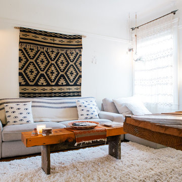
Inspiration for an eclectic living room remodel in San Francisco with white walls
Inspiration for an eclectic living room remodel in San Francisco with white walls
 Vetter Architects
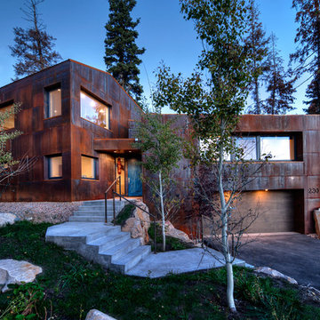
The owners requested that their home harmonize with the spirit of the surrounding Colorado mountain setting and enhance their outdoor recreational lifestyle - while reflecting their contemporary architectural tastes. The site was burdened with a myriad of strict design criteria enforced by the neighborhood covenants and architectural review board. Creating a distinct design challenge, the covenants included a narrow interpretation of a “mountain style” home which established predetermined roof pitches, glazing percentages and material palettes - at direct odds with the client‘s vision of a flat-roofed, glass, “contemporary” home.
Our solution finds inspiration and opportunities within the site covenant’s strict definitions. It promotes and celebrates the client’s outdoor lifestyle and resolves the definition of a contemporary “mountain style” home by reducing the architecture to its most basic vernacular forms and relying upon local materials.
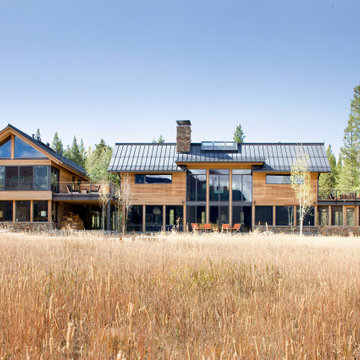
The home utilizes a simple base, middle and top that echoes the surrounding mountains and vegetation. The massing takes its cues from the prevalent lodgepole pine trees that grow at the mountain’s high altitudes. These pine trees have a distinct growth pattern, highlighted by a single vertical trunk and a peaked, densely foliated growth zone above a sparse base. This growth pattern is referenced by placing the wood-clad body of the home at the second story above an open base composed of wood posts and glass. A simple peaked roof rests lightly atop the home - visually floating above a triangular glass transom. The home itself is neatly inserted amongst an existing grove of lodgepole pines and oriented to take advantage of panoramic views of the adjacent meadow and Continental Divide beyond.
The main functions of the house are arranged into public and private areas and this division is made apparent on the home’s exterior. Two large roof forms, clad in pre-patinated zinc, are separated by a sheltering central deck - which signals the main entry to the home. At this connection, the roof deck is opened to allow a cluster of aspen trees to grow – further reinforcing nature as an integral part of arrival.
Outdoor living spaces are provided on all levels of the house and are positioned to take advantage of sunrise and sunset moments. The distinction between interior and exterior space is blurred via the use of large expanses of glass. The dry stacked stone base and natural cedar cladding both reappear within the home’s interior spaces.
This home offers a unique solution to the client’s requests while satisfying the design requirements of the neighborhood covenants. The house provides a variety of indoor and outdoor living spaces that can be utilized in all seasons. Most importantly, the house takes its cues directly from its natural surroundings and local building traditions to become a prototype solution for the “modern mountain house”.
Overview
Ranch Creek Ranch
Winter Park, Colorado
Completion Date
October, 2007
Services
Architecture, Interior Design, Landscape Architecture
 CHRISTOPHER STROM ARCHITECTS
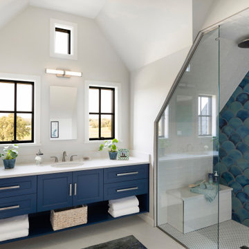
Eye-Land: Named for the expansive white oak savanna views, this beautiful 5,200-square foot family home offers seamless indoor/outdoor living with five bedrooms and three baths, and space for two more bedrooms and a bathroom.
The site posed unique design challenges. The home was ultimately nestled into the hillside, instead of placed on top of the hill, so that it didn’t dominate the dramatic landscape. The openness of the savanna exposes all sides of the house to the public, which required creative use of form and materials. The home’s one-and-a-half story form pays tribute to the site’s farming history. The simplicity of the gable roof puts a modern edge on a traditional form, and the exterior color palette is limited to black tones to strike a stunning contrast to the golden savanna.
The main public spaces have oversized south-facing windows and easy access to an outdoor terrace with views overlooking a protected wetland. The connection to the land is further strengthened by strategically placed windows that allow for views from the kitchen to the driveway and auto court to see visitors approach and children play. There is a formal living room adjacent to the front entry for entertaining and a separate family room that opens to the kitchen for immediate family to gather before and after mealtime.
 Visbeen Architects
The Laurel was a project that required a rigorous lesson in southern architectural vernacular. The site being located in the hot climate of the Carolina shoreline, the client was eager to capture cross breezes and utilize outdoor entertainment spaces. The home was designed with three covered porches, one partially covered courtyard, and one screened porch, all accessed by way of French doors and extra tall double-hung windows. The open main level floor plan centers on common livings spaces, while still leaving room for a luxurious master suite. The upstairs loft includes two individual bed and bath suites, providing ample room for guests. Native materials were used in construction, including a metal roof and local timber.

 Zola European Windows
Located in, Summit Park, Park City UT lies one of the most efficient houses in the country. The Summit Haus – designed and built by Chris Price of PCD+B, is an exploration in design and construction of advanced high performance housing. Seeing a rising demand for sustainable housing along with rising Carbon emissions leading to global warming, this house strives to show that sensible, good design can create spaces adequate for today’s housing demands while adhering to strict standards. The house was designed to meet the very rigid Passiv House rating system – 90% more efficient than a typical home in the area.
The house itself was intended to nestle neatly into the 45 degree sloped site and to take full advantage of the limited solar access and views. The views range from short, highly wooded views to a long corridor out towards the Uinta Mountain range towards the east. The house was designed and built based off Passiv Haus standards, and the framing and ventilation became critical elements to maintain such minimal energy requirements.
Zola triple-pane, tilt-and-turn Thermo uPVC windows contribute substantially to the home’s energy efficiency, and takes advantage of the beautiful surrounding of the location, including forrest views from the deck off of the kitchen.
Photographer: Douglas Burke
 Design By Beth Mosall
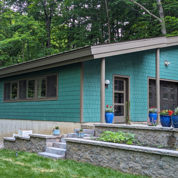
A challenging slope required careful siting.
Example of a small trendy detached studio / workshop shed design
Example of a small trendy detached studio / workshop shed design
 Prentiss Balance Wickline Architects
Photographer: Jay Goodrich
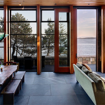
This 2800 sf single-family home was completed in 2009. The clients desired an intimate, yet dynamic family residence that reflected the beauty of the site and the lifestyle of the San Juan Islands. The house was built to be both a place to gather for large dinners with friends and family as well as a cozy home for the couple when they are there alone.
The project is located on a stunning, but cripplingly-restricted site overlooking Griffin Bay on San Juan Island. The most practical area to build was exactly where three beautiful old growth trees had already chosen to live. A prior architect, in a prior design, had proposed chopping them down and building right in the middle of the site. From our perspective, the trees were an important essence of the site and respectfully had to be preserved. As a result we squeezed the programmatic requirements, kept the clients on a square foot restriction and pressed tight against property setbacks.
The delineate concept is a stone wall that sweeps from the parking to the entry, through the house and out the other side, terminating in a hook that nestles the master shower. This is the symbolic and functional shield between the public road and the private living spaces of the home owners. All the primary living spaces and the master suite are on the water side, the remaining rooms are tucked into the hill on the road side of the wall.
Off-setting the solid massing of the stone walls is a pavilion which grabs the views and the light to the south, east and west. Built in a position to be hammered by the winter storms the pavilion, while light and airy in appearance and feeling, is constructed of glass, steel, stout wood timbers and doors with a stone roof and a slate floor. The glass pavilion is anchored by two concrete panel chimneys; the windows are steel framed and the exterior skin is of powder coated steel sheathing.
 JS Interiors LLC
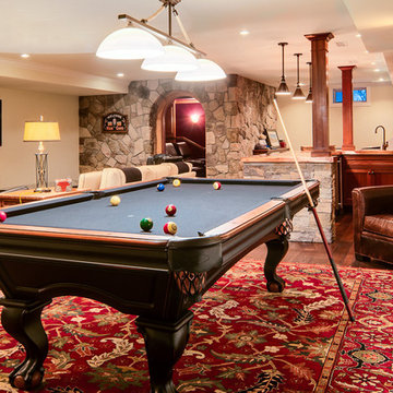
Basement - traditional underground dark wood floor and brown floor basement idea in Portland Maine with beige walls and no fireplace
5