
Search results for "Size tire" in Home Design Ideas
 Rolf Schroeder General Contractors, Inc.
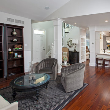
The layout of this early 90’s home was adequate for the husband when he was just living there. However, now the family of three and their loving cat live there together; the space quickly became confined and inadequate. The Clients contacted us to discuss what their options may be to help the home feel more spacious. After a few weeks of design and engineering, we went to work on opening up the first floor to increase the size of the rooms while creating continuity with the adjoining rooms. A once tired and confined layout became a spacious, comfortable, & aesthetically pleasing space to live and entertain.
 Rolf Schroeder General Contractors, Inc.
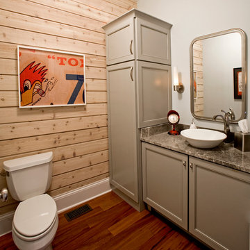
The layout of this early 90’s home was adequate for the husband when he was just living there. However, now the family of three and their loving cat live there together; the space quickly became confined and inadequate. The Clients contacted us to discuss what their options may be to help the home feel more spacious. After a few weeks of design and engineering, we went to work on opening up the first floor to increase the size of the rooms while creating continuity with the adjoining rooms. A once tired and confined layout became a spacious, comfortable, & aesthetically pleasing space to live and entertain.
 Granit Architects + Interiors
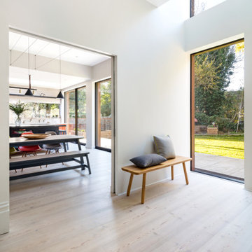
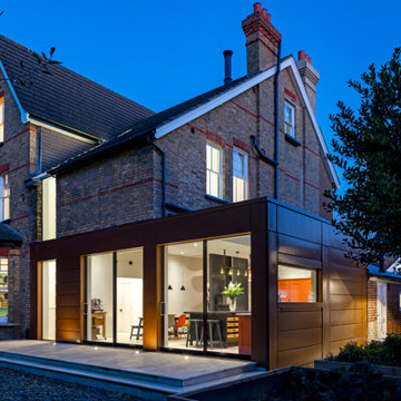
We are delighted to have completed the radical transformation of a tired detached property in South Croydon.
When they appointed Granit, our clients were living in the property which had previously been divided into a number of flats.
The historic sub-division had resulted in an extremely poor use of space with redundant staircases, kitchens and bathrooms throughout.
Our clients sought to reconfigure the property back into a single dwelling for his growing family.
Our client had an eye for design and was keen to balance contemporary design whilst maintaining as much of the character of the original house.
Maximising natural light, space and establishing a visual and physical connection were also key drivers for the design. Owing to the size of the property, it became apparent that reconfiguration rather than extension provided the solution to meet the brief.
A metal clad ‘intervention’ was introduced to the rear facade. This created a strong horizontal element creating a visual balance with the vertical nature of the three storey gable.
The metal cladding specified echoed the colour of the red brick string courses tying old with new. Slender frame sliding doors provide access and views of the large garden.
The central circulation space was transformed by the introduction of a double height glazed slot wrapping up the rear facade and onto the roof. This allows daylight to permeate into the heart of the otherwise dark deep floor plan. The staircase was reconfigured into a series of landings looking down over the main void space below and out towards the tree canopies at the rear of the garden.
The introduction of double pocket doors throughout the ground floor creates a series of interconnected spaces and the whitewashed Larch flooring flows seamlessly from room to room. A bold palette of colours and materials lends character and texture throughout the property.
The end result is a spacious yet cosy environment for the family to inhabit for years to come.
Find the right local pro for your project
 Sandy Schargel Interiors
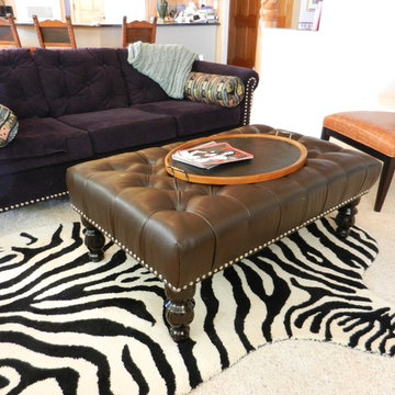
The sofa was "reimagined" aka-reupholstered. New fabric in aubegene (eggplant/purple), new legs and nail heads helped make an old, tired - but loved - sofa into a totally new piece. Patterned bolsters were added. Since a special sized ottoman/coffee table was needed, the ottoman was custom made. Faux leather was used; nail heads enhanced the ottoman. A faux zebra rug was placed under the ottoman.
 Granit Architects + Interiors
We are delighted to have completed the radical transformation of a tired detached property in South Croydon.
When they appointed Granit, our clients were living in the property which had previously been divided into a number of flats.
The historic sub-division had resulted in an extremely poor use of space with redundant staircases, kitchens and bathrooms throughout.
Our clients sought to reconfigure the property back into a single dwelling for his growing family.
Our client had an eye for design and was keen to balance contemporary design whilst maintaining as much of the character of the original house.
Maximising natural light, space and establishing a visual and physical connection were also key drivers for the design. Owing to the size of the property, it became apparent that reconfiguration rather than extension provided the solution to meet the brief.
A metal clad ‘intervention’ was introduced to the rear facade. This created a strong horizontal element creating a visual balance with the vertical nature of the three storey gable.
The metal cladding specified echoed the colour of the red brick string courses tying old with new. Slender frame sliding doors provide access and views of the large garden.
The central circulation space was transformed by the introduction of a double height glazed slot wrapping up the rear facade and onto the roof. This allows daylight to permeate into the heart of the otherwise dark deep floor plan. The staircase was reconfigured into a series of landings looking down over the main void space below and out towards the tree canopies at the rear of the garden.
The introduction of double pocket doors throughout the ground floor creates a series of interconnected spaces and the whitewashed Larch flooring flows seamlessly from room to room. A bold palette of colours and materials lends character and texture throughout the property.
The end result is a spacious yet cosy environment for the family to inhabit for years to come.
 SLR Architecture Inc.
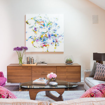
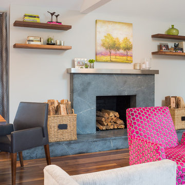
This tired ranch was in dire need of an update. Formerly the kitchen was separate from the living room and the dining area was severely undersized.
SLR Architecture opened up the kitchen to the great room and defined the living and dining areas so that each space stands on it's own. With help from interior designer Justine Sterling the finishes, furniture, ad accessories were carefully considered so that the whole room works as an overall composition.
A compact mud room was carved out of the back hall from a formally over sized laundry room so the family had a convenient drop zone, also the front entry was upgraded and a new rear deck was added for easier exterior access. Lighting was carefully considered so that different zones were well lit.
photo: Jessica Delaney
 SLR Architecture Inc.
This tired ranch was in dire need of an update. Formerly the kitchen was separate from the living room and the dining area was severely undersized.
SLR Architecture opened up the kitchen to the great room and defined the living and dining areas so that each space stands on it's own. With help from interior designer Justine Sterling the finishes, furniture, ad accessories were carefully considered so that the whole room works as an overall composition.
A compact mud room was carved out of the back hall from a formally over sized laundry room so the family had a convenient drop zone, also the front entry was upgraded and a new rear deck was added for easier exterior access. Lighting was carefully considered so that different zones were well lit.
photo: Jessica Delaney

Sponsored
Sunbury, OH

J.Holderby - Renovations
Franklin County's Leading General Contractors - 2X Best of Houzz!
 Granit Architects + Interiors
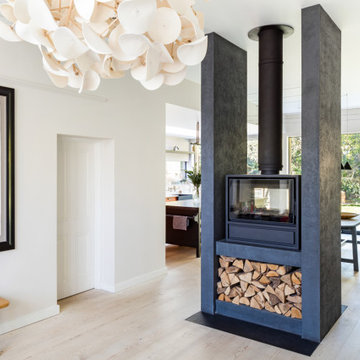
We are delighted to have completed the radical transformation of a tired detached property in South Croydon.
When they appointed Granit, our clients were living in the property which had previously been divided into a number of flats.
The historic sub-division had resulted in an extremely poor use of space with redundant staircases, kitchens and bathrooms throughout.
Our clients sought to reconfigure the property back into a single dwelling for his growing family.
Our client had an eye for design and was keen to balance contemporary design whilst maintaining as much of the character of the original house.
Maximising natural light, space and establishing a visual and physical connection were also key drivers for the design. Owing to the size of the property, it became apparent that reconfiguration rather than extension provided the solution to meet the brief.
A metal clad ‘intervention’ was introduced to the rear facade. This created a strong horizontal element creating a visual balance with the vertical nature of the three storey gable.
The metal cladding specified echoed the colour of the red brick string courses tying old with new. Slender frame sliding doors provide access and views of the large garden.
The central circulation space was transformed by the introduction of a double height glazed slot wrapping up the rear facade and onto the roof. This allows daylight to permeate into the heart of the otherwise dark deep floor plan. The staircase was reconfigured into a series of landings looking down over the main void space below and out towards the tree canopies at the rear of the garden.
The introduction of double pocket doors throughout the ground floor creates a series of interconnected spaces and the whitewashed Larch flooring flows seamlessly from room to room. A bold palette of colours and materials lends character and texture throughout the property.
The end result is a spacious yet cosy environment for the family to inhabit for years to come.
 Granit Architects + Interiors
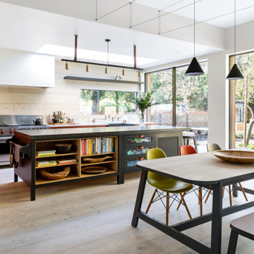
We are delighted to have completed the radical transformation of a tired detached property in South Croydon.
When they appointed Granit, our clients were living in the property which had previously been divided into a number of flats.
The historic sub-division had resulted in an extremely poor use of space with redundant staircases, kitchens and bathrooms throughout.
Our clients sought to reconfigure the property back into a single dwelling for his growing family.
Our client had an eye for design and was keen to balance contemporary design whilst maintaining as much of the character of the original house.
Maximising natural light, space and establishing a visual and physical connection were also key drivers for the design. Owing to the size of the property, it became apparent that reconfiguration rather than extension provided the solution to meet the brief.
A metal clad ‘intervention’ was introduced to the rear facade. This created a strong horizontal element creating a visual balance with the vertical nature of the three storey gable.
The metal cladding specified echoed the colour of the red brick string courses tying old with new. Slender frame sliding doors provide access and views of the large garden.
The central circulation space was transformed by the introduction of a double height glazed slot wrapping up the rear facade and onto the roof. This allows daylight to permeate into the heart of the otherwise dark deep floor plan. The staircase was reconfigured into a series of landings looking down over the main void space below and out towards the tree canopies at the rear of the garden.
The introduction of double pocket doors throughout the ground floor creates a series of interconnected spaces and the whitewashed Larch flooring flows seamlessly from room to room. A bold palette of colours and materials lends character and texture throughout the property.
The end result is a spacious yet cosy environment for the family to inhabit for years to come.
 Amy Pearson Design
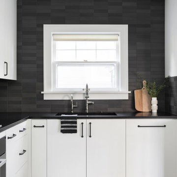
This classic Portland bungalow in the highly desirable Irvington neighborhood was in desperate need of a kitchen update. Aside from tired finishes and cabinets that have seen a full life, the original layout left the family living in a small portion of the kitchen and not taking advantage of the full square footage.
The family desired a design that married both the original architectural details of their bungalow with their preference for clean and modern European design. To accomplish this request, APD brought in sleek flat panel custom frameless cabinets filled with smart and strategic accessories to make the most out of every cabinet box, including full height pantry pull-out, spice and utensil pull-outs flanking the cooking zone, a blind corner pull-0ut to avoid loosing items in the hard-to-reach space, trash & recycling pull-0ut disguised to blend with the adjacent three drawers, and a wall cabinet pull-out sized to fit under the support beam spanning the width of the room. For the traditional - we kept the classic moldings around the windows and doors, continued the homes hardwood floors into the new space, incorporated classic school house light fixtures, and swapped out the slider to the back patio in favor for one with divided lights adding to the architectural detail. Matte black granite countertops with handmade black ceramic tile backsplash bridge the gap between the modern and the traditional thanks to their clean lines, high contrast color palette, and textural and artistic details.
Opting for a few adjustments to the layout created a space plan that took advantage of the full square footage of the room! In the original layout, the refrigerator was squeezed onto the same wall as the cooking, leaving very little counterspace around the hard working cooking zone along with a significant portion of the room (a previous addition) under-utilized. Relocating the refrigerator increased counterspace and storage while creating a “flow” through the entire room.
Luxury Miele and Subzero appliances make this kitchen a chef’s dream! To add to the clean modern look, we opted for an induction cooktop with wall oven directly below … a great alternative to the often used range! Paneling the built-in refrigerator and dishwasher help to calm the overall visual noise of the space, hiding the two hardworking appliances away!
This new family kitchen is at once hardworking, sleek, and timeless!
 Granit Architects + Interiors
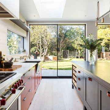
We are delighted to have completed the radical transformation of a tired detached property in South Croydon.
When they appointed Granit, our clients were living in the property which had previously been divided into a number of flats.
The historic sub-division had resulted in an extremely poor use of space with redundant staircases, kitchens and bathrooms throughout.
Our clients sought to reconfigure the property back into a single dwelling for his growing family.
Our client had an eye for design and was keen to balance contemporary design whilst maintaining as much of the character of the original house.
Maximising natural light, space and establishing a visual and physical connection were also key drivers for the design. Owing to the size of the property, it became apparent that reconfiguration rather than extension provided the solution to meet the brief.
A metal clad ‘intervention’ was introduced to the rear facade. This created a strong horizontal element creating a visual balance with the vertical nature of the three storey gable.
The metal cladding specified echoed the colour of the red brick string courses tying old with new. Slender frame sliding doors provide access and views of the large garden.
The central circulation space was transformed by the introduction of a double height glazed slot wrapping up the rear facade and onto the roof. This allows daylight to permeate into the heart of the otherwise dark deep floor plan. The staircase was reconfigured into a series of landings looking down over the main void space below and out towards the tree canopies at the rear of the garden.
The introduction of double pocket doors throughout the ground floor creates a series of interconnected spaces and the whitewashed Larch flooring flows seamlessly from room to room. A bold palette of colours and materials lends character and texture throughout the property.
The end result is a spacious yet cosy environment for the family to inhabit for years to come.
 Amy Pearson Design
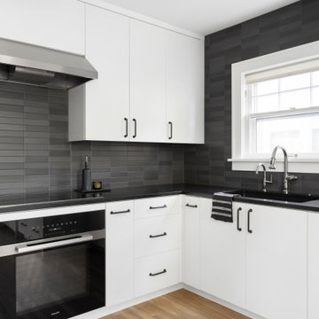
This classic Portland bungalow in the highly desirable Irvington neighborhood was in desperate need of a kitchen update. Aside from tired finishes and cabinets that have seen a full life, the original layout left the family living in a small portion of the kitchen and not taking advantage of the full square footage.
The family desired a design that married both the original architectural details of their bungalow with their preference for clean and modern European design. To accomplish this request, APD brought in sleek flat panel custom frameless cabinets filled with smart and strategic accessories to make the most out of every cabinet box, including full height pantry pull-out, spice and utensil pull-outs flanking the cooking zone, a blind corner pull-0ut to avoid loosing items in the hard-to-reach space, trash & recycling pull-0ut disguised to blend with the adjacent three drawers, and a wall cabinet pull-out sized to fit under the support beam spanning the width of the room. For the traditional - we kept the classic moldings around the windows and doors, continued the homes hardwood floors into the new space, incorporated classic school house light fixtures, and swapped out the slider to the back patio in favor for one with divided lights adding to the architectural detail. Matte black granite countertops with handmade black ceramic tile backsplash bridge the gap between the modern and the traditional thanks to their clean lines, high contrast color palette, and textural and artistic details.
Opting for a few adjustments to the layout created a space plan that took advantage of the full square footage of the room! In the original layout, the refrigerator was squeezed onto the same wall as the cooking, leaving very little counterspace around the hard working cooking zone along with a significant portion of the room (a previous addition) under-utilized. Relocating the refrigerator increased counterspace and storage while creating a “flow” through the entire room.
Luxury Miele and Subzero appliances make this kitchen a chef’s dream! To add to the clean modern look, we opted for an induction cooktop with wall oven directly below … a great alternative to the often used range! Paneling the built-in refrigerator and dishwasher help to calm the overall visual noise of the space, hiding the two hardworking appliances away!
This new family kitchen is at once hardworking, sleek, and timeless!
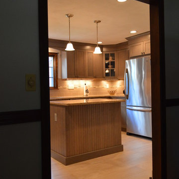
 Attleboro Kitchen and Bath
A once tired, dark and dated space, this kitchen received new life with custom cabinetry in a modern grey stain. By keeping the style simple, the homeowners honored the home's traditional New England Colonial conservative style. A new 8x48 plank-size tile with a grey pickling on the floor tied the space into one cohesive look.
Sponsored
Sunbury, OH
J.Holderby - Renovations
Franklin County's Leading General Contractors - 2X Best of Houzz!
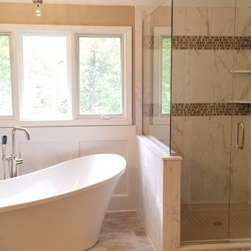
 Drab to Fab Decorating
This bathroom went thru a huge transformation. We were limited in what we could do because of the over sized window over the tub but the final product was stunning. We took out the old recessed tub for a free standing tub, added decorative wainscoting to add visual interest. We tired the vanity and went with a beautiful grey,beige and brown tone color scheme in the tiles and walls.
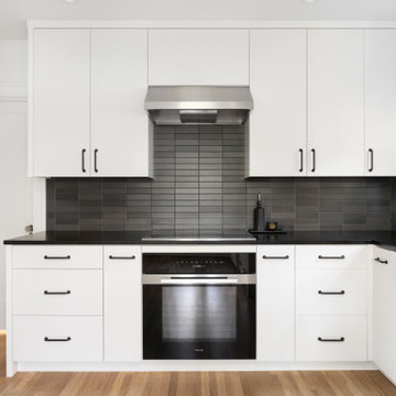 Amy Pearson Design
This classic Portland bungalow in the highly desirable Irvington neighborhood was in desperate need of a kitchen update. Aside from tired finishes and cabinets that have seen a full life, the original layout left the family living in a small portion of the kitchen and not taking advantage of the full square footage.
The family desired a design that married both the original architectural details of their bungalow with their preference for clean and modern European design. To accomplish this request, APD brought in sleek flat panel custom frameless cabinets filled with smart and strategic accessories to make the most out of every cabinet box, including full height pantry pull-out, spice and utensil pull-outs flanking the cooking zone, a blind corner pull-0ut to avoid loosing items in the hard-to-reach space, trash & recycling pull-0ut disguised to blend with the adjacent three drawers, and a wall cabinet pull-out sized to fit under the support beam spanning the width of the room. For the traditional - we kept the classic moldings around the windows and doors, continued the homes hardwood floors into the new space, incorporated classic school house light fixtures, and swapped out the slider to the back patio in favor for one with divided lights adding to the architectural detail. Matte black granite countertops with handmade black ceramic tile backsplash bridge the gap between the modern and the traditional thanks to their clean lines, high contrast color palette, and textural and artistic details.
Opting for a few adjustments to the layout created a space plan that took advantage of the full square footage of the room! In the original layout, the refrigerator was squeezed onto the same wall as the cooking, leaving very little counterspace around the hard working cooking zone along with a significant portion of the room (a previous addition) under-utilized. Relocating the refrigerator increased counterspace and storage while creating a “flow” through the entire room.
Luxury Miele and Subzero appliances make this kitchen a chef’s dream! To add to the clean modern look, we opted for an induction cooktop with wall oven directly below … a great alternative to the often used range! Paneling the built-in refrigerator and dishwasher help to calm the overall visual noise of the space, hiding the two hardworking appliances away!
This new family kitchen is at once hardworking, sleek, and timeless!
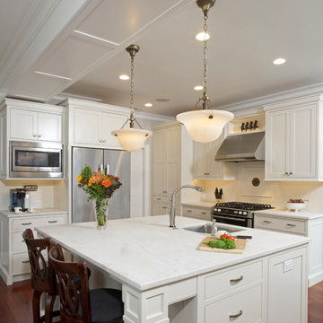 Rolf Schroeder General Contractors, Inc.
The layout of this early 90’s home was adequate for the husband when he was just living there. However, now the family of three and their loving cat live there together; the space quickly became confined and inadequate. The Clients contacted us to discuss what their options may be to help the home feel more spacious. After a few weeks of design and engineering, we went to work on opening up the first floor to increase the size of the rooms while creating continuity with the adjoining rooms. A once tired and confined layout became a spacious, comfortable, & aesthetically pleasing space to live and entertain.
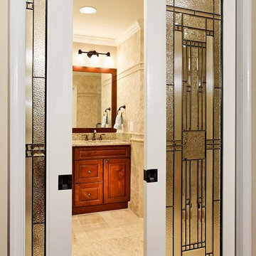
 Michael Nash Design, Build & Homes
2011 NARI CAPITAL COTY HONORABLE MENTION AWARD WINNER
The existing master bathroom in this home was vintage Seventies. The small, 5’x8’ room contained a tub, a toilet and a small vanity. Just outside was a wasted dressing area and doors to a closet.
Tired of the look, the homeowner wanted a contemporary space with all the amenities that a new bathroom has to offer. To meet their needs, the remodeling team at Michael Nash Design, Build & Homes redid the space, installed double vanities, increased the size of the shower and upgraded the materials.
The new design combined the dressing area, some of closet area and the bathroom to create a much bigger bathroom. The tub was removed, the toilet relocated and a large corner shower with built-in bench and shelving was installed. A 60” leaded glass door (pocket door) was installed as the bathroom entrance to provide more light.
Heated flooring was installed under new tumbled marble flooring for extra comfort. Use of tumbled marble in the shower floor, walls and bathroom surround was tastefully designed and outlined with rope and chair rails. The heavy glass custom shower enclosure allows a clear viewing of decoratively laid marbles.
The end result lets the clients spend more time in their bathroom which is beautiful and cleverly designed to fit their lifestyles.
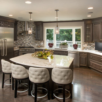

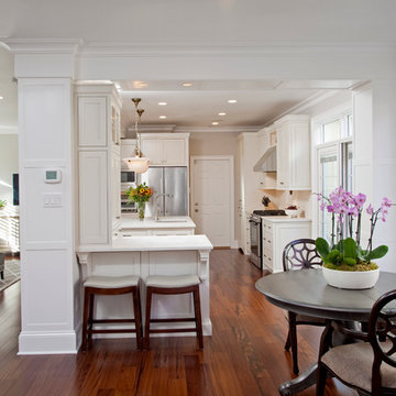 Rolf Schroeder General Contractors, Inc.
The layout of this early 90’s home was adequate for the husband when he was just living there. However, now the family of three and their loving cat live there together; the space quickly became confined and inadequate. The Clients contacted us to discuss what their options may be to help the home feel more spacious. After a few weeks of design and engineering, we went to work on opening up the first floor to increase the size of the rooms while creating continuity with the adjoining rooms. A once tired and confined layout became a spacious, comfortable, & aesthetically pleasing space to live and entertain.
 Cabinets by Trivonna
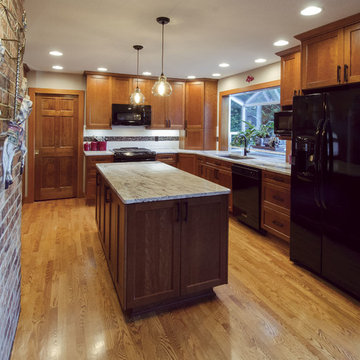
Photo by Ross Irwin --- The clients performed a massive face-lift on their home over the years, the last room that needed some TLC was the kitchen. The cabinets were looking tired and lacked accessibility. We didn't revolution the layout, but we did streamlined it. We reduced the size of the island, eliminating the overhang. Also, we turned a clutter-magnet desk area, into an upscale looking hutch. Also, we elongated the wall cabinets to make them touch the ceiling and avoid dust-collection.
 Rolf Schroeder General Contractors, Inc.
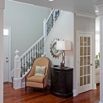
The layout of this early 90’s home was adequate for the husband when he was just living there. However, now the family of three and their loving cat live there together; the space quickly became confined and inadequate. The Clients contacted us to discuss what their options may be to help the home feel more spacious. After a few weeks of design and engineering, we went to work on opening up the first floor to increase the size of the rooms while creating continuity with the adjoining rooms. A once tired and confined layout became a spacious, comfortable, & aesthetically pleasing space to live and entertain.
14