
Search results for "Slow result" in Home Design Ideas
 Tile Doctor Ltd
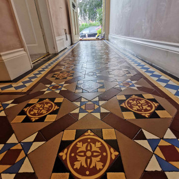
A young couple recently bought a house in Barnsley and were renovating it from top to bottom, included in the plan was the desire to have the previously unloved Victorian floor made beautiful again. The house stands in an area of Barnsley famous for its’ big Victorian villas and quite rightly they felt it was important to ensure period features like this original floor were correctly maintained.
Due to the floor being covered up for many years the floor had developed damp staining, it also had a lot of paint splattered on it. There were also some loose tiles that needed fixing back in place and the layer of old floor polish was present which would need removing.
I started by protecting all the skirting boards, doors and carpets bordering the tiles from splashing. The loose tiles were then cleaned up and then secured back in place using a fast-setting adhesive.
Once the adhesive was set, I turned my attention to stripping and cleaning the floor starting with the application of a coarse 200-grit diamond pad fitted to a weighted rotary buffing machine. The pad was lubricated using a dilution of Tile Doctor Remove & Go which was applied to small sections of the floor and left to soak in for ten minutes first. I run the buffing machine at a slow speed to minimise splashing. Remove & Go is amazing at removing old floor coatings (i.e. sealers), dirt and grime from the floor. When the diamond pad had been used on each section of the floor for five minutes the slurry was vacuumed up using a wet vac machine and I moved onto the next section. Once the whole floor had been cleaned in this way it was time to start the next step.
Old floors like this which don’t have the benefit of a damp proof membrane, and have been covered up for a long time, can suffer from efflorescence issues due to moisture being trapped in the tile. This will result in white salt staining appearing on the tiles for days, weeks and sometimes months afterwards. To counter this the alkaline salts are neutralised by giving the floor an acid rinse using Tile Doctor Acid Gel and leaving it to dwell for five minutes before going over the floor again with the coarse diamond pad. The slurry was again removed with a wet vacuum and the floor was scrubbed clean with damp cloths.
I returned a few days later once the floor had dried to seal the floor. The client wanted a satin finish so knowing the floor had damp and efflorescence issues I opted for Tile Doctor Seal and Go Extra. This is a topical sealer which leaves a lovely satin finish but also allows for the floor to breathe. six coats were required to make the floor look perfect, allowing the lovely colours to come through.
Once complete the floor looked much brighter and the colours really shone through. The owners were really happy with the renovation we carried out and before leaving I took time to discuss how best to maintain the tiles going forward including the use of Neutral Tile cleaner.
Matthew Lovett
South Yorkshire Tile Doctor
 Whitespace
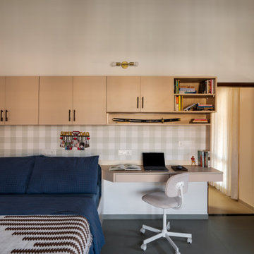
This 3-bedroom residence in Bangalore was designed for a family of three who wanted a home rooted in Indian warmth, craft and character, while still feeling refined, functional and contemporary.
The design language draws deeply from traditional Indian aesthetics, expressed through earthy materials, handcrafted details and a rich but calming palette. Raw brick, natural wood, stone, cane, rattan, textured fabrics and earthy hues come together to create a home that feels grounded, tactile and lived-in. Traditional furniture forms are thoughtfully balanced with contemporary lines, giving the space a timeless yet fresh identity.
A strong emphasis was placed on craft. Every element in the home was 100% customised and handcrafted on site by skilled carpenters, allowing each room to carry a distinct sense of personality. Antique wooden pillars and curated props sourced from Kerala add depth, nostalgia and authenticity, while handmade lighting elements bring warmth and artisanal charm.
Biophilic-inspired wallpapers, natural textures and carefully layered materials connect the interiors to nature. Athangudi tiles have been used in key areas to introduce colour, pattern and a sense of regional heritage, creating memorable design moments without overwhelming the overall calmness of the home.
The result is a deeply personal residence that celebrates Indian craftsmanship, natural materials and slow design — a home that is traditional in spirit, contemporary in comfort, and entirely bespoke in execution.
 Whitespace
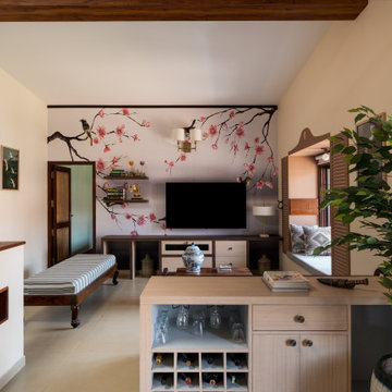
This 3-bedroom residence in Bangalore was designed for a family of three who wanted a home rooted in Indian warmth, craft and character, while still feeling refined, functional and contemporary.
The design language draws deeply from traditional Indian aesthetics, expressed through earthy materials, handcrafted details and a rich but calming palette. Raw brick, natural wood, stone, cane, rattan, textured fabrics and earthy hues come together to create a home that feels grounded, tactile and lived-in. Traditional furniture forms are thoughtfully balanced with contemporary lines, giving the space a timeless yet fresh identity.
A strong emphasis was placed on craft. Every element in the home was 100% customised and handcrafted on site by skilled carpenters, allowing each room to carry a distinct sense of personality. Antique wooden pillars and curated props sourced from Kerala add depth, nostalgia and authenticity, while handmade lighting elements bring warmth and artisanal charm.
Biophilic-inspired wallpapers, natural textures and carefully layered materials connect the interiors to nature. Athangudi tiles have been used in key areas to introduce colour, pattern and a sense of regional heritage, creating memorable design moments without overwhelming the overall calmness of the home.
The result is a deeply personal residence that celebrates Indian craftsmanship, natural materials and slow design — a home that is traditional in spirit, contemporary in comfort, and entirely bespoke in execution.
Find the right local pro for your project
 Whitespace
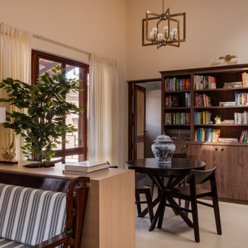
This 3-bedroom residence in Bangalore was designed for a family of three who wanted a home rooted in Indian warmth, craft and character, while still feeling refined, functional and contemporary.
The design language draws deeply from traditional Indian aesthetics, expressed through earthy materials, handcrafted details and a rich but calming palette. Raw brick, natural wood, stone, cane, rattan, textured fabrics and earthy hues come together to create a home that feels grounded, tactile and lived-in. Traditional furniture forms are thoughtfully balanced with contemporary lines, giving the space a timeless yet fresh identity.
A strong emphasis was placed on craft. Every element in the home was 100% customised and handcrafted on site by skilled carpenters, allowing each room to carry a distinct sense of personality. Antique wooden pillars and curated props sourced from Kerala add depth, nostalgia and authenticity, while handmade lighting elements bring warmth and artisanal charm.
Biophilic-inspired wallpapers, natural textures and carefully layered materials connect the interiors to nature. Athangudi tiles have been used in key areas to introduce colour, pattern and a sense of regional heritage, creating memorable design moments without overwhelming the overall calmness of the home.
The result is a deeply personal residence that celebrates Indian craftsmanship, natural materials and slow design — a home that is traditional in spirit, contemporary in comfort, and entirely bespoke in execution.
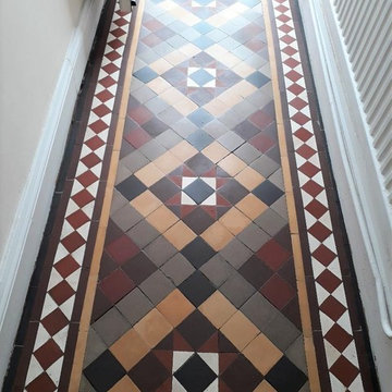 Tile Doctor Ltd
As is often the case in years past and for whatever reason many homeowners covered their decorative Victorian hallway tiles in a variety of products from carpet to laminate flooring. These days the trend has reversed and quite rightly many homeowners now realise the value a tiled floor can bring to a property and look to us to have it restored.
Our client had purchased a property in Norfolk seaport of Kings Lynn and, on lifting the dirty old carpet and decaying underlay in the hallway, discovered a beautiful tiled entrance hall. It was obvious that a previous owner had decided to lay carpet over the tiles as an easy way of hiding the result of careless renovation and decorating which had resulted in a thick coating of plaster, paint, carpet tape glue and various other contaminants which had become firmly stuck to the surface. There were also two small rectangular black and brown tiles missing behind the front door which had been damaged during the removal of some old lead pipes.
This was clearly a job which would need somewhat more than a scrubbing brush and a bottle of Flash!
Our first job was to remove as much of the solid contaminants as possible by hand with floor scrapers and a steamer which softened the more stubborn lumps. We then applied Tile Doctor Remove & Go which is a powerful alkaline stripper to the whole area, left it to dwell on the surface for twenty minutes and then scrubbed it in using a rotary machine fitted with a black scrubbing pad. The resulting slurry was then power rinsed and extracted away using our Ninja machine which is a high-power industrial vacuum. Any remaining patches where the carpet tape had been stuck down were spot treated using Tile Doctor Nanotech HBU which made short work of the hardened glue.
The result was a clean floor, but the surface still felt slightly rough and pitted, a problem which we resolved using the rotary machine fitted with a 200-grit diamond burnishing pad followed by a 400-grit pad with a little 400 grit honing powder which left the surface smooth, silky and ready for the application of a sealer.
Finally, we acid washed the whole area using Tile Doctor Acid Gel, a slow release product which would neutralise any remaining chemicals, improve new sealer adhesion and inhibit the future production of any efflorescence salts. We had used a fair amount of water during the cleaning process, so we left the floor to dry off thoroughly overnight with assistance from our commercial dehumidifier.
On our return the following day, we discussed the sealer options with the client and recommended using microporous Tile Doctor Colour Grow which is an impregnating sealer that seeps into the pores of the stone protecting it from within. It will provide an excellent fluid resistant seal whilst enhancing the natural colours in the stone, additionally it’s fully breathable thereby enabling any moisture trapped under the floor to rise through the floor and evaporate. This is important on old floors like this where no damp-proof membrane was installed. The sealer was applied with a paint pad in tow coats and allowed to dry for an hour before buffing the floor with a hog’s hair pad to give a rich natural-look sheen finish.
The Victorian tiles responded well to the treatments which were completed in two consecutive days. My client was extremely pleased with the results and left the following comment:
“My floor was in poor condition after being buried under carpet as well as many, many years of paint and muck. I enjoyed the time they spent at my home and wouldn’t hesitate to use (or recommend) the Tile Doctor service in the future.”
Nick White
Norfolk Tile Doctor
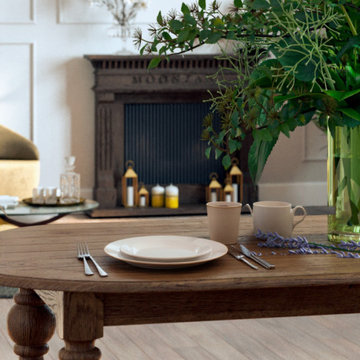
 Tint Interior Design
This project was created for a family who wanted their home to feel warm, calm, and welcoming every single day.
They loved classic details, natural wood, soft neutral colors, and spaces that feel comfortable rather than formal.
We focused on gentle light, cozy textures, and furniture that invites you to sit down, relax, and stay a little longer.
The living and dining areas were designed to feel connected, so the family can spend time together — whether it’s a quiet morning coffee, dinner with friends, or a slow weekend afternoon.
Natural materials, soft fabrics, and warm tones create a peaceful atmosphere that feels timeless and easy to live in.
Nothing feels too perfect or untouchable — everything is made for real life, real moments, and real comfort.
The result is a home that feels elegant, but also deeply personal and warm.
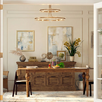 Tint Interior Design
This project was created for a family who wanted their home to feel warm, calm, and welcoming every single day.
They loved classic details, natural wood, soft neutral colors, and spaces that feel comfortable rather than formal.
We focused on gentle light, cozy textures, and furniture that invites you to sit down, relax, and stay a little longer.
The living and dining areas were designed to feel connected, so the family can spend time together — whether it’s a quiet morning coffee, dinner with friends, or a slow weekend afternoon.
Natural materials, soft fabrics, and warm tones create a peaceful atmosphere that feels timeless and easy to live in.
Nothing feels too perfect or untouchable — everything is made for real life, real moments, and real comfort.
The result is a home that feels elegant, but also deeply personal and warm.
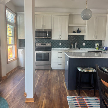
 Metta Home
This kitchen at the Blue Marlin Beach House was taken down to the studs, as a part of the overall renovation, then thoughtfully rebuilt to make the most of every inch! Keeping the existing peninsula while maximizing the overall layout and flow. The peninsula was reimagined with new cabinetry below and refined detailing, turning it into an easy, natural spot for gathering and additional seating.
A softly scaled, almost scaly backsplash brings in a subtle nod to the home’s coastal fishing roots, while quartzite countertops echo the texture of sand,visually rich, but smooth and easy for the day to day job.
Inside the cabinetry, smart storage solutions were layered in to support how the kitchen is actually used, improving workflow and keeping everything within reach. The end result feels relaxed but considered a kitchen that works hard behind the scenes while still inviting you to slow down, pull up a seat, and stay awhile.
 Gravel To Gold, Inc.
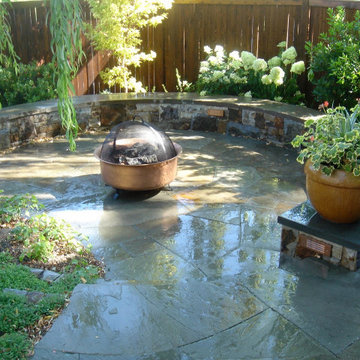
Tucked beneath the wide canopy of a mature willow, Stone and Fire is an intimate backyard retreat shaped by elevation and anchored by craftsmanship. This space unfolds around a central tree, whose presence offered both inspiration and challenge. Rather than fight the varied topography, we used it—layering spaces and guiding movement with finely built stonework.
A master stonemason laid every element by hand: from the outdoor fireplace that anchors the primary gathering space, to the built-in grill and custom countertops that form a quiet culinary hub. Curated hardscape materials—textured flagstone, dry-stacked retaining walls, and tailored stone edging—bring cohesion and warmth. The result is a space that feels both elemental and refined.
Designed for connection, Stone and Fire balances intimacy and openness, offering a seamless blend of structure and nature. It’s a place to cook, to gather, and to slow down—where fire meets stone and the landscape holds the memory of every evening spent outdoors.
 Astro Design Inc.
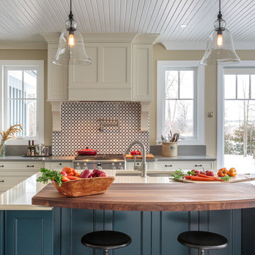
This countryside kitchen includes a beautiful blue statement island, which adds originality to the classic space. The cabinetry is made by Downsview and the design is done through Astro Design Centre in Ottawa Canada.
Astro Design, Ottawa
DoubleSpace Photography
 Walczak Design And Build
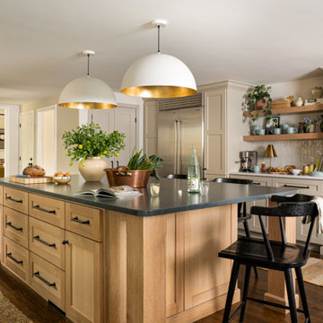
What once felt dark, segmented, and inefficient is now a bright, connected, and highly functional first floor designed for real family living.
Our clients, Terry and Lou, came to us with a home that simply wasn’t keeping up with their growing family. The kitchen was cramped, with tight working lanes and limited light. The laundry room doubled as a powder room—yet functioned poorly as both. Sightlines between spaces were cut off, making it difficult to stay connected to their young children throughout the day. Across the board, the home felt dated and disconnected.
Through thoughtful planning and strategic structural changes, we reimagined the entire first floor to better support how this family truly lives.
We began by redefining the entry experience—creating a true foyer complete with a dedicated drop zone and custom cubby storage. This space now acts as a natural landing point, bringing order and intention to everyday comings and goings.
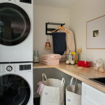
Adjacent to the new entry, we relocated and redesigned the laundry room. Now positioned exactly where it needs to be, it functions as a hardworking utility space with countertops for folding, a utility sink for immediate stain treatment, and the ability to be closed off—keeping daily life contained when needed.
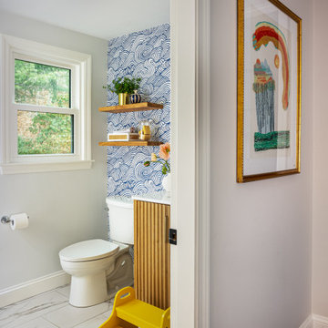
Separating the previous shared function allowed us to carve out a distinct, personality-filled powder room. Wrapped in a bold wave-patterned wallpaper and grounded by a custom reeded oak vanity with warm brass accents, this space delivers a moment of delight and individuality within the home.
The kitchen transformation is where the impact is felt most deeply.
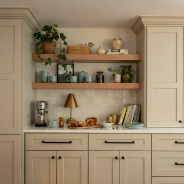
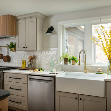
What was once a dark, restrictive layout has been opened into a spacious, highly efficient U-shaped kitchen with generous clearances and an oversized island for gathering. A thoughtful mix of painted cabinetry and rift white oak introduces warmth and balance, while the custom reeded hood becomes a sculptural focal point. Open shelving, integrated pantry storage, and layered lighting ensure the space is as functional as it is beautiful.
Beyond aesthetics, the redesign prioritizes flow—both in movement and in connection. Sightlines between the kitchen, dining, and living areas were intentionally opened, allowing for ease of interaction and visibility throughout the main living spaces.
To unify the home, existing hardwood floors were refinished and extended, creating continuity and a seamless visual experience from one space to the next.
The result is a home that feels lighter, more open, and deeply aligned with how this family lives day to day—designed not just to look beautiful, but to support everything from busy mornings to slow, shared evenings.
 Walczak Design And Build
What once felt dark, segmented, and inefficient is now a bright, connected, and highly functional first floor designed for real family living.
Our clients, Terry and Lou, came to us with a home that simply wasn’t keeping up with their growing family. The kitchen was cramped, with tight working lanes and limited light. The laundry room doubled as a powder room—yet functioned poorly as both. Sightlines between spaces were cut off, making it difficult to stay connected to their young children throughout the day. Across the board, the home felt dated and disconnected.
Through thoughtful planning and strategic structural changes, we reimagined the entire first floor to better support how this family truly lives.
We began by redefining the entry experience—creating a true foyer complete with a dedicated drop zone and custom cubby storage. This space now acts as a natural landing point, bringing order and intention to everyday comings and goings.
Adjacent to the new entry, we relocated and redesigned the laundry room. Now positioned exactly where it needs to be, it functions as a hardworking utility space with countertops for folding, a utility sink for immediate stain treatment, and the ability to be closed off—keeping daily life contained when needed.
Separating the previous shared function allowed us to carve out a distinct, personality-filled powder room. Wrapped in a bold wave-patterned wallpaper and grounded by a custom reeded oak vanity with warm brass accents, this space delivers a moment of delight and individuality within the home.
The kitchen transformation is where the impact is felt most deeply.
What was once a dark, restrictive layout has been opened into a spacious, highly efficient U-shaped kitchen with generous clearances and an oversized island for gathering. A thoughtful mix of painted cabinetry and rift white oak introduces warmth and balance, while the custom reeded hood becomes a sculptural focal point. Open shelving, integrated pantry storage, and layered lighting ensure the space is as functional as it is beautiful.
Beyond aesthetics, the redesign prioritizes flow—both in movement and in connection. Sightlines between the kitchen, dining, and living areas were intentionally opened, allowing for ease of interaction and visibility throughout the main living spaces.
To unify the home, existing hardwood floors were refinished and extended, creating continuity and a seamless visual experience from one space to the next.
The result is a home that feels lighter, more open, and deeply aligned with how this family lives day to day—designed not just to look beautiful, but to support everything from busy mornings to slow, shared evenings.
 Walczak Design And Build
What once felt dark, segmented, and inefficient is now a bright, connected, and highly functional first floor designed for real family living.
Our clients, Terry and Lou, came to us with a home that simply wasn’t keeping up with their growing family. The kitchen was cramped, with tight working lanes and limited light. The laundry room doubled as a powder room—yet functioned poorly as both. Sightlines between spaces were cut off, making it difficult to stay connected to their young children throughout the day. Across the board, the home felt dated and disconnected.
Through thoughtful planning and strategic structural changes, we reimagined the entire first floor to better support how this family truly lives.
We began by redefining the entry experience—creating a true foyer complete with a dedicated drop zone and custom cubby storage. This space now acts as a natural landing point, bringing order and intention to everyday comings and goings.
Adjacent to the new entry, we relocated and redesigned the laundry room. Now positioned exactly where it needs to be, it functions as a hardworking utility space with countertops for folding, a utility sink for immediate stain treatment, and the ability to be closed off—keeping daily life contained when needed.
Separating the previous shared function allowed us to carve out a distinct, personality-filled powder room. Wrapped in a bold wave-patterned wallpaper and grounded by a custom reeded oak vanity with warm brass accents, this space delivers a moment of delight and individuality within the home.
The kitchen transformation is where the impact is felt most deeply.
What was once a dark, restrictive layout has been opened into a spacious, highly efficient U-shaped kitchen with generous clearances and an oversized island for gathering. A thoughtful mix of painted cabinetry and rift white oak introduces warmth and balance, while the custom reeded hood becomes a sculptural focal point. Open shelving, integrated pantry storage, and layered lighting ensure the space is as functional as it is beautiful.
Beyond aesthetics, the redesign prioritizes flow—both in movement and in connection. Sightlines between the kitchen, dining, and living areas were intentionally opened, allowing for ease of interaction and visibility throughout the main living spaces.
To unify the home, existing hardwood floors were refinished and extended, creating continuity and a seamless visual experience from one space to the next.
The result is a home that feels lighter, more open, and deeply aligned with how this family lives day to day—designed not just to look beautiful, but to support everything from busy mornings to slow, shared evenings.
 Castellano and Sons
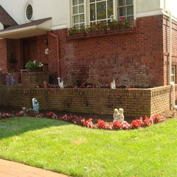
We took a basic overgrown garden, removed and recycled all the plants and installed easy to maintain and slow growing shrubs. The end result was a much better looking garden that was easier to take care of.
 Walczak Design And Build
What once felt dark, segmented, and inefficient is now a bright, connected, and highly functional first floor designed for real family living.
Our clients, Terry and Lou, came to us with a home that simply wasn’t keeping up with their growing family. The kitchen was cramped, with tight working lanes and limited light. The laundry room doubled as a powder room—yet functioned poorly as both. Sightlines between spaces were cut off, making it difficult to stay connected to their young children throughout the day. Across the board, the home felt dated and disconnected.
Through thoughtful planning and strategic structural changes, we reimagined the entire first floor to better support how this family truly lives.
We began by redefining the entry experience—creating a true foyer complete with a dedicated drop zone and custom cubby storage. This space now acts as a natural landing point, bringing order and intention to everyday comings and goings.
Adjacent to the new entry, we relocated and redesigned the laundry room. Now positioned exactly where it needs to be, it functions as a hardworking utility space with countertops for folding, a utility sink for immediate stain treatment, and the ability to be closed off—keeping daily life contained when needed.
Separating the previous shared function allowed us to carve out a distinct, personality-filled powder room. Wrapped in a bold wave-patterned wallpaper and grounded by a custom reeded oak vanity with warm brass accents, this space delivers a moment of delight and individuality within the home.
The kitchen transformation is where the impact is felt most deeply.
What was once a dark, restrictive layout has been opened into a spacious, highly efficient U-shaped kitchen with generous clearances and an oversized island for gathering. A thoughtful mix of painted cabinetry and rift white oak introduces warmth and balance, while the custom reeded hood becomes a sculptural focal point. Open shelving, integrated pantry storage, and layered lighting ensure the space is as functional as it is beautiful.
Beyond aesthetics, the redesign prioritizes flow—both in movement and in connection. Sightlines between the kitchen, dining, and living areas were intentionally opened, allowing for ease of interaction and visibility throughout the main living spaces.
To unify the home, existing hardwood floors were refinished and extended, creating continuity and a seamless visual experience from one space to the next.
The result is a home that feels lighter, more open, and deeply aligned with how this family lives day to day—designed not just to look beautiful, but to support everything from busy mornings to slow, shared evenings.
 Walczak Design And Build
What once felt dark, segmented, and inefficient is now a bright, connected, and highly functional first floor designed for real family living.
Our clients, Terry and Lou, came to us with a home that simply wasn’t keeping up with their growing family. The kitchen was cramped, with tight working lanes and limited light. The laundry room doubled as a powder room—yet functioned poorly as both. Sightlines between spaces were cut off, making it difficult to stay connected to their young children throughout the day. Across the board, the home felt dated and disconnected.
Through thoughtful planning and strategic structural changes, we reimagined the entire first floor to better support how this family truly lives.
We began by redefining the entry experience—creating a true foyer complete with a dedicated drop zone and custom cubby storage. This space now acts as a natural landing point, bringing order and intention to everyday comings and goings.
Adjacent to the new entry, we relocated and redesigned the laundry room. Now positioned exactly where it needs to be, it functions as a hardworking utility space with countertops for folding, a utility sink for immediate stain treatment, and the ability to be closed off—keeping daily life contained when needed.
Separating the previous shared function allowed us to carve out a distinct, personality-filled powder room. Wrapped in a bold wave-patterned wallpaper and grounded by a custom reeded oak vanity with warm brass accents, this space delivers a moment of delight and individuality within the home.
The kitchen transformation is where the impact is felt most deeply.
What was once a dark, restrictive layout has been opened into a spacious, highly efficient U-shaped kitchen with generous clearances and an oversized island for gathering. A thoughtful mix of painted cabinetry and rift white oak introduces warmth and balance, while the custom reeded hood becomes a sculptural focal point. Open shelving, integrated pantry storage, and layered lighting ensure the space is as functional as it is beautiful.
Beyond aesthetics, the redesign prioritizes flow—both in movement and in connection. Sightlines between the kitchen, dining, and living areas were intentionally opened, allowing for ease of interaction and visibility throughout the main living spaces.
To unify the home, existing hardwood floors were refinished and extended, creating continuity and a seamless visual experience from one space to the next.
The result is a home that feels lighter, more open, and deeply aligned with how this family lives day to day—designed not just to look beautiful, but to support everything from busy mornings to slow, shared evenings.

 The Way We Play
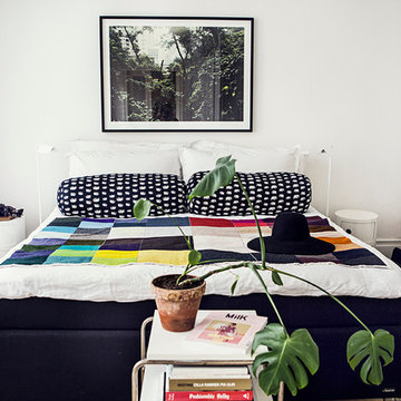
Inspiration for a large scandinavian master light wood floor bedroom remodel in Stockholm with white walls, a wood stove and a tile fireplace
 Walczak Design And Build
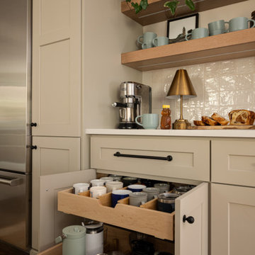
What once felt dark, segmented, and inefficient is now a bright, connected, and highly functional first floor designed for real family living.
Our clients, Terry and Lou, came to us with a home that simply wasn’t keeping up with their growing family. The kitchen was cramped, with tight working lanes and limited light. The laundry room doubled as a powder room—yet functioned poorly as both. Sightlines between spaces were cut off, making it difficult to stay connected to their young children throughout the day. Across the board, the home felt dated and disconnected.
Through thoughtful planning and strategic structural changes, we reimagined the entire first floor to better support how this family truly lives.
We began by redefining the entry experience—creating a true foyer complete with a dedicated drop zone and custom cubby storage. This space now acts as a natural landing point, bringing order and intention to everyday comings and goings.
Adjacent to the new entry, we relocated and redesigned the laundry room. Now positioned exactly where it needs to be, it functions as a hardworking utility space with countertops for folding, a utility sink for immediate stain treatment, and the ability to be closed off—keeping daily life contained when needed.
Separating the previous shared function allowed us to carve out a distinct, personality-filled powder room. Wrapped in a bold wave-patterned wallpaper and grounded by a custom reeded oak vanity with warm brass accents, this space delivers a moment of delight and individuality within the home.
The kitchen transformation is where the impact is felt most deeply.
What was once a dark, restrictive layout has been opened into a spacious, highly efficient U-shaped kitchen with generous clearances and an oversized island for gathering. A thoughtful mix of painted cabinetry and rift white oak introduces warmth and balance, while the custom reeded hood becomes a sculptural focal point. Open shelving, integrated pantry storage, and layered lighting ensure the space is as functional as it is beautiful.
Beyond aesthetics, the redesign prioritizes flow—both in movement and in connection. Sightlines between the kitchen, dining, and living areas were intentionally opened, allowing for ease of interaction and visibility throughout the main living spaces.
To unify the home, existing hardwood floors were refinished and extended, creating continuity and a seamless visual experience from one space to the next.
The result is a home that feels lighter, more open, and deeply aligned with how this family lives day to day—designed not just to look beautiful, but to support everything from busy mornings to slow, shared evenings.
 Walczak Design And Build
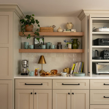
What once felt dark, segmented, and inefficient is now a bright, connected, and highly functional first floor designed for real family living.
Our clients, Terry and Lou, came to us with a home that simply wasn’t keeping up with their growing family. The kitchen was cramped, with tight working lanes and limited light. The laundry room doubled as a powder room—yet functioned poorly as both. Sightlines between spaces were cut off, making it difficult to stay connected to their young children throughout the day. Across the board, the home felt dated and disconnected.
Through thoughtful planning and strategic structural changes, we reimagined the entire first floor to better support how this family truly lives.
We began by redefining the entry experience—creating a true foyer complete with a dedicated drop zone and custom cubby storage. This space now acts as a natural landing point, bringing order and intention to everyday comings and goings.
Adjacent to the new entry, we relocated and redesigned the laundry room. Now positioned exactly where it needs to be, it functions as a hardworking utility space with countertops for folding, a utility sink for immediate stain treatment, and the ability to be closed off—keeping daily life contained when needed.
Separating the previous shared function allowed us to carve out a distinct, personality-filled powder room. Wrapped in a bold wave-patterned wallpaper and grounded by a custom reeded oak vanity with warm brass accents, this space delivers a moment of delight and individuality within the home.
The kitchen transformation is where the impact is felt most deeply.
What was once a dark, restrictive layout has been opened into a spacious, highly efficient U-shaped kitchen with generous clearances and an oversized island for gathering. A thoughtful mix of painted cabinetry and rift white oak introduces warmth and balance, while the custom reeded hood becomes a sculptural focal point. Open shelving, integrated pantry storage, and layered lighting ensure the space is as functional as it is beautiful.
Beyond aesthetics, the redesign prioritizes flow—both in movement and in connection. Sightlines between the kitchen, dining, and living areas were intentionally opened, allowing for ease of interaction and visibility throughout the main living spaces.
To unify the home, existing hardwood floors were refinished and extended, creating continuity and a seamless visual experience from one space to the next.
The result is a home that feels lighter, more open, and deeply aligned with how this family lives day to day—designed not just to look beautiful, but to support everything from busy mornings to slow, shared evenings.
8