
Search results for "Small square windows" in Home Design Ideas
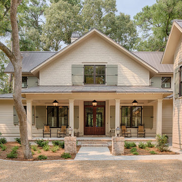
 Visbeen Architects
The best of past and present architectural styles combine in this welcoming, farmhouse-inspired design. Clad in low-maintenance siding, the distinctive exterior has plenty of street appeal, with its columned porch, multiple gables, shutters and interesting roof lines. Other exterior highlights included trusses over the garage doors, horizontal lap siding and brick and stone accents. The interior is equally impressive, with an open floor plan that accommodates today’s family and modern lifestyles. An eight-foot covered porch leads into a large foyer and a powder room. Beyond, the spacious first floor includes more than 2,000 square feet, with one side dominated by public spaces that include a large open living room, centrally located kitchen with a large island that seats six and a u-shaped counter plan, formal dining area that seats eight for holidays and special occasions and a convenient laundry and mud room. The left side of the floor plan contains the serene master suite, with an oversized master bath, large walk-in closet and 16 by 18-foot master bedroom that includes a large picture window that lets in maximum light and is perfect for capturing nearby views. Relax with a cup of morning coffee or an evening cocktail on the nearby covered patio, which can be accessed from both the living room and the master bedroom. Upstairs, an additional 900 square feet includes two 11 by 14-foot upper bedrooms with bath and closet and a an approximately 700 square foot guest suite over the garage that includes a relaxing sitting area, galley kitchen and bath, perfect for guests or in-laws.
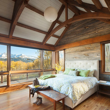
 SV Design
When full-time Massachusetts residents contemplate building a second home in Telluride, Colorado the question immediately arises; does it make most sense to hire a regionally based Rocky Mountain architect or a sea level architect conveniently located for all of the rigorous collaboration required for successful bespoke home design. Determined to prove the latter true, Siemasko + Verbridge accompanied the potential client as they scoured the undulating Telluride landscape in search of the perfect house site.
The selected site’s harmonious balance of untouched meadow rising up to meet the edge of an aspen grove and the opposing 180 degree view of Wilson’s Range spoke to everyone. A plateau just beyond a fork in the meadow provided a natural flatland, requiring little excavation and yet the right amount of upland slope to capture the views. The intrinsic character of the site was only enriched by an elk trail and snake-rail fence.
Establishing the expanse of Wilson’s range would be best served by rejecting the notion of selected views, the central sweeping curve of the roof inverts a small saddle in the range with which it is perfectly aligned. The soaring wave of custom windows and the open floor plan make the relatively modest house feel sizable despite its footprint of just under 2,000 square feet. Officially a two bedroom home, the bunk room and loft allow the home to comfortably sleep ten, encouraging large gatherings of family and friends. The home is completely off the grid in response to the unique and fragile qualities of the landscape. Great care was taken to respect the regions vernacular through the use of mostly native materials and a palette derived from the terrain found at 9,820 feet above sea level.
Photographer: Gibeon Photography
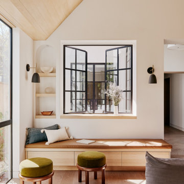
 Laney LA, Inc.
Rather than starting with an outcome in mind, this 1,400 square foot residence began from a polemic place - exploring shared conviction regarding the concentrated power of living with a smaller footprint. From the gabled silhouette to passive ventilation, the home captures the nostalgia for the past with the sustainable practices of the future.
While the exterior materials contrast a calm, minimal palette with the sleek lines of the gabled silhouette, the interior spaces embody a playful, artistic spirit. From the hand painted De Gournay wallpaper in the master bath to the rugged texture of the over-grouted limestone and Portuguese cobblestones, the home is an experience that encapsulates the unexpected and the timeless.
Find the right local pro for your project
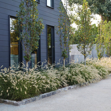
 Marvin
Architect: Blaine Bonadies, Bonadies Architect
Photography By: Jean Allsopp Photography
“Just as described, there is an edgy, irreverent vibe here, but the result has an appropriate stature and seriousness. Love the overscale windows. And the outdoor spaces are so great.”
Situated atop an old Civil War battle site, this new residence was conceived for a couple with southern values and a rock-and-roll attitude. The project consists of a house, a pool with a pool house and a renovated music studio. A marriage of modern and traditional design, this project used a combination of California redwood siding, stone and a slate roof with flat-seam lead overhangs. Intimate and well planned, there is no space wasted in this home. The execution of the detail work, such as handmade railings, metal awnings and custom windows jambs, made this project mesmerizing.
Cues from the client and how they use their space helped inspire and develop the initial floor plan, making it live at a human scale but with dramatic elements. Their varying taste then inspired the theme of traditional with an edge. The lines and rhythm of the house were simplified, and then complemented with some key details that made the house a juxtaposition of styles.
The wood Ultimate Casement windows were all standard sizes. However, there was a desire to make the windows have a “deep pocket” look to create a break in the facade and add a dramatic shadow line. Marvin was able to customize the jambs by extruding them to the exterior. They added a very thin exterior profile, which negated the need for exterior casing. The same detail was in the stone veneers and walls, as well as the horizontal siding walls, with no need for any modification. This resulted in a very sleek look.
MARVIN PRODUCTS USED:
Marvin Ultimate Casement Window
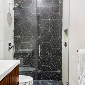
 kimberly peck architect
This brownstone, located in Harlem, consists of five stories which had been duplexed to create a two story rental unit and a 3 story home for the owners. The owner hired us to do a modern renovation of their home and rear garden. The garden was under utilized, barely visible from the interior and could only be accessed via a small steel stair at the rear of the second floor. We enlarged the owner’s home to include the rear third of the floor below which had walk out access to the garden. The additional square footage became a new family room connected to the living room and kitchen on the floor above via a double height space and a new sculptural stair. The rear facade was completely restructured to allow us to install a wall to wall two story window and door system within the new double height space creating a connection not only between the two floors but with the outside. The garden itself was terraced into two levels, the bottom level of which is directly accessed from the new family room space, the upper level accessed via a few stone clad steps. The upper level of the garden features a playful interplay of stone pavers with wood decking adjacent to a large seating area and a new planting bed. Wet bar cabinetry at the family room level is mirrored by an outside cabinetry/grill configuration as another way to visually tie inside to out. The second floor features the dining room, kitchen and living room in a large open space. Wall to wall builtins from the front to the rear transition from storage to dining display to kitchen; ending at an open shelf display with a fireplace feature in the base. The third floor serves as the children’s floor with two bedrooms and two ensuite baths. The fourth floor is a master suite with a large bedroom and a large bathroom bridged by a walnut clad hall that conceals a closet system and features a built in desk. The master bath consists of a tiled partition wall dividing the space to create a large walkthrough shower for two on one side and showcasing a free standing tub on the other. The house is full of custom modern details such as the recessed, lit handrail at the house’s main stair, floor to ceiling glass partitions separating the halls from the stairs and a whimsical builtin bench in the entry.
 Studio Dearborn
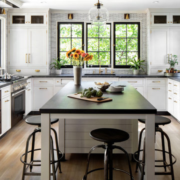
INTERNATIONAL AWARD WINNER. 2018 NKBA Design Competition Best Overall Kitchen. 2018 TIDA International USA Kitchen of the Year. 2018 Best Traditional Kitchen - Westchester Home Magazine design awards.
The designer's own kitchen was gutted and renovated in 2017, with a focus on classic materials and thoughtful storage. The 1920s craftsman home has been in the family since 1940, and every effort was made to keep finishes and details true to the original construction. For sources, please see the website at www.studiodearborn.com. Photography, Adam Kane Macchia and Timothy Lenz

 Twelve Stones Designs, LLC
The owners of this kitchen had spent the money to upgrade the finishes in their kitchen upon building the home 12 years ago, but after living in the space for several years they realized how nonfunctional the layout really was. The (then) two preschool aged children had grown into busy, hungry teenagers with many friends who also liked to hang out at the house. So the family needed a more functional kitchen with better traffic flow, space for daily activities revolving around the kitchen at different times of day, and a kitchen that could accommodate cooking for and serving large groups. Furthermore, the dark, traditional finishes no longer reflected the homeowners’ style. They requested a brighter, more relaxed, coastal style that reflected their love of the seaside cities they like to visit.
Originally, the kitchen was U-shaped with a narrow island in the middle. The island created narrow aisles that bottle-necked at the dishwasher, refrigerator, and cooktop areas. There was a pass-through from the foyer into the kitchen, but the owners never liked that the pass-through was also located so close to the powder room. The awkward proximity was unappealing and made guests feel uncomfortable.
The kitchen’s storage was made up of lots of narrow cabinets, apothecary drawers, clipped corner units, and very few drawers. It lacked useful storage for the larger items the family used on a daily basis. And the kitchen’s only pantry was small closet that had only builder-grade, narrow shelving with no illumination to be able to see the contents inside.
Overall, the kitchen’s lighting plan was poorly executed. Only six recessed cans illuminated the entire kitchen and nook areas. The under cabinet lighting was not evenly distributed either. In fact, the builder had mis-placed the under cabinet lighting around the decorative pilasters which made for choppy, dark cubbies. Further, the builder didn’t include any lighting over the sink or the bar area, which meant whoever was doing the dishes was always in their own shadow. That, coupled with the steep overhang of the game room above made the bar area feel like a dim, cavernous space that wasn’t inviting or task oriented. The kitchen looked out into the main living space, but the raised bar and a narrow wall (which held the only large cabinet in the kitchen) created more of a barrier than a relationship to the living room or breakfast nook. In fact, one couldn’t even see the breakfast nook from the cooktop or sink areas due to its orientation. The raised bar top was too narrow to comfortably sit to either dine at or chat from due to the lack of knee space. The the homeowners confided that the kitchen felt more like a dark, dirty prison than place where the family, or their guests, wanted to gather and commune.
The clients' needs and desires were:
➢ to create a kitchen that would be a space the family loved to be in; to relate to the adjacent spaces all around, and to have better flow for entertaining large groups
➢ to remove the walls between the breakfast nook and living area and to be able to utilize the natural light from the windows in both those areas
➢ to incorporate a functional chopping block for prepping fresh food for home cooked meals, an island with a large sink and drain board, 2 pull out trash cans, and seating for at least the 2 teens to eat or do homework
➢ to design a kitchen and breakfast nook with an airy, coastal, relaxed vibe that blended with the rest of the house's coastal theme
➢ to integrate a layered lighting plan which would include ample general illumination, specific task lighting, decorative lighting, and lots of illuminated storage
➢ to design a kitchen with not only more storage for all the husband’s kitchen gadgets and collection of oils and spices, but smart storage, including a coffee/breakfast bar and a place to store and conceal the toaster oven and microwave
➢ to find a way to utilize the large open space between the kitchen, pantry area, and breakfast nook
Twelve Stones Designs achieved the owner's goals by:
➢ removing the walls between the kitchen and living room to allow the natural light to filter in from the adjacent rooms and to create a connection between the kitchen, nook, and living spaces for a sense of unity and communion
➢ removing the existing pantry and designing 3 large pantry style cabinets with LED tape lights and rollout drawers to house lots of kitchen appliances, gadgets, and tons of groceries. We also took the cabinets all the way up to the 9’ ceiling for additional storage for seasonal items and bulk storage.
➢ designing 2 islands - 1 with a gorgeous black walnut chopping block that houses a drawer for chopping and carving knives and a custom double pull out trash unit for point of use utilization - and 1 that houses the dishwasher, a large Blanco Gourmet sink with integrated drain board, woven baskets for fresh root vegetables and kitchen towels, plenty of drawer storage for kitchen items, and bar seating for up to 4 diners.
➢ closing off the space between the kitchen and the powder room to create a beautiful new private alcove for the powder room as well as adding some decorative storage. This also gave us space to include more tall storage near the new range for precision placement of the husband’s extensive oil and spice collection as well as a location for a combo-steam oven the wife wanted for baking and cooking healthy meals.
The project is enhanced functionally by:
➢ incorporated USB and standard receptacles for the kids’ laptops and phone charging in the large island
➢ designing the small island to include additional open shelving for items used on a daily basis such as a variety of bowls, plates, and colanders. This set up also works well for the husband who prefers to “plate” his dinners in restaurant-style fashion before presenting them to the table.
➢ the integration of specific storage units, such as double stacked cutlery drawers, a custom spice pull-out, a Kuerig coffee and tea pod drawer, and custom double stacked utensil drawers
➢ moving the refrigerator to the old oven location - this eliminated the bottle neck as well as created a better relationship to the eating table. It also utilizes the floor space between the pantry, nook, and kitchen
➢ creating a banquet style breakfast nook - this banquette seating not only doubles the amount of seating for large gatherings but it better utilizes the odd space between the kitchen and the previous nook area. It also helps to create a distinct pathway from the mudroom room through the pantry area, kitchen, nook, and living room.
➢ the coffee/breakfast bar area which includes the perfect location for the concealed microwave and toaster oven, convenient storage for the coffee pods and tea accoutrements. Roll-out drawers below also house the smoothie maker, hot water kettle, and a plethora of smoothie-making ingredients such as protein powders, smoothie additives, etc. Furthermore, the drawers below the Keurig house measuring utensil, cutlery, baking supplies and tupperware storage.
➢ incorporating lots of wide drawers and pullouts to accommodate large cookware.
➢ utilizing as much vertical space as possible by building storage to the ceiling which accommodates the family’s abundant amount of serving platters, baking sheets, bakeware, casserole dishes, and additional cutting boards.
The project is enhanced aesthetically by:
➢ new 5-piece Versailles pattern porcelain tile that now seamlessly joins the entire down stairs area together creating a bright, cohesiveness feeling instead of choppy separated spaces - it also adds a coastal feeling
➢ designing a cabinet to conceal the microwave and toaster oven
➢ the coastal influenced light fixtures over the nook table and island
➢ the sandy colors of the Langdon Cambria countertops. The swirling pattern and sparkling quartz pieces remind the homeowner of black-and-tan sandy beaches
➢ the striped banquet seating whose creamy white background and blue-green stripes were the inspiration for the cabinet and wall colors.
➢ All the interior doors were painted black to coordinate with the blacks and grays in the backsplash tile and countertop. This also adds a hint of tailored formality to an otherwise casual space.
➢ the use of WAC's Oculux small aperture LED units for the overhead lighting complimented with Diode LED strips for task lighting under the cabinets and inside the pantry and glass wall cabinets. All of the lighting applications are on separate dimmer switches.
Innovative uses of materials or construction methods by Realty Restoration LLC:
➢ Each 1-1/2” x 3” block of reclaimed end-grain black walnut that makes up the center island chopping block was hand milled and built in the shop. It was designed to look substantial and proportional to the surrounding elements, executed by creating the 4 inch tall top with a solid wood chamfered edge band.
➢ The metal doors on either side of the vent hood were also custom designed for this project and built in the Realty Restoration LLC shop. They are made 1x2, 11-gauge mild steel with ribbed glass. Weighing 60 lbs a piece, heavy duty cabinet hinges were added to support the weight of the door and keep them from sagging.
➢ Under-cabinet receptacles were added along the range wall in order to have a clean, uninterrupted backsplash.
Design obstacles to overcome:
➢ Because we were removing the demising walls between the kitchen and living room, we had to find a way to plumb and vent the new island. We did this by tunneling through the slab (the slab had post tension cables which prevented us from just trenching) to run a new wet vent through a nearby structural wall. We pulled the existing hot and cold lines between upper floor joists and ran them down the structural wall as well and up through a conduit in the tunnel.
➢ Since we were converting from wall overs to a gas range it allowed us to utilize the 220 feed for the wall ovens to provide a new sub panel for all the new kitchen circuits
➢ Due to framing deficiencies inherited from the original build there was a 1-1/2” differential in the floor-to-ceiling height over a 20 foot span; by utilizing the process of cutting and furring coupled with the crown moulding details on the cabinet elevations we were able to mask the problem and provide seamless transitions between the cabinet components.
Evidence of superior craftsmanship:
➢ uniquely designed, one-of-a-kind metal “X” end panels on the large island. The end panels were custom made in the Realty Restoration LLC shop and fitted to the exact dimensions of the island. The welding seams are completely indistinguishable - the posts look like they are cut from a single sheet of metal
➢ square metal posts on the small island were also custom made and designed to compliment and carry through the metal element s throughout the kitchen
➢ the beautiful, oversized end panels on the pantry cabinets which give the breakfast nook a tailored look
➢ integrating a large format 5 piece Versailles tile pattern to seamlessly flow from the existing spaces into the new kitchen space
➢ By constructing a custom cabinet that jogged around a corner we could not remodel (housing the entry way coat closet) we were able to camouflage the adjacent wall offset within the upper and lower cabinets. By designing around the existing jog in the structural walls we accomplished a few things: we were able to find the space to house, and hide, the microwave and toaster oven yet still have a clean cohesive appearance from the kitchen side. Additionally, the owners were able to keep their much needed coat closet and we didn’t have to increase the budget with unnecessary structural work.
Sponsored
Columbus, OH
Free consultation for landscape design!

Peabody Landscape Group
Franklin County's Reliable Landscape Design & Contracting
 Saikley Architects
This house was a very small mid-century bungalow with previous additions that resulted in a large but chaotic layout. The owners wanted to convert the house to a super-efficient, and charming Craftsman-style, 6 bedroom home for their large family and work at home.
We achieved the space needs by moving a few walls for a more efficient, organized layout, setting up spaces for overlapping uses, and making a small upstairs addition. Every bit of square footage was optimized to meet the goals of the project without making the house huge or adding unnecessary cost.
Much thought was given to the entry sequence near the front door. A large flow-through mudroom with storage for each family member, and adjacent laundry, make it easy for children to be taught to keep their things organized and to contribute to household chores. A mail station and central home admin area at the mudroom help keep clutter down at other areas and minimize home management tasks. A garage door near the kitchen gives quick access to bulk items.
The existing house had too much view to the street from the living room through large corner windows, and too little entry transition, to the extent that the family did not feel comfortable using the living room much without shades drawn. We raised the window sills and brought the new windows in from the corner of the house, allowing plenty of light while protecting privacy and a sense of enclosure in the living room. We enlarged the front porch to create a more graceful transition from the public to private space. We located the front door so that the circulation from entry into the house would allow for furnishing the living room with a sitting circle that is not intruded upon by people walking through the room.
Sight lines through the living spaces were an important consideration in the design. The owners wanted discreet spaces for living room, kitchen, dining and family room, but also wanted the living spaces to feel connected and to be able to easily watch their children. Being able to see the children playing in the yard while getting things done inside the house was also important. While largely working with the existing structure, we opened walls and rearranged the use of spaces to make a series of connected living spaces with long views through them.
The character of the remodeled house is a contemporary Craftsman with classic materials and cool, consistent colors. A few arches echo through the house to frame spaces and soften the feeling of the rooms.
Photography: Kurt Manley
https://saikleyarchitects.com/portfolio/bungalow-expansion/
 Kaplan Thompson Architects
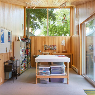
Designed to maximize function with minimal impact, the studio serves up adaptable square footage in a wrapping almost healthy enough to eat.
The open interior space organically transitions from personal to communal with the guidance of an angled roof plane. Beneath the tallest elevation, a sunny workspace awaits creative endeavors. The high ceiling provides room for big ideas in a small space, while a cluster of windows offers a glimpse of the structure’s soaring eave. Solid walls hugging the workspace add both privacy and anchors for wall-mounted storage. Towards the studio’s southern end, the ceiling plane slopes downward into a more intimate gathering space with playfully angled lines.
The building is as sustainable as it is versatile. Its all-wood construction includes interior paneling sourced locally from the Wood Mill of Maine. Lengths of eastern white pine span up to 16 feet to reach from floor to ceiling, creating visual warmth from a material that doubles as a natural insulator. Non-toxic wood fiber insulation, made from sawdust and wax, partners with triple-glazed windows to further insulate against extreme weather. During the winter, the interior temperature is able to reach 70 degrees without any heat on.
As it neared completion, the studio became a family project with Jesse, Betsy, and their kids working together to add the finishing touches. “Our whole life is a bit of an architectural experiment”, says Jesse, “but this has become an incredibly useful space.”
 BC&J Architecture
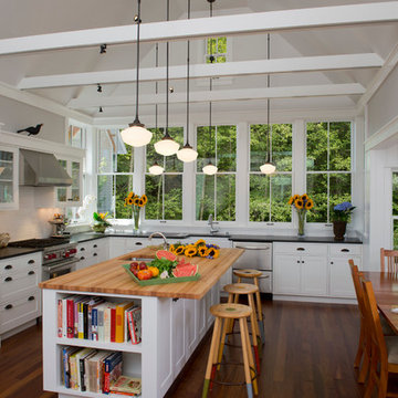
The Back Bay House is comprised of two main structures, a nocturnal wing and a daytime wing, joined by a glass gallery space. The daytime wing maintains an informal living arrangement that includes the dining space placed in an intimate alcove, a large country kitchen and relaxing seating area which opens to a classic covered porch and on to the water’s edge. The nocturnal wing houses three bedrooms. The master at the water side enjoys views and sounds of the wildlife and the shore while the two subordinate bedrooms soak in views of the garden and neighboring meadow.
To bookend the scale and mass of the house, a whimsical tower was included to the nocturnal wing. The tower accommodates flex space for a bunk room, office or studio space. Materials and detailing of this house are based on a classic cottage vernacular language found in these sorts of buildings constructed in pre-war north america and harken back to a simpler time and scale. Eastern white cedar shingles, white painted trim and moulding collectively add a layer of texture and richness not found in today’s lexicon of detail. The house is 1,628 sf plus a 228 sf tower and a detached, two car garage which employs massing, detail and scale to allow the main house to read as dominant but not overbearing.
Designed by BC&J Architecture.
 O’Hara Interiors
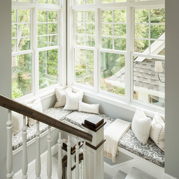
Martha O'Hara Interiors, Interior Design | L. Cramer Builders + Remodelers, Builder | Troy Thies, Photography | Shannon Gale, Photo Styling
Please Note: All “related,” “similar,” and “sponsored” products tagged or listed by Houzz are not actual products pictured. They have not been approved by Martha O’Hara Interiors nor any of the professionals credited. For information about our work, please contact design@oharainteriors.com.
 ODS Architecture
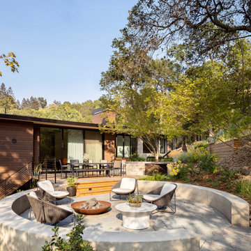
In a wooded area of Lafayette, a mid-century home was re-imagined for a graphic designer and kindergarten teacher couple and their three children. A major new design feature is a high ceiling great room that wraps from the front to the back yard, turning a corner at the kitchen and ending at the family room fireplace. This room was designed with a high flat roof to work in conjunction with existing roof forms to create a unified whole, and raise interior ceiling heights from eight to over ten feet. All new lighting and large floor to ceiling Fleetwood aluminum windows expand views of the trees beyond.
The existing home was enlarged by 700 square feet with a small exterior addition enlarging the kitchen over an existing deck, and a larger amount by excavating out crawlspace at the garage level to create a new home office with full bath, and separate laundry utility room. The remodeled residence became 3,847 square feet in total area including the garage.
Exterior curb appeal was improved with all new Fleetwood windows, stained wood siding and stucco. New steel railing and concrete steps lead up to the front entry. Front and rear yard new landscape design by Huettl Landscape Architecture dramatically alters the site. New planting was added at the front yard with landscape lighting and modern concrete pavers and the rear yard has multiple decks for family gatherings with the focal point a concrete conversation circle with central fire feature.
Everything revolves around the corner kitchen, large windows to the backyard, quartz countertops and cabinetry in painted and walnut finishes. The homeowners enjoyed the process of selecting Heath Tile for the kitchen backsplash and white oval tiles at the family room fireplace. Black brick tiles by Fireclay were used on the living room hearth. The kitchen flows into the family room all with views to the beautifully landscaped yards.
The primary suite has a built-in window seat with large windows overlooking the garden, walnut cabinetry in a skylit walk-in closet, and a large dramatic skylight bouncing light into the shower. The kid’s bath also has a skylight slot with light angling downward over double sinks. More colorful tile shows up in these spaces, as does a geometric patterned tile in the downstairs office bath shower.
The large yard is taken full advantage of with concrete paved walkways, stairs and firepit circle. New retaining walls in the rear yard helped to add more level usable outdoor space, with wood slats to visually blend them into the overall design.
The end result is a beautiful transformation of a mid-century home, that both captures the client’s personalities and elevates the house into the modern age.
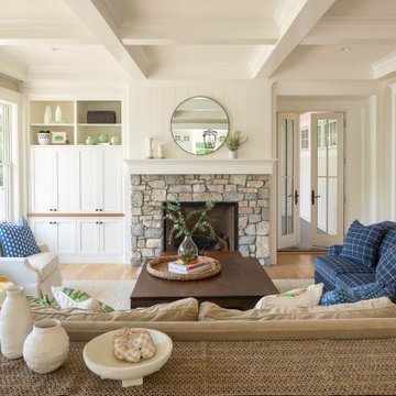
 Mark D. Williams Custom Homes, Inc.
Cozy bright greatroom with coffered ceiling detail. Beautiful south facing light comes through Pella Reserve Windows (screens roll out of bottom of window sash). This room is bright and cheery and very inviting. We even hid a remote shade in the beam closest to the windows for privacy at night and shade if too bright.
Sponsored
Columbus, OH

Wannemacher Interiors
Customized Award-Winning Interior Design Solutions in Franklin Cnty OH
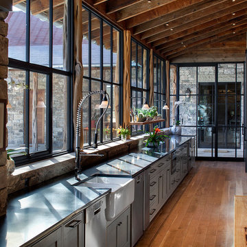
 Rehme Steel Windows & Doors
Rehme Steel Windows & Doors
Don B. McDonald, Architect
TMD Builders
Thomas McConnell Photography
Example of a mountain style single-wall medium tone wood floor kitchen design in Austin with a farmhouse sink, gray cabinets, shaker cabinets and stainless steel appliances
Example of a mountain style single-wall medium tone wood floor kitchen design in Austin with a farmhouse sink, gray cabinets, shaker cabinets and stainless steel appliances
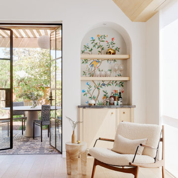 Laney LA, Inc.
Rather than starting with an outcome in mind, this 1,400 square foot residence began from a polemic place - exploring shared conviction regarding the concentrated power of living with a smaller footprint. From the gabled silhouette to passive ventilation, the home captures the nostalgia for the past with the sustainable practices of the future.
While the exterior materials contrast a calm, minimal palette with the sleek lines of the gabled silhouette, the interior spaces embody a playful, artistic spirit. From the hand painted De Gournay wallpaper in the master bath to the rugged texture of the over-grouted limestone and Portuguese cobblestones, the home is an experience that encapsulates the unexpected and the timeless.
 Alex Nerland
David Kingsbury, www.davidkingsburyphoto.com
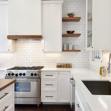
Mid-sized elegant l-shaped dark wood floor eat-in kitchen photo in San Francisco with a single-bowl sink, shaker cabinets, white cabinets, quartz countertops, white backsplash, subway tile backsplash, stainless steel appliances and an island
Mid-sized elegant l-shaped dark wood floor eat-in kitchen photo in San Francisco with a single-bowl sink, shaker cabinets, white cabinets, quartz countertops, white backsplash, subway tile backsplash, stainless steel appliances and an island
 Jim Deen/Kitchen Kraft
John Evans
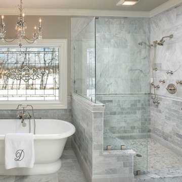
Inspiration for a timeless white tile and marble tile bathroom remodel in Columbus with gray walls
Inspiration for a timeless white tile and marble tile bathroom remodel in Columbus with gray walls
 Markalunas Architecture and Design, LLC
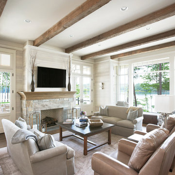
Lake Front Country Estate Living Room, designed by Tom Markalunas, built by Resort Custom Homes. Photography by Rachael Boling.
Inspiration for a timeless formal and open concept medium tone wood floor living room remodel in Other with beige walls, a standard fireplace, a stone fireplace and a wall-mounted tv
Inspiration for a timeless formal and open concept medium tone wood floor living room remodel in Other with beige walls, a standard fireplace, a stone fireplace and a wall-mounted tv
 Rosenberg Kolb Architects
Salisbury, CT
This 4,000 square foot vacation house in northwest Connecticut sits on a small promontory with views across a lake to hills beyond. While the site was extraordinary, the owner’s existing house had no redeeming value. It was demolished, and its foundations provided the base for this house.
The new house rises from a stone base set into the hillside. A guest bedroom, recreation room and wine cellar are located in this half cellar with views toward the lake. Above the house steps back creating a terrace across the entire length of the house with a covered dining porch at one end and steps down to the lawn at the other end.
This main portion of the house is sided with wood clapboard and detailed simply to recall the 19th century farmhouses in the area. Large windows and ‘french’ doors open the living room and family room to the terrace and view. A large kitchen is open to the family room and also serves a formal dining room on the entrance side of the house. On the second floor a there is a spacious master suite and three additional bedrooms. A new ‘carriage house’ garage thirty feet from the main house was built and the driveway and topography altered to create a new sense of approach and entry.
 i.d. | interior design
Andrea Rugg Photography
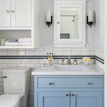
Example of a small classic kids' black and white tile and ceramic tile marble floor and gray floor corner shower design in Minneapolis with blue cabinets, a two-piece toilet, blue walls, an undermount sink, quartz countertops, a hinged shower door, white countertops and shaker cabinets
Example of a small classic kids' black and white tile and ceramic tile marble floor and gray floor corner shower design in Minneapolis with blue cabinets, a two-piece toilet, blue walls, an undermount sink, quartz countertops, a hinged shower door, white countertops and shaker cabinets
4