
Search results for "Space saving modular" in Home Design Ideas
 BC&J Architecture
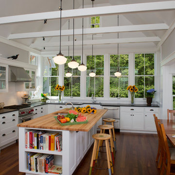
The Back Bay House is comprised of two main structures, a nocturnal wing and a daytime wing, joined by a glass gallery space. The daytime wing maintains an informal living arrangement that includes the dining space placed in an intimate alcove, a large country kitchen and relaxing seating area which opens to a classic covered porch and on to the water’s edge. The nocturnal wing houses three bedrooms. The master at the water side enjoys views and sounds of the wildlife and the shore while the two subordinate bedrooms soak in views of the garden and neighboring meadow.
To bookend the scale and mass of the house, a whimsical tower was included to the nocturnal wing. The tower accommodates flex space for a bunk room, office or studio space. Materials and detailing of this house are based on a classic cottage vernacular language found in these sorts of buildings constructed in pre-war north america and harken back to a simpler time and scale. Eastern white cedar shingles, white painted trim and moulding collectively add a layer of texture and richness not found in today’s lexicon of detail. The house is 1,628 sf plus a 228 sf tower and a detached, two car garage which employs massing, detail and scale to allow the main house to read as dominant but not overbearing.
Designed by BC&J Architecture.
 Simply Home Decorating
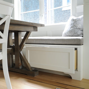
This tiny home is located on a treelined street in the Kitsilano neighborhood of Vancouver. We helped our client create a living and dining space with a beach vibe in this small front room that comfortably accommodates their growing family of four. The starting point for the decor was the client's treasured antique chaise (positioned under the large window) and the scheme grew from there. We employed a few important space saving techniques in this room... One is building seating into a corner that doubles as storage, the other is tucking a footstool, which can double as an extra seat, under the custom wood coffee table. The TV is carefully concealed in the custom millwork above the fireplace. Finally, we personalized this space by designing a family gallery wall that combines family photos and shadow boxes of treasured keepsakes. Interior Decorating by Lori Steeves of Simply Home Decorating. Photos by Tracey Ayton Photography
 Safferstone Interiors
Dennis and Joe have a large, light-filled house. New construction meant lofted space and open floor plans with traditional styling. Running a busy dental practice by day and engaged in a rich social life by night, this couple needed a professional to take the lead on making their house a home.
That’s my cue!
They wanted to take risks, and stay away from “matchy-matchy”. We gussied up a plain ol’ TV room and gave it a healthy dose of luxury.
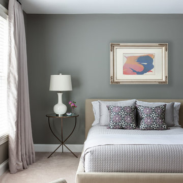
Our plan was initially inspired by an abstract painting hanging over their stone fireplace. We brought in their love of the outdoors to make things cozy and used family furniture whenever possible for nostalgia and comfort.
I took their love for one-of-a-kind objects and started making a design plan, aiming to solve their biggest frustration: the family room. They had a tortured relationship with a “forgotten family room,” a great space that was spacious and bright, but not at all cozy or joyful, and certainly not “them.”
I wanted to create a cozy space functional for everyday curling up with puppies and watching TV after dinner, yet chic enough for hosting the pre-dinner kitchen overflow and cocktails during parties.
I went looking for contrasting textures and materials. I wanted to balance patterns and scale, and use non-traditional colors as neutrals to create an overall sense of “BAM!”
Dennis and Joe loved the nod to the classics juxtaposed with new and different globally-inspired pieces. For this project our design aesthetic can be described as Middle Eastern/tribal meets mid-century modern. We played to their sensible side with proportion and balance, and stayed as far away from boring/bleh as we could.
You could say this room was pretty successful...It was featured in DC Modern Luxury. (#nobigdeal, right?)
From there we moved on to other spaces.. We added colorful pillows and sheer drapery to finish off their formal living room. We kept an inherited bedroom set from Dennis’ Mom and added color, draperies, and pillows to overhaul the guest bedroom.
Their project was not a rip-and-replace, we weren’t starting from scratch with a blank piece of paper.
Rather, our goal was to take what was already there and make it better, more like them. Using functionality first, we focused on giving the house a soothing, joyful aesthetic. We upped the chic factor by a gajillion and helped them find their ‘happy’ at home. See more Safferstone stuff at www.safferstone.com. Connect with us on Facebook, get inspired on Pinterest, and share modern musings on life & design on Instagram. Or, send us a love note at hello@safferstone.com.
Photo: Angie Seckinger
Find the right local pro for your project
 Simply Home Decorating
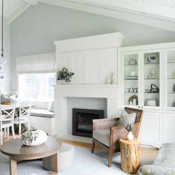
This tiny home is located on a treelined street in the Kitsilano neighborhood of Vancouver. We helped our client create a living and dining space with a beach vibe in this small front room that comfortably accommodates their growing family of four. The starting point for the decor was the client's treasured antique chaise (positioned under the large window) and the scheme grew from there. We employed a few important space saving techniques in this room... One is building seating into a corner that doubles as storage, the other is tucking a footstool, which can double as an extra seat, under the custom wood coffee table. The TV is carefully concealed in the custom millwork above the fireplace. Finally, we personalized this space by designing a family gallery wall that combines family photos and shadow boxes of treasured keepsakes. Interior Decorating by Lori Steeves of Simply Home Decorating. Photos by Tracey Ayton Photography
 The Brooklyn Studio
This residence was a complete gut renovation of a 4-story row house in Park Slope, and included a new rear extension and penthouse addition. The owners wished to create a warm, family home using a modern language that would act as a clean canvas to feature rich textiles and items from their world travels. As with most Brooklyn row houses, the existing house suffered from a lack of natural light and connection to exterior spaces, an issue that Principal Brendan Coburn is acutely aware of from his experience re-imagining historic structures in the New York area. The resulting architecture is designed around moments featuring natural light and views to the exterior, of both the private garden and the sky, throughout the house, and a stripped-down language of detailing and finishes allows for the concept of the modern-natural to shine.
Upon entering the home, the kitchen and dining space draw you in with views beyond through the large glazed opening at the rear of the house. An extension was built to allow for a large sunken living room that provides a family gathering space connected to the kitchen and dining room, but remains distinctly separate, with a strong visual connection to the rear garden. The open sculptural stair tower was designed to function like that of a traditional row house stair, but with a smaller footprint. By extending it up past the original roof level into the new penthouse, the stair becomes an atmospheric shaft for the spaces surrounding the core. All types of weather – sunshine, rain, lightning, can be sensed throughout the home through this unifying vertical environment. The stair space also strives to foster family communication, making open living spaces visible between floors. At the upper-most level, a free-form bench sits suspended over the stair, just by the new roof deck, which provides at-ease entertaining. Oak was used throughout the home as a unifying material element. As one travels upwards within the house, the oak finishes are bleached to further degrees as a nod to how light enters the home.
The owners worked with CWB to add their own personality to the project. The meter of a white oak and blackened steel stair screen was designed by the family to read “I love you” in Morse Code, and tile was selected throughout to reference places that hold special significance to the family. To support the owners’ comfort, the architectural design engages passive house technologies to reduce energy use, while increasing air quality within the home – a strategy which aims to respect the environment while providing a refuge from the harsh elements of urban living.
This project was published by Wendy Goodman as her Space of the Week, part of New York Magazine’s Design Hunting on The Cut.
Photography by Kevin Kunstadt
 Byggmeister Inc
Photo by Mike Casey
The owners of this 1960s ranch house loved their house but it wasn't configured to meet their needs. The house had only two small bedrooms for the family of four, and there was no casual living space for parents and kids to hang out separately. Neither we nor the clients wanted to increase the home's energy usage. It was a tall order: could we increase the home's size without increasing its energy footprint?
ADDING FUNCTIONALITY
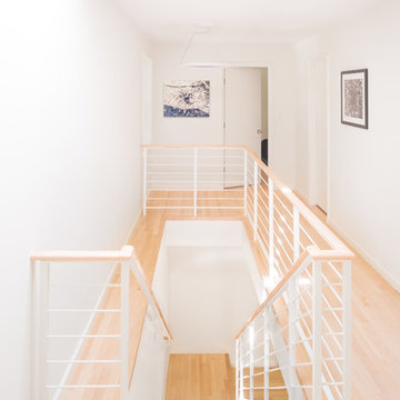
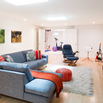
We built two small additions, one at the front of the home and one off the side adjacent to the two existing bedrooms. These new spaces provided an additional bedroom on the main level as well as a new stair down to the basement. At basement level, the additions yielded a guest room, a full bathroom and a laundry area. The existing basement, which is now easily accessible from the main floor, was refinished as a casual family room.
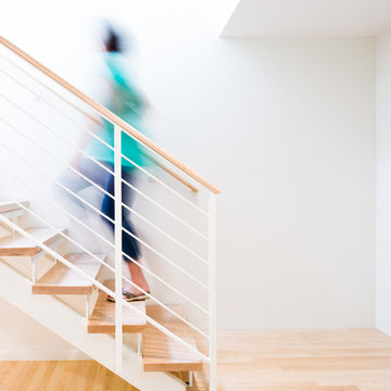
The architect designed the new spaces to be spare and bright, replicating the mid-century aesthetic. Every detail—from the open stair, to the light maple floors, to the detailing of the bathroom vanity—echoes the vintage and character of the original home.
INTEGRATING ENERGY AND DESIGN
The key to meeting this challenge was a rigorous and integrated planning process with early-stage energy modeling accompanying design. As the architect (Anita Rogers) worked out the space plan, the energy consultant (Mike Duclos) analyzed how various scenarios could be combined with envelope and mechanical packages to not only hold the line on energy use but improve performance. We anticipate the plan we settled on will save 25% annually over pre-project energy use.
 Byggmeister Inc
Photo by Mike Casey
The owners of this 1960s ranch house loved their house but it wasn't configured to meet their needs. The house had only two small bedrooms for the family of four, and there was no casual living space for parents and kids to hang out separately. Neither we nor the clients wanted to increase the home's energy usage. It was a tall order: could we increase the home's size without increasing its energy footprint?
ADDING FUNCTIONALITY
We built two small additions, one at the front of the home and one off the side adjacent to the two existing bedrooms. These new spaces provided an additional bedroom on the main level as well as a new stair down to the basement. At basement level, the additions yielded a guest room, a full bathroom and a laundry area. The existing basement, which is now easily accessible from the main floor, was refinished as a casual family room.
The architect designed the new spaces to be spare and bright, replicating the mid-century aesthetic. Every detail—from the open stair, to the light maple floors, to the detailing of the bathroom vanity—echoes the vintage and character of the original home.
INTEGRATING ENERGY AND DESIGN
The key to meeting this challenge was a rigorous and integrated planning process with early-stage energy modeling accompanying design. As the architect (Anita Rogers) worked out the space plan, the energy consultant (Mike Duclos) analyzed how various scenarios could be combined with envelope and mechanical packages to not only hold the line on energy use but improve performance. We anticipate the plan we settled on will save 25% annually over pre-project energy use.

Sponsored
Columbus, OH
Free consultation for landscape design!

Peabody Landscape Group
Franklin County's Reliable Landscape Design & Contracting
 Byggmeister Inc
Photo by Mike Casey
The owners of this 1960s ranch house loved their house but it wasn't configured to meet their needs. The house had only two small bedrooms for the family of four, and there was no casual living space for parents and kids to hang out separately. Neither we nor the clients wanted to increase the home's energy usage. It was a tall order: could we increase the home's size without increasing its energy footprint?
ADDING FUNCTIONALITY
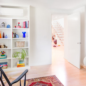
We built two small additions, one at the front of the home and one off the side adjacent to the two existing bedrooms. These new spaces provided an additional bedroom on the main level as well as a new stair down to the basement. At basement level, the additions yielded a guest room, a full bathroom and a laundry area. The existing basement, which is now easily accessible from the main floor, was refinished as a casual family room.
The architect designed the new spaces to be spare and bright, replicating the mid-century aesthetic. Every detail—from the open stair, to the light maple floors, to the detailing of the bathroom vanity—echoes the vintage and character of the original home.
INTEGRATING ENERGY AND DESIGN
The key to meeting this challenge was a rigorous and integrated planning process with early-stage energy modeling accompanying design. As the architect (Anita Rogers) worked out the space plan, the energy consultant (Mike Duclos) analyzed how various scenarios could be combined with envelope and mechanical packages to not only hold the line on energy use but improve performance. We anticipate the plan we settled on will save 25% annually over pre-project energy use.
 Byggmeister Inc
Photo by Mike Casey
The owners of this 1960s ranch house loved their house but it wasn't configured to meet their needs. The house had only two small bedrooms for the family of four, and there was no casual living space for parents and kids to hang out separately. Neither we nor the clients wanted to increase the home's energy usage. It was a tall order: could we increase the home's size without increasing its energy footprint?
ADDING FUNCTIONALITY
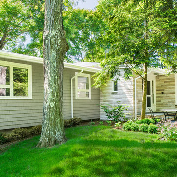
We built two small additions, one at the front of the home and one off the side adjacent to the two existing bedrooms. These new spaces provided an additional bedroom on the main level as well as a new stair down to the basement. At basement level, the additions yielded a guest room, a full bathroom and a laundry area. The existing basement, which is now easily accessible from the main floor, was refinished as a casual family room.
The architect designed the new spaces to be spare and bright, replicating the mid-century aesthetic. Every detail—from the open stair, to the light maple floors, to the detailing of the bathroom vanity—echoes the vintage and character of the original home.
INTEGRATING ENERGY AND DESIGN
The key to meeting this challenge was a rigorous and integrated planning process with early-stage energy modeling accompanying design. As the architect (Anita Rogers) worked out the space plan, the energy consultant (Mike Duclos) analyzed how various scenarios could be combined with envelope and mechanical packages to not only hold the line on energy use but improve performance. We anticipate the plan we settled on will save 25% annually over pre-project energy use.
 Byggmeister Inc
Photo by Mike Casey
The owners of this 1960s ranch house loved their house but it wasn't configured to meet their needs. The house had only two small bedrooms for the family of four, and there was no casual living space for parents and kids to hang out separately. Neither we nor the clients wanted to increase the home's energy usage. It was a tall order: could we increase the home's size without increasing its energy footprint?
ADDING FUNCTIONALITY
We built two small additions, one at the front of the home and one off the side adjacent to the two existing bedrooms. These new spaces provided an additional bedroom on the main level as well as a new stair down to the basement. At basement level, the additions yielded a guest room, a full bathroom and a laundry area. The existing basement, which is now easily accessible from the main floor, was refinished as a casual family room.
The architect designed the new spaces to be spare and bright, replicating the mid-century aesthetic. Every detail—from the open stair, to the light maple floors, to the detailing of the bathroom vanity—echoes the vintage and character of the original home.
INTEGRATING ENERGY AND DESIGN
The key to meeting this challenge was a rigorous and integrated planning process with early-stage energy modeling accompanying design. As the architect (Anita Rogers) worked out the space plan, the energy consultant (Mike Duclos) analyzed how various scenarios could be combined with envelope and mechanical packages to not only hold the line on energy use but improve performance. We anticipate the plan we settled on will save 25% annually over pre-project energy use.
 Rotator Rod
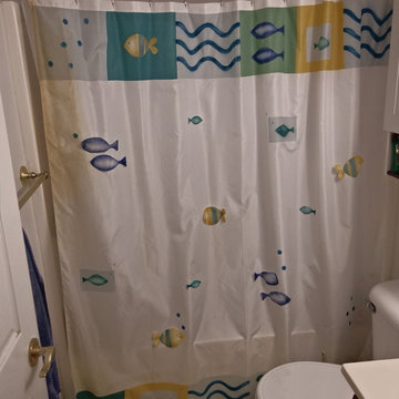
This Rotator Rod customer wanted to expand the shower space in their guest bathroom without knocking down walls or losing any of their already small bathroom space. The bathroom felt uncomfortably small with its old, straight shower rod but is not used very frequently. The customer was looking for a quick and cost effective way to save space for holiday guests.
The Rotator Rod is the original curved shower rod that rotates. It's curved design instantly gives you a luxuriously large shower like in all the major hotels. After showering, simply flip the Rotator Rod shower rod into the tub -- and out of your way -- while you use the rest of the bathroom! The Rotator Rod is the only bathroom invention that expands shower space by 33% without forfeiting any bathroom space.
In this photograph, the Rotator Rod flipped out, like a traditional curved shower rod.
This photo helps illustrate how much shower space -- and bathroom space -- you gain with the original curved shower rod that rotates! White the Rotator Rod is in the "in" position, the shower curtain hangs into and against the shower instead of on top of the toilet. The narrow towel bar is another great space-saving idea and the tropical shower curtain also helps brighten up the small space!
 Rotator Rod
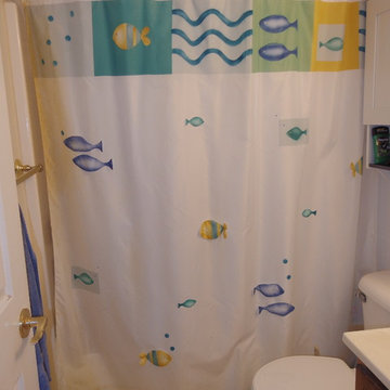
This Rotator Rod customer wanted to expand the shower space in their guest bathroom without knocking down walls or losing any of their already small bathroom space. The bathroom felt uncomfortably small with its old, straight shower rod but is not used very frequently. The customer was looking for a quick and cost effective way to save space for holiday guests.
The Rotator Rod is the original curved shower rod that rotates. It's curved design instantly gives you a luxuriously large shower like in all the major hotels. After showering, simply flip the Rotator Rod shower rod into the tub -- and out of your way -- while you use the rest of the bathroom! The Rotator Rod is the only bathroom invention that expands shower space by 33% without forfeiting any bathroom space.
In this photograph, the Rotator Rod flipped out, like a traditional curved shower rod.
This photo helps illustrate how much shower space -- and bathroom space -- you gain with the original curved shower rod that rotates! White the Rotator Rod is in the "out" position, the shower curtain in this small guest bathroom is too close to the toilet. Can you imagine your friends and family trying to use the restroom with a damp shower curtain constantly clinging to them?! The narrow towel bar is another great space-saving idea and the tropical shower curtain also helps brighten up the small space!
 Kitchen Design Concepts
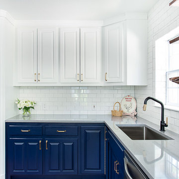
We introduce to you one of our newer services we are providing here at Kitchen Design Concepts: spaces that just need a little reviving! As of recent, we are taking on projects that are in need of minimal updating, as in, spaces that don’t need a full-on remodel. Yes, you heard right! If your space has good bones, you like the layout of your kitchen, and you just need a few cosmetic changes, then today’s feature is for you! Recently, we updated a space where we did just this! The kitchen was in need of a little love, some fresh paint, and new finishes. And if we’re being honest here, the result looks almost as if the kitchen had a full-on remodel! To learn more about this space and how we did our magic, continue reading below:
The Before and After
First, see what an impact new finishes can make! The “before” image shows a kitchen with outdated finishes such as the tile countertops, backsplash, and cabinetry finish. The “after” image, is a kitchen that looks almost as if its brand new, the image speaks for itself!
Cabinetry
With the wooden cabinetry in this kitchen already having great bones, all we needed to do was our refinishing process that involved removing door and drawer fronts, sanding, priming, and painting. The main color of the cabinetry is white (Sherwin Williams Pure White 7005) and as an accent, we applied a deep navy blue that really pops in this space (Sherwin Willaims Naval 6244). As a special design element, we incorporated a natural wooden band across the hood which is subtle but adds an element of surprise.
Countertops
The original countertops in this space were a 12×12 tile with cracks and discolored grout from all the wear and tear. To replace the countertops, we installed a clean and crisp quartz that is not only durable but easy to maintain (no grout here!). The 3cm countertops are a Cambria quartz in a grey-tone color (Carrick).
Backsplash
Keeping things simple, yet classic, we installed a 3×6 subway tile from Interceramic. The crisp white pairs well with all the other finishes of the space and really brighten the space up! To spice things up, we paired the white tile with a contrasting grout color (Cape Grey) that matches the countertop. This is a simple method to add interest to your white backsplash!
Fixtures and Fittings
For the fixtures and fittings of the kitchen, we wanted pieces that made a statement. That’s why we selected this industrial style faucet from Brizo! The faucet is a Brizo LITZE™ PULL-DOWN FAUCET WITH ARC SPOUT AND INDUSTRIAL HANDLE (63044LF-BLGL). The matte black paired with the luxe gold elements really make a statement! To match the gold elements of the faucet, we installed cabinetry hardware from Topknobs in the same gold finish. The hardware is a Channing pull TK743HB. Lastly, the large single bowl sink (who doesn’t want a large sink?!) is a great functional touch to the kitchen. The sink is a Blanco Precision 16″ R10 super single with 16″ Drainer in stainless steel (516216).
Sponsored
Columbus, OH
Free consultation for landscape design!
Peabody Landscape Group
Franklin County's Reliable Landscape Design & Contracting
 DANIELLE Interior Design & Decor
Taylor Abeel
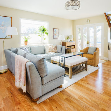
Family room - mid-sized coastal enclosed light wood floor and brown floor family room idea in San Diego with beige walls and no fireplace
Family room - mid-sized coastal enclosed light wood floor and brown floor family room idea in San Diego with beige walls and no fireplace
 Altura Architects
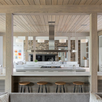
The main level at this modern farmhouse has a great room and den bookended by stone fireplaces. The kitchen is at the center of the main living spaces where we designed multiple islands for smart base cabinet storage which still allows visual connection from the kitchen to all spaces. The open living spaces serve the owner’s desire to create a comfortable environment for entertaining during large family gatherings. There are plenty of spaces where everyone can spread out whether it be eating or cooking, watching TV or just chatting by the fireplace. The main living spaces also act as a privacy buffer between the master suite and a guest suite.
Photography by Todd Crawford.
 Janna Makaeva/Cutting Edge Stencils
Owner of Nest Studio, DIY expert and blogger behind The Eagle's Nest
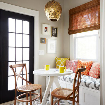
A stylish eat in kitchen space featuring a Shipibo Stenciled floor in gray and white.
 Growsgreen Landscape Design
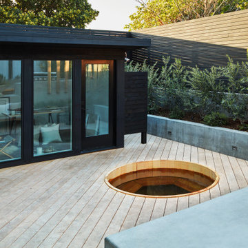
I designed the ADU to be tucked back as a vertical element to create a cozy space for the hot tub area and not take over the space vertically if it were in other spots. By having it off to the side, it grounds the garden and becomes a destination as well as recedes rather than dominate the space. It acts as an office space. Keep in mind that you can always do heated flooring if you do a concrete pad or tile as we planned for in this space. Energy efficient and also saves on space. Deck chairs can be brought closer to the hot tub at social events. Modern shed by Eric Enns of Modern Spaces and Sheds.
Sponsored
Columbus, OH

Hope Restoration & General Contracting
Columbus Design-Build, Kitchen & Bath Remodeling, Historic Renovations
 Jack Calderone
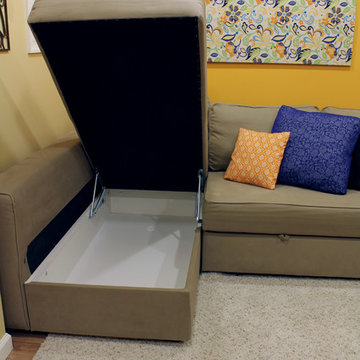
This entryway and living area are part of an adventuresome project my wife and I embarked upon to create a complete apartment in the basement of our townhouse. We designed a floor plan that creatively and efficiently used all of the 385-square-foot-space, without sacrificing beauty, comfort or function – and all without breaking the bank! To maximize our budget, we did the work ourselves and added everything from thrift store finds to DIY wall art to bring it all together.
The chaise section of the couch opens to provide extra storage.
 Bohannon Design Team
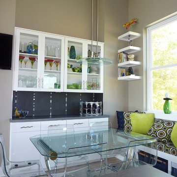
This fresh and fun dining area is filled with natural light. Wendy designed these contemporary space saving built ins and banquette for our client.
Example of a mid-sized trendy dark wood floor and gray floor kitchen/dining room combo design in Dallas with beige walls
Example of a mid-sized trendy dark wood floor and gray floor kitchen/dining room combo design in Dallas with beige walls
 Sustainable Home
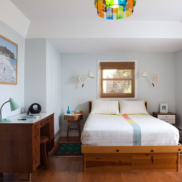
The vintage desk creates a compact space to do work. The bright colors of the lucite panel chandelier and the hand stiched Indian bedspread pick up the colors of the surfboards in the large format photo of Avila Beach. The client wanted guests to feel welcomed by a California vibe.
Photos by- Michele Lee Willson
30