
Search results for "Space saving modular" in Home Design Ideas
 Wanda Ely Architect Inc.
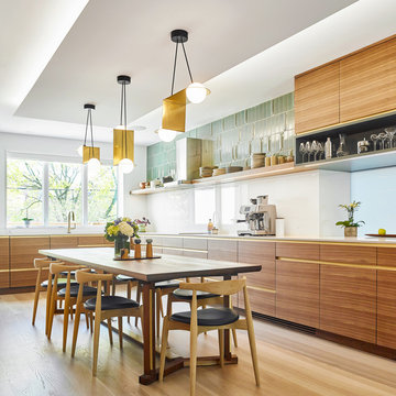
The kitchen is designed for two serious home chefs who often entertain guests for dinner parties. Merging the kitchen and dining room into a singular space was a strategic design decision to both foster their style of ‘chefs table’ entertaining, and also make the most efficient use of valuable floor space - a common consideration in most Toronto homes. The table becomes an island-like surface for additional prep space, and also as the surface upon which the meal is eventually enjoyed.
 Barbara Brown Photography
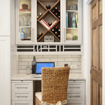
Open kitchen designed entertaining. Kitchen with view of dining and family room. Butcher block island counter top and stove vent trim, quarts stove and sink counter top,with subway tile back splash. Multi storage spaces to keep the kitchen uncluttered. Coffered ceiling with tongue and grove panels. Built in desk.
 Portland Stair Company
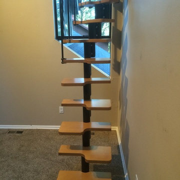
You ascend as a ladder.
Portland Stair company
Example of a small minimalist staircase design in Portland
Example of a small minimalist staircase design in Portland
Find the right local pro for your project
 Manhattan Comfort
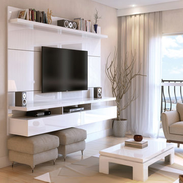
The City Theater Panel 2.2 designed by Manhattan Comfort creates a sophisticated theatrical vibe for your living room. Simply attach it to the panel using the built-in TV mount, lie back, relax and enjoy the view. The City 2.2 TV stand offers an organized space for your TV and accessories. The City 2.2 comes with built-in brackets to conveniently hang your TV and save floor space! Features 3 media shelves and 2 spacious cubbies with flip down doors. Features an overhead shelf to display photos, collectable and trophies. Choose between different modern finishes to compliment your living environment. Our unique finishes allow easy cleaning, so your TV stand always looks shiny and new. Recommended for concrete and brick walls, not dry walls. The unique paint is protected by the Microban Antibacterial Protection.
Wall Mounted Theater Center and Panel for Living Room and Bedroom use. * Upon Assembly, measures: 86.5 inches in Length, 63.42 inches in Height, 14.92 inches in Depth. * Recommended for a 80" Flat Screen TV. * Includes Brackets to Mount TV on Panel * Ample Storage Space with Media Holes for Wire Management and 1 Media Hole for TV Wire. * Features 2 Flip-Open Doors for Storage, 3 Media Shelves, and 1 Overhead Shelf for Picture Frames and Collectable Items. * Contemporary Multipurpose Theater Center. Accomodates Space for TV and Storage for Media Devices. * Home Assembly Required. All Hardware Included. Recommended for Brick and Concrete Walls.
 Thinkterior LLC
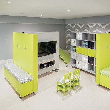
THEME The theme in this space is
defined by the design and flow of the
rest of this beautiful contemporary
home. They needed the space to blend
with the home while still providing the
youngest family members with all the
enjoyment of a dedicated play room.
FOCUS The focus of this space
changes with the configuration of
the modular pieces around the room.
One configuration could put focus
on the television for movie night,
another could create a stage for a
musical performance, while another
could close off the kids play area all
together keeping the focus on adult
conversation. Every configuration
provides focus on the activity or plans
for that moment.
STORAGE Each of the modular pieces
includes multiple storage options.
The multimedia section ensures that
all electronic equipment and remote
devices have a dedicated home no
matter where the section is placed. The
large dedicated storage unit provides
open blocks that can be filled with
baskets of toys or books while creating
the perfect wall in any configuration.
The magnetic section allows for display
of artwork or calendars while the lower
box provides closed storage and a
cushioned seating area.
GROWTH These modular pieces will
always be a useful and functional
addition to this space providing the
family with endless configuration
options ensuring that the space will
mature with the family.
SAFETY Safety is always a concern
and modular pieces require added
attention to stability and security
to ensure that they will provide the
desired flexible functionality along
with the safety of built in elements.
Custom made brackets lock the
sections together at multiple points to
keep them linked once placed and the
rolling castors under each section also
lock into place to ensure that they will
not continue to move across the floor.

 DHD Architecture and Interior Design
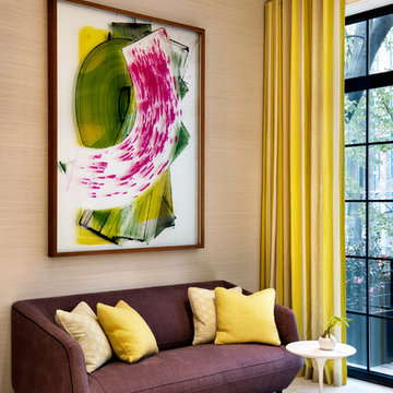
This stately townhouse underwent a full renovation from both the DHD Architecture and Interiors team to provide a young family with rooms to grow into. Spaces were updated with contemporary furnishings and refined architectural details, while still honoring the classic, formal elements of the historic home. The expansive outdoor space is framed by the dining area’s floor to ceiling windows and bold window treatment. DHD’s interiors team aimed to transform the room into an inviting and livable space for the family, designing a custom kitchen banquette and using playfully bright, warm color tones. While the master bedroom keeps to a soft, muted palette incorporating deep shades of purples, the children’s rooms are extravagantly fun, complete with fuchsia bedding and oversized Lucite table lamps.
Photography: Emily Andrews
3 Bedrooms / 6,000 Square Feet
Sponsored
Columbus, OH

Structural Remodeling
Franklin County's Heavy Timber Specialists | Best of Houzz 2020!
 Paradise Tiny Homes LLC
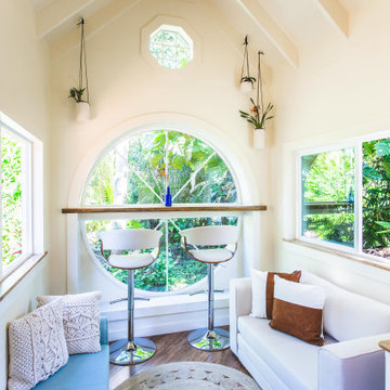
The centerpiece and focal point to this tiny home living room is the grand circular-shaped window which is actually two half-moon windows jointed together where the mango woof bartop is placed. This acts as a work and dining space. Hanging plants elevate the eye and draw it upward to the high ceilings. Colors are kept clean and bright to expand the space. The loveseat folds out into a sleeper and the ottoman/bench lifts to offer more storage. The round rug mirrors the window adding consistency. This tropical modern coastal Tiny Home is built on a trailer and is 8x24x14 feet. The blue exterior paint color is called cabana blue. The large circular window is quite the statement focal point for this how adding a ton of curb appeal. The round window is actually two round half-moon windows stuck together to form a circle. There is an indoor bar between the two windows to make the space more interactive and useful- important in a tiny home. There is also another interactive pass-through bar window on the deck leading to the kitchen making it essentially a wet bar. This window is mirrored with a second on the other side of the kitchen and the are actually repurposed french doors turned sideways. Even the front door is glass allowing for the maximum amount of light to brighten up this tiny home and make it feel spacious and open. This tiny home features a unique architectural design with curved ceiling beams and roofing, high vaulted ceilings, a tiled in shower with a skylight that points out over the tongue of the trailer saving space in the bathroom, and of course, the large bump-out circle window and awning window that provides dining spaces.
 Furnitureland South
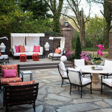
“Greensboro’s Grandest House” was recently selected as the 2013 ShowHouse presented by the Junior League of Greensboro and national media sponsor Traditional Home. Among the local and national design talent featured in this special fundraising event was design duo Patti Allen and Stephanie James of Furnitureland South, who transformed the estate’s patio into a classic, colorful and cozy space.
Built in the early 1920s, the Adamsleigh estate is more than 15,000 square feet and covers 13.5 acres that include pools, a lake, tennis courts, a stone gazebo and a five-car garage. The 30×60 patio presented a special design challenge – the space was in disrepair and sat unevenly on a downward slope. Rising to the challenge, Patti and Stephanie partnered with Outer Space Landscapes to change the elevation of the patio in order to draw attention to the focal point and inspiration of the project: a beautiful canopy sofa by Century Furniture.
The addition of 6 tons of landscaping material included Pennsylvania blue stone, pebbles, sand, cherry trees, azaleas and geraniums all blooming in the colors of the latest Sunbrella fabrics featured in the outdoor furnishings: crisp, sandy white, fuchsia and tangerine. Patti and Stephanie wanted to showcase clean and classic outdoor style with an edge of color and unexpected elements. Playful ottomans by Baker float in the space for multiple functions, adding an extra pop of color to the sophisticated setting which includes a dining table by Oscar de la Renta, organic spot tables from Phillips Collection, and daybeds and seating from Century Furniture.
Combining their passion for interior spaces with signature designs, Allen and James Designs gave this outdoor space the comfort, color and style it deserved.
Patti and Stephanie, co-founders of Allen and James Designs, are committed to inspire and influence unique spaces for home, work, play and relaxation. With over 25 years of experience and a dedication to client relationships, their infusion of international inspiration with style, color, texture and vision make Patti and Stephanie a creative duo capable of exceeding the expectations of any client’s design project. By forming over 400 connections with key manufactures such as Henredon, Century, Lillian August, Dovetail, Maitland Smith and Huntington House, Allen and James Designs can provide a broad range of options that virtually meet any need a client has to create their dream home.
 Eyoh Design
Guadalajara, San Clemente Coastal Modern Remodel
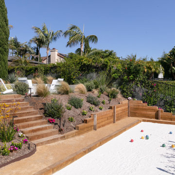
This major remodel and addition set out to take full advantage of the incredible view and create a clear connection to both the front and rear yards. The clients really wanted a pool and a home that they could enjoy with their kids and take full advantage of the beautiful climate that Southern California has to offer. The existing front yard was completely given to the street, so privatizing the front yard with new landscaping and a low wall created an opportunity to connect the home to a private front yard. Upon entering the home a large staircase blocked the view through to the ocean so removing that space blocker opened up the view and created a large great room.
Indoor outdoor living was achieved through the usage of large sliding doors which allow that seamless connection to the patio space that overlooks a new pool and view to the ocean. A large garden is rare so a new pool and bocce ball court were integrated to encourage the outdoor active lifestyle that the clients love.
The clients love to travel and wanted display shelving and wall space to display the art they had collected all around the world. A natural material palette gives a warmth and texture to the modern design that creates a feeling that the home is lived in. Though a subtle change from the street, upon entering the front door the home opens up through the layers of space to a new lease on life with this remodel.
 Plain & Posh
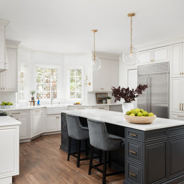
This kitchen was originally built in the early 21st century and was a very dark cherry wood with lots of fussy detailing. The designer, Stephanie Frees., removed a lot of the busy woodworking, the entire range wall and then reworked the space from there, trying to incorporate as many of the original cabinets as possible to save on cost.
Painting the perimeter Benjamin Moore Dove white and the island a custom mix navy blue added brightness and interest. The homeowners splurged on a stunning white marble for the countertops. The beautiful detail pattern on the simple subway tile adds depth and interest to the backsplash area. Removing a few wall cabinets at the bar and adding the wood shelves, as well as building in the bookcase cabinetry in the family room adds cohesive details that ties all of the rooms together. The family loves to gather around the built-in banquette that allows their large family to all dine comfortably.
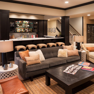
 Kyle Hunt & Partners, Incorporated
Builder & Interior Selections: Kyle Hunt & Partners, Architect: Sharratt Design Company, Landscape Design: Yardscapes, Photography by James Kruger, LandMark Photography
 Morantz Custom Cabinetry Inc.
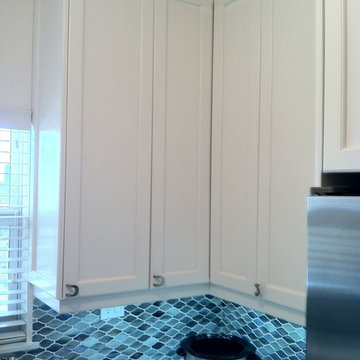
This is a corner cabinet in a small shaker kitchen. The room is 9x9. The space is a kosher kitchen in a condo in a building in Miami beach that was once a hotel. Here is how we maximized upper cabinet corner. Many cabinet shops make a blind corner to save money, but there is a lot of wasted space. Or, they make a 45degree cabinet which sticks out very far, covers valuable counter real estate and
It's difficult to keep uncluttered. In the next frame, you will see the bifold door which opens to provide excellent storage that is easy to access and takes the same space as a blind corner. Tzvi Morantz.
Sponsored
Columbus, OH

Hope Restoration & General Contracting
Columbus Design-Build, Kitchen & Bath Remodeling, Historic Renovations
 Elizabeth Beach Hacking, ShelfGenie Designer
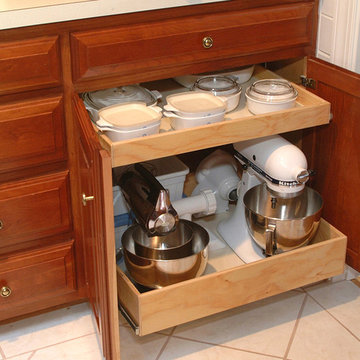
Need extra height in your cabinets? These ShelfGene Glide-Outs are double height. Notice how the top Glide-Out is only a few inches tall. You can accomplish this because the shelf slides to you - which means you don't have to force your hand in there! Hi! I'm Elizabeth Beach Hacking of ShelfGenie MA (S. Shore, N. Shore, Metro West & Cape Cod). Call me at: 646-944-8599 to find out how we can fit your kitchen with space saving Glide-Outs. Receive $100 off your custom order, just by mentioning Houzz.
 Jessica Meister
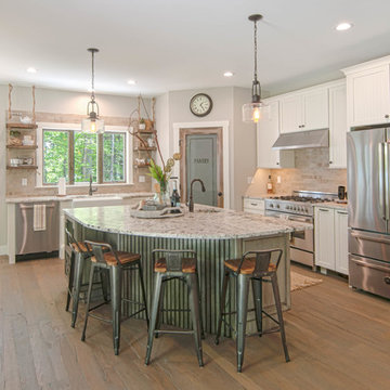
To save money, we used an existing house design our builder had worked on previously and made changes to the layout to open up the space and maximize on our incredible lake views.
The first thing we changed was to flip the kitchen layout and move the stove and hood to the side wall to make room for a window and some open shelving over a farmhouse sink. This allowed us to maximize the partial lake views on the south side of the house and saved money on additional custom cabinets.
We also removed a smaller pantry that was closing off the open space between the kitchen and living room. Instead, we turned the corner of the kitchen into a much larger, walk-in pantry that also saved us a bit on granite costs and added a ton of storage.
Granite: iCloud, leathered finish
Island Cabinets: Medallion Appaloosa finish, Brookhill door style
Perimeter Cabinets: Divinity Classic painted finish, Potters Mill door style beaded with wide cove top moldings
Floors: Castle Combe Hardwood in Corsham
Backsplash: Daltile Brickwork in Terrace
Appliances: Bertazoni 36-inch all gas oven and range and coordinating appliances
Paint Color: Revere Pewter by Benjamin Moore
Trim: White Dove by Benjamin Moore
Windows: Anderson 400 series with pine casings stained in minwax jacobean
Pendants: Austin Allen & Company
Kitchen Design: Home Again by Hancock Lumber
Builder: Island Cove Building and Development
Floating Shelves with Jute Rope custom designed and built by Rowe Station Woodworks of New Gloucester, Maine
Decor by My Sister's Garage of Windham, Maine
 TVL Creative Ltd.
[Our Clients]
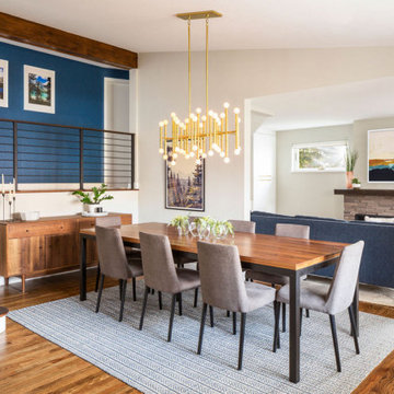
We were so excited to help these new homeowners re-envision their split-level diamond in the rough. There was so much potential in those walls, and we couldn’t wait to delve in and start transforming spaces. Our primary goal was to re-imagine the main level of the home and create an open flow between the space. So, we started by converting the existing single car garage into their living room (complete with a new fireplace) and opening up the kitchen to the rest of the level.
[Kitchen]
The original kitchen had been on the small side and cut-off from the rest of the home, but after we removed the coat closet, this kitchen opened up beautifully. Our plan was to create an open and light filled kitchen with a design that translated well to the other spaces in this home, and a layout that offered plenty of space for multiple cooks. We utilized clean white cabinets around the perimeter of the kitchen and popped the island with a spunky shade of blue. To add a real element of fun, we jazzed it up with the colorful escher tile at the backsplash and brought in accents of brass in the hardware and light fixtures to tie it all together. Through out this home we brought in warm wood accents and the kitchen was no exception, with its custom floating shelves and graceful waterfall butcher block counter at the island.
[Dining Room]
The dining room had once been the home’s living room, but we had other plans in mind. With its dramatic vaulted ceiling and new custom steel railing, this room was just screaming for a dramatic light fixture and a large table to welcome one-and-all.
[Living Room]
We converted the original garage into a lovely little living room with a cozy fireplace. There is plenty of new storage in this space (that ties in with the kitchen finishes), but the real gem is the reading nook with two of the most comfortable armchairs you’ve ever sat in.
[Master Suite]
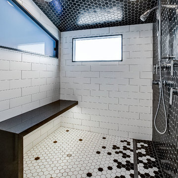
This home didn’t originally have a master suite, so we decided to convert one of the bedrooms and create a charming suite that you’d never want to leave. The master bathroom aesthetic quickly became all about the textures. With a sultry black hex on the floor and a dimensional geometric tile on the walls we set the stage for a calm space. The warm walnut vanity and touches of brass cozy up the space and relate with the feel of the rest of the home. We continued the warm wood touches into the master bedroom, but went for a rich accent wall that elevated the sophistication level and sets this space apart.
[Hall Bathroom]
The floor tile in this bathroom still makes our hearts skip a beat. We designed the rest of the space to be a clean and bright white, and really let the lovely blue of the floor tile pop. The walnut vanity cabinet (complete with hairpin legs) adds a lovely level of warmth to this bathroom, and the black and brass accents add the sophisticated touch we were looking for.
[Office]
We loved the original built-ins in this space, and knew they needed to always be a part of this house, but these 60-year-old beauties definitely needed a little help. We cleaned up the cabinets and brass hardware, switched out the formica counter for a new quartz top, and painted wall a cheery accent color to liven it up a bit. And voila! We have an office that is the envy of the neighborhood.
 Lee Edwards - residential design
Situated on the west slope of Mt. Baker Ridge, this remodel takes a contemporary view on traditional elements to maximize space, lightness and spectacular views of downtown Seattle and Puget Sound. We were approached by Vertical Construction Group to help a client bring their 1906 craftsman into the 21st century. The original home had many redeeming qualities that were unfortunately compromised by an early 2000’s renovation. This left the new homeowners with awkward and unusable spaces. After studying numerous space plans and roofline modifications, we were able to create quality interior and exterior spaces that reflected our client’s needs and design sensibilities. The resulting master suite, living space, roof deck(s) and re-invented kitchen are great examples of a successful collaboration between homeowner and design and build teams.

 Plain & Posh
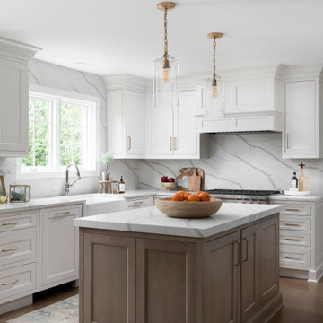
Thse clients came to me for a kitchen refresh. Keeping the existing floor plan but updating as much as possible. After explaining my thoughts, they chose to go with a much larger project. The wall to the garage wash pushed bach 12" to allow for the island to happen. This almost couldn't happen as there is a support post in the garage we had to keep. I designed the last pantry area as on 10" deep, allowing us to conceal that behind the cabinets. Then, we opend up the wall to the dining room to make the rooms one large space. The wall to the family room was also openend up, leaving the half wall to allow for the kitchen eating area. They wanted to incorporate a bar area, without it feeling like a "bar" The fabulous tall custom unit houses their wine collection and then half of the dining room buffet area holds glassware and other bar items. I helped the clients with all of the design choices.We all wanted to keep the space classic, war, functional and with mixed materials. I chose to use the same countertop material for the backsplash, to keep the space feeling as large as possible.
 The Brooklyn Studio
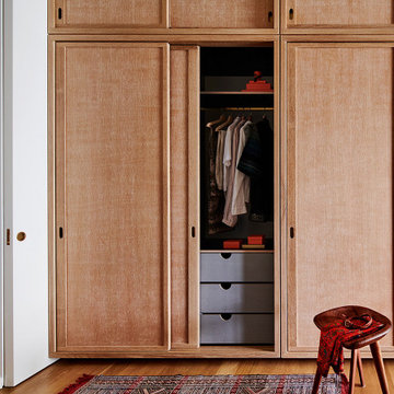
This residence was a complete gut renovation of a 4-story row house in Park Slope, and included a new rear extension and penthouse addition. The owners wished to create a warm, family home using a modern language that would act as a clean canvas to feature rich textiles and items from their world travels. As with most Brooklyn row houses, the existing house suffered from a lack of natural light and connection to exterior spaces, an issue that Principal Brendan Coburn is acutely aware of from his experience re-imagining historic structures in the New York area. The resulting architecture is designed around moments featuring natural light and views to the exterior, of both the private garden and the sky, throughout the house, and a stripped-down language of detailing and finishes allows for the concept of the modern-natural to shine.
Upon entering the home, the kitchen and dining space draw you in with views beyond through the large glazed opening at the rear of the house. An extension was built to allow for a large sunken living room that provides a family gathering space connected to the kitchen and dining room, but remains distinctly separate, with a strong visual connection to the rear garden. The open sculptural stair tower was designed to function like that of a traditional row house stair, but with a smaller footprint. By extending it up past the original roof level into the new penthouse, the stair becomes an atmospheric shaft for the spaces surrounding the core. All types of weather – sunshine, rain, lightning, can be sensed throughout the home through this unifying vertical environment. The stair space also strives to foster family communication, making open living spaces visible between floors. At the upper-most level, a free-form bench sits suspended over the stair, just by the new roof deck, which provides at-ease entertaining. Oak was used throughout the home as a unifying material element. As one travels upwards within the house, the oak finishes are bleached to further degrees as a nod to how light enters the home.
The owners worked with CWB to add their own personality to the project. The meter of a white oak and blackened steel stair screen was designed by the family to read “I love you” in Morse Code, and tile was selected throughout to reference places that hold special significance to the family. To support the owners’ comfort, the architectural design engages passive house technologies to reduce energy use, while increasing air quality within the home – a strategy which aims to respect the environment while providing a refuge from the harsh elements of urban living.
This project was published by Wendy Goodman as her Space of the Week, part of New York Magazine’s Design Hunting on The Cut.
Photography by Kevin Kunstadt
 iSpace, LLC
Builder: Tanglewood Homes |
Photographer: Lee Bruegger
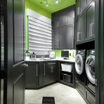
Example of a trendy porcelain tile and beige floor laundry room design in Other with shaker cabinets, black cabinets, green walls and a side-by-side washer/dryer
Example of a trendy porcelain tile and beige floor laundry room design in Other with shaker cabinets, black cabinets, green walls and a side-by-side washer/dryer
58