
Search results for "Specific impact" in Home Design Ideas
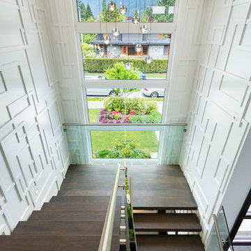
 SGDI - Sarah Gallop Design Inc.
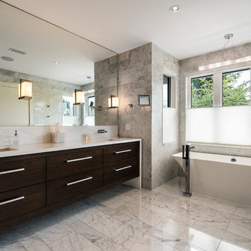
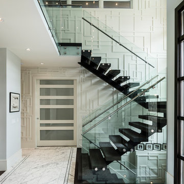
The objective was to create a warm neutral space to later customize to a specific colour palate/preference of the end user for this new construction home being built to sell. A high-end contemporary feel was requested to attract buyers in the area. An impressive kitchen that exuded high class and made an impact on guests as they entered the home, without being overbearing. The space offers an appealing open floorplan conducive to entertaining with indoor-outdoor flow.
Due to the spec nature of this house, the home had to remain appealing to the builder, while keeping a broad audience of potential buyers in mind. The challenge lay in creating a unique look, with visually interesting materials and finishes, while not being so unique that potential owners couldn’t envision making it their own. The focus on key elements elevates the look, while other features blend and offer support to these striking components. As the home was built for sale, profitability was important; materials were sourced at best value, while retaining high-end appeal. Adaptations to the home’s original design plan improve flow and usability within the kitchen-greatroom. The client desired a rich dark finish. The chosen colours tie the kitchen to the rest of the home (creating unity as combination, colours and materials, is repeated throughout).
Photos- Paul Grdina
 Pennsylvania Landscape & Nursery Association
u2014 ALE: Wayne Rain Garden
Pennsylvania Landscape & Nursery Association
u2014 ALE: Wayne Rain Garden
Terren Landscapes http://www.terrenlandscapes.com
2014 PLNA Awards for Landscape Excellence winner
Category: Residential Up to $15,000
Award Level: Gold
Project Description:
Our company was contracted by the client to provide a creative solution to an ongoing drainage problem. Their property is located within 30 feet of a local stream that collects storm water from the surrounding area. The nearby stream and high water table caused the lawn area at the side of their home to flood and to remain waterlogged for a few days after each storm. The client not only had difficulty growing plants in the existing conditions, but also had a problem with mosquitoes due to standing water.
Our goal was to design a self-contained, naturalistic rain garden that slowed storm water runoff, allowed for percolation, and promoted infiltration while permitting excess clean water to enter the nearby stream with diminished force. As designed, the rain garden allows the earth to slowly and more naturally
absorb excess storm water while filtering out toxins such as excess nitrogen and phosphorous which are frequently found in the landscape, therefore reducing the contaminants entering the stream.
A percolation test was conducted with criteria of absorbing a one-inch rainstorm within four hours without overflow. The one-inch storm calculation included an existing downspout from the home, which would be piped into the rain garden to reduce roof runoff. The first test failed due to a deep layer of high clay-content soil. Excavation continued until a layer of sandy loam was reached, the percolation test was repeated, and a successful test result was achieved. Next, the entire rain garden basin was excavated to the sandy loam layer and the soil amended with compost and sand to create a highly porous planting media.
Geotextile fabric was placed to help reduce migration of the surface stone into the soil and allow for minimal maintenance. Gravel, river stone and small boulders were carefully placed to achieve the look of a natural streambed.
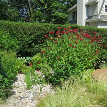
A palette of mostly native plants with a few non-invasive ornamentals were chosen for their ability to survive in extreme conditions ranging from floods to drought and were placed according to their specific preferences.
Wetland plants were chosen for the lowest portion of the rain garden as that area remains saturated for longer periods of time, with a Chionanthus virginicus as a focal point surrounded by irises and ferns at the lowest depth.
Plants tolerant of drier conditions were chosen for the upper edges of the garden. The beautiful colors of Monarda, Ligularia, Eupatorium, Solidago, Chelone, and Rudbeckia were scattered within the upper edge, while movement and softness were incorporated by use of the graceful Nassella that lines the border. Finally, winter interest was provided with a backdrop of Cornus sericea.
As built, this small rain garden creates tremendous impact by decreasing the amount of storm water runoff not only on our client's property, but also in the neighboring stream. It serves as a means of slowing the water and providing an area for infiltration back into the earth. The plants provide a habitat for birds, butterflies, and insects, working in harmony with nature and providing beautiful visual interest year-round.
Photo Credit:
Lisa C. Falls
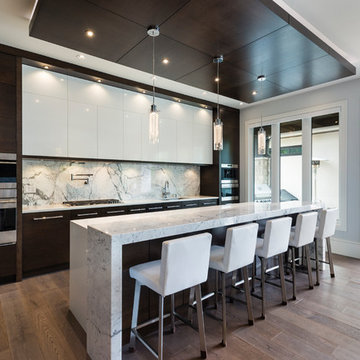 SGDI - Sarah Gallop Design Inc.
The objective was to create a warm neutral space to later customize to a specific colour palate/preference of the end user for this new construction home being built to sell. A high-end contemporary feel was requested to attract buyers in the area. An impressive kitchen that exuded high class and made an impact on guests as they entered the home, without being overbearing. The space offers an appealing open floorplan conducive to entertaining with indoor-outdoor flow.
Due to the spec nature of this house, the home had to remain appealing to the builder, while keeping a broad audience of potential buyers in mind. The challenge lay in creating a unique look, with visually interesting materials and finishes, while not being so unique that potential owners couldn’t envision making it their own. The focus on key elements elevates the look, while other features blend and offer support to these striking components. As the home was built for sale, profitability was important; materials were sourced at best value, while retaining high-end appeal. Adaptations to the home’s original design plan improve flow and usability within the kitchen-greatroom. The client desired a rich dark finish. The chosen colours tie the kitchen to the rest of the home (creating unity as combination, colours and materials, is repeated throughout).
Photos- Paul Grdina
Find the right local pro for your project
 Masterpiece Design Group
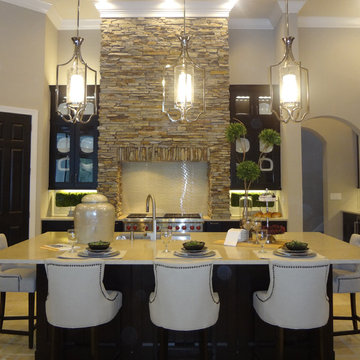
Textures ---
It’s all about the right blend of textures, as shown here; while we utilized a more rustic dry- stack stone for over the range, incorporating clean line cabinets, and glass tile backsplash kept this kitchen bright and modern feeling.
 SGDI - Sarah Gallop Design Inc.
The objective was to create a warm neutral space to later customize to a specific colour palate/preference of the end user for this new construction home being built to sell. A high-end contemporary feel was requested to attract buyers in the area. An impressive kitchen that exuded high class and made an impact on guests as they entered the home, without being overbearing. The space offers an appealing open floorplan conducive to entertaining with indoor-outdoor flow.
Due to the spec nature of this house, the home had to remain appealing to the builder, while keeping a broad audience of potential buyers in mind. The challenge lay in creating a unique look, with visually interesting materials and finishes, while not being so unique that potential owners couldn’t envision making it their own. The focus on key elements elevates the look, while other features blend and offer support to these striking components. As the home was built for sale, profitability was important; materials were sourced at best value, while retaining high-end appeal. Adaptations to the home’s original design plan improve flow and usability within the kitchen-greatroom. The client desired a rich dark finish. The chosen colours tie the kitchen to the rest of the home (creating unity as combination, colours and materials, is repeated throughout).
Photos- Paul Grdina
 SGDI - Sarah Gallop Design Inc.
The objective was to create a warm neutral space to later customize to a specific colour palate/preference of the end user for this new construction home being built to sell. A high-end contemporary feel was requested to attract buyers in the area. An impressive kitchen that exuded high class and made an impact on guests as they entered the home, without being overbearing. The space offers an appealing open floorplan conducive to entertaining with indoor-outdoor flow.
Due to the spec nature of this house, the home had to remain appealing to the builder, while keeping a broad audience of potential buyers in mind. The challenge lay in creating a unique look, with visually interesting materials and finishes, while not being so unique that potential owners couldn’t envision making it their own. The focus on key elements elevates the look, while other features blend and offer support to these striking components. As the home was built for sale, profitability was important; materials were sourced at best value, while retaining high-end appeal. Adaptations to the home’s original design plan improve flow and usability within the kitchen-greatroom. The client desired a rich dark finish. The chosen colours tie the kitchen to the rest of the home (creating unity as combination, colours and materials, is repeated throughout).
Photos- Paul Grdina
 Flooret
Part of the Modin Vinyl Plank Collection, Available Exclusively From www.Flooret.com
$3.49 / sq ft, 22.08 sq ft per box
50% WIDER. 25% LONGER. TWICE AS DURABLE
Luxury Vinyl Plank, 5 mm x 9" x 60" (1.0 mm / 40 mil wear-layer)
Lifetime Residential Warranty, 20 year Commercial Warranty
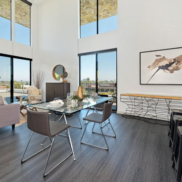
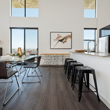
Sleek and chic. In terms of high-impact, going with a dark wire-brush pattern is a sure way to quickly define a space. Never boring, this modern pattern will set the mood immediately.
The most important specification for determining the durability of vinyl flooring is the thickness of the wear-layer. The best wear-layers are made of thick, clear virgin PVC, which covers the paper print-film that gives the floor its unique appearance. Once the wear-layer wears through, the paper is damaged and the floor will need replacement.
Most vinyl floors come with a 8-12 mil wear-layer (0.2-3 mm). The top commercial specs in the industry are higher, at 20-22 mil (0.5 mm). A select few manufacturers offer a “super” commercial spec of 28 mil (0.7 mm).
For Modin, we decided to set a new standard: 40 mil (1.0 mm) of premium virgin PVC. This allows us to offer an industry-leading 20 year Commercial Warranty (Lifetime Residential), compared to nearly all other commercial vinyl floors’ 10 year Commercial Warranty.
Beyond our superior wear-layer, we also use a patented click mechanism for superior hold, and a ceramic-bead coating.
SIZE MATTERS
Wider and longer planks create a sense of space and luxury. Most vinyl floors come in 6” or 7” widths, and 36” or 48” lengths.
For Modin, we designed our planks to be 9” wide, and 60” long. This extra large size allows our gorgeous designs to be fully expressed.
DETAILS THAT COUNT
We made sure to get all the details right. Real texture, to create the feel of wire-brushed wood. Low sheen level, to ensure a natural look that wears well over time. 4-sided bevels, to more accurately emulate the look of real planks. When added together they help create the unique look that is Modin.
DESIGNS THAT INSPIRE
We spent nearly a year just focusing on our designs, to ensure they provide the right mix of color and depth. Focusing on timeless wire-brush and European Oak styles, as well as more contemporary modern washes, our collection offers truly beautiful design that is both functional and inspiring.

Sponsored
Delaware, OH

Buckeye Basements, Inc.
Central Ohio's Basement Finishing ExpertsBest Of Houzz '13-'21
 Flooret
Part of the Modin Vinyl Plank Collection, Available Exclusively From www.Flooret.com
$3.49 / sq ft, 22.08 sq ft per box
50% WIDER. 25% LONGER. TWICE AS DURABLE
Luxury Vinyl Plank, 5 mm x 9" x 60" (1.0 mm / 40 mil wear-layer)
Lifetime Residential Warranty, 20 year Commercial Warranty
Sleek and chic. In terms of high-impact, going with a dark wire-brush pattern is a sure way to quickly define a space. Never boring, this modern pattern will set the mood immediately.
The most important specification for determining the durability of vinyl flooring is the thickness of the wear-layer. The best wear-layers are made of thick, clear virgin PVC, which covers the paper print-film that gives the floor its unique appearance. Once the wear-layer wears through, the paper is damaged and the floor will need replacement.
Most vinyl floors come with a 8-12 mil wear-layer (0.2-3 mm). The top commercial specs in the industry are higher, at 20-22 mil (0.5 mm). A select few manufacturers offer a “super” commercial spec of 28 mil (0.7 mm).
For Modin, we decided to set a new standard: 40 mil (1.0 mm) of premium virgin PVC. This allows us to offer an industry-leading 20 year Commercial Warranty (Lifetime Residential), compared to nearly all other commercial vinyl floors’ 10 year Commercial Warranty.
Beyond our superior wear-layer, we also use a patented click mechanism for superior hold, and a ceramic-bead coating.
SIZE MATTERS
Wider and longer planks create a sense of space and luxury. Most vinyl floors come in 6” or 7” widths, and 36” or 48” lengths.
For Modin, we designed our planks to be 9” wide, and 60” long. This extra large size allows our gorgeous designs to be fully expressed.
DETAILS THAT COUNT
We made sure to get all the details right. Real texture, to create the feel of wire-brushed wood. Low sheen level, to ensure a natural look that wears well over time. 4-sided bevels, to more accurately emulate the look of real planks. When added together they help create the unique look that is Modin.
DESIGNS THAT INSPIRE
We spent nearly a year just focusing on our designs, to ensure they provide the right mix of color and depth. Focusing on timeless wire-brush and European Oak styles, as well as more contemporary modern washes, our collection offers truly beautiful design that is both functional and inspiring.
 Accoya Wood
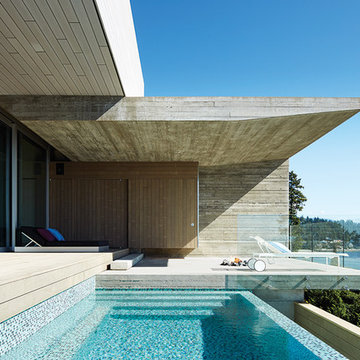
Accoya was selected as the ideal material for this breathtaking home in West Vancouver. Accoya was used for the railing, siding, fencing and soffits throughout the property. In addition, an Accoya handrail was specifically custom designed by Upper Canada Forest Products.
Design Duo Matt McLeod and Lisa Bovell of McLeod Bovell Modern houses switched between fluidity, plasticity, malleability and even volumetric design to try capture their process of space-making.
Unlike anything surrounding it, this home’s irregular shape and atypical residential building materials are more akin to modern-day South American projects that stem from their surroundings to showcase concrete’s versatility. This is why the Accoya was left in its rough state, to accentuate the minimalist and harmonious aesthetics of its natural environment.
Photo Credit: Martin Tessler
 SGDI - Sarah Gallop Design Inc.
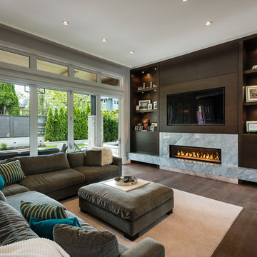
The objective was to create a warm neutral space to later customize to a specific colour palate/preference of the end user for this new construction home being built to sell. A high-end contemporary feel was requested to attract buyers in the area. An impressive kitchen that exuded high class and made an impact on guests as they entered the home, without being overbearing. The space offers an appealing open floorplan conducive to entertaining with indoor-outdoor flow.
Due to the spec nature of this house, the home had to remain appealing to the builder, while keeping a broad audience of potential buyers in mind. The challenge lay in creating a unique look, with visually interesting materials and finishes, while not being so unique that potential owners couldn’t envision making it their own. The focus on key elements elevates the look, while other features blend and offer support to these striking components. As the home was built for sale, profitability was important; materials were sourced at best value, while retaining high-end appeal. Adaptations to the home’s original design plan improve flow and usability within the kitchen-greatroom. The client desired a rich dark finish. The chosen colours tie the kitchen to the rest of the home (creating unity as combination, colours and materials, is repeated throughout).
Photos- Paul Grdina
 SGDI - Sarah Gallop Design Inc.
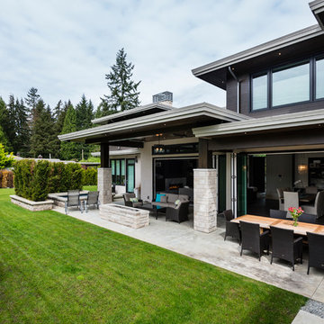
The objective was to create a warm neutral space to later customize to a specific colour palate/preference of the end user for this new construction home being built to sell. A high-end contemporary feel was requested to attract buyers in the area. An impressive kitchen that exuded high class and made an impact on guests as they entered the home, without being overbearing. The space offers an appealing open floorplan conducive to entertaining with indoor-outdoor flow.
Due to the spec nature of this house, the home had to remain appealing to the builder, while keeping a broad audience of potential buyers in mind. The challenge lay in creating a unique look, with visually interesting materials and finishes, while not being so unique that potential owners couldn’t envision making it their own. The focus on key elements elevates the look, while other features blend and offer support to these striking components. As the home was built for sale, profitability was important; materials were sourced at best value, while retaining high-end appeal. Adaptations to the home’s original design plan improve flow and usability within the kitchen-greatroom. The client desired a rich dark finish. The chosen colours tie the kitchen to the rest of the home (creating unity as combination, colours and materials, is repeated throughout).
Photos- Paul Grdina

 Change Your Bathroom©
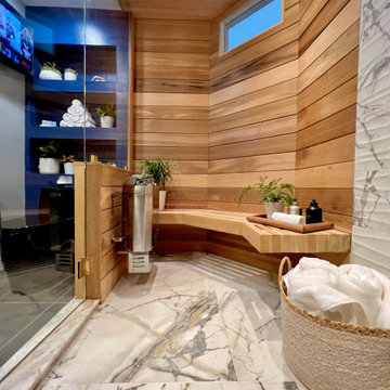
This transformation started with a builder grade bathroom and was expanded into a sauna wet room. With cedar walls and ceiling and a custom cedar bench, the sauna heats the space for a relaxing dry heat experience. The goal of this space was to create a sauna in the secondary bathroom and be as efficient as possible with the space. This bathroom transformed from a standard secondary bathroom to a ergonomic spa without impacting the functionality of the bedroom.
This project was super fun, we were working inside of a guest bedroom, to create a functional, yet expansive bathroom. We started with a standard bathroom layout and by building out into the large guest bedroom that was used as an office, we were able to create enough square footage in the bathroom without detracting from the bedroom aesthetics or function. We worked with the client on her specific requests and put all of the materials into a 3D design to visualize the new space.
Houzz Write Up: https://www.houzz.com/magazine/bathroom-of-the-week-stylish-spa-retreat-with-a-real-sauna-stsetivw-vs~168139419
The layout of the bathroom needed to change to incorporate the larger wet room/sauna. By expanding the room slightly it gave us the needed space to relocate the toilet, the vanity and the entrance to the bathroom allowing for the wet room to have the full length of the new space.
This bathroom includes a cedar sauna room that is incorporated inside of the shower, the custom cedar bench follows the curvature of the room's new layout and a window was added to allow the natural sunlight to come in from the bedroom. The aromatic properties of the cedar are delightful whether it's being used with the dry sauna heat and also when the shower is steaming the space. In the shower are matching porcelain, marble-look tiles, with architectural texture on the shower walls contrasting with the warm, smooth cedar boards. Also, by increasing the depth of the toilet wall, we were able to create useful towel storage without detracting from the room significantly.
This entire project and client was a joy to work with.
 Drummond House Plans
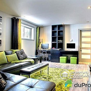
FAMILY ROOM - HOME DESIGN NO. 3713-V1 by Drummond House Plans
Having received much attention at a Home Show in which it had been built on site and in response to the many requests for the addition of a garage to plan 3713, we are pleased to present model 3713-V1. The addition of a garage that is 14’ wide and almost 28’ deep is sure to meet the needs of the many who specifically requested this convenient feature.
Outside, the addition of a garage clad in fibre cement panels with cedar siding matches the rest of the structure for a pleasing visual impact and definite curb appeal.
Inside, other than the service entrance from the garage, this plan shares the same laudable features as its predecessor such as 9’ ceilings throughout the main level, a modern fireplace in the living room, a kitchen with an 8’ x 3’ island and computer corner, nicely sized bedrooms with ample closet space that includes a walk-in in the master bedroom and a full bathroom with separate 42” x 60” shower enclosure.
We invite you to discover our contemporary collection and share your comments with us ! http://www.drummondhouseplans.com/modern-and-contemporary.html
Blueprints, CAD and PDF files available starting at only $919 (best price guarantee)
DRUMMOND HOUSE PLANS - 2014 COPYRIGHTS
 SGDI - Sarah Gallop Design Inc.
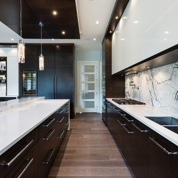
The objective was to create a warm neutral space to later customize to a specific colour palate/preference of the end user for this new construction home being built to sell. A high-end contemporary feel was requested to attract buyers in the area. An impressive kitchen that exuded high class and made an impact on guests as they entered the home, without being overbearing. The space offers an appealing open floorplan conducive to entertaining with indoor-outdoor flow.
Due to the spec nature of this house, the home had to remain appealing to the builder, while keeping a broad audience of potential buyers in mind. The challenge lay in creating a unique look, with visually interesting materials and finishes, while not being so unique that potential owners couldn’t envision making it their own. The focus on key elements elevates the look, while other features blend and offer support to these striking components. As the home was built for sale, profitability was important; materials were sourced at best value, while retaining high-end appeal. Adaptations to the home’s original design plan improve flow and usability within the kitchen-greatroom. The client desired a rich dark finish. The chosen colours tie the kitchen to the rest of the home (creating unity as combination, colours and materials, is repeated throughout).
Photos- Paul Grdina
 SGDI - Sarah Gallop Design Inc.
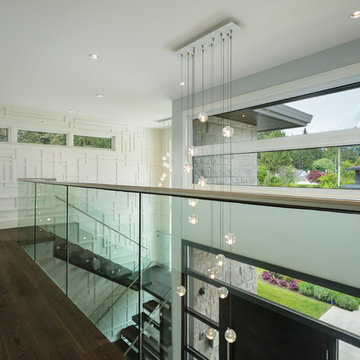
The objective was to create a warm neutral space to later customize to a specific colour palate/preference of the end user for this new construction home being built to sell. A high-end contemporary feel was requested to attract buyers in the area. An impressive kitchen that exuded high class and made an impact on guests as they entered the home, without being overbearing. The space offers an appealing open floorplan conducive to entertaining with indoor-outdoor flow.
Due to the spec nature of this house, the home had to remain appealing to the builder, while keeping a broad audience of potential buyers in mind. The challenge lay in creating a unique look, with visually interesting materials and finishes, while not being so unique that potential owners couldn’t envision making it their own. The focus on key elements elevates the look, while other features blend and offer support to these striking components. As the home was built for sale, profitability was important; materials were sourced at best value, while retaining high-end appeal. Adaptations to the home’s original design plan improve flow and usability within the kitchen-greatroom. The client desired a rich dark finish. The chosen colours tie the kitchen to the rest of the home (creating unity as combination, colours and materials, is repeated throughout).
Photos- Paul Grdina
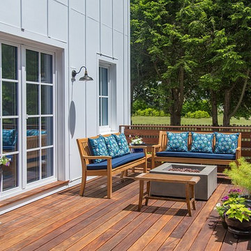
 ZeroEnergy Design
This LEED Platinum certified house reflects the homeowner's desire for an exceptionally healthy and comfortable living environment, within a traditional neighborhood.
INFILL SITE. The family, who moved from another area of Wellesley, sought out this property to be within walking distance of the high school and downtown area. An existing structure on the tight lot was removed to make way for the new home. 84% of the construction waste, from both the previous structure and the new home, was diverted from a landfill. ZED designed to preserve the existing mature trees on the perimeter of the property to minimize site impacts, and to maintain the character of the neighborhood as well as privacy on the site.
EXTERIOR EXPRESSION. The street facade of the home relates to the local New England vernacular. The rear uses contemporary language, a nod to the family’s Californian roots, to incorporate a roof deck, solar panels, outdoor living space, and the backyard swimming pool. ZED’s careful planning avoided to the need to face the garage doors towards the street, a common syndrome of a narrow lot.
THOUGHTFUL SPACE. Homes with dual entries can often result in duplicate and unused spaces. In this home, the everyday and formal entry areas are one and the same; the front and garage doors share the entry program of coat closets, mudroom storage with bench for removing your shoes, and a laundry room with generous closets for the children's sporting equipment. The entry area leads directly to the living space, encompassing the kitchen, dining and sitting area areas in an L-shaped open plan arrangement. The kitchen is placed at the south-west corner of the space to allow for a strong connection to the dining, sitting and outdoor living spaces. A fire pit on the deck satisfies the family’s desire for an open flame while a sealed gas fireplace is used indoors - ZED’s preference after omitting gas burning appliances completely from an airtight home. A small study, with a window seat, is conveniently located just off of the living space. A first floor guest bedroom includes an accessible bathroom for aging visitors and can be used as a master suite to accommodate aging in place.
HEALTHY LIVING. The client requested a home that was easy to clean and would provide a respite from seasonal allergies and common contaminants that are found in many indoor spaces. ZED selected easy to clean solid surface flooring throughout, provided ample space for cleaning supplies on each floor, and designed a mechanical system with ventilation that provides a constant supply of fresh outdoor air. ZED selected durable materials, finishes, cabinetry, and casework with low or no volatile organic compounds (VOCs) and no added urea formaldehyde.
YEAR-ROUND COMFORT. The home is super insulated and air-tight, paired with high performance triple-paned windows, to ensure it is draft-free throughout the winter (even when in front of the large windows and doors). ZED designed a right-sized heating and cooling system to pair with the thermally improved building enclosure to ensure year-round comfort. The glazing on the home maximizes passive solar gains, and facilitates cross ventilation and daylighting.
ENERGY EFFICIENT. As one of the most energy efficient houses built to date in Wellesley, the home highlights a practical solution for Massachusetts. First, the building enclosure reduces the largest energy requirement for typical houses (heating). Super-insulation, exceptional air sealing, a thermally broken wall assembly, triple pane windows, and passive solar gain combine for a sizable heating load reduction. Second, within the house only efficient systems consume energy. These include an air source heat pump for heating & cooling, a heat pump hot water heater, LED lighting, energy recovery ventilation, and high efficiency appliances. Lastly, photovoltaics provide renewable energy help offset energy consumption. The result is an 89% reduction in energy use compared to a similar brand new home built to code requirements.
RESILIENT. The home will fare well in extreme weather events. During a winter power outage, heat loss will be very slow due to the super-insulated and airtight envelope– taking multiple days to drop to 60 degrees even with no heat source. An engineered drainage system, paired with careful the detailing of the foundation, will help to keep the finished basement dry. A generator will provide full operation of the all-electric house during a power outage.
OVERALL. The home is a reflection of the family goals and an expression of their values, beautifully enabling health, comfort, safety, resilience, and utility, all while respecting the planet.
ZED - Architect & Mechanical Designer
Bevilacqua Builders Inc - Contractor
Creative Land & Water Engineering - Civil Engineering
Barbara Peterson Landscape - Landscape Design
Nest & Company - Interior Furnishings
Eric Roth Photography - Photography
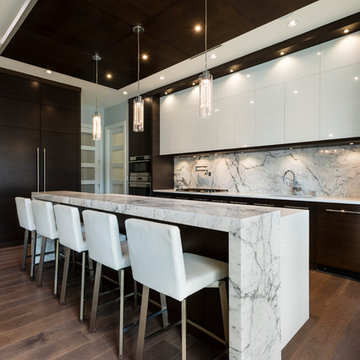 SGDI - Sarah Gallop Design Inc.
The objective was to create a warm neutral space to later customize to a specific colour palate/preference of the end user for this new construction home being built to sell. A high-end contemporary feel was requested to attract buyers in the area. An impressive kitchen that exuded high class and made an impact on guests as they entered the home, without being overbearing. The space offers an appealing open floorplan conducive to entertaining with indoor-outdoor flow.
Due to the spec nature of this house, the home had to remain appealing to the builder, while keeping a broad audience of potential buyers in mind. The challenge lay in creating a unique look, with visually interesting materials and finishes, while not being so unique that potential owners couldn’t envision making it their own. The focus on key elements elevates the look, while other features blend and offer support to these striking components. As the home was built for sale, profitability was important; materials were sourced at best value, while retaining high-end appeal. Adaptations to the home’s original design plan improve flow and usability within the kitchen-greatroom. The client desired a rich dark finish. The chosen colours tie the kitchen to the rest of the home (creating unity as combination, colours and materials, is repeated throughout).
Photos- Paul Grdina
 Pennsylvania Landscape & Nursery Association
u2014 ALE: Wayne Rain Garden
Pennsylvania Landscape & Nursery Association
u2014 ALE: Wayne Rain Garden
Terren Landscapes http://www.terrenlandscapes.com
2014 PLNA Awards for Landscape Excellence winner
Category: Residential Up to $15,000
Award Level: Gold
Project Description:
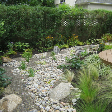
Our company was contracted by the client to provide a creative solution to an ongoing drainage problem. Their property is located within 30 feet of a local stream that collects storm water from the surrounding area. The nearby stream and high water table caused the lawn area at the side of their home to flood and to remain waterlogged for a few days after each storm. The client not only had difficulty growing plants in the existing conditions, but also had a problem with mosquitoes due to standing water.
Our goal was to design a self-contained, naturalistic rain garden that slowed storm water runoff, allowed for percolation, and promoted infiltration while permitting excess clean water to enter the nearby stream with diminished force. As designed, the rain garden allows the earth to slowly and more naturally
absorb excess storm water while filtering out toxins such as excess nitrogen and phosphorous which are frequently found in the landscape, therefore reducing the contaminants entering the stream.
A percolation test was conducted with criteria of absorbing a one-inch rainstorm within four hours without overflow. The one-inch storm calculation included an existing downspout from the home, which would be piped into the rain garden to reduce roof runoff. The first test failed due to a deep layer of high clay-content soil. Excavation continued until a layer of sandy loam was reached, the percolation test was repeated, and a successful test result was achieved. Next, the entire rain garden basin was excavated to the sandy loam layer and the soil amended with compost and sand to create a highly porous planting media.
Geotextile fabric was placed to help reduce migration of the surface stone into the soil and allow for minimal maintenance. Gravel, river stone and small boulders were carefully placed to achieve the look of a natural streambed.
A palette of mostly native plants with a few non-invasive ornamentals were chosen for their ability to survive in extreme conditions ranging from floods to drought and were placed according to their specific preferences.
Wetland plants were chosen for the lowest portion of the rain garden as that area remains saturated for longer periods of time, with a Chionanthus virginicus as a focal point surrounded by irises and ferns at the lowest depth.
Plants tolerant of drier conditions were chosen for the upper edges of the garden. The beautiful colors of Monarda, Ligularia, Eupatorium, Solidago, Chelone, and Rudbeckia were scattered within the upper edge, while movement and softness were incorporated by use of the graceful Nassella that lines the border. Finally, winter interest was provided with a backdrop of Cornus sericea.
As built, this small rain garden creates tremendous impact by decreasing the amount of storm water runoff not only on our client's property, but also in the neighboring stream. It serves as a means of slowing the water and providing an area for infiltration back into the earth. The plants provide a habitat for birds, butterflies, and insects, working in harmony with nature and providing beautiful visual interest year-round.
Photo Credit:
Lisa C. Falls
 Housetrends Magazine
Since moving into her Dublin home two and a half years ago, Nancy Sanford has been peeling off the decades—quite literally. Built in the 1980s, the home was “very well-maintained, but very little had been done to it” in terms of updating the finishes or style, Sanford says. Plush white carpet ran from wall-to-wall-to-wall, almond-colored laminate coated the kitchen cabinets and wallpaper ran rampant—even covering some ceilings.
Despite her efforts, Sanford knew it was going to take more than cosmetic editing to shake the ‘80s and make the home her own. Although she lives in the traditional-leaning Muirfield community, Sanford adores a minimalist, contemporary style—and admits to devouring design magazines “ad nauseam.”
To implement her thoroughly modern vision, Sanford turned to Brigid Norton, an interior designer and family friend, and Kristi Youles, a kitchen designer with The JAE Company. Working together, the trio created a carefully considered contemporary design that’s easy on the eyes, and the body.
In addition to improving the flow of the kitchen—by removing a V-shaped peninsula that angled out into the room—and adding appliances like a stainless steel refrigerator, Sanford’s short list of must-haves included clean, uncluttered lines and no wall cabinets over the countertops. “I’ve found as I’ve aged, I’ve gotten shorter and just don’t use the upper cabinets,” Sanford explains.
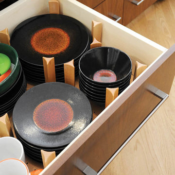
Easy-access, smooth-slide drawers with clean slab fronts were the answer—resulting in strong visual lines, an open, airy feel and enhanced ergonomics. Starting with a “needs assessment,” Youles and Norton designed the space quite literally around Nancy. By looking at factors such as her height and which items she uses most frequently, they were able to determine the optimum placement for everything from canned goods in the pantry to cutlery, pans and plates in the customized drawers, all of which helped to achieve the ultimate kitchen organization.
But there’s more to the kitchen cabinets smooth façade than clean-lined storage. Walnut drawer fronts—found on the oven and the base of the island—are book-matched, allowing the grain to continue from drawer to drawer. And even in spaces where drawers weren’t feasible, beneath the sink and in a desk area, the designers continued the look with cabinet doors crafted to resemble drawers.
The visual continuity of these lines might not be as impactful if it weren’t for the careful selection of contrasting finishes. The designers filled the space with pure, glossy white—using a specific type of quartz, White Cliff by Cambria, to accent the bold rectangular design of the island. Then, to break up the expanse of accompanying white painted drawers, walnut was selected to bring the contrasting warmth and grain of wood without red undertones. It is commonly found in modern furniture design, as well as current productions of mid-century designs like the iconic Eames Lounge Chair from Herman Miller, Youles says.
15