
Search results for "Specific impact" in Home Design Ideas
 Glow Design Group
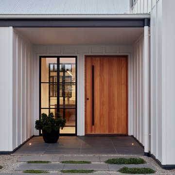
Entry to the Village house by GLOW design group. Photo by Jack Lovel
Mid-sized cottage concrete floor and white floor entryway photo in Melbourne with white walls and a light wood front door
Mid-sized cottage concrete floor and white floor entryway photo in Melbourne with white walls and a light wood front door
 SGDI - Sarah Gallop Design Inc.
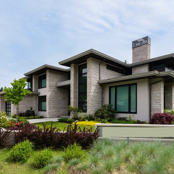
The objective was to create a warm neutral space to later customize to a specific colour palate/preference of the end user for this new construction home being built to sell. A high-end contemporary feel was requested to attract buyers in the area. An impressive kitchen that exuded high class and made an impact on guests as they entered the home, without being overbearing. The space offers an appealing open floorplan conducive to entertaining with indoor-outdoor flow.
Due to the spec nature of this house, the home had to remain appealing to the builder, while keeping a broad audience of potential buyers in mind. The challenge lay in creating a unique look, with visually interesting materials and finishes, while not being so unique that potential owners couldn’t envision making it their own. The focus on key elements elevates the look, while other features blend and offer support to these striking components. As the home was built for sale, profitability was important; materials were sourced at best value, while retaining high-end appeal. Adaptations to the home’s original design plan improve flow and usability within the kitchen-greatroom. The client desired a rich dark finish. The chosen colours tie the kitchen to the rest of the home (creating unity as combination, colours and materials, is repeated throughout).
Photos- Paul Grdina
 SGDI - Sarah Gallop Design Inc.
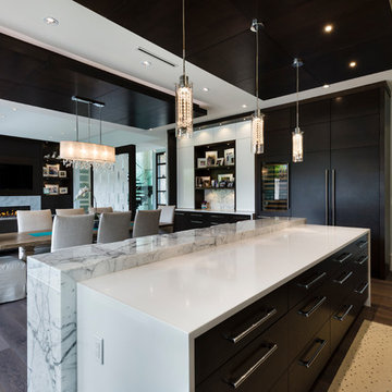
The objective was to create a warm neutral space to later customize to a specific colour palate/preference of the end user for this new construction home being built to sell. A high-end contemporary feel was requested to attract buyers in the area. An impressive kitchen that exuded high class and made an impact on guests as they entered the home, without being overbearing. The space offers an appealing open floorplan conducive to entertaining with indoor-outdoor flow.
Due to the spec nature of this house, the home had to remain appealing to the builder, while keeping a broad audience of potential buyers in mind. The challenge lay in creating a unique look, with visually interesting materials and finishes, while not being so unique that potential owners couldn’t envision making it their own. The focus on key elements elevates the look, while other features blend and offer support to these striking components. As the home was built for sale, profitability was important; materials were sourced at best value, while retaining high-end appeal. Adaptations to the home’s original design plan improve flow and usability within the kitchen-greatroom. The client desired a rich dark finish. The chosen colours tie the kitchen to the rest of the home (creating unity as combination, colours and materials, is repeated throughout).
Photos- Paul Grdina
Find the right local pro for your project
 Flooret
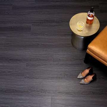
Sleek and chic. In terms of high-impact, going with a dark wire-brush pattern is a sure way to quickly define a space. Never boring, this modern pattern will set the mood immediately.
The most important specification for determining the durability of vinyl flooring is the thickness of the wear-layer. The best wear-layers are made of thick, clear virgin PVC, which covers the paper print-film that gives the floor its unique appearance. Once the wear-layer wears through, the paper is damaged and the floor will need replacement.
Most vinyl floors come with a 8-12 mil wear-layer (0.2-3 mm). The top commercial specs in the industry are higher, at 20-22 mil (0.5 mm). A select few manufacturers offer a “super” commercial spec of 28 mil (0.7 mm).
For Modin, we decided to set a new standard: 40 mil (1.0 mm) of premium virgin PVC. This allows us to offer an industry-leading 20 year Commercial Warranty (Lifetime Residential), compared to nearly all other commercial vinyl floors’ 10 year Commercial Warranty.
Beyond our superior wear-layer, we also use a patented click mechanism for superior hold, and a ceramic-bead coating.
SIZE MATTERS
Wider and longer planks create a sense of space and luxury. Most vinyl floors come in 6” or 7” widths, and 36” or 48” lengths.
For Modin, we designed our planks to be 9” wide, and 60” long. This extra large size allows our gorgeous designs to be fully expressed.
DETAILS THAT COUNT
We made sure to get all the details right. Real texture, to create the feel of wire-brushed wood. Low sheen level, to ensure a natural look that wears well over time. 4-sided bevels, to more accurately emulate the look of real planks. When added together they help create the unique look that is Modin.
DESIGNS THAT INSPIRE
We spent nearly a year just focusing on our designs, to ensure they provide the right mix of color and depth. Focusing on timeless wire-brush and European Oak styles, as well as more contemporary modern washes, our collection offers truly beautiful design that is both functional and inspiring.
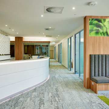
 Bloomming
CUTTING-EDGE OFFICE FRONT DESK DESIGN
We have created the ultimate room divider for your professional workspace. Say hello to Facet – the best you can find in office front desk design. Facet is a fully modular system and available in any size. The separate facets can rotate. If you leave Facet as it is, you have a neat, polished look, but if you decide to turn some of the facets around you can create a quirky, fun screen for your office. It is all up to you! Either way, you are sure to impress your clients with this chic and unique modern office divider.
CREATE AN INSPIRING WORKSPACE WITH FACET
Having a welcoming and motivational workspace is very important. Your colleagues and you spend so much time at your office, you should be able to draw inspiration from it instead of feeling drained when you enter it. Having well-made furniture and beautifully designed pieces in your workspace, will help in creating an inspiring workspace. And that is why Facet office front desk design is ideal for an office environment. The craftsmanship and attention to detail in the design, will make anyone feel motivated to be creative and do their best.
Facet works perfectly as a backdrop behind reception to separate it from the rest of the office. This creates a calm and welcoming area at reception for your clients and guests. It also gives a stylish and professional first impression of your company. Choose Facet for on trend office front desk design décor.
GO FROM POLISHED TO PLAYFUL WITH FACET
The cool thing about Facet is that you can alter the look of it. You can turn around the diamond-shaped facets to change the look of the pattern and to adjust the amount that can be seen through it. Take a look at the sixth picture on this page. Drag the vertical line over the picture from left to right and back again. See how the screen goes from neat and polished to fun and playful? You can achieve the same look with our office front desk design screen by turning the facets around or keeping them as they are.
Facet room divider screens are available in any size, we just need your desired dimensions and will start assembling it. It is also available in a range of sophisticated colors. Choose one that fits your office interior, or we can develop a specific color if you want something that we don’t have on offer. Developing your own color will cost a bit more, contact us for the possibilities. We want you to be 100% happy with your office front desk design, so feel free to phone or email us if you have any questions or special requests!
This particular office divider is installed in a trendy medical clinic in Brisbane, Australia. It divides the reception area from the working area. Interior design is done by Louise Kollosche.
Project – Office Front Desk Design
Product – Room Divider Facet
Dimensions – Width 306cm x Height 171cm
Color – White
Ceiling Attachments – Brushed Stainless Steel
Location – Brisbane, Australia
Client – Karen Campbell, BCNC
Architect – Louise Kollosche, Kodesigned
Builder – Phillip Boon, Ulex Constructions
Photography – Cathy Taylor Photography
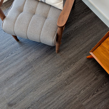 Flooret
Part of the Modin Vinyl Plank Collection, Available Exclusively From www.Flooret.com
$3.49 / sq ft, 22.08 sq ft per box
50% WIDER. 25% LONGER. TWICE AS DURABLE
Luxury Vinyl Plank, 5 mm x 9" x 60" (1.0 mm / 40 mil wear-layer)
Lifetime Residential Warranty, 20 year Commercial Warranty
Sleek and chic. In terms of high-impact, going with a dark wire-brush pattern is a sure way to quickly define a space. Never boring, this modern pattern will set the mood immediately.
The most important specification for determining the durability of vinyl flooring is the thickness of the wear-layer. The best wear-layers are made of thick, clear virgin PVC, which covers the paper print-film that gives the floor its unique appearance. Once the wear-layer wears through, the paper is damaged and the floor will need replacement.
Most vinyl floors come with a 8-12 mil wear-layer (0.2-3 mm). The top commercial specs in the industry are higher, at 20-22 mil (0.5 mm). A select few manufacturers offer a “super” commercial spec of 28 mil (0.7 mm).
For Modin, we decided to set a new standard: 40 mil (1.0 mm) of premium virgin PVC. This allows us to offer an industry-leading 20 year Commercial Warranty (Lifetime Residential), compared to nearly all other commercial vinyl floors’ 10 year Commercial Warranty.
Beyond our superior wear-layer, we also use a patented click mechanism for superior hold, and a ceramic-bead coating.
SIZE MATTERS
Wider and longer planks create a sense of space and luxury. Most vinyl floors come in 6” or 7” widths, and 36” or 48” lengths.
For Modin, we designed our planks to be 9” wide, and 60” long. This extra large size allows our gorgeous designs to be fully expressed.
DETAILS THAT COUNT
We made sure to get all the details right. Real texture, to create the feel of wire-brushed wood. Low sheen level, to ensure a natural look that wears well over time. 4-sided bevels, to more accurately emulate the look of real planks. When added together they help create the unique look that is Modin.
DESIGNS THAT INSPIRE
We spent nearly a year just focusing on our designs, to ensure they provide the right mix of color and depth. Focusing on timeless wire-brush and European Oak styles, as well as more contemporary modern washes, our collection offers truly beautiful design that is both functional and inspiring.
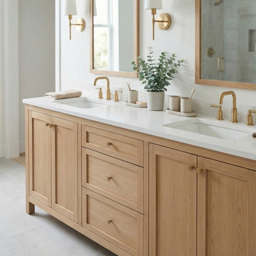
 SabaRehman Abdulrehman
Morning routines shouldn’t involve a traffic jam at the sink. The 2025 Houzz Bathroom Trends Study found that 65 percent of U.S. renovators now choose a double-sink vanity to skip the wait. Designers agree: Titan Builders dubbed 2025 “the year of bigger, storage-packed double vanities,” forecasting dual-basin setups in family, guest, and even powder baths. As KBIS 2025 launches land, prototypes for 2026 layer in spa-grade wood, built-in outlets, and planet-friendly finishes. In this guide, we rank six standout models and show you how to size, install, and enjoy a clutter-free, two-sink future.
Methodology and selection criteria
A well-planned double-sink vanity keeps busy morning routines calm and clutter-free.
Before we crowned any winners, we mapped the entire 2024–2026 double-sink (dual-basin) market. That meant parsing KBIS exhibitor releases, scraping bestseller lists from Home Depot, Lowe’s, and Wayfair, and reviewing designer short lists in trade magazines. The sweep produced 110 candidate vanities, giving us visibility into every style, price tier, and material in play.
We then scored each model against six weighted factors that continue to matter long after installers leave:
- Build quality – 25 percent.Solid hardwood frames, dovetail drawers, and furniture-grade plywood backs, never particleboard in disguise.
- Design versatility – 20 percent.Lines and finishes that suit modern, classic, or farmhouse baths without dating quickly.
- Sustainability – 15 percent.FSC-certified wood, CARB 2 compliance, and low-VOC finishes for healthier air.
- Storage efficiency – 15 percent.Deep drawers, tilt-outs, or power cubbies that corral countertop clutter.
- Value for money – 15 percent.Fair street price for the materials, stone tops, sinks, and soft-close hardware included.
- Brand reputation and warranty – 10 percent.Manufacturers with responsive support and at least a one-year parts guarantee.
- Footprint: 72 W × 22 D × 36 H in. (183 × 56 × 91 cm)
- Crated weight: 506 lb / 230 kg
- Street price: about $2,575 with marble top and basins, Q4 2025
- Footprint: 48 W × 22 D in. (122 × 56 cm)
- Height: 34.8 in. (88 cm) with backsplash
- Sliding barn door plus 3 drawers
- Pre-drilled 8-in. faucet spacing, sinks included
- Footprint: 60 W × 21 D × 34 H in. (152 × 53 × 86 cm)
- Integrated power: 4 AC + 2 USB, UL-listed
- Crated weight: 300 lb / 136 kg
- Street price: about $2,349 at Home Depot, Q4 2025
- Footprint: 72 W × 22 D in. (183 × 56 cm)
- Height: 34 in. (86 cm) plus 4 in. backsplash
- Counter: 1 in. Carrara marble, apron-front sinks included
- Hardware: oil-rubbed bronze, soft-close doors and drawers
- Footprint: 60 W × 22 D × 34 H in. (152 × 56 × 86 cm)
- Construction: solid poplar and plywood, waterfall quartz top
- Integrated slim power bank, soft-close doors and drawers
- Target price: just under $2,300 with top and basins

Sponsored
Delaware, OH

Buckeye Basements, Inc.
Central Ohio's Basement Finishing ExpertsBest Of Houzz '13-'21
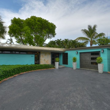
 Rose Development and Construction
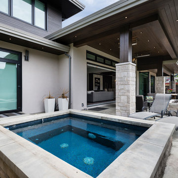
The final exterior improvement, which features a modern garage door and full impact window replacements specifically matched to the original frame color and configuration.
 SGDI - Sarah Gallop Design Inc.
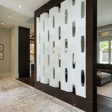
The objective was to create a warm neutral space to later customize to a specific colour palate/preference of the end user for this new construction home being built to sell. A high-end contemporary feel was requested to attract buyers in the area. An impressive kitchen that exuded high class and made an impact on guests as they entered the home, without being overbearing. The space offers an appealing open floorplan conducive to entertaining with indoor-outdoor flow.
Due to the spec nature of this house, the home had to remain appealing to the builder, while keeping a broad audience of potential buyers in mind. The challenge lay in creating a unique look, with visually interesting materials and finishes, while not being so unique that potential owners couldn’t envision making it their own. The focus on key elements elevates the look, while other features blend and offer support to these striking components. As the home was built for sale, profitability was important; materials were sourced at best value, while retaining high-end appeal. Adaptations to the home’s original design plan improve flow and usability within the kitchen-greatroom. The client desired a rich dark finish. The chosen colours tie the kitchen to the rest of the home (creating unity as combination, colours and materials, is repeated throughout).
Photos- Paul Grdina
 SGDI - Sarah Gallop Design Inc.
The objective was to create a warm neutral space to later customize to a specific colour palate/preference of the end user for this new construction home being built to sell. A high-end contemporary feel was requested to attract buyers in the area. An impressive kitchen that exuded high class and made an impact on guests as they entered the home, without being overbearing. The space offers an appealing open floorplan conducive to entertaining with indoor-outdoor flow.
Due to the spec nature of this house, the home had to remain appealing to the builder, while keeping a broad audience of potential buyers in mind. The challenge lay in creating a unique look, with visually interesting materials and finishes, while not being so unique that potential owners couldn’t envision making it their own. The focus on key elements elevates the look, while other features blend and offer support to these striking components. As the home was built for sale, profitability was important; materials were sourced at best value, while retaining high-end appeal. Adaptations to the home’s original design plan improve flow and usability within the kitchen-greatroom. The client desired a rich dark finish. The chosen colours tie the kitchen to the rest of the home (creating unity as combination, colours and materials, is repeated throughout).
Photos- Paul Grdina
 User
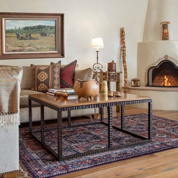
UserThis home in Las Campanas, built in the late 80’s, was a major remodel for Diva Interior Design and took more than two years to complete. The home was given a fresh, new look with new sandstone and custom wood flooring through-out the house. All of the baths were remodeled with new tile, stone and plumbing fixtures. The master bath was transformed into a luxury spa and the master closet was expanded to meet the needs of the new owners, with built cabinets for specific storage needs. Cabinets were refinished, walls were re-plastered and painted and all the lighting was redone. After completing the remodeling, Diva designed and furnished the entire house, working with the clients to design a very personalized aesthetic to blend their extensive collection of art and artifacts collected over a lifetime of travel and living in all parts of Europe and Russia. Custom pieces were designed using carving details from Nicolai Fetchin, the Russian artist and carver that lived in Taos and had a great impact on New Mexico style.
 Drummond House Plans
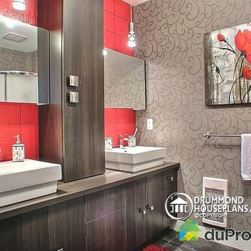
BATHROOM NO.2 - HOME DESIGN NO. 3713-V1 by Drummond House Plans
Having received much attention at a Home Show in which it had been built on site and in response to the many requests for the addition of a garage to plan 3713, we are pleased to present model 3713-V1. The addition of a garage that is 14’ wide and almost 28’ deep is sure to meet the needs of the many who specifically requested this convenient feature.
Outside, the addition of a garage clad in fibre cement panels with cedar siding matches the rest of the structure for a pleasing visual impact and definite curb appeal.
Inside, other than the service entrance from the garage, this plan shares the same laudable features as its predecessor such as 9’ ceilings throughout the main level, a modern fireplace in the living room, a kitchen with an 8’ x 3’ island and computer corner, nicely sized bedrooms with ample closet space that includes a walk-in in the master bedroom and a full bathroom with separate 42” x 60” shower enclosure.
We invite you to discover our contemporary collection and share your comments with us ! http://www.drummondhouseplans.com/modern-and-contemporary.html
Blueprints, CAD and PDF files available starting at only $919 (best price guarantee)
DRUMMOND HOUSE PLANS - 2014 COPYRIGHTS
 Stone Standard
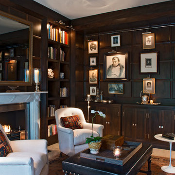
 The client provided a unique collection of framed images of Napoleon Bonaparte which were collected over several decades. The images are hung on a custom gallery rail system designed. Holes were drilled through the stems of Visual Comfort picture lights to allow the gallery rods to pass through the lights. This allowed centering of the picture lights to each rod. The bookcase lights are from the same series but they were modified to accept a one inch diameter custom rosette. The cabinet hardware, as with all of the metal finishes in the room, is polished nickel and includes Baldwin flush ring pulls, Von Morris mortise butt hinges and Brusso ball catches.
The beveled mirror and frame above the hearth is actually a Seura television mirror with Premier Glass. The television is completely undetectable when it is off and, when it is on, the picture is clear and bright. Undetectable behind the mirror is a Russound IR receiver that transfers IR signals to a cable box, DVD player, and Apple TV receiver located in the lower cabinets. The source components are connected to the television with HDMI cables. Bose wall-mounted speakers, positioned in the lower alcoves of the bookcase, are supplemented with a Sonos subwoofer placed under the sofa.
Surrounding the mantle and mirror is a three inch wide frame, identical to the frame around the gallery wall, that allows the Chesney's Edinburgh Carrara marble mantle and the steel Andover register grate to be set back from the bookcases. The mantle rests securely on a hearth stone of honed black granite which was recessed into the concrete floor. Suspended within the grate is an EcoSmart Bioethonal burner specifically designed for historic register grates. Volcanic stone was placed between the burner and the grate to conceal the front of the burner.
The bookcases, cabinets and wall paneling are fabricated from a combination of solid mahogany and mahogany plywood. Crown and base molding were eliminated from the design to minimize the impact of the library in an otherwise contemporary house. The fascia above the bookcases and mantle, as well as the fascia above the gallery wall, are single pieces of solid mahogany carefully shaved to follow the irregular contours of the drywall ceiling and eliminate the need for caulk or fillers. The same method was employed at the bottom rail of the face frame to allow it to follow the slight undulations of the concrete floor. Eloy Estrada built the wood components and installed them along with all of the other components in the room.
The two adjustable height Galerie des Lamps floor lamps on either side of the mantle are from the Grasshopper series. The Visual Comfort Dorchester Pharmacy floor lamps, on either side of the sofa, plug into a recessed Lew electrical floor box that was recessd into the floor under the sofa. The room originally had a chandelier and recessed lights all of which were all removed. The Lutron light switches, in matte Midnight, allow for independent dimming of the bookcase and picture lights. Within three of the bookcase alcoves are Littlight gooseneck lamps used to highlight various artifacts. The outlets for these lamps, and their transformers, are concealed under a removable wood panel at the back of the alcove. The cords for the display lamps cleanly pass through a Mockett grommet.
The layout of the room and gallery rail system were designed by Leland Stone.
 David Lund Design
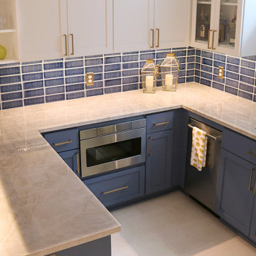
Like most kitchens, this basement bar kitchenette was all about the materials. Making the right selections is critical to a project's success, especially a kitchen, so how does that work?
To make sure we get the selections right, we follow a plan, or more accurately, a selection sequence, that ensures we make the right selections in the right order.
For kitchens and bathrooms, material selections follow a simple cadence - one, two, three. First countertops and tile, then plumbing fixtures, and, finally, hardware and accessories.
So, why countertops and tile first?
Simple, they have the greatest impact on the look, color, and mood of a room, and, much like the foundation, they are critical to the stability of a house. Selecting the right countertops (and corresponding tile) is critical to the aesthetic stability of a space.
In our three step process, the selection of countertops is intricately linked to the selection of tile. Yes, we begin with the countertops, but tile selection is only a half step behind. The two materials work in tandem given their proximity to each other ( often they actually touch each other).
Another consideration is selection flexibility. There are literally hundreds of thousands of tile options, making it easier to find the right tile to match the chosen countertops than it is to find countertops to match a specific tile.
To the cool and creamy quartzite countertop, we added a dark, rich counterpart - walnut. The elevated countertop, the one where friends sit and upon which drinks are set is warm and welcoming.
 Change Your Bathroom©
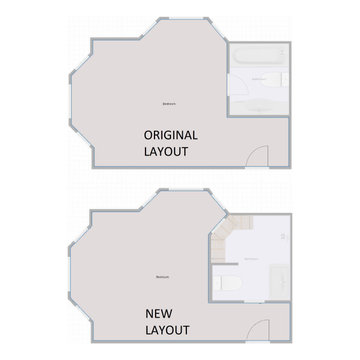
This transformation started with a builder grade bathroom and was expanded into a sauna wet room. With cedar walls and ceiling and a custom cedar bench, the sauna heats the space for a relaxing dry heat experience. The goal of this space was to create a sauna in the secondary bathroom and be as efficient as possible with the space. This bathroom transformed from a standard secondary bathroom to a ergonomic spa without impacting the functionality of the bedroom.
This project was super fun, we were working inside of a guest bedroom, to create a functional, yet expansive bathroom. We started with a standard bathroom layout and by building out into the large guest bedroom that was used as an office, we were able to create enough square footage in the bathroom without detracting from the bedroom aesthetics or function. We worked with the client on her specific requests and put all of the materials into a 3D design to visualize the new space.
Houzz Write Up: https://www.houzz.com/magazine/bathroom-of-the-week-stylish-spa-retreat-with-a-real-sauna-stsetivw-vs~168139419
The layout of the bathroom needed to change to incorporate the larger wet room/sauna. By expanding the room slightly it gave us the needed space to relocate the toilet, the vanity and the entrance to the bathroom allowing for the wet room to have the full length of the new space.
This bathroom includes a cedar sauna room that is incorporated inside of the shower, the custom cedar bench follows the curvature of the room's new layout and a window was added to allow the natural sunlight to come in from the bedroom. The aromatic properties of the cedar are delightful whether it's being used with the dry sauna heat and also when the shower is steaming the space. In the shower are matching porcelain, marble-look tiles, with architectural texture on the shower walls contrasting with the warm, smooth cedar boards. Also, by increasing the depth of the toilet wall, we were able to create useful towel storage without detracting from the room significantly.
This entire project and client was a joy to work with.
 Drummond House Plans
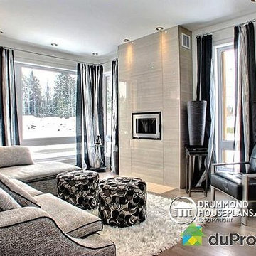
LIVING ROOM - HOME DESIGN NO. 3713-V1 by Drummond House Plans
Having received much attention at a Home Show in which it had been built on site and in response to the many requests for the addition of a garage to plan 3713, we are pleased to present model 3713-V1. The addition of a garage that is 14’ wide and almost 28’ deep is sure to meet the needs of the many who specifically requested this convenient feature.
Outside, the addition of a garage clad in fibre cement panels with cedar siding matches the rest of the structure for a pleasing visual impact and definite curb appeal.
Inside, other than the service entrance from the garage, this plan shares the same laudable features as its predecessor such as 9’ ceilings throughout the main level, a modern fireplace in the living room, a kitchen with an 8’ x 3’ island and computer corner, nicely sized bedrooms with ample closet space that includes a walk-in in the master bedroom and a full bathroom with separate 42” x 60” shower enclosure.
We invite you to discover our contemporary collection and share your comments with us ! http://www.drummondhouseplans.com/modern-and-contemporary.html
Blueprints, CAD and PDF files available starting at only $919 (best price guarantee)
DRUMMOND HOUSE PLANS - 2015 COPYRIGHTS
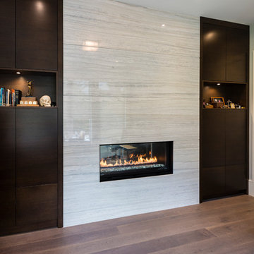 SGDI - Sarah Gallop Design Inc.
The objective was to create a warm neutral space to later customize to a specific colour palate/preference of the end user for this new construction home being built to sell. A high-end contemporary feel was requested to attract buyers in the area. An impressive kitchen that exuded high class and made an impact on guests as they entered the home, without being overbearing. The space offers an appealing open floorplan conducive to entertaining with indoor-outdoor flow.
Due to the spec nature of this house, the home had to remain appealing to the builder, while keeping a broad audience of potential buyers in mind. The challenge lay in creating a unique look, with visually interesting materials and finishes, while not being so unique that potential owners couldn’t envision making it their own. The focus on key elements elevates the look, while other features blend and offer support to these striking components. As the home was built for sale, profitability was important; materials were sourced at best value, while retaining high-end appeal. Adaptations to the home’s original design plan improve flow and usability within the kitchen-greatroom. The client desired a rich dark finish. The chosen colours tie the kitchen to the rest of the home (creating unity as combination, colours and materials, is repeated throughout).
Photos- Paul Grdina
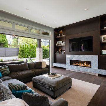 SGDI - Sarah Gallop Design Inc.
The objective was to create a warm neutral space to later customize to a specific colour palate/preference of the end user for this new construction home being built to sell. A high-end contemporary feel was requested to attract buyers in the area. An impressive kitchen that exuded high class and made an impact on guests as they entered the home, without being overbearing. The space offers an appealing open floorplan conducive to entertaining with indoor-outdoor flow.
Due to the spec nature of this house, the home had to remain appealing to the builder, while keeping a broad audience of potential buyers in mind. The challenge lay in creating a unique look, with visually interesting materials and finishes, while not being so unique that potential owners couldn’t envision making it their own. The focus on key elements elevates the look, while other features blend and offer support to these striking components. As the home was built for sale, profitability was important; materials were sourced at best value, while retaining high-end appeal. Adaptations to the home’s original design plan improve flow and usability within the kitchen-greatroom. The client desired a rich dark finish. The chosen colours tie the kitchen to the rest of the home (creating unity as combination, colours and materials, is repeated throughout).
Photos- Paul Grdina
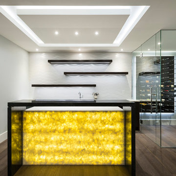 SGDI - Sarah Gallop Design Inc.
The objective was to create a warm neutral space to later customize to a specific colour palate/preference of the end user for this new construction home being built to sell. A high-end contemporary feel was requested to attract buyers in the area. An impressive kitchen that exuded high class and made an impact on guests as they entered the home, without being overbearing. The space offers an appealing open floorplan conducive to entertaining with indoor-outdoor flow.
Due to the spec nature of this house, the home had to remain appealing to the builder, while keeping a broad audience of potential buyers in mind. The challenge lay in creating a unique look, with visually interesting materials and finishes, while not being so unique that potential owners couldn’t envision making it their own. The focus on key elements elevates the look, while other features blend and offer support to these striking components. As the home was built for sale, profitability was important; materials were sourced at best value, while retaining high-end appeal. Adaptations to the home’s original design plan improve flow and usability within the kitchen-greatroom. The client desired a rich dark finish. The chosen colours tie the kitchen to the rest of the home (creating unity as combination, colours and materials, is repeated throughout).
Photos- Paul Grdina
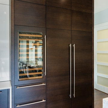 SGDI - Sarah Gallop Design Inc.
The objective was to create a warm neutral space to later customize to a specific colour palate/preference of the end user for this new construction home being built to sell. A high-end contemporary feel was requested to attract buyers in the area. An impressive kitchen that exuded high class and made an impact on guests as they entered the home, without being overbearing. The space offers an appealing open floorplan conducive to entertaining with indoor-outdoor flow.
Due to the spec nature of this house, the home had to remain appealing to the builder, while keeping a broad audience of potential buyers in mind. The challenge lay in creating a unique look, with visually interesting materials and finishes, while not being so unique that potential owners couldn’t envision making it their own. The focus on key elements elevates the look, while other features blend and offer support to these striking components. As the home was built for sale, profitability was important; materials were sourced at best value, while retaining high-end appeal. Adaptations to the home’s original design plan improve flow and usability within the kitchen-greatroom. The client desired a rich dark finish. The chosen colours tie the kitchen to the rest of the home (creating unity as combination, colours and materials, is repeated throughout).
Photos- Paul Grdina
16