
Search results for "Specific impact" in Home Design Ideas
 Housetrends Magazine
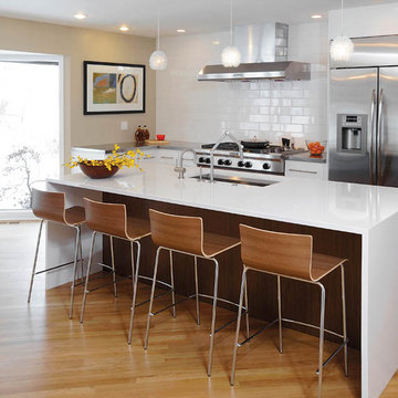
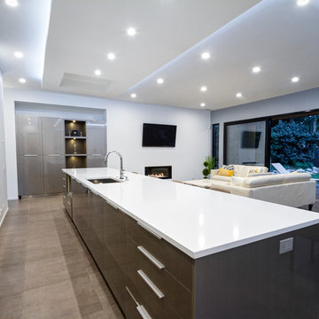
Since moving into her Dublin home two and a half years ago, Nancy Sanford has been peeling off the decades—quite literally. Built in the 1980s, the home was “very well-maintained, but very little had been done to it” in terms of updating the finishes or style, Sanford says. Plush white carpet ran from wall-to-wall-to-wall, almond-colored laminate coated the kitchen cabinets and wallpaper ran rampant—even covering some ceilings.
Despite her efforts, Sanford knew it was going to take more than cosmetic editing to shake the ‘80s and make the home her own. Although she lives in the traditional-leaning Muirfield community, Sanford adores a minimalist, contemporary style—and admits to devouring design magazines “ad nauseam.”
To implement her thoroughly modern vision, Sanford turned to Brigid Norton, an interior designer and family friend, and Kristi Youles, a kitchen designer with The JAE Company. Working together, the trio created a carefully considered contemporary design that’s easy on the eyes, and the body.
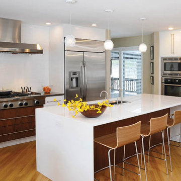
In addition to improving the flow of the kitchen—by removing a V-shaped peninsula that angled out into the room—and adding appliances like a stainless steel refrigerator, Sanford’s short list of must-haves included clean, uncluttered lines and no wall cabinets over the countertops. “I’ve found as I’ve aged, I’ve gotten shorter and just don’t use the upper cabinets,” Sanford explains.
Easy-access, smooth-slide drawers with clean slab fronts were the answer—resulting in strong visual lines, an open, airy feel and enhanced ergonomics. Starting with a “needs assessment,” Youles and Norton designed the space quite literally around Nancy. By looking at factors such as her height and which items she uses most frequently, they were able to determine the optimum placement for everything from canned goods in the pantry to cutlery, pans and plates in the customized drawers, all of which helped to achieve the ultimate kitchen organization.
But there’s more to the kitchen cabinets smooth façade than clean-lined storage. Walnut drawer fronts—found on the oven and the base of the island—are book-matched, allowing the grain to continue from drawer to drawer. And even in spaces where drawers weren’t feasible, beneath the sink and in a desk area, the designers continued the look with cabinet doors crafted to resemble drawers.
The visual continuity of these lines might not be as impactful if it weren’t for the careful selection of contrasting finishes. The designers filled the space with pure, glossy white—using a specific type of quartz, White Cliff by Cambria, to accent the bold rectangular design of the island. Then, to break up the expanse of accompanying white painted drawers, walnut was selected to bring the contrasting warmth and grain of wood without red undertones. It is commonly found in modern furniture design, as well as current productions of mid-century designs like the iconic Eames Lounge Chair from Herman Miller, Youles says.
 Bloomming
CUTTING-EDGE OFFICE FRONT DESK DESIGN
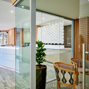
We have created the ultimate room divider for your professional workspace. Say hello to Facet – the best you can find in office front desk design. Facet is a fully modular system and available in any size. The separate facets can rotate. If you leave Facet as it is, you have a neat, polished look, but if you decide to turn some of the facets around you can create a quirky, fun screen for your office. It is all up to you! Either way, you are sure to impress your clients with this chic and unique modern office divider.
CREATE AN INSPIRING WORKSPACE WITH FACET
Having a welcoming and motivational workspace is very important. Your colleagues and you spend so much time at your office, you should be able to draw inspiration from it instead of feeling drained when you enter it. Having well-made furniture and beautifully designed pieces in your workspace, will help in creating an inspiring workspace. And that is why Facet office front desk design is ideal for an office environment. The craftsmanship and attention to detail in the design, will make anyone feel motivated to be creative and do their best.
Facet works perfectly as a backdrop behind reception to separate it from the rest of the office. This creates a calm and welcoming area at reception for your clients and guests. It also gives a stylish and professional first impression of your company. Choose Facet for on trend office front desk design décor.
GO FROM POLISHED TO PLAYFUL WITH FACET
The cool thing about Facet is that you can alter the look of it. You can turn around the diamond-shaped facets to change the look of the pattern and to adjust the amount that can be seen through it. Take a look at the sixth picture on this page. Drag the vertical line over the picture from left to right and back again. See how the screen goes from neat and polished to fun and playful? You can achieve the same look with our office front desk design screen by turning the facets around or keeping them as they are.
Facet room divider screens are available in any size, we just need your desired dimensions and will start assembling it. It is also available in a range of sophisticated colors. Choose one that fits your office interior, or we can develop a specific color if you want something that we don’t have on offer. Developing your own color will cost a bit more, contact us for the possibilities. We want you to be 100% happy with your office front desk design, so feel free to phone or email us if you have any questions or special requests!
This particular office divider is installed in a trendy medical clinic in Brisbane, Australia. It divides the reception area from the working area. Interior design is done by Louise Kollosche.
Project – Office Front Desk Design
Product – Room Divider Facet
Dimensions – Width 306cm x Height 171cm
Color – White
Ceiling Attachments – Brushed Stainless Steel
Location – Brisbane, Australia
Client – Karen Campbell, BCNC
Architect – Louise Kollosche, Kodesigned
Builder – Phillip Boon, Ulex Constructions
Photography – Cathy Taylor Photography
 SGDI - Sarah Gallop Design Inc.
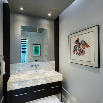
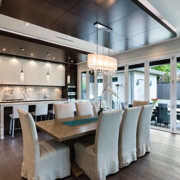
The objective was to create a warm neutral space to later customize to a specific colour palate/preference of the end user for this new construction home being built to sell. A high-end contemporary feel was requested to attract buyers in the area. An impressive kitchen that exuded high class and made an impact on guests as they entered the home, without being overbearing. The space offers an appealing open floorplan conducive to entertaining with indoor-outdoor flow.
Due to the spec nature of this house, the home had to remain appealing to the builder, while keeping a broad audience of potential buyers in mind. The challenge lay in creating a unique look, with visually interesting materials and finishes, while not being so unique that potential owners couldn’t envision making it their own. The focus on key elements elevates the look, while other features blend and offer support to these striking components. As the home was built for sale, profitability was important; materials were sourced at best value, while retaining high-end appeal. Adaptations to the home’s original design plan improve flow and usability within the kitchen-greatroom. The client desired a rich dark finish. The chosen colours tie the kitchen to the rest of the home (creating unity as combination, colours and materials, is repeated throughout).
Photos- Paul Grdina
Find the right local pro for your project
 Smarthaus + Wexler/Kollman P.C., Ltd.
This custom, high-performance home was designed and built to a LEED for Homes Platinum rating, the highest rating given to homes when certified by the US Green Building Council. The house has been laid out to take maximum advantage of both passive and active solar energy, natural ventilation, low impact and recyclable materials, high efficiency lighting and controls, in a structure that is very simple and economical to build. The envelope of the house is designed to require a minimum amount of energy in order to live and use the home based on the lifestyle of the occupants. The home will have an innovative HVAC system that has been recently developed by engineers from the University of Illinois which uses considerably less energy than a conventional heating and cooling system and provides extremely high indoor air quality utilizing a CERV (conditioned energy recovery ventilation system) combined with a cost effective installation.
Lawrence Smith
 SGDI - Sarah Gallop Design Inc.
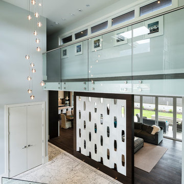
The objective was to create a warm neutral space to later customize to a specific colour palate/preference of the end user for this new construction home being built to sell. A high-end contemporary feel was requested to attract buyers in the area. An impressive kitchen that exuded high class and made an impact on guests as they entered the home, without being overbearing. The space offers an appealing open floorplan conducive to entertaining with indoor-outdoor flow.
Due to the spec nature of this house, the home had to remain appealing to the builder, while keeping a broad audience of potential buyers in mind. The challenge lay in creating a unique look, with visually interesting materials and finishes, while not being so unique that potential owners couldn’t envision making it their own. The focus on key elements elevates the look, while other features blend and offer support to these striking components. As the home was built for sale, profitability was important; materials were sourced at best value, while retaining high-end appeal. Adaptations to the home’s original design plan improve flow and usability within the kitchen-greatroom. The client desired a rich dark finish. The chosen colours tie the kitchen to the rest of the home (creating unity as combination, colours and materials, is repeated throughout).
Photos- Paul Grdina
 SGDI - Sarah Gallop Design Inc.
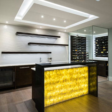
The objective was to create a warm neutral space to later customize to a specific colour palate/preference of the end user for this new construction home being built to sell. A high-end contemporary feel was requested to attract buyers in the area. An impressive kitchen that exuded high class and made an impact on guests as they entered the home, without being overbearing. The space offers an appealing open floorplan conducive to entertaining with indoor-outdoor flow.
Due to the spec nature of this house, the home had to remain appealing to the builder, while keeping a broad audience of potential buyers in mind. The challenge lay in creating a unique look, with visually interesting materials and finishes, while not being so unique that potential owners couldn’t envision making it their own. The focus on key elements elevates the look, while other features blend and offer support to these striking components. As the home was built for sale, profitability was important; materials were sourced at best value, while retaining high-end appeal. Adaptations to the home’s original design plan improve flow and usability within the kitchen-greatroom. The client desired a rich dark finish. The chosen colours tie the kitchen to the rest of the home (creating unity as combination, colours and materials, is repeated throughout).
Photos- Paul Grdina
 SGDI - Sarah Gallop Design Inc.
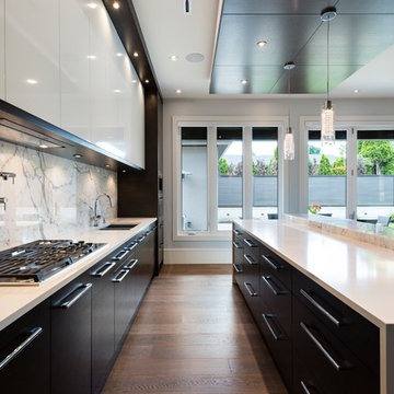
The objective was to create a warm neutral space to later customize to a specific colour palate/preference of the end user for this new construction home being built to sell. A high-end contemporary feel was requested to attract buyers in the area. An impressive kitchen that exuded high class and made an impact on guests as they entered the home, without being overbearing. The space offers an appealing open floorplan conducive to entertaining with indoor-outdoor flow.
Due to the spec nature of this house, the home had to remain appealing to the builder, while keeping a broad audience of potential buyers in mind. The challenge lay in creating a unique look, with visually interesting materials and finishes, while not being so unique that potential owners couldn’t envision making it their own. The focus on key elements elevates the look, while other features blend and offer support to these striking components. As the home was built for sale, profitability was important; materials were sourced at best value, while retaining high-end appeal. Adaptations to the home’s original design plan improve flow and usability within the kitchen-greatroom. The client desired a rich dark finish. The chosen colours tie the kitchen to the rest of the home (creating unity as combination, colours and materials, is repeated throughout).
Photos- Paul Grdina

Sponsored
Delaware, OH

Buckeye Basements, Inc.
Central Ohio's Basement Finishing ExpertsBest Of Houzz '13-'21
 SGDI - Sarah Gallop Design Inc.
The objective was to create a warm neutral space to later customize to a specific colour palate/preference of the end user for this new construction home being built to sell. A high-end contemporary feel was requested to attract buyers in the area. An impressive kitchen that exuded high class and made an impact on guests as they entered the home, without being overbearing. The space offers an appealing open floorplan conducive to entertaining with indoor-outdoor flow.
Due to the spec nature of this house, the home had to remain appealing to the builder, while keeping a broad audience of potential buyers in mind. The challenge lay in creating a unique look, with visually interesting materials and finishes, while not being so unique that potential owners couldn’t envision making it their own. The focus on key elements elevates the look, while other features blend and offer support to these striking components. As the home was built for sale, profitability was important; materials were sourced at best value, while retaining high-end appeal. Adaptations to the home’s original design plan improve flow and usability within the kitchen-greatroom. The client desired a rich dark finish. The chosen colours tie the kitchen to the rest of the home (creating unity as combination, colours and materials, is repeated throughout).
Photos- Paul Grdina
 Housetrends Magazine
Since moving into her Dublin home two and a half years ago, Nancy Sanford has been peeling off the decades—quite literally. Built in the 1980s, the home was “very well-maintained, but very little had been done to it” in terms of updating the finishes or style, Sanford says. Plush white carpet ran from wall-to-wall-to-wall, almond-colored laminate coated the kitchen cabinets and wallpaper ran rampant—even covering some ceilings.
Despite her efforts, Sanford knew it was going to take more than cosmetic editing to shake the ‘80s and make the home her own. Although she lives in the traditional-leaning Muirfield community, Sanford adores a minimalist, contemporary style—and admits to devouring design magazines “ad nauseam.”
To implement her thoroughly modern vision, Sanford turned to Brigid Norton, an interior designer and family friend, and Kristi Youles, a kitchen designer with The JAE Company. Working together, the trio created a carefully considered contemporary design that’s easy on the eyes, and the body.
In addition to improving the flow of the kitchen—by removing a V-shaped peninsula that angled out into the room—and adding appliances like a stainless steel refrigerator, Sanford’s short list of must-haves included clean, uncluttered lines and no wall cabinets over the countertops. “I’ve found as I’ve aged, I’ve gotten shorter and just don’t use the upper cabinets,” Sanford explains.
Easy-access, smooth-slide drawers with clean slab fronts were the answer—resulting in strong visual lines, an open, airy feel and enhanced ergonomics. Starting with a “needs assessment,” Youles and Norton designed the space quite literally around Nancy. By looking at factors such as her height and which items she uses most frequently, they were able to determine the optimum placement for everything from canned goods in the pantry to cutlery, pans and plates in the customized drawers, all of which helped to achieve the ultimate kitchen organization.
But there’s more to the kitchen cabinets smooth façade than clean-lined storage. Walnut drawer fronts—found on the oven and the base of the island—are book-matched, allowing the grain to continue from drawer to drawer. And even in spaces where drawers weren’t feasible, beneath the sink and in a desk area, the designers continued the look with cabinet doors crafted to resemble drawers.
The visual continuity of these lines might not be as impactful if it weren’t for the careful selection of contrasting finishes. The designers filled the space with pure, glossy white—using a specific type of quartz, White Cliff by Cambria, to accent the bold rectangular design of the island. Then, to break up the expanse of accompanying white painted drawers, walnut was selected to bring the contrasting warmth and grain of wood without red undertones. It is commonly found in modern furniture design, as well as current productions of mid-century designs like the iconic Eames Lounge Chair from Herman Miller, Youles says.
 User
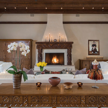
UserThis home in Las Campanas, built in the late 80’s, was a major remodel for Diva Interior Design and took more than two years to complete. The home was given a fresh, new look with new sandstone and custom wood flooring through-out the house. All of the baths were remodeled with new tile, stone and plumbing fixtures. The master bath was transformed into a luxury spa and the master closet was expanded to meet the needs of the new owners, with built cabinets for specific storage needs. Cabinets were refinished, walls were re-plastered and painted and all the lighting was redone. After completing the remodeling, Diva designed and furnished the entire house, working with the clients to design a very personalized aesthetic to blend their extensive collection of art and artifacts collected over a lifetime of travel and living in all parts of Europe and Russia. Custom pieces were designed using carving details from Nicolai Fetchin, the Russian artist and carver that lived in Taos and had a great impact on New Mexico style.
 SGDI - Sarah Gallop Design Inc.
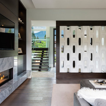
The objective was to create a warm neutral space to later customize to a specific colour palate/preference of the end user for this new construction home being built to sell. A high-end contemporary feel was requested to attract buyers in the area. An impressive kitchen that exuded high class and made an impact on guests as they entered the home, without being overbearing. The space offers an appealing open floorplan conducive to entertaining with indoor-outdoor flow.
Due to the spec nature of this house, the home had to remain appealing to the builder, while keeping a broad audience of potential buyers in mind. The challenge lay in creating a unique look, with visually interesting materials and finishes, while not being so unique that potential owners couldn’t envision making it their own. The focus on key elements elevates the look, while other features blend and offer support to these striking components. As the home was built for sale, profitability was important; materials were sourced at best value, while retaining high-end appeal. Adaptations to the home’s original design plan improve flow and usability within the kitchen-greatroom. The client desired a rich dark finish. The chosen colours tie the kitchen to the rest of the home (creating unity as combination, colours and materials, is repeated throughout).
Photos- Paul Grdina
 User
UserEvery design decision for this Caribbean beach residence was guided by the desire to maximize the views of the property’s breathtaking natural surroundings.
To connect the spaces and reveal the views from every vantage point, the team reconfigured the layout to create vistas, and installed window film to reduce solar heat gain. These modifications increased efficiencies, reused 90% of the interior envelope and did not impact the exterior structure of the building. In addition to providing incredible views, opening up the plan allows cross ventilation, maximizing the use of ocean breezes to cool the interior. The result is an effortless flow and maximization of space.
Throughout the interior, dark materials express the concept of respite in the shade, and emphasize the sweeping views of the Caribbean Sea. Millwork crafted by local artisans from local materials establishes hierarchy – providing a clear understanding of the layout – and filters light to create privacy and drama. Screens help define the spaces and create suspense.
Varying screen opacities serve specific functions: nearly opaque screens build suspense, translucent screens provide privacy, and reflective screens – as seen in the kitchen ceiling – create mystery in the core where light and views
are challenged. Referencing the seaside location, the baseboards create a sense of being in a deep shallow. The 16” tall baseboards create a pool effect, engaging the walls with Cradle to Cradle certified Mosa tile flooring. The irregular height also conceals power and data cabling. The resulting space is a contemporary oasis that offers a high-level of comfort and functionality.
Anne Rausch Photography
 GIOVANI GLASS
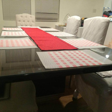
"Do You Need a Beautiful Glass Table Top? GLASS TABLE TOP NYC is The Right Solution Popularly used to protect the surface of any desk or table to prevent from scratching, glass table top elegantly covers any wood surface, giving a beautiful smooth touch. we are the largest supplier of GLASS TABLE TOPs in new york & new jersey. At our manufacturing plants in brooklyn New york we customize your Table Top by Custom Cut, Tempering, Polishing and Beveling. We have the largest collection of Glass to choose from.
The glass tabletops can be used in many different ways, however most famous is to use glass to protect surface of the table, desk and coffee table. While used as the cover on wood surface, generally thinner glass like 1/4" is been used. Edges of glass will generally get polished to smooth this out and avoid possibility of the injury from sharp edges. While glass is used as the wood surface cover there’s not any need for tempering any glass. You have come at a right place for the replacement table top. You can custom cut, polish, bevel, Custom glass table top. or temper the glass. It ensures perfectly customized fit, and gives you an opportunity to choose glass type that you want, as well as gets this delivered in the record time for home or office needs. No matter whether it is for the glass table replacement, the glass table cover or table design of own, steps of customizing the glass table top will be the same. The glass table tops come custom manufactured that means all pieces are at your specification."
 Metro Interiors
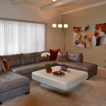
Before, this family room had a lot of “little things” distracting the eye. We simplified things and created a fresh new design that’s decluttered, cohesive, and designed with the family in mind.
The room had a lot of wood detail – on the ceiling and the wall. We had it painted an off-white, Benjamin Moore’s “Cake Batter” to lighten things up and make the room feel more spacious. The ceiling beams are seen has harsh, oppressive energy in Feng Shui, so it was especially important to minimize their impact. We did that by matching the ceiling color with the beam color. On the rest of the walls we went with another neutral, a soft earth tone to add some warmth.
For the windows we chose new treatments that are still vertical, because that function was important to the family, but with a unique texture on the blinds to add some interest.
The new carpet is nice and soft, and we found a new leather sectional to anchor the room. It’s larger, and has an updated style, with a configuration that wraps around. It was specifically chosen for its durability as well, since this is where the family spends a lot of time – it can withstand spills and regular wear and tear. A contemporary and practical floor lamp was also added alongside the sofa for additional lighting.
The cocktail table is a great piece the homeowners previously had, which we encouraged them to keep. We knew it would work well in the design, and look brand new with the finished room’s color scheme and furniture. It was in such nice shape, and also durable; plus the size worked in perfect balance paired with the sofa in the room. We changed things up on the surface with creative accents that coordinate with the design and add some new life.
With the grouping of art on the wall before, it was hard to know what to focus on. The new piece of artwork, which we found on a trip to an art gallery, is sculptural and fun. The size also helps to create balance in the room, and its contemporary look and color effortlessly complete the room.
 User
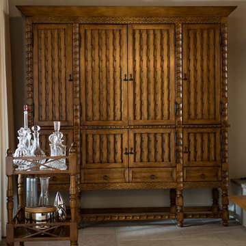
UserThis home in Las Campanas, built in the late 80’s, was a major remodel for Diva Interior Design and took more than two years to complete. The home was given a fresh, new look with new sandstone and custom wood flooring through-out the house. All of the baths were remodeled with new tile, stone and plumbing fixtures. The master bath was transformed into a luxury spa and the master closet was expanded to meet the needs of the new owners, with built cabinets for specific storage needs. Cabinets were refinished, walls were re-plastered and painted and all the lighting was redone. After completing the remodeling, Diva designed and furnished the entire house, working with the clients to design a very personalized aesthetic to blend their extensive collection of art and artifacts collected over a lifetime of travel and living in all parts of Europe and Russia. Custom pieces were designed using carving details from Nicolai Fetchin, the Russian artist and carver that lived in Taos and had a great impact on New Mexico style.
 United Porte Inc
Your front door is your best defender. It protects you, your family, and your most valuable personal belongings from theft and damage.
Furthermore, VDom Doors insulate your home from extreme weather conditions, as well as unwanted animals, insects, and dust from entering. Due to its versatility, metal-plastic entrance doors are perfect for both private houses and shops, offices, and administrative buildings.
Our doors have several superior features:
Metal-plastic doors – lighter (around 120lbs for a door unit) than iron and steel doors, but no less strong and reliable! Scratch and impact resistance, ease of care, and environmentally friendly.
In principle, we use only all-welded reinforcement, 1/10" thick (!) for the entrance doors. Such reinforcement is a necessary condition for real burglary resistance.
We use an aluminum threshold with a special thermal insert that cuts off the cold from the room. We also complete with an amplifier to securely fix the bottom of the door and cut off the cold.
1 1/4" thick HPL sandwich panel, consists of foamed extruded Styrofoam, with rigid PVC overlays high pressure on both sides.
Energy savings double-glazed safety windows.
Stiffening Ribs: These non-visible details add to our door's security.
Quality insulation serves to reduce unwanted external noise, as well as protect against extreme heat, and severe cold.
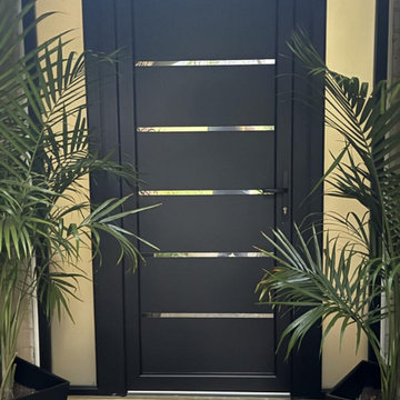
Introducing the Manux collection of modern metal-plastic doors in a sleek Black Matte color. These doors are expertly crafted from durable metal-plastic material and feature European roller hinges and an aluminum threshold, ensuring both longevity and security for your home.
The exterior design boasts five No Glass panels, creating a modern and stylish look that will enhance the curb appeal of any home. The Black Matte color provides a sophisticated and contemporary feel, perfect for those who want to make a bold statement with their entrance.
The interior design also features five No Glass panels, creating a cohesive and stylish look throughout the home.
With the Manux collection, you can have both style and function. These modern front doors are perfect for homeowners who want to elevate the look of their home's exterior while also ensuring their property's safety and security. And with our easy ordering process and user-friendly website, you can have your new door delivered right to your doorstep.
Upgrade your home's curb appeal and make a statement with the Manux collection of modern metal-plastic doors in sleek Black Matte. Order yours today and experience the perfect combination of style and function.
Specifications:
Model - 8415 Manux
Core - Metal-plastic
Color - Black Matte
Door thickness - 2 1/3"
Door slab width — 31"
Frame thickness - 2 3/4"
Swing direction - Inswing only, right or left
Hardware included:
Metal-plastic 2 3/4" thick frame - dimensions of the door with frame is 34" x 82".
Aluminum threshold.
European roller hinges (3D adjustment).
Handle set with lock Vorne and cylinder (5 keys included).
Sealants - 2 rows of seals protect against blowing.


 Field Architecture
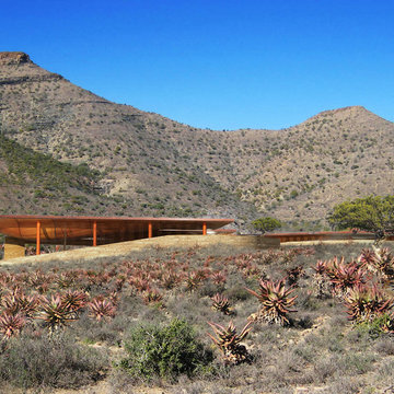
The architecture of the Karoo Wilderness Center is a result of a thorough process of investigation into the origins and character of the Karoo landscape and the flora and fauna that result from its particular qualities. The tectonic events that produced the specific topography of the site, trajectories of water runoff, wind movement, soil composition, and effects of plant and animal species on the landscape have converged to create the conditions of the site chosen for the Center. Each of these factors have in turn been subject to the impact of human inhabitation and vernacular building practices, amplified in recent generations to a harmful degree by shortsighted agricultural strategies and their associated effects of overgrazing, water over-manipulation and erosion.
Fundamental to the architectural response is the premise that the human species is an inherent part of the conditions that comprise and affect the landscape. The significance of the Center, enhanced and informed by the activities that occur within and as an extension of it, lies in the co-dependence of the Center and the ecosystem as inherently bound entities. The architecture of the Center is intended to make evident the natural processes of the Karoo and establish a new precedent for building within and through an ecosystem defined by dynamic flux.
 Flooret
Part of the Modin Vinyl Plank Collection, Available Exclusively From www.Flooret.com
$3.49 / sq ft, 22.08 sq ft per box
50% WIDER. 25% LONGER. TWICE AS DURABLE
Luxury Vinyl Plank, 5 mm x 9" x 60" (1.0 mm / 40 mil wear-layer)
Lifetime Residential Warranty, 20 year Commercial Warranty
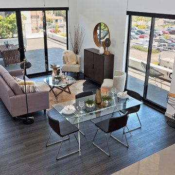
Sleek and chic. In terms of high-impact, going with a dark wire-brush pattern is a sure way to quickly define a space. Never boring, this modern pattern will set the mood immediately.
The most important specification for determining the durability of vinyl flooring is the thickness of the wear-layer. The best wear-layers are made of thick, clear virgin PVC, which covers the paper print-film that gives the floor its unique appearance. Once the wear-layer wears through, the paper is damaged and the floor will need replacement.
Most vinyl floors come with a 8-12 mil wear-layer (0.2-3 mm). The top commercial specs in the industry are higher, at 20-22 mil (0.5 mm). A select few manufacturers offer a “super” commercial spec of 28 mil (0.7 mm).
For Modin, we decided to set a new standard: 40 mil (1.0 mm) of premium virgin PVC. This allows us to offer an industry-leading 20 year Commercial Warranty (Lifetime Residential), compared to nearly all other commercial vinyl floors’ 10 year Commercial Warranty.
Beyond our superior wear-layer, we also use a patented click mechanism for superior hold, and a ceramic-bead coating.
SIZE MATTERS
Wider and longer planks create a sense of space and luxury. Most vinyl floors come in 6” or 7” widths, and 36” or 48” lengths.
For Modin, we designed our planks to be 9” wide, and 60” long. This extra large size allows our gorgeous designs to be fully expressed.
DETAILS THAT COUNT
We made sure to get all the details right. Real texture, to create the feel of wire-brushed wood. Low sheen level, to ensure a natural look that wears well over time. 4-sided bevels, to more accurately emulate the look of real planks. When added together they help create the unique look that is Modin.
DESIGNS THAT INSPIRE
We spent nearly a year just focusing on our designs, to ensure they provide the right mix of color and depth. Focusing on timeless wire-brush and European Oak styles, as well as more contemporary modern washes, our collection offers truly beautiful design that is both functional and inspiring.
17