
Search results for "Specific stage" in Home Design Ideas

 Lauren Jacobsen Design
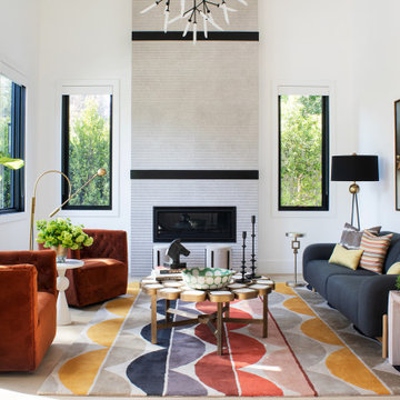
The Living Room is one of the first rooms seen right off the entry so the interior design demanded something unique. Strong color was added and curves in furnishings and patterns to offset all the rectangular shapes so the room is softer. This room sets the stage for what is to come throughout. Not your typical "only neutral colors" seen in most Modern Farmhouse architecture, they are there, but there is a layer of specifically selected colors added. The color palette moves you through the entire house utilizing different percentages of selected colors so each room feels like its own design but holds together with all other rooms.
 Bynum Design
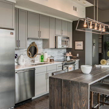
Example of a transitional galley dark wood floor kitchen design in Nashville with an undermount sink, shaker cabinets, gray cabinets, wood countertops, white backsplash, stainless steel appliances and an island
Find the right local pro for your project
 Carley M Design Studio
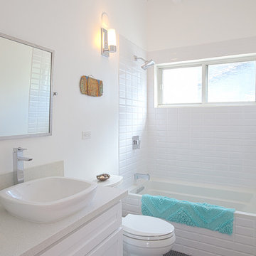
Rehab of mid century modern house, featuring elegant white bathroom with unique black hexagonal floor tiling.Design, Construction Management and Staging by Carley Montgomery. Eric Charles Photography
 Isla Homes
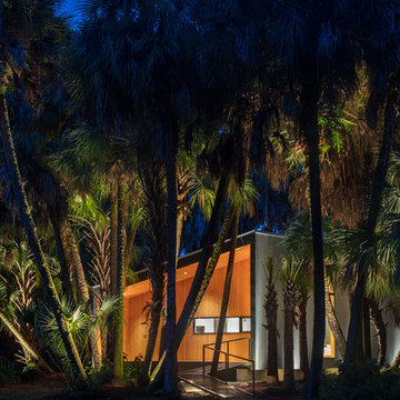
I built this on my property for my aging father who has some health issues. Handicap accessibility was a factor in design. His dream has always been to try retire to a cabin in the woods. This is what he got.
It is a 1 bedroom, 1 bath with a great room. It is 600 sqft of AC space. The footprint is 40' x 26' overall.
The site was the former home of our pig pen. I only had to take 1 tree to make this work and I planted 3 in its place. The axis is set from root ball to root ball. The rear center is aligned with mean sunset and is visible across a wetland.
The goal was to make the home feel like it was floating in the palms. The geometry had to simple and I didn't want it feeling heavy on the land so I cantilevered the structure beyond exposed foundation walls. My barn is nearby and it features old 1950's "S" corrugated metal panel walls. I used the same panel profile for my siding. I ran it vertical to match the barn, but also to balance the length of the structure and stretch the high point into the canopy, visually. The wood is all Southern Yellow Pine. This material came from clearing at the Babcock Ranch Development site. I ran it through the structure, end to end and horizontally, to create a seamless feel and to stretch the space. It worked. It feels MUCH bigger than it is.
I milled the material to specific sizes in specific areas to create precise alignments. Floor starters align with base. Wall tops adjoin ceiling starters to create the illusion of a seamless board. All light fixtures, HVAC supports, cabinets, switches, outlets, are set specifically to wood joints. The front and rear porch wood has three different milling profiles so the hypotenuse on the ceilings, align with the walls, and yield an aligned deck board below. Yes, I over did it. It is spectacular in its detailing. That's the benefit of small spaces.
Concrete counters and IKEA cabinets round out the conversation.
For those who cannot live tiny, I offer the Tiny-ish House.
Photos by Ryan Gamma
Staging by iStage Homes
Design Assistance Jimmy Thornton
 Sandra Hambley
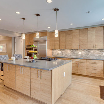
With a listing price of just under $4 million, this gorgeous row home located near the Convention Center in Washington DC required a very specific look to attract the proper buyer.
The home has been completely remodeled in a modern style with bamboo flooring and bamboo kitchen cabinetry so the furnishings and decor needed to be complimentary. Typically, transitional furnishings are used in staging across the board, however, for this property we wanted an urban loft, industrial look with heavy elements of reclaimed wood to create a city, hotel luxe style. As with all DC properties, this one is long and narrow but is completely open concept on each level, so continuity in color and design selections was critical.
The row home had several open areas that needed a defined purpose such as a reception area, which includes a full bar service area, pub tables, stools and several comfortable seating areas for additional entertaining. It also boasts an in law suite with kitchen and living quarters as well as 3 outdoor spaces, which are highly sought after in the District.
 User
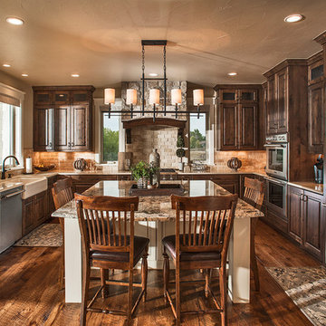
UserElegant u-shaped dark wood floor and brown floor eat-in kitchen photo in Denver with a farmhouse sink, raised-panel cabinets, dark wood cabinets, beige backsplash, stone tile backsplash, stainless steel appliances and an island

 Suhr Interior Design
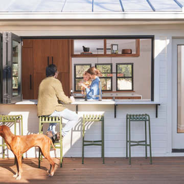
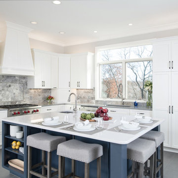
Open kitchen design with white shaker cabinets and a large custom Island. 12x24 gray tile ties in with the stone backsplash and quartz countertop. The navy/blue island anchors the kitchen and adds some needed color.
- Shot by Matt Kocourek
 Designed To Appeal
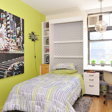
Inspiration for a mid-sized eclectic boy medium tone wood floor kids' room remodel in New York with green walls
 Arcadia Communities
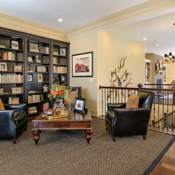
The Kavanagh Model Home by Arcadia at Willowsford in Ashburn, VA: 4 Bedrooms, 4 Bath [Photo Credit: Maxine Schnitzer Photography 2014]
Example of a classic home design design in DC Metro
Example of a classic home design design in DC Metro
 Nar Design Group
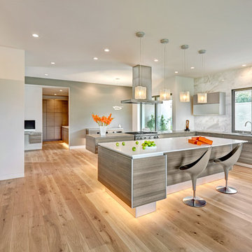
This gorgeous European Poggenpohl Kitchen is the culinary center of this new modern home for a young urban family. The homeowners had an extensive list of objectives for their new kitchen. It needed to accommodate formal and non-formal entertaining of guests and family, intentional storage for a variety of items with specific requirements, and use durable and easy to maintain products while achieving a sleek contemporary look that would be a stage and backdrop for their glorious artwork collection.
Solution: A large central island acts as a gathering place within the great room space. The tall cabinetry items such as the ovens and refrigeration are grouped on the wall to keep the rest of the kitchen very light and open. Luxury Poggenpohl cabinetry and Caesarstone countertops were selected for their supreme durability and easy maintenance.
Warm European oak flooring is contrasted by the gray textured Poggenpohl cabinetry flattered by full width linear Poggenphol hardware. The tall aluminum toe kick on the island is lit from underneath to give it a light and airy luxurious feeling. To further accent the illuminated toe, the surface to the left of the range top is fully suspended 18” above the finished floor.
A large amount of steel and engineering work was needed to achieve the floating of the large Poggenpohl cabinet at the end of the peninsula. The conversation is always, “how did they do that?”
Photo Credit: Fred Donham of PhotographerLink
 The Artisans Group, Inc.
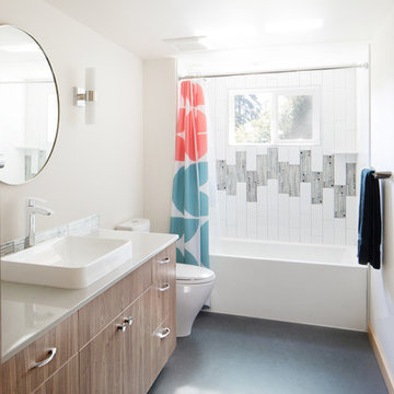
Winner of the 2018 Tour of Homes Best Remodel, this whole house re-design of a 1963 Bennet & Johnson mid-century raised ranch home is a beautiful example of the magic we can weave through the application of more sustainable modern design principles to existing spaces.
We worked closely with our client on extensive updates to create a modernized MCM gem.
Extensive alterations include:
- a completely redesigned floor plan to promote a more intuitive flow throughout
- vaulted the ceilings over the great room to create an amazing entrance and feeling of inspired openness
- redesigned entry and driveway to be more inviting and welcoming as well as to experientially set the mid-century modern stage
- the removal of a visually disruptive load bearing central wall and chimney system that formerly partitioned the homes’ entry, dining, kitchen and living rooms from each other
- added clerestory windows above the new kitchen to accentuate the new vaulted ceiling line and create a greater visual continuation of indoor to outdoor space
- drastically increased the access to natural light by increasing window sizes and opening up the floor plan
- placed natural wood elements throughout to provide a calming palette and cohesive Pacific Northwest feel
- incorporated Universal Design principles to make the home Aging In Place ready with wide hallways and accessible spaces, including single-floor living if needed
- moved and completely redesigned the stairway to work for the home’s occupants and be a part of the cohesive design aesthetic
- mixed custom tile layouts with more traditional tiling to create fun and playful visual experiences
- custom designed and sourced MCM specific elements such as the entry screen, cabinetry and lighting
- development of the downstairs for potential future use by an assisted living caretaker
- energy efficiency upgrades seamlessly woven in with much improved insulation, ductless mini splits and solar gain
 TM GRADY BUILDERS
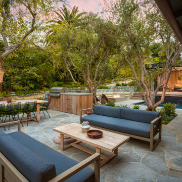
Trendy backyard stone patio photo in Orange County with a roof extension and a bbq area
 The Artisans Group, Inc.
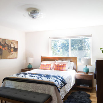
Winner of the 2018 Tour of Homes Best Remodel, this whole house re-design of a 1963 Bennet & Johnson mid-century raised ranch home is a beautiful example of the magic we can weave through the application of more sustainable modern design principles to existing spaces.
We worked closely with our client on extensive updates to create a modernized MCM gem.
Extensive alterations include:
- a completely redesigned floor plan to promote a more intuitive flow throughout
- vaulted the ceilings over the great room to create an amazing entrance and feeling of inspired openness
- redesigned entry and driveway to be more inviting and welcoming as well as to experientially set the mid-century modern stage
- the removal of a visually disruptive load bearing central wall and chimney system that formerly partitioned the homes’ entry, dining, kitchen and living rooms from each other
- added clerestory windows above the new kitchen to accentuate the new vaulted ceiling line and create a greater visual continuation of indoor to outdoor space
- drastically increased the access to natural light by increasing window sizes and opening up the floor plan
- placed natural wood elements throughout to provide a calming palette and cohesive Pacific Northwest feel
- incorporated Universal Design principles to make the home Aging In Place ready with wide hallways and accessible spaces, including single-floor living if needed
- moved and completely redesigned the stairway to work for the home’s occupants and be a part of the cohesive design aesthetic
- mixed custom tile layouts with more traditional tiling to create fun and playful visual experiences
- custom designed and sourced MCM specific elements such as the entry screen, cabinetry and lighting
- development of the downstairs for potential future use by an assisted living caretaker
- energy efficiency upgrades seamlessly woven in with much improved insulation, ductless mini splits and solar gain
 Simply Unique Finds & Design
Saunders Real Estate Photography
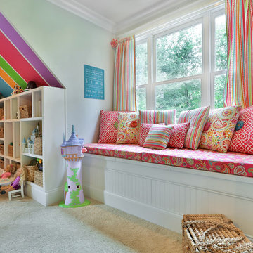
Example of a classic girl carpeted kids' room design in Atlanta
Example of a classic girl carpeted kids' room design in Atlanta
 Klopf Architecture
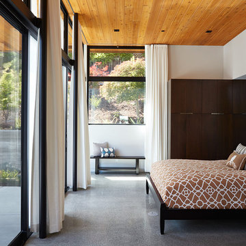
Klopf Architecture, Arterra Landscape Architects and Henry Calvert of Calvert Ventures Designed and built a new warm, modern, Eichler-inspired, open, indoor-outdoor home on a deeper-than-usual San Mateo Highlands property where an original Eichler house had burned to the ground.
The owners wanted multi-generational living and larger spaces than the original home offered, but all parties agreed that the house should respect the neighborhood and blend in stylistically with the other Eichlers. At first the Klopf team considered re-using what little was left of the original home and expanding on it. But after discussions with the owner and builder, all parties agreed that the last few remaining elements of the house were not practical to re-use, so Klopf Architecture designed a new home that pushes the Eichler approach in new directions.
One disadvantage of Eichler production homes is that the house designs were not optimized for each specific lot. A new custom home offered the team a chance to start over. In this case, a longer house that opens up sideways to the south fit the lot better than the original square-ish house that used to open to the rear (west). Accordingly, the Klopf team designed an L-shaped “bar” house with a large glass wall with large sliding glass doors that faces sideways instead of to the rear like a typical Eichler. This glass wall opens to a pool and landscaped yard designed by Arterra Landscape Architects.
Driving by the house, one might assume at first glance it is an Eichler because of the horizontality, the overhanging flat roof eaves, the dark gray vertical siding, and orange solid panel front door, but the house is designed for the 21st Century and is not meant to be a “Likeler.” You won't see any posts and beams in this home. Instead, the ceiling decking is a western red cedar that covers over all the beams. Like Eichlers, this cedar runs continuously from inside to out, enhancing the indoor / outdoor feeling of the house, but unlike Eichlers it conceals a cavity for lighting, wiring, and insulation. Ceilings are higher, rooms are larger and more open, the master bathroom is light-filled and more generous, with a separate tub and shower and a separate toilet compartment, and there is plenty of storage. The garage even easily fits two of today's vehicles with room to spare.
A massive 49-foot by 12-foot wall of glass and the continuity of materials from inside to outside enhance the inside-outside living concept, so the owners and their guests can flow freely from house to pool deck to BBQ to pool and back.
During construction in the rough framing stage, Klopf thought the front of the house appeared too tall even though the house had looked right in the design renderings (probably because the house is uphill from the street). So Klopf Architecture paid the framer to change the roofline from how we had designed it to be lower along the front, allowing the home to blend in better with the neighborhood. One project goal was for people driving up the street to pass the home without immediately noticing there is an "imposter" on this lot, and making that change was essential to achieve that goal.
This 2,606 square foot, 3 bedroom, 3 bathroom Eichler-inspired new house is located in San Mateo in the heart of the Silicon Valley.
Klopf Architecture Project Team: John Klopf, AIA, Klara Kevane
Landscape Architect: Arterra Landscape Architects
Contractor: Henry Calvert of Calvert Ventures
Photography ©2016 Mariko Reed
Location: San Mateo, CA
Year completed: 2016
 Bilotta Kitchen & Home
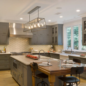
This expansive traditional kitchen by senior designer, Randy O'Kane and Architect, Clark Neuringer, features Bilotta Collection cabinet in a custom color. Randy says, the best part about working with this client was that she loves design – and not just interior but she also loves holiday decorating and she has a beautiful sense of aesthetic (and does everything to the nines). For her kitchen she wanted a barn-like feel and it absolutely had to be functional because she both bakes and cooks for her family and neighbors every day. And as the mother of four teenage girls she has a lot of people coming in and out of her home all the time. She wanted her kitchen to be comfortable – not untouchable and not too “done”. When she first met with Bilotta senior designer Randy O’Kane, her #1 comment was: “I’m experiencing white kitchen fatigue”. So right from the start finding the perfect color was the prime focus. The challenge was infusing a center hall colonial with a sense of warmth, comfort and that barn aesthetic without being too rustic which is why they went with a straight greenish grey paint vs. something distressed. The flooring, by Artisan Wood floors, looks reclaimed with its wider long planks and fumed finish. The barn door separating the laundry room and the kitchen was made from hand selected barn wood, made custom according to the client’s detailed specifications, and hung with sliding hardware. The kitchen hardware was really a window sash pull from Rocky Mountain that was repurposed as handles in a living bronze finish mounted horizontally. Glazed brick tile, by Ann Sacks, really helped to embrace the overall concept. Since a lot of parties are hosted out of that space, the kitchen, and butler’s pantry off to the side, needed a good flow as well as areas to bake and stage the creations. Double ovens were a must as well as a 48” Wolf Range and a Rangecraft hood – four ovens are going all the time. Beverage drawers were added to allow others to flow through the kitchen without disturbing the cook. Lots of storage was added for a well-stocked kitchen. A unique detail is double door wall cabinets, some with wire mesh to allow to see their dishes for easy access. In the butler’s pantry, instead of mesh they opted for antique mirror glass fronts. Countertops are a natural quartzite for care free use and a solid wood table, by Brooks Custom, extends of the island, removable for flexibility, making the kitchen and dining area very functional. One of the client’s antique pieces (a hutch) was incorporated into the kitchen to give it a more authentic look as well as another surface to decorate and provide storage. The lighting over the island and breakfast table has exposed Edison bulbs which hearkens to that “barn” lighting. For the sinks, they used a fireclay Herbeau farmhouse on the perimeter and an undermount Rohl sink on the island. Faucets are by Waterworks. Standing back and taking it all in it’s a wonderful collaboration of carefully designed working space and a warm gathering space for family and guests. Bilotta Designer: Randy O’Kane, Architect: Clark Neuringer Architects, posthumously. Photo Credit: Peter Krupenye
 Baran Studio Architecture
Peter Lyons
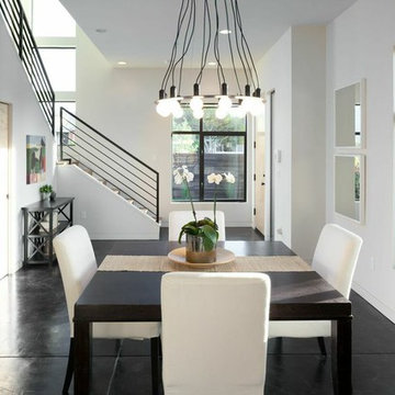
Dining room - contemporary concrete floor and black floor dining room idea in San Francisco with white walls
Dining room - contemporary concrete floor and black floor dining room idea in San Francisco with white walls
 Hulburd Design
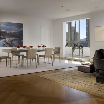
This San Francisco pied-a-tier was a complete redesign and remodel in a prestigious Nob Hill hi-rise overlooking Huntington Park. With stunning views of the bay and a more impressive art collection taking center stage, the architecture takes a minimalist approach, with gallery-white walls receding to the background. The mix of custom-designed built-in furniture and furnishings selected by Hulburd Design read themselves as pieces of art against parquet wood flooring.
10