
Search results for "Specification" in Home Design Ideas
 Dura Supreme Cabinetry
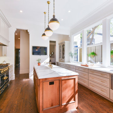
With an ideal location in the Pacific Heights neighborhood of San Francisco, this dated Victorian residence had "beautiful bones" but had been sitting on the market for a year before being purchased with plans to revitalize the interior. Interior designer, Noel Han, explained, "Historical Victorian homes in this area often have beautiful architectural elements that I aim to preserve, but the floor plan and layout tend to be stuffy, not live-able and not light filled. Modern families want bright, light-filled, spacious rooms that take advantage of outdoor views and living spaces, and function well for storage, meals and entertaining."
Preserving the architectural integrity and special features of the home was one of Han's goals but at the same time, she re-designed the space, moving walls and adding windows to create an open floorplan that flowed easily between the kitchen and outdoor living spaces. Where the range once stood in the original design, now an entire wall of windows provides panoramic views of the outdoors and fills the kitchen with light. Below the windows, Han designed a long bank of base cabinets with drawers to provide plenty of storage and work surface. Light now pours into the space even on foggy days. The range was moved to the opposite wall so that beautiful window views could be added to the kitchen.
Han selected a palette of finishes with an eye toward creating a "soft color aesthetic". "White painted finishes are very popular right now but would have felt stark and cold in this space," she explained. "The French grey paint from Dura Supreme was a perfect complement for this vintage Victorian home, to create a classic color scheme".
"This beautiful home already had hardware elements with a vintage brass finish, so I carefully selected antiqued, brushed brass hardware, plumbing and metal finishes to blend with the original elements," said Han. She continued, "The La Cornue French Range adds modern function with a French antique look."
"I appreciate working with Dura Supreme cabinetry because of the quality of the cabinetry, fast delivery and the custom options. I'm able to create beautiful architectural details like the pull-out columns on both sides of the range and the curved mullion doors on the furniture hutch, and they offer a stunning palette of finishes and styles," explained Han. For the bath cabinetry, Han created a similar palette of finishes and styles to create a complementary look throughout the entire home.
Product Details:
Perimeter: Dura Supreme Cabinetry shown in the St. Augustine door style and Mullion Pattern #15 door style with a “Zinc” painted finish.
Kitchen Island: Dura Supreme Cabinetry shown in the St. Augustine door style with a Clove stain and Black Accent finish on Cherry wood.
For more information about Noel Han, Interior Designer, click to her website here www.atelnoel.com.
For more information about Gilmans Kitchens and Baths, click to their website here www.gkandb.com.
Photography by: Ned Bonzi www.nedbonzi.com.
Request a FREE Dura Supreme Brochure Packet:
http://www.durasupreme.com/request-brochure
 Twelve Stones Designs, LLC
The owners of this kitchen had spent the money to upgrade the finishes in their kitchen upon building the home 12 years ago, but after living in the space for several years they realized how nonfunctional the layout really was. The (then) two preschool aged children had grown into busy, hungry teenagers with many friends who also liked to hang out at the house. So the family needed a more functional kitchen with better traffic flow, space for daily activities revolving around the kitchen at different times of day, and a kitchen that could accommodate cooking for and serving large groups. Furthermore, the dark, traditional finishes no longer reflected the homeowners’ style. They requested a brighter, more relaxed, coastal style that reflected their love of the seaside cities they like to visit.
Originally, the kitchen was U-shaped with a narrow island in the middle. The island created narrow aisles that bottle-necked at the dishwasher, refrigerator, and cooktop areas. There was a pass-through from the foyer into the kitchen, but the owners never liked that the pass-through was also located so close to the powder room. The awkward proximity was unappealing and made guests feel uncomfortable.
The kitchen’s storage was made up of lots of narrow cabinets, apothecary drawers, clipped corner units, and very few drawers. It lacked useful storage for the larger items the family used on a daily basis. And the kitchen’s only pantry was small closet that had only builder-grade, narrow shelving with no illumination to be able to see the contents inside.
Overall, the kitchen’s lighting plan was poorly executed. Only six recessed cans illuminated the entire kitchen and nook areas. The under cabinet lighting was not evenly distributed either. In fact, the builder had mis-placed the under cabinet lighting around the decorative pilasters which made for choppy, dark cubbies. Further, the builder didn’t include any lighting over the sink or the bar area, which meant whoever was doing the dishes was always in their own shadow. That, coupled with the steep overhang of the game room above made the bar area feel like a dim, cavernous space that wasn’t inviting or task oriented. The kitchen looked out into the main living space, but the raised bar and a narrow wall (which held the only large cabinet in the kitchen) created more of a barrier than a relationship to the living room or breakfast nook. In fact, one couldn’t even see the breakfast nook from the cooktop or sink areas due to its orientation. The raised bar top was too narrow to comfortably sit to either dine at or chat from due to the lack of knee space. The the homeowners confided that the kitchen felt more like a dark, dirty prison than place where the family, or their guests, wanted to gather and commune.
The clients' needs and desires were:
➢ to create a kitchen that would be a space the family loved to be in; to relate to the adjacent spaces all around, and to have better flow for entertaining large groups
➢ to remove the walls between the breakfast nook and living area and to be able to utilize the natural light from the windows in both those areas
➢ to incorporate a functional chopping block for prepping fresh food for home cooked meals, an island with a large sink and drain board, 2 pull out trash cans, and seating for at least the 2 teens to eat or do homework
➢ to design a kitchen and breakfast nook with an airy, coastal, relaxed vibe that blended with the rest of the house's coastal theme
➢ to integrate a layered lighting plan which would include ample general illumination, specific task lighting, decorative lighting, and lots of illuminated storage
➢ to design a kitchen with not only more storage for all the husband’s kitchen gadgets and collection of oils and spices, but smart storage, including a coffee/breakfast bar and a place to store and conceal the toaster oven and microwave
➢ to find a way to utilize the large open space between the kitchen, pantry area, and breakfast nook
Twelve Stones Designs achieved the owner's goals by:
➢ removing the walls between the kitchen and living room to allow the natural light to filter in from the adjacent rooms and to create a connection between the kitchen, nook, and living spaces for a sense of unity and communion
➢ removing the existing pantry and designing 3 large pantry style cabinets with LED tape lights and rollout drawers to house lots of kitchen appliances, gadgets, and tons of groceries. We also took the cabinets all the way up to the 9’ ceiling for additional storage for seasonal items and bulk storage.
➢ designing 2 islands - 1 with a gorgeous black walnut chopping block that houses a drawer for chopping and carving knives and a custom double pull out trash unit for point of use utilization - and 1 that houses the dishwasher, a large Blanco Gourmet sink with integrated drain board, woven baskets for fresh root vegetables and kitchen towels, plenty of drawer storage for kitchen items, and bar seating for up to 4 diners.
➢ closing off the space between the kitchen and the powder room to create a beautiful new private alcove for the powder room as well as adding some decorative storage. This also gave us space to include more tall storage near the new range for precision placement of the husband’s extensive oil and spice collection as well as a location for a combo-steam oven the wife wanted for baking and cooking healthy meals.
The project is enhanced functionally by:
➢ incorporated USB and standard receptacles for the kids’ laptops and phone charging in the large island
➢ designing the small island to include additional open shelving for items used on a daily basis such as a variety of bowls, plates, and colanders. This set up also works well for the husband who prefers to “plate” his dinners in restaurant-style fashion before presenting them to the table.
➢ the integration of specific storage units, such as double stacked cutlery drawers, a custom spice pull-out, a Kuerig coffee and tea pod drawer, and custom double stacked utensil drawers
➢ moving the refrigerator to the old oven location - this eliminated the bottle neck as well as created a better relationship to the eating table. It also utilizes the floor space between the pantry, nook, and kitchen
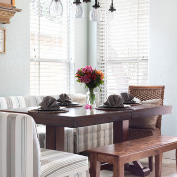
➢ creating a banquet style breakfast nook - this banquette seating not only doubles the amount of seating for large gatherings but it better utilizes the odd space between the kitchen and the previous nook area. It also helps to create a distinct pathway from the mudroom room through the pantry area, kitchen, nook, and living room.
➢ the coffee/breakfast bar area which includes the perfect location for the concealed microwave and toaster oven, convenient storage for the coffee pods and tea accoutrements. Roll-out drawers below also house the smoothie maker, hot water kettle, and a plethora of smoothie-making ingredients such as protein powders, smoothie additives, etc. Furthermore, the drawers below the Keurig house measuring utensil, cutlery, baking supplies and tupperware storage.
➢ incorporating lots of wide drawers and pullouts to accommodate large cookware.
➢ utilizing as much vertical space as possible by building storage to the ceiling which accommodates the family’s abundant amount of serving platters, baking sheets, bakeware, casserole dishes, and additional cutting boards.
The project is enhanced aesthetically by:
➢ new 5-piece Versailles pattern porcelain tile that now seamlessly joins the entire down stairs area together creating a bright, cohesiveness feeling instead of choppy separated spaces - it also adds a coastal feeling
➢ designing a cabinet to conceal the microwave and toaster oven
➢ the coastal influenced light fixtures over the nook table and island
➢ the sandy colors of the Langdon Cambria countertops. The swirling pattern and sparkling quartz pieces remind the homeowner of black-and-tan sandy beaches
➢ the striped banquet seating whose creamy white background and blue-green stripes were the inspiration for the cabinet and wall colors.
➢ All the interior doors were painted black to coordinate with the blacks and grays in the backsplash tile and countertop. This also adds a hint of tailored formality to an otherwise casual space.
➢ the use of WAC's Oculux small aperture LED units for the overhead lighting complimented with Diode LED strips for task lighting under the cabinets and inside the pantry and glass wall cabinets. All of the lighting applications are on separate dimmer switches.
Innovative uses of materials or construction methods by Realty Restoration LLC:
➢ Each 1-1/2” x 3” block of reclaimed end-grain black walnut that makes up the center island chopping block was hand milled and built in the shop. It was designed to look substantial and proportional to the surrounding elements, executed by creating the 4 inch tall top with a solid wood chamfered edge band.
➢ The metal doors on either side of the vent hood were also custom designed for this project and built in the Realty Restoration LLC shop. They are made 1x2, 11-gauge mild steel with ribbed glass. Weighing 60 lbs a piece, heavy duty cabinet hinges were added to support the weight of the door and keep them from sagging.
➢ Under-cabinet receptacles were added along the range wall in order to have a clean, uninterrupted backsplash.
Design obstacles to overcome:
➢ Because we were removing the demising walls between the kitchen and living room, we had to find a way to plumb and vent the new island. We did this by tunneling through the slab (the slab had post tension cables which prevented us from just trenching) to run a new wet vent through a nearby structural wall. We pulled the existing hot and cold lines between upper floor joists and ran them down the structural wall as well and up through a conduit in the tunnel.
➢ Since we were converting from wall overs to a gas range it allowed us to utilize the 220 feed for the wall ovens to provide a new sub panel for all the new kitchen circuits
➢ Due to framing deficiencies inherited from the original build there was a 1-1/2” differential in the floor-to-ceiling height over a 20 foot span; by utilizing the process of cutting and furring coupled with the crown moulding details on the cabinet elevations we were able to mask the problem and provide seamless transitions between the cabinet components.
Evidence of superior craftsmanship:
➢ uniquely designed, one-of-a-kind metal “X” end panels on the large island. The end panels were custom made in the Realty Restoration LLC shop and fitted to the exact dimensions of the island. The welding seams are completely indistinguishable - the posts look like they are cut from a single sheet of metal
➢ square metal posts on the small island were also custom made and designed to compliment and carry through the metal element s throughout the kitchen
➢ the beautiful, oversized end panels on the pantry cabinets which give the breakfast nook a tailored look
➢ integrating a large format 5 piece Versailles tile pattern to seamlessly flow from the existing spaces into the new kitchen space
➢ By constructing a custom cabinet that jogged around a corner we could not remodel (housing the entry way coat closet) we were able to camouflage the adjacent wall offset within the upper and lower cabinets. By designing around the existing jog in the structural walls we accomplished a few things: we were able to find the space to house, and hide, the microwave and toaster oven yet still have a clean cohesive appearance from the kitchen side. Additionally, the owners were able to keep their much needed coat closet and we didn’t have to increase the budget with unnecessary structural work.
 Weiss Construction, LLC
Mekenzie France
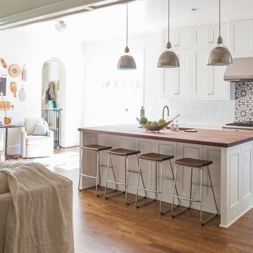
Inspiration for a mid-sized transitional l-shaped dark wood floor and brown floor open concept kitchen remodel in Charlotte with an undermount sink, white cabinets, wood countertops, stainless steel appliances, an island, recessed-panel cabinets and multicolored backsplash
Inspiration for a mid-sized transitional l-shaped dark wood floor and brown floor open concept kitchen remodel in Charlotte with an undermount sink, white cabinets, wood countertops, stainless steel appliances, an island, recessed-panel cabinets and multicolored backsplash
Find the right local pro for your project
 Dura Supreme Cabinetry
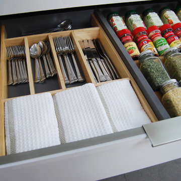
This contemporary kitchen features the NEW Stainless Steel Drawers and Roll-Out Shelves from Dura Supreme Cabinetry. The Bria (frameless) cabinets in Dura Supreme's "White" and Wired-Foil cabinets in Dura Supreme's "Wired-Mercury" are a great combination of cabinetry for creating the clean sleek look of this modern two-tone kitchen design.
Dura Supreme Cabinetry is excited to introduce NEW Stainless Steel Drawers and Roll-Out Shelves for their Bria Cabinetry (Frameless / Full-Access product line). For a limited time, this new metal drawer system is available exclusively from Dura Supreme as they partnered with Blum to be the first American manufacturer to bring it to market.
Dura Supreme’s Stainless Steel Drawers and Roll-Out Shelves are an attractive option for any kitchen design. Sleek, double-wall, stainless steel sides are only ½” thick and work with many of Dura Supreme’s wood drawer accessories, as well as the coordinating gray metal accessories designed specifically for Stainless Steel drawers. Concealed, undermount glides are integrated into the sides and are self-closing with a soft-close feature.
Our new Stainless Steel drawer option provides a contemporary alternative to our classic Maple dovetailed drawer. For homeowners that favor Transitional or Contemporary styling, this sleek, high-performance drawer system will be ideal!
Request a FREE Dura Supreme Brochure:
http://www.durasupreme.com/request-brochure
Find a Dura Supreme Showroom in your area:
http://www.durasupreme.com/dealer-locator
Want to become a Dura Supreme Dealer? Go to:
http://www.durasupreme.com/new-dealer-inquiry
To view a video and more info about this product go to: http://www.durasupreme.com/storage-solutions/stainless-steel-drawers-roll-outs
 McLain Homes, LLC
Photos by Scott Richard
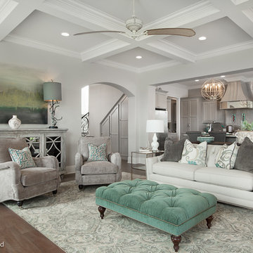
Inspiration for a contemporary living room remodel in New Orleans
Inspiration for a contemporary living room remodel in New Orleans
 User
UserReagen Taylor Photography
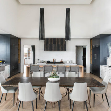
Example of a transitional light wood floor and beige floor dining room design in Austin with white walls
Example of a transitional light wood floor and beige floor dining room design in Austin with white walls
 Stonelace Designs
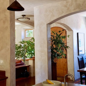
Inspiration for a mid-sized mediterranean u-shaped brown floor open concept kitchen remodel in Other with a double-bowl sink, raised-panel cabinets, medium tone wood cabinets, solid surface countertops, brown backsplash, stainless steel appliances and an island
 Custom Surface Solutions
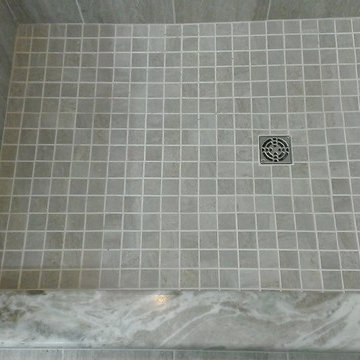
Custom Surface Solutions - Owner Craig Thompson (512) 430-1215. This project shows a remodeled master bathroom with 12" x 24" tile on a vertical offset pattern used on the walls and floors. Includes glass mosaic accent band and shower box, and Fantasy Brown marble knee wall top and seat surface.
 Thomas J. Pearson, Inc.
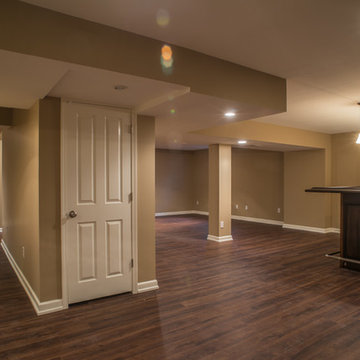
This project included a whole first floor and basement remodel. With
the first floor, the space where the laundry room was originally located
was converted and instead utilized for the kitchen area. A new floor
system was framed to provide a new laundry room in the garage.
Several walls were removed to open up the space of the kitchen to the
rest of the first floor. Granite counter tops, custom glazed cabinetry,
and hand scraped wood floors were included in this kitchen. For
aesthetics and style, the island in the middle of the kitchen was
stained to provide a contrast to the cream-colored cabinets
throughout the kitchen. The material over the fireplace was removed,
new tile was installed, and the walls, ceiling, and woodwork were
repainted.
Like the kitchen, the basement included a new hand scraped wood
floor. The basement was completely gutted, framed, drywalled, and
finished like the first floor as well. A new bar with custom cabinetry
was installed. Along the foot of the cabinets of the bar a new metal
bar was installed to provide a commercial feel. Pendant lights were
installed to hang just above those seated at the bar. A new full
bathroom and closet were added in the basement as well.
Architect: Constantine Design Group
Photography: Bird and Branch
 Breathe Design Studio
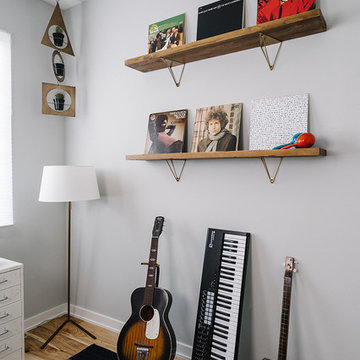
Completed in 2015, this project incorporates a Scandinavian vibe to enhance the modern architecture and farmhouse details. The vision was to create a balanced and consistent design to reflect clean lines and subtle rustic details, which creates a calm sanctuary. The whole home is not based on a design aesthetic, but rather how someone wants to feel in a space, specifically the feeling of being cozy, calm, and clean. This home is an interpretation of modern design without focusing on one specific genre; it boasts a midcentury master bedroom, stark and minimal bathrooms, an office that doubles as a music den, and modern open concept on the first floor. It’s the winner of the 2017 design award from the Austin Chapter of the American Institute of Architects and has been on the Tribeza Home Tour; in addition to being published in numerous magazines such as on the cover of Austin Home as well as Dwell Magazine, the cover of Seasonal Living Magazine, Tribeza, Rue Daily, HGTV, Hunker Home, and other international publications.
Featured on Dwell!
https://www.dwell.com/article/sustainability-is-the-centerpiece-of-this-new-austin-development-071e1a55
 Calligaris
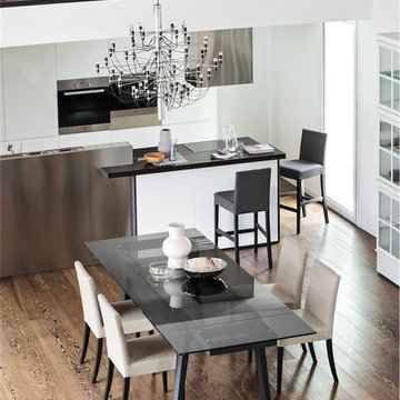
CS/4086_GTR_P132_P132: Maestro Table - Graphite Leg Finish - Transparent Top
Features -
Two Separately Openable 15 6/8"" End Extensions
Location - Indoor
Specifications -
Max Width - 102.38
Materials - Beech, Tempered Glass
Finishes - Graphite, Graphite, Transparent
CS/1463_P132_A02: Bess Low Wooden Chair - Graphite Frame - Denver Sand Seat Finish
Features -
Nylon Gliders Included
Stain Resistant
Water Resistant
Undetectable By Sight, Smell, And Touch
Blott Off Water And Oily Stains Immediately
Seat Frame Supported By Elastic Belts
FSC Certified
Location - Indoor
Specifications -
Materials - Beech, 39% Viscose, 25% PL, 17% Linen, 15% Cotton, 4% Acrylic
Finishes - Graphite, Denver Sand
Chair Leg Height - 17.75

 Advance Design Studio, Ltd.
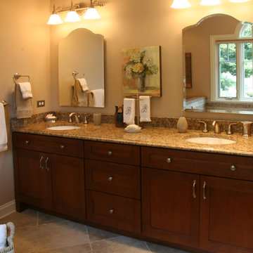
Inspiration for a large timeless master beige tile and porcelain tile porcelain tile bathroom remodel in Chicago with medium tone wood cabinets, an undermount sink, raised-panel cabinets, granite countertops, beige walls and a two-piece toilet
 Lori Ramsay Design
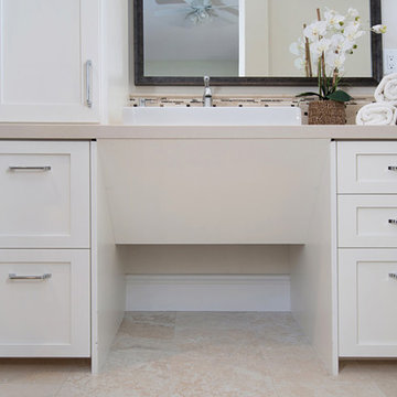
We created this beautiful accessible bathroom in Carlsbad to give our client a more functional space. We designed this unique bath, specific to the client's specifications to make it more wheel chair accessible. Features such as the roll in shower, roll up vanity and the ability to use her chair for flexibility over the fixed wall mounted seat allow her to be more independent in this bathroom. Safety was another significant factor for the room. We added support bars in all areas and with maximum flexibility to allow the client to perform all bathing functions independently, and all were positioned after carefully recreating her movements. We met the objectives of functionality and safety without compromising beauty in this aging in place bathroom. Travertine-look porcelain tile was used in a large format on the shower walls to minimize grout lines and maximize ease of maintenance. A crema marfil marble mosaic in an elongated hex pattern was used in the shower room for it’s beauty and flexibility in sloped shower. A custom cabinet was made to the height ideal for our client’s use of the sink and a protective panel placed over the pea trap.
 Breathe Design Studio
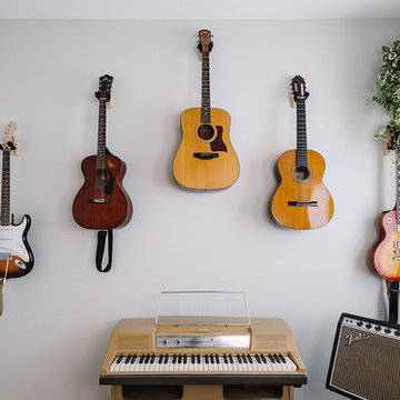
Completed in 2015, this project incorporates a Scandinavian vibe to enhance the modern architecture and farmhouse details. The vision was to create a balanced and consistent design to reflect clean lines and subtle rustic details, which creates a calm sanctuary. The whole home is not based on a design aesthetic, but rather how someone wants to feel in a space, specifically the feeling of being cozy, calm, and clean. This home is an interpretation of modern design without focusing on one specific genre; it boasts a midcentury master bedroom, stark and minimal bathrooms, an office that doubles as a music den, and modern open concept on the first floor. It’s the winner of the 2017 design award from the Austin Chapter of the American Institute of Architects and has been on the Tribeza Home Tour; in addition to being published in numerous magazines such as on the cover of Austin Home as well as Dwell Magazine, the cover of Seasonal Living Magazine, Tribeza, Rue Daily, HGTV, Hunker Home, and other international publications.
Featured on Dwell!
https://www.dwell.com/article/sustainability-is-the-centerpiece-of-this-new-austin-development-071e1a55
 Flooret
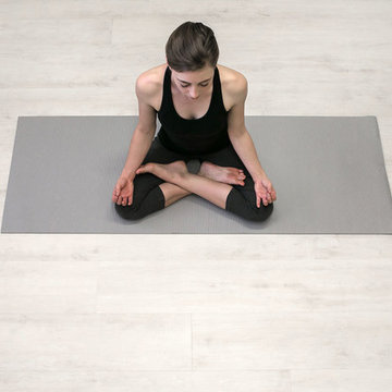
Nordic simplicity. White floors can be challenging to use, but when pulled off correctly are extremely rewarding. An instant statement-maker, they often present the challenge of maintenance. For Nordland, we specifically created a slightly weathered pattern with darker knots, so that they do not reveal dirt as quickly.
The most important specification for determining the durability of vinyl flooring is the thickness of the wear-layer. The best wear-layers are made of thick, clear virgin PVC, which covers the paper print-film that gives the floor its unique appearance. Once the wear-layer wears through, the paper is damaged and the floor will need replacement.
Most vinyl floors come with a 8-12 mil wear-layer (0.2-3 mm). The top commercial specs in the industry are higher, at 20-22 mil (0.5 mm). A select few manufacturers offer a “super” commercial spec of 28 mil (0.7 mm).
For Modin, we decided to set a new standard: 40 mil (1.0 mm) of premium virgin PVC. This allows us to offer an industry-leading 20 year Commercial Warranty (Lifetime Residential), compared to nearly all other commercial vinyl floors’ 10 year Commercial Warranty.
Beyond our superior wear-layer, we also use a patented click mechanism for superior hold, and a ceramic-bead coating.
SIZE MATTERS
Wider and longer planks create a sense of space and luxury. Most vinyl floors come in 6” or 7” widths, and 36” or 48” lengths.
For Modin, we designed our planks to be 9” wide, and 60” long. This extra large size allows our gorgeous designs to be fully expressed.
DETAILS THAT COUNT
We made sure to get all the details right. Real texture, to create the feel of wire-brushed wood. Low sheen level, to ensure a natural look that wears well over time. 4-sided bevels, to more accurately emulate the look of real planks. When added together they help create the unique look that is Modin.
DESIGNS THAT INSPIRE
We spent nearly a year just focusing on our designs, to ensure they provide the right mix of color and depth. Focusing on timeless wire-brush and European Oak styles, as well as more contemporary modern washes, our collection offers truly beautiful design that is both functional and inspiring.
 Breathe Design Studio
Completed in 2015, this project incorporates a Scandinavian vibe to enhance the modern architecture and farmhouse details. The vision was to create a balanced and consistent design to reflect clean lines and subtle rustic details, which creates a calm sanctuary. The whole home is not based on a design aesthetic, but rather how someone wants to feel in a space, specifically the feeling of being cozy, calm, and clean. This home is an interpretation of modern design without focusing on one specific genre; it boasts a midcentury master bedroom, stark and minimal bathrooms, an office that doubles as a music den, and modern open concept on the first floor. It’s the winner of the 2017 design award from the Austin Chapter of the American Institute of Architects and has been on the Tribeza Home Tour; in addition to being published in numerous magazines such as on the cover of Austin Home as well as Dwell Magazine, the cover of Seasonal Living Magazine, Tribeza, Rue Daily, HGTV, Hunker Home, and other international publications.
Featured on Dwell!
https://www.dwell.com/article/sustainability-is-the-centerpiece-of-this-new-austin-development-071e1a55
 Inspired Closets OKC
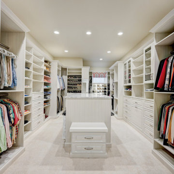
We created a very well thought out and custom designed closet for this designated large closet area. We created areas of full 24" depth and 14" depth for the perfect storage layout. Specific areas were given for shoe storage and folding as well. Many drawers, specific hanging for pants and hutch areas were designed for specific storage as well. We utilized tllt out laundry hampers, pullout pant racks, swivel out ironing boards along with pullout valet rods, belt racks and tie racks. The show stopper is our LED lit shoe shrine which showcases her nicer shoes.
 Chairish
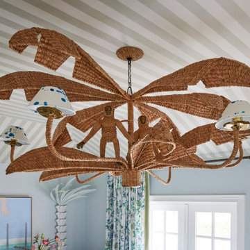
The Chairish Villa at The Colony is a celebration of authentic Palm Beach style, reimagined for today’s tastemaking and affluent guests. As America’s premier emporium for vintage and antique furnishings, Chairish is known for serving up historical design expertise with heaping sides of high/low chic and playful irreverence. Likewise, the Colony is celebrated the world over as a vintage mecca with a 100-year history of tastemaking residents.
This spirit of play guided our design approach, and the Chairish Villa fearlessly mixes historically significant, Palm Beach specific design themes with modern additions like contemporary art, mid-century furnishings and sophisticated layering to delight The Colony’s fashionable clientele. Chinoiserie motifs, animalia details, wicker, rattan, and breezy hues abound.
Palm Beach is a famed treasure trove of vintage and antique furnishings, offered by an extensive community of expert local purveyors. Almost all the furnishings selected by Chairish for the project were locally sourced from Chairish dealers within 5 miles from the hotel, making The Chairish Villa at The Colony both a fashionable and sustainable destination.
We used matching archival wallpaper and fabric pairings. This approach was specifically inspired by the Yellow Roses Room at the Flagler Mansion, and we sourced our textile, wallpaper, and trim pairings exclusively from our partner Schumacher Hospitality. Schumacher’s Del Tesoro pattern, based on a 19th-century French document, served as the project’s overall jumping off point. We also used Hydrangea Drape, which was inspired by a design of Hobe Erwin.
The villa features over 40 pieces of art: largely comprised of contemporary works from 20 artists from around the world, half of which were tapped to create original works specific to the space. This impressive showing is complemented by a small selection of vintage artwork as well. Noteworthy Artists include: Liz Marsh, Hope Olson, Brock DeBoer, Lia Burke Libaire, Venetia Syms, Ron Giusti, and Virginia Chamlee, among others.
Special thanks to our local partners for their incredible work on this project, particularly:
Catharine Willmer Interiors (Interior Design)
David’s Drapery Workroom (Window Treatments)
Associated Interior Designer Service (Upholstery)
Wallpaper by Wendy (Wallpaper Hanger/Installer)
Illume (Custom Lampshades)

60