
Search results for "Spending" in Home Design Ideas
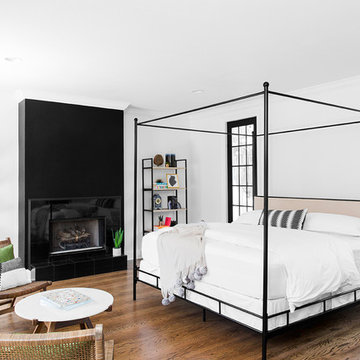
 Alair Homes Dallas
What could go possibly wrong? Nothing with Alair as their contractor.
Some creativity was required to get these clients the overall feel of the home they wanted without breaking the budget.
The end result proves you can still have a big impact on a small budget if you target key areas and spend wisely.
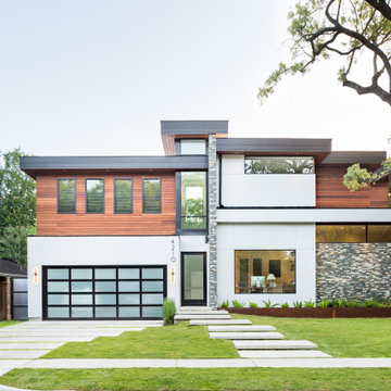
 Winfrey Design Build
Inspiration for a contemporary multicolored two-story mixed siding house exterior remodel in Houston

Find the right local pro for your project

 My Splash Pad
Dogs love the mobile splash pad. This Dallas doggy daycare purchased a few of our mobile splash pad features for their dogs to keep cool during the Texas heat.
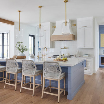
 2 Chicks Design Co
Two-Tone Coastal Kitchen with Blue Island and Brass Pendants. A custom two-tone kitchen with wood accents in a Ponte Vedra Beach new build by 2 Chicks Design Co. A mid-tone blue island with quartz counter, brass pendants and faucets, accent beam separating the eat-in dining area, and a dramatic hood anchor an open kitchen, dining and family area designed for entertaining.
Tags: Transitional Kitchen, Coastal Kitchen, Blue Kitchen Island, Two-Tone Kitchen, Brass Pendant, Open Kitchen, Beam Ceiling
 Rhoads Estate Homes, LLC
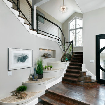
Large transitional wooden u-shaped metal railing staircase photo in Cincinnati with wooden risers



 CAB Architects
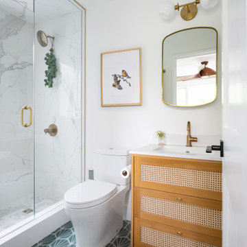
Inspiration for a small transitional master white tile and porcelain tile ceramic tile, green floor and single-sink doorless shower remodel in Toronto with brown cabinets, a two-piece toilet, white walls, an undermount sink, quartz countertops, white countertops, a built-in vanity and shaker cabinets
 California Closets Connecticut
NASHVILLE LIVE/WORK SPACE
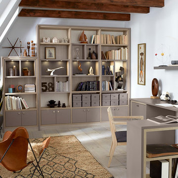
From an imagined spare bedroom we created this comfortable space that takes the “home office” concept to the next level— as it is not only about work but also about storing the memories and “stuff” of daily life in a place where you also want to spend time together.
• Live/work space for two people—ie. “this is where I work and live”— a place to relax and read, open your laptop, spend time together.
• The monochromatic color palette of Tesoro Pietra and Cashmere, natural aluminum metal accents, matte black leather shelves, and great accent lighting create a warm, moody elegance.
• For this shot we built a ceiling and angled windows – wanted it to feel like a room in someone’s home that was transformed by this design (vs. adding a storage closet or shelves).
 Advance Design Studio, Ltd.
After six years of living in their Huntley IL home, Chris and Meghan were tired of their dark, dingy, outdated kitchen and it was finally time for a long-anticipated change. “The kitchen is the place where we live, it’s where we do everything,” Meghan said. “It was important that it be a space where we wanted to be.” Meghan loves cooking and enjoys including their girls in healthy meal prepping, this led them to want a brighter, more enjoyable kitchen with increased functionality and improved storage.
For Chris especially, the laundry room was an entirely dysfunctional eyesore. “We had a washer and a dryer, but it was all kind-of cobbled together!” Chris said. “There were always laundry piles everywhere, we weren’t really sure what we wanted to do in there, but it was time for us to make a change.” The mess of the space was stressful every time they walked in the door from the garage each day. Kids’ backpacks and shoes piled up haphazardly in the makeshift boot-bench closet left the family feeling disorganized and stressed. They needed space for folding clothes and locker cubbies to help keep the family organized.
Having known Christine and Todd in the Huntley community for years, Chris and Meghan were familiar with their work. “We already trusted them personally and having seen their projects for years we knew they did top notch work. After we reviewed the initial round of designs, we knew that hiring them was definitely the right choice,” Meghan and Chris said. Although Chris had done a lot of work in their home himself, the kitchen and laundry room renovation was such a large undertaking that he didn’t want to steal time away from his family to spend what would surely be many long weekends doing the job himself. “That would not have been a wise choice for us,” Chris laughed.
“Our designer, Michelle was very, very, easy to work with; anything we wanted to see or weren’t sure about, she went above and beyond to make this easy for us. She was easy to get hold of and always quick to respond,” the couple said. Michelle pulled ideas that mirrored the couple’s taste and style and was adept at directing the couple to limited choices that didn’t overwhelm them and kept the process moving. “I have a hard time making decisions. Michelle made the decision-making process so easy. I loved how she listened to what I liked and then presented three great options for me to choose from,” Meghan said.
The main objectives for the kitchen were better storage solutions, they wanted the space to reflect their lifestyle and taste, and they wanted it to last for years with low maintenance. One of the first steps in creating a more functional kitchen was relocating the refrigerator, creating an improved workflow for the busy family.
“We didn’t know that we could even move the refrigerator to a new location where it is now, that was something that we never would have thought of,” Chris said. “The new refrigerator location makes the kitchen feel so much bigger. We didn’t add any space, but our whole kitchen with the new design just seems like it’s so much larger than before!” Meghan said.
The perimeter mist colored cabinets helped warm and brighten the entire room, while the graphite colored cabinets on the island added contrast. Using this fresh, clean color palette satisfied the couple’s desire for a bright space that was the exact opposite of what they had before. Organization accessories were also added to the cabinets such as a spice drawer tray and roll outs to create hidden convenience.
“I absolutely love the hidden spices – it makes cooking so much more enjoyable!” Chris said. “And all the pull outs, and the double trash bin, who would think you could get so excited about organization!” the couple said in unison.
One thing they hated in their original kitchen was how dark the space felt. Added lighting on the ceiling with the new light fixtures combined with the lighter cabinetry colors throughout solved this problem. “Our new kitchen has this warm, almost cozy feeling that our old kitchen never had, it’s just a space that I love spending my time in now,” Meghan said. The light airy feeling was accentuated with the use of floating white shelves on either side of the decorative range hood. “We have so much cabinetry space, the new design is amazing we actually have more storage space than we will ever need,” Meghan said.
The island was extended to create more work surface and added space for stool seating. “The new island changes how we live. Now the kids can be in the kitchen with us, doing homework, eating breakfast, and the three of us have special dinners there when Chris is working late,” Meghan said.
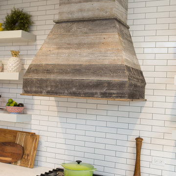
The Carrara Marmi Quartz countertops were chosen because they are, not only beautiful, but are made from hard-working material that doesn’t require maintenance. The white subway tile backsplash that wraps to the ceiling behind the focal point cooktop range/hood compliments the crisp white countertops perfectly, while brushed brass hardware and light fixtures keep the design fresh and new.
The couple had a few fears at the beginning of the project, as most homeowners do. Their biggest fear was being out of their kitchen and laundry room for an extended time. The crew made it very easy for the family to work in a limited space keeping the washer and dryer hooked up the majority of the time, and also getting appliances working with minimal downtime.
“They above and beyond accommodated us to get us through the process,” Meghan said. “They did a great job making sure we were as comfortable as possible throughout the process,” Chris added.
“Our project manager DJ did a great job. He was very good at updating us on schedule changes, getting guys in as quickly as possible. Everyone that stepped in the house was nice and did great work,” said Chris. They thought Advance’s carpenter was phenomenal and were impressed when he took a conceptual idea from a photograph and worked with designer Michelle to create a one of a kind range/hood that has become the topic of conversation with friends and family who visit the new kitchen. “He was in our house literally every day for several weeks. He was easy to work with and good at what he did,” Meghan and Chris said.
The focal point of the kitchen; a hand-crafted, custom-built ventilation hood was clad with handpicked reclaimed barnwood. Advance Design’s carpenter built the framework and the cladding to create a one-of-a-kind design element that the couple loves.
“I think it was especially fun for him to create something unique from scratch, showcasing his talent in this area,” Meghan said. “I love that my kitchen is not like everyone else’s. I got to pick out the wood on my hood and watch it being built and was able to choose what pieces of wood went where on it. It’s totally unique.”
Red Oak flooring was toothed-in throughout the kitchen and the rest of the first floor anywhere changes were made. Then the whole floor was refinished to tone down the orange undertones in the existing floor stain, ultimately changing the color complexion of the entire first floor. The result is a completely new feeling to the entire home.
Renovating the laundry room was extremely important to Meghan and Chris, but they had trouble visualizing what the possibilities were for the seemingly small space. Michelle produced beautiful 3D illustrations that helped them envision the space in a whole new way.
“I must have told Michelle 100 times that I am a visual person, seeing the designs in 3D made it so easy to make decisions and see what we could really do with our space,” Meghan said.
A dividing wall and doorway were removed between the existing laundry room and hallway formerly containing a coat closet, providing space to design specialized graphite colored cabinetry matching the kitchen island to house custom storage cubbies for each family member. Adding the tall utility cabinetry in the new laundry area helped solve the storage issue, tucking away cleaning supplies, household items, and even the cat got its own cubby.
“I love how everything is now hidden in its own space. I can’t tell you how much I hated coming home and seeing everything sitting around on counters,” Chris said.
Electrical outlets were planned for the inside of utility cabinets, so devices could charge in hidden locations. Stacking the washer and dryer allowed for wider countertop space to provide a folding area and a special space for clothes to hang. “The way I do laundry has been completely transformed! I can actually fold clothes and hang them now right out of the washer and dryer,” Meghan said.
“The end result in the kitchen and the laundry/mud room was an updated light and bright space, with a smarter work flow that better meets the needs of this family,” Michelle said.
“I would totally recommend Advance Design,” Meghan said. “Sometimes I sit and just look at my kitchen and laundry room and think ‘Wow, I can’t believe I get to live here!’ It’s an understatement to say we love our new space.”
 Interior Motives LA
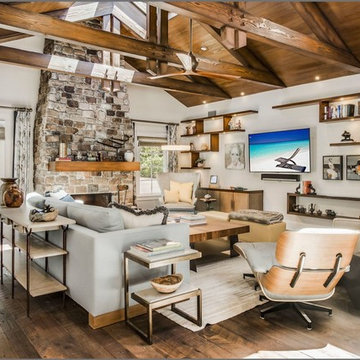
Example of a trendy dark wood floor and brown floor family room design in Los Angeles with gray walls, a standard fireplace, a stone fireplace and a wall-mounted tv
 Maugel DeStefano Architects
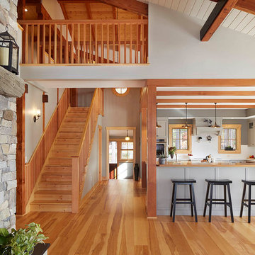
For those lucky enough to live lakeside in New Hampshire, warm evening summer breezes are best enjoyed from a comfortable screened porch. This summer camp underwent a drastic renovation and expansion so the family could enjoy life at the lake and offer year-round living to future generations. The project’s design especially focused around expanding the existing screened porch, where the family spends most of their time. Keeping the porch at the best viewing corner of the home, while expanding into a wrap-around style to best take in the water views, was important. Meticulous planning helped navigate the design around strict allowances for a residence with such close proximity to the water, per the New Hampshire Department of Environmental Services.
To make the camp a family cottage, there was a complete re-facing of the exterior, a mudroom addition and a dormer addition to create an office space open to living areas below. Extensive renovations to the interior resulted in a new kitchen for family to gather, reconfiguration to create a first-floor master suite and improved access to the exterior, especially the wrap-around porch.
Now the home, and porch, can be enjoyed to the fullest by the owners, family and friends.
Greg West
 Stewart Home Designs
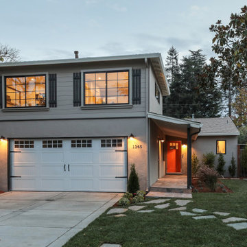
Transitional gray two-story exterior home photo in San Francisco with a shingle roof and a gray roof
 Jami Abbadessa
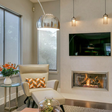
This couple was ready for some major changes in their home on north Euclid in Upland, CA. After completing their nursery last year, they asked for help designing their family room. Everything had to go! The brick fireplace, the TV niche next to the fireplace, the wet bar…none of it portrayed my client’s taste or style in any way. They requested a space that was modern, not fussy, clean and contemporary. I achieved this look by transforming the fireplace wall with limestone and paneled walls with hidden storage behind where the TV niche used to be. Other features that helped in this transformation are updated recessed and accent lighting, fixtures, window coverings, sleek, contemporary furnishings, art and accessories. The existing carpet was replaced with dark wood flooring that seamlessly meets the new limestone fireplace hearth that runs the distance of the entire focal wall.
A roadblock popped up when we found out the SMALLEST WALL in the house that was part of the existing wet bar turned out to be where the main plumbing and electrical were housed. Instead of spending the exorbitant amount of money that it would’ve cost to remove this wall, I instead turned the unused wet bar into a functional feature with oodles of storage on one side and a wall niche on the opposite to display art.
Now this space is a functional and comfortable room in their house where they can relax and spend time with family.

 Susan Yeley Homes
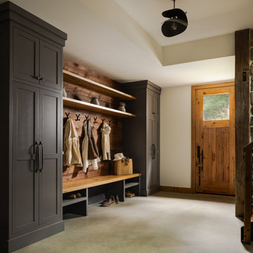
This gem of a house was built in the 1950s, when its neighborhood undoubtedly felt remote. The university footprint has expanded in the 70 years since, however, and today this home sits on prime real estate—easy biking and reasonable walking distance to campus.
When it went up for sale in 2017, it was largely unaltered. Our clients purchased it to renovate and resell, and while we all knew we'd need to add square footage to make it profitable, we also wanted to respect the neighborhood and the house’s own history. Swedes have a word that means “just the right amount”: lagom. It is a guiding philosophy for us at SYH, and especially applied in this renovation. Part of the soul of this house was about living in just the right amount of space. Super sizing wasn’t a thing in 1950s America. So, the solution emerged: keep the original rectangle, but add an L off the back.
With no owner to design with and for, SYH created a layout to appeal to the masses. All public spaces are the back of the home--the new addition that extends into the property’s expansive backyard. A den and four smallish bedrooms are atypically located in the front of the house, in the original 1500 square feet. Lagom is behind that choice: conserve space in the rooms where you spend most of your time with your eyes shut. Put money and square footage toward the spaces in which you mostly have your eyes open.
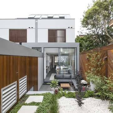
In the studio, we started calling this project the Mullet Ranch—business up front, party in the back. The front has a sleek but quiet effect, mimicking its original low-profile architecture street-side. It’s very Hoosier of us to keep appearances modest, we think. But get around to the back, and surprise! lofted ceilings and walls of windows. Gorgeous.
 Hawk Renovations
This is an example of a contemporary full sun backyard concrete paver retaining wall landscape in Other.
 COSWICK LTD
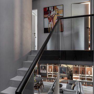
Modern minimalism as a basis for unusual, expressive art objects and author’s painting. This is what determined the main style of the living space. The concept was based on such materials as concrete and plaster, natural wood and stone. The interior had to be as natural as possible, reflecting the architectural image of the residential complex and the beauty of the surrounding nature. “The most important thing for me in this project is the result. Customers say that the interior has become their place of power! They want to return home, invite guests, spend a lot of time in their house and enjoy life here! It is very valuable and important that the project was realized almost 100%, while the customers themselves were interested not to deviate even a millimeter from the project, but to do everything exactly as the Author intended,” emphasized project designer Ksenia Mitskevich.
Coswick oak Cinnamon hardwood flooring was used in the project.
Designer: Ksenia Mitskevich.
Photo by Sergey Pilipovich.
Coswick’s partner: Domani.
58