
Search results for "Split level garage conversion" in Home Design Ideas
 TATCOR DESIGN BUILD
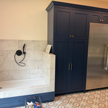
Pantry and Dog Care center off rustic elegant kitchen through hidden cabinet doors. Subzero fridge and Freeze supports main kitchen. 8ft Pella Life Style door leads to the dog yard or the dog can take the dog door located next to the dog shower complete with a dog brush water wand. Dog water bowl filler is convenient.
The rustic/elegant kitchen (right) custom cabinets are white oak and charcoal black with a large island and an island banquette. To the left of a coffee bar, flanked by 2 sub zero built in units is a hidden cabinet door that leads to a large pantry with a dog bath, dog pot filler, and a doggie door to the outside. The traditional curved stove vent hood is accented by white oak. Two large, crystal chandeliers hang of the island. Adjacent to the kitchen is a cozy seating area in front of a large gas log set fireplace flanked by black mullion Pella life style windows.
This new 7,200 SF Custom Designed (Rustic/Elegant Farmhouse Ranch) Home was built on part of the foundation of the previous home which was a split level. Our architectural strategy required a continuous first floor (10ft) and the home remained aligned with the existing circle driveway. The rustic metal roof front entrance porch (gas lanterns) leads into a massive 2 story center hall (home of a large, centered gathering table) to a large centered outdoor back yard courtyard (kitchen to the right and sports bar to the left) which centers on the new swimming pool and wide outdoor stairs of the retaining wall required for the extensive stormwater management system. That establishes the center of the home stretching over 100 ft from the front step to the back yard stairs flanked by 2 fire features highlighting the pool. The locations of other rooms listed below are to the right and left of this centered home line. Kitchen, kitchen fireplace, pantry, and guest suite are to the right. Entrance to the finished basement theater room are to the right along with a bar to support events in the center hall. To the left of the center 2 story hall are the exercise room with sauna (with glass garage type door to the front porch), sport bar with theater and see through fireplace, game room, mudroom, laundry, 4 car conditioned garage, and pool changing rooms. From the centered 2 story hall to the right is the glass stairwell and curved stairs made of white oak and wrought iron. These beautiful stairs lead to the library balcony overlooking the massive center hall and large gathering dining table. From the right of the balcony are the primary suite with a private 2nd floor porch and a bedroom suite. From the left of the balcony are 2 more suites with a laundry room, kitchenette, and a large EZ Breeze, closed in porch that overlooks the pool and provides coverage over the pool patio next to the see through fireplace in the sports bar theater room.
The exterior is James Hardie fibercement and limestone veneer. Fascia and frieze boards are capped with heavy roof metal materials. The front porch roof is standing metal seam and columns and ceiling are rustic, reclaimed wood.

 Harper Elm General Contractor
Tim Correira Photography
Example of a large transitional detached two-car garage workshop design in Boston
Example of a large transitional detached two-car garage workshop design in Boston
 U.S. Green Building Council (USGBC)
LEED Certification Level: Platinum.
Builder: R & S Engineering & Construction.
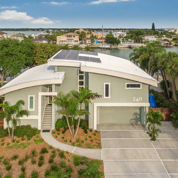
The Cavanaugh Residence is a contemporary split level with a split personality. Totally designed from the ground up to minimize impact and maximize energy and water efficiency, its beautiful facade belies its hard-working, high-producing systems, earning it a LEED Platinum score of 116.5, and a HERS rating of minus 22. The 2774 square foot home produces over 100 per cent of its power with a 10.8 kw pv system, and captures 100 per cent of its freshwater needs from the curved metal roofs through an engineered collection and purification system, stored in an integrated concrete cistern.
Constructed of locally made SIP panels on an infill waterfront lot, the home is oriented to maximize the production of the pv panels. Six inch SIP panels work together with a highly reflective, highly emmisive cool standing seam roof, icynene insulation in ceiling and floors, and carefully placed high efficiency windows and doors to create a tightly sealed environment. The 17-seer Trane heat pump variable speed compressors and TAM 7 air handlers, along with a whole house dehumidifier and fresh air intake provide a comfortable, clean indoor environment while using little energy. In the shoulder seasons, natural ventilation cools the home with fresh breezes drawn from lower windows in each room flowing through the curved ceilings to clerestory windows at the top of the house.
Natural daylighting, with windows placed in corners and high clerestories, bounce the abundant natural light so that the owners use the interior LED lighting primarily at night. Windows were sited to frame views of the neighboring park and water, and capture the light, but represent a very low percentage of glazing to wall to conserve energy.
Primarily native, xeriscaped turfless landscaping sips reclaimed water from its drip and bubbler irrigiation system, and requires little trimming or chemicals. Established trees, protected during construction, shade the home, FSC certified decks, and yard, providing a cool place to enjoy the outdoors at any time of the day, even in Florida's summer heat.
Rainwater is diverted from the bay through the engineered collection and filtration system to an integrated concrete cistern hidden beneath the decks. Abundant Florida rainwater supplies 100 per cent of the home's needs, including drinking, bathing, and cleaning. Naturally soft, the highly filtered and UV purified water requires no chemical treatment or water softener. Coupled with minimal hardscape and permeable drive and walkways, almost all ground water remains on the lot, and out of storm sewers and bay runoffs.
Designed as a forever home for this active retired couple, an open floor plan provides diagonal interior views along with great circulation space. Wide hallways and doors, curbless showers, an elevator, and extra blocking in the walls for grab rails insures the couple of being able to use their home even if physical disabilities arise.
The home's footprint is minimized by building over the conditioned crawlspace and over-sized garage, and the finished floor height, at least two feet above flood code requirements, significantly reduces insurance costs while maximizing storage space for camping and water sports equipment.
Materials, fixtures and appliances were carefully selected for energy and water efficiency, local production where possible, recycled content/recyclability, durability, and cost-effectiveness. The owners were very involved in vetting and materials selections, and assisted in just-in-time purchasing to minimize waste. Scrap materials were sorted daily for re-use elsewhere in the project (blocking, concrete forms, drywall scraps as acoustical insulation in interior walls, etc.), resulting in a tiny waste pile at the end of a dumpster-free project. Concrete waste was hauled to a local recycler to become road base, and extra useable materials were returned to the vendor or donated to Habitat Restore.
Cost-effective choices, and careful planning, saved significant dollars in construction cost as well as landfill space.
One of the biggest challenges was finding qualified subcontractors who would work within the guidelines. With the help of our LEED consultant and meetings and explanations, most subcontractors not only bought into the ideas readily, but offered up new ideas. Highly skilled and professional, the team of subs, LEED consultant, and contractor proved that LEED construction is excellent construction.
The team, the owners, and I also found that LEED construction makes great economic sense. Most materials (other than increased insulation and photovoltaic panels) cost no more, and sometimes less, than those employed in construction of a lesser standard. The owners have been living in the home for a year now, and are thrilled with the results. No power bill. No water bill. Extremely low insurance bill. Minimal ground maintenance. No fabric softener. Reduced use of soap, detergents, and shampoos and cleaning supplies. Less time cleaning with spot-free rainwater. Careful planning and materials selection brought the project in under budget, and the home operates at an extremely low cost, both to the homeowners, and the environment. Who wouldn't be thrilled?
Find the right local pro for your project
 TATCOR DESIGN BUILD
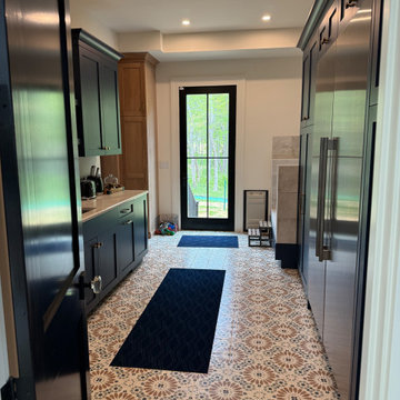
Pantry and Dog Care center off rustic elegant kitchen through hidden cabinet doors. Subzero fridge and Freeze supports main kitchen. 8ft Pella Life Style door leads to the dog yard or the dog can take the dog door located next to the dog shower complete with a dog brush water wand. Dog water bowl filler is convenient.
The rustic/elegant kitchen (right) custom cabinets are white oak and charcoal black with a large island and an island banquette. To the left of a coffee bar, flanked by 2 sub zero built in units is a hidden cabinet door that leads to a large pantry with a dog bath, dog pot filler, and a doggie door to the outside. The traditional curved stove vent hood is accented by white oak. Two large, crystal chandeliers hang of the island. Adjacent to the kitchen is a cozy seating area in front of a large gas log set fireplace flanked by black mullion Pella life style windows.
This new 7,200 SF Custom Designed (Rustic/Elegant Farmhouse Ranch) Home was built on part of the foundation of the previous home which was a split level. Our architectural strategy required a continuous first floor (10ft) and the home remained aligned with the existing circle driveway. The rustic metal roof front entrance porch (gas lanterns) leads into a massive 2 story center hall (home of a large, centered gathering table) to a large centered outdoor back yard courtyard (kitchen to the right and sports bar to the left) which centers on the new swimming pool and wide outdoor stairs of the retaining wall required for the extensive stormwater management system. That establishes the center of the home stretching over 100 ft from the front step to the back yard stairs flanked by 2 fire features highlighting the pool. The locations of other rooms listed below are to the right and left of this centered home line. Kitchen, kitchen fireplace, pantry, and guest suite are to the right. Entrance to the finished basement theater room are to the right along with a bar to support events in the center hall. To the left of the center 2 story hall are the exercise room with sauna (with glass garage type door to the front porch), sport bar with theater and see through fireplace, game room, mudroom, laundry, 4 car conditioned garage, and pool changing rooms. From the centered 2 story hall to the right is the glass stairwell and curved stairs made of white oak and wrought iron. These beautiful stairs lead to the library balcony overlooking the massive center hall and large gathering dining table. From the right of the balcony are the primary suite with a private 2nd floor porch and a bedroom suite. From the left of the balcony are 2 more suites with a laundry room, kitchenette, and a large EZ Breeze, closed in porch that overlooks the pool and provides coverage over the pool patio next to the see through fireplace in the sports bar theater room.
The exterior is James Hardie fibercement and limestone veneer. Fascia and frieze boards are capped with heavy roof metal materials. The front porch roof is standing metal seam and columns and ceiling are rustic, reclaimed wood.

 TVL Creative Ltd.
Cramped kitchen be gone! That was the project motto and top priority. The goal was to transform the current layout from multiple smaller spaces into a connected whole that would activate the main level for our clients, a young family of four.
The biggest obstacle was the wall dividing the kitchen and the dining room. Removing this wall was central to opening up and integrating the main living spaces, but the existing ductwork that ran right through the center of the wall posed a design challenge, er design opportunity. The resulting design solution features a central pantry that captures the ductwork and provides valuable storage- especially when compared to the original kitchen's 18" wide pantry cabinet. The pantry also anchors the kitchen island and serves as a visual separation of space between the kitchen and homework area.
Through our design development process, we learned the formal living room was of no service to their lifestyle and therefore space they rarely spent time in. With that in mind, we proposed to eliminate the unused living room and make it the new dining room. Relocating the dining room to this space inherently felt right given the soaring ceiling and ample room for holiday dinners and celebrations. The new dining room was spacious enough for us to incorporate a conversational seating area in the warm, south-facing window alcove.
Now what to do with the old dining room?! To answer that question we took inspiration from our clients' shared profession in education and developed a craft area/homework station for both of their boys. The semi-custom cabinetry of the desk area carries over to the adjacent wall and forms window bench base with storage that we topped with butcher block for a touch of warmth. While the boys are young, the bench drawers are the perfect place for a stash of toys close to the kitchen.
The kitchen begins just beyond the window seat with their refrigerator enclosure. Opposite the refrigerator is the new pantry with twenty linear feet of shelving and space for brooms and a stick vacuum. Extending from the backside of the pantry the kitchen island design incorporates counter seating on the family room side and a cabinetry configuration on the kitchen side with drawer storage, a trashcan center, farmhouse sink, and dishwasher.
We took careful time in design and execution to align the range and sink because while it might seem like a small detail, it plays an important role in supporting the symmetrical configuration of the back wall of the kitchen. The rear wall design utilizes an appliance garage mirrors the visual impact of the refrigerator enclosure and helps keep the now open kitchen tidy. Between the appliance garage and refrigerator enclosure is the cooking zone with 30" of cabinetry and work surface on either side of the range, a chimney style vent hood, and a bold graphic tile backsplash.
The backsplash is just one of many personal touches we added to the space to reflect our client's modern eclectic style and love of color. Swooping lines of the mid-mod style barstools compliment the pendants and backsplash pattern. A pop of vibrant green on the frame of the pantry door adds a fresh wash of color to an otherwise neutral space. The big show stopper is the custom charcoal gray and copper chevron wall installation in the dining room. This was an idea our clients softly suggested, and we excitedly embraced the opportunity. It is also a kickass solution to the head-scratching design dilemma of how to fill a large and lofty wall.
We are so grateful to bring this design to life for our clients and now dear friends.
 TVL Creative Ltd.
Cramped kitchen be gone! That was the project motto and top priority. The goal was to transform the current layout from multiple smaller spaces into a connected whole that would activate the main level for our clients, a young family of four.
The biggest obstacle was the wall dividing the kitchen and the dining room. Removing this wall was central to opening up and integrating the main living spaces, but the existing ductwork that ran right through the center of the wall posed a design challenge, er design opportunity. The resulting design solution features a central pantry that captures the ductwork and provides valuable storage- especially when compared to the original kitchen's 18" wide pantry cabinet. The pantry also anchors the kitchen island and serves as a visual separation of space between the kitchen and homework area.
Through our design development process, we learned the formal living room was of no service to their lifestyle and therefore space they rarely spent time in. With that in mind, we proposed to eliminate the unused living room and make it the new dining room. Relocating the dining room to this space inherently felt right given the soaring ceiling and ample room for holiday dinners and celebrations. The new dining room was spacious enough for us to incorporate a conversational seating area in the warm, south-facing window alcove.
Now what to do with the old dining room?! To answer that question we took inspiration from our clients' shared profession in education and developed a craft area/homework station for both of their boys. The semi-custom cabinetry of the desk area carries over to the adjacent wall and forms window bench base with storage that we topped with butcher block for a touch of warmth. While the boys are young, the bench drawers are the perfect place for a stash of toys close to the kitchen.
The kitchen begins just beyond the window seat with their refrigerator enclosure. Opposite the refrigerator is the new pantry with twenty linear feet of shelving and space for brooms and a stick vacuum. Extending from the backside of the pantry the kitchen island design incorporates counter seating on the family room side and a cabinetry configuration on the kitchen side with drawer storage, a trashcan center, farmhouse sink, and dishwasher.
We took careful time in design and execution to align the range and sink because while it might seem like a small detail, it plays an important role in supporting the symmetrical configuration of the back wall of the kitchen. The rear wall design utilizes an appliance garage mirrors the visual impact of the refrigerator enclosure and helps keep the now open kitchen tidy. Between the appliance garage and refrigerator enclosure is the cooking zone with 30" of cabinetry and work surface on either side of the range, a chimney style vent hood, and a bold graphic tile backsplash.
The backsplash is just one of many personal touches we added to the space to reflect our client's modern eclectic style and love of color. Swooping lines of the mid-mod style barstools compliment the pendants and backsplash pattern. A pop of vibrant green on the frame of the pantry door adds a fresh wash of color to an otherwise neutral space. The big show stopper is the custom charcoal gray and copper chevron wall installation in the dining room. This was an idea our clients softly suggested, and we excitedly embraced the opportunity. It is also a kickass solution to the head-scratching design dilemma of how to fill a large and lofty wall.
We are so grateful to bring this design to life for our clients and now dear friends.


 User
What once was a drop zone for all sorts of sports equipment and gear has become an organized and easily accessible space for this family's litany of balls, sticks, rackets, and wheeled transportation.

 Lancko Group Inc.
Wide Symmetrical Slats Frame a center ribbon of Encountered Grain. Available with Vertical Grain on the Edges and Horizontal in the Center or vice-versa with Horizontal Grain on Edges and Vertical Grain on the center.
No standard sizes of doors. Each door is produced to your exact specifications at our manufacturing facilities.
Industry accepted lead times; each manufacturing step is made with caution and care to insure a quality product that hopefully outlasts our generation.
It is good to be green; we use Formaldehyde Free products and low VOC Glues, Stains and Cores.
Our cores are FSC certified and we can get any material with FSC certifications.
We build our doors with engineered FSC certified laminated veneer lumber (LVL) cores. This material is none other than the best in the industry and provides superior strength and unmatched dimensional stability. It also has the best results in warping and twist tests. Our LVL core can hold screws with the same capacity as many wood species and is a MUCH better product than the cheap fiberboard core local carpenters typically use. Our cores can be machined the same as many solid wood species and they accept any hardware prep without affecting door integrity.
Stainless steel inserts, special wood elements or leather or cowhide inlays are a common landscape at Lancko. Please let us know what you are dreaming, most likely we can come up with a solution to achieve it.
About 80% of our doors are built with Hidden Hinges. Cool and exclusive and although they are a time consuming & difficult part to put together, we love it when our clients choose this available option. It is a luxury that will pay for itself, an investment into pure refinement and quality that greatly complements Lancko Doors and most definitively your project.
Capabilities. Can we do 20mins, 45 mins., 60 mins. and up to 3 Hour Fire Rated Doors, Bullet Proof Doors, Sound Proof Doors, Barn Doors, Huge Doors, Mini Doors, Hidden Doors, Louver Doors, Bi-pass Doors, Bi-fold doors, Pocket Doors, Dutch Doors, Rustic Doors, Stile and Rail Doors, Leather Doors, Cowhide Doors? Yes we can.. oh and dog doors too and of course we can do normal swing doors. What about gates? Yes. Modern Entry Doors? Yes. Garage doors? No, we need to draw the line somewhere.
Available as: Slabs only, slabs and jambs knocked down,Pre-hung units or Pre-hung & pre-finished units with hardware installed. You decide your level of door package. The best way to go to insure a top notch factory controlled quality product??... well that would be the Pre-Hung, Pre-Finished and Hardware installed product. It will cost you the same as doing it at the uncontrollable job site and the quality will be incomparable. Plus we use Conversion Varnish to finish our products. Who uses Conversion Varnish? High-End Kitchen Manufacturers and Lancko.
At Lancko, we can also manufacture Contemporary and Modern trim to complement your doors and integrate your design throughout your project.

 Saikley Architects
We updated this 1907 two-story family home for re-sale. We added modern design elements and amenities while retaining the home’s original charm in the layout and key details. The aim was to optimize the value of the property for a prospective buyer, within a reasonable budget.
New French doors from kitchen and a rear bedroom open out to a new bi-level deck that allows good sight lines, functional outdoor living space, and easy access to a garden full of mature fruit trees. French doors from an upstairs bedroom open out to a private high deck overlooking the garden. The garage has been converted to a family room that opens to the garden.
The bathrooms and kitchen were remodeled the kitchen with simple, light, classic materials and contemporary lighting fixtures. New windows and skylights flood the spaces with light. Stained wood windows and doors at the kitchen pick up on the original stained wood of the other living spaces.
New redwood picture molding was created for the living room where traces in the plaster suggested that picture molding has originally been. A sweet corner window seat at the living room was restored. At a downstairs bedroom we created a new plate rail and other redwood trim matching the original at the dining room. The original dining room hutch and woodwork were restored and a new mantel built for the fireplace.
We built deep shelves into space carved out of the attic next to upstairs bedrooms and added other built-ins for character and usefulness. Storage was created in nooks throughout the house. A small room off the kitchen was set up for efficient laundry and pantry space.
We provided the future owner of the house with plans showing design possibilities for expanding the house and creating a master suite with upstairs roof dormers and a small addition downstairs. The proposed design would optimize the house for current use while respecting the original integrity of the house.
Photography: John Hayes, Open Homes Photography
https://saikleyarchitects.com/portfolio/classic-craftsman-update/


 TVL Creative Ltd.
Cramped kitchen be gone! That was the project motto and top priority. The goal was to transform the current layout from multiple smaller spaces into a connected whole that would activate the main level for our clients, a young family of four.
The biggest obstacle was the wall dividing the kitchen and the dining room. Removing this wall was central to opening up and integrating the main living spaces, but the existing ductwork that ran right through the center of the wall posed a design challenge, er design opportunity. The resulting design solution features a central pantry that captures the ductwork and provides valuable storage- especially when compared to the original kitchen's 18" wide pantry cabinet. The pantry also anchors the kitchen island and serves as a visual separation of space between the kitchen and homework area.
Through our design development process, we learned the formal living room was of no service to their lifestyle and therefore space they rarely spent time in. With that in mind, we proposed to eliminate the unused living room and make it the new dining room. Relocating the dining room to this space inherently felt right given the soaring ceiling and ample room for holiday dinners and celebrations. The new dining room was spacious enough for us to incorporate a conversational seating area in the warm, south-facing window alcove.
Now what to do with the old dining room?! To answer that question we took inspiration from our clients' shared profession in education and developed a craft area/homework station for both of their boys. The semi-custom cabinetry of the desk area carries over to the adjacent wall and forms window bench base with storage that we topped with butcher block for a touch of warmth. While the boys are young, the bench drawers are the perfect place for a stash of toys close to the kitchen.
The kitchen begins just beyond the window seat with their refrigerator enclosure. Opposite the refrigerator is the new pantry with twenty linear feet of shelving and space for brooms and a stick vacuum. Extending from the backside of the pantry the kitchen island design incorporates counter seating on the family room side and a cabinetry configuration on the kitchen side with drawer storage, a trashcan center, farmhouse sink, and dishwasher.
We took careful time in design and execution to align the range and sink because while it might seem like a small detail, it plays an important role in supporting the symmetrical configuration of the back wall of the kitchen. The rear wall design utilizes an appliance garage mirrors the visual impact of the refrigerator enclosure and helps keep the now open kitchen tidy. Between the appliance garage and refrigerator enclosure is the cooking zone with 30" of cabinetry and work surface on either side of the range, a chimney style vent hood, and a bold graphic tile backsplash.
The backsplash is just one of many personal touches we added to the space to reflect our client's modern eclectic style and love of color. Swooping lines of the mid-mod style barstools compliment the pendants and backsplash pattern. A pop of vibrant green on the frame of the pantry door adds a fresh wash of color to an otherwise neutral space. The big show stopper is the custom charcoal gray and copper chevron wall installation in the dining room. This was an idea our clients softly suggested, and we excitedly embraced the opportunity. It is also a kickass solution to the head-scratching design dilemma of how to fill a large and lofty wall.
We are so grateful to bring this design to life for our clients and now dear friends.

 The Salamander Company LLC.
This 2400 sq. ft. home rests at the very beginning of the high mesa just outside of Taos. To the east, the Taos valley is green and verdant fed by rivers and streams that run down from the mountains, and to the west the high sagebrush mesa stretches off to the distant Brazos range.
The house is sited to capture the high mountains to the northeast through the floor to ceiling height corner window off the kitchen/dining room.The main feature of this house is the central Atrium which is an 18 foot adobe octagon topped with a skylight to form an indoor courtyard complete with a fountain. Off of this central space are two offset squares, one to the east and one to the west. The bedrooms and mechanical room are on the west side and the kitchen, dining, living room and an office are on the east side.
The house is a straw bale/adobe hybrid, has custom hand dyed plaster throughout with Talavera Tile in the public spaces and Saltillo Tile in the bedrooms. There is a large kiva fireplace in the living room, and a smaller one occupies a corner in the Master Bedroom. The Master Bathroom is finished in white marble tile. The separate garage is connected to the house with a triangular, arched breezeway with a copper ceiling.



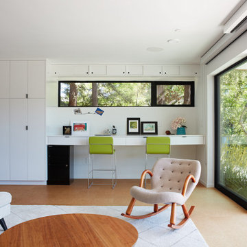
 Klopf Architecture
The Roger Lee designed house from 1962 was purchased by the current homeowners in almost original condition, as the previous owners elected to defer most maintenance projects over the years. The clients were able to see beyond the dated materials and finishes, single-paned glass and uninsulated walls and they approached Klopf Architecture to help them expand and update the entire home, one the family could settle into and enjoy for years to come. It was important that the new designs were aligned with Lee's original intent not only because of the client's appreciation for mid-century modern architecture, but also because the house was deemed historical. The Stanford Real Estate Office requires a stringent design review which safeguards the integrity of the community, which Klopf Architecture was happy to oblige going into their updated designs.
As with many original mid-century modern homes, the house was scaled to the 1960s lifestyle where rooms were smaller and openings to views were limited and tightly framed. The original conditions defined the direction the family of four would take in updating the house and making it comfortable for their modern lifestyle. Klopf designed a full gut remodel and major addition to bring the house into the 21st century and provide the living area needed for the client's family. The newly expanded house added just about 1,100 sf to create an airy, comfortable and family friendly house, taking full advantage of the beautiful southwestern views that extend out to the hills beyond. The enclosed garage created an additional 240 sf of covered space for long-term storage.
A cracked swimming pool created an eyesore taking up a majority of the backyard landscape, so it was one of the first elements to go during the transformation. Working with Outer Space Landscape Architects, the family asked for a mix of relaxing outdoor patio spaces that eventually blend into the native landscaping, extending their views outward toward the natural greenery of the trees beyond their property. Filling in the old pool was a smart way to expand the living spaces outward. The orientation of the house was designed to enjoy the views, but the original architecture provided the first homeowners with mere glimpses of the landscape outside.
Klopf was able to broaden those views, continuing and extending on the original architecture to take full advantage of the unobstructed natural views across the rear facade of the house. Small horizontal openings in the primary bedroom and office were replaced with much taller windows that now follow the angled roof line upward, extending across almost all of the facade. We worked with Western Windows, whose designs included an oblique-shaped, operable casement that allowed our design to rise with the slope. A new corner office added to the primary suite, offers a bright and functional work-from-home solution that looks out at the distant views and added natural light from the expanded window configuration that now wraps around the corner.
The existing lower level was designed by Lee as a utilitarian space, serving as a wet pool room with a drain in the center of the floor, bathroom, laundry and storage areas. Without the need for a pool room, Klopf was able to convert the area into a much more comfortable and functional living space with a new family room and guest suite. The new spaces enjoy easy access to a new outdoor patio through floor to ceiling, full-width glass sliders.
Continuing along the rear facade, a previously exposed deck extending from the living room and hallway provided access to the backyard through a single set of stairs leading toward the side of the house which made sense when the pool was in place. The new deck was re-envisioned as an extension of the main living room and now serves as a second outdoor living room. A new slatted pergola above provides the homeowners welcome relief from the hot afternoon sun. A second set of stairs now creates a better connection to the redesigned lower level. Klopf was able to reconfigure the spaces, extending the living room outward toward the views, where the family now claims it as the heart of the home, spending a large majority of their time outdoors.
Back inside, the original wood-burning Malm fireplace was beautifully restored and a gas burner installed to comply with California's strict air standards. It now rests in front of a wall of Heath accent tiles where a dated red brick wall used to stand. A new taller window brings more light and views into the refreshed interior living room. The original glass doors opposite the fireplace were replaced by larger sliders that when fully opened, create a seamless transition to the new outdoor living area so the two spaces feel like one connected space. The original utilitarian kitchen was needlessly tucked into the far back corner and closed-off, out of sight from the living room, so the clients asked Klopf to open it up and expand the kitchen forward so it felt more connected. Today the much larger kitchen is connected to the living area where a short wall with a cutout offers a visual glimpse into the kitchen and a handy pass-through counter for serving guests. A new breakfast nook was also added to create another spot where the family can gather for casual meals. Just outside, a new built-in outdoor grill and prep area extends the kitchen outside and connects to a new outdoor dining spot nestled amongst the trees, taking advantage of the views out back.
Klopf was able to expand the other two bedrooms, add a new laundry room and half-bath and convert the carport to an enclosed garage to add more storage areas which was lost when the pool house was converted to the family and guest room.
To maintain a historical connection to the original designs, the exterior siding was repeated on all exterior walls, a full-height stained glass window at the front entryway restored, and an interior slatted screen element repeated outside at the exterior entry courtyard and over the new outdoor living room to create a shade trellis. The new house stands proudly and shines against it's new landscaping features, while respecting and expanding on the original intent of Roger Lee's designs epitomizing the comforts of indoor-outdoor living in Northern California.
Completion year: 2020
Klopf Architecture project team: John Klopf, Klara Kevane, Noel Andrade
Contractor: ORB Construction, Brendan O'Reilly
Structural engineer: Sezen and Moon
Landscape architect: Outer space
Furnishings and decoration: Urbanism Designs
Photographer: Mariko Reed
 TVL Creative Ltd.
Cramped kitchen be gone! That was the project motto and top priority. The goal was to transform the current layout from multiple smaller spaces into a connected whole that would activate the main level for our clients, a young family of four.
The biggest obstacle was the wall dividing the kitchen and the dining room. Removing this wall was central to opening up and integrating the main living spaces, but the existing ductwork that ran right through the center of the wall posed a design challenge, er design opportunity. The resulting design solution features a central pantry that captures the ductwork and provides valuable storage- especially when compared to the original kitchen's 18" wide pantry cabinet. The pantry also anchors the kitchen island and serves as a visual separation of space between the kitchen and homework area.
Through our design development process, we learned the formal living room was of no service to their lifestyle and therefore space they rarely spent time in. With that in mind, we proposed to eliminate the unused living room and make it the new dining room. Relocating the dining room to this space inherently felt right given the soaring ceiling and ample room for holiday dinners and celebrations. The new dining room was spacious enough for us to incorporate a conversational seating area in the warm, south-facing window alcove.
Now what to do with the old dining room?! To answer that question we took inspiration from our clients' shared profession in education and developed a craft area/homework station for both of their boys. The semi-custom cabinetry of the desk area carries over to the adjacent wall and forms window bench base with storage that we topped with butcher block for a touch of warmth. While the boys are young, the bench drawers are the perfect place for a stash of toys close to the kitchen.
The kitchen begins just beyond the window seat with their refrigerator enclosure. Opposite the refrigerator is the new pantry with twenty linear feet of shelving and space for brooms and a stick vacuum. Extending from the backside of the pantry the kitchen island design incorporates counter seating on the family room side and a cabinetry configuration on the kitchen side with drawer storage, a trashcan center, farmhouse sink, and dishwasher.
We took careful time in design and execution to align the range and sink because while it might seem like a small detail, it plays an important role in supporting the symmetrical configuration of the back wall of the kitchen. The rear wall design utilizes an appliance garage mirrors the visual impact of the refrigerator enclosure and helps keep the now open kitchen tidy. Between the appliance garage and refrigerator enclosure is the cooking zone with 30" of cabinetry and work surface on either side of the range, a chimney style vent hood, and a bold graphic tile backsplash.
The backsplash is just one of many personal touches we added to the space to reflect our client's modern eclectic style and love of color. Swooping lines of the mid-mod style barstools compliment the pendants and backsplash pattern. A pop of vibrant green on the frame of the pantry door adds a fresh wash of color to an otherwise neutral space. The big show stopper is the custom charcoal gray and copper chevron wall installation in the dining room. This was an idea our clients softly suggested, and we excitedly embraced the opportunity. It is also a kickass solution to the head-scratching design dilemma of how to fill a large and lofty wall.
We are so grateful to bring this design to life for our clients and now dear friends.
 TVL Creative Ltd.
Cramped kitchen be gone! That was the project motto and top priority. The goal was to transform the current layout from multiple smaller spaces into a connected whole that would activate the main level for our clients, a young family of four.
The biggest obstacle was the wall dividing the kitchen and the dining room. Removing this wall was central to opening up and integrating the main living spaces, but the existing ductwork that ran right through the center of the wall posed a design challenge, er design opportunity. The resulting design solution features a central pantry that captures the ductwork and provides valuable storage- especially when compared to the original kitchen's 18" wide pantry cabinet. The pantry also anchors the kitchen island and serves as a visual separation of space between the kitchen and homework area.
Through our design development process, we learned the formal living room was of no service to their lifestyle and therefore space they rarely spent time in. With that in mind, we proposed to eliminate the unused living room and make it the new dining room. Relocating the dining room to this space inherently felt right given the soaring ceiling and ample room for holiday dinners and celebrations. The new dining room was spacious enough for us to incorporate a conversational seating area in the warm, south-facing window alcove.
Now what to do with the old dining room?! To answer that question we took inspiration from our clients' shared profession in education and developed a craft area/homework station for both of their boys. The semi-custom cabinetry of the desk area carries over to the adjacent wall and forms window bench base with storage that we topped with butcher block for a touch of warmth. While the boys are young, the bench drawers are the perfect place for a stash of toys close to the kitchen.
The kitchen begins just beyond the window seat with their refrigerator enclosure. Opposite the refrigerator is the new pantry with twenty linear feet of shelving and space for brooms and a stick vacuum. Extending from the backside of the pantry the kitchen island design incorporates counter seating on the family room side and a cabinetry configuration on the kitchen side with drawer storage, a trashcan center, farmhouse sink, and dishwasher.
We took careful time in design and execution to align the range and sink because while it might seem like a small detail, it plays an important role in supporting the symmetrical configuration of the back wall of the kitchen. The rear wall design utilizes an appliance garage mirrors the visual impact of the refrigerator enclosure and helps keep the now open kitchen tidy. Between the appliance garage and refrigerator enclosure is the cooking zone with 30" of cabinetry and work surface on either side of the range, a chimney style vent hood, and a bold graphic tile backsplash.
The backsplash is just one of many personal touches we added to the space to reflect our client's modern eclectic style and love of color. Swooping lines of the mid-mod style barstools compliment the pendants and backsplash pattern. A pop of vibrant green on the frame of the pantry door adds a fresh wash of color to an otherwise neutral space. The big show stopper is the custom charcoal gray and copper chevron wall installation in the dining room. This was an idea our clients softly suggested, and we excitedly embraced the opportunity. It is also a kickass solution to the head-scratching design dilemma of how to fill a large and lofty wall.
We are so grateful to bring this design to life for our clients and now dear friends.

 Décor Aid
Having a small child, loving to entertain and looking to declutter and kid-proof the gathering spaces of their home in the quaint village of Rockville Centre, Long Island, a stone’s throw from Manhattan, our client’s main objective was to have their living room and den transformed with a family friendly home makeover with mid-century modern tones boasting a formal, yet relaxed spirit
Stepping into the home we found their living room and den both architecturally well appointed yet in need of modern transitional furniture pieces and the pops of color our clients admired, as there was a substantial amount of cool, cold grays in the rooms.
Decor Aid designer Vivian C. approached the design and placement of the pieces sourced to be kid-friendly while remaining sophisticated and practical for entertaining.
“We played off of the clients love for blush pinks, mid-century modern and turquoise. We played with the use of gold and silver metals to mix it up.”
In the living room, we used the prominent bay window and its illuminating natural light as the main architectural focal point, while the fireplace and mantels soft white tone helped inform the minimalist color palette for which we styled the room around.
To add warmth to the living room we played off of the clients love for blush pinks and turquoise while elevating the room with flashes of gold and silver metallic pieces. For a sense of play and to tie the space together we punctuated the kid-friendly living room with an eclectic juxtaposition of colors and materials, from a beautifully patchworked geometric cowhide rug from All Modern, to a whimsical mirror placed over an unexpected, bold geometric credenza, to the blush velvet barrel chair and abstract blue watercolor pillows.
“When sourcing furniture and objects, we chose items that had rounded edges and were shatter proof as it was vital to keep each room’s decor childproof.” Vivian ads.
Their vision for the den remained chic, with comfort and practical functionality key to create an area for the young family to come together.
For the den, our main challenge was working around the pre-existing dark gray sectional sofa. To combat its chunkiness, we played off of the hues in the cubist framed prints placed above and focused on blue and orange accents which complement and play off of each other well. We selected orange storage ottomans in easy to clean, kid-friendly leather to maximize space and functionality. To personalize the appeal of the den we included black and white framed family photos. In the end, the result created a fun, relaxed space where our clients can enjoy family moments or watch a game while taking in the scenic view of their backyard.
For harmony between the rooms, the overall tone for each room is mid-century modern meets bold, yet classic contemporary through the use of mixed materials and fabrications including marble, stone, metals and plush velvet, creating a cozy yet sophisticated enough atmosphere for entertaining family and friends and raising a young children.
“The result od this family friendly room was really fantastic! Adding some greenery, more pillows and throws really made the space pop.” Vivian C. Decor Aid’s Designer

 Upland Homes
Modern functionality meets rustic charm in this expansive custom home. Featuring a spacious open-concept great room with dark hardwood floors, stone fireplace, and wood finishes throughout.
142