
Search results for "Squeeze" in Home Design Ideas
 Shuler Architecture
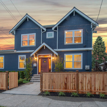
Completed in 2019, this is a home we completed for client who initially engaged us to remodeled their 100 year old classic craftsman bungalow on Seattle’s Queen Anne Hill. During our initial conversation, it became readily apparent that their program was much larger than a remodel could accomplish and the conversation quickly turned toward the design of a new structure that could accommodate a growing family, a live-in Nanny, a variety of entertainment options and an enclosed garage – all squeezed onto a compact urban corner lot.
Project entitlement took almost a year as the house size dictated that we take advantage of several exceptions in Seattle’s complex zoning code. After several meetings with city planning officials, we finally prevailed in our arguments and ultimately designed a 4 story, 3800 sf house on a 2700 sf lot. The finished product is light and airy with a large, open plan and exposed beams on the main level, 5 bedrooms, 4 full bathrooms, 2 powder rooms, 2 fireplaces, 4 climate zones, a huge basement with a home theatre, guest suite, climbing gym, and an underground tavern/wine cellar/man cave. The kitchen has a large island, a walk-in pantry, a small breakfast area and access to a large deck. All of this program is capped by a rooftop deck with expansive views of Seattle’s urban landscape and Lake Union.
Unfortunately for our clients, a job relocation to Southern California forced a sale of their dream home a little more than a year after they settled in after a year project. The good news is that in Seattle’s tight housing market, in less than a week they received several full price offers with escalator clauses which allowed them to turn a nice profit on the deal.
 Ariana Designs & Interiors
Ariana Designs and Architecture redefines a Kirkland home by blending contemporary and traditional styles with rustic charm. A soothing palette of white, gray, and ivory pairs beautifully with warm wood and granite, creating a timeless yet modern feel.
The redesigned kitchen enhances function and flow with a central island, optimized layout, and seamless indoor-outdoor connection—perfect for both daily living and entertaining. Every detail reflects thoughtful craftsmanship, balancing beauty and practicality in a space designed for comfort and effortless gatherings.
 Erika Gurskyte Pace
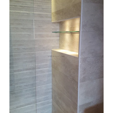
Maximised the space, enough storage, squeezed a washing machine to this small apartment.
Shelf under the mirror. Custom made vanity.
Mid-sized minimalist master gray tile and ceramic tile walk-in shower photo in Other with flat-panel cabinets and a console sink
Mid-sized minimalist master gray tile and ceramic tile walk-in shower photo in Other with flat-panel cabinets and a console sink
Find the right local pro for your project
 Heidi Reis / Abode Agency LLC
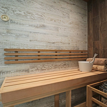
This Grant Park house was built in 1999. With that said, this bathroom was dated, builder grade with a tiny shower (3 ft x 3 ft) and a large jacuzzi-style 90s tub. The client was interested in a much larger shower, and he really wanted a sauna if squeeze it in there. Because this bathroom was tight, I decided we could potentially go into the large walk-in closet and expand to include a sauna. The client was looking for a refreshing coastal theme, a feel good space that was completely different than what existed.
This renovation was designed by Heidi Reis with Abode Agency LLC, she serves clients in Atlanta including but not limited to Intown neighborhoods such as: Grant Park, Inman Park, Midtown, Kirkwood, Candler Park, Lindberg area, Martin Manor, Brookhaven, Buckhead, Decatur, and Avondale Estates.
For more information on working with Heidi Reis, click here: https://www.AbodeAgency.Net/
 Jay McKinnon Company
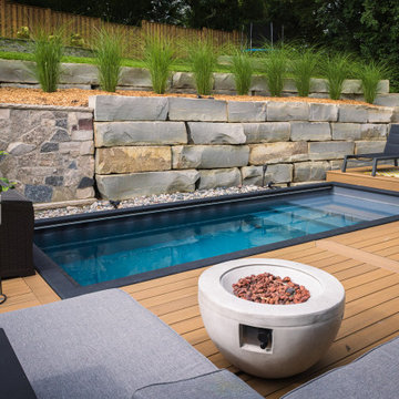
We pushed back the existing hillside to squeeze in enough space for a shipping container pool, comfortable lounge and dinning space as well as a level spot for a children's playset.
 User
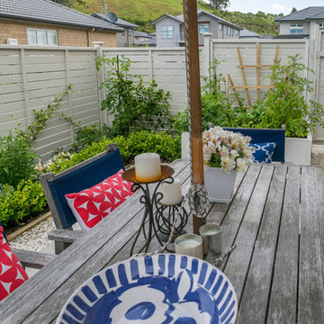
UserA tiny outdoor space was made to feel larger by replacing the lawn with paved paths and a courtyard. New steps replaced a sloping path to the front door. This home now has great street appeal and the courtyard provides a pretty flower filled living space throughout the year. There is even a small vegetable box squeezed in.

 Shuler Architecture
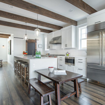
Completed in 2019, this is a home we completed for client who initially engaged us to remodeled their 100 year old classic craftsman bungalow on Seattle’s Queen Anne Hill. During our initial conversation, it became readily apparent that their program was much larger than a remodel could accomplish and the conversation quickly turned toward the design of a new structure that could accommodate a growing family, a live-in Nanny, a variety of entertainment options and an enclosed garage – all squeezed onto a compact urban corner lot.
Project entitlement took almost a year as the house size dictated that we take advantage of several exceptions in Seattle’s complex zoning code. After several meetings with city planning officials, we finally prevailed in our arguments and ultimately designed a 4 story, 3800 sf house on a 2700 sf lot. The finished product is light and airy with a large, open plan and exposed beams on the main level, 5 bedrooms, 4 full bathrooms, 2 powder rooms, 2 fireplaces, 4 climate zones, a huge basement with a home theatre, guest suite, climbing gym, and an underground tavern/wine cellar/man cave. The kitchen has a large island, a walk-in pantry, a small breakfast area and access to a large deck. All of this program is capped by a rooftop deck with expansive views of Seattle’s urban landscape and Lake Union.
Unfortunately for our clients, a job relocation to Southern California forced a sale of their dream home a little more than a year after they settled in after a year project. The good news is that in Seattle’s tight housing market, in less than a week they received several full price offers with escalator clauses which allowed them to turn a nice profit on the deal.
 Shuler Architecture
Completed in 2019, this is a home we completed for client who initially engaged us to remodeled their 100 year old classic craftsman bungalow on Seattle’s Queen Anne Hill. During our initial conversation, it became readily apparent that their program was much larger than a remodel could accomplish and the conversation quickly turned toward the design of a new structure that could accommodate a growing family, a live-in Nanny, a variety of entertainment options and an enclosed garage – all squeezed onto a compact urban corner lot.
Project entitlement took almost a year as the house size dictated that we take advantage of several exceptions in Seattle’s complex zoning code. After several meetings with city planning officials, we finally prevailed in our arguments and ultimately designed a 4 story, 3800 sf house on a 2700 sf lot. The finished product is light and airy with a large, open plan and exposed beams on the main level, 5 bedrooms, 4 full bathrooms, 2 powder rooms, 2 fireplaces, 4 climate zones, a huge basement with a home theatre, guest suite, climbing gym, and an underground tavern/wine cellar/man cave. The kitchen has a large island, a walk-in pantry, a small breakfast area and access to a large deck. All of this program is capped by a rooftop deck with expansive views of Seattle’s urban landscape and Lake Union.
Unfortunately for our clients, a job relocation to Southern California forced a sale of their dream home a little more than a year after they settled in after a year project. The good news is that in Seattle’s tight housing market, in less than a week they received several full price offers with escalator clauses which allowed them to turn a nice profit on the deal.
 Digital Living
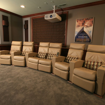
Example of a mid-sized classic enclosed carpeted and gray floor home theater design in Chicago with beige walls and a projector screen
 Spring Creek Design
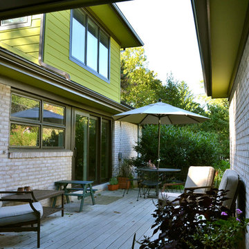
Tim & Elissa have a beautiful home in the most desirable Wyomissing neighborhood. Broad sidewalks under stately oaks, with nearby parks makes it a perfect place to raise a growing family. But their 2-bedroom mid-century rancher was becoming a squeeze. They asked Spring Creek Design to come up with a cost-effective solution to their space problem, while also tackling some of the home’s aged infrastructure.
Design Criteria:
- Increase living space by adding a new 2nd storey Master Suite.
- Enhance livability with an open floorplan on the first floor.
- Improve the connection to the outdoors.
- Update basics systems with new windows, HVAC and insulation.
- Update interior with paint & refinished floors.
Special Features:
- Bright, mid-century modern design is true to the home’s vintage.
- Custom steel cable railings at both stairways.
- New open plan creates strong connections between kitchen, living room, dining room and deck.
- High-performance Pella windows throughout, including a new triple-panel slider to the deck.
 Erika Gurskyte Pace
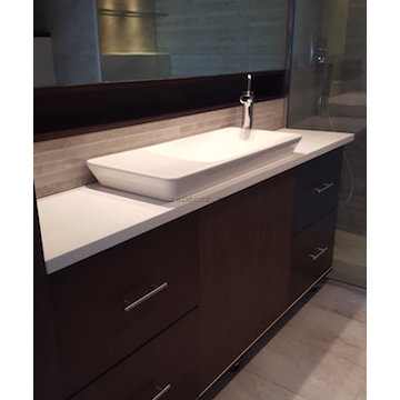
Maximised the space, enough storage, squeezed a washing machine to this small apartment.
Shelf under the mirror. Custom made vanity.
Example of a mid-sized minimalist master gray tile and ceramic tile walk-in shower design in Other with flat-panel cabinets and a console sink
Example of a mid-sized minimalist master gray tile and ceramic tile walk-in shower design in Other with flat-panel cabinets and a console sink
 Abbas Rachaman, Designer, Board&Vellum
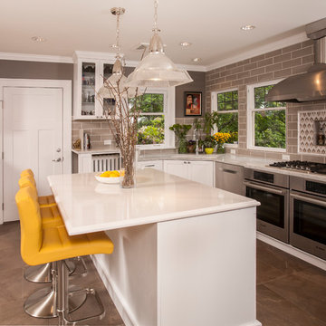
This is major kitchen remodel done on a tight budget!
1st thing I noticed in the original kitchen (please refer to before pictures) was that the ceiling height was lower than both the adjacent rooms, and of course the soffit cabinets made everything lower so I suggested we take the ceiling height up the match the other rooms. Through process of elimination I found the best place for the sink was in the corner because she would now have 2 windows for views of the neighborhood and a place to put the plants that once sat on the floor in the “breakfast nook”. Moving the gas cook top the exterior wall allowed for ease of installation and venting out also this was the best place to put it given the amount of windows. It is very important to me to design every kitchen with surface space on either side of the cook top so that you have enough room for baking racks, cookie sheets, etc.. to spread out. The solution to the double oven request was to put 2 of them under the counter instead of stacking them which would have taken up surface space. During the design meeting I asked how often to you close that door to the dining room? To which they replied “never, we always leave it open”. I knew then that door was a waste of space so I decided to toss that to make a bigger opening to make the kitchen more inviting as you enter from the dining room. Another thing I always talk about during kitchen designs is “landing zone”. You must have a surface to place things on once you enter the kitchen, be it groceries, keys, phone, wallet, etc.. But I find it functional and it keeps you from walking into a room with large things on either side of you. Again relating back to making sure the kitchen felt inviting. Definitely wanted make sure we had as much pullout kitchen accessories and deep drawers for ease of use because we did not have room for a lot of upper cabinets. I decided to take full advantage of those large open windows buy taking the tile to the ceiling and picture framing them with tile liners. The effect is that you see more light coming in because of the contrast of the darker tile. My solution to the clients request to get as much light in from the adjacent family room was to take out that kitchen desk and frame in a large opening. I needed to make sure that opening made a statement so instead of doing a standard door casing I added architectural details of molding around the doorway and highlighted by insetting the molding into the wall and painting the inset a different color. Once I was able to achieve bringing in the most light, I decided I could bring in a little drama by going with a dark wall color! It is okay to use dark wall colors as long as you have enough light so it still feels inviting. My solution to the radiator was to move it over to give us just enough room to squeeze in another cabinet for capturing as much storage as I could. I needed to make sure I had that “landing zone” so I wanted to place a counter top over the radiator, but how? I used a decorative post to give the kitchen a little something extra and to tie back in with the cabinets. Then I added a counter top above the wine refrigerator but both had to be the same height because they were across from each other. So what a great challenge this turned out be. Because of me needing to make the wine refrigerator counter top higher to match the other counter top, I was able to fit in a little drawer for wine accessories above the wine refrigerator. More storage! Yes!! Painting the radiator white to give it a fresh new look added a lot and was relatively simple in the grand scheme of things. Solution to pantry was to make it a cabinet pantry so that we didn’t have to work around the thickness of walls and a door. Island size was determined by NKBA standards of having enough room for traffic flow around the kitchen which allowed us 3 chairs. And if someone ever wanted to, they could use the counter above the radiator as a surface to work on. Of course we updated all the lighting, made sure we had under counter lighting, and they are all LED. Lastly porcelain floor tiles , ceramic backsplash and quartz counter tops were the material of choice for ease of maintenance and budget.
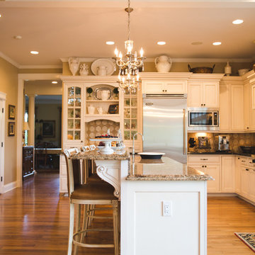
 Northlight Interiors
Beautifully designed with an entertainer in mind. This home has many happy parties from birthdays to apple squeezes. The owner needed a place to prepare meals from small to large. Commercial appliances were designed into the space along with deep drawers to hold pans and dishes.
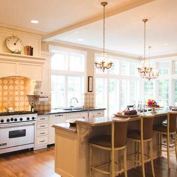 Northlight Interiors
Beautifully designed with an entertainer in mind. This home has many happy parties from birthdays to apple squeezes. The owner needed a place to prepare meals from small to large. Commercial appliances were designed into the space along with deep drawers to hold pans and dishes.
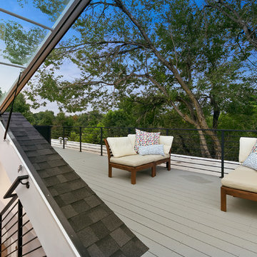
 Root Architecture and Development, LLC
in order to meet building height restrictions in Denver, rather than try to squeeze a third floor with low celings, Root Architecture opted to build a roof top deck instead that features access from a floating staircase. The Daylighter windows offers walk out access to the deck.
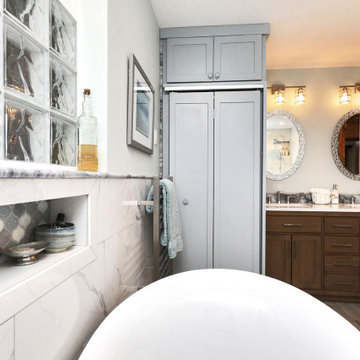
 Whidbey South Woodworks
Trying to squeeze this stackable unit in this space was also another challenge due the towel warmer. But we got it in.
Bathroom - bathroom idea in Seattle
Bathroom - bathroom idea in Seattle
 Provoke Design
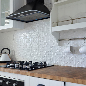
When designing this space I wanted to create a Queenslander style kitchen with modern functionality.
This design is a simple L shape design, it still has everything you need to cook and bake if you feel like it. The dishwasher is 450mm wide and allowed the pantry to be squeezed into space. The microwave is hidden above the fridge behind the lift-up door.
This is a very clever design allowing a fully functional kitchen in a small spacious space.

 Renovisions
 A work-smart kitchen layout was a must for this homeowner. That’s why she got together with the Renovisions team. In the old kitchen, lack of enough cabinet space and organized storage, created an overflowing situation with contents pushed to the countertops, making it hard to escape the clutter. Moreover, the inconvenient position of the refrigerator made entering and exiting the kitchen literally a squeeze. Redesigning the kitchen was a challenge but Ed envisioned a new spacious layout that naturally flowed between all work areas.
At the top of the must-have list was the addition of an Island with an electric cooktop and much needed deep drawer storage. To create a better flow, the work surfaces, storage and appliances were arranged in the most functional way. The microwave was built into the cabinetry with an adjacent pull-out spice rack and it is closer to the refrigerator making reheating food easier.
The key part of overhauling this kitchen was upgrading the cabinetry, countertops, and appliances as well as adding a unique backsplash tile. Renovisions suggested the gorgeous maple wood cabinetry with a light grey stain. The stainless steel appliances play off the grey cabinetry, colorful veining in the granite countertops and attractive glass subway tile, giving the kitchen a sleeker and more modern look.
63