
Search results for "Squeeze" in Home Design Ideas
 HQ Architects
Alex Bowman
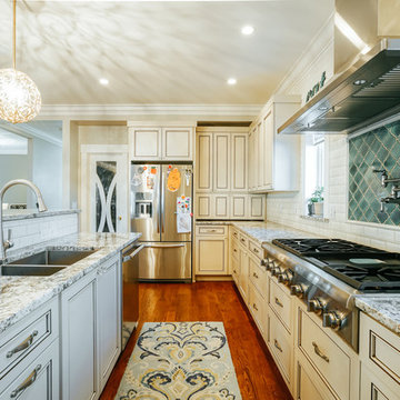
Example of a large classic u-shaped medium tone wood floor open concept kitchen design in Denver with a drop-in sink, raised-panel cabinets, white cabinets, granite countertops, white backsplash, subway tile backsplash, stainless steel appliances and an island
Example of a large classic u-shaped medium tone wood floor open concept kitchen design in Denver with a drop-in sink, raised-panel cabinets, white cabinets, granite countertops, white backsplash, subway tile backsplash, stainless steel appliances and an island
 sticklab
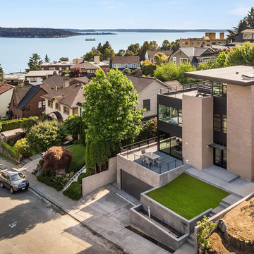
Squeezed into a 3600 square foot property, this 3500 square foot, four level home enjoys commanding views of downtown Seattle and Elliott Bay. Concrete, brick, cedar and metals guard against the elements.

Find the right local pro for your project
 Sheridan Interiors, Inc.
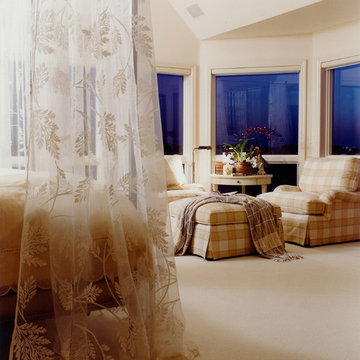
A Master Bedroom in a weekend waterfront residence needed a fresh, open look --- not too fussy, but with an inviting, comfortable atmosphere. It needed to be easy to maintain, but with a luxuriousness to the design. Although the room feels large which is due to the soaring ceiling height, it is not that big. There was just enough space for two night tables on each side of the king-size bed and with the other walls being angled and having windows, it was tricky to get a furniture plan worked out. There is, in addition to the pair of chairs, an armoire for a television screen just out of the camera range. Not trying to squeeze in more furniture has kept the room feeling light and airy.
Photographer: Wade Zimmerman
 A. Bollman & Sons.
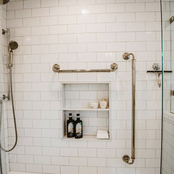
The original main bathroom for this 1930's brick colonial hadn't seen the light of white since it's last re-haul in the 70s, It has been completely transformed from a heavy pink-tiled nightmare (walls, ceilings, arches everywhere) and returned to it's classic black and white architectural roots.
 Deb Seeley Designs LLC
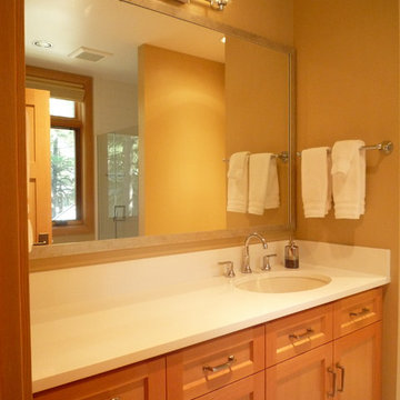
Quartz counter tops, with a silver frame mirror highlight this small guest bathroom. I specifically designed the cabinets with the sink to one side, this allows two people in the bathroom at one time. One can use the sink without encroaching too far into the person using the counter space on the left. I prefer more functional counter space versus trying to squeeze in two sinks, which reduces functional space.
 Ariana Designs & Interiors
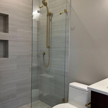
This bathroom renovation by Ariid Build blends luxury with functionality, featuring rich natural materials, timeless finishes, and smart storage solutions. A custom dark wood vanity with a white marble countertop adds warmth and durability, complemented by gold hardware for a refined touch. Textured wall tiles and a glass shower door create depth and openness, while a built-in niche keeps the space clutter-free. Thoughtful lighting and sophisticated details ensure an inviting, elegant atmosphere. Every element was carefully selected to enhance daily living while elevating the home’s overall beauty.
 User
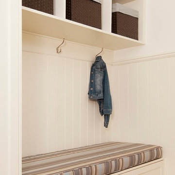
UserSqueezing by the washer and dryer at the start and end of each day, my clients could not help but be reminded of an endless chore — laundry! Relocating the laundry facilities and designing a proper mudroom allows for a smoother, stress-free transition when the family enters and exits their home.
Nicole Billark Photography
 My Kitchen And Bath
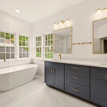
A complete primary bathroom remodel in Springfield, Virginia, designed around three priorities our clients came in with: a real walk-in shower, a freestanding tub by the windows, and a proper double vanity with storage that actually worked.
The original layout had everything in the wrong place. The tub sat against an interior wall away from the natural light. A small stall shower took up real estate across the room. The vanity was squeezed into whatever space was left over. Three windows on the back wall were doing nothing for the room because the layout was fighting them. Our solution involved knocking down the dividing wall between the old shower and vanity area, relocating plumbing for both the tub and the new vanities, and placing the freestanding tub directly under the bay of windows so morning light became part of the experience.
Design Approach
We anchored the room around contrast: deep navy cabinetry against soft white walls, warm brushed gold against cool marble tile, sharp Shaker lines against the curved silhouette of the freestanding tub. Navy was the design decision the rest of the room was built around — the clients knew they wanted color but didn't want anything that would feel dated in five years. Navy reads bold without being loud, pairs with virtually any metal finish, and has staying power that trendier choices don't.
We used Fabuwood Galaxy Indigo for the vanities — all-plywood construction with solid wood doors and drawer fronts, soft close throughout. Shaker-style flat panels keep the navy from feeling heavy. The brushed gold (Jeffrey Alexander 635-96SBZ in satin bronze) shows up across hardware, faucets, lighting, the tub filler, and the shower trim, creating a quiet continuity throughout the room.
The Shower
Removing the wall between the old shower and old vanity area created room for a proper walk-in. We tiled the entire shower floor to ceiling in Decovita Calacatta Suave 24x48" porcelain — large format installed in a 50% offset horizontal pattern, with cement board and redgard underneath. The marble-look porcelain gives the visual depth of natural marble without the maintenance.
A built-in shower bench, custom-built into the corner, is wrapped in the same wall tile on the front with a quartz top matching the vanity counter. The shower niche is detailed with MSI Arabescato Carrara 2" honed hex mosaic at the back, the same tile used on the shower floor. All tile edges are finished with Schluter in satin bronze to match the room's metal finishes. The shower door is custom frameless 3/8" tempered glass with a satin bronze pull — no metal frame interrupting the sight line.
The Vanities and Countertops
The new double vanity gives both clients their own space for morning routines. Counter tops are MSI Calacatta Miraggio Cielo quartz with pencil edging and a 4" backsplash — a soft white with subtle gray veining that reads like real Calacatta marble without the porosity issues. Two undermount square porcelain sinks finish the surface cleanly.
The Tub
A 60" freestanding soaker tub sits under the bay of three windows. The floor-mounted tub filler is satin bronze with a handheld sprayer. We relocated the drain and supply lines to make the centered placement work. The tub is the room's quietest feature and its strongest — clients tell us they use this bathroom differently than they used the old one.
Flooring
MSI Sande Ivory 12x24" matte porcelain runs throughout the bathroom floor in a 50% offset pattern parallel to the vanity wall. Cement board underneath, 4" white wood baseboard, Whisper Grey grout that handles daily use without showing wear.
Paint and Lighting
Walls are Benjamin Moore Chantilly Lace 2121-70 in satin — a true crisp white that doesn't lean cool or warm. The ceiling uses Benjamin Moore Aura Bath and Spa White, which is formulated to resist mildew in high-humidity spaces. Lighting is layered: three new 6" LED recessed lights on a dimmer, two satin bronze vanity sconces above the mirrors, and the existing three windows providing the daytime ambient light.
Project Specs
Location: Springfield, Virginia
Project type: Full primary bathroom remodel
Project duration: Approximately 5 weeks
Style: Modern, Transitional
Color palette: Navy, white, brushed gold, marble
Materials
Cabinetry: Fabuwood Galaxy Indigo, Shaker-style flat panel maple, all-plywood construction
Cabinet hardware: Jeffrey Alexander 635-96SBZ Satin Bronze pulls
Vanity counter and bench top: MSI Calacatta Miraggio Cielo Quartz, pencil edge with 4" backsplash
Sinks: Undermount white porcelain BR-202 square (x2)
Wall tile: Decovita Calacatta Suave 24x48" porcelain
Floor tile: MSI Sande Ivory 12x24" matte porcelain
Shower floor + niche back: MSI Arabescato Carrara 2" honed hex mosaic marble
Edge trim: Schluter satin bronze
Shower door: Custom frameless 3/8" tempered glass
Tub: 60" freestanding acrylic soaker (Ferguson)
Tub filler: Floor-mounted satin bronze (Ferguson)
Vanity faucets, mirrors, sconces, toilet: Satin bronze coordinated finishes (Ferguson)
Wall paint: Benjamin Moore Chantilly Lace 2121-70 Satin
Ceiling paint: Benjamin Moore Aura Bath and Spa White
Grout: Whisper Grey (floor), Standard White (walls and shower)
Designed and built by My Kitchen and Bath out of our Alexandria showroom at 5710 General Washington Drive. We've been designing and building kitchens, bathrooms, and full home renovations across Northern Virginia and the DMV since 1994.
 Ariana Designs & Interiors
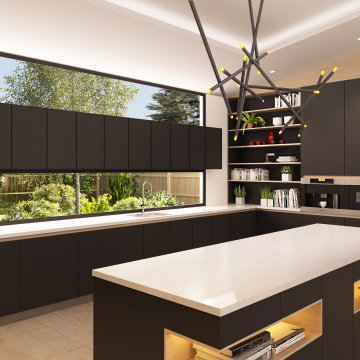
Modern kitchens embody sleek innovation and luxury. Our clients wanted a statement space—both stunning and functional. We crafted a glamorous black kitchen that exudes elegance, showcasing advanced materials, expert craftsmanship, and bold design.
 Shuler Architecture
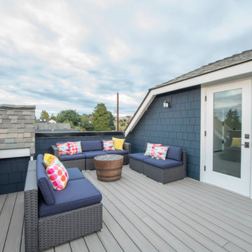
Completed in 2019, this is a home we completed for client who initially engaged us to remodeled their 100 year old classic craftsman bungalow on Seattle’s Queen Anne Hill. During our initial conversation, it became readily apparent that their program was much larger than a remodel could accomplish and the conversation quickly turned toward the design of a new structure that could accommodate a growing family, a live-in Nanny, a variety of entertainment options and an enclosed garage – all squeezed onto a compact urban corner lot.
Project entitlement took almost a year as the house size dictated that we take advantage of several exceptions in Seattle’s complex zoning code. After several meetings with city planning officials, we finally prevailed in our arguments and ultimately designed a 4 story, 3800 sf house on a 2700 sf lot. The finished product is light and airy with a large, open plan and exposed beams on the main level, 5 bedrooms, 4 full bathrooms, 2 powder rooms, 2 fireplaces, 4 climate zones, a huge basement with a home theatre, guest suite, climbing gym, and an underground tavern/wine cellar/man cave. The kitchen has a large island, a walk-in pantry, a small breakfast area and access to a large deck. All of this program is capped by a rooftop deck with expansive views of Seattle’s urban landscape and Lake Union.
Unfortunately for our clients, a job relocation to Southern California forced a sale of their dream home a little more than a year after they settled in after a year project. The good news is that in Seattle’s tight housing market, in less than a week they received several full price offers with escalator clauses which allowed them to turn a nice profit on the deal.
 sticklab
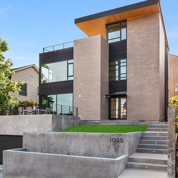
Squeezed into a 3600 square foot property, this 3500 square foot, four level home enjoys commanding views of downtown Seattle and Elliott Bay. Concrete, brick, cedar and metals guard against the elements. Interior details are crisp and clean, with some elaboration at the stair.
 RBL & Associates, LLC
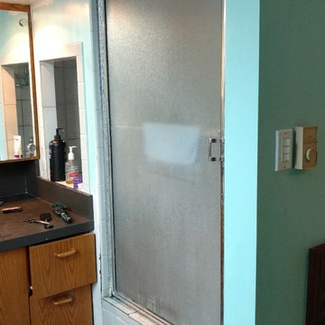
Before photo of previous poorly designed remodel. whirlpool tub squeezed into this space and closed off by the pivot door creating a terribly claustrophobic space
 Keep Calm and Stage LLC
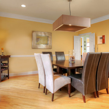
A square dining table easily seating 8. Can seat 12 at a squeeze!
Mid-sized eclectic light wood floor enclosed dining room photo in New York with yellow walls
Mid-sized eclectic light wood floor enclosed dining room photo in New York with yellow walls
 Closets, Storage, & More
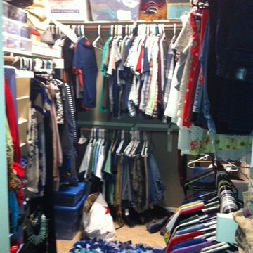
Before: Client purchased a canvas shoe organizer to squeeze out space for folded clothes and shoes, yet its limited in hanging space!
http://closetsstorageandmore.com
 GLYNNdesignbuild
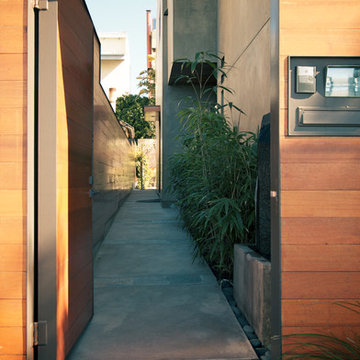
A sideyard front door entry in Playa del Rey. This space was 5' wide but we managed to squeeze in a custom fence, 3' wide sidewalk, and a planter/fountain as you approach the front door.
 Northlight Interiors
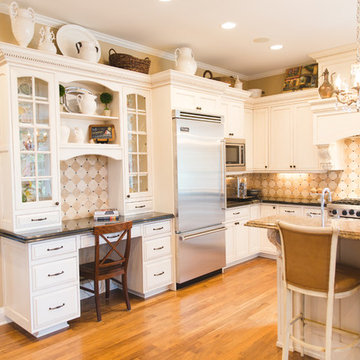
Beautifully designed with an entertainer in mind. This home has many happy parties from birthdays to apple squeezes. The owner needed a place to prepare meals from small to large. Commercial appliances were designed into the space along with deep drawers to hold pans and dishes.
 Mainsail Home Design LLC
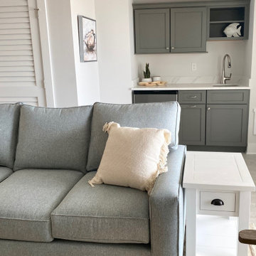
Squeezing in an additional living space on the ground floor of this bay front condo provides more room for entertaining, complete with a built-in bar.
 Florman Architects Inc.
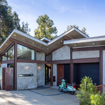
 Three structures are located on a 6,500 sqft, sloped lot. The main house is squeezed between front setbacks, a drainage easements through the middle, an access easement to the north and a 30’ topography following height limit. The street level contains an office, a bedroom, an entry and a garage. The lower level contains indoor /outdoor living spaces separated by a glass wall. Sharing this glass wall is the master bedroom. The Studio 420 is located to the west of the drainage easement and contains the parts and tools needed to repair their grown up toys (a dune buggy, motor cycles, an antique sports car, and a three wheeled vehicle). The Studio 120 became the third structure. This structure is a utility room that blocks the neighbor’s views into their backyard and is as backdrop for outdoor dining. The home’s form is a reaction to being pinched between site constraints and the need to live an outdoor life while being indoors.
 Viahouse
A proud project that I would like to share.
I got a project from a family who lived in a penthouse apartment.
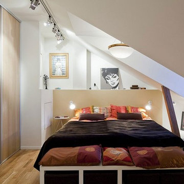
They found it difficult to furnish the apartment as there were sloping walls, also lacked the apartment too light outside.
My suggestion was to turn on the light by low ceiling and then install some larger windows in the ceiling. It works just really good, the apartment has a completely new look and now has plenty of light.
When making high ceiling solution space becomes very large, because they do not feel they are being squeezed to the sloping walls.
A super solution and the budget was affordable. But all expenditures, the budget kept at $ 38,000
65